Walking into a well-designed room painted in grey-green feels like stepping into a peaceful garden after a light rain.
Many people find that more homeowners are choosing these natural shades for their spaces, moving away from plain white and basic gray.
The mix of green and grey creates a fresh and calm feeling – it’s like bringing the quietness of nature indoors.
I created this guide to help you pick the perfect grey-green shade for your home.
After testing numerous paint samples and seeing these colors in real homes, I’ll share what works best in different spaces.
Whether you’re planning to paint one wall or an entire room, you’ll find practical tips and honest advice about how these colors look.
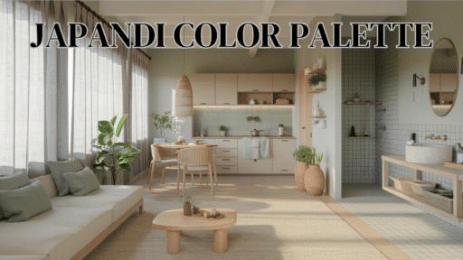
Choose the Right Green for your Home
1. Lighting
- Lots of sunlight – Use darker shades
- Limited light – Choose lighter tones
- Warm bulbs – Enhance green tones
2. Room Size
- Small rooms – Light colors (LRV 30+)
- Large rooms – Dark colors (LRV 15-27)
3. Your Style
- Peaceful mood – Treron, Blanched Thyme
- Social spaces – Rosemary, Evergreen Fog
- Focus areas – Mid-tone options
4. Before You Paint
- Test large samples on different walls
- Check colors in morning and evening light
- Make sure it flows with other rooms
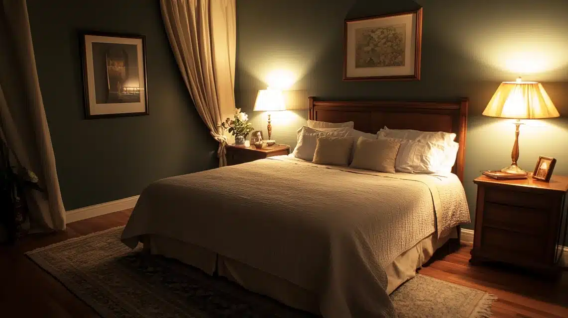
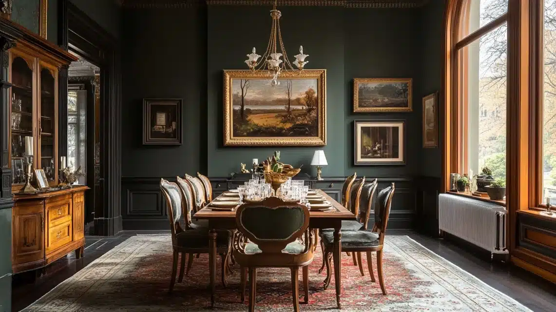
1. Farrow and Ball Treron
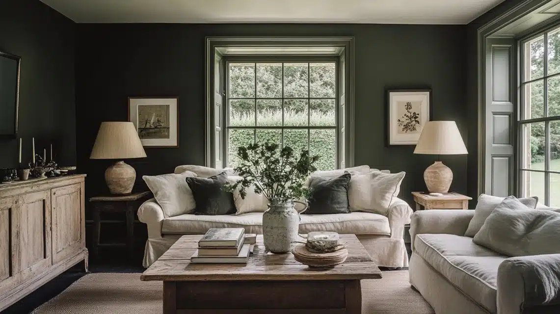
Treron shows its true character in different lights throughout the day.
In morning light, it appears as a soft gray with green hints, while evening light brings out its deeper green tones.
With an LRV of 27, this paint creates a strong presence without feeling heavy.
The color works well in both old houses and new builds.
When used in living rooms, it makes a perfect background for cream sofas and wooden furniture.
In dining rooms, it sets a refined mood for dinner parties.
For bedrooms, it pairs nicely with white linens and brass fixtures, making the space feel both classic and current.
Pro Tip: Test this color at different times of day before committing – its chameleon-like quality means it will look completely different in morning versus evening light.
2. Valspar Blanched Thyme
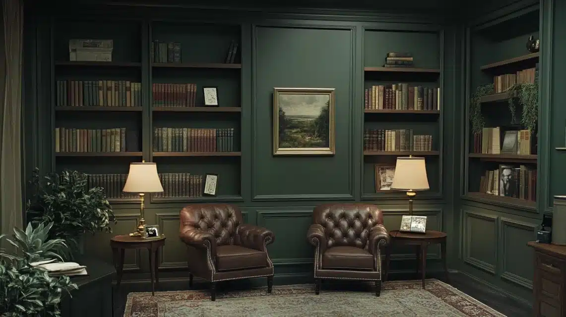
This paint color, with an LRV of 35, brings a sense of calm to any room.
It shifts between gray and green depending on the time of day, making it interesting without being distracting.
The color feels warm even in spaces with less natural light.
It works wonderfully in study areas and libraries, where its muted tone helps create focus.
In these spaces, it pairs well with dark wood shelving and leather furniture.
The color makes books stand out against the walls while maintaining a quiet atmosphere perfect for reading or working.
Pro Tip: This color is perfect for north-facing rooms because it stays warm even without direct sunlight – no need to worry about it looking cold or gray.
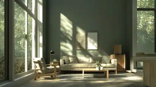
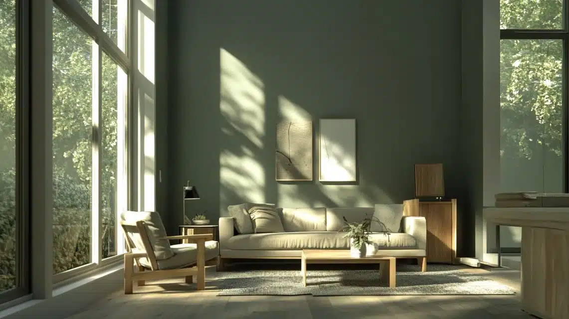
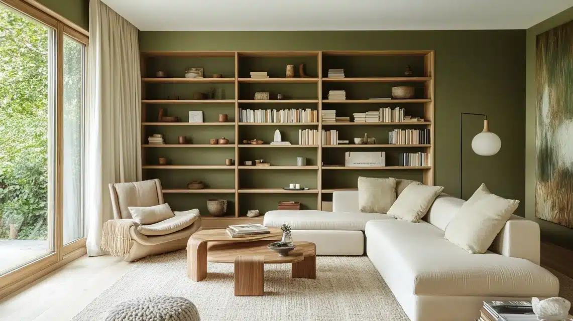
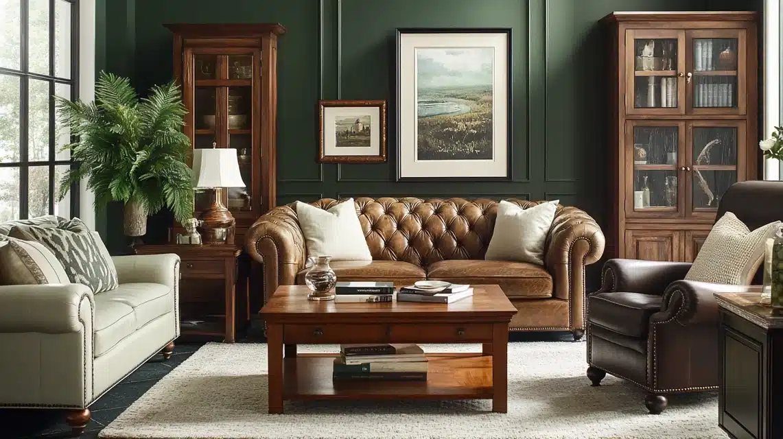
3. Sherwin-Williams Oakmoss
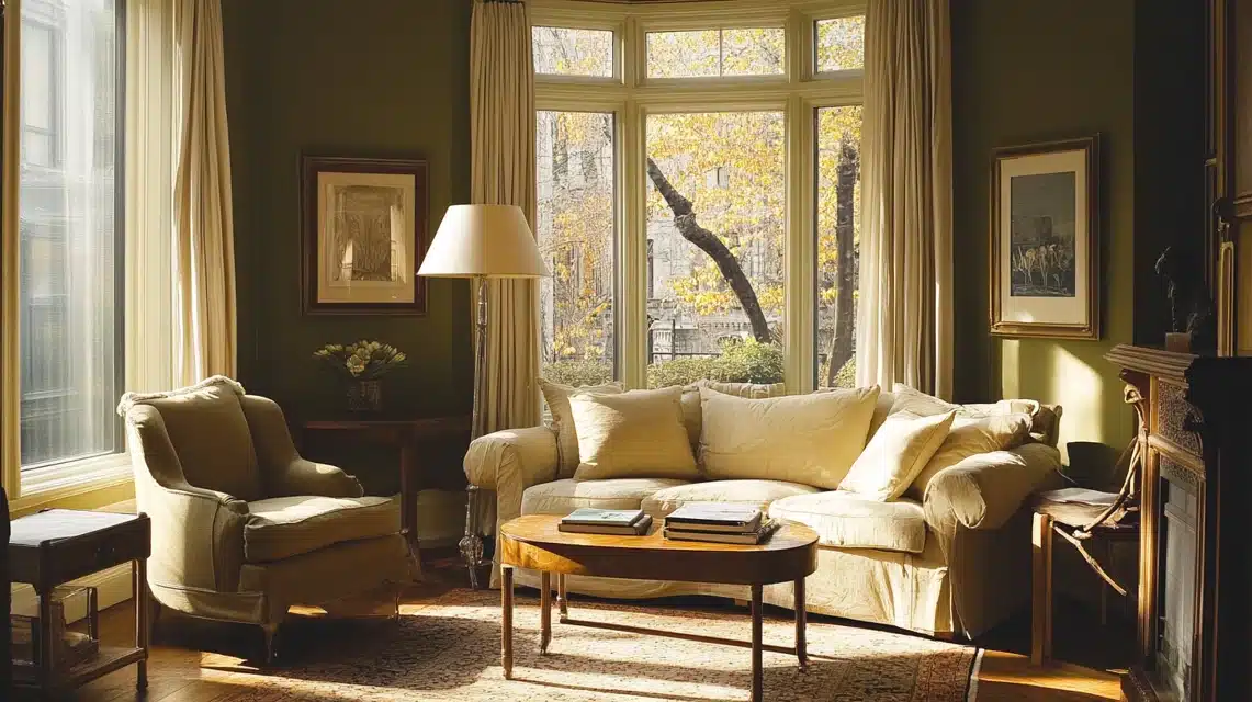
Oakmoss, with its low LRV of 13, brings richness to any space.
This deep color changes throughout the day – sometimes showing more gray, other times revealing its green nature.
It’s a strong choice that still manages to act as a neutral in most settings.
In living rooms, Oakmoss creates a cozy feeling, especially when paired with cream-colored furniture and natural textures.
For home offices, it provides a solid background that helps with concentration.
The color looks particularly good with white trim and golden-toned wood floors.
Pro Tip: Always paint your trim and ceiling in crisp white when using Oakmoss – the contrast will prevent the room from feeling too dark and adds architectural definition.
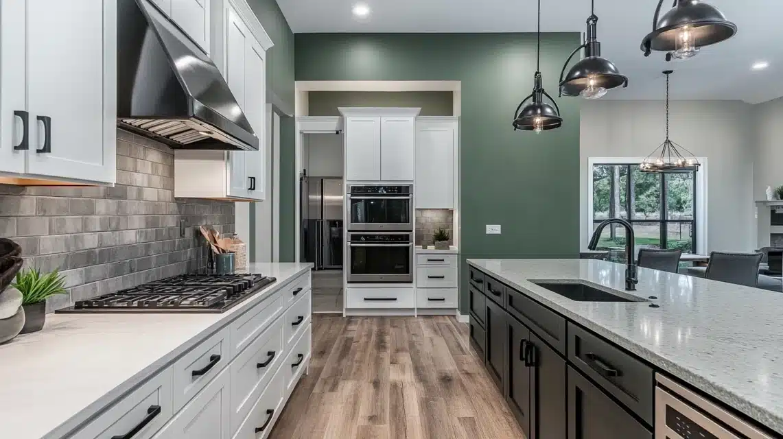
4. Sherwin-Williams Thunderous
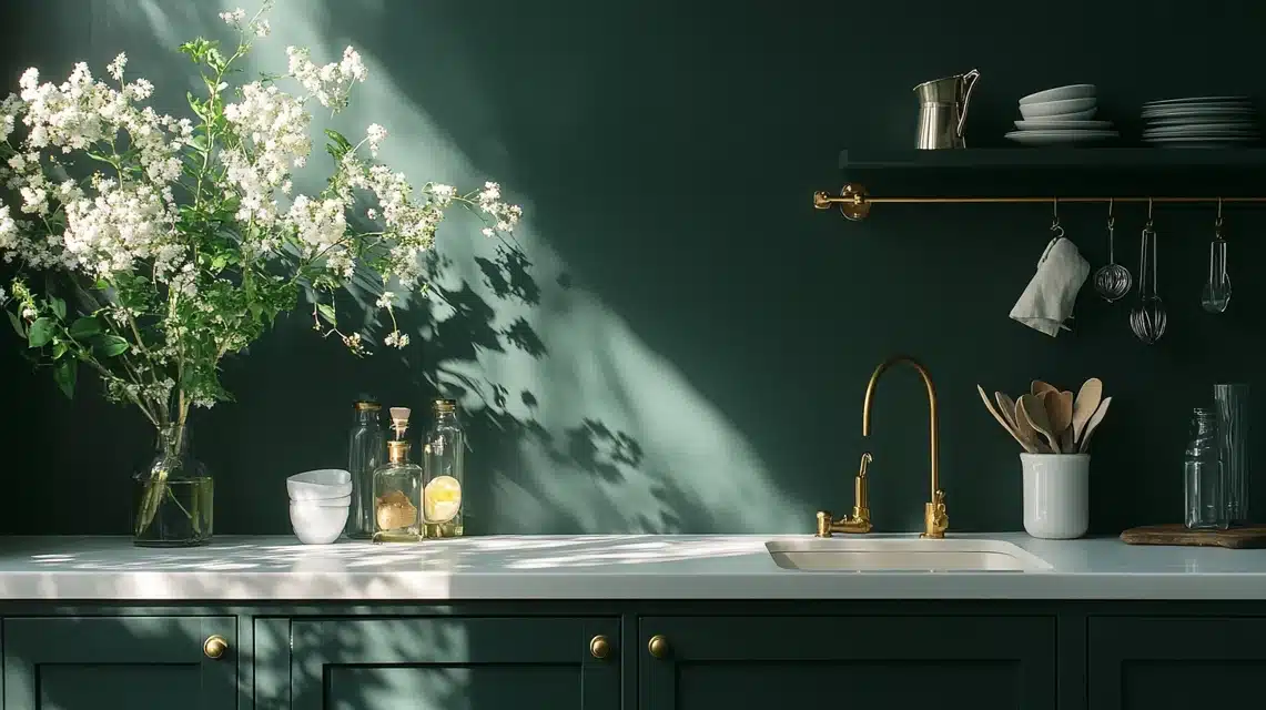
Thunderous stands out with its low LRV of 15, making it perfect for creating strong visual impact.
The color shifts between smoky green and deep charcoal, depending on your room’s lighting.
In bright spaces, it reveals subtle green notes, while in darker areas, it takes on a more mysterious quality.
This color excels on kitchen cabinets, where it contrasts beautifully with white countertops and brass hardware.
It also makes a strong impact on accent walls, especially when paired with light-colored furniture.
For modern spaces, it works well with concrete, steel, and glass elements.
Pro Tip: Use Thunderous on kitchen cabinets instead of walls – it creates maximum impact without overwhelming the space, and the color looks stunning against white quartz or marble countertops.
5. Evergreen Fog Sherwin Williams
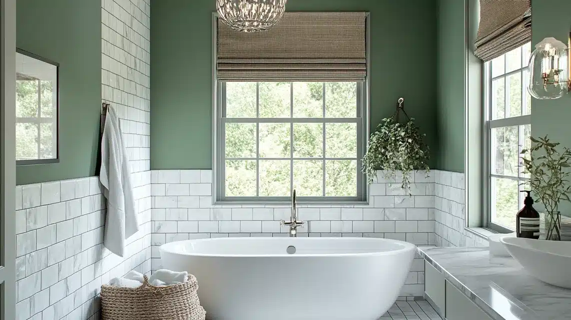
This paint color sits at the perfect middle point with an LRV of 30.
During the day, it shows as a clear green-gray, while evening light brings out its softer side.
The color feels natural in any setting, making it a good choice for connecting different rooms.
In bathrooms, it creates a spa-like feeling when paired with white tiles and natural textures.
Kitchens painted in this shade feel fresh and clean, especially with white cabinets and marble counters.
For bedrooms, it provides a restful background that works well with any bedding color.
Pro Tip: This is the safest choice for first-time grey-green users – its balanced LRV and neutral temperature make it nearly foolproof in any room or lighting condition.
6. Sherwin-Williams Rosemary
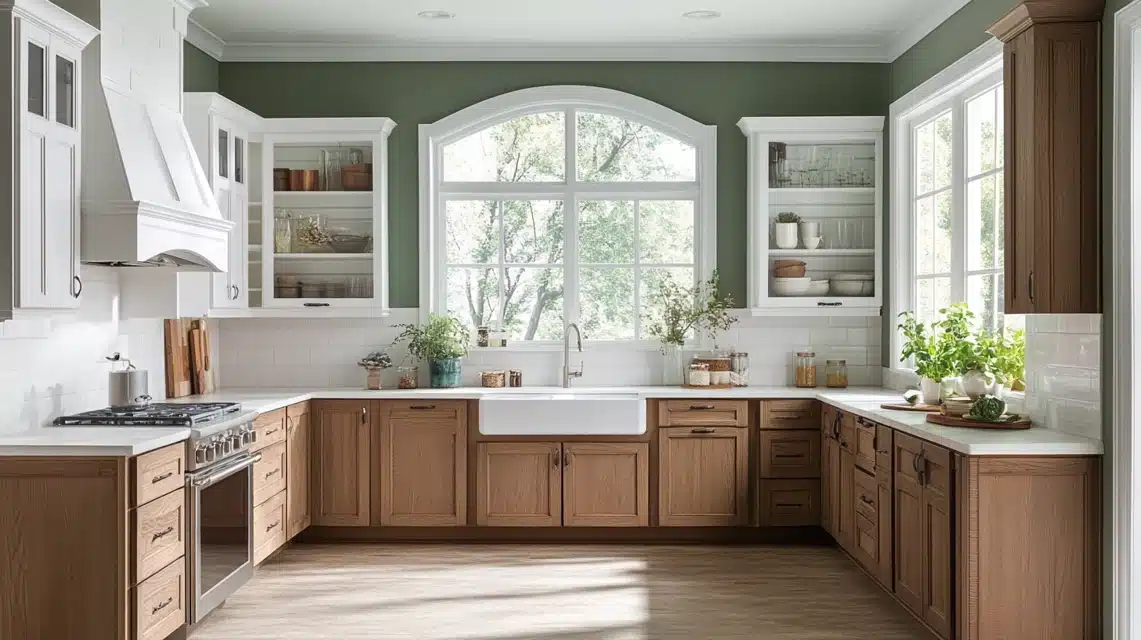
Rosemary by Sherwin Williams brings life to any room while maintaining sophistication.
As a warmer green with organic qualities, it makes spaces feel connected to nature.
This color shows its depth particularly well in spaces with good lighting.
It shines in kitchens, where it complements both white and wood cabinets.
In bathrooms, it creates a fresh, clean feeling that stays interesting over time.
The color also works well in spaces that connect to the outdoors, helping to blur the line between inside and outside.
Pro Tip: Paint your mudroom or entryway in Rosemary to create a beautiful transition from outdoors to indoors – it literally brings the garden inside while still feeling sophisticated.
7. Ripe Olive
Ripe Olive offers depth and richness that makes spaces feel grounded.
With significant saturation, this green brings nature’s darker tones inside.
It changes character throughout the day, sometimes appearing almost black, other times showing its green heart clearly.
This color makes an impact on exterior doors and shutters, where it contrasts nicely with light-colored siding.
Inside, it works well on built-in shelving or as an accent wall in a living room.
When used with light woods and cream textiles, it creates a balanced, natural feeling.
Pro Tip: Use Ripe Olive on built-in bookshelves or cabinetry rather than walls – it creates dramatic depth and makes your books and decor pop without overwhelming the entire room.
What LRV means: Light Reflectance Value measures how much light a paint color reflects, on a scale of 0-100. Higher numbers mean more light reflection (brighter/lighter colors), while lower numbers mean less reflection (darker colors).
Complete Guide to Grey-Green Paint Colors
Walking into a well-designed room painted in grey-green feels like stepping into a peaceful garden after a light rain. These natural shades create a fresh and calm feeling, bringing the quietness of nature indoors.
How to Choose the Right Grey-Green Paint
Key Factors to Consider
Lighting Assessment:
- Natural light abundance – Spaces with lots of sunlight can handle darker shades
- Limited natural light – Rooms need lighter options to avoid feeling dim
- North-facing rooms – Require lighter tones to compensate for cooler light
- South-facing rooms – Can support deeper, richer colors
Room Size Impact:
- Smaller spaces – Work better with lighter tones to feel more open
- Larger rooms – Can support deeper colors without feeling overwhelming
- High ceilings – Allow for bolder, darker shades
- Low ceilings – Benefit from lighter options to create height
Existing Decor Compatibility:
- Review current furniture colors and materials
- Consider flooring tones (light wood, dark wood, tile)
- Evaluate existing accent colors
- Think about architectural features (trim, moldings, fixtures)
Paint Color Comparison Table
Here’s a comprehensive comparison of the top grey-green paint colors to help you make the best choice for your space:
| Paint Color | Brand | LRV | Characteristics | Best Lighting | Ideal Rooms |
|---|---|---|---|---|---|
| Treron | Farrow & Ball | 27 | Soft gray with green hints in morning, deeper green in evening | All lighting conditions | Living rooms, dining rooms, bedrooms |
| Blanched Thyme | Valspar | 35 | Calm, shifts between gray and green, warm even in low light | Low to medium light | Studies, libraries, home offices |
| Oakmoss | Sherwin-Williams | 13 | Deep and rich, changes throughout day, acts as neutral | Medium to bright light | Living rooms, home offices |
| Thunderous | Sherwin-Williams | 15 | Smoky green to deep charcoal, mysterious quality | Bright spaces preferred | Kitchens, accent walls, modern spaces |
| Evergreen Fog | Sherwin-Williams | 30 | Perfect middle point, clear green-gray, naturally versatile | All lighting conditions | Bathrooms, kitchens, bedrooms |
| Rosemary | Sherwin-Williams | N/A | Warmer green with organic qualities, sophisticated | Good lighting preferred | Kitchens, bathrooms, outdoor connections |
| Ripe Olive | Various | N/A | Deep and grounded, appears almost black to clearly green | Variable lighting | Exterior doors, built-ins, accent walls |
Use this table as your quick reference guide when narrowing down options – the LRV values are especially helpful for matching paint darkness to your room’s lighting conditions.
Creative Ways to Use Dark Grey Green in your Home!
Add a Calming Backdrop
I love how gray-green walls make a room feel like a retreat.
In my living room, this shade creates a welcoming space where people naturally want to gather and relax.
For bedrooms, I’ve noticed it promotes better sleep – the color seems to signal our brains to slow down.
When I paint all walls in this tone, the effect is like being wrapped in a soft blanket.
Even a single feature wall can bring this peaceful feeling.
Pair With Black and White
I’ve discovered that adding black and white elements to a gray-green room creates an instant style upgrade.
In my kitchen, white cabinets and black hardware against gray-green walls look clean and put-together.
This combination works especially well in bathrooms too – I like using white tiles with black fixtures against green walls.
The contrast feels modern without trying too hard.
Add the Color in Traditional Spaces
I’ve seen how gray-green brings fresh life to older homes while keeping their character intact.
In my client’s Victorian house, we painted the dining room in a deep gray-green, and it looks like it’s always been there.
The color frames antique furniture beautifully and makes gold picture frames stand out.
When I work with formal spaces, I notice how this color adds depth without making the room feel stuffy.
Pair With Wood or Leather
I always tell my clients that gray-green is like nature’s neutral.
In my own home, I paired leather chairs with gray-green walls, and the combination feels rich and grounded.
Wood furniture looks even better against these walls – I’ve noticed how both light and dark woods seem to glow.
The mix creates a space that feels both put-together and comfortable.
Lighting is the Key

I’ve learned through trial and error that lighting changes everything about gray-green paint.
In my north-facing office, I chose a lighter shade to make up for less natural light.
South-facing rooms can handle darker tones – I’ve used them successfully in sunny spaces. When it comes to artificial light, I prefer warm bulbs with gray-green walls.
They bring out the color’s natural warmth, while cool bulbs can make it feel flat.
Add Patterns for a Light Touch
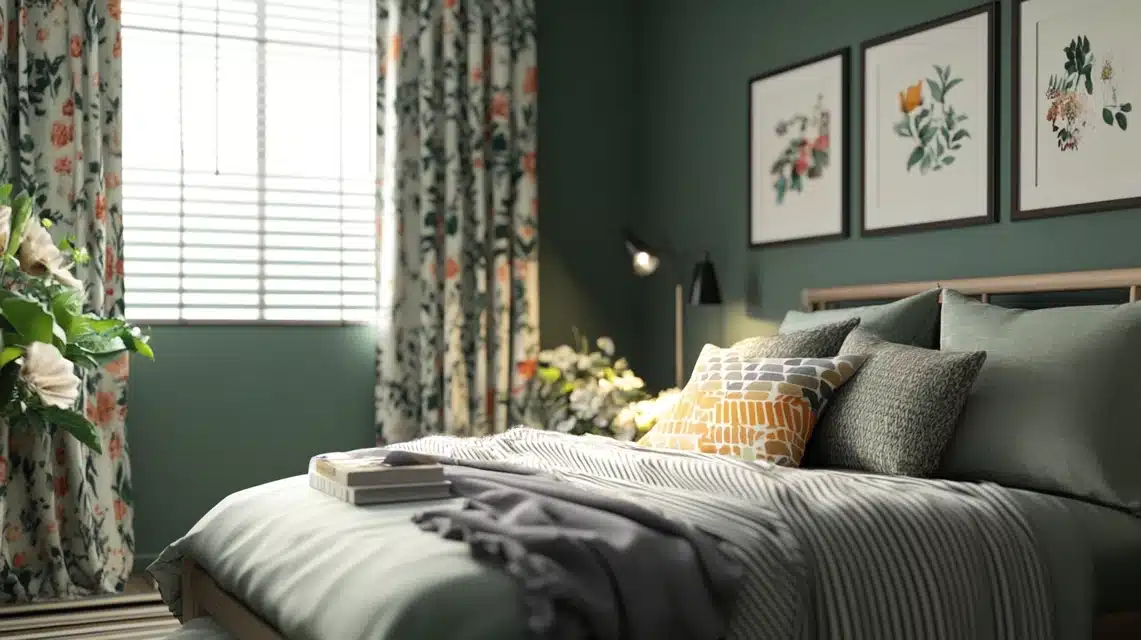
I’ve found that patterns can make a gray-green room feel more alive.
In my guest bedroom, I added floral curtains that pick up the wall color but add movement and interest.
When I work with solid gray-green walls, I like to layer in geometric cushions or striped rugs.
The key is finding patterns that include your wall color but bring in complementary shades.
This keeps the room feeling cohesive but not boring.
DIY Headboard idea
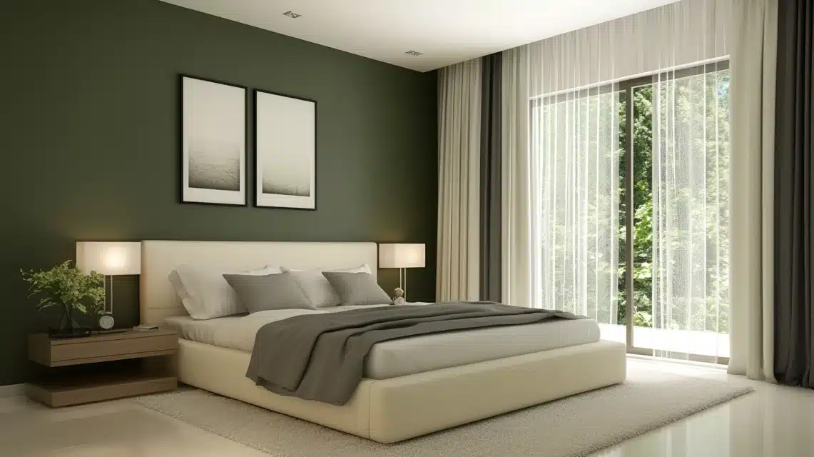
I recently tried this in my own bedroom – painting the wall behind my bed in a deep gray-green instead of buying an expensive headboard.
The effect was stunning! I added a simple upholstered headboard in cream linen, and the combination looks custom and expensive.
When I help friends with bedroom makeovers, this is one of my favorite money-saving tips that still delivers major impact.
Conclusion
After working with gray-green shades in my home and clients’ spaces, I can tell you these colors are worth trying.
They create peaceful bedrooms, sophisticated dining rooms, and welcoming living spaces.
The key is picking the right shade for your light and room size.
I hope this guide gives you the confidence to try gray-green in your home.
Whether you start small with a powder room or go bold with a living room, there’s a perfect shade for your space.
Trust your instincts – and remember, test your paint samples in different lights before making the final choice!

Alex Guerrero, a graduate with a Fine Arts degree from the Rhode Island School of Design, has been a visionary in the world of color and design for over 15 years. His professional journey began in the heart of the fashion industry in Milan, where he developed an acute sense for color harmonies and trends. Alex joined our team in 2018, offering fresh and innovative perspectives on color utilization in various spaces. Renowned for his ability to blend contemporary trends with timeless elegance. Outside of work, Alex is an accomplished painter and a volunteer art therapist, his artistic talents further enriching his professional insights.