Looking for a paint color that feels like a weekend getaway? Meet Adirondack Blue by Behr.
This stunning blue-gray shade has won hearts across the country. It’s not just another paint color on the shelf. Adirondack Blue brings the peaceful spirit of mountain lakes right into your home.
Homeowners love this all-around hue for good reason. It works beautifully on both interior walls and exterior siding. From cozy bedrooms to welcoming front doors, this color adapts to any space.
The best part? You can see exactly how it looks before you make a purchase. Behr’s official website shows real room photos, color details, and helpful tools to visualize your project.
If you’re planning a small accent wall or a whole house makeover, Adirondack Blue deserves a close look. Let’s find out what makes this color so special.
What is Adirondack Blue by Behr?
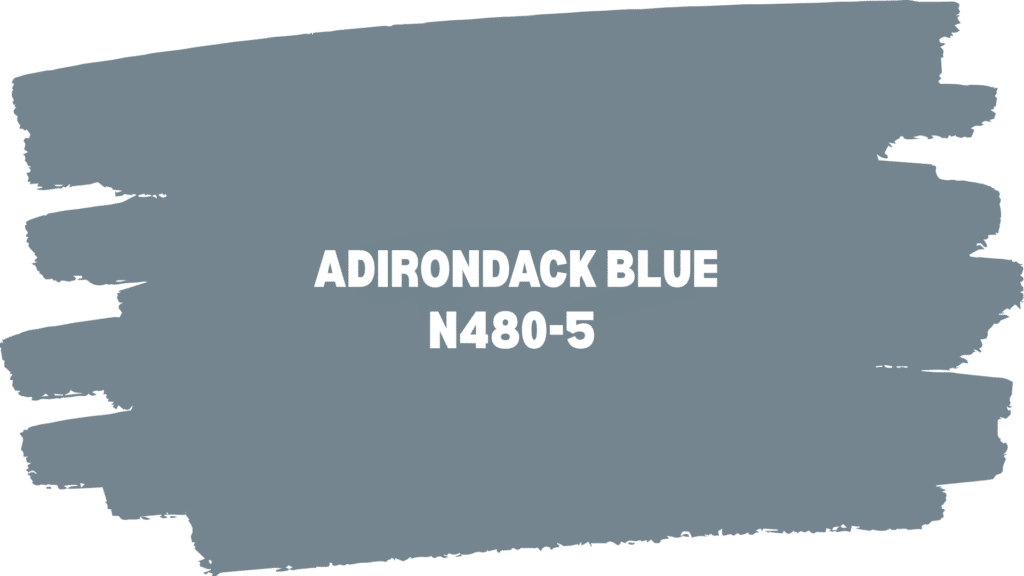
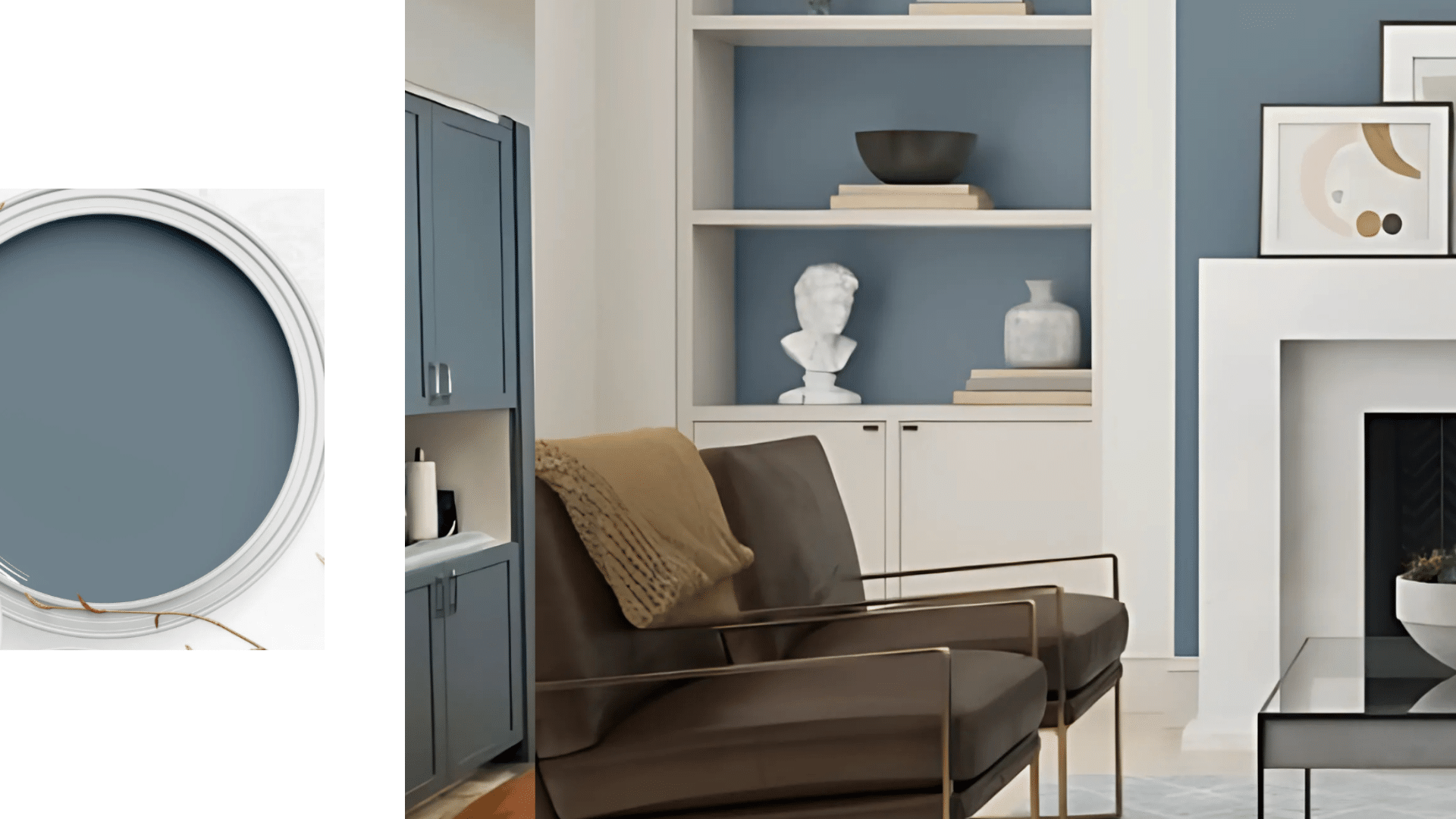
Imagine the perfect blend of sky and stone. That’s Adirondack Blue in a nutshell. This beautiful slate blue paint (N480-5) draws its inspiration from the peaceful lakes and mountains of upstate New York.
Behr describes it as “stable and reassuring.” This color truly brings a sense of calm to any room. It’s not too bright or overwhelming. Instead, it whispers rather than shouts.
With an LRV of 23, it’s on the darker side but still feels airy. The RGB values (116, 133, 143) create that perfect gray-blue balance. It’s part of Behr’s gray color family, which explains why it pairs so well with other neutrals.
What makes this color special is how it adapts to its surroundings. Modern farmhouse? Perfect. Coastal cottage? Absolutely. Traditional home? It works beautifully.
This all-around shade bridges the gap between cool and warm tones, making it a favorite among designers.
Plus, it offers excellent coverage and fade protection for both indoor and outdoor projects.
Why Choose Adirondack Blue for Your Space?
This isn’t just another shade of blue. Adirondack Blue works like a design chameleon, fitting perfectly into almost any home style—the secret lies in its balanced gray undertones that complement rather than compete.
• Modern Farmhouse – Pairs beautifully with white shiplap and natural wood beams. The blue adds grace while keeping that cozy, lived-in feel.
• Coastal Style – Mimics ocean waves without screaming “beach house.” It brings seaside calm to any room, especially with white and sandy beige accents.
• Rustic Cabin – Complements exposed wood and stone perfectly. The earthy undertones match natural materials while adding a refined touch.
• Traditional Homes – Adds depth to classic spaces without overwhelming ornate details. It’s graceful enough for formal dining rooms yet welcoming in family spaces.
• Contemporary Design – The clean, crisp tone works with sleek lines and minimal decor. It provides color without disrupting modern simplicity.
• Transitional Spaces – Bridges the gap between old and new smoothly. Perfect for homes that mix vintage finds with modern furniture.
Where to Add Adirondack Blue Behr
Every room in your home can benefit from this all-around shade. Adirondack Blue works beautifully as an accent wall, full room color, or even on furniture pieces. The key is knowing where it shines brightest.
Bedrooms: Create a Calming Environment
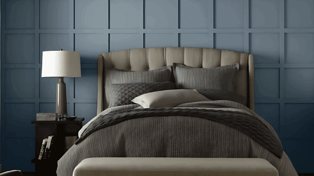
Change your bedroom into a peaceful retreat with Adirondack Blue on the wall behind your headboard. This calming color promotes better sleep and creates a spa-like atmosphere.
Pair it with crisp white bedding and natural wood furniture for the perfect balance. The darker tone also hides minor wall imperfections while adding graceful depth.
Living Rooms: Make a Statement Wall
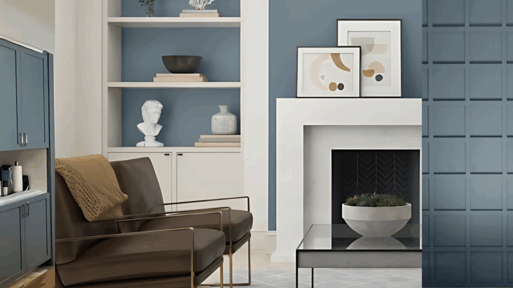
Create a stunning focal point by painting one accent wall in your living room. Adirondack Blue adds depth without overwhelming your space or existing furniture.
It works especially well behind a fireplace or entertainment center, making these features pop. The color also photographs beautifully, perfect for hosting and entertaining guests.
Bathrooms: Build a Spa-Like Retreat
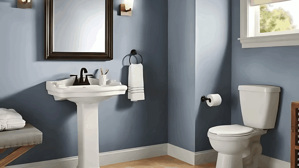
Turn your bathroom into a serene escape with Adirondack Blue walls. The color mimics water without being too literal, creating a spa vibe. It pairs perfectly with white fixtures, marble countertops, and brushed gold hardware.
The darker shade also helps hide water spots and daily wear better than lighter colors. Consider using it in powder rooms for maximum impact without overwhelming larger spaces.
Kitchens: Add Personality to Your Space
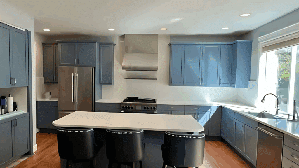
Give your kitchen island or lower cabinets a fresh update with Adirondack Blue. This unexpected choice adds personality while remaining practical for daily use. The color looks stunning with white upper cabinets and natural wood countertops.
It’s also forgiving of fingerprints and food splatters, making it ideal for busy cooking spaces. The shade won’t go out of style, protecting your investment for years to come.
Exterior Spaces: Boost Your Curb Appeal
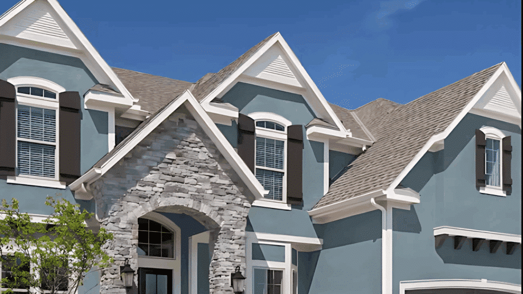
Boost your home’s curb appeal with Adirondack Blue on your front door or shutters. This welcoming color stands out beautifully against brick, stone, or white siding.
It’s graceful enough for traditional homes yet fresh enough for a modern look. The fade-resistant formula ensures your exterior stays vibrant through all seasons.
Best Coordinating Colors with Adirondack Blue
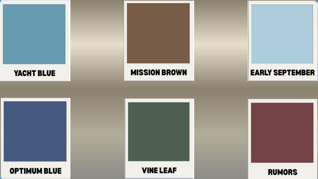
The beauty of Adirondack Blue lies in its ability to complement other colors. These carefully chosen Behr shades create stunning combinations that enhance your space without competing for attention.
If you want subtle harmony or bold contrast, these colors work perfectly together.
| Color Name | Color Code | Description |
|---|---|---|
| Rumors | MQ1-15 | A soft, warm gray that creates a graceful neutral backdrop, making Adirondack Blue pop beautifully. |
| Yacht Blue | S490-4 | A lighter, brighter blue that creates a layered monochromatic look perfect for coastal or contemporary spaces. |
| Early September | M500-2 | A gentle green-gray that adds natural warmth while maintaining the calming, earthy feel of Adirondack Blue. |
| Vine Leaf | N400-7 | A rich, deep green that creates dramatic contrast while staying true to nature-inspired color palettes. |
| Mission Brown | N250-7 | A warm brown that adds cozy depth and works especially well in rustic or traditional design schemes. |
| Optimum Blue | M540-7 | A deeper, more saturated blue that creates stunning tone-on-tone combinations for graceful color blocking. |
Let Adirondack Blue be your dominant color, choose one coordinating shade for accents, and add small pops of a third color through accessories. This creates a balanced, professional look that feels intentional rather than scattered.
Similar Colors to Adirondack Blue
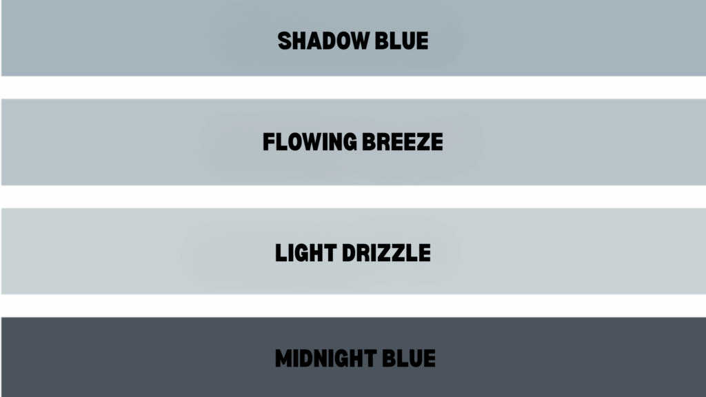
If you love Adirondack Blue but want to find out similar shades, Behr offers a whole family of coordinating colors. These blues and blue-grays share the same graceful undertones and calming qualities.
They’re all part of the same color story, making it easy to create beautiful gradients or find the perfect shade for your space.
Shadow Blue (N480-3)
With its neutral blue base and gray crosscurrents, Shadow Blue creates a subtle and sleek appearance. At LRV 45, it’s noticeably lighter than Adirondack Blue while maintaining the same refined character.
This shade works beautifully in contemporary spaces that need color without overwhelming the design.
Flowing Breeze (N480-2)
This crisp pale blue-gray brings cool, calm energy to any space with its rejuvenating quality. At LRV 55, it’s much lighter than Adirondack Blue but keeps the same graceful undertones.
It’s perfect for creating an airy, spa-like atmosphere in bedrooms or bathrooms.
Light Drizzle (N480-1)
The palest option in this family, Light Drizzle, offers neutral gray tones with just a whisper of blue. With an LRV of 64, it’s ideal for spaces that require a subtle color without a dramatic impact.
This shade works perfectly as a backdrop for bolder accent colors or natural wood tones.
Midnight Blue (N480-7)
The deepest option in this collection, Midnight Blue, offers serenity with its blue-gray base and hints of black. At LRV 9, it creates cocooning, restful environments perfect for bedrooms or reading nooks.
This shade brings the calm of nighttime shadows while maintaining graceful
Conclusion
Adirondack Blue by Behr isn’t just another paint color – it’s your ticket to creating serene spaces.
This all-around slate blue brings the calming spirit of mountain lakes into any room, working beautifully with countless design styles and color combinations.
Its excellent coverage and fade protection mean your investment will look beautiful for years to come.
The best part? You don’t have to guess how it’ll look in your space. Visit Behr’s official website to access detailed color information, view real-life room photos, and utilize their visualization tools to try before you buy.
Ready to change your home with this shade? Visit Behr.com today to find Adirondack Blue at your local retailer, order samples, and start planning your perfect paint project. Your dream space is just a brush stroke away.


