
Picking the right white paint can make your rooms feel bigger, brighter, and more peaceful.
Alabaster Sherwin Williams (SW 7008) is a warm white that works in any home, adding a soft, cozy feel without being too yellow or stark. It’s a color that helps make any room feel just right.
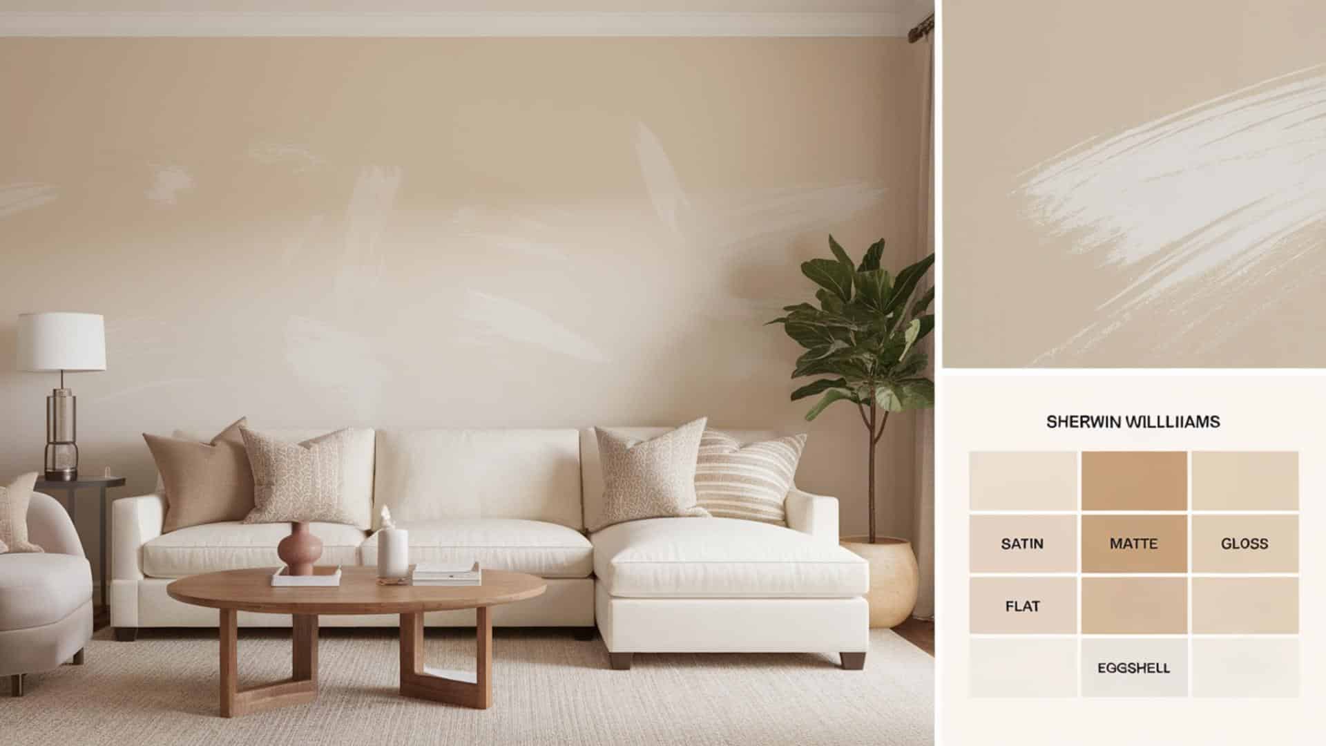
We’ll show what makes Alabaster special – its warm undertones, high light reflection (LRV 82), and how it changes with the time of day.
We’ll also explain how this white fits in different rooms like living rooms and kitchens, which finishes work best for each space, and colors that go well with it for different looks.
We will also share tips for keeping this paint looking fresh and which similar whites to consider.
Let’s see why this paint color has become so popular with homeowners across the country and how it might work in your home too!
Understanding Paint Color Basics
Colors have undertones, which are the hints of color hiding in a main color. Alabaster has warm undertones that make it feel soft and cozy.
With an LRV (Light Reflectance Value) of 82, Alabaster reflects a lot of light, making rooms feel bigger and brighter. This white looks different throughout the day – warmer in the morning sun, clean in midday light, and softer in the evening.
North-facing rooms make it look cooler, while south-facing rooms bring out its warmth.
Color Terminology
| Attribute | Value |
|---|---|
| SW Code | SW 7008 |
| Light Reflective Value (LRV) | 82 |
| RGB | 237 / 234 / 224 |
| Hex Value | #EDEAE0 |
What These Numbers Mean?
- SW Code (SW 7008): Sherwin Williams’ unique identifier for Alabaster.
- LRV (82): Reflects a high amount of light, making spaces feel bright and airy.
- RGB (237, 234, 224): A warm white with a soft, creamy tone.
- Hex Value (#EDEAE0): Used for digital and design accuracy.
Psychology on White Shades
White colors, like Alabaster, can affect how we feel in a room.
- White rooms feel clean and fresh
- White walls can help you feel calm
- White spaces often seem bigger than they are
- White is good for people who want a simple look
Using white paint like Alabaster helps create a peaceful feeling in your home.
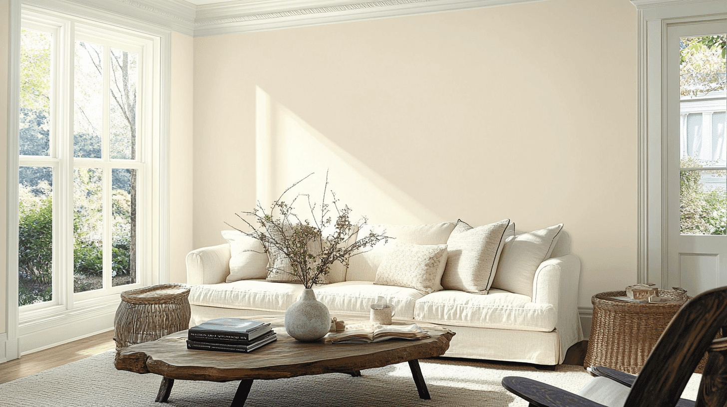
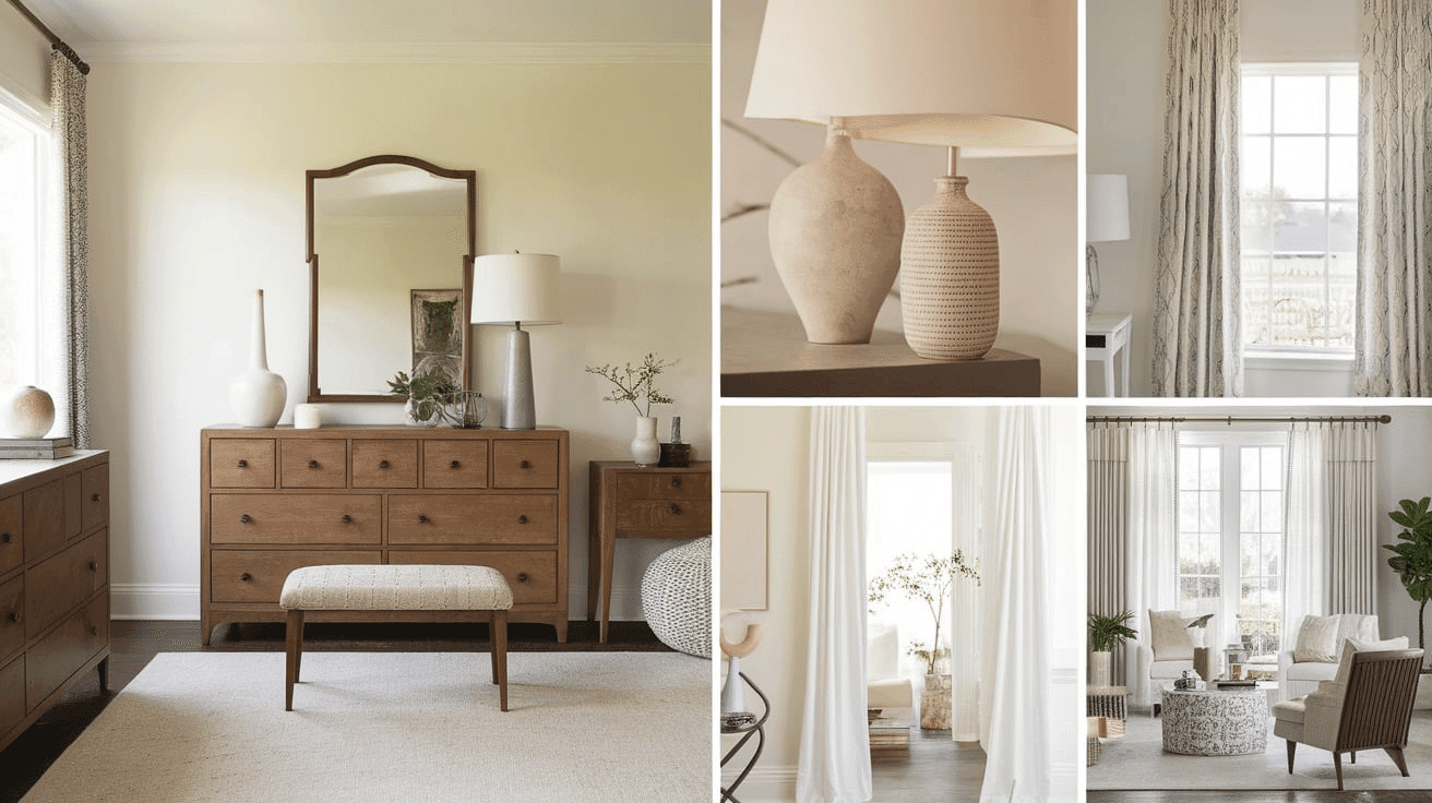
Why Choose This Color?
Alabaster shines in all types of light – it looks warm in morning sun, cool and calm in afternoon light, and cozy under lamps at night. This color fits both new modern homes and older traditional houses.
If you have dark wood floors, Alabaster makes them stand out. It also works well with most countertops, whether they’re light or dark.
Alabaster is a good choice when you don’t want to repaint often, as it stays in style year after year and matches almost any furniture or decor you bring into your home.
1. Key Features
Alabaster looks different depending on what you paint. On trim, it appears crisp and bright. On the walls, it feels soft and warm. In rooms with lots of shadows, Alabaster adds depth without making the space feel small.
This color changes slightly throughout the day – more yellow in natural sunlight and more white under indoor lights at night.
This change is small but makes rooms feel alive.
2. Durability & Maintenance
Alabaster hides small marks and dirt better than pure white paints, making it practical for busy homes.
- Wipe walls with a damp cloth every few months to keep the color fresh
- Use magic erasers for tough spots without damaging the color
- Touch-ups blend in well, even years after the first painting
- Choose washable formulas for kitchens and bathrooms
- Avoid oil-based cleaners as they can yellow the paint over time
3. Texture & Finish Recommendations
- Eggshell – Best for living rooms and bedrooms where a soft, slightly reflective surface works well
- Satin – Perfect for kitchens, bathrooms, and kids’ rooms because it’s easy to clean
- Flat – Good for ceilings or rooms with bumpy walls that you want to hide
- Semi-gloss – Great for trim, doors, and windows to create contrast with wall color
Room-By-Room Recommendations
Living Spaces & Open Floor Plans
Alabaster makes living rooms feel bigger and more open. It works well with any furniture color and helps connect different areas in open floor plans.
Extra Tips:
- Add warm wood accents to balance the cool white of Alabaster
- Use different lighting fixtures to change how Alabaster looks throughout the day
Bedrooms & Relaxation Areas
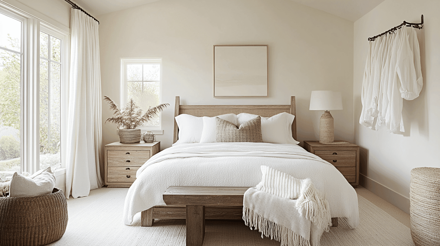
Alabaster creates a calm feeling in bedrooms that helps with sleep. It’s light enough to make small bedrooms feel bigger but still cozy enough for larger rooms.
Extra Tips:
- Pair with soft gray or blue bedding for a peaceful bedroom look
- Add textured curtains or rugs to keep the room from feeling too plain
Kitchens & High-Traffic Areas
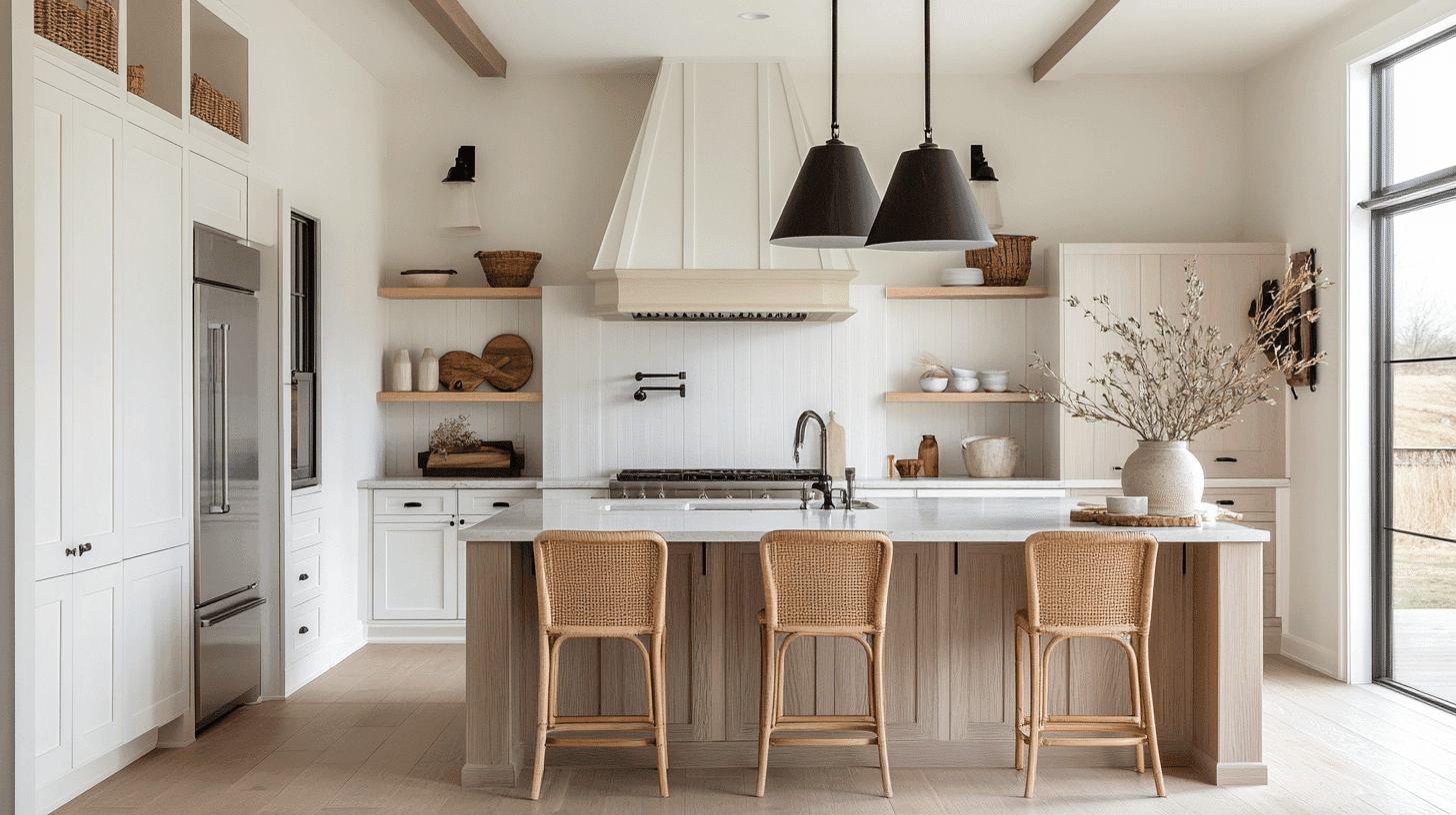
Alabaster works great in kitchens because it hides small marks and cleans easily. It makes kitchens feel clean and bright without being too stark white.
Extra Tips:
- Use Alabaster on cabinets and walls for a clean, matching look
- Choose a slightly darker color for lower cabinets if you want some contrast
Bathrooms & Spa-like Retreats
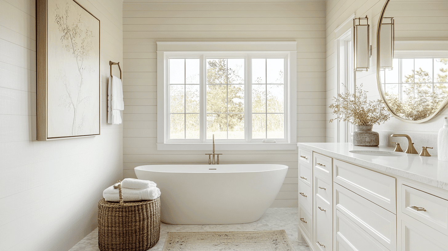
Alabaster gives bathrooms a clean, fresh feeling. It works with both modern and old-fashioned bathroom fixtures and makes small bathrooms feel bigger.
Extra Tips:
- Add plants to bring life to an Alabaster bathroom
- Use white towels and bath mats to create a hotel-like bathroom feel
Color Pairings & Combinations
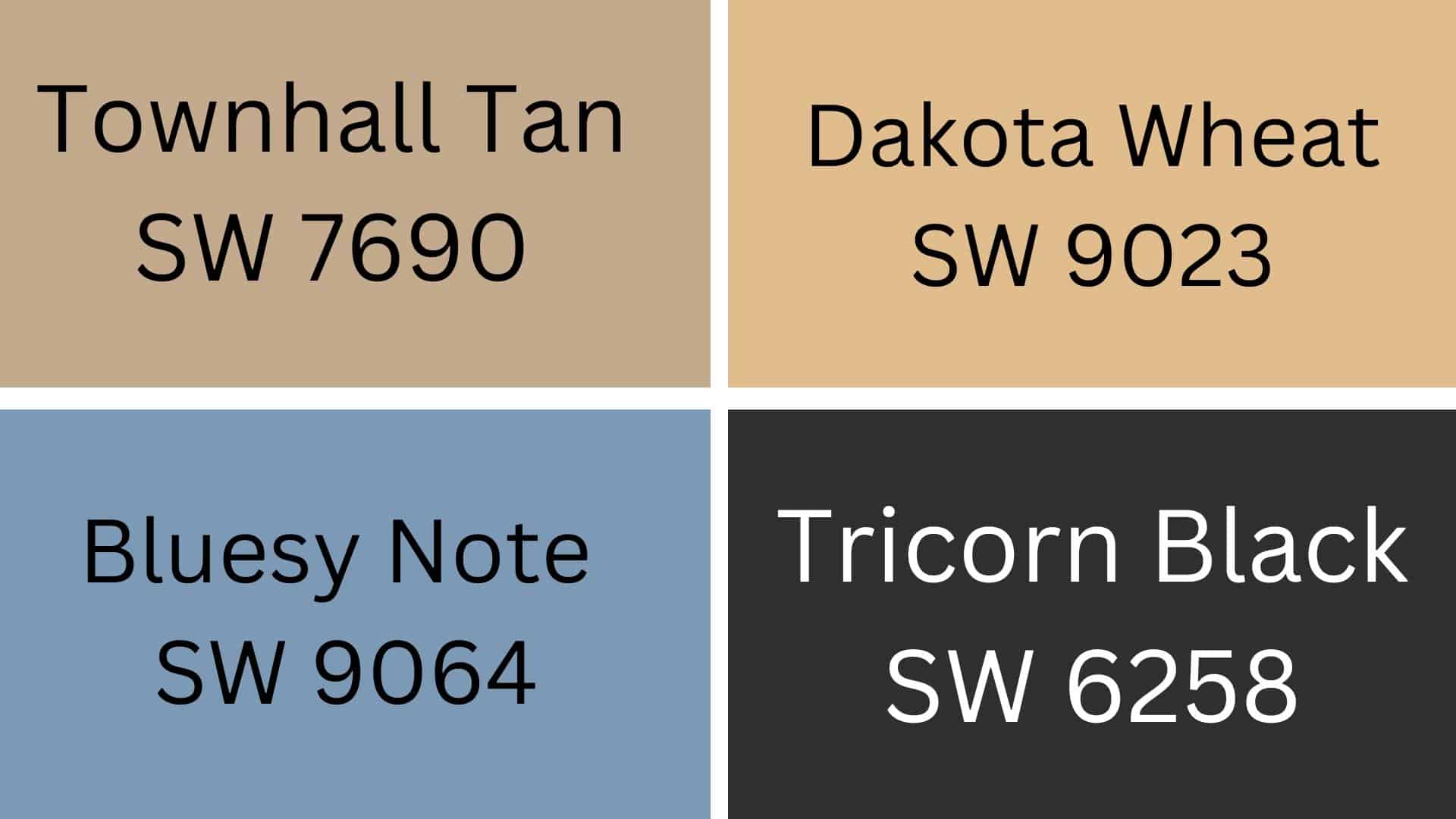
Townhall Tan goes great with Alabaster. This warm tan color makes rooms feel cozy and calm when used with Alabaster on trim or walls.
Dakota Wheat brings a golden touch next to Alabaster. This soft wheat color works well in kitchens and living rooms, giving a sunny feel without being too bright.
Bluesy Note adds a cool touch when paired with Alabaster. This blue-gray color makes a nice contrast that feels clean and fresh in bathrooms or bedrooms.
Tricorn Black creates a strong contrast with Alabaster. This deep black works well for door frames or accent walls, making the white look even brighter and cleaner.
Creating Cohesive Color Schemes
1. Monochromatic Scheme
- Mix Alabaster with darker whites and off-whites for a clean look
- Add light gray tones that share Alabaster’s soft feeling
- Use different paint finishes (flat, eggshell, semi-gloss) for subtle depth
2. Warm Color Scheme
- Pair Alabaster with soft yellows for a sunny, cheerful feeling
- Add light tan or beige colors for a cozy, welcoming room
- Use gold or copper accents to make the space feel rich and warm
3. Cool Color Scheme
- Mix Alabaster with light blues for a clean, fresh feeling
- Add soft greens to bring a nature-inspired touch to your room
- Use gray-blue shades to create a calm, peaceful space
Alabaster works well in all these schemes because it’s such a friendly, simple white that plays nicely with other colors!
Coordinating with Furniture & Decor
1. Wood Tones
Alabaster works well with both light and dark wood tones. It helps bring out the natural beauty of your wooden pieces.
- Light woods like maple and birch look clean and bright against Alabaster walls.
- Dark woods like walnut and mahogany stand out nicely and create a good mix
2. Metals
Alabaster pairs nicely with all kinds of metal finishes in your home. The soft white lets the metals shine.
- Gold and brass metals look warm and rich against Alabaster
- Silver and chrome give a clean, cool look when used with Alabaster
3. Decor
Alabaster is a great background for all kinds of home items. It makes your favorite things look better.
- Colorful pillows and rugs pop against the soft white background
- Plants and flowers look fresh and green against Alabaster walls
Similar Colors & Alternatives
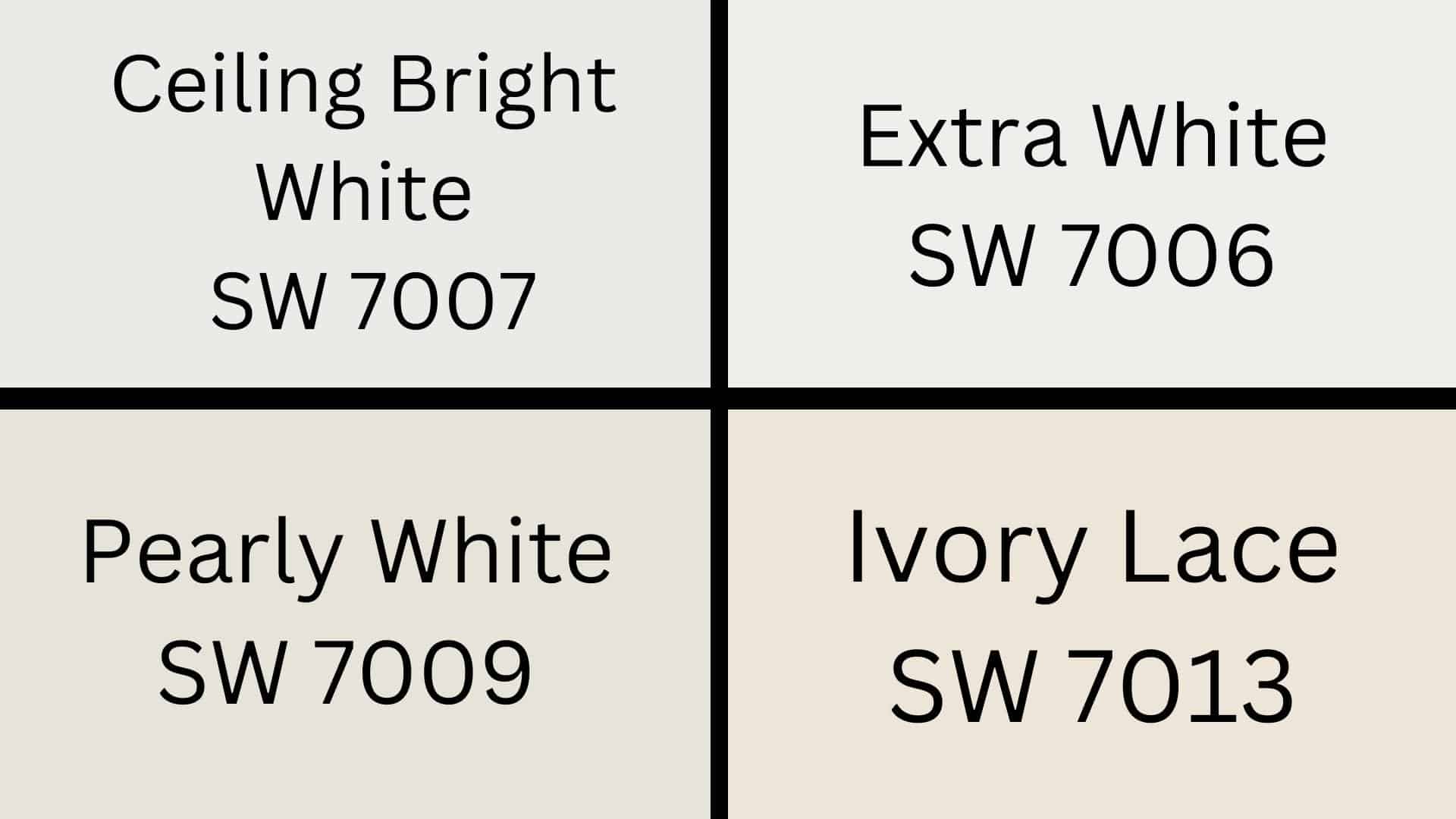
1. Ceiling Bright White (SW 7007)
Ceiling Bright White is a very clean, bright white color. It works well for ceilings and gives rooms a fresh, open feeling.
Extra White is the whitest white that Sherwin Williams makes. It has no yellow in it and looks very crisp and clean in most rooms.
Pearly White has a tiny bit of warmth to it. It’s still very white but has just enough cream color to make it feel soft and cozy.
Ivory Lace is a warm white with more cream tones. It looks good in rooms that get lots of natural light and pair well with wooden furniture.
Final Thoughts
Alabaster is a warm white with a high LRV of 82 that makes rooms feel bigger and brighter. It works well in any room and changes slightly throughout the day—it is warmer in the morning sun and softer at night.
If you want a white that stays in style and matches any furniture, Alabaster is a perfect choice. It works in both new modern homes and older houses.
Ready to try Alabaster in your home? Get a sample first to see how it looks in your lighting before painting the whole room.
Explore additional color reviews for more comparisons for your home.

Alex Guerrero, a graduate with a Fine Arts degree from the Rhode Island School of Design, has been a visionary in the world of color and design for over 15 years. His professional journey began in the heart of the fashion industry in Milan, where he developed an acute sense for color harmonies and trends. Alex joined our team in 2018, offering fresh and innovative perspectives on color utilization in various spaces. Renowned for his ability to blend contemporary trends with timeless elegance. Outside of work, Alex is an accomplished painter and a volunteer art therapist, his artistic talents further enriching his professional insights.