
Choosing colors for a room is not always easy. Most people have stood in a paint store, stared at hundreds of swatches, and walked away more confused than when they came in.
That is where analogous colors come in. They are among the simplest and most effective color combinations anyone can use, and they work in almost any space, from living rooms to bedrooms.
This blog breaks down exactly what they are, why they work so well together, and how anyone can use them to put together a room that feels balanced, warm, and visually pleasing.
What are Analogous Colors?
They are groups of colors that sit next to each other on the color wheel. Because they share similar undertones, these colors naturally look connected and balanced when used together.
This close relationship creates a smooth and pleasing transition from one color to the next. Most analogous color schemes include three colors that work together in a simple structure.
Typically, one color acts as the main or dominant shade, another works as the supporting color, and the third adds a small accent for variety.
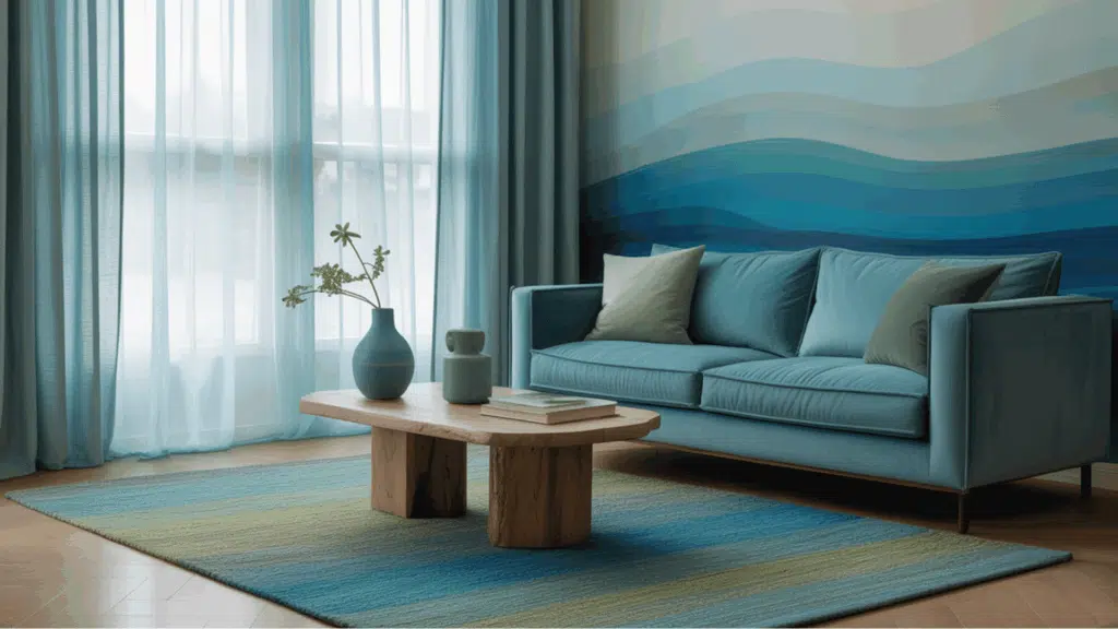
For example, blue, blue-green, and green form a common analogous combination. Since these shades share a similar base tone, they blend easily without creating a strong contrast.
This is why analogous palettes are often used in art, design, and decor to create harmony and a calm visual flow.
How Analogous Colors Work in Color Theory?
To understand them, it helps to first look at the color wheel. The color wheel organizes colors by how they relate to one another, making it easier to see which combinations work well together.
Colors on the wheel are grouped into three main categories:
- Primary Colors: Red, blue, and yellow. These are the base colors that cannot be created by mixing other colors.
- Secondary Colors: Green, orange, and purple. These are formed by mixing two primary colors.
- Tertiary Colors: Colors made by combining a primary color with a nearby secondary color, such as yellow-green or red-orange.
They are created by selecting neighboring colors on the color wheel. Because these shades share similar undertones, they blend smoothly, creating a natural visual flow.
For example:
- Yellow → Yellow-Green → Green
- Red → Red-Orange → Orange
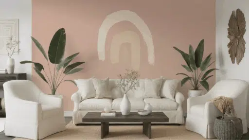
Examples of Analogous Color Combinations
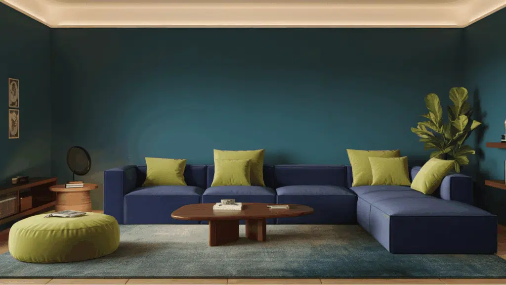
Analogous color schemes can feel warm, cool, or balanced depending on the colors used. Since these shades sit next to each other on the color wheel, they naturally blend well and create smooth transitions.
Warm palettes usually feel energetic and bright, while cool palettes often create a calm and relaxing mood. Both types appear often in nature, which is why analogous color schemes tend to look balanced and pleasing.
The table below shows some common analogous color combinations and where they often appear.
| Color Category | Analogous Color Combination | Common Examples in Nature |
|---|---|---|
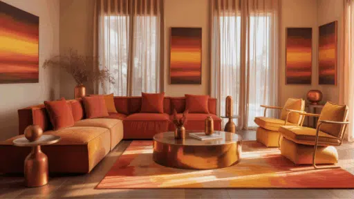
| Warm | Red → Red-Orange → Orange | Sunset skies |
| Warm | Orange → Yellow-Orange → Yellow | Autumn leaves |
| Warm | Yellow → Yellow-Green → Green | Early fall foliage |
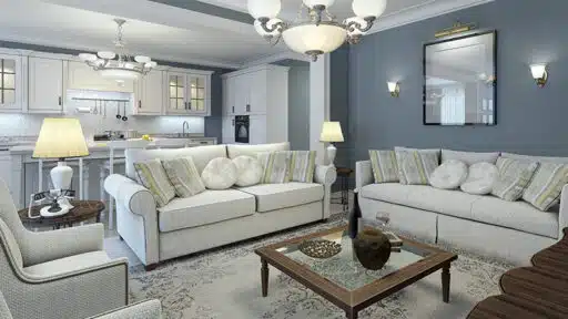
| Cool | Blue → Blue-Green → Green | Ocean water and sea plants |
| Cool | Green → Teal → Blue | Forest landscapes |
| Cool | Purple → Blue-Purple → Blue | Evening skies and twilight |
Why Designers Use Analogous Colors?
Analogous colors are popular because they create a balanced look without strong contrast. Here are some reasons designers use them.
1. They Create Harmony
Analogous colors create a natural sense of harmony because the shades share similar tones and sit close together on the color wheel. This close relationship allows the colors to blend smoothly without harsh contrast.
As a result, the overall design feels balanced and easy on the eyes. Many designers use analogous palettes to achieve a calm, unified look.
The gentle transition from one color to another helps maintain visual flow and makes the composition feel comfortable, organized, and pleasant to look at.
2. They Are Easy to Work With
Analogous color palettes are easy to work with, which makes them a good choice for beginners. Since the colors sit next to each other on the color wheel, they already share similar tones.
Because of this natural connection, even simple combinations tend to look balanced and pleasing without much effort. This makes creating a smooth and coordinated design much easier.
3. They Work in Many Design Areas
They work well across many creative fields because they create a smooth and connected look. Designers often use these palettes to keep a project visually consistent and easy to follow.
This approach appears in graphic design, interior design, fashion, painting, illustration, and website design. Since the colors naturally relate to each other, they help build clear themes and organized layouts.
The result usually feels balanced, simple, and pleasant to look at, which is why many creators rely on analogous color schemes.
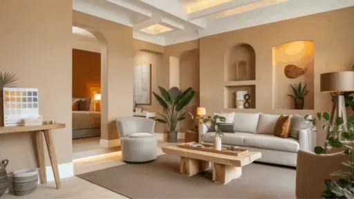
Using Analogous Colors Effectively in the Home
Analogous colors naturally blend well, but a few simple tips can help the palette look more balanced and visually interesting.
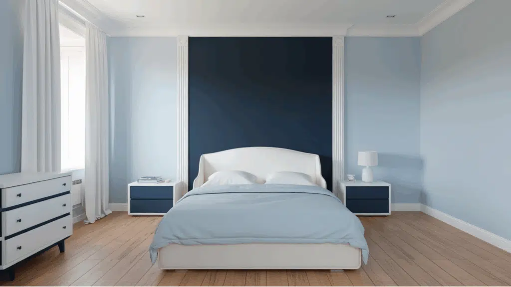
1. Use the 60-30-10 Rule
This rule helps keep the color scheme balanced.
- 60% – Main or dominant color
- 30% – Secondary color
- 10% – Accent color
Example: A room might use mostly blue, some blue-green, and small green accents.
2. Add Neutral Colors
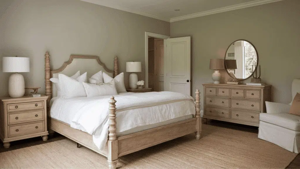
- Neutrals help separate similar tones and prevent the palette from looking too crowded.
- Common neutral choices include: White, Gray, Beige, Black
- These shades make the overall color scheme feel cleaner and more balanced.
3. Adjust Light and Dark Shades
- Use lighter and darker versions of the colors.
- This adds depth and contrast to the design.
- It also prevents the palette from looking flat or dull.
- Slight brightness adjustments can help highlight certain elements and improve visual balance.
Analogous Colors Vs Other Color Schemes
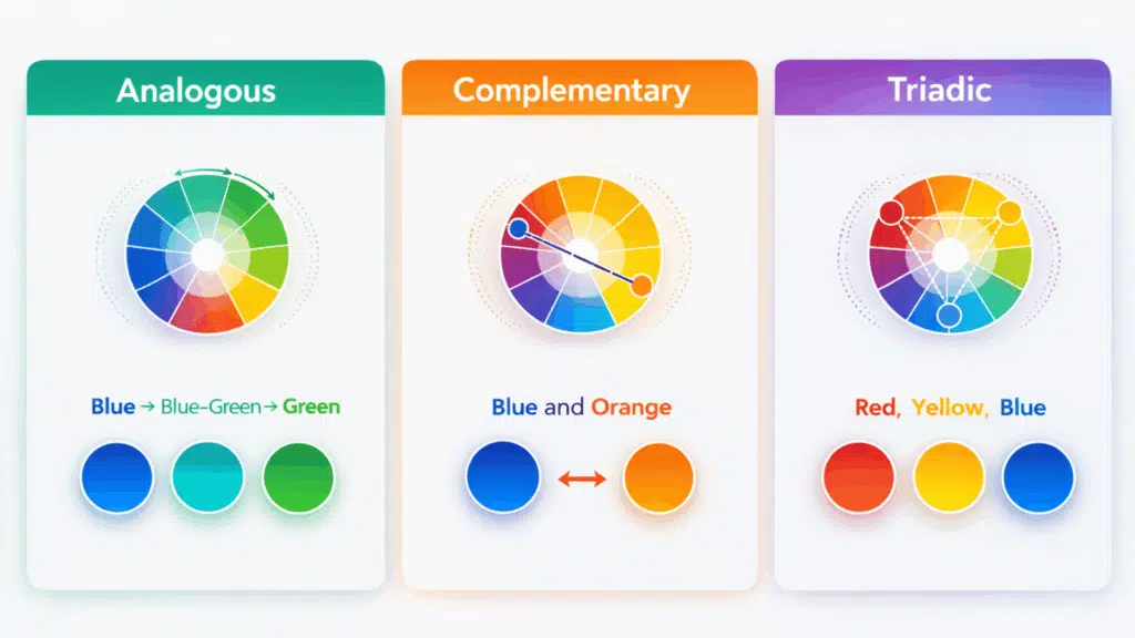
Analogous colors are one type of color scheme used in color theory. Each scheme creates a different visual effect depending on how the colors relate to each other on the color wheel.
Analogous schemes focus on harmony and smooth transitions, while complementary schemes create strong contrast. Triadic schemes provide balance with more color variety.
| Color Scheme | Description | Example |
|---|---|---|
| Analogous | Colors that sit next to each other on the color wheel | Blue, Blue-Green, Green |
| Complementary | Colors positioned opposite each other on the color wheel | Blue and Orange |
| Triadic | Three colors evenly spaced around the color wheel | Red, Yellow, Blue |
Common Mistakes When Using Analogous Colors
Sometimes designs do not look balanced because the colors are too similar. Keeping the palette simple and balanced usually produces the best results.
Avoid these common mistakes when working with analogous color schemes:
- Using colors that are too close in brightness: This can make the design look flat and difficult to distinguish.
- Not choosing a dominant color: Without a main color, the palette may look confusing or unorganized.
- Forgetting to add contrast or neutral tones: Neutrals like white, gray, or black help break up similar shades.
- Using too many colors in a single palette: Neighboring colors can make the design look messy.
- Ignoring light and dark balance: Designs can feel dull if all the colors have the same intensity.
- Using equal amounts of every color: When all colors appear in the same proportion, the design may lose focus.
- Not considering the overall mood of the palette: Choosing colors without thinking about the mood can make the design feel inconsistent.
Conclusion
Analogous colors offer a simple way to create color harmony in art, design, and everyday projects. Because these colors sit next to each other on the color wheel, they naturally blend and create a smooth visual flow.
From interior spaces to graphic layouts, they help keep a design balanced and easy on the eyes. The key is choosing a dominant color, adding a supporting shade, and using an accent to complete the palette.
When used with the right balance of light, dark, and neutral tones, analogous color schemes can make any design feel organized, calm, and visually appealing.

Alex Guerrero, a graduate with a Fine Arts degree from the Rhode Island School of Design, has been a visionary in the world of color and design for over 15 years. His professional journey began in the heart of the fashion industry in Milan, where he developed an acute sense for color harmonies and trends. Alex joined our team in 2018, offering fresh and innovative perspectives on color utilization in various spaces. Renowned for his ability to blend contemporary trends with timeless elegance. Outside of work, Alex is an accomplished painter and a volunteer art therapist, his artistic talents further enriching his professional insights.