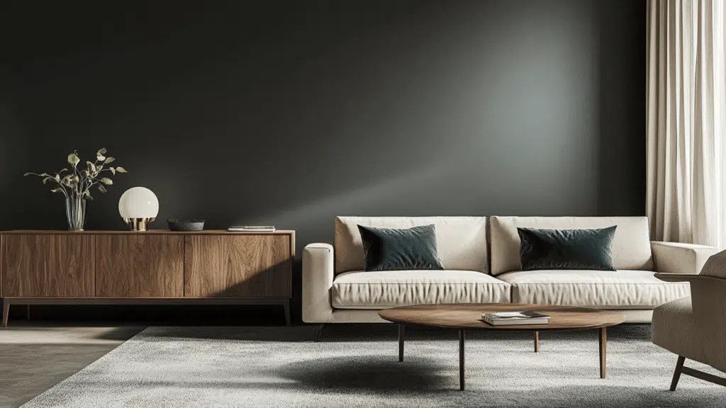
Hunting for a moody, dark paint color that instantly commands attention?
When I updated my library, Benjamin Moore’s Ashwood Moss caught my eye. It transformed an ordinary room into something noteworthy.
This graphite-green shade adds depth without overpowering your space; consider it a welcoming alternative to black.
Watch how it changes with the passing hours. It shows green hints in the morning sun and then becomes rich and warm as twilight falls.
Want to know why professional decorators have kept this color their secret weapon for years?
Let’s look at what makes this timeless shade worth your consideration.
Understanding Benjamin Moore’s Ashwood Moss
This is a deep, sophisticated graphite-green that creates cozy, grounded spaces.
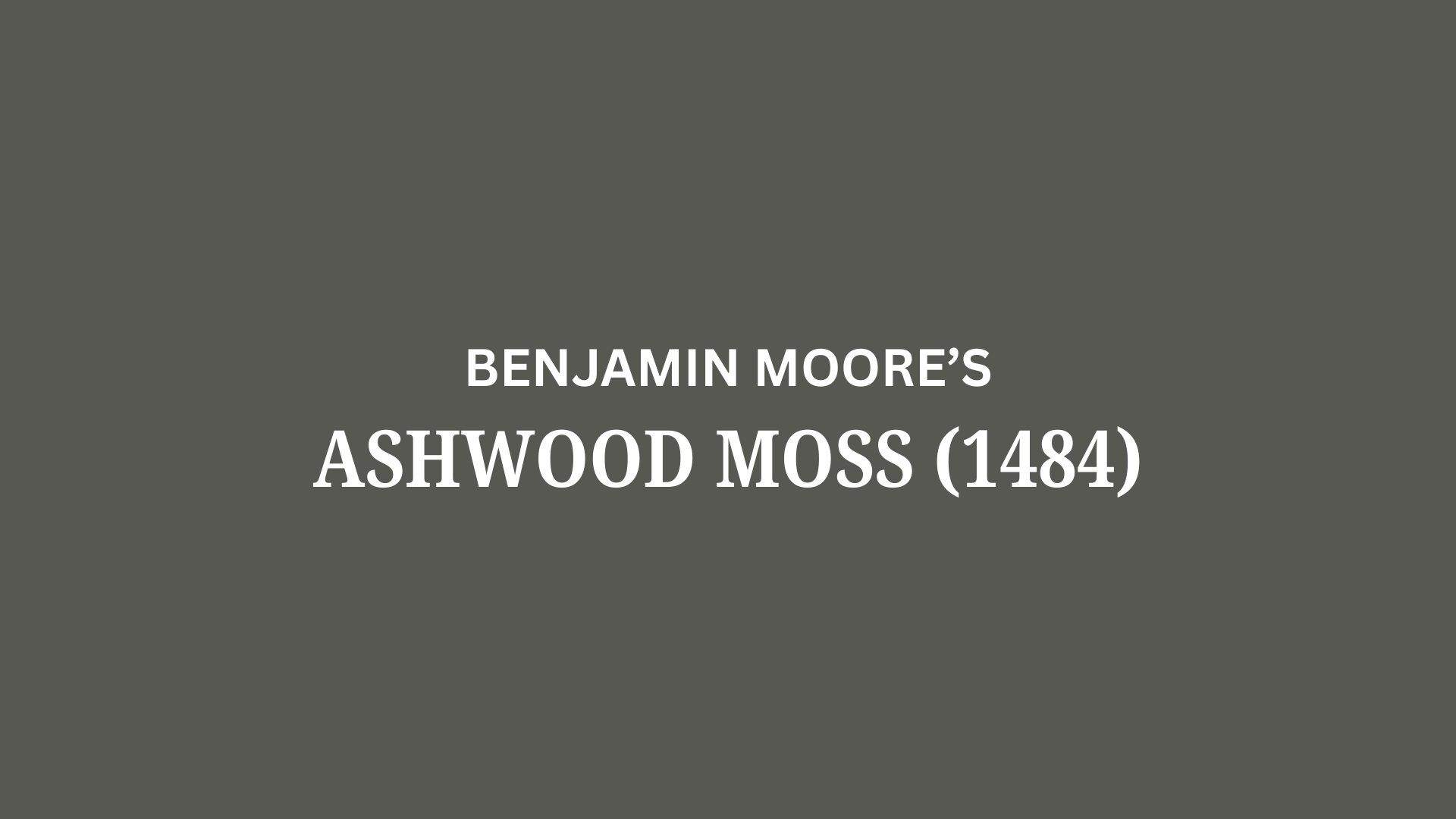
Benjamin Moore’s Ashwood Moss (1484), part of their Classic Color Collection, provides rich, natural depth for any interior or exterior space.
It reminds many people of moss-covered forest floors or weathered patina with its earthy, organic presence.
Color Terminology
Here’s what makes this color so popular among designers and homeowners alike.
Understanding these numbers helps you see why this color works so well in so many different spaces.
PROPERTY | VALUE |
LRV | 10.46 |
RGB | 86, 88, 81 |
HEX | #565851 |
This low light reflection creates depth while adding drama to your spaces.
Designers use the RGB and Hex codes when matching fabrics or digital designs to this popular color.
Undertones:
- This color carries subtle green undertones that give it a natural, earthy feel.
- It can show hints of gray in certain lights, especially north-facing rooms.
- Though it’s called “moss,” it’s really more of a deep neutral that feels sophisticated and grounded.
Psychology of Deep Neutrals
The colors we choose affect how we feel in our homes, and they create a special mood.
- Deep neutrals help rooms feel cozy and intimate
- Earthy green-gray colors: Create spaces that feel timeless and connected to nature
- Dark colors with green undertones: Make even modern spaces feel established and grounded
- Benefits: Creates focused environments, adds architectural interest, and works in both traditional and contemporary homes
It creates sophisticated living spaces; its timeless versatility complements all styles while enhancing other elements in your room.
Why Choose Benjamin Moore’s Ashwood Moss (1484)?
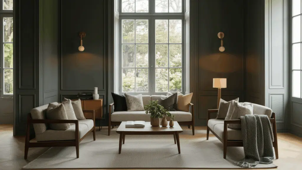
This classic Benjamin Moore shade is a deep, earthy graphite green that makes any room feel grounded and urbane.
It creates spaces that feel connected to nature without being too obviously green or too dark.
1. Versatility
It works in almost any room of your house.
In north-facing light, it looks more gray and moody.
In south-facing rooms, the green undertones emerge.
This color is perfect for living rooms, home offices, libraries, and even kitchen cabinets.
You can use it as an accent wall or paint an entire room.
It pairs beautifully with both light neutrals and rich jewel tones.
Many designers call it a “chameleon color” because it shifts subtly throughout the day.
2. Key Features
With an LRV of 10.46, this color adds drama and depth without feeling like a black hole.
It’s much more interesting than plain gray but not as bold as a true green.
The subtle green undertones make spaces feel connected to nature and more inviting.
Its complex undertones help disguise wall imperfections better than flat colors.
This color has remained popular because it feels both classic and current.
It’s the perfect backdrop for brass fixtures, wood tones, and natural textures.
3. Durability
This holds up well as both wall color and on cabinetry.
It doesn’t show fingerprints as easily as lighter colors.
When used with Benjamin Moore’s quality paint, it cleans up nicely with a damp cloth.
This color ages gracefully over time, taking on a beautiful patina.
It hides small marks and scuffs better than mid-tone colors.
Even after years, it maintains its rich, sophisticated character.
4. Texture and Feeling
It creates rooms that feel both timeless and intentional.
The deep color evokes forests and natural environments.
It grounds spaces with lots of light or high ceilings.
In smaller rooms, it creates a cozy, intimate feeling without closing in the space.
Even in rooms with little natural light, this paint brings a rich dimension.
It works beautifully with all wood tones, from the lightest oak to rich, dark walnut.
Room Color Recommendations: Benjamin Moore Ashwood Moss
This is a deep, rich graphite-green that makes rooms feel sophisticated and grounded.
It shifts between soft gray in shadows and gentle green in sunlight, creating spaces that feel timeless.
1. Living Spaces and Home Offices
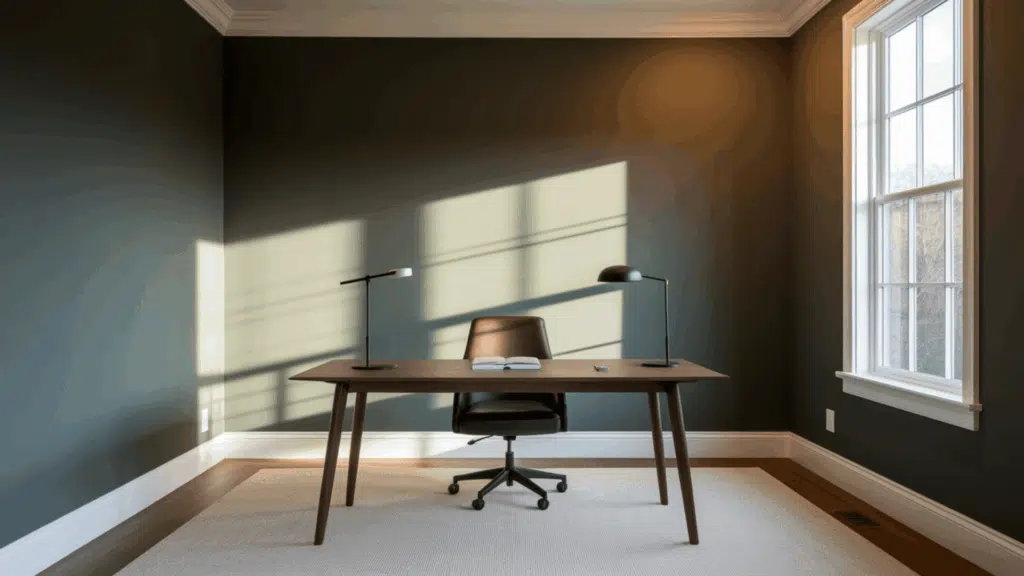
- Walls create a dramatic backdrop that lets your furniture and art shine against a rich, complex background that adds depth without overwhelming the space.
- This versatile shade complements both modern leather furniture and traditional wooden pieces, making it perfect for homes that blend different styles.
- It creates a focused environment that feels both professional and comfortable in home offices or libraries, helping to create the perfect mood for concentration.
2. Kitchens and Cabinets
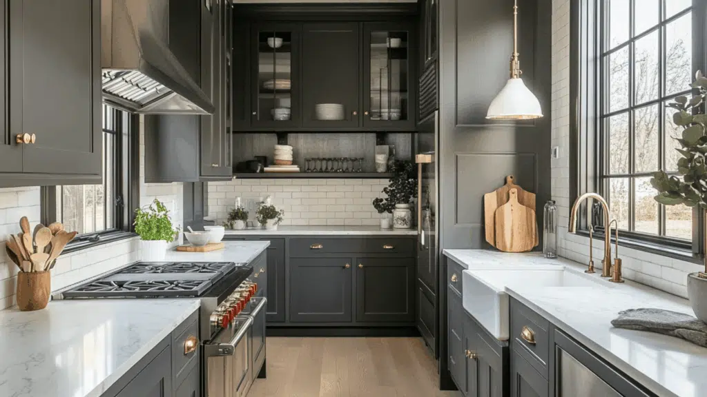
- This color transforms kitchen cabinets into sophisticated focal points that feel both current and timeless. Its rich depth creates spaces that feel custom and well-designed.
- It pairs beautifully with marble countertops and brass hardware, letting these elements stand out like jewelry against a perfect backdrop.
- Cabinet doors painted with the shade hide cooking splatters and fingerprints better than lighter colors, making it practical for busy household kitchens.
3. Exterior Applications
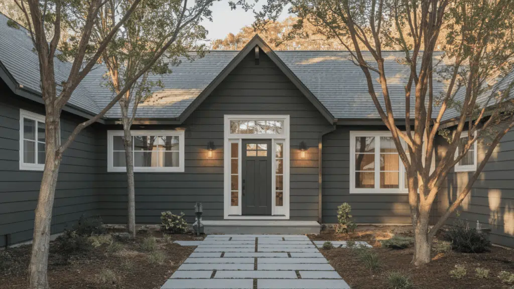
- This deep green-gray makes home exteriors feel grounded and connected to the landscape while providing a sophisticated alternative to common neutrals.
- With its subtle green undertones, it works particularly well for homes surrounded by trees or natural settings, creating harmony between architecture and environment.
- Exterior doors painted in this rich shade create a welcoming focal point that stands out without feeling too bold or trendy.
Color Pairings for Benjamin Moore Ashwood Moss (1484)
This is a deep graphite-green with earthy undertones.
Its Light Reflectance Value (LRV) of 10.46 makes it a rich, dramatic color that creates depth and character.
Here are color pairings that work beautifully with this timeless shade.
Complementary Trim Colors
The right trim can make the painted walls look even better in your home.
These colors pair especially well with its rich, earthy personality.
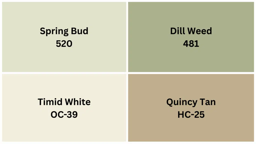
1. Spring Bud (520)
A gentle, fresh green that creates a harmonious connection with the shade while adding brightness.
It gives your trim a natural, cohesive look that enhances the depth of the wall color without stark contrast.
2. Dill Weed (481)
A brighter, livelier green that creates an energetic yet complementary contrast with the deeper wall color.
This pairing creates a dynamic, nature-inspired look that works well in spaces meant to feel vibrant and alive.
3. Timid White (OC-39)
A soft off-white with subtle undertones that complement the earthy qualities of the shade perfectly.
The gentle contrast creates a sophisticated, refined feel from walls to trim that feels elegant and timeless.
4. Quincy Tan (HC-25)
A warm, earthy tan that pairs with the shade to create a natural, grounded palette.
This combination feels organic and intentional, perfect for creating spaces with a connection to nature.
Creating Cohesive Color Schemes
This rich color works beautifully as a focal point color for anchoring your home’s palette.
Here are three different ways to build color schemes around this versatile graphite-green, which will give your spaces a pulled-together look.
SCHEME | MAIN WALL/AREA | TRIM/ACCENT/CEILINGS | OTHER ROOMS/ACCENTS |
Monochromatic | Ashwood Moss (1484) | Dragon’s Breath (1547), Gray Horse (2140-50) | Vintage Charm (1455), Croquet (AF-455) |
Warm | Ashwood Moss (1484) | Montgomery White (HC-33), Toasted Pecan (1209) | Golden Retriever (2165-30), Burnt Caramel (2167-10) |
Cool | Ashwood Moss (1484) | Van Courtland Blue (HC-145), Smoke (2122-40) |
NOTE: All colors are from the Benjamin Moore collection. Paint colors may appear different depending on lighting conditions, so it is recommended that you test samples in your space before making final decisions.
Coordinating with Furniture and Decor
This is a deep, rich graphite-green that makes your furniture and decorations stand out beautifully.
It’s like a sophisticated backdrop that highlights everything in the room with depth and character.
1. Wood Tones
It has a special way of making wood furniture look even more beautiful.
The green undertones complement natural materials perfectly.
Light woods like maple or ash create a contemporary, Scandinavian feeling against these deep walls.
Medium woods like cherry or oak create perfect balance and harmony with this color.
Dark walnut or mahogany paired with this color creates a classic, library-like feeling that never goes out of style.
2. Metals
It works with almost any metal finish to create different moods in your home.
The complex undertones make this color extra versatile.
Brass and gold fixtures pop against the deep background, creating a rich, luxurious feeling.
The warmth feels perfectly balanced.
Silver and chrome create a more contemporary, clean contrast that feels fresh and modern.
Aged bronze hardware adds depth that feels timeless and sophisticated.
3. Decor
It creates the perfect background for both neutral and colorful decorations in your home.
It’s friendly to almost any style but particularly shines with certain elements.
Cream textiles and natural linens stand out beautifully against the deep green-gray background.
When paired with this color, jewel tones like sapphire blue, emerald, or ruby create rich, dramatic spaces.
With this deep neutral, layered textures like wool throws, velvet pillows, and natural fiber rugs create depth and interest.
Similar Paint Colors: Perfect Alternatives to BM Ashwood Moss
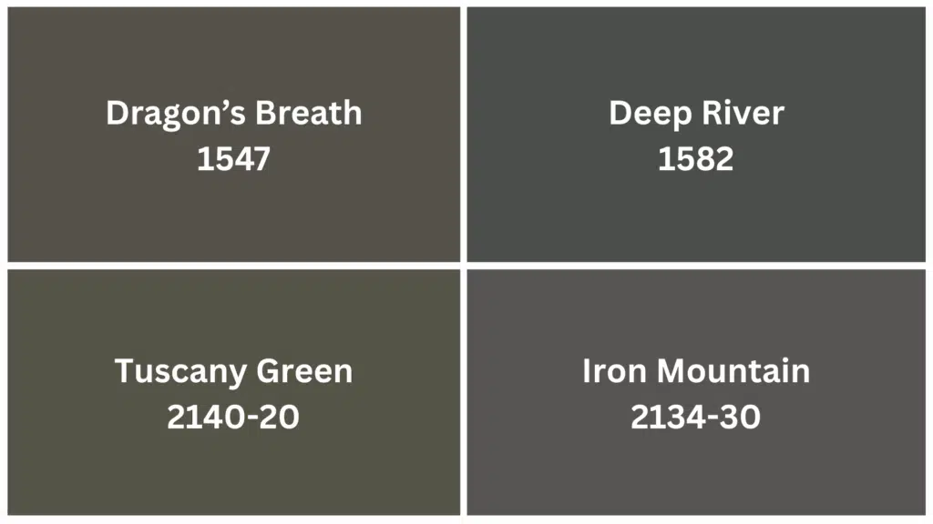
These deep neutrals create suave and grounded spaces. Each has special qualities that might work better for your rooms and lighting conditions.
1. Dragon’s Breath (1547)
Dragon’s Breath offers rich depth with warmer gray undertones.
- A deep gray with subtle warm undertones and similar depth to the shade.
- Creates equally dramatic spaces but with less green influence for a more neutral backdrop.
- Works beautifully in spaces where you want depth without the specific green-gray character.
When you need drama without forest hints, this shade brings equal impact with more neutral versatility.
2. Deep River (1582)
Deep River shifts the mood from forest to water.
- A rich blue-gray with similar depth and complexity.
- Slightly cooler than the shade, creating rooms that feel serene and refined.
- Perfect alternative for spaces where you want a water-inspired rather than forest-inspired mood.
This blue-gray alternative creates calm, collected spaces while maintaining the same striking presence.
3. Tuscany Green (2140-20)
Tuscany Green adds Mediterranean flair to deep green.
- A deep olive green with more evident warm undertones.
- Similar depth to the shade but with a more Mediterranean character.
- Creates spaces with slightly more color while maintaining that sophisticated, timeless quality.
This olive-toned option brings a similar impact with sun-kissed warmth, perfect for creating timeless spaces.
4. Iron Mountain (2134-30)
Iron Mountain delivers comparable depth without the green.
- A deep charcoal with subtle blue-gray undertones
- Similar to Ashwood Moss but with a more industrial, urban feeling
- Perfect for creating dramatic, contemporary spaces without any green influence
This powerful charcoal brings industrial strength to contemporary spaces while maintaining the same dramatic effect.
Wrapping It Up
Benjamin Moore Ashwood Moss stands out with rare qualities, striking impact paired with lasting appeal.
After trying it in various rooms and lighting situations, I’m certain this graphite-green belongs among top-tier neutrals.
It anchors any room while adding subtle character that many trendy colors can’t match.
From cabinet projects to full wall applications, Ashwood Moss balances current style with enduring appeal.
Take time to test a sample in your home; the green undertones react uniquely to each setting’s particular light.
For anyone seeking a dark neutral that remains both current and lasting, Ashwood Moss is ready for your next project.
Share your before-and-after photos in the comments below!
If you’re interested in more informational color review content, feel free to click here and explore other blogs that you might enjoy.

Alex Guerrero, a graduate with a Fine Arts degree from the Rhode Island School of Design, has been a visionary in the world of color and design for over 15 years. His professional journey began in the heart of the fashion industry in Milan, where he developed an acute sense for color harmonies and trends. Alex joined our team in 2018, offering fresh and innovative perspectives on color utilization in various spaces. Renowned for his ability to blend contemporary trends with timeless elegance. Outside of work, Alex is an accomplished painter and a volunteer art therapist, his artistic talents further enriching his professional insights.