Looking for a paint color that makes your home feel both cozy and stylish?
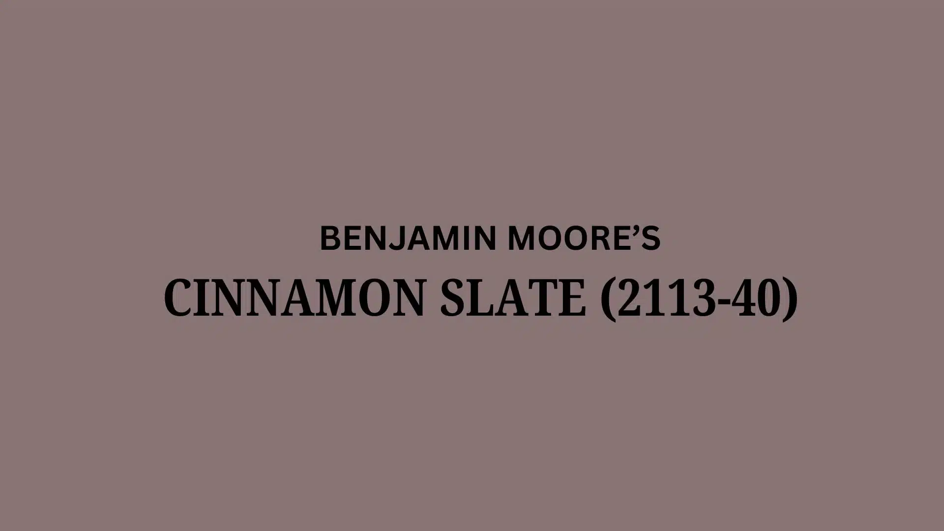
Benjamin Moore Cinnamon Slate might be your perfect match.
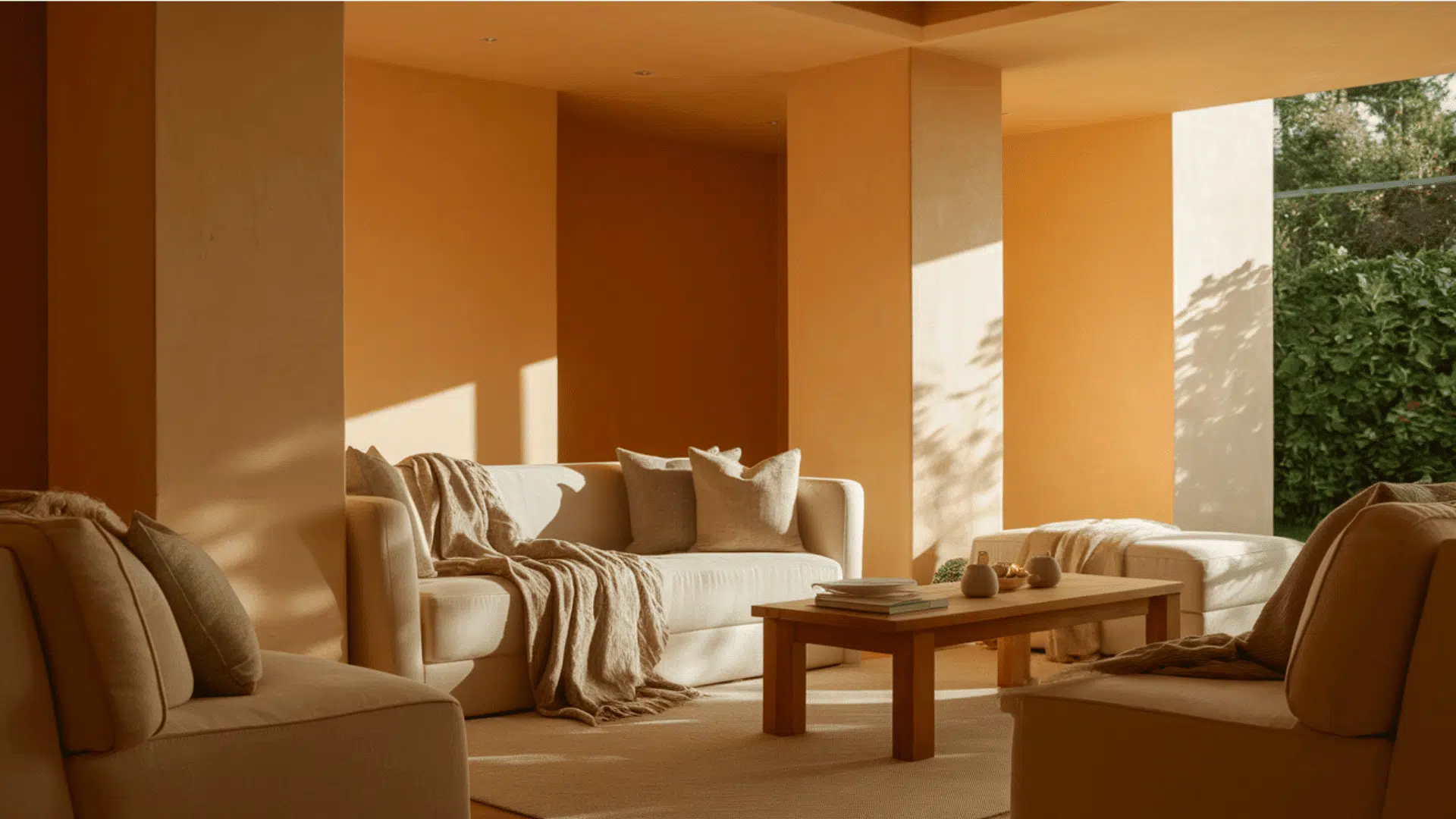
This rich, earthy color alters plain walls into warm, inviting spaces that feel just right.
It works in both modern farmhouses and city apartments, creating a backdrop that makes your furniture look amazing.
With its warm reddish-brown undertones and gray influences, this color shifts throughout the day, always looking beautiful.
It’s not just a flat brown – it’s a complex, living color that adds depth without darkness.
The best part?
It hides fingerprints and smudges, making it perfect for busy homes where real life happens.
Understanding Benjamin Moore’s Cinnamon Slate (2113-40)
Benjamin Moore Cinnamon Slate (2113-40) is a rich, earthy paint color from Benjamin Moore that converts ordinary walls into cozy, refined spaces.
This color works wonderfully in both modern and traditional homes, creating a warm backdrop that feels inviting all year round.
You’ll find this color listed as 2113-40 when you’re at the paint store.
Color Terminology
Let’s look at the numbers that tell us about this beautiful paint:
Here is the information presented in table format:
| PROPERTY | VALUE |
|---|---|
| RGB Value | 137, 116, 117 |
| HEX Value | #897475 |
| Light Reflectance Value (LRV) | 19.71 |
With its lower LRV of 19.71, it adds depth to rooms without making them feel too dark.
Keep these RGB and Hex codes handy when shopping for matching furniture or decor online.
Undertones:
- It carries warm reddish-brown undertones with gentle gray influences
- It’s a friendly color that shifts slightly as the light changes throughout the day
- Not a flat brown, but a complex, cozy shade that feels alive on your walls
Psychology of Neutral Colors
The paint colors we choose impact our daily moods and home atmosphere, especially versatile ones like this.
- Balanced earth tones: Help create peaceful, grounded environments
- Refined neutral shades: Make decorating almost foolproof
- Adaptable wall colors: Look different but beautiful in morning and evening light
- Advantages: Hides fingerprints and smudges, works with many decor styles, creates a timeless look
People love this color because it feels both modern and classic at the same time.
You really can’t go wrong with Cinnamon Slate – it’s like a favorite coffee shop for your walls!
Why Choose the Benjamin Moore Cinnamon Slate?
Benjamin Moore Cinnamon Slate is a rich, earthy brown paint color.
It makes rooms feel warm and inviting without being too dark.
This color works with many decorating styles from traditional to modern.
1. Versatility
This color shifts beautifully as light changes throughout the day.
Morning sunshine brings out its warm reddish tones, while evening light reveals its refined gray side.
It works wonderfully in dining rooms, libraries, bedrooms, and accent walls.
This friendly color looks amazing in both country cottages and sleek city apartments.
2. Key Features
This neutral color creates the perfect balance between cozy and graceful.
With its lower LRV of 19.71, it adds depth without making spaces feel too dark.
This color has staying power because it feels both timeless and current.
Once on your walls, it makes wood furniture and floors look even more beautiful.
3. Durability
In Benjamin Moore’s quality paint formulas, this color stands up to real life incredibly well.
The rich brown tone hides fingerprints and marks better than lighter colors.
Its premium pigments keep their gorgeous color even after years of cleaning, making your paint investment last longer.
Perfect for busy homes with kids and pets.
4. Texture Patterns
This color creates a soft, suede-like look that instantly makes rooms feel more expensive.
Its subtle red-gray undertones add depth without overwhelming your style.
This makes white trim pop with clean contrast and transitions smoothly between connected rooms, letting your favorite decor shine.
Room Color Recommendations: Benjamin Moore Cinnamon Slate
This rich, earthy brown paint adds warmth to any room.
It shifts throughout the day, showing reddish tones in morning light.
By evening, it displays deeper gray-brown tones that feel cozy.
The color works well in both modern and traditional spaces.
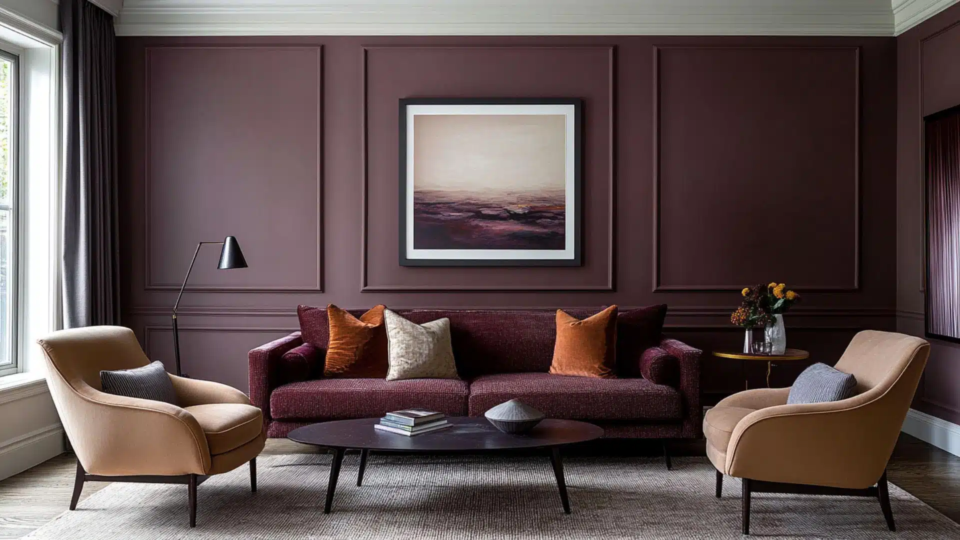
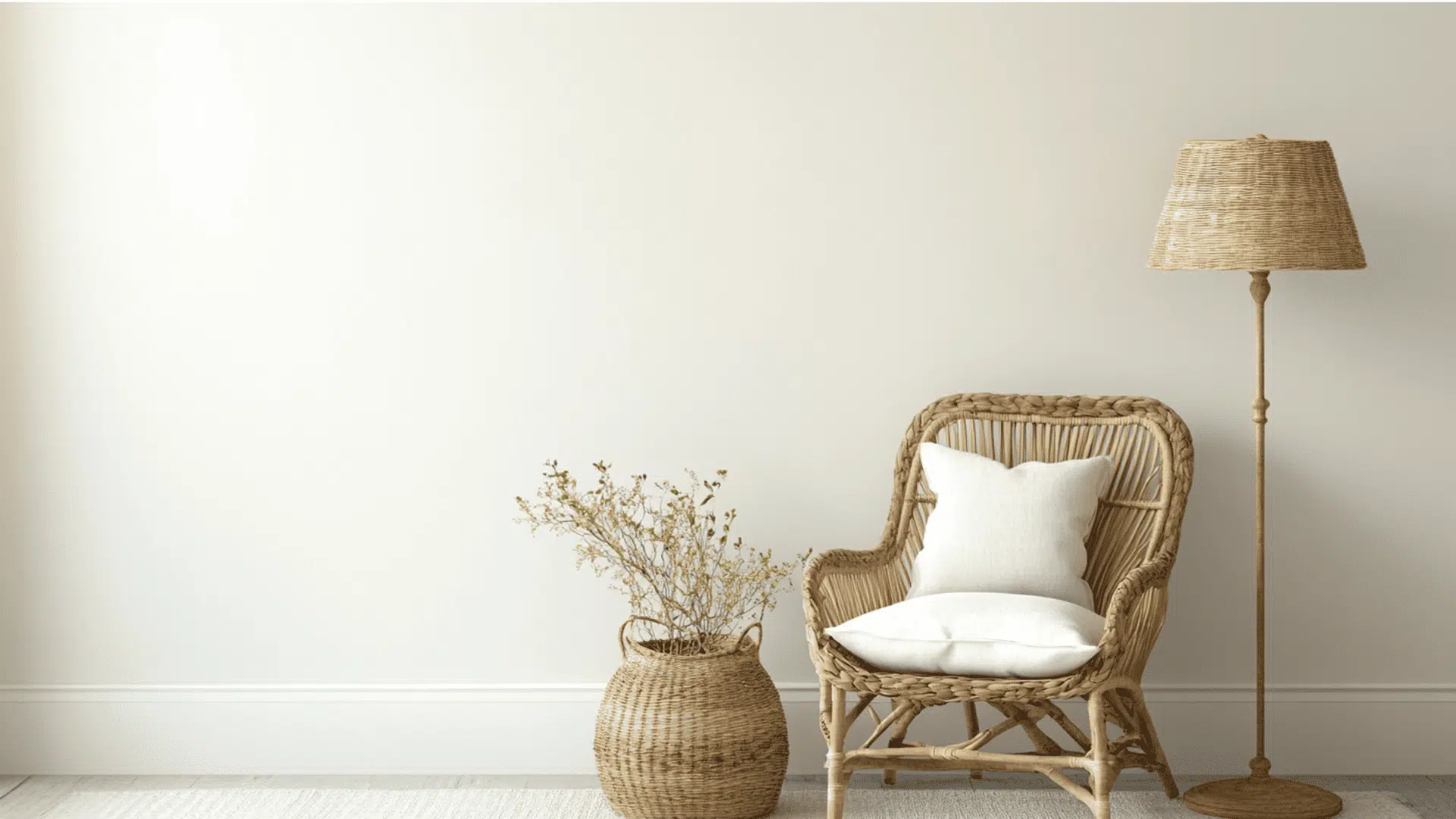
1. Living Spaces and Family Rooms
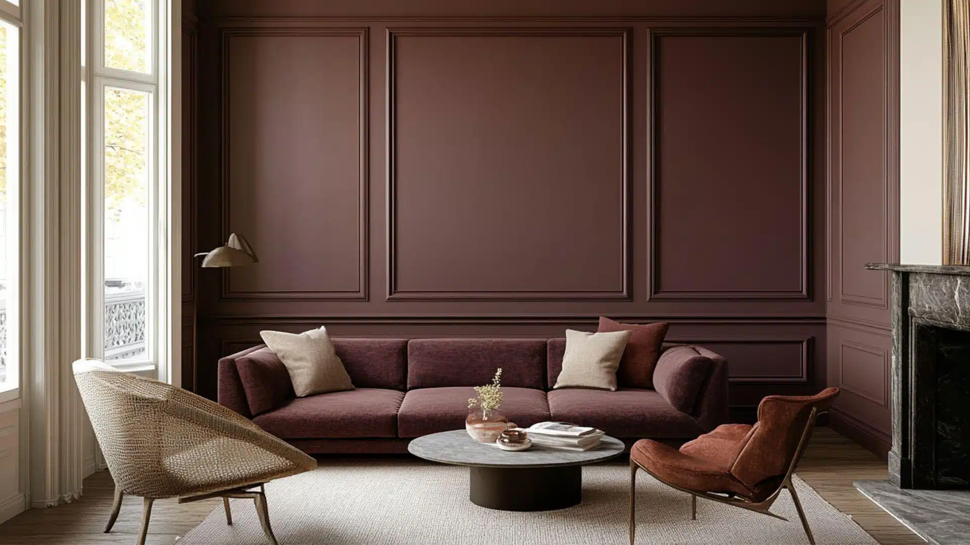
Cinnamon Slate truly shines in living and family rooms.
It creates a comfortable backdrop for everyday life.
- It creates a cozy backdrop that makes living rooms feel warm and welcoming.
- This color pairs beautifully with cream furniture and natural wood accents.
- Try it with white trim for nice contrast or with gold-toned light fixtures.
This versatile color handles changing light throughout the day.
Many homeowners find they love it even more as years pass.
2. Kitchens and Dining Areas
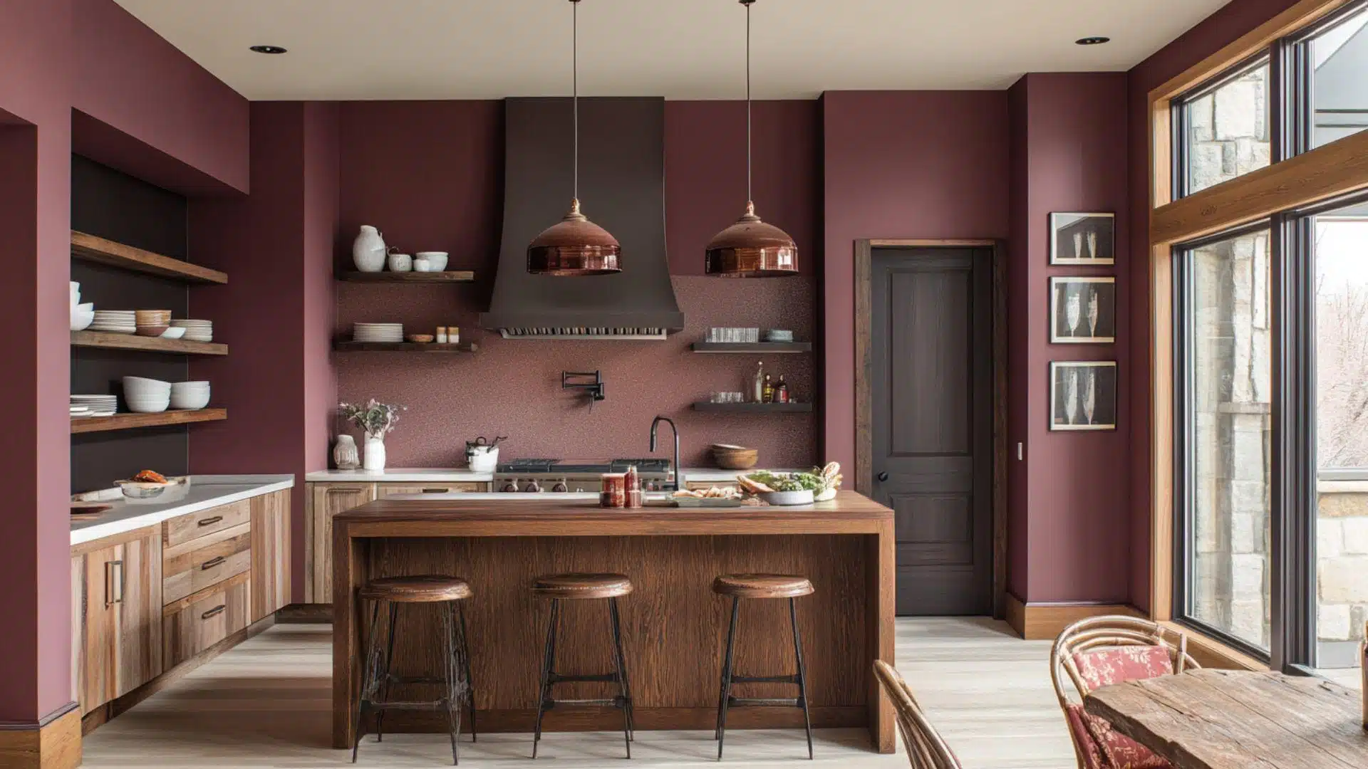
Kitchens and dining spaces benefit from this rich, practical color.
The earthy tone creates a gathering place everyone enjoys spending time in.
- It makes kitchens feel warm and inviting for family meals and conversations.
- The color looks amazing with white or cream cabinets for an earthy feel.
- Its depth hides small marks and fingerprints, perfect for busy cooking areas.
Painting just one accent wall can change your eating area.
Your kitchen will feel more custom and intentional with this color.
3. Bedrooms and Relaxation Spaces
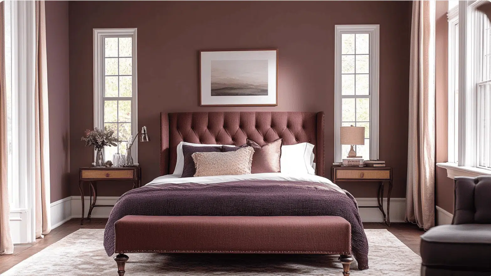
Bedrooms need colors that help you unwind and rest well.
The color feels like a gentle hug at the end of a long day.
- It converts bedrooms into peaceful retreats for better sleep quality.
- The cocoa-like warmth promotes relaxation and creates a sense of security.
- It pairs beautifully with soft creams, light blues, or sage greens.
Many people report that their bedrooms feel more complete with this color.
It works in both large master suites and cozy guest rooms.
Color Pairings for Benjamin Moore Cinnamon Slate (2113-40)
This rich brown has beautiful depth that makes rooms feel warm.
It adds inviting comfort to spaces with its earthy, urbane tone.
Its lower LRV of 19.71 creates cozy spaces that never feel flat or boring.
Here are the perfect partner colors for this versatile shade.
Complementary Trim Colors
The right trim color makes this color shine in your home.
These colors create beautiful relationships with this warm, rich brown.
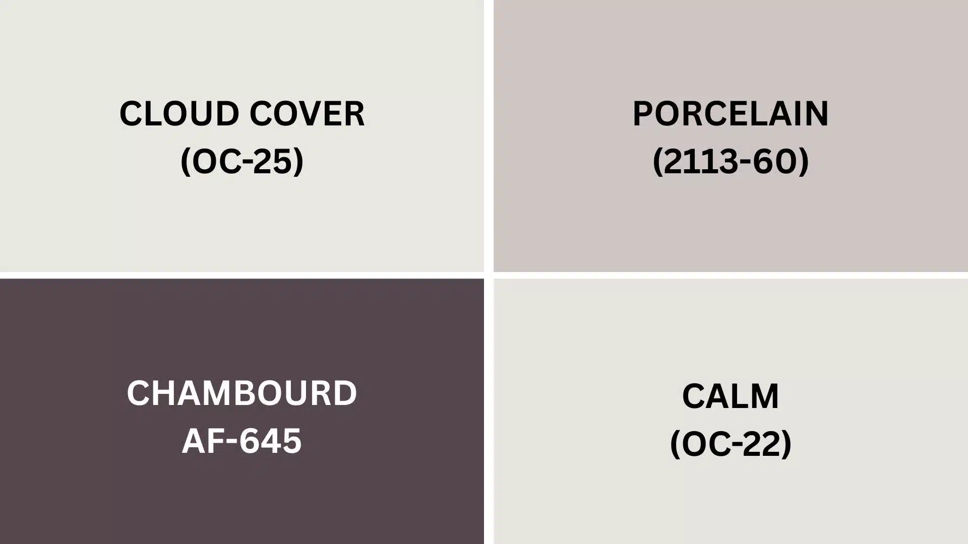
1. Cloud Cover (OC-25)
A soft, clean white that creates beautiful contrast against the walls.
It brightens the space while letting the rich brown be the star.
Perfect for trim, doors, and ceilings in living rooms and bedrooms.
2. Porcelain (2113-60)
A gentle, warm beige that creates a subtle, cultured look when paired with the color.
This combo works beautifully in dining rooms and hallways for a cohesive feel.
The soft contrast feels lavish without being too dramatic for everyday spaces.
3. Calm (OC-22)
A light, airy shade that balances the depth of the color perfectly.
Use Calm on trim for a fresh look that keeps rooms feeling open.
This pairing creates peaceful spaces that feel both grounded and bright.
4. Charmbourd (AF-645)
A deeper charcoal that creates dramatic combinations with this color.
Try it on kitchen islands or accent furniture with walls.
This rich pairing adds instant refinement to any room in your home.
Creating Cohesive Color Schemes
Benjamin Moore Cinnamon Slate pairs beautifully with many colors.
It helps create a connected feel throughout your home spaces.
This rich brown shade makes a perfect starting point for various design styles.
Here are three different color schemes that use it as the main color.
Here is a helpful color scheme table:
| SCHEME | MAIN WALLS / AREAS | TRIM / ACCENT / CEILINGS | OTHER ROOMS / ACCENTS |
|---|---|---|---|
| Monochromatic | Cinnamon Slate (2113-40) | Cloud Cover (OC-25) | Weimaraner (AF-155), Kona (AF-65) |
| Warm | Cinnamon Slate (2113-40) | Porcelain (2113-60) | Aegean Olive (1491), Saddle Soap (AF-110) |
| Cool | Cinnamon Slate (2113-40) | Calm (OC-22) | Stone Harbor (2111-50), Kendall Charcoal (HC-166) |
NOTE: All colors shown are Benjamin Moore paints. Always test samples on your walls before buying full gallons.
Coordinating with Furniture and Decor
This rich, earthy color gives your room a cozy feel.
It creates a perfect backdrop that makes your furniture stand out in a good way.
1. Wood Tones
Dark woods like walnut and mahogany pop, creating a warm, inviting look.
Medium woods blend right in, making rooms feel put together without trying too hard.
Light woods brighten up the space and give a nice contrast to this deeper wall color.
The reddish undertones in the color really bring out the natural beauty in wood furniture.
2. Metals
Gold and brass fixtures look amazing with this color, adding a touch of warmth that feels just right.
Silver and chrome create a cool contrast that looks modern and fresh against the warm walls.
Black metal pieces stand out nicely, giving your space defined lines and a designer touch.
Brushed nickel hardware offers a subtle match that works well in kitchens and bathrooms.
3. Decor
Cream, ivory, and light tan fabrics soften the richness of the paint color, creating a balanced look.
Green plants really pop against this color, bringing life to any room.
Blue accents create a pleasing contrast that draws the eye without being too much.
Natural textures like jute rugs and woven baskets complement this earthy tone, adding depth to your space.
Similar Paint Colors: Perfect Alternatives to BM Cinnamon Slate
These colors are great options if you like Cinnamon Slate but want to explore similar choices.
They all have that cozy, warm feeling, but with their own special touch.
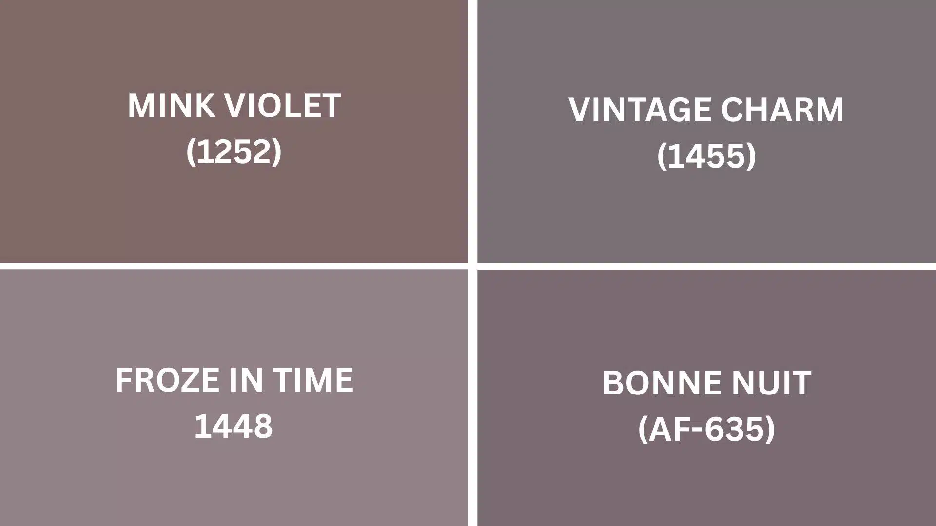
1. Mink Violet (1252)
- Has purple-gray undertones that add a touch of softness to your walls.
- Creates a more dreamy, relaxed feeling compared to the color.
- Pairs beautifully with silver, light woods, and soft greens.
2. Vintage Charm (1455)
- Offers a lighter, more pinkish-beige alternative to the color.
- Creates spaces that feel bright yet still very warm.
- Works wonderfully in rooms that don’t get tons of natural light.
3. Frozen in Time (1448)
- Provides a cooler, more gray-blue alternative to the warmth of the color.
- Creates a calmer, more peaceful feeling in your space.
- Looks amazing with navy, white, and brushed nickel finishes.
4. Bonne Nuit (AF-635)
- Offers a deeper, more dramatic alternative with blue-gray undertones.
- Creates spaces that feel cultured and cozy at the same time.
- Pairs beautifully with gold, cream, and dark wood furniture.
Final Thoughts
Benjamin Moore Cinnamon Slate brings warmth to any room without being too dark or heavy.
It pairs beautifully with cream furniture, natural wood, and both gold and silver fixtures.
This versatile color works in kitchens, bedrooms, and living rooms, shifting with the light to keep your space feeling fresh.
This color stands up well to daily life, hiding marks and smudges that show on lighter colors.
If you choose this rich brown or similar options like Mink Violet or Vintage Charm, you’ll create a timeless look that works with many decorating styles.
Ready to change your home with Cinnamon Slate?
Share your experiences in the comments below!
If you’re interested in more informational color review content, feel free to click here and explore other blogs that you might enjoy.

Alex Guerrero, a graduate with a Fine Arts degree from the Rhode Island School of Design, has been a visionary in the world of color and design for over 15 years. His professional journey began in the heart of the fashion industry in Milan, where he developed an acute sense for color harmonies and trends. Alex joined our team in 2018, offering fresh and innovative perspectives on color utilization in various spaces. Renowned for his ability to blend contemporary trends with timeless elegance. Outside of work, Alex is an accomplished painter and a volunteer art therapist, his artistic talents further enriching his professional insights.