Looking for a white paint that strikes the perfect balance between crispness and versatility?
Decorator’s White Benjamin Moore (CC-20) might be exactly what your space needs. This exceptional shade has earned its reputation as a designer favorite for good reason.
With its subtle cool undertones and remarkable adaptability, Decorator’s White Benjamin Moore creates a fresh, clean backdrop that responds beautifully to changing light throughout the day.
From bathrooms to living areas to home offices, this timeless white delivers the perfect canvas for your design vision.
Not too stark and not too soft, Decorator’s White Benjamin Moore allows your furniture, artwork, and decor to shine while providing just enough depth to stand confidently on its own.
Understanding Paint Color Basics
Color Terminology
| Property | Value |
|---|---|
| LRV | 82.68 (High reflectance, very bright) |
| RGB Values | 235, 237, 234 (A soft, off-white blend) |
| HEX Code | #EBEDEA (A light, neutral white shade) |
Why Choose Benjamin Moore Decorator’s White
Decorator’s White CC-20 offers exceptional adaptability for almost any space. This bright white with subtle cool undertones creates a clean foundation that responds beautifully to different lighting conditions and design styles.
Its balanced nature provides the perfect backdrop without overwhelming your décor elements, making it an ideal choice for homeowners seeking a timeless color that will remain relevant through changing trends.
1. Key Features of Decorator’s White CC-20
This premium paint delivers a smooth, even finish with excellent coverage. Decorator’s White reads as a crisp white, subtle off-white, or luminous neutral, depending on lighting and surrounding colors.
Unlike many white paints, its balanced undertones avoid appearing too yellow or blue. The color’s clarity creates visual openness without flattening a space.
2. Durability
Benjamin Moore’s advanced formula ensures Decorator’s White CC-20 maintains its integrity for years. The paint resists discoloration, marking, and daily wear while remaining washable for easy maintenance.
Its quality formulation bonds well to prepared surfaces, reducing the need for frequent touch-ups. This longevity makes it a smart investment for both residential and commercial spaces.
3. Texture Patterns
Decorator’s White CC-20 performs beautifully across various texture applications. From sleek modern walls to textured surfaces, this adaptable shade enhances surface details without diminishing them.
It’s particularly effective for highlighting design features like crown molding or wainscoting. The color’s pure quality adds brightness to walls with minimal effort.
Room-by-Room Color Recommendations with Decorator’s White
Bathrooms and Spa-Like Retreats

Decorator’s White creates a clean, refreshing sanctuary in bathrooms. Pair with soft blue accents or natural stone for a spa-like atmosphere. Its bright quality enhances small spaces while reflecting light beautifully on glossy surfaces.
Dining Spaces

In dining rooms, Decorator’s White provides a fresh canvas that makes table settings and food pop. Complement with warm wood tones and metal fixtures for balance. This crisp backdrop enhances both casual family meals and formal entertaining.
Home Offices and Focus Spaces

Decorator’s White delivers a clear, distraction-free environment perfect for concentration. Its bright quality reduces eye strain while creating an airy backdrop for productivity. Add natural elements or bold accents to personalize without compromising focus.
Color Pairings and Combinations for Decorator’s White CC-20

Decorator’s White creates a versatile foundation that pairs beautifully with many complementary colors. Its subtle cool undertones work particularly well with blues and grays, while its crisp clarity makes richer tones pop.
This adaptable white balances both warm and cool accents, allowing for flexibility in your color scheme.
The clean canvas serves as an ideal backdrop that enhances rather than competes with other colors in your palette, making it a reliable choice for designers seeking a timeless white.
Complementary Trim Colors
- Oxford White CC-30 – Slightly warmer white for trim and moldings.
- Raindance CC-680 – Soft gray for subtle contrast and depth.
- Chantilly Lace OC-65 – Brighter white for ceilings and detailed elements.
- Blue Note 2129-30 – Deep navy for dramatic accents and focal points.
Creating Cohesive Color Schemes
Decorator’s White CC-20 serves as a versatile foundation for numerous color schemes, creating spaces with clarity and brightness.
This balanced white acts as a perfect canvas, allowing you to build varied looks ranging from bold and dramatic to subtle and refined. Its cool undertones provide the ideal starting point for any design vision.
Monochromatic Scheme
A monochromatic scheme uses various white shades alongside Decorator’s White CC-20 to create depth without complexity. This crisp white makes spaces feel cohesive yet interesting.
The subtle variations between similar tones create polished layers while maintaining a clean, minimalist look that feels intentional rather than flat.
My recommendations are:
- Decorator’s White CC-20 on walls with Oxford White CC-30 trim creates a subtle, refined contrast.
- Try a shinier finish of Decorator’s White CC-20 on crown moldings – it makes a difference!
- Add White Dove OC-17 on a bookshelf or accent piece for a touch more dimension.
- Layer in textured whites like linen upholstery and matte ceramics to bring the whole look to life.
Warm Color Scheme
Decorator’s White CC-20’s cool undertones complement warm colors beautifully. This combination feels balanced yet inviting when natural light flows through the space.
The harmony between the crisp white and warm hues creates visual interest without overwhelming contrast. Terracotta, rust, and amber tones pop against this neutral white backdrop.
My recommendations are:
- Use Cappuccino Froth 2174-50 in dining spaces – it feels incredibly inviting for gatherings.
- Warmouth CSP-75 works wonders in hallways and ties everything together.
- Manchester Tan HC-81 makes bedrooms feel rich without trying too hard.
- Try Muslin OC-12 for a subtle accent wall that doesn’t steal all the attention.
Cool Color Scheme
With its inherently cool-toned nature, Decorator’s White CC-20 pairs wonderfully with other cool colors. This adaptable mix creates spaces that feel fresh and airy.
The balance between the white’s crispness and cool tones like blue, teal, or sage produces a harmonious, contemporary look that avoids feeling cold or stark while maintaining visual interest.
My recommendations are:
- Smoke 2122-40 in bathrooms alongside Decorator’s White CC-20 living areas feels just right.
- Metropolitan AF-690 in bedrooms creates a peaceful vibe while keeping things grounded.
- Hale Navy HC-154 makes home offices feel focused but not stark or boring.
- Santorini Blue 1662 accent wall adds enough contrast to catch your eye.
Coordinating with Furniture and Decor
Wood Tones

Decorator’s White CC-20 enhances both light and dark wood tones. Its crisp backdrop makes walnut and mahogany appear richer while allowing oak and maple to feel fresh.
This versatile white creates contrast with warm woods and harmony with bleached or natural finishes.
Metals

This bright white pairs beautifully with all metal finishes. Silver and chrome create a clean, modern look, while brass and gold offer warmth and depth.
Black metal hardware provides striking contrast against the white backdrop, making fixtures appear more defined and purposeful.
Fabrics

Bold patterns and rich textures stand out against the Decorator’s White. The neutral backdrop allows colorful upholstery to shine while complementing neutral linens and cotton.
This adaptable white works equally well with casual fabrics and formal textiles, from natural fibers to luxurious materials.
Decor

Decorator’s White creates the perfect gallery-like setting for artwork and accessories. Plants appear more vibrant against this backdrop, while ceramics and glassware reflect light beautifully.
This clean canvas allows statement pieces to command attention while unifying diverse decorative elements.
Similar Paint Colors: Alternative to Decorator’s White CC-20
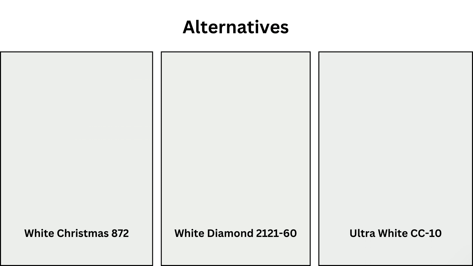
If you’re considering options similar to Decorator’s White CC-20 but with subtle variations, these alternatives offer comparable brightness with different undertone characteristics.
Each provides the clean, fresh appeal of Decorator’s White but with unique qualities that might better suit specific lighting conditions or design preferences.
White Christmas (872)
- Slightly warmer undertones for cozier spaces.
- Perfect for north-facing rooms that need warmth.
- Creates a softer look than the Decorator’s White.
- It pairs beautifully with natural materials.
- Maintains brightness without appearing stark.
White Diamond (2121-60)
- More reflective quality for darker spaces.
- Contains subtle blue-gray undertones.
- Creates a crisper, more contemporary feel.
- Excellent for modern minimalist designs.
- Shows beautiful depth in varying light conditions.
Ultra White (CC-10)
- Brightest option with minimal undertones.
- Creates maximum light reflection in any space.
- Perfect for true white gallery-like walls.
- It makes small spaces feel significantly larger.
- Provides a clean slate for vibrant accent colors.
Wrapping It Up
Decorator’s White Benjamin Moore stands as a testament to the power of a well-chosen white paint.
Its remarkable versatility makes it suitable for virtually any space in your home, from bright sunlit rooms to darker corners that need brightening.
With its perfect balance of crispness and warmth, this paint color continues to be a favorite among professional designers and homeowners.
For bathrooms, kitchens, living areas, and beyond, Decorator’s White Benjamin Moore offers a clean canvas that adapts to your unique style.
Its subtle cool undertones, excellent coverage, and durability make it an investment that will continue to enhance your spaces for years to come.
For a timeless white that never disappoints, Decorator’s White Benjamin Moore remains an exceptional choice.

Alex Guerrero, a graduate with a Fine Arts degree from the Rhode Island School of Design, has been a visionary in the world of color and design for over 15 years. His professional journey began in the heart of the fashion industry in Milan, where he developed an acute sense for color harmonies and trends. Alex joined our team in 2018, offering fresh and innovative perspectives on color utilization in various spaces. Renowned for his ability to blend contemporary trends with timeless elegance. Outside of work, Alex is an accomplished painter and a volunteer art therapist, his artistic talents further enriching his professional insights.