Are you searching for the perfect white paint that feels warm and welcoming instead of cold and stark?
Benjamin Moore Linen White might be exactly what your walls need!
This creamy off-white has been a designer favorite for decades because it makes rooms feel cozy without being too yellow.
It brightens spaces while keeping them comfortable and lived-in, never feeling clinical or harsh.
This color shifts beautifully throughout the day, looking fresh in morning light and glowing like candlelight in the evening.
It works in every room from kitchens to bedrooms, and pairs with almost any furniture style.
Unlike bright whites that show every fingerprint, this is practical for busy homes with kids and pets.
It’s no wonder this timeless color remains one of Benjamin Moore’s most beloved whites!
Understanding Benjamin Moore’s Linen White
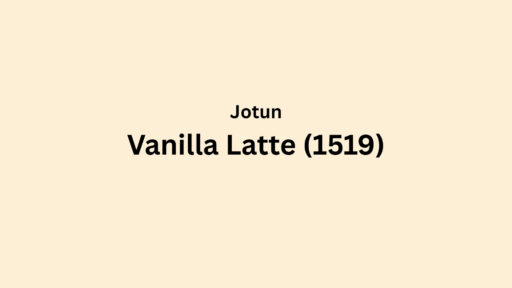
This is a cordial, light off-white that makes rooms feel cozy and inviting.
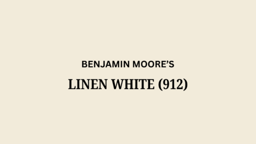
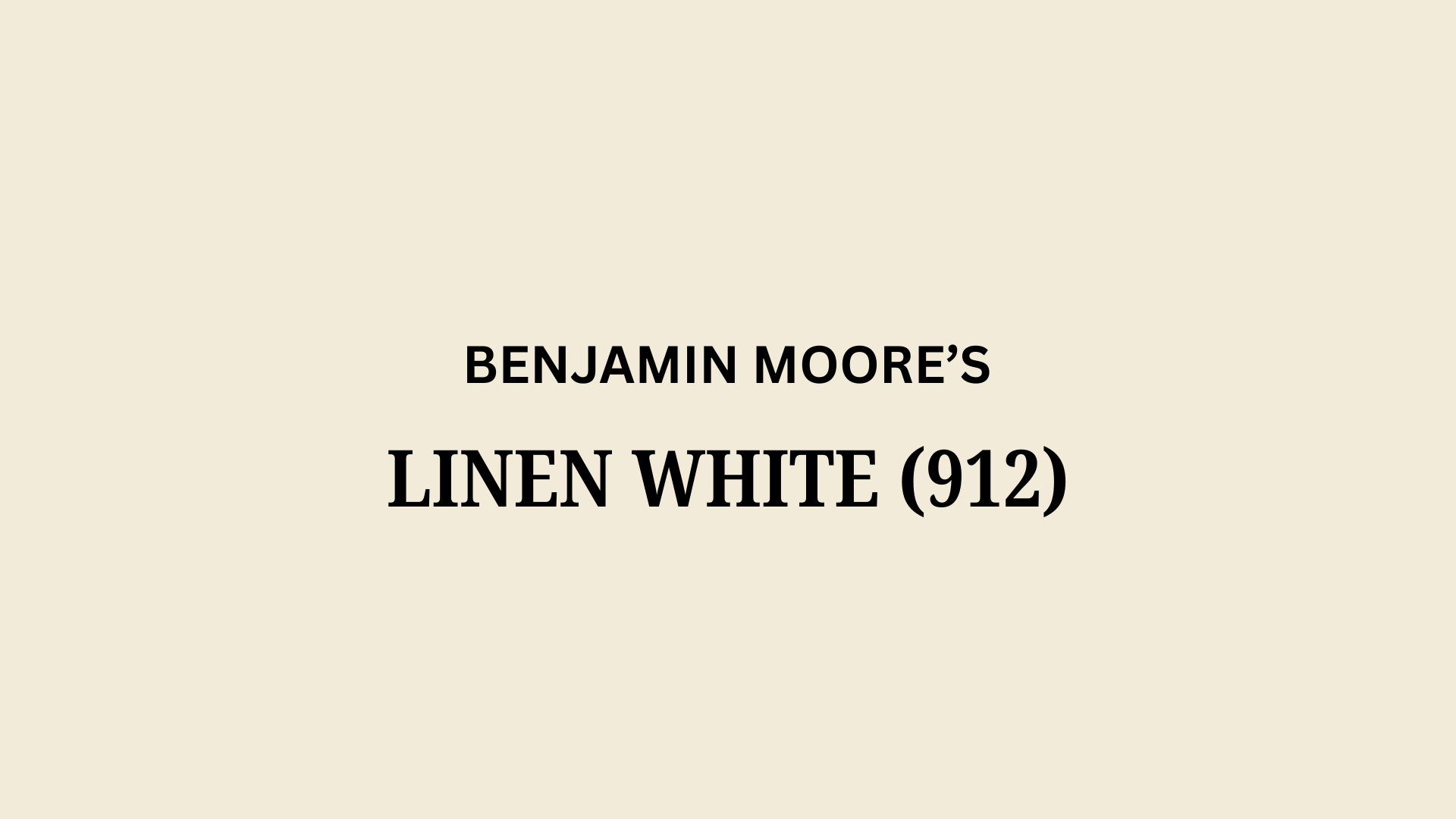
Benjamin Moore’s Linen White (912), also known as PM-28 and OC-146, provides subtle warmth for any interior space.
It reminds many people of soft cotton sheets or vanilla ice cream with its gentle, comforting glow.
Color Terminology
Here’s what makes this color so popular among designers and homeowners alike.
Understanding these numbers helps you see why this color works so well in so many different spaces.
| PROPERTY | VALUE |
|---|---|
| LRV | 80.94 |
| RGB | 242, 235, 218 |
| HEX | #F2EBDA |
This highlight reflection helps make small rooms look bigger and dark rooms brighter.
Designers use the RGB and Hex codes when matching fabrics or digital designs to this popular color.
Undertones:
- This color carries subtle yellow and cream undertones that give it warmth.
- It can show hints of beige in certain lights, especially late afternoon sun.
- Though it’s called “white,” it’s really more of a soft neutral that feels lived-in and comfortable.
Psychology of Warm Whites
The colors we choose affect how we feel in our homes, and they create a special mood.
- Warm whites help rooms feel welcoming and relaxed
- Creamy neutral colors: Create spaces that feel timeless and never too stark
- Soft whites with yellow undertones: Make even new spaces feel established and comfortable
- Benefits: Flattering to skin tones, versatile with many decorating styles, works in both old and new homes
It creates welcoming living spaces, timeless versatility complements all styles while enhancing other elements in your room.
Why Choose Benjamin Moore Linen White?
Benjamin Moore Linen White is a warm, pale off-white that makes any room feel cozy and welcoming.
It creates spaces that feel like home without being too yellow or too stark white.
1. Versatility
It works in almost any room of your house.
In morning light, it looks bright and fresh. By evening, it warms up to create a soft, golden glow.
This color is perfect for living rooms, bedrooms, kitchens, and even bathrooms.
You can paint your whole house with it.
It easily matches both modern furniture and antique pieces.
Many designers call it a “chameleon color” because it changes slightly throughout the day.
2. Key Features
With an LRV of 80.94, this color brightens dark rooms while still feeling warm.
It’s much softer than pure white but not as yellow as cream.
The subtle warmth makes skin tones look better and rooms feel more inviting.
Its yellow undertones help disguise wall imperfections better than cooler whites.
This color has been popular for decades because it never goes out of style.
It’s the perfect backdrop for colorful art and furniture.
3. Durability
This holds up well in busy family homes.
It doesn’t show fingerprints as easily as brighter whites.
When used with Benjamin Moore’s quality paint, it cleans up nicely with a damp cloth.
This color ages gracefully over time, taking on a gentle patina.
It hides small marks and scuffs better than stark whites.
Even after years, it maintains its warm, inviting glow.
4. Texture and Feeling
It creates rooms that feel both timeless and comfortable.
The soft color evokes fresh laundry hung in the sunshine.
It warms up spaces with lots of windows.
In smaller rooms, it makes everything feel bigger without the cold feeling of pure white.
Even on cloudy days, this paint brings a hint of sunshine indoors.
It works beautifully with all wood tones, from the lightest oak to rich, dark walnut.
Room Color Recommendations: Benjamin Moore Linen White
This is a warm, light off-white that makes rooms feel cozy and inviting.
It shifts between soft ivory in shadows and gentle cream in sunlight, creating spaces that feel timeless.
1. Living Spaces and Open Floor Plans
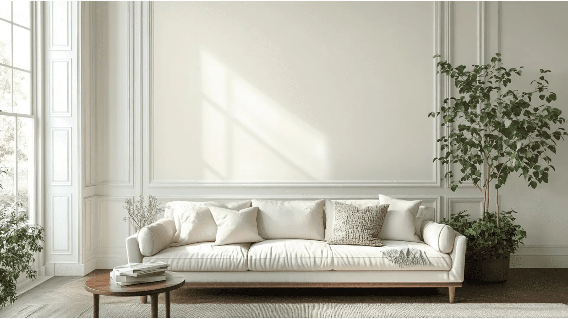
- Walls create a warm backdrop that lets your furniture and art become the stars without competing for attention or looking too stark against darker pieces.
- This versatile shade complements modern glass tables and antique wooden furniture, making it perfect for homes that blend different styles.
- In open-concept spaces, it flows smoothly between rooms while adding subtle warmth throughout the home, creating a cohesive look that still feels interesting.
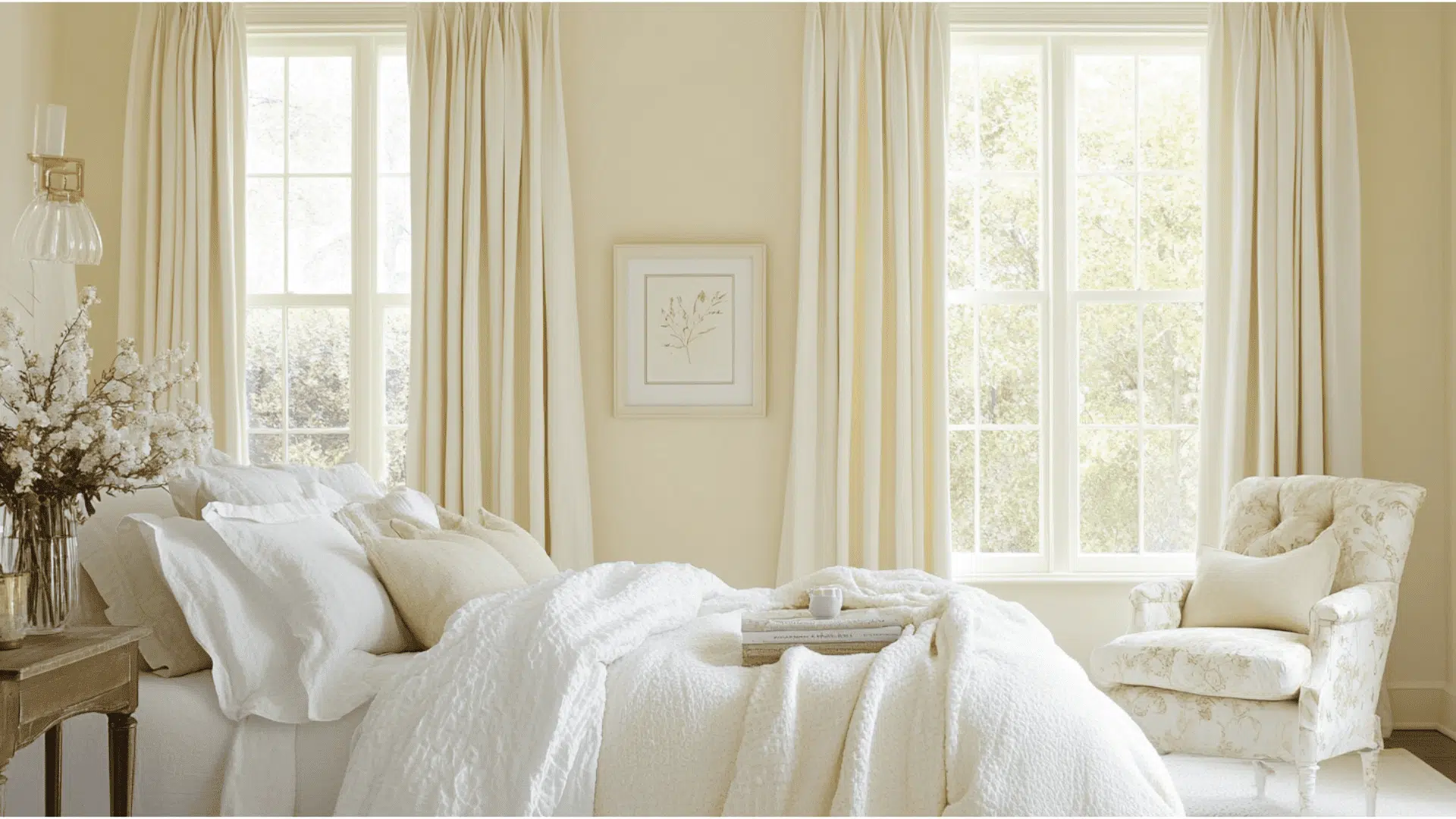
2. Bedrooms and Relaxation Areas

- This color changes bedrooms into cozy retreats that feel like high-end hotels. Its soft glow creates spaces that help lower stress and promote better sleep.
- It pairs beautifully with all bedding colors from crisp white to rich jewel tones, allowing you to change your look seasonally without repainting your walls.
- Evening light makes this color glow like candlelight, perfect for unwinding after long days, while morning sun brings out its fresh, clean qualities.
3. Kitchens and High-Traffic Zones

- This gentle cream makes kitchens feel warm and welcoming without the clinical feel of bright whites, creating spaces where family naturally wants to gather and linger.
- Cabinet doors and trim painted Linen White hide fingerprints and minor scuffs better than stark colors, making it practical for busy households with children and pets.
- With its high LRV of 80.94, it brightens dark corners while maintaining a soft, livable feel that makes even small kitchens feel more spacious and inviting.
Color Pairings for Benjamin Moore Linen White (912)
This is a friendly off-white with soft cream undertones.
Its Light Reflectance Value (LRV) of 80.94 makes it bright enough to open up spaces while keeping them cozy.
Here are color pairings that work beautifully with this timeless shade.
Complementary Trim Colors
The right trim can make the painted walls look even better in your home.
These colors pair especially well with its warm, inviting personality.
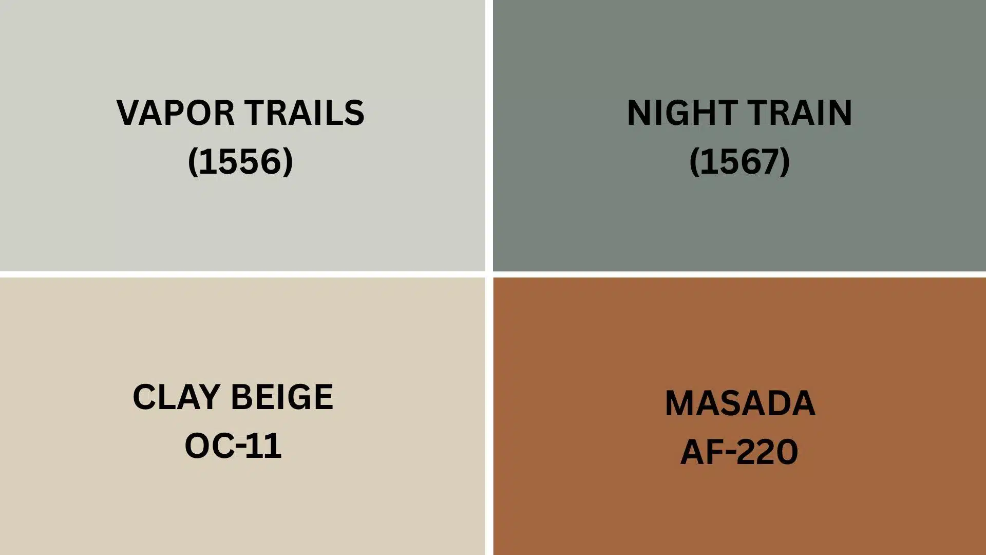
1. Vapor Trails (1556)
A soft, airy light gray with subtle blue undertones that creates a clean contrast against the color without feeling cold or harsh.
It gives your trim a modern look while letting the warmth of this color shine.
2. Night Train (1567)
A deep charcoal with blue-gray undertones that creates a dramatic contrast against the walls.
This bold pairing works in homes where you want architectural details to stand out and create a more formal, refined look.
3. Clay Beige (OC-11)
A neutral light beige that complements the paint color perfectly for a subtle, tone-on-tone look.
The gentle contrast creates a soft, flowing feel from walls to trim that works well in traditional or transitional homes.
4. Masada (AF-220)
A warm taupe with gray undertones that pairs with the paint color to create an earthy, grounded feeling.
This combination feels natural and timeless, perfect for homes with wood accents and natural materials.
Creating Cohesive Color Schemes
This warm color works beautifully as a foundation color for your entire home.
Here are three different ways to build color schemes around this versatile off-white, which will give your spaces a pulled-together look.
| SCHEME | MAIN WALL/AREA | TRIM/ACCENT/CEILINGS | OTHER ROOMS/ACCENTS |
|---|---|---|---|
| Monochromatic | Linen White (912) | Swiss Coffee (OC-45) | |
| Warm | Linen White (912) | Manchester Tan (HC-81), Muslin (OC-12), Shaker Beige (HC-45) | Alexandria Beige (HC-77), |
| Cool | Linen White (912) | Pale Oak (OC-20), Gray Owl (OC-52), Stonington Gray (HC-170) | Wickham Gray (HC-171), Silver Satin (OC-26), Blue Note (2129-30) |
NOTE: All colors are from the benjamin Moore collection. Paint colors may appear different depending on lighting conditions, so it is recommended that you test samples in your space before making final decisions.
Coordinating with Furniture and Decor
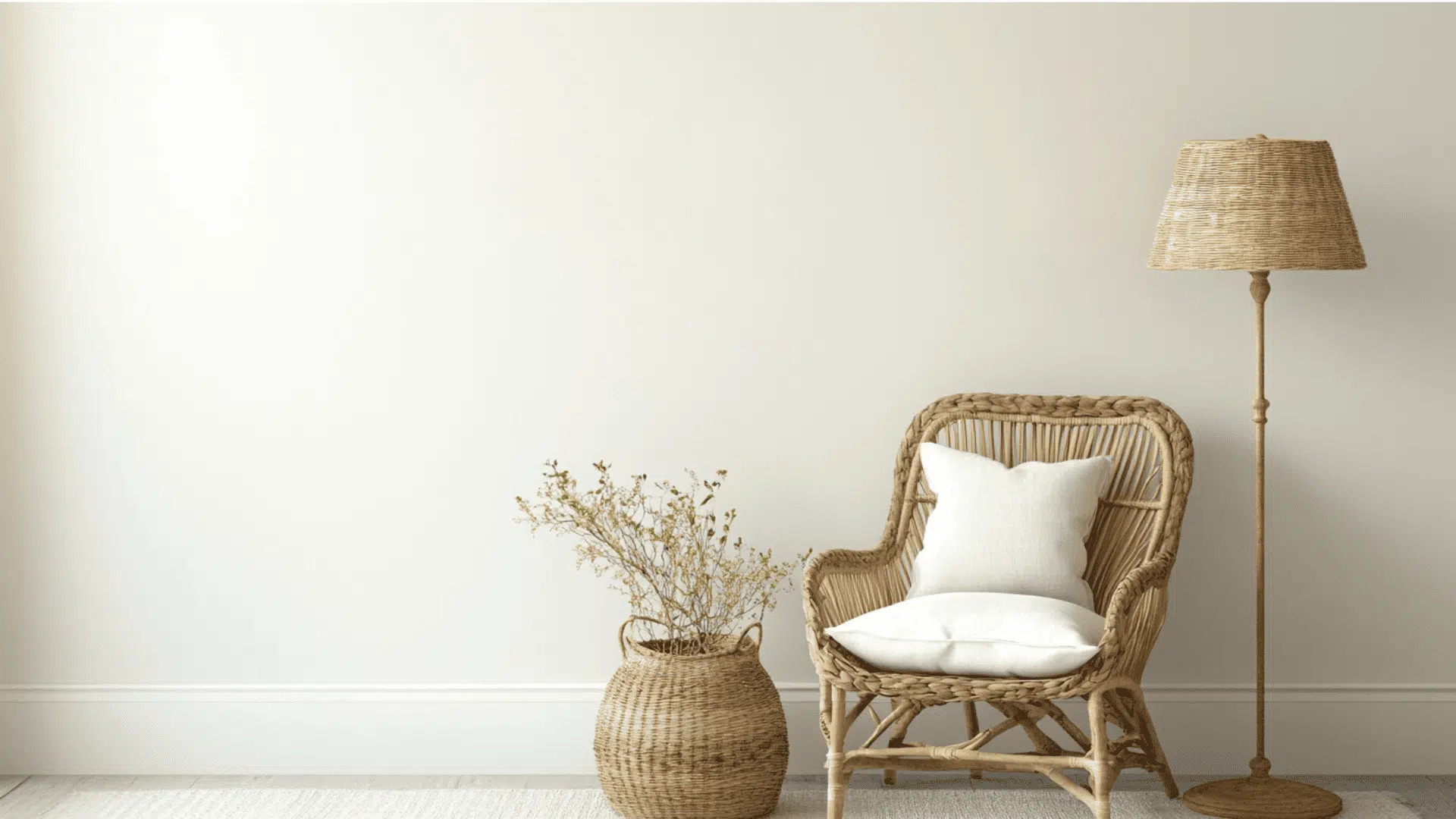
This is a warm, pale off-white that makes your furniture and decorations feel right at home.
It’s like a soft, cozy backdrop that hugs everything in the room with warmth.
1. Wood Tones
It has a special way of making wood furniture look its absolute best. The creamy undertones complement most wood finishes without competing.
Dark woods like mahogany create a classic, traditional look against the walls.
Medium cherry or oak woods blend beautifully with this color, creating spaces that feel established and comfortable.
Light woods paired with this color create a casual, country-inspired feeling that never goes out of style.
2. Metals
It works with almost any metal finish you already have in your home.
The warm undertones make this color extra versatile.
Antique brass and bronze fixtures look like they were made for the walls.
The vintage feeling is perfect.
Nickel and chrome still look clean and fresh, but without the stark contrast of brighter whites.
Oil-rubbed bronze hardware adds a touch of enlightenment that feels timeless and graceful.
3. Decor
It creates the perfect background for both neutral and colorful decorations in your home.
It’s friendly to almost any style.
Blue and green accessories look extra crisp against the warm cream background of Linen White.
Earth tones like terracotta, rust, and olive green create a grounded, natural feeling in the space.
With this warm white, layered textures like velvet pillows, woven throws, and natural fiber rugs feel extra cozy.
Similar Paint Colors: Perfect Alternatives to BM Linen White (912)
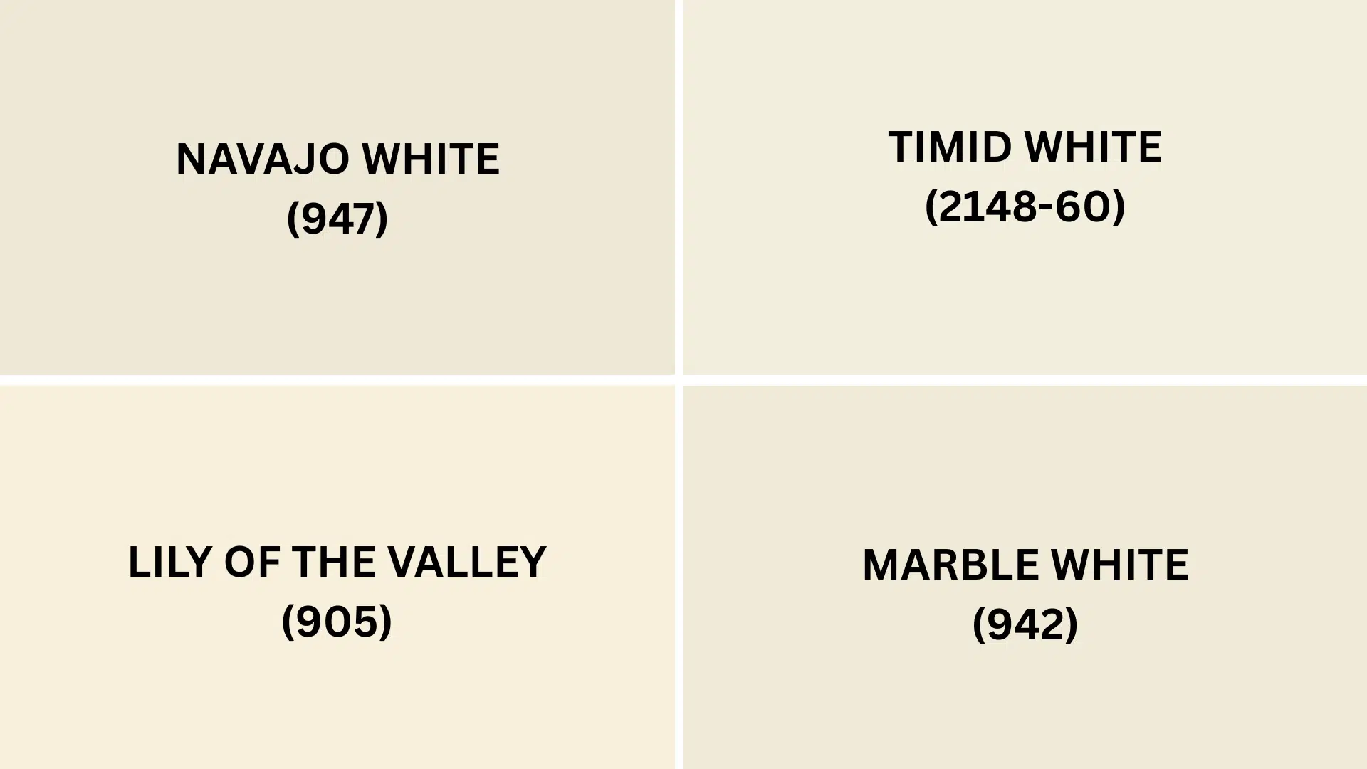
These light-colored whites create warm and inviting spaces. Each has special qualities that might work better for your rooms and lighting conditions.
1. Navajo White (947)
- A classic cream with yellow undertones and an LRV of 79.88
- Slightly warmer than the color, creating rooms that feel extra cozy
- Works beautifully in homes with lots of wood trim and traditional furniture
2. Timid White (2148-60)
- A soft off-white with the faintest hint of pink undertones
- Higher LRV of 85.35 makes rooms feel brighter while still keeping warmth
- Creates a fresh feeling that works well in bedrooms and living spaces
3. Lily of the Valley (905)
- A soft off-white with subtle green undertones for a fresh twist
- Brightness is similar, but it feels cooler and more natural
- Pairs wonderfully with plants and botanical prints in sunny rooms
4. Marble White (942)
- A clean off-white with subtle gray undertones for a more modern feel
- Slightly brighter than the color while still avoiding harsh brightness
- Creates spaces that feel urbane yet comfortable in changing light
Final Thoughts
Benjamin Moore Linen White (912) proves that white walls don’t have to feel cold or boring.
This versatile cream creates rooms that feel both fresh and cozy at the same time.
Its warm undertones make everything from wood furniture to colorful art look amazing.
The soft, creamy color brightens spaces while keeping them feeling welcoming.
You’re painting the whole house or just one room, it easily adapts to different lighting and styles.
It pairs beautifully with both modern and traditional elements, making it perfect for homes that develop over time.
Ready to alter your space with this timeless color?
Grab a sample pot and see how this magical cream changes your room!
Share your before-and-after photos in the comments below!
If you’re interested in more informational color review content, feel free to click here and explore other blogs that you might enjoy.

Alex Guerrero, a graduate with a Fine Arts degree from the Rhode Island School of Design, has been a visionary in the world of color and design for over 15 years. His professional journey began in the heart of the fashion industry in Milan, where he developed an acute sense for color harmonies and trends. Alex joined our team in 2018, offering fresh and innovative perspectives on color utilization in various spaces. Renowned for his ability to blend contemporary trends with timeless elegance. Outside of work, Alex is an accomplished painter and a volunteer art therapist, his artistic talents further enriching his professional insights.