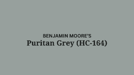
Looking for a refined, versatile, and effortlessly sleek gray shade?
Benjamin Moore’s Puritan Gray might be just the thing.
This refined neutral gray has subtle warm undertones that keep it balanced and inviting, never too stark or flat.
It shifts gently with the light, crisp and clean in sunlit rooms, and warm and cozy in lower light, while always maintaining a sense of timeless refinement.
Great for living rooms, bedrooms, or accent walls, Puritan Gray complements both traditional and contemporary spaces.
It’s a designer favorite for creating rooms that feel grounded, polished, and effortlessly connected to modern living.
Understanding Benjamin Moore Puritan Gray
Benjamin Moore Puritan Gray is a refined, balanced gray with subtle warm undertones.
It feels fresh and clean during the day and cozy at night, offering a refined yet approachable look for any space.
Color Terminology
Let’s look at the technical specifications of Puritan Gray.
These numbers help designers and painters understand exactly what this color looks like.
| PROPERTY | Value |
|---|---|
| LRV | 34.291 |
| Hex Code | #979F9B1 |
| RGB | 151, 159, 155 |
With its balanced LRV, Puritan Gray provides the perfect amount of light reflection, creating spaces that feel both refined and welcoming.
You can use these values when testing room designs for paintings or custom furnishings.
Undertones
- It has soft blue and warm taupe undertones mixed in
- It shifts beautifully during the day, feeling cooler in shadow and warmer in sunlight
- Not just plain gray, but a refined, tasteful tone that feels both classic and modern
The Psychology of Grays: Its Effect on Mood and Perception
The paint shades we pick influence our daily feelings and home atmosphere.
Refined grays: Build calm, refined spaces that feel balanced
Neutral tones: They make rooms feel more graceful and thoughtfully designed
Classic wall: The colors look amazing in both daylight and soft indoor lighting
Benefits: It highlights natural textures, pairs with any décor, creates a timeless foundation
Homeowners love this color because it feels both polished and peaceful.
It’s like having the perfect, graceful backdrop with charm, and it always feels just right!
Why Choose Benjamin Moore’s Puritan Gray?
Benjamin Moore’s Puritan Gray is a refined neutral gray with subtle warm undertones.
1. Versatility
This soft gray shifts beautifully as natural light moves through your rooms during the day.
Cool daylight makes it feel fresh and crisp, while warm evening light brings out its cozier tones.
It feels perfect in living rooms, bedrooms, and even kitchen nooks across a wide range of home styles.
This shade looks amazing in farmhouse, mid-century, traditional, or modern spaces where calmness and grace are valued.
2. Key Features
It strikes the perfect balance between neutrality and adding a personal touch to your space.
With its soft light reflection, it adds depth without feeling too heavy or stark on the walls.
This color remains loved because it feels both refined and easygoing at the same time.
Once it’s on your walls or furniture, it makes wood, metal, and décor accents stand out effortlessly.
3. Durability
In Benjamin Moore’s premium paint lines, this shade holds up well in both busy and decorative areas.
The soft gray tone hides everyday marks better than bright whites or very dark hues.
It retains its lavish color even after cleaning or exposure to sunlight, whether indoors or outside.
That makes it an excellent choice for homes where style and durability both matter every day.
4. Texture Patterns
This color builds a calm, polished look that makes every room feel more complete and intentionally styled.
Its warm-gray undertones create soft depth that flat grays can’t bring to life.
It makes bright white trim and natural wood furniture pop with quiet contrast and visual clarity.
It unifies open layouts with subtle charm, letting your style remain the primary focus.
Room by Room: Benjamin Moore’s Puritan Gray
This is a refined gray paint that makes rooms feel calm, sleek, and welcoming.
It changes gently throughout the day, appearing crisper in daylight and warmer, cozier in the evening glow.
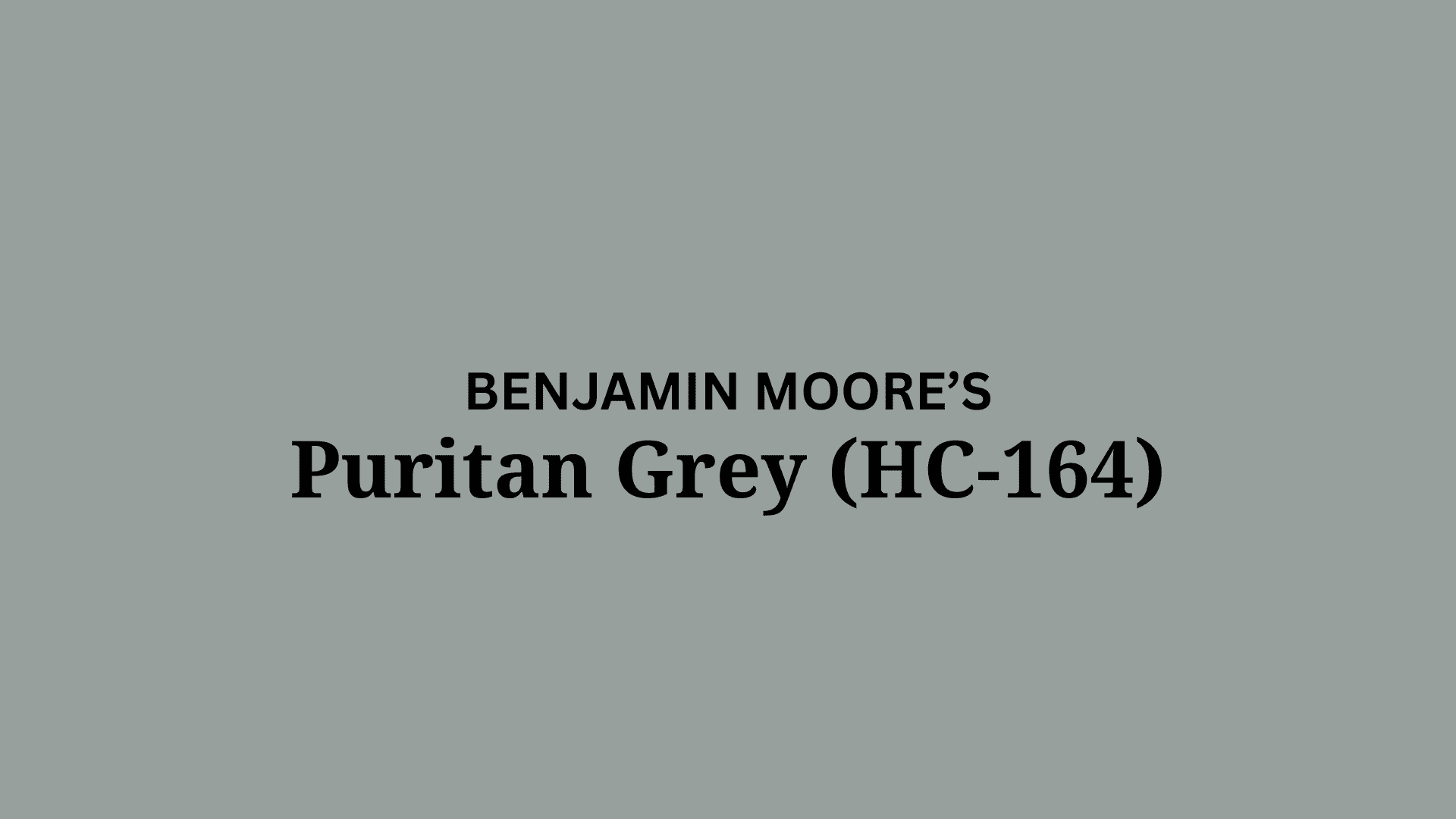
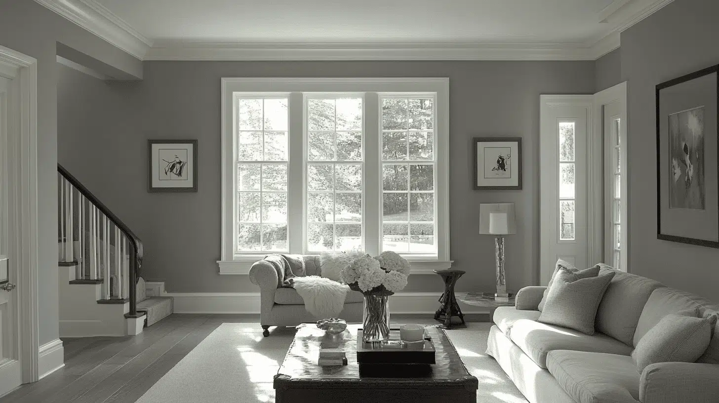
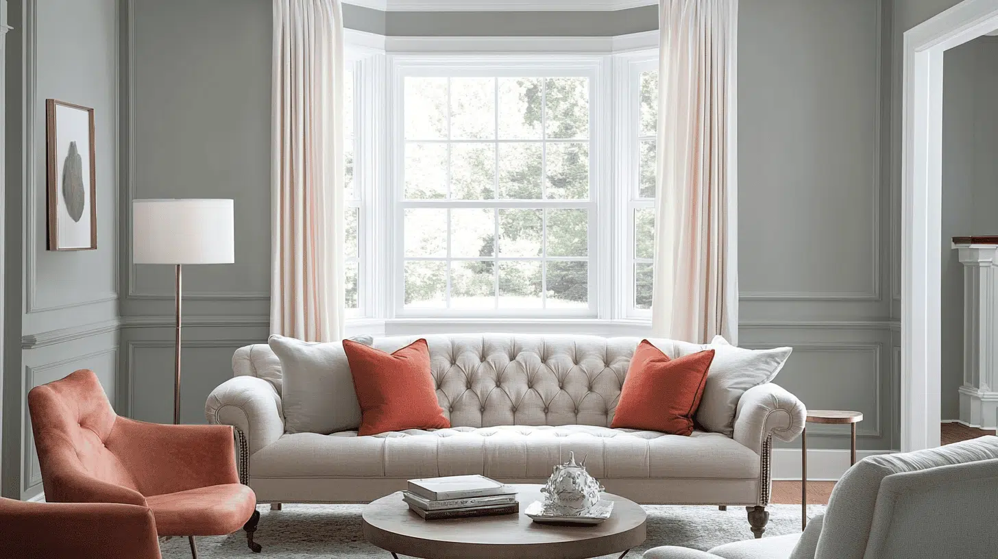
1. Living Spaces and Open Floor Plans
This refined gray builds a calm, grounded atmosphere in living rooms where style and comfort come together.
It fits beautifully in any home style, from classic to contemporary interiors.
- The soft tone brings quiet grace to your space, making it feel polished and thoughtfully designed.
- It looks stunning with colorful furniture, metallic finishes, and natural wood accents.
- Pair it with crisp white trim and stone or brick features for a timeless, cozy look.
This shade helps your room feel complete and welcoming without being too bold or busy.
Your family will love how relaxed and refined the space feels for every gathering.
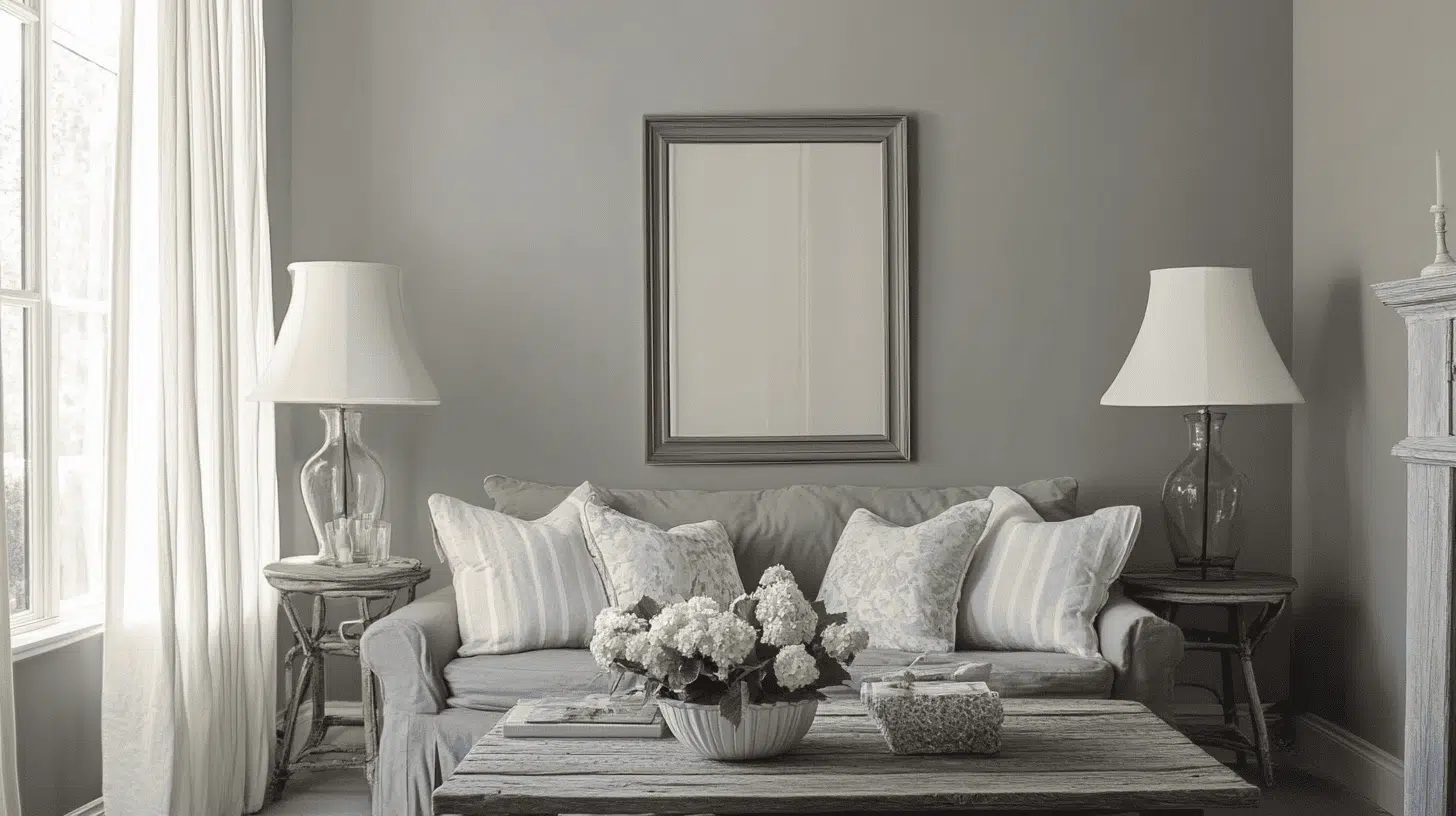
2. Bedrooms and Relaxation Areas
This soft gray creates a calm, peaceful vibe in bedrooms where rest matters most.
It fits beautifully on a feature wall behind the bed, adding depth and quiet refinement.
- The color pairs well with white bedding, cozy blankets, and soft lighting for a soothing look.
- It looks lovely with pale wood furniture, neutral rugs, and silver or brushed gold accents.
- Pair it with light curtains and soft decor for a balanced, restful space.
This shade helps bedrooms feel sleek and flexible without being too dark or dull.
Kids and adults alike will love how cozy and timeless the space feels as it grows with them.
3. Kitchens and High-Traffic Areas
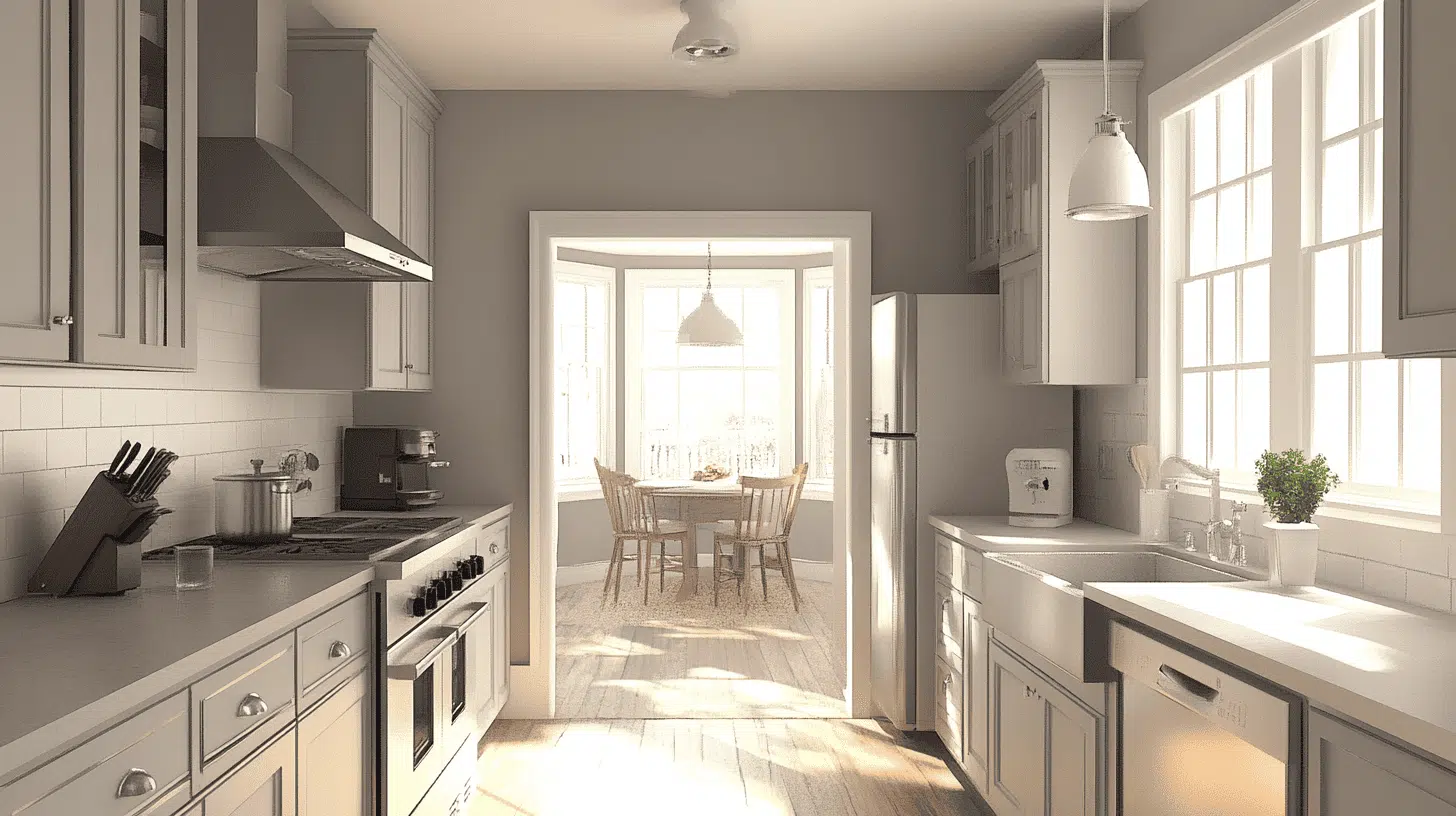
This refined gray stands out in kitchens where both style and durability matter every day.
It fits beautifully on upper cabinets or kitchen islands for a sleek, polished touch.
- The color pairs well with white countertops, brushed nickel hardware, and light tile backsplashes.
- It looks stunning with satin or pearl finishes that balance durability with subtle sheen.
- Use Aura or Regal Select formulas for easy cleaning and long-lasting beauty.
This shade helps kitchens feel grand and functional without being too bold or high-maintenance.
Your guests will appreciate the calm and stylish ambiance of your kitchen every time they walk in.
Color Pairings and Combinations for Puritan Gray (HC-164)
Puritan Gray is a refined neutral with subtle warm undertones, giving it a balanced, refined feel that’s full of character.
It’s perfect for creating sleek, comfortable spaces with a touch of modern culture.
Ready to build a color palette around it? Here are some designer-approved shades that pair beautifully with Benjamin Moore’s Puritan Gray.
Complementary Colors for Puritan Gray
Pairing the right colors with Puritan Gray can enhance its natural refinement and change the feel of your space.
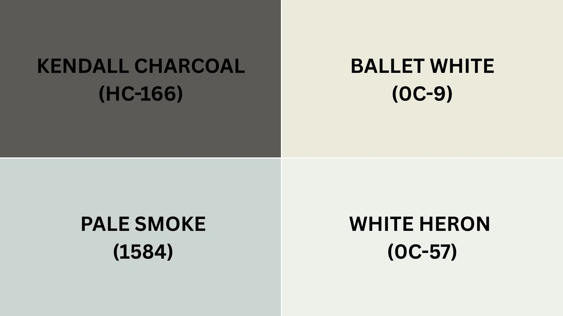
1. Kendall Charcoal (HC-166)
This refined charcoal brings out Puritan Gray’s subtle warmth through striking contrast, creating a designer-worthy palette that feels both modern and timeless.
Use it strategically on kitchen islands, bathroom vanities, or feature walls to anchor the space with dramatic elegance.
2. Ballet White (OC-9)
The gentle undertones in Ballet White echo the soft complexity of Puritan Gray, creating a harmonious flow that feels effortlessly coordinated rather than matchy-matchy.
This pairing works beautifully in bedrooms and living spaces where you want tranquil intricacy without any harsh transitions.
3. Pale Smoke (1584)
This lighter gray creates beautiful tonal layering with Puritan Gray, offering subtle variation that adds visual interest without disrupting the serene atmosphere.
It’s perfect for open floor plans where you want to define different areas while maintaining a cohesive, flowing color story throughout your home.
4. White Heron (OC-57)
The crisp clarity of White Heron provides the perfect clean contrast to highlight Puritan Gray’s nuanced character and prevent the space from feeling too moody.
This classic combination works exceptionally well in kitchens and bathrooms where you want the refined gray to shine against bright, fresh white details.
Each of these pairings highlights a different side of Puritan Gray, from dramatic and bold to soft and serene.
Creating Cohesive Color Schemes
These handpicked Benjamin Moore color palettes, featuring Puritan Gray, eliminate the guesswork in designing a stylish and balanced space.
If your style is warm and cozy or cool and modern, there’s a combo here that will look just right in the morning, noon, or night.
Simply choose the one that suits your vibe and lighting, and let Puritan Gray take care of the rest.
SCHEME | MAIN WALLS / AREA | TRIM / ACCENT / CEILINGS | OTHER ROOMS / ACCENTS |
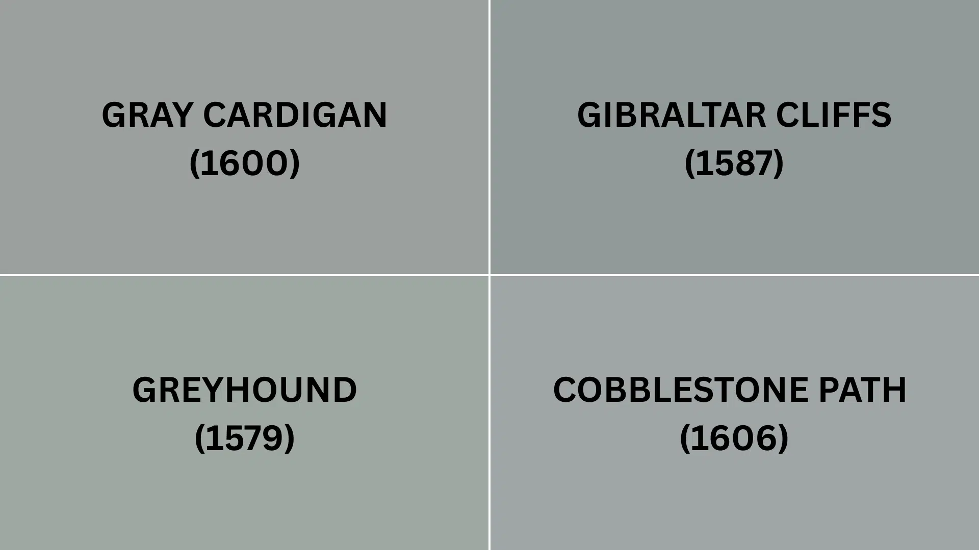
Monochromatic | Puritan Gray | Pale Smoke (1584) | Gray Cardigan (1600) Gibraltar Cliffs (1587) Greyhound (1579) |
Warm | Puritan Gray | Pale Smoke (1584) Cobblestone Path (1606) | |
Cool | Puritan Gray | White Heron (OC-57) Ballet White (OC-9) | Gibraltar Cliffs (1587) Greyhound (1579) |
NOTE: Paint colors from the Benjamin Moore collection may vary under different lighting conditions, so it is recommended that you test samples in your actual space before finalizing your selection.
Coordinating with Furniture and Decor
Benjamin Moore’s Puritan Gray is a refined, balanced neutral with subtle warm undertones that make it feel both refined and easy to live with.
It works beautifully as a calming wall color or a subtle accent, adding timeless style to any space.
Its neutral tone lets furniture and décor shine, creating a look that’s polished yet comfortable.
1. Wood Tones
Light oak or maple offers a soft contrast that brightens the gray, giving the space a fresh, modern feel.
Walnut or cherry enhances Puritan Gray’s warmth, creating a rich, polished look that feels refined and inviting.
Reclaimed or weathered wood brings out its organic, natural side, perfect for farmhouse or rustic-inspired rooms with authentic character.
2. Metals
Brass or gold accents add warmth and luxury, balancing the neutral tone of Puritan Gray for a welcoming, refined look.
Brushed nickel or chrome creates a clean contrast and a modern edge, making it a great choice for kitchens and bathrooms.
Matte black hardware highlights Puritan Gray’s refined side, giving the space a bold, contemporary feel.
3. Decor
Textural elements, such as linen, wool, and woven materials, add depth and enhance Puritan Gray’s natural, calming feel.
Artwork in cream, ivory, or soft colors stands out beautifully against the gray, adding visual interest without overwhelming.
Plants and greenery bring a lively contrast while reinforcing Puritan Gray’s organic, balanced vibe.
Similar Paint Colors: Perfect Alternatives to Puritan Gray
These colors have subtle differences that, depending on your lighting and desired look, might make one work better in your home.
1. Gray Cardigan (1600)
This soft, cozy gray has a gentle warmth that feels like wrapping up in your favorite sweater.
It works beautifully as a main color, whether on an accent wall, trim, or an entire room, offering quiet comfort without being too subdued.
Depending on the light, it shifts between soft dove gray and warm beige, making it a versatile favorite.
Try pairing it with whites, natural wood, or brass for a warm, inviting look.
2. Gibraltar Cliffs (1587)
With its deeper gray tone and hint of blue, Gibraltar Cliffs feels strong and grounded, like standing on a rocky coastline.
It brings complexity and depth, and pairs beautifully with crisp whites, natural textures, and silver accents for a touch of grace.
Perfect for creating drama in dining rooms, studies, or refined feature walls.
3. Greyhound (1579)
Greyhound is a sleek gray that manages to feel both modern and timeless.
It adapts beautifully to different lighting, giving your space a polished, contemporary look.
It pairs effortlessly with bright whites, dark woods, and metallic finishes, making it ideal for living rooms, cabinetry, or full-room applications where refinement without going too dark is desired.
4. Cobblestone Path (1606)
Inspired by weathered stone pathways, this warm gray brings a touch of history and character.
It shifts with the light, adding rich dimension and authenticity to any space.
Pair it with cream, walnut, or antique brass to create a warm, timeless atmosphere.
It’s a great choice for accent walls, built-ins, or cozy spaces, such as libraries and powder rooms.
Final Thoughts
Benjamin Moore’s Puritan Gray brings instant refinement and classiness to any space.
Its refined, balanced neutral is perfect for serene bedrooms, stylish living rooms, or polished dining areas.
It pairs beautifully with wood, metals, and textures, and its depth adds incredible dimension to walls, especially when paired with layered lighting.
Thinking of trying it?
Test a sample in your lighting and see how it shifts throughout the day.
Where would you use Puritan Gray first?
And if you’re craving more color inspiration, check out more Benjamin Moore favorites for your next project.

Alex Guerrero, a graduate with a Fine Arts degree from the Rhode Island School of Design, has been a visionary in the world of color and design for over 15 years. His professional journey began in the heart of the fashion industry in Milan, where he developed an acute sense for color harmonies and trends. Alex joined our team in 2018, offering fresh and innovative perspectives on color utilization in various spaces. Renowned for his ability to blend contemporary trends with timeless elegance. Outside of work, Alex is an accomplished painter and a volunteer art therapist, his artistic talents further enriching his professional insights.