Looking for the perfect white paint that isn’t too stark or boring? Seapearl Benjamin Moore (OC-19) might be just what you need!
This popular off-white paint creates bright, cozy spaces that feel open and welcoming in any home.
With soft beige and pink undertones, Seapearl offers a warm, natural cream-white that’s easy on the eyes.
It’s not just another white – it has personality without being flashy. With a high LRV of 76.43, this versatile color brightens dark rooms and makes small spaces feel bigger.
Seapearl Benjamin Moore works beautifully in any lighting and pairs well with both colorful and neutral furniture.
If you’re painting your living room, bedroom, or kitchen, this timeless off-white provides the perfect backdrop for your favorite furniture and decorations.
Understanding Paint Color Basics
Seapearl is a popular off-white paint color by Benjamin Moore. It creates bright and cozy spaces that feel open and welcoming.
Color Terminology
Let’s look at the technical details of Seapearl Benjamin Moore. These numbers help designers and painters understand exactly what this color looks like.
| PROPERTY | VALUE |
|---|---|
| LRV | 76.43 |
| RGB | 231 / 228 / 217 |
| Hex Value | #E7E4D9 |
The high LRV of 76.43 shows why Seapearl brightens up rooms so well. You can use the RGB and Hex values when matching this color for digital designs or ordering custom items.
Undertones:
- Seapearl has soft beige and pink undertones
- It’s a light, warm off-white that feels cozy
- Not a stark white, but a natural, soft cream-white
Psychology of Off-White Colors
Colors affect how we feel in a room, even light ones like Seapearl. The right off-white can make a big difference in your home.
- Warm off-whites like Seapearl create a feeling of comfort and openness
- Cream-based neutrals: Bring a welcoming, calm feeling to any room
- Natural off-whites: Make spaces feel bigger, brighter, and more inviting
- Benefits: Easy on the eyes, works well in any lighting, and pairs nicely with both colorful and neutral furniture.
Seapearl is a safe choice that won’t go out of style. It works as a perfect backdrop for your favorite furniture and decorations.
Why Choose Benjamin Moore Seapearl (OC-19)?
Benjamin Moore Seapearl is a peaceful off-white that makes rooms feel open and fresh. It’s easy to live with and makes decorating simple because it works with almost any color.
1. Versatility
Benjamin Moore Seapearl (OC-19) looks beautiful in all types of light. Its soft, cream-colored hue stays true in morning sunlight and feels warm and cozy when evening comes.
This light color works well in any room of your house and complements both country-style and modern homes without looking out of place.
2. Key Features
Benjamin Moore Seapearl matches almost everything due to its neutral, cream-white tone. With its high LRV of 76, it brightens up dark rooms and makes small spaces feel bigger. It gives walls a clean look that won’t go out of style, so you won’t need to repaint for many years.
3. Durability
Benjamin Moore Seapearl in Aura or Regal Select finishes holds up well to daily wear and tear, making it ideal for busy kitchens and living rooms.
Its light color hides dust well while keeping its soft, warm glow. When cleaned regularly, this paint stays looking fresh for a long time.
4. Texture Patterns
Benjamin Moore Seapearl creates a smooth, gentle look that makes your walls feel finished. Its warm undertones catch light in a way that softens harsh angles and makes rooms feel more welcoming.
When used throughout your home, it ties different rooms together while letting your furniture and decorations stand out.
Room-by-Room Color Recommendations with Benjamin Moore Seapearl (OC-19)
Seapearl is a friendly off-white that works nicely in every room of your home. It changes slightly throughout the day, staying bright but warm in any lighting.
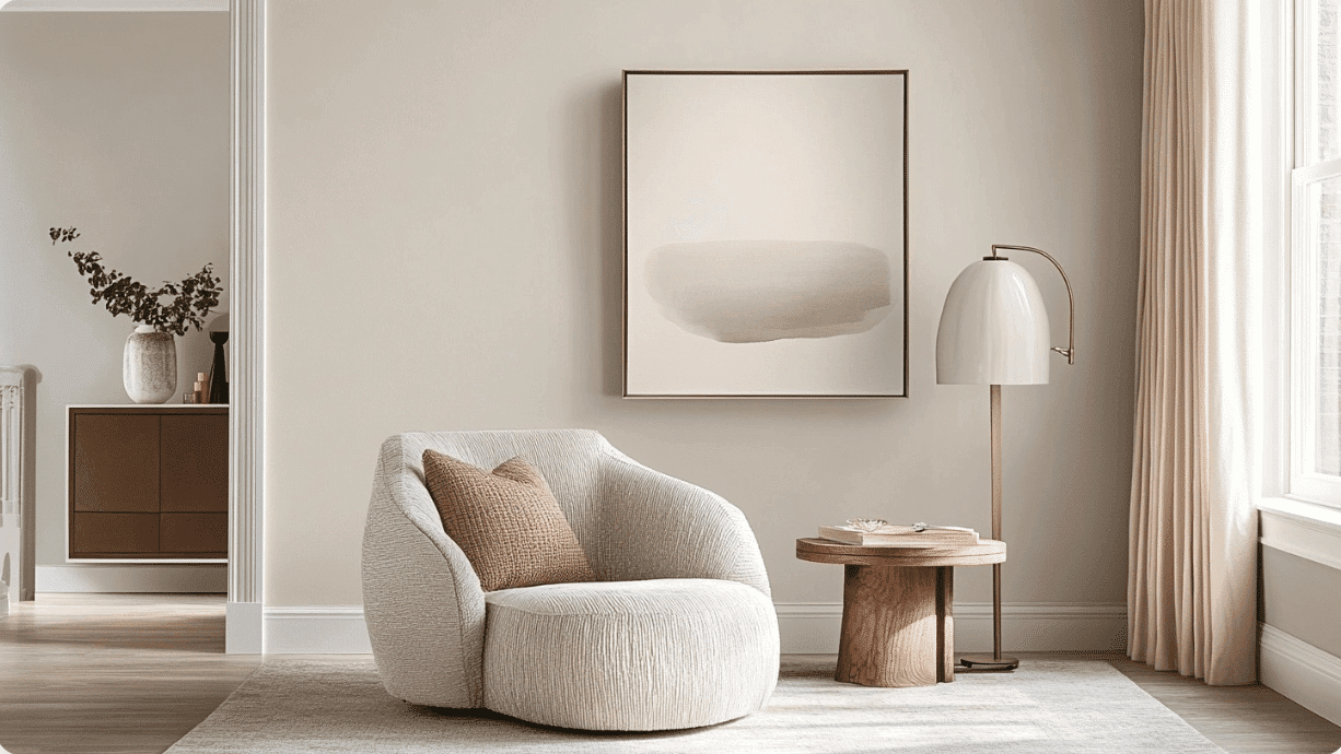
1. Living Spaces and Open Floor Plans
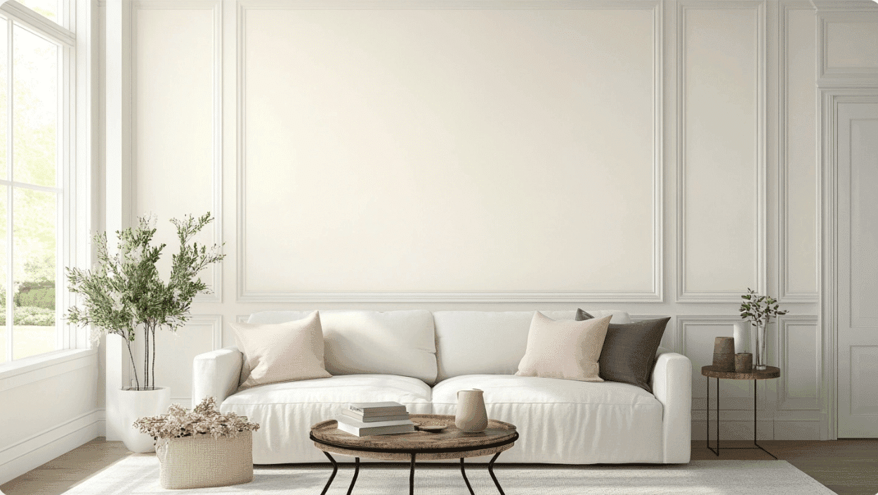
- Seapearl (OC-19) creates a bright, airy foundation in living areas, making rooms feel larger while providing a soft backdrop for furniture and décor.
- The warm undertones bring a welcoming glow to your space, especially in rooms with natural light.
- For open floor plans, use Seapearl throughout to create a cohesive flow, or pair it with slightly darker neutrals, such as Edgecomb Gray (HC-173), for subtle definition.
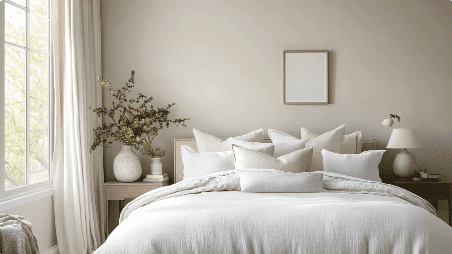
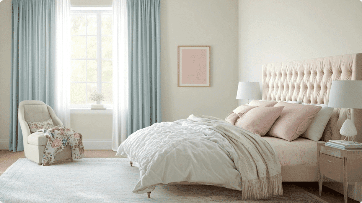
2. Bedrooms and Relaxation Areas
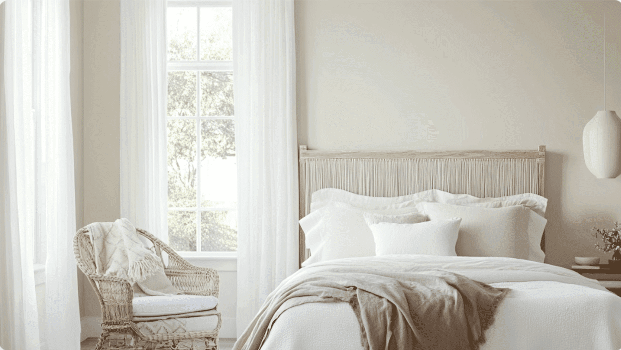
- Seapearl offers a clean and peaceful environment in its bedrooms, promoting a serene atmosphere.
- The higher LRV (76.43) reflects light beautifully, keeping the room bright during the day while maintaining a soft, soothing quality.
- Consider using Seapearl on all walls for a fresh, timeless look, or combine with soft blue-greens like Palladian Blue (HC-144) for a gentle contrast.
3. Kitchens and High-Traffic Zones
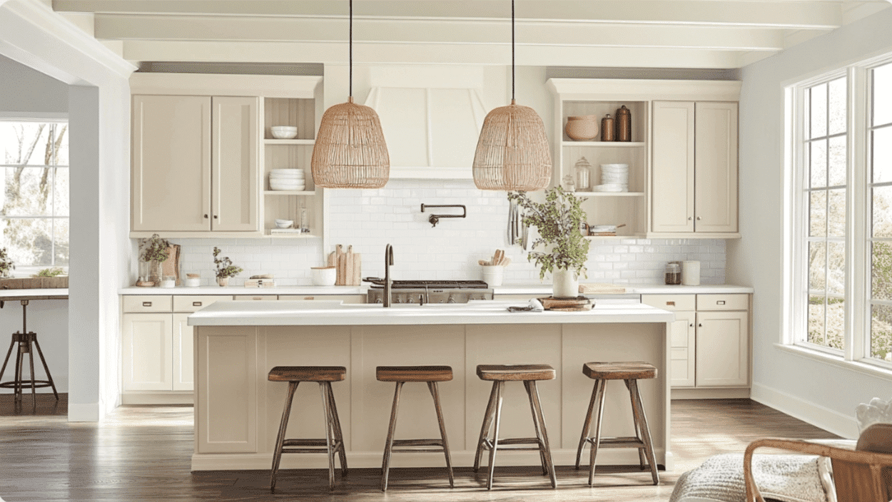
- Seapearl, available in a pearl or semi-gloss finish, is easy to clean and maintains its fresh appearance even in high-traffic areas.
- This versatile off-white pairs beautifully with both light and dark cabinets, allowing your kitchen features to stand out.
- The warm undertones complement most countertop materials, including marble, quartz, wood, and laminate, making them adaptable to various kitchen styles.
4. Bathrooms and Spa-like Retreats
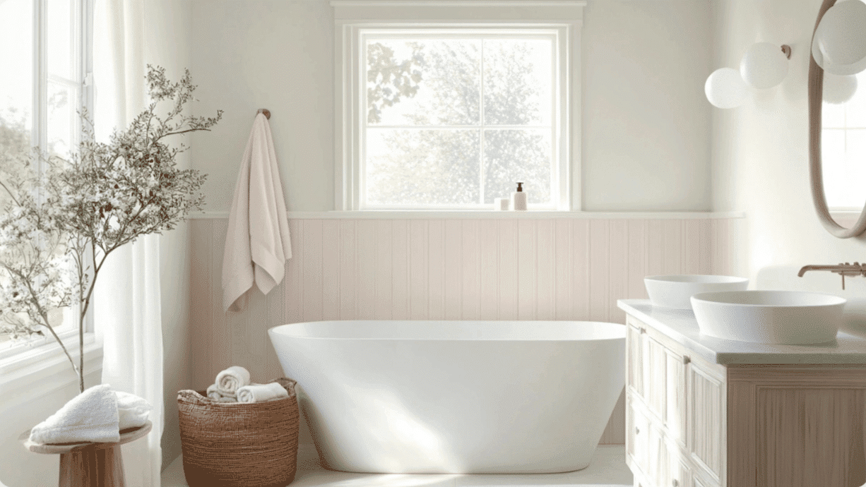
- Seapearl converts bathrooms into bright, clean spaces that feel both refreshing and relaxing.
- The light tone makes small bathrooms feel more spacious while providing a timeless backdrop for fixtures and accessories.
- Pair with chrome or brass fixtures and natural elements like wood or plants to enhance Seapearl’s warm, inviting quality.
Color Pairings and Combinations for Benjamin Moore Seapearl (OC-19)
Seapearl is a gentle off-white with soft beige and pink undertones. Its higher Light Reflectance Value (LRV) of 76.43 makes it a lighter neutral that brightens spaces while adding warmth and subtle dimension.
Here are color pairings and combinations for this shade.
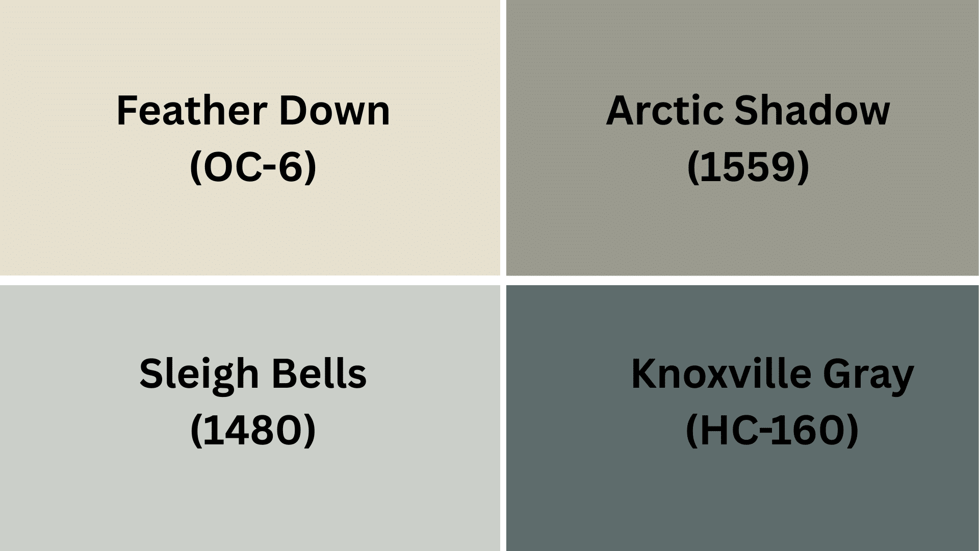
Complementary Trim Colors
Choosing the right trim color can make a significant difference when using Seapearl. These colors work especially well with Seapearl and can highlight its warm undertones.
- Feather Down (OC-6) – A warm, creamy off-white that creates a soft, barely-there contrast with Seapearl, perfect for trim in rooms where you want a cohesive, flowing look
- Arctic Shadows (1559) – A light blue-gray that pairs beautifully with Seapearl to create a fresh, airy feeling while adding subtle color to moldings and doors
- Sleigh Bells (1480) – A light gray with warm undertones that offers gentle definition against Seapearl while maintaining a soft, pleasant transition
- Knoxville Gray (HC-160) – A deeper charcoal with green undertones that creates dramatic contrast when used with Seapearl for trim or accent details in more refined spaces
Each of these colors brings out different qualities in Seapearl. Try a few sample pairings to see which one works best in your lighting and space.
Creating Cohesive Color Schemes
Seapearl works beautifully with many other colors to create a pulled-together look throughout your home. Here are three different color schemes that use Seapearl as the main color.
1. Monochromatic Scheme
- Seapearl (OC-19) for main walls
- White Dove (OC-17) for trim
- Decorator’s White (OC-149) for ceilings
- Edgecomb Gray (HC-173) for accent pieces or adjoining rooms
2. Warm Color Scheme
- Seapearl (OC-19) for main living areas
- Kingsport Gray (HC-86) for dining room
- Feather Down (OC-6) for hallways
- Alexandria Beige (HC-77) for bedrooms
3. Cool Color Scheme
- Seapearl (OC-19) for main walls
- Palladian Blue (HC-144) for bathrooms
- Gray Owl (OC-52) for bedrooms
- Silver Satin (OC-26) for home office
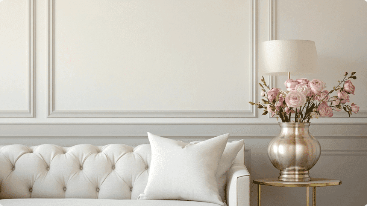
Coordinating with Furniture and Decor
Seapearl is a friendly color that complements almost any furniture and decoration. Its warm, off-white tone creates a perfect backdrop for showcasing your favorite things.
1. Wood Tones
Seapearl looks great with a variety of woods, ranging from dark to light. This makes decorating easy, regardless of the furniture you already have.
Dark woods, such as walnut and espresso, create a cozy contrast against Seapearl’s light walls. Medium woods, such as oak and cherry, add warmth while maintaining a bright atmosphere. Lighter woods, such as maple and pine, blend nicely with Seapearl for a fresh, airy look.
2. Metals
Brass and gold fixtures add a touch of warmth that brings out Seapearl’s soft beige undertones. Matte black hardware creates clean lines and modern contrast against the off-white walls.
Silver, chrome, and brushed nickel keep spaces feeling bright and reflect light beautifully in rooms painted with Seapearl.
3. Decor
Soft fabrics, such as linen, cotton, and wool, look right at home against Seapearl’s gentle background.
Blue, green, and gray accents complement Seapearl perfectly, creating a calm and peaceful atmosphere in any room. Natural items, such as plants, woven baskets, and stone, bring texture and life to the clean canvas that Seapearl provides.
Similar Paint Colors: Perfect Alternative to Seapearl (OC-19)
Both these colors work well in many different rooms. They create bright, open spaces that feel welcoming and clean.
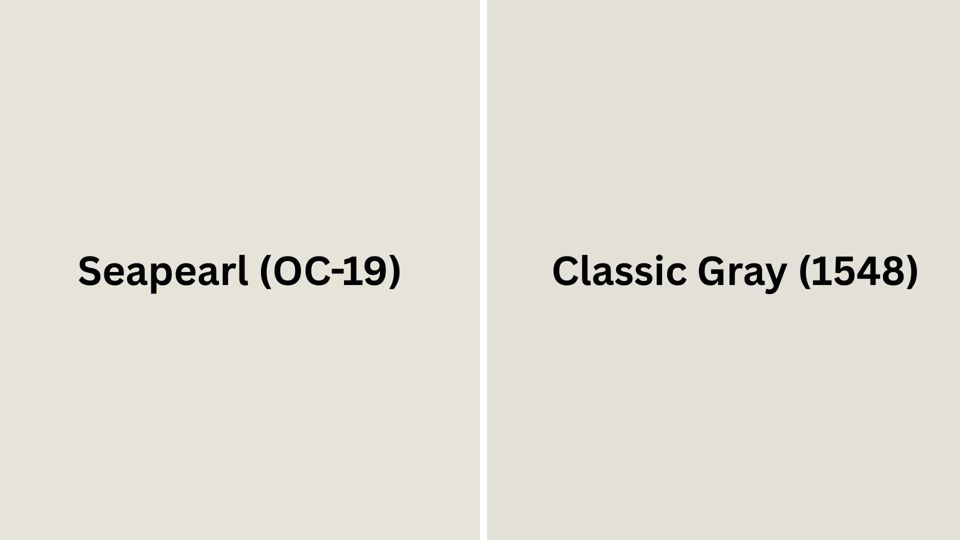
Seapearl (OC-19) vs. Classic Gray (1548)
These two colors look similar but have small differences. You might prefer one over the other depending on the light in your room.
- Warm off-white with soft pink and beige undertones
- A high LRV of 76.43 creates bright, open spaces with excellent light reflection
- Creates a cozy yet fresh atmosphere that feels both clean and inviting
- Slightly cooler than Seapearl with gentle gray undertones instead of pink
- Similar LRV (73.67) maintains brightness while offering a more neutral base
- Creates a more modern feeling that works especially well with contemporary furniture
Final Thoughts
Seapearl Benjamin Moore stands out as a friendly, off-white shade that transforms every room it touches.
Its warm undertones create that “just right” feeling – not too stark, not too yellow, but perfectly balanced.
This versatile paint adapts beautifully to various lighting conditions throughout the day, while maintaining its soft, welcoming glow.
It plays well with various wood tones, metals, and decor styles, making it a designer favorite for good reason.
If you’re repainting one room or your entire home, Seapearl Benjamin Moore offers that rare combination of timeless appeal and everyday practicality.
Why settle for ordinary white when you can have extraordinary? Grab a sample of Seapearl today and see the difference for yourself!
If you’re interested in more informational color review blogs, feel free to click here and explore blogs that you might enjoy.

Alex Guerrero, a graduate with a Fine Arts degree from the Rhode Island School of Design, has been a visionary in the world of color and design for over 15 years. His professional journey began in the heart of the fashion industry in Milan, where he developed an acute sense for color harmonies and trends. Alex joined our team in 2018, offering fresh and innovative perspectives on color utilization in various spaces. Renowned for his ability to blend contemporary trends with timeless elegance. Outside of work, Alex is an accomplished painter and a volunteer art therapist, his artistic talents further enriching his professional insights.