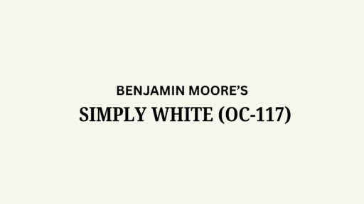
Have you been struggling to find a paint color that feels both bright and cozy? Benjamin Moore Silver Satin (OC-26)(also known 856) might be exactly what you need for your home.
This popular soft gray-white creates bright, graceful spaces that work in any room. With its balanced blend of warm beige and cool gray undertones, Silver Satin offers the best of both worlds.
It brightens rooms wonderfully without feeling cold or harsh. Morning light brings out its clean, crisp qualities, while evening light shows its subtle warmth and depth.
Designers love Silver Satin because it works with almost any color scheme or furniture style. Whether you have modern, traditional, or eclectic taste, this versatile paint color provides the perfect backdrop for showing off your own style.
Understanding Paint Color Basics
Are you looking for a versatile neutral that works in almost any space? Benjamin Moore Silver Satin (OC-26) is a beloved soft gray-white that creates bright, refined spaces that feel both modern and timeless.
Color Terminology
Let’s look at the technical details of Benjamin Moore Silver Satin. These numbers help you understand exactly what this color looks like:
| PROPERTY | VALUE |
|---|---|
| LRV | 74.9 |
| RGB | 228 / 225 / 217 |
| Hex Value | #E4E1D9 |
Silver Satin brightens rooms wonderfully without being too stark or reflective. These color codes help when creating digital designs or matching accessories.
Undertones:
- Silver Satin has subtle gray and warm beige undertones
- It’s a soft, luminous off-white with gray leanings
- Not too cool or warm, offering perfect balance for walls
Psychology of Gray-White Paint
Color affects how we feel in a room, even soft neutrals like Silver Satin. The right shade makes a big difference in your home.
- Balanced gray-whites like Silver Satin create a feeling of refinement and calm.
- Soft neutral colors: Add a contemporary, clean feeling that’s still warm and inviting
- Versatile off-whites: Make spaces feel cohesive, organized, and gracefully designed
- Benefits: Creates a perfect backdrop for artwork, works in any lighting, and pairs beautifully with both bold colors and subtle neutrals
Silver Satin is a designer favorite because it provides lasting appeal that won’t quickly go out of style. It creates the perfect neutral canvas for showing off your style.
Why Choose Benjamin Moore Silver Satin (OC-26)?
Benjamin Moore Silver Satin is a urbane gray-white that creates bright, lavish spaces. Its perfect balance makes decorating simple because it harmonizes with virtually any color scheme or style.
1. Versatility
Benjamin Moore Silver Satin (OC-26) adapts beautifully to changing light throughout the day. Morning light highlights its bright, clean qualities, while evening light brings out its subtle warmth and depth.
This balanced neutral works equally well in living rooms, bedrooms, kitchens, and bathrooms. It complements both traditional and contemporary design elements without feeling too cold or sterile.
2. Key Features
Benjamin Moore Silver Satin creates a refined neutral backdrop with its perfect balance of gray and warm undertones.
It brightens spaces without being too stark or reflective, making rooms feel more spacious and airy.
This timeless shade provides lasting appeal that won’t quickly go out of style, saving you from frequent repainting as trends change.
3. Durability
Benjamin Moore Silver Satin in premium finishes resists daily wear and cleaning, making it ideal for hallways and family rooms where walls often need maintenance.
Its soft gray-white tone hides minor smudges and imperfections while maintaining a clean appearance. Regular maintenance keeps this paint looking fresh and vibrant for years.
4. Texture Effects
Benjamin Moore Silver Satin creates a refined, luminous look on walls. Its subtle gray undertones add depth and interest without overwhelming the space or feeling too cold.
When used consistently throughout connected areas, it creates excellent flow while allowing structural details and decorative elements to become focal points in your home.
Room-by-Room Color Recommendations with Benjamin Moore Silver Satin (OC-26)
Silver Satin is a versatile gray-white that adapts beautifully throughout your home. It shifts subtly from morning to evening, maintaining its bright yet cultured appearance in various lighting conditions.
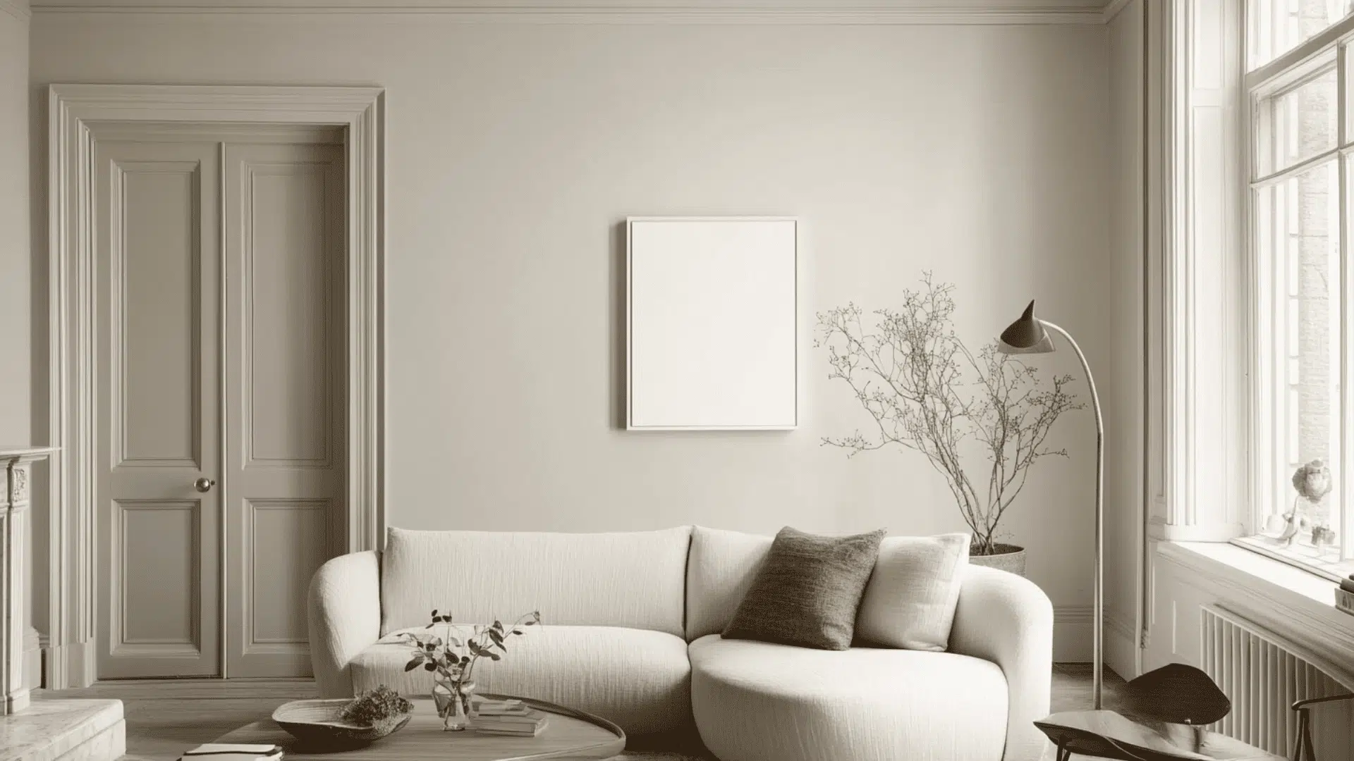
1. Living Spaces and Open Floor Plans
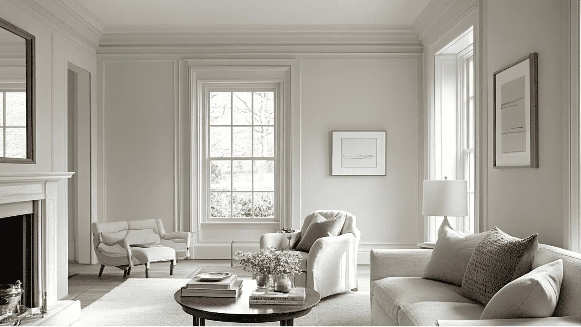
- Silver Satin (OC-26) creates a luminous, graceful foundation in living areas. It makes spaces feel open and airy while providing the perfect neutral backdrop for artwork and colorful accessories.
- The balanced gray undertones add subtle refinement to your walls without feeling cold, creating a refined atmosphere that works with both traditional and modern furniture styles.
- For open-concept homes, Silver Satin provides excellent continuity. Pair it with slightly deeper grays like Revere Pewter (HC-172) for structural definition between connected spaces.
2. Bedrooms and Relaxation Areas
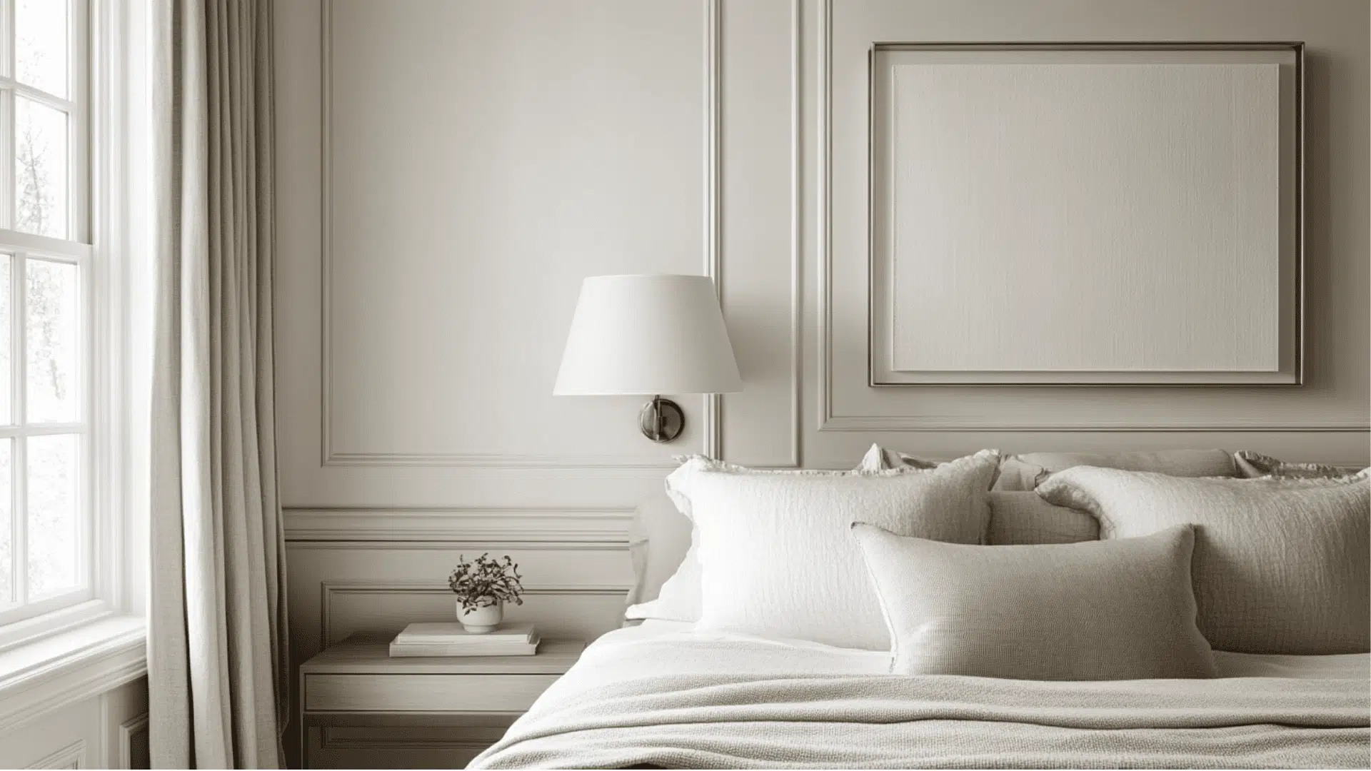
- Silver Satin offers a clean, serene environment in bedrooms, promoting restful sleep with its soft, balanced tone that feels both fresh and calming throughout day and night.
- The bright reflective quality keeps bedrooms feeling light and spacious during daytime hours while creating a gentle, soothing atmosphere when evening comes.
- Try Silver Satin with crisp white bedding for a hotel-inspired look, or pair it with soft blues and greens like Quiet Moments (1563) for a tranquil retreat effect.
3. Kitchens and High-Traffic Zones
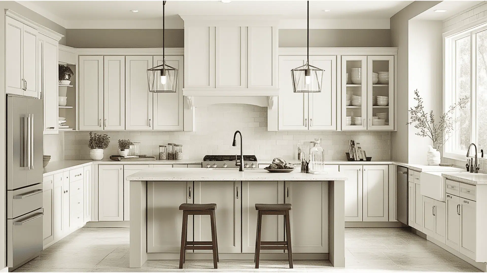
- Silver Satin in a pearl or semi-gloss finish resists stains and cleans easily, maintaining its refined appearance even in busy kitchen and hallway areas.
- This versatile neutral complements both white and wood-toned cabinets, stainless steel appliances, and most countertop materials for a cohesive, designer-approved kitchen look.
- The balanced undertones work beautifully with marble, subway tile, and natural stone elements, creating a timeless kitchen aesthetic that won’t quickly feel dated.
4. Bathrooms and Spa-like Retreats
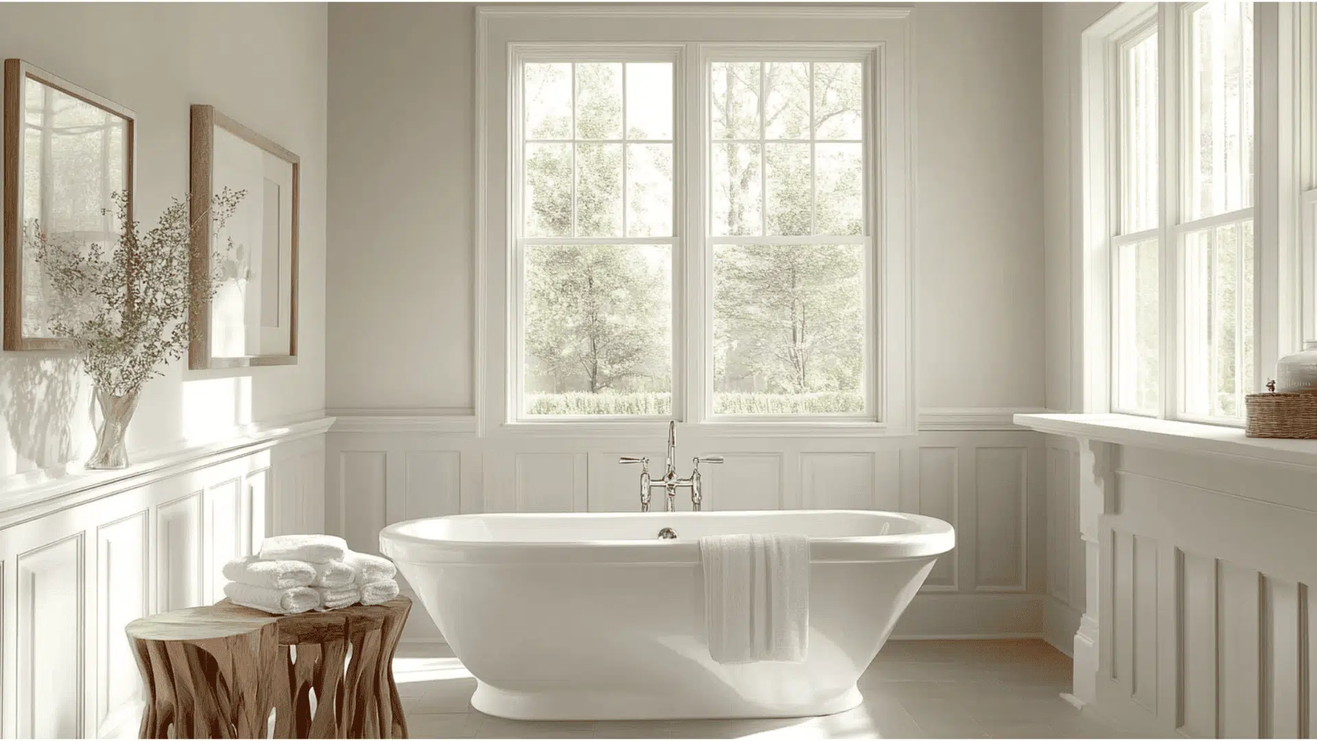
- Silver Satin transforms bathrooms into bright, refined spaces that feel both clean and relaxing, creating a perfect backdrop for fixtures and accessories of any finish.
- The soft gray-white tone makes small bathrooms appear larger while adding just enough color to prevent the clinical feeling that comes with pure white walls.
- Pair with chrome fixtures and white tile for a contemporary look, or add natural wood accents and greenery to bring warmth to Silver Satin’s subtle coolness.
Color Pairings and Combinations for Benjamin Moore Silver Satin (OC-26)
Silver Satin is a versatile gray-white with subtle warm undertones. Its bright reflective quality creates a luminous neutral that adds refinement to spaces while maintaining a light, airy feeling. Here are color pairings and combinations for this popular shade.
Complementary Trim Colors
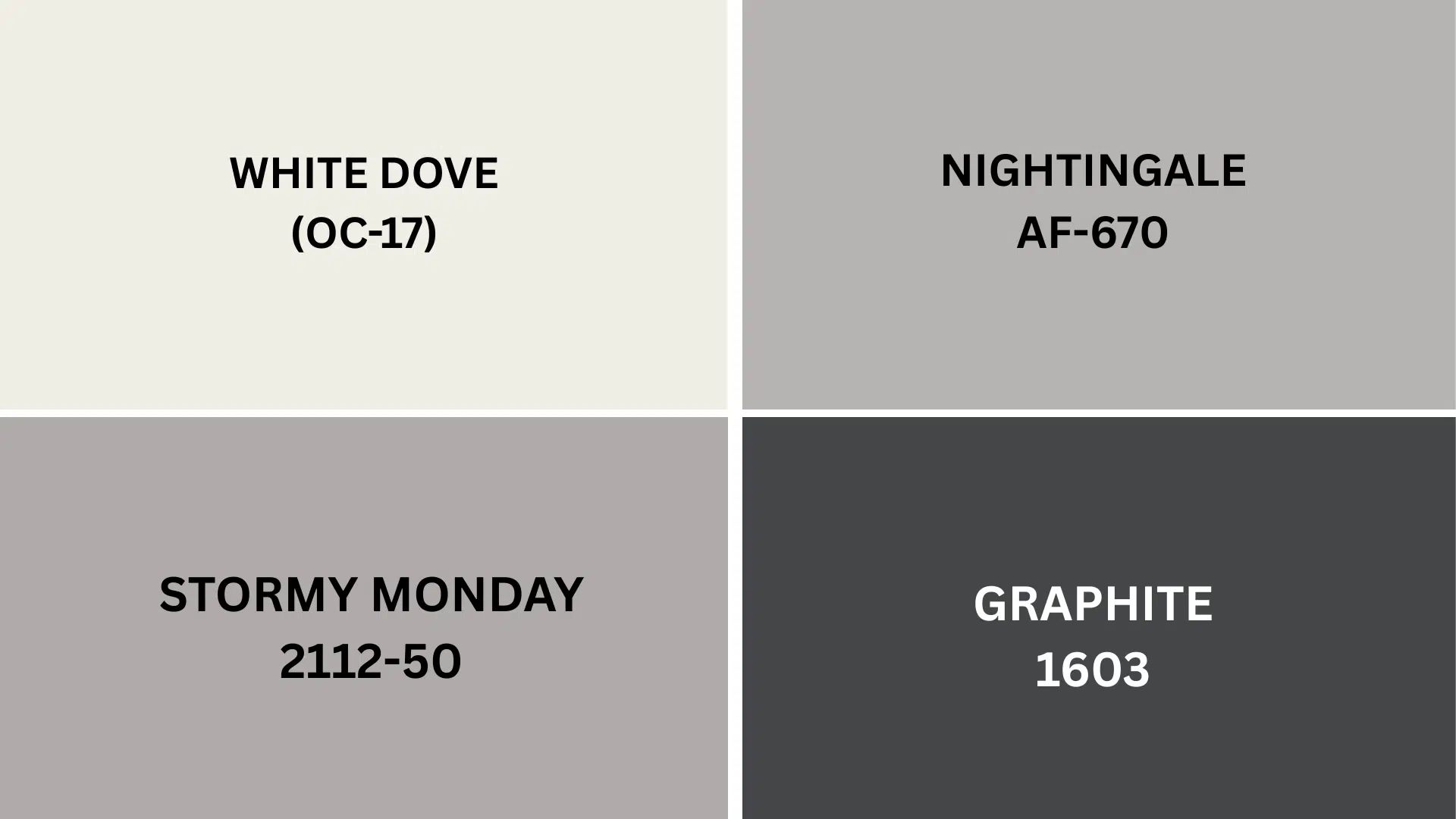
Choosing the right trim color can enhance Silver Satin’s classy appearance and highlight its subtle undertones. These specific colors create striking combinations with Silver Satin:
- White Dove (OC-17) – A soft, warm white that creates gentle contrast with Silver Satin, perfect for trim, moldings, and doors when you want a refined, cohesive look throughout your space
- Nightingale (AF-670) – A mid-tone taupe with subtle lavender undertones that pairs beautifully with Silver Satin, creating a classy, grounded feeling when used on trim or adjacent walls
- Stormy Monday (2112-50) – A complex blue-gray that offers a cooler counterpoint to Silver Satin’s warmth, creating sleek definition for structural details while maintaining a harmonious flow
- Graphite (1603) – A deep charcoal that creates dramatic contrast against Silver Satin, making a bold statement when used for doors, window frames, or furniture in contemporary spaces
Each of these colors brings out different aspects of Silver Satin. Consider testing several combinations to see which creates your desired effect in your specific lighting conditions.
Creating Cohesive Color Schemes
Silver Satin works harmoniously with many other colors to create a coordinated look throughout your home. Here are three different color schemes that use Silver Satin as the main color.
1. Monochromatic Scheme
- Silver Satin (OC-26) for main walls
- White Dove (OC-17) for trim
- Chantilly Lace (OC-65) for ceilings
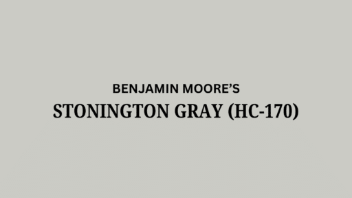
- Stonington Gray (HC-170) for accent pieces or adjoining rooms
2. Warm Color Scheme
- Silver Satin (OC-26) for main living areas
- Nightingale (AF-670) for the dining room
- Balboa Mist (OC-27) for hallways
- Smokey Taupe (983) for bedrooms
3. Cool Color Scheme
- Silver Satin (OC-26) for main walls
- Breath of Fresh Air (806) for bathrooms
- Stormy Monday (2112-50) for bedrooms
- Silver Satin (OC-26) for home office
Coordinating with Furniture and Decor
Silver Satin is a versatile neutral that enhances nearly any furniture and decorative style. Its balanced gray-white tone creates a graceful foundation for showcasing your items.
1. Wood Tones
Silver Satin pairs beautifully with various wood finishes, offering flexibility with your existing furniture pieces. Dark woods like walnut and mahogany create an urbane contrast against Silver Satin, highlighting their rich tones.
Medium woods such as oak and cherry add warmth while maintaining a clean aesthetic. Light woods, including ash and birch, maintain a contemporary, fresh feeling when paired with this luminous gray-white.
2. Metals
Brushed nickel and chrome hardware complement Silver Satin’s cool undertones, creating a sleek, contemporary look in kitchens and bathrooms.
Matte black fixtures offer crisp definition against Silver Satin walls, creating a modern aesthetic that feels both current and timeless.
Brass and gold accents add unexpected warmth that beautifully balances Silver Satin’s subtle coolness, creating refined interest in any room.
3. Decor
Textured accessories like woven throws, natural fiber rugs, and linen curtains add visual interest by creating dimension against Silver Satin’s smooth surface.
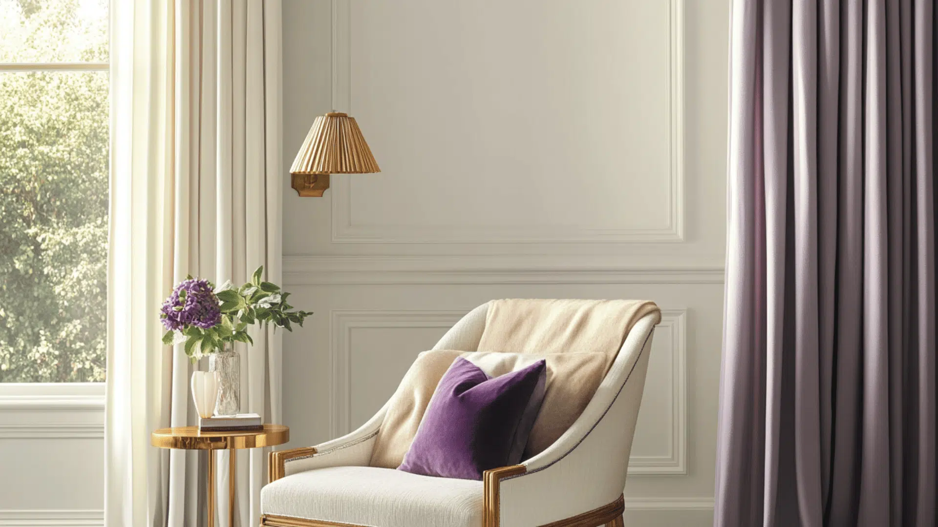
Blue, purple, and cool green accents enhance Silver Satin’s subtle undertones, creating a fresh, cohesive color story throughout your space.
Natural elements, including stone, leather, and indoor plants, introduce organic contrast that perfectly balances Silver Satin’s refined, tailored appearance.
Similar Paint Colors: Perfect Alternative to Silver Satin (OC-26)
These colors work well in many different rooms throughout your home. They create bright, urbane spaces that feel both modern and timeless.
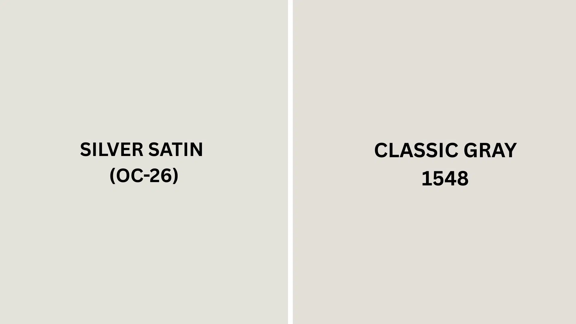
Silver Satin (OC-26) vs. Classic Gray (1548)
These two colors look similar but have subtle differences. Depending on your lighting and design preferences, you might prefer one over the other.
Silver Satin (OC-26)
- Luminous gray-white with balanced warm undertones
- Creates bright, classy spaces with excellent light reflection
- Offers a refined, classy atmosphere that feels fresh yet warm
Classic Gray (1548)
- Slightly warmer than Silver Satin with more noticeable beige undertones
- Creates a similar brightness while providing a softer, more relaxed feeling
- Works exceptionally well in spaces where you want a hint more warmth without going too creamy
Final Thoughts
Benjamin Moore Silver Satin (OC-26) combines the best of both worlds – brightness and warmth in one versatile shade. Its balanced gray-white tone pairs beautifully with everything from White Dove trim to Stormy Monday accents.
This adaptable color complements any wood tone or metal finish while creating urbane spaces that won’t go out of style.
Silver Satin brightens rooms while adding just enough interest to avoid feeling sterile. Whether for living rooms, bedrooms, or kitchens, this designer favorite delivers timeless appeal.
Ready to create a space that feels both fresh and inviting? Comment below and tell us which room you’d paint with Silver Satin first!
If you’re interested in more informational color review blogs, feel free to click here and explore other blogs that you might enjoy.

Alex Guerrero, a graduate with a Fine Arts degree from the Rhode Island School of Design, has been a visionary in the world of color and design for over 15 years. His professional journey began in the heart of the fashion industry in Milan, where he developed an acute sense for color harmonies and trends. Alex joined our team in 2018, offering fresh and innovative perspectives on color utilization in various spaces. Renowned for his ability to blend contemporary trends with timeless elegance. Outside of work, Alex is an accomplished painter and a volunteer art therapist, his artistic talents further enriching his professional insights.