

Want a paint color that brings instant sunshine and warmth to your home?
Benjamin Moore Stuart Gold might be exactly what you’re looking for.
This beloved warm yellow paint converts any room into a positive, welcoming space that feels like permanent sunshine.
If you’re painting your kitchen, living room, or bedroom, this versatile shade works beautifully anywhere.
It’s not too bold or overwhelming, but it’s definitely more interesting than plain white walls.
This changes throughout the day as light moves through your rooms, looking fresh in morning sunshine and cozy in evening light.
This classic color works with both traditional and modern home styles, making it perfect for any homeowner wanting happiness.
Understanding Benjamin Moore’s Stuart Gold
This paint color is a treasured warm yellow paint color by Benjamin Moore.
It changes plain walls into bright, sunny spaces that brighten up almost any home.
You can find this color as HC-10 or 202 in Benjamin Moore’s Historic Collection.
Color Terminology
Let’s analyze what makes this shade so wonderful.
These details help you understand the real personality of this lovely paint.
| PROPERTY | VALUE |
|---|---|
| LRV | 47.74 |
| RGB | 222 / 184 / 102 |
| Hex Value | #DEB866 |
With its higher LRV, it makes rooms feel bright and airy while adding warm color.
Save these numbers when you’re shopping for coordinating pillows and accessories online.
Undertones:
- It has gentle cream and soft peach undertones mixed in
- It shifts beautifully during the day, appearing lighter at noon and richer at sunset
- Not just plain yellow, but a layered, golden tone that feels inviting
Psychology of Yellow Colors
The paint shades we pick really influence our daily feelings and home atmosphere.
- Sunny yellows Build happy, energizing spaces for families
- Golden tones make rooms feel warmer and more welcoming to everyone
- Cheerful wall colors look amazing in both natural daylight and evening lamps
- Benefits: Brighten dark corners, match most furniture styles, bring sunshine indoors
Homeowners love this color because it feels both classic and joyful.
It’s like having the perfect sunny backdrop with charm, and it always feels just good!
Why Choose Benjamin Moore Stuart Gold (HC-10)?
Benjamin Moore Stuart Gold is a warm, sunny yellow that makes rooms feel pleasant and welcoming. It works great with different home styles and brings a touch of sunshine indoors.
1. Versatility
This bright gold shifts beautifully as natural light moves through your rooms during the day.
Bright morning sunshine makes it look fresh and lively, while soft evening light shows warmer, cozier tones.
It feels perfect in kitchens, dining rooms, and even cozy reading nooks throughout your house.
This shade looks amazing in cottage homes, farmhouse spaces, or anywhere you want that happy, uplifting feeling.
2. Key Features
It hits the perfect balance between being bright and staying easy to live with every day.
With its good light reflection, it brings warmth without making spaces feel too bold or overwhelming.
This color stays loved because it feels both joyful and classic at the same time.
Once it’s on your walls, it makes your artwork and furniture look more thoughtful and well-chosen than before.
3. Durability
In Benjamin Moore’s high-quality paint lines, this shade handles busy family life and everyday use really well.
The warm yellow tone covers up small scuffs better than pure white or very pale colors do.
It holds its gorgeous golden color even through regular cleaning, keeping your walls looking fresh for many years.
This makes it ideal for active households and rooms that get used constantly every day.
4. Texture Patterns
This color builds a warm, sunny atmosphere that immediately makes rooms feel more complete and polished.
Its subtle cream undertones create visual richness that simple flat colors just cannot achieve or deliver.
It makes bright white baseboards and ceiling trim pop with clean, crisp contrast that looks really nice.
It ties different spaces together with warmth while keeping your personal decorating style as the main focus.
Room Color Recommendations: Benjamin Moore Stuart Gold
This is a warm yellow paint that makes rooms feel delighted and bright.
It changes gently throughout the day, appearing lighter in morning sun and richer in evening light.
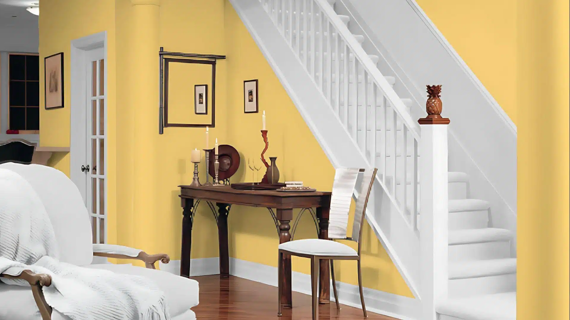
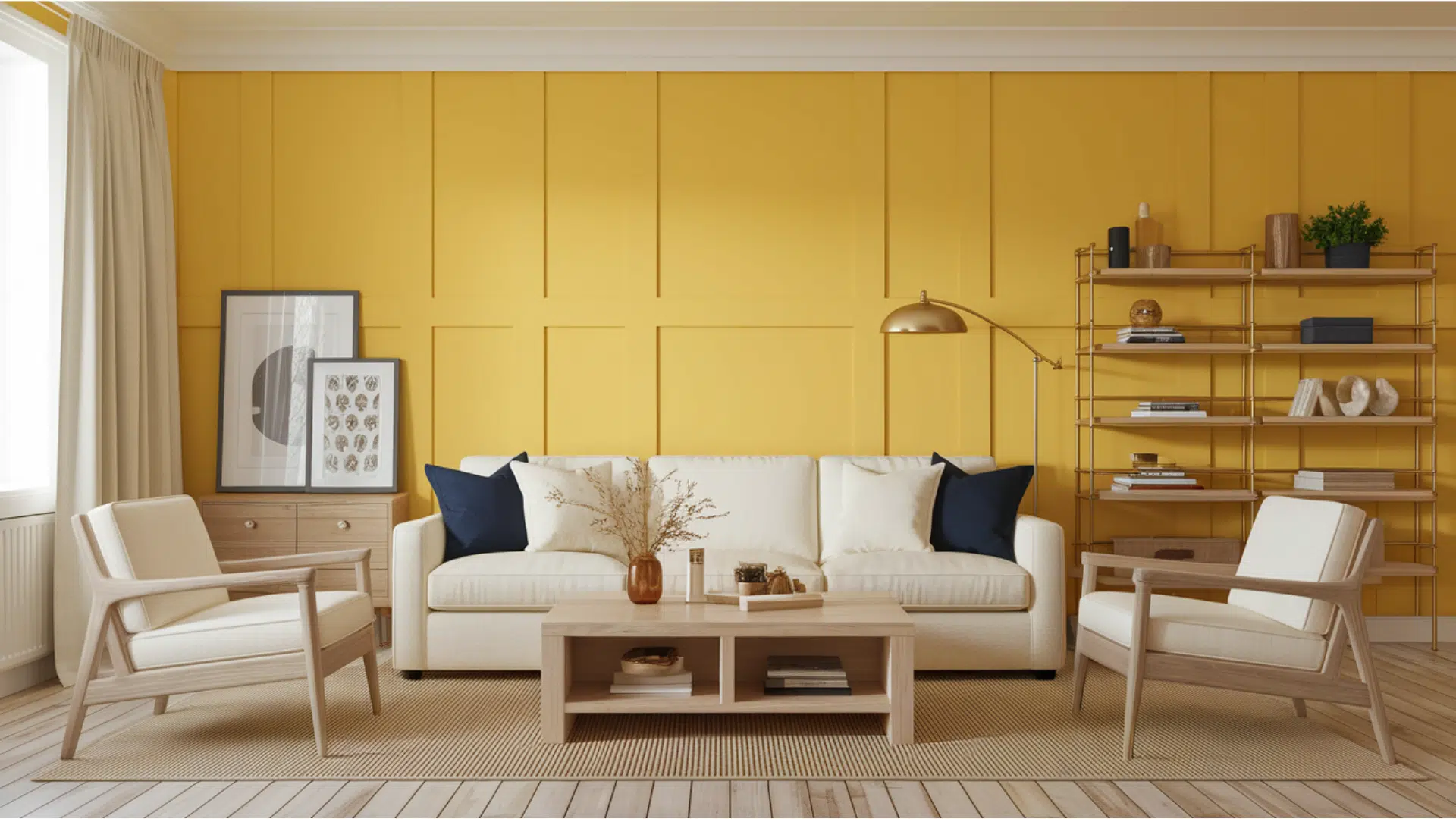
1. Living Spaces and Family Rooms
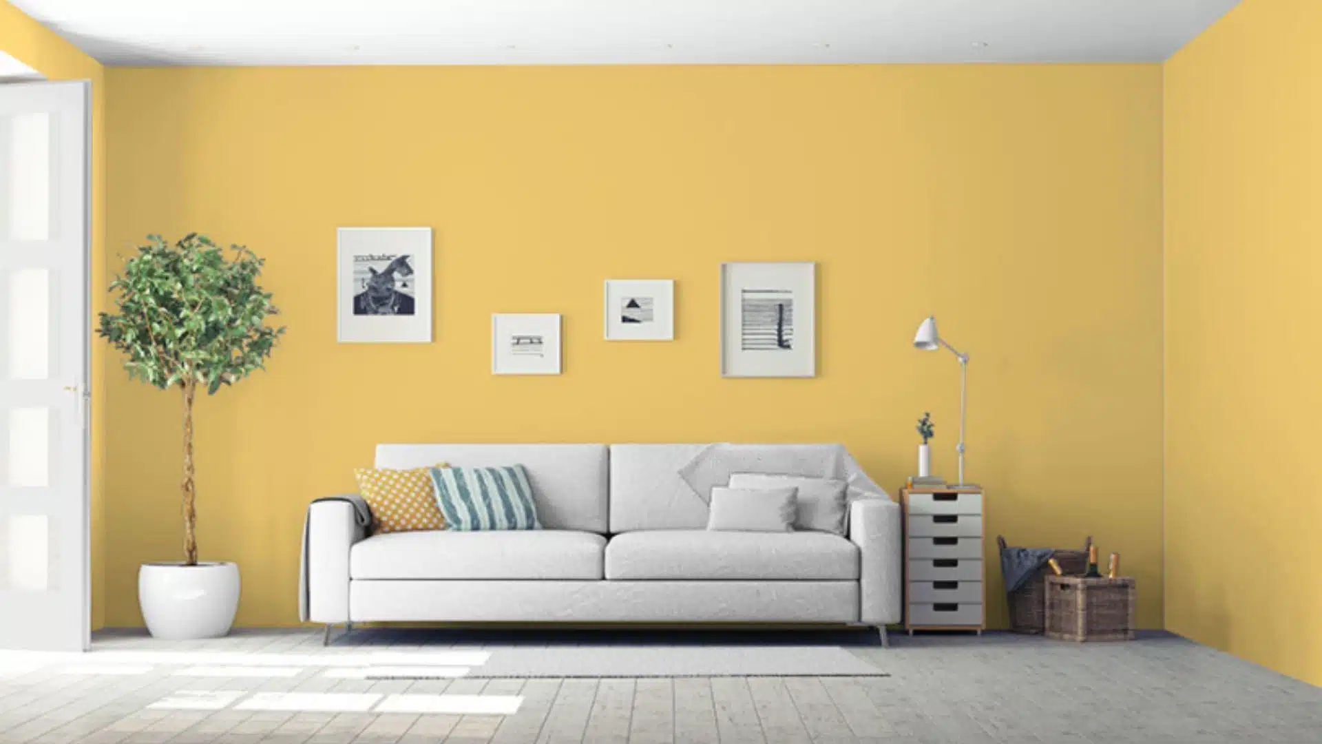
This sunny gold builds a happy atmosphere in living rooms where families gather every evening.
It fits beautifully in any home style, from traditional to contemporary designs.
- The bright color brings sunshine inside, making your space feel energetic and welcoming.
- It looks stunning with navy blue sofas, white furniture, and dark wood coffee tables.
- Pair it with crisp white trim and honey oak floors for a bright, classic look.
This shade helps your room feel finished without being too flashy or overwhelming.
Your family will love how warm and inviting the space feels for game nights.
2. Bathrooms and Spa-Like Retreats
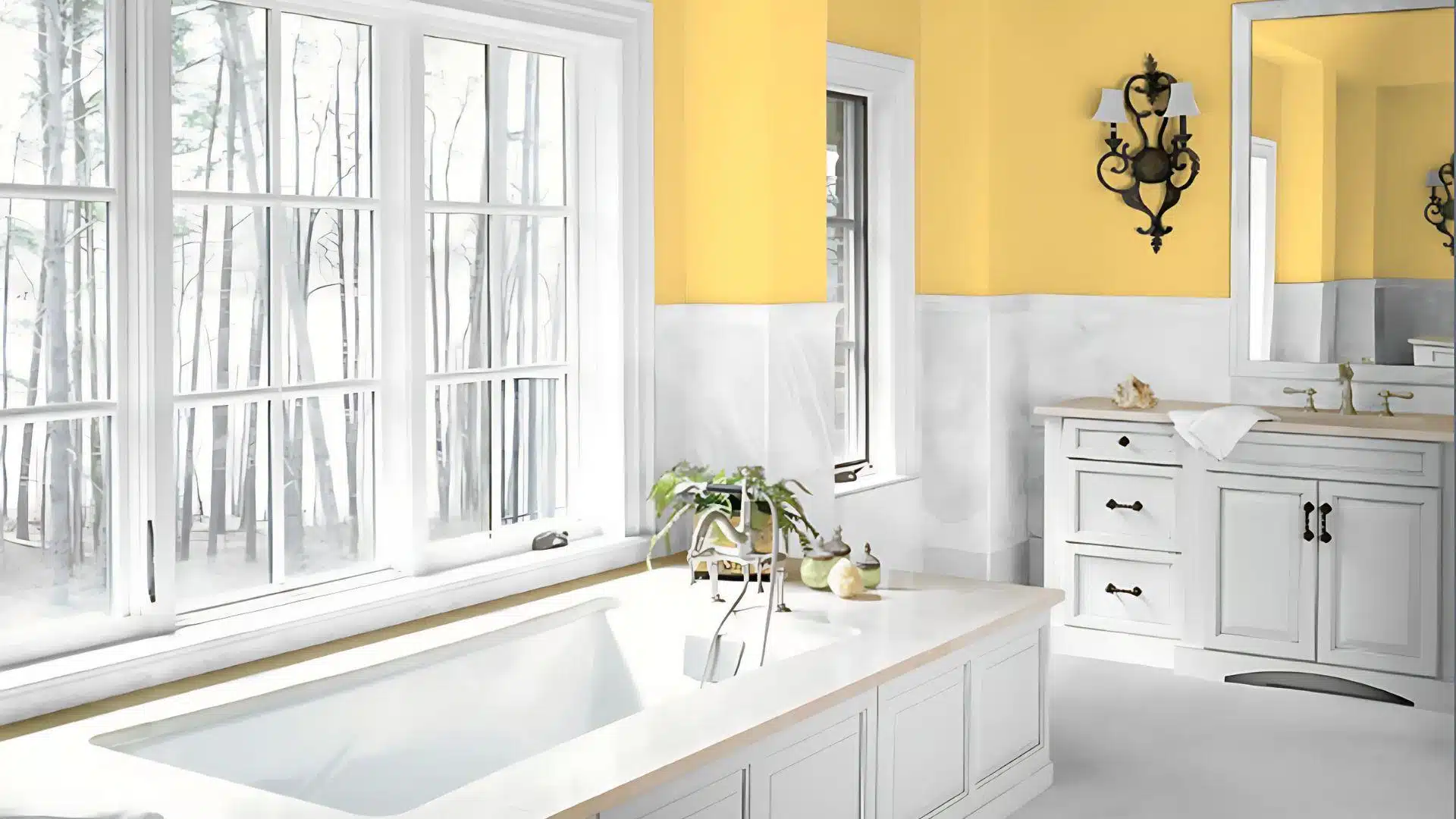
This makes bathrooms feel bright but not harsh like some bold yellows can be.
This tone works wonderfully with many different fixtures and tile choices.
- It creates a beautiful contrast with white subway tiles while adding warmth and personality throughout.
- The golden tone pairs flawlessly with both chrome fixtures and brushed brass bathroom hardware.
- In powder rooms, this color sets a positive mood that makes guests feel happy.
Morning routines feel more pleasant against this soft, sunny background color every single day.
Your bathroom becomes an uplifting retreat, where you start each day with a smile.
3. Bedrooms and Relaxation Spaces
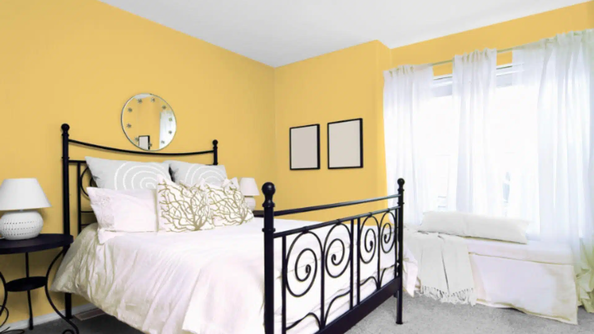
This color alters bedrooms into cozy sanctuaries that help you wake up feeling refreshed.
The warm yellow tones naturally encourage positive feelings and better mornings.
- It creates a comfortable sleeping environment that isn’t too bright or distracting for rest.
- This gold works with white, cream, or soft blue bedding for a hotel-like feel.
- The color makes large bedrooms feel more intimate while adding cheer to smaller spaces.
You’ll wake up happier in a room painted with this naturally uplifting, sunny wall color.
Your bedroom will become a personal haven where you love to start and end your days.
Color Pairings and Combinations for Stuart Gold (HC-10)
This is a warm yellow that brings sunshine inside your home.
Its warm tone creates happy, welcoming spaces that feel bright and energetic.
Here are the best partner colors for this versatile gold shade.
Complementary Trim Colors
The perfect trim color can totally change how this yellow looks in your space.
These carefully chosen colors make stunning combinations with this soft, sunny tone.
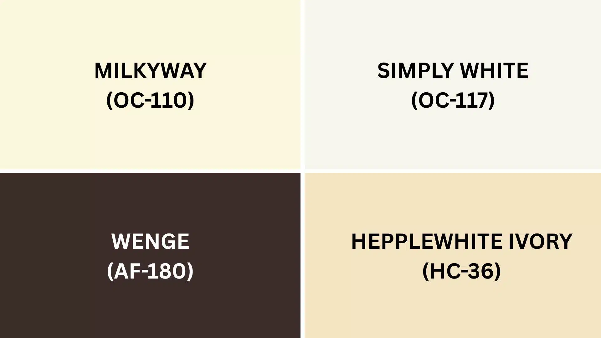
1. Milkyway (OC-110)
A soft, creamy white that adds gentle brightness against the golden walls without harsh contrast.
This combo performs beautifully in bedrooms, living rooms, and hallways where you want a cozy, comfortable feeling throughout your home.
2. Hepplewhite Ivory (HC-36)
A warm, antique white that creates graceful balance when used with the gold on trim or cabinets.
This combination builds a classic, timeless look perfect for dining rooms and formal spaces that need refinement.
3. Simply White (OC-117)
A clean, pure white that makes the yellow walls pop with fresh, crisp contrast that feels modern.
This pairing works great in kitchens, bathrooms, and offices where you want a bright, energetic feeling.
4. Wenge (AF-180)
A deep, rich brown that creates striking drama when used as accent walls or built-in furniture pieces.
This combo adds enlightenment to living rooms or studies without feeling too overwhelming or heavy.
Creating Cohesive Color Schemes
This pairs with many other colors to create a flowing feel throughout your home.
This warm yellow shade can be the ideal starting point for different decorating styles.
Here are three color schemes that use this lovely gold as the main color.
| SCHEME | MAIN WALLS / AREAS | TRIM / ACCENT / CEILINGS | OTHER ROOMS / ACCENTS |
|---|---|---|---|
| Monochromatic | Stuart Gold (HC-10) | Milkyway (OC-110) | Hepplewhite Ivory (HC-36), Simply White (OC-117) |
| Warm | Stuart Gold (HC-10) | Wenge (AF-180) | Sedona Clay (2174-30), Middleton Pink (HC-62) |
| Cool | Stuart Gold (HC-10) | Nimbus Gray (2131-50) | Stone Harbor (2111-50), Gray Cashmere (2138-60) |
NOTE: All colors shown are Benjamin Moore paints. Colors will look different in your home’s lighting, so always test samples first before buying full gallons.
Coordinating with Furniture and Decor
This joyful yellow creates a perfect backdrop that makes your furniture and accessories look more vibrant.
Its warm gold tone works like a neutral but with more character than plain white or beige.
1. Wood Tones
Light woods like maple and pine look fresh and clean against these sunny gold walls throughout your home.
The pale wood brightens spaces while the yellow walls add that cozy, welcoming warmth you want.
Medium woods such as cherry and oak feel naturally harmonious with this color, like they were meant to be together.
Dark woods, including walnut and espresso, create a beautiful, rich contrast when paired with this versatile golden shade.
2. Metals
Warm metals like brass and copper shine against the gold background, creating a graceful look in your space.
Cool metals like chrome and stainless steel offer crisp contrast that feels contemporary without being too harsh.
Oil-rubbed bronze and aged brass highlight the sunny qualities in the paint, making rooms feel inviting and comfortable.
These metal finishes work perfectly in kitchens, bathrooms, and light fixtures throughout your entire house.
3. Decor
White, cream, and soft gray fabrics create a gentle palette that lets the sunny wall color shine.
Deep navy and forest green make stunning accent colors that stand out against the golden walls.
Natural materials like woven rugs, wooden bowls, and cotton throws enhance the warm quality of this bright color.
Your artwork and family photos look amazing against this backdrop, making everything appear more thoughtful and well-curated.
Alternative Paints Similar to Benjamin Moore Stuart Gold
These colors are great choices if you love this warm yellow but want to explore other options.
They all have that positive, sunny quality, and each has its own special character.
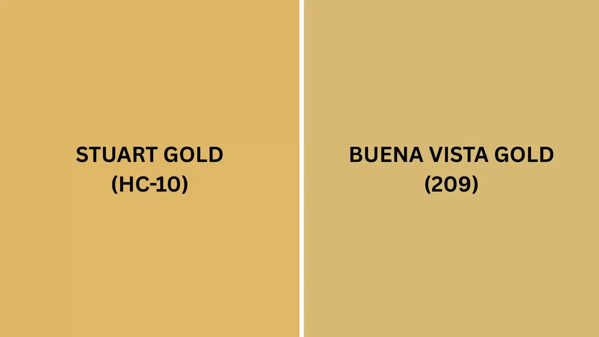
Stuart Gold vs. Buena Vista Gold
Both colors bring sunny warmth to your home, but they each have their own personality.
This feels lighter and more cheerful, while Buena Vista Gold is deeper and more dramatic.
Stuart Gold (HC-10)
This shade is perfect for people who want yellow that’s bright but not overwhelming.
It brings sunshine to rooms without feeling too bold or in-your-face.
- Offers a lighter, brighter yellow that feels fresh and airy in any room.
- Creates bright spaces that feel welcoming without being too bold or overwhelming for daily living.
- Looks beautiful with white trim, light woods, and casual furniture pieces throughout your home.
It works best in rooms with lots of natural light.
It’s great for families who want something happy but still easy to live with.
Buena Vista Gold (209)
This color has more depth and richness, making it feel more grown-up and refined.
It’s perfect for people who want yellow with more drama and personality.
- Provides a deeper, richer yellow that feels more dramatic and urbane than Stuart Gold.
- Creates inviting spaces that feel warm and cozy without being too bright or harsh.
- Performs beautifully with dark woods, cream trim, and traditional furniture pieces throughout your home.
Buena Vista Gold is ideal for formal spaces or rooms where you want more impact.
It’s the bolder choice that still feels warm and welcoming.
Final Thoughts
Benjamin Moore Stuart Gold proves that the right paint color can truly brighten your home and mood every day.
This warm, joyful yellow creates spaces where families love to gather and guests feel instantly welcome.
From sunny kitchens to cozy bedrooms, this versatile color looks beautiful in any room you choose.
It hides everyday wear better than lighter colors while keeping rooms feeling bright and happy.
Plus, it pairs well with everything from white trim to bold accent colors.
If you’re updating one room or painting your entire house, it delivers perfect cheerfulness and refinement.
It’s the kind of color that makes people smile when they walk into your home.
Ready to bring golden sunshine to your walls?
Comment below your thoughts about this amazing color!
If you’re interested in more color review content, feel free to click here and explore other blogs that you might enjoy.

Alex Guerrero, a graduate with a Fine Arts degree from the Rhode Island School of Design, has been a visionary in the world of color and design for over 15 years. His professional journey began in the heart of the fashion industry in Milan, where he developed an acute sense for color harmonies and trends. Alex joined our team in 2018, offering fresh and innovative perspectives on color utilization in various spaces. Renowned for his ability to blend contemporary trends with timeless elegance. Outside of work, Alex is an accomplished painter and a volunteer art therapist, his artistic talents further enriching his professional insights.