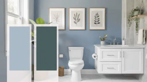
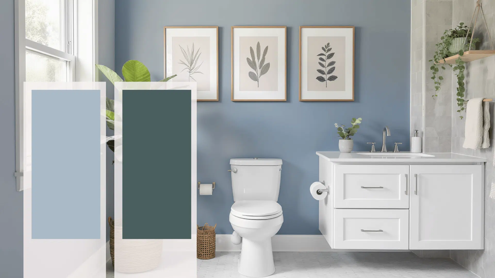
Bathroom walls see more moisture, light shifts, and daily wear than nearly any other room in your home.
The color you choose doesn’t just set a mood; it affects how the space handles humidity, how clean it looks between scrubs, and whether that cramped powder room feels breathable or boxed in.
Most people pick shades that either wash out under artificial light or trap the room in darkness.
The difference between a bathroom that works and one that fights you often comes down to understanding which tones actually perform.
Finding the best paint color for bathroom walls means looking past trends and focusing on what holds up when steam fogs the mirror and morning light cuts through at odd angles.
Paint Finish to Use with Bathroom Colors
Choosing the right paint finish matters as much as the color in a bathroom setting. Moisture, steam, and frequent cleaning can quickly affect how walls look and perform over time.
The finishes below balance durability, appearance, and maintenance, making them suitable for most bathroom layouts and usage levels:
| Paint finish | Moisture handling | Cleaning ease | Best use case |
|---|---|---|---|
| Satin | Handles humidity well | Easy to wipe | Main bathroom walls |
| Semi-gloss | High moisture resistance | Very easy | High-splash zones |
| Eggshell | Moderate resistance | Light cleaning | Low-humidity bathrooms |
| Gloss | Very high resistance | Very easy | Trim and doors |
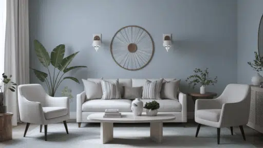
Best Paint Color for Bathroom
The right wall color determines whether your bathroom feels cramped or breathable, clinical or comfortable; small decisions that reshape daily routines.
These shades work with fixtures, maintaining their appearance despite steam, splashes, and changing natural light:
1. Soft White
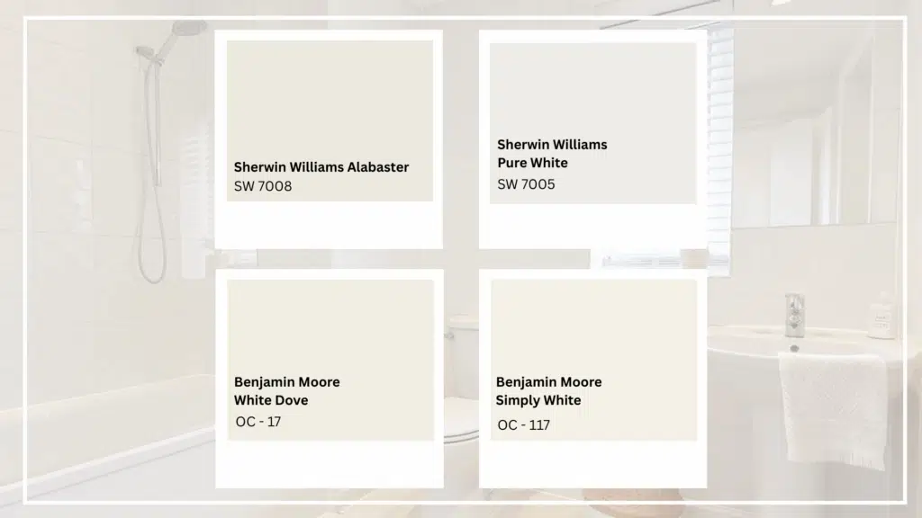
Soft white remains one of the most reliable choices for bathroom walls because it keeps the space bright, balanced, and visually clean.
This shade reflects light well, helping smaller bathrooms feel open without appearing stark.
It also provides a neutral backdrop that supports different tile styles, metal finishes, and layout changes over time.
Best furniture and fixture pairings: White or light wood vanities, marble or ceramic tiles, chrome or brushed nickel fixtures, and minimal open shelving
Paint color options
- Sherwin-Williams:Alabaster, Pure White
- Benjamin Moore:White Dove, Simply White
- Behr: Swiss Coffee
2. Warm Off-White
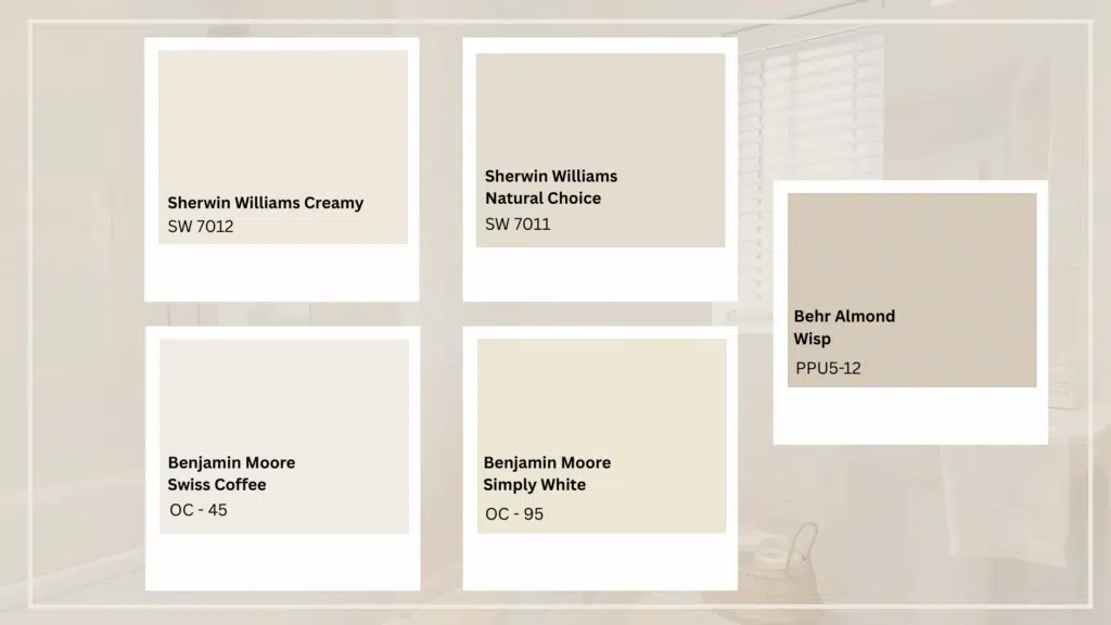
Warm off-white adds gentle depth while keeping the bathroom light and inviting.
Unlike cooler whites, this shade reduces harsh contrast and works well in spaces with artificial lighting.
It helps create a balanced backdrop that feels comfortable rather than clinical, making it suitable for both compact bathrooms and larger primary spaces.
Best furniture and fixture pairings: Cream or light oak vanities, porcelain tiles, brushed brass or matte black fixtures, woven or natural accent pieces
Paint color options
- Sherwin-Williams:Creamy, Natural Choice
- Benjamin Moore:Swiss Coffee, Navajo White
- Behr: Almond Wisp
3. Light Gray
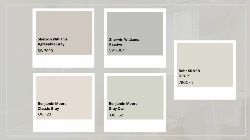
Light gray offers a modern yet flexible wall color that brings structure without darkening the room.
It pairs easily with white fixtures and adds subtle contrast that feels intentional.
This shade suits bathrooms that aim for a clean, updated look while allowing tiles, mirrors, and lighting to stand out naturally.
Best furniture and fixture pairings: White or charcoal vanities, stone or concrete-look tiles, chrome or matte black hardware, frameless glass showers
Paint color options
- Sherwin-Williams:Agreeable Gray, Passive
- Benjamin Moore:Classic Gray, Gray Owl
- Behr: Silver Drop
4. Blush Pink
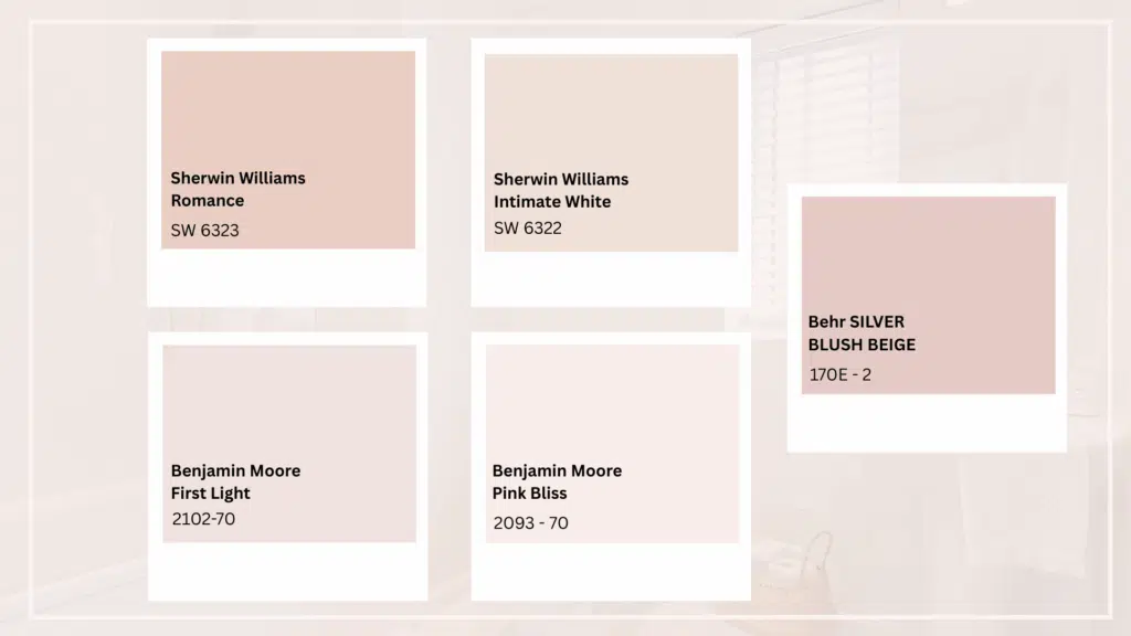
Blush pink adds warmth and softness without making the bathroom feel loud or overly decorative.
This shade works well in small spaces by reflecting light gently while adding character.
It suits bathrooms that need a subtle color presence and pairs well with modern or classic fittings without overpowering the layout.
Best furniture and fixture pairings: White or light wood vanities, marble or terrazzo tiles, brushed brass or rose gold fixtures, simple framed mirrors
Paint color options
- Sherwin-Williams: Romance, Intimate White
- Benjamin Moore: First Light, Pink Bliss
- Behr: Soft Blush
5. Soft Aqua Blue
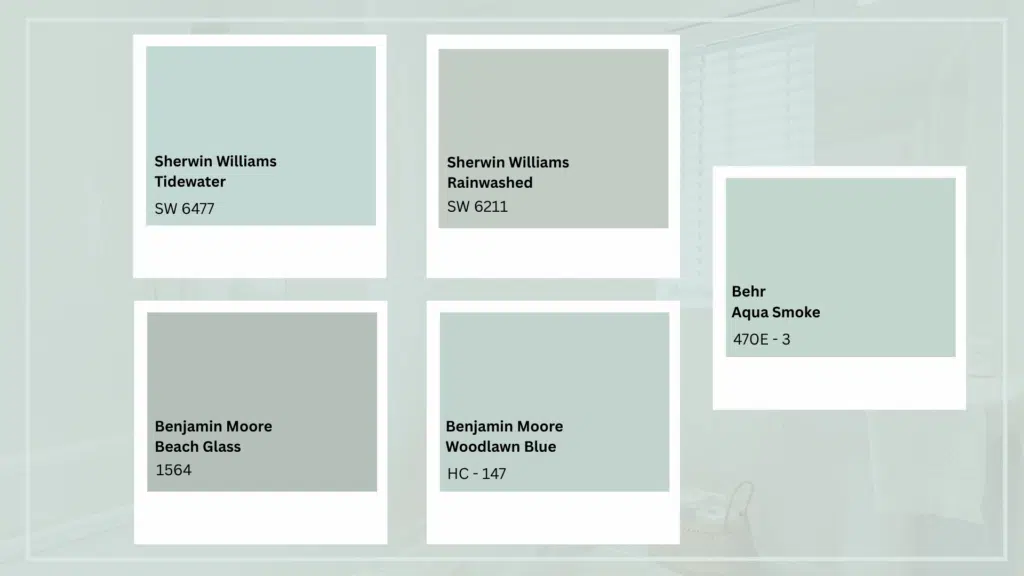
Soft aqua blue brings a fresh, airy tone that feels relaxed and clean.
This color works especially well in bathrooms that aim for a calm atmosphere while still showing personality.
It complements white fixtures naturally and helps prevent the space from feeling flat, even in bathrooms with limited floor area.
Best furniture and fixture pairings: White or pale gray vanities, ceramic or glass tiles, chrome or brushed nickel fixtures, minimal open shelving
Paint color options
- Sherwin-Williams: Tidewater, Rainwashed
- Benjamin Moore: Beach Glass, Woodlawn Blue
- Behr: Aqua Smoke
Also Read: Benjamin Moore Blues
6. Soft Lavender
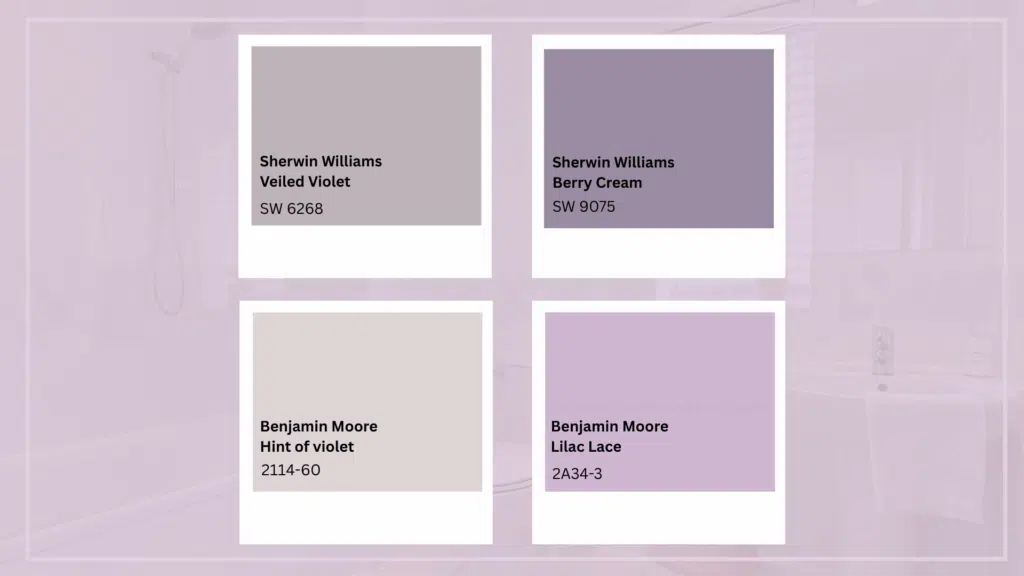
Soft lavender adds a light touch of color while maintaining a calm bathroom atmosphere.
This shade works well when a space needs visual interest without becoming busy.
It reflects light gently and pairs easily with common bathroom finishes, making it a practical choice for guest and primary bathrooms alike.
Best furniture and fixture pairings: White or pale wood vanities, light stone tiles, chrome or brushed nickel fixtures, clear glass accents
Paint color options
- Sherwin-Williams: Veiled Violet, Berry Cream
- Benjamin Moore: Hint of Violet
- Behr: Lilac Lace
7. Muted Teal Blue
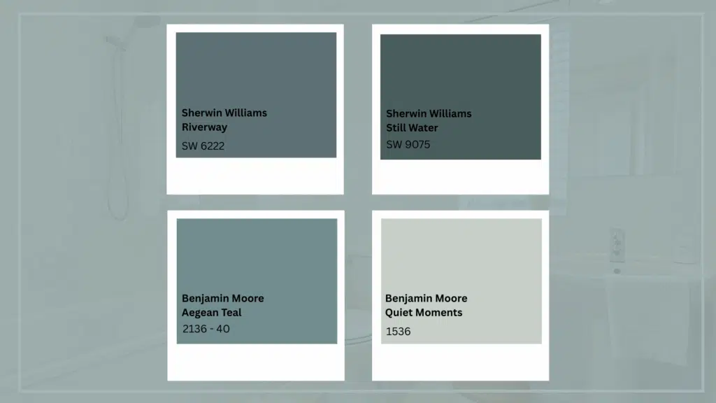
Muted teal blue introduces depth and character while staying balanced enough for everyday use.
This color works well in bathrooms that benefit from a stronger visual anchor without feeling enclosed.
It performs especially well under artificial lighting and complements both warm and cool design elements.
Best furniture and fixture pairings: Natural wood or white vanities, patterned floor tiles, matte black or brushed brass fixtures, and simple wall-mounted storage
Paint color options
- Sherwin-Williams: Riverway, Still Water
- Benjamin Moore: Aegean Teal, Quiet Moments
- Behr: Blueprint
8. Peach Beige
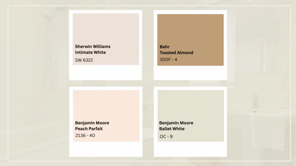
Peach beige adds warmth with a soft hint of color, making the bathroom feel comfortable rather than flat.
This shade works well in spaces that rely on artificial lighting, as it prevents walls from looking dull.
It offers a subtle alternative to plain neutrals while staying easy to coordinate with fixtures.
Best furniture and fixture pairings: Light wood or cream vanities, porcelain or ceramic tiles, brushed brass or champagne fixtures, warm-toned accessories
Paint color options
- Sherwin-Williams: Intimate White
- Benjamin Moore: Peach Parfait, Ballet White
- Behr: Toasted Almond
9. Powder Blue
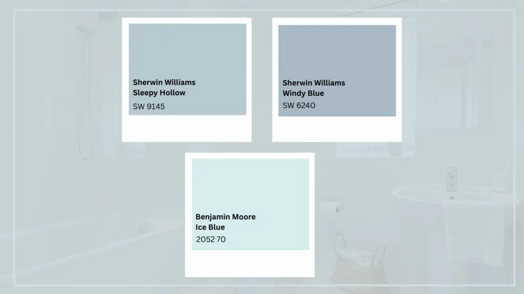
Powder blue brings a light, airy feel that suits bathrooms designed for daily use.
This color adds freshness without drawing too much attention, helping the space stay visually calm.
It works well across different bathroom sizes and pairs naturally with standard white fixtures and finishes.
Best furniture and fixture pairings: White or pale gray vanities, classic subway tiles, chrome or brushed nickel fixtures, framed wall mirrors
Paint color options
- Sherwin-Williams: Sleepy Hollow, Windy Blue
- Benjamin Moore: Ice Blue, Silver Cloud
- Behr: Adirondack Blue
10. Soft Mint Green
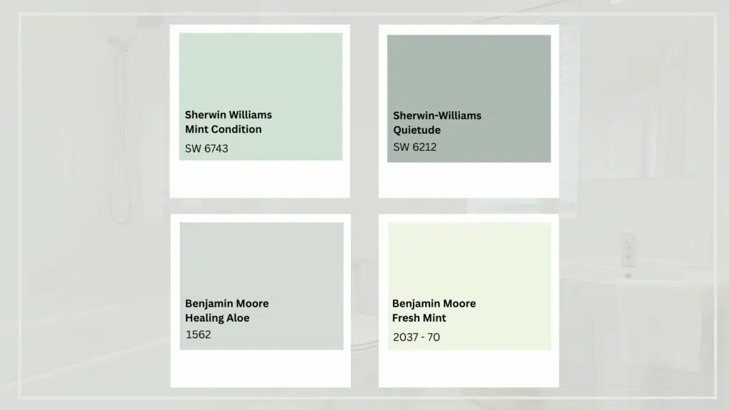
Soft mint green brings a clean, refreshing tone that works well in bathrooms where a light touch of color is needed.
This shade keeps the space feeling open while adding visual interest beyond neutrals.
It performs well in both natural and artificial lighting and helps create a relaxed, everyday setting.
Best furniture and fixture pairings: White or light wood vanities, ceramic or mosaic tiles, chrome or brushed nickel fixtures, simple glass or metal accents
Paint color options
- Sherwin-Williams: Mint Condition, Quietude
- Benjamin Moore: Healing Aloe, Fresh Mint
- Behr: Pale Green
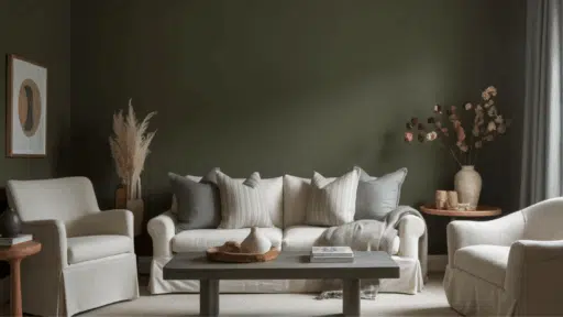
Why Neutral Colors Work Best in Bathrooms?
Bathroom spaces have unique needs due to moisture, lighting limits, and size constraints.
The colors discussed above meet these practical demands while keeping the space visually balanced and easy to maintain.
They reflect available light effectively: Light and soft shades help bounce artificial and natural light across walls, preventing the bathroom from feeling tight, dull, or overly enclosed.
They support a clean visual impression: These colors reduce harsh contrast and visual noise, helping surfaces look orderly and well-kept, even between regular cleaning schedules.
They adapt well to common bathroom materials: Neutral and soft tones pair smoothly with tiles, stone, metal fixtures, and glass without clashing or drawing attention away from finishes.
They remain suitable over time: These shades allow easy updates to towels, fixtures, or décor without requiring repainting, making them a practical long-term choice.
Quick tip: Test paint samples under both morning and evening lighting to confirm how the color reads before committing to the full bathroom.
Final Thoughts
Selecting the best paint color for bathroom walls comes down to matching the tone to the function.
Soft whites open tight spaces, muted blues add character without chaos, and warm off-whites prevent that sterile feeling most people try to avoid.
The finish matters just as much; satin for general walls, semi-gloss where water hits hardest.
These aren’t just aesthetic choices; they’re decisions that affect how your bathroom ages, how often you’re repainting, and whether the space feels like somewhere you actually want to start your morning.
Test samples in your specific lighting conditions before committing.
What looks perfect on a paint chip can read completely different once it’s covering four walls under your fixture setup.
What color changed your bathroom? Share your experience below.

Alex Guerrero, a graduate with a Fine Arts degree from the Rhode Island School of Design, has been a visionary in the world of color and design for over 15 years. His professional journey began in the heart of the fashion industry in Milan, where he developed an acute sense for color harmonies and trends. Alex joined our team in 2018, offering fresh and innovative perspectives on color utilization in various spaces. Renowned for his ability to blend contemporary trends with timeless elegance. Outside of work, Alex is an accomplished painter and a volunteer art therapist, his artistic talents further enriching his professional insights.