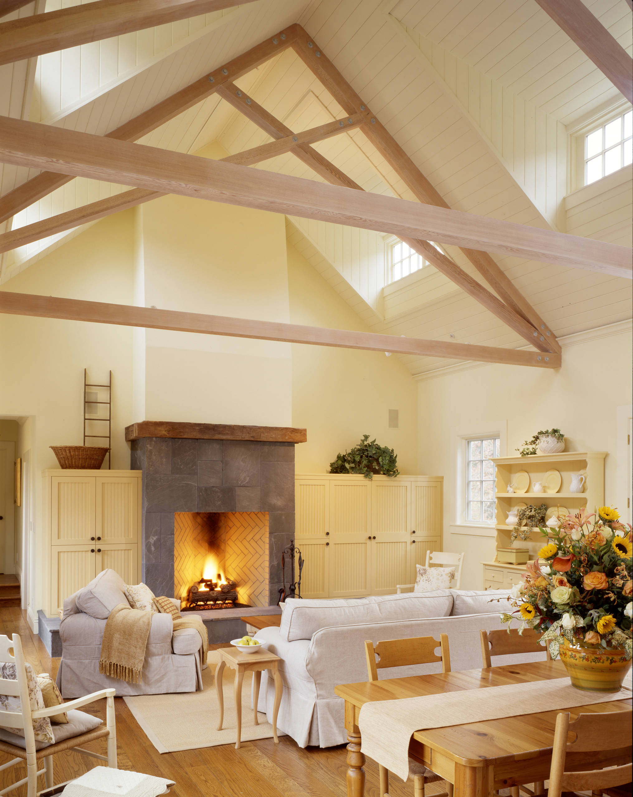
Farmhouse style of interior decorations has made a comeback these last few years because of its utility. It has more to do with the state of mind than mere furniture. When arranged carefully, it gives a cozy and comfortable home. But choosing the right decor, especially farmhouse paint colors, is not an easy task.
The appropriate colors used in a modern farmhouse homestead will retain its rustic evergreen charm. On the other hand, it should also facilitate modern contraptions and create a seamless aesthetic. The right farmhouse colors are always in high demand because of their classic style and neutral tones. But is cream and beige everything there is available?
In this article, we discuss the best farmhouse hues that turn every house into a safe and cozy haven.
1. White
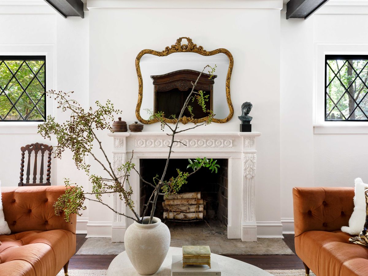
When you think of farmhouse decor, the first color that comes to mind is white. But pure white may look stark and sterile, making the place not very welcoming. Instead, softer shades of white are often preferred. These off-whites are often put against pure white accents to create a balance. Benjamin Moore’s White Dove looks great on walls, especially if the molding or trim is snowy white.
If you are planning on adding bolder colors to the decor, the soft whites will help them shine. Many other colors of soft white are considered to be the best farmhouse paint colors this year. They also give you plenty of chances to play with different textures.
2. Cream
Another off-white shade that looks good in rustic houses is Benjamin Moore’s Vanilla Ice Cream. The creamy shades provide a certain warmth in whatever space it is used. Not to mention the calm and tranquil auro it exudes that matches perfectly with farmhouse decor. The buttery undertones help the bright white shive even brighter.
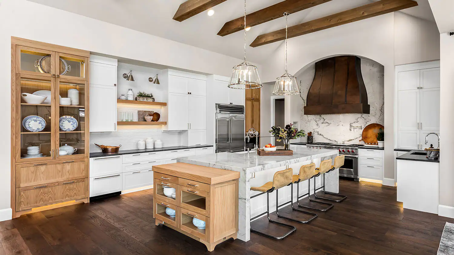
Cream colors are often used on walls as they pair well with lots of other colors. Your natural wooden furniture is sure to look vintage under the soft light of these whites. To make the rooms pop a little, use accents of teal, emerald, and brick red. This combination of farmhouse paint colors is sure to transform your home.
3. Greige
Greige has become the new IT word when it comes to interior decor. The perfect blend of gray and beige has the neutral-color lovers in thrall. It gained much popularity among farmhouse paint colors this year because of its rustic appeal. Using a greige like Sherwin William’s Crushed Ice will make any room look special, especially in larger spaces.
Greige colors have the perfect amount of lightness to them, as they ensure an airy feel. But the trick to choosing the right greige is the undertones. Those with green or blue undertones will have a cool finish, while the red and yellow undertones will go warmer. Make sure you observe your existing decor before choosing a greige.
4. Cocoa Brown
After talking of the white and white-like hues, shifting to the dark is natural. Especially since farmhouse decor is the perfect blend of light and shadows, focusing on nature. And a dark color that is sure to make you feel all warm and cozy is cocoa brown. The rich brown shade has many paints available on the internet, among which the most popular is Benjamin Moore’s Kona.
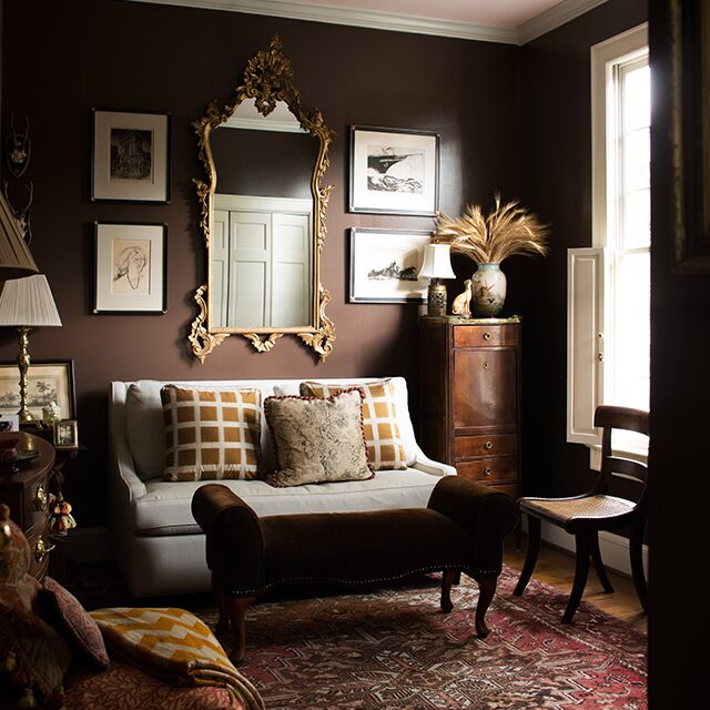
The color may be bold, but it works perfectly with farmhouse decor to create a sense of coziness. It also creates a sharp yet soft contrast against off-white when used as an accent. If you have rustic cream decor, this shade will pair off nicely on window and door trims.
5. Charcoal
On the darker side of the farmhouse paint colors, the palette is charcoal. Unlike sharp black colors, charcoal shades like Benjamin Moore’s Charcoal Linen are the perfect mixture of light and broody. They are a modern take on the usual farmhouse colors but work charmingly against rustic decor. These hues are bold but are excellent statement pieces.
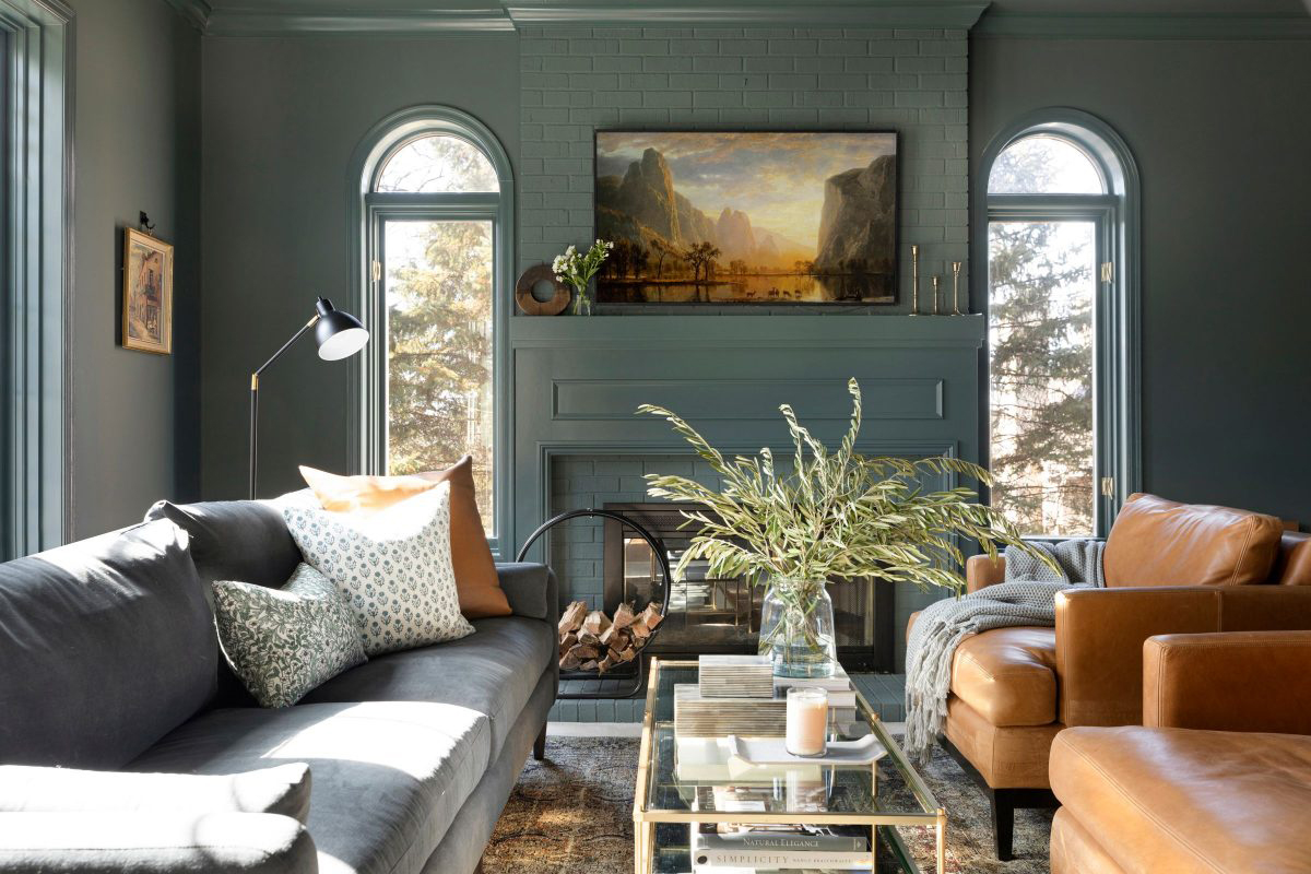
The different shades of charcoal are essentially dark grays with blue undertones. These work well as accents if you wish to repaint old furniture or change the door and window trims. However, they can also be used on walls, but make sure the room gets plenty of natural light.
6. Pale Yellow
Yellow is another color that is often associated with farmhouse decor because of its brightness. It imitates the sunlight and makes the room a warm haven. But you have to avoid the shades of yellow that are not within the Farmhouse Paint Colors palette. On the other hand, a pale buttery yellow is sure to make the rooms look airy and cheerful.
Buttery yellows work especially well If you have dark wooden furniture with an aged patina. Paint like Benjamin Moore’s Pale Straw is the perfect neutral yellow for most farmhouse-style rooms. Whether for a nursery or a hallway, this yellow is never a miss. Pair it with bolder colors like tal and violet for a striking effect.
7. Mustard Yellow
For those who want to move off pale hues, a cheerful color for your farmhouse would be mustard yellow. These paints provide a bold warmth that is usually not found in the Farmhouse Paint Colors palette. And accordingly, there are a variety of hues available, from the muted Mustard Seed to the bright Yellow Coneflower.
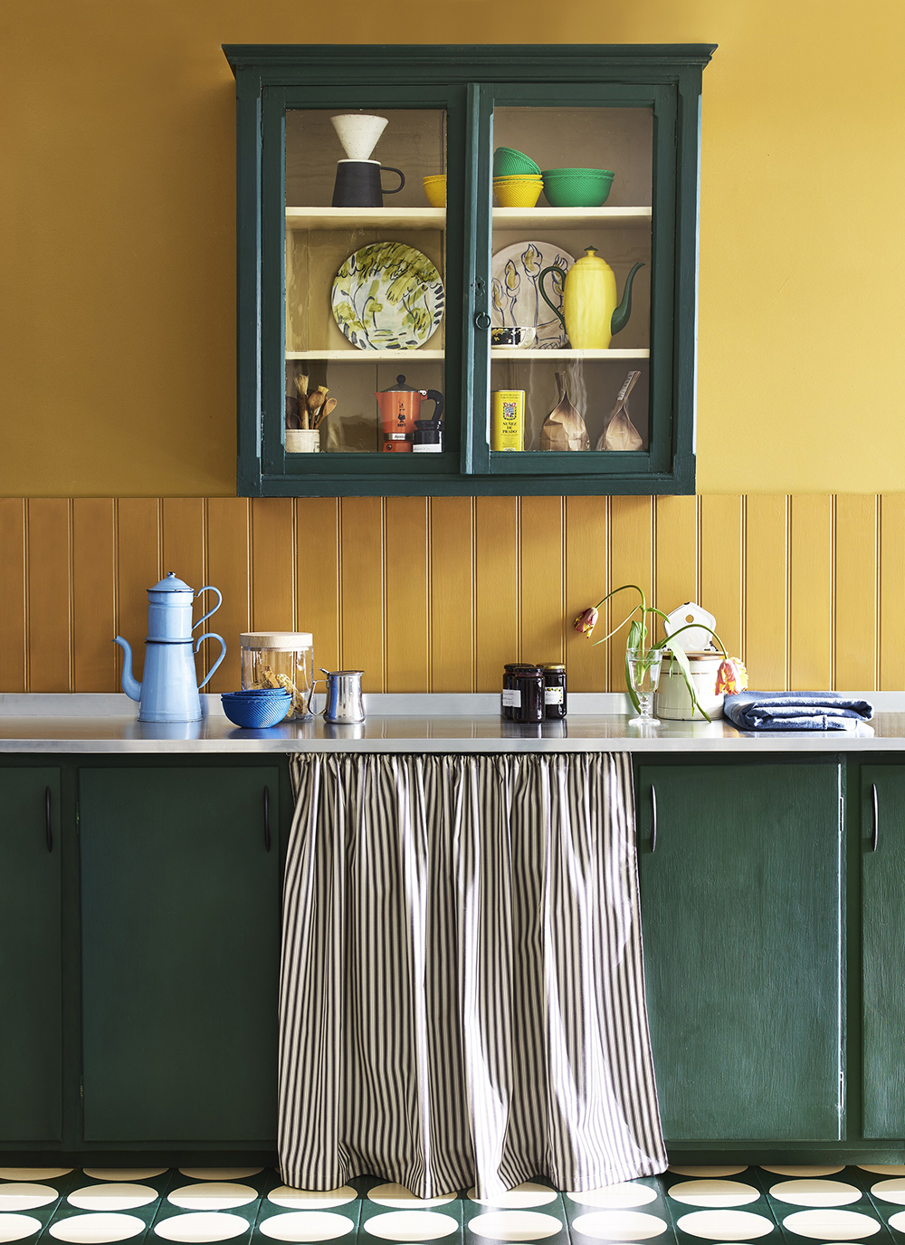
Using this one-of-a-kind paint would show off your rooms in a subtle way. The browner undertones of Benjamin Moore’s Mustard Seed are more grounded. But the brighter shades are richer and more saturated, pairing well with white trims. If your rooms appear darker with woods like walnut or mahogany, mustard yellow adds the vintage charm it lacks.
8. Pale Violet
If you are looking for a unique color that fits your farmhouse decor palate, your first thought will not be violet. But there is a certain charm to the shades of light violet that suit every decor needs. For one, the pale colors have a dash of gray that adds depth to your walls, making the room look bigger. This colorful choice is also garden-inspired, creating a fanciful aura.
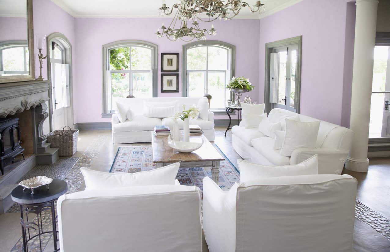
Some of the most common choices are Benjamin Moore’s Violet Dusk and Valspar’s Purple Mist. These shades look great against most farmhouse decor but can pop up beautifully against yellow. It is bound to turn places like the foyer into the most welcoming zones of the house.
9. Pale Pink
Painting the interior of a house is a costly affair. The color remains unchanged for at least a few years. So consider your choices and decor preferences before shopping for paints. Most adults would never consider pink as a practical wall color solely because it looks feminine. However, it adds a charm to your entire house, even if it’s used in one room.
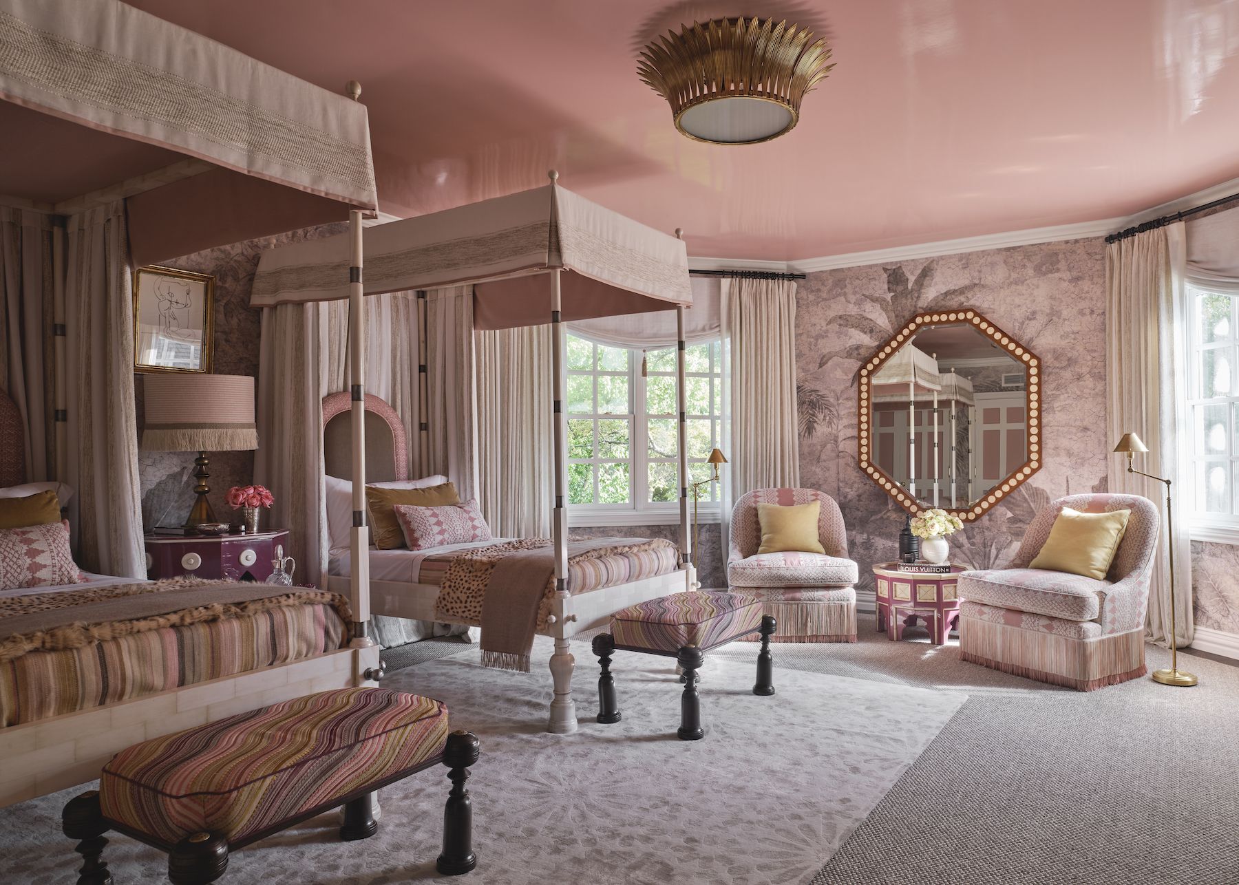
Pale pinks like Benjamin Moore’s Playful Pink are more of a French farmhouse palette. But these soft pinks are nothing like the pink we saw in the 60s. The cool gray undertones give them an almost neutral look. For something more vibrant, go for a rosy shade with peachy undertones.
10. Barn Red
Red is not often considered to be in the same wheelhouse as farmhouse-style homes. But certain bold shades perform very well in grounding the house. Barn red is a hue that has been part of farmhouse decor since its conception. The color is a little warm, with deep brown undertones that remind us of vintage barns. These colors also look magical during the Fall/Winter season.
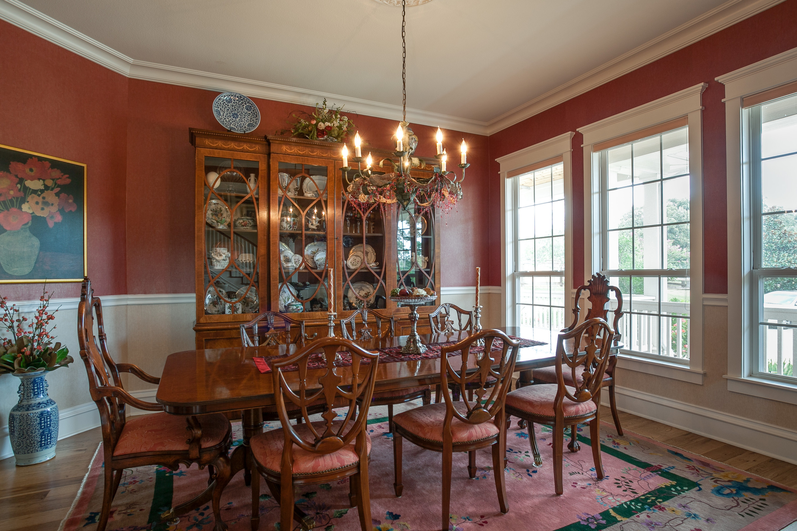
The most popular shades of barn red available are Benjamin Moore’s Cottage Red and Sherwin-Williams’s Foxy. Their ideal location would be the kitchen, where it can provide warmth for the entire house. Instead of full walls, you can also use these as accents on trims for a pop of color.
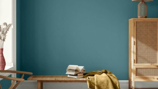
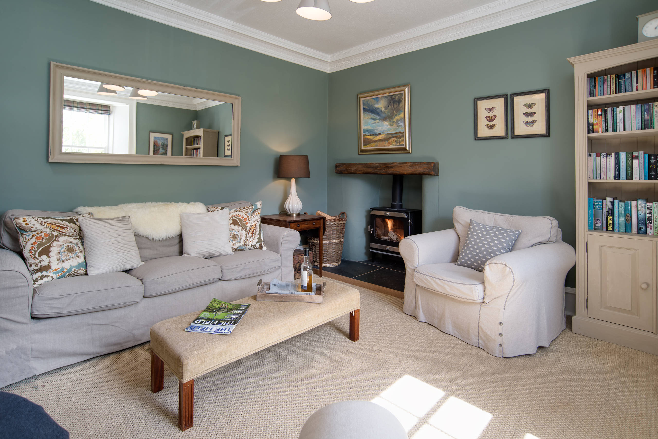
11. Teal Blue
The farmhouse paint colors palette carries a lot more shades than whites and browns. These colors add a dash of brightness throughout the house and make them look cozy. One such vivid shade is teal, a charming blue-green that enthralls everyone. Using a muted shade of teal will make your house look more like a coastal farmhouse but in the best way possible.
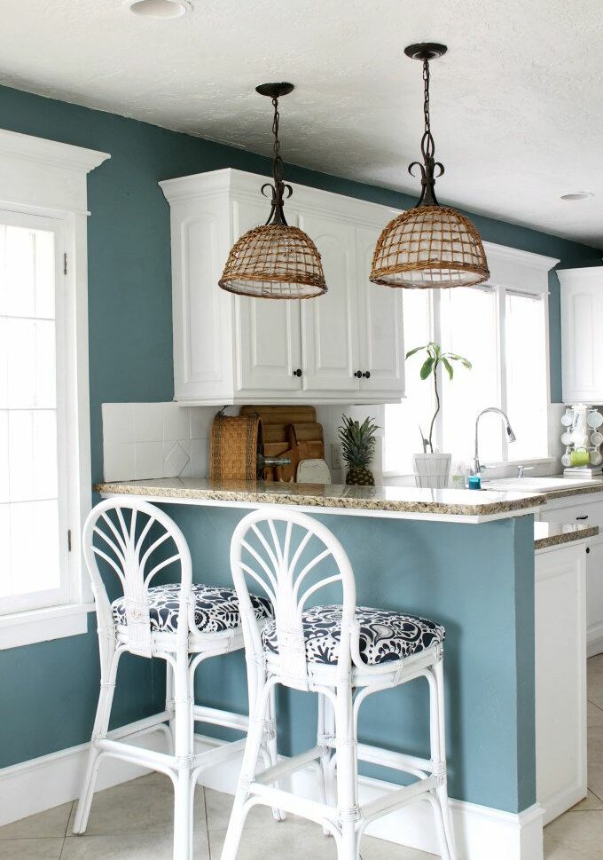
The most common shades of teal used in farmhouses have just the right amount of gray in them to make them neutral. Benjamin Moore’s Blue Echo is distinctively blue with a little green that makes it perfect for dining rooms. These light teals also work beautifully against soft whites and creams.
12. Sage
A shade of green that has become immensely popular is sage green. The hue of these paints is light enough to support farmhouse decor without being too boring. Sage greens usually have just the right amount of grays in the mix to make them neutral. But the focus is usually on the calming undertone. The muted color resembles dried sage leaves, from which it gets its name.
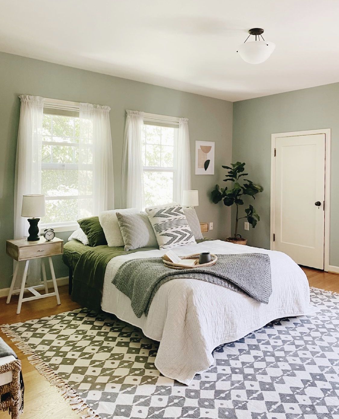
Sage is a very versatile color that can be used in a variety of ways. The paints available in the market usually differ quite a lot, from Benjamin Moore’s Rolling Hills to Sherwin Williams’s Agate Green. The brighter shades work perfectly as accents on kitchen cabinets.
13. Gray-Green
Another green shade that we often see in the mix of farmhouse paint colors in the palette is gray-green. With sage, the focus is more on the greener side. But in paints like Sherwin Williams’s Silver Strand, we see gray taking center stage. The undertones in shades like these make the most difference. The color seems lighter than the air itself but with a cyan undertone that freshens up the room.
If you are looking for a solid wall color that would not overwhelm, choose a gray-green. For interior walls, it can help shape up any drywall or shiplap. It also looks great in kitchens, making them airy, cooler, and elevated.
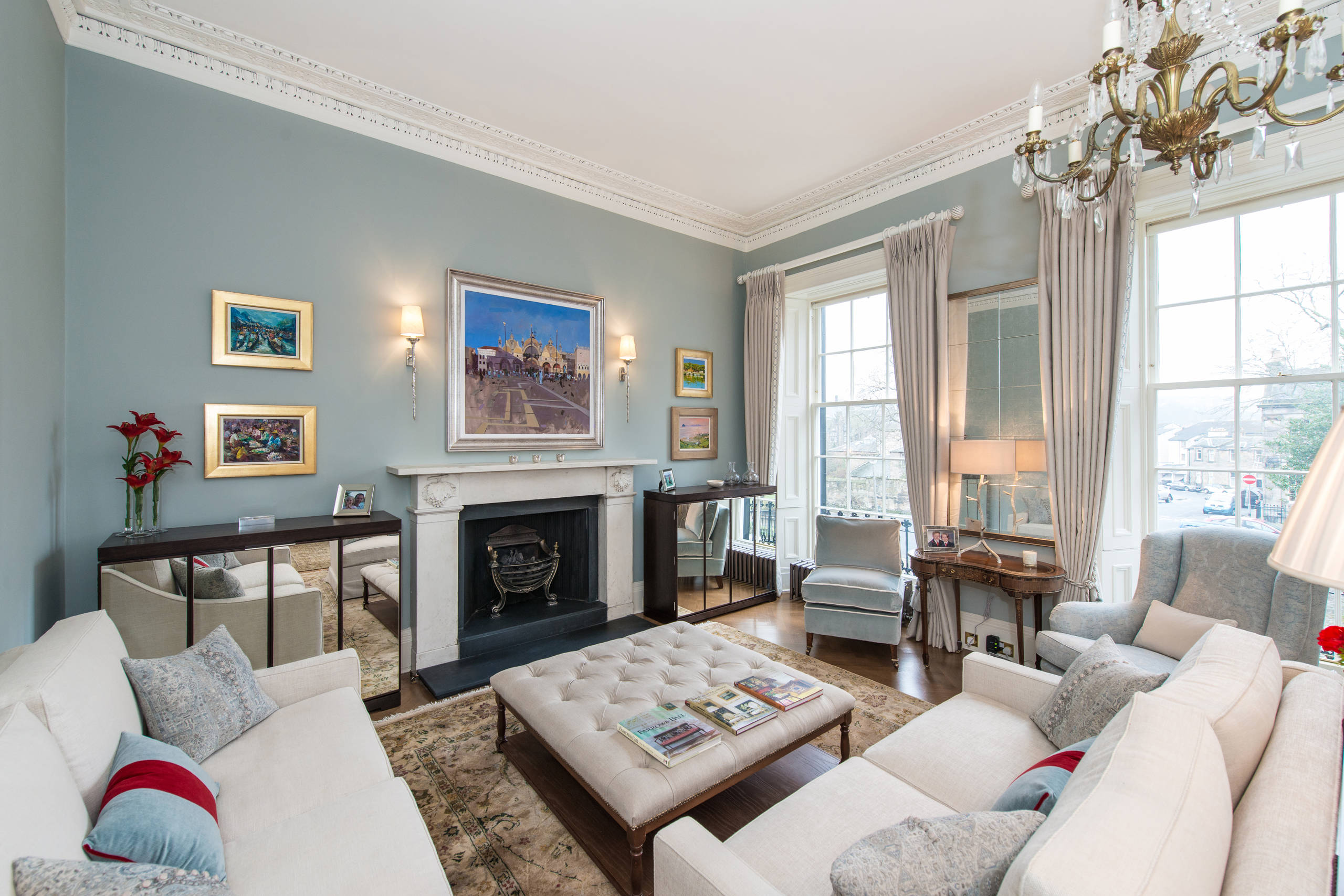
14. Gray-Blue
Grays may seem boring as wall color choices, but with the right undertone, you can make them shine. One such combination that takes the breath away is gray-blue. These navy paint shades bring to mind the images of beautiful English coastal cottages. And adding gray to blue makes it the perfect mixture of bold and classic.
The lighter shades can brighten up even damp spaces like basements. A few coats of Benjamin Moore’s Andes Summit are sure to give a dramatic visual. The color is named after a mountain in South America and gives off the same vibes. The coolness of the color would always pair the best with cool accents and decor choices.
15. Robin’s Egg Blue
Among the unique colors that work well with the farmhouse theme is Robin’s Egg Blue. The paint is bright and delicate but will show up well against whites. It is a bolder choice than creams, but the result is equally rewarding. Usually, the color is used for nurseries, but they can also elevate any other room of the house.
The most popular shades of Robin’s Egg are Benjamin Moore’s Bird’s Egg and Sherwin Williams’s Open Air. Both of these contain a touch of gray that keeps the brightness on the muted side. However, the breeziness of the blue will give a natural, airy vibe to most rooms, like the breakfast parlor.
Bottom Line
There are hundreds of paints available in the market that adorn modern homes. But among all of these, only the right ones are capable of turning a house into the perfect farmhouse. These colors are not just creams and whites but have hues of every part of the rainbow. The trick is to choose the right shades.
The perfect farmhouse paint colors palette includes more than soft white and greige for the perfect homestead. They have muted versions of blues, reds, greens, and even blacks. The right combination is just a matter of selection. Comment below and let us know your favorite farmhouse decor colors!
Frequently Asked Questions
What Colour Walls Are Trending This Year?
Warmer neutrals have grown in popularity this year. But the colors you use in your own homes are always subjective. The popular trends help us decide which among the hundreds of paints to get. So you are sure to never go wrong with shades of whites, beiges, tans, and grays with warm undertones.
What are the Three Most Popular Colors This Year?
Apart from warm neutrals, the three most popular colors this year are green, blue, and brown. The earthy tones have become a favorite in recent years due to their connection with nature. This trend is sure to continue for the years to come, as this makes any space feel safe. The calming aura of nature-inspired hues is hard to deny.

Alex Guerrero, a graduate with a Fine Arts degree from the Rhode Island School of Design, has been a visionary in the world of color and design for over 15 years. His professional journey began in the heart of the fashion industry in Milan, where he developed an acute sense for color harmonies and trends. Alex joined our team in 2018, offering fresh and innovative perspectives on color utilization in various spaces. Renowned for his ability to blend contemporary trends with timeless elegance. Outside of work, Alex is an accomplished painter and a volunteer art therapist, his artistic talents further enriching his professional insights.