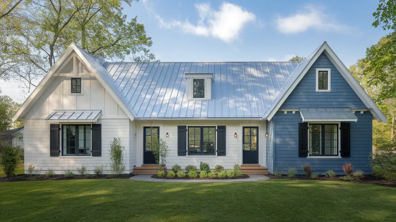

Hey color explorers!
Ever walked into a room and instantly felt calm and happy?
That’s the magic Clary Sage from Sherwin-Williams can bring to your space!
This gorgeous green-gray paint isn’t just another color on the wall—it’s a total mood maker!
Part earthy, part refined, Clary Sage sits perfectly between not too bold and definitely not boring.
If you’re refreshing your bedroom, kitchen, or living room, this versatile shade goes well with almost everything.
Are you curious about how this popular paint color could alter your home?
Let’s explore the wonderful world of Clary Sage together!
What room are you thinking about painting next?
Understanding Sherwin-Williams Clary Sage
This soft green paint brings the outdoors inside your home.
It makes rooms feel calm and peaceful.
Color Terminology
Here are the simple facts about this color.
These numbers help you match this paint to other things in your home.
| PROPERTY | VALUE |
|---|---|
| LRV | 41 |
| RGB | 172 / 173 / 151 |
| Hex Value | #ACAD97 |
You can use these numbers when you want to match this color online or when buying home items.
Undertones:
There’s something effortlessly soothing about green, especially when it carries a gentle twist.
This is the shade that whispers freshness.
Perfect for adding warmth without overpowering the space.
- Soft green with hints of yellow
- Earth-like color that feels natural
- Not a bright green, but a soft, fancy green
This green doesn’t compete.
It brings harmony, subtle charm, and a grounded grace to any palette.
A quiet nod to nature, with just the right touch of polish.
Psychology of Green Colors
When you put this color on your walls, it will make you feel calm.
This paint can change how you feel in a room.
- Green like this: Helps you feel close to nature and relaxed
- Earth colors: Make a room feel calm
- Soft greens: Make spaces feel balanced
This green works well over time.
It won’t go out of style, and it makes a good background for the things you love.
Why Choose Sherwin-Williams Clary Sage (SW6178)?
Clary Sage is a calm, soft green that brings nature inside while still looking nice.
It’s good when you want something natural with some style.
1. Versatility
It looks good as light changes through the day.
In morning light, it looks fresh and green. At night, it seems softer.
This color works in bedrooms, living rooms, and even kitchens.
This green works well if you like modern farm style, nature style, or a mix of old and new.
2. Key Features
This green goes well with most furniture colors.
It’s not too bright and not too dark.
It makes a room feel cozy.
Unlike trendy colors that look old fast, this green will look good for many years.
3. Durability
When used with good paint, it hides marks and scuffs.
This is good for busy homes with kids or pets.
The mid-tone green hides small flaws while still looking natural.
A quick wipe keeps walls looking fresh for years.
4. Texture Patterns
This paint has a soft, rich look that adds depth to your walls.
It changes with the light during the day, making soft shadows.
This color flows well from room to room.
It lets art and natural things stand out.
Room Color Recommendations: Sherwin-Williams Clary Sage
This nice soft green works well in any room of your home.
It changes a bit as the day goes on, but stays calm in any light.
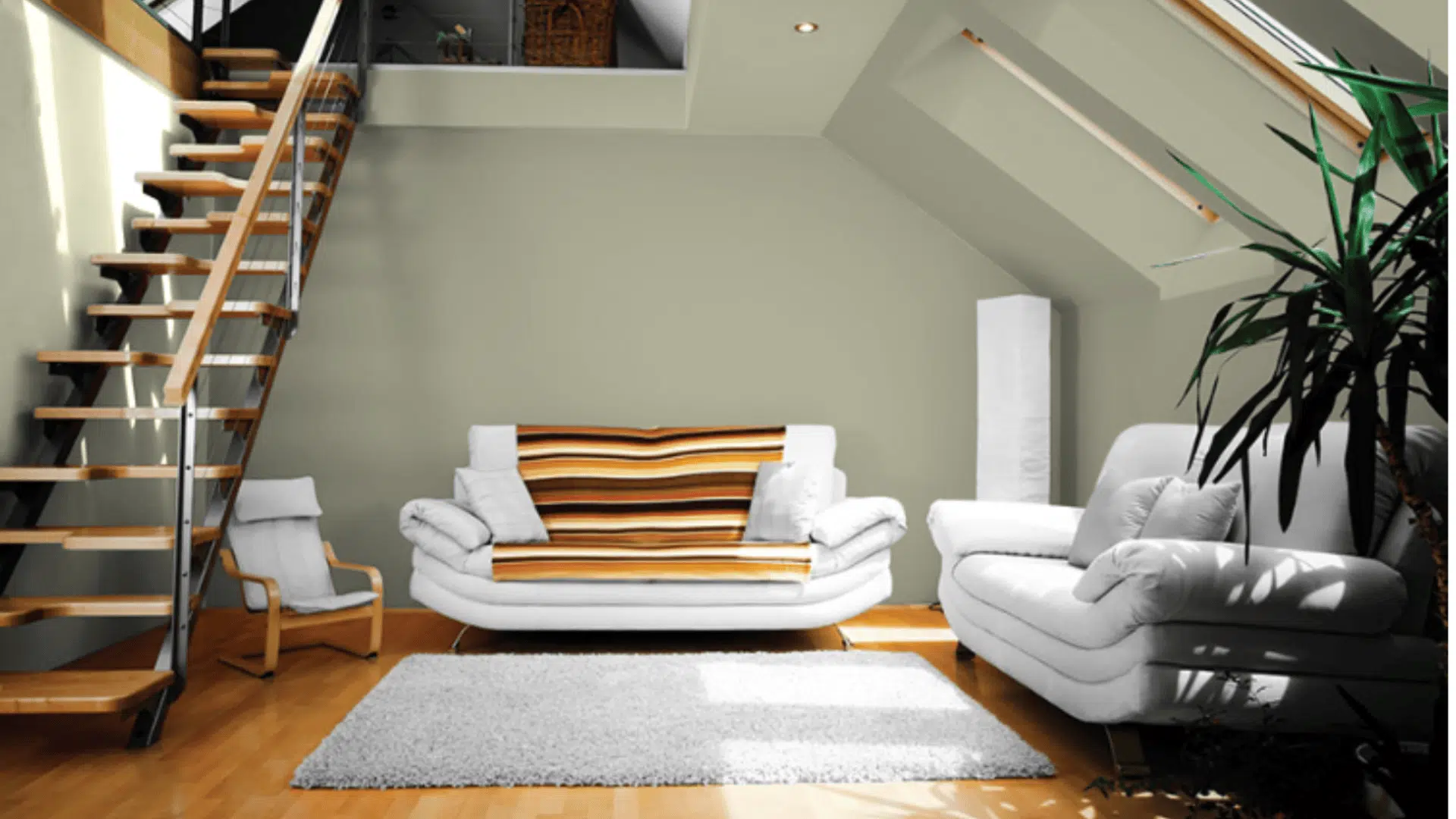
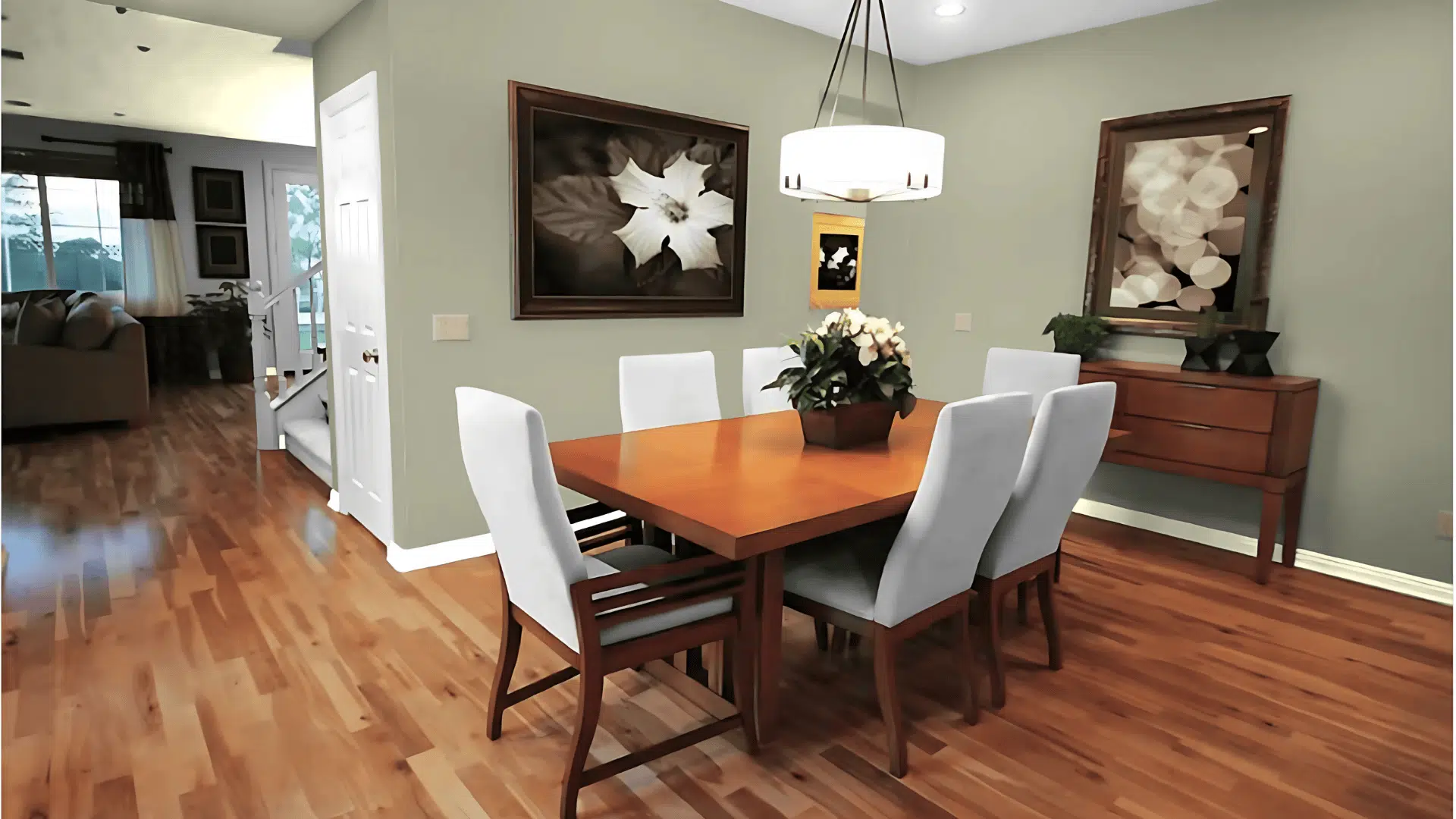
1. Living Spaces and Open Floor Plans
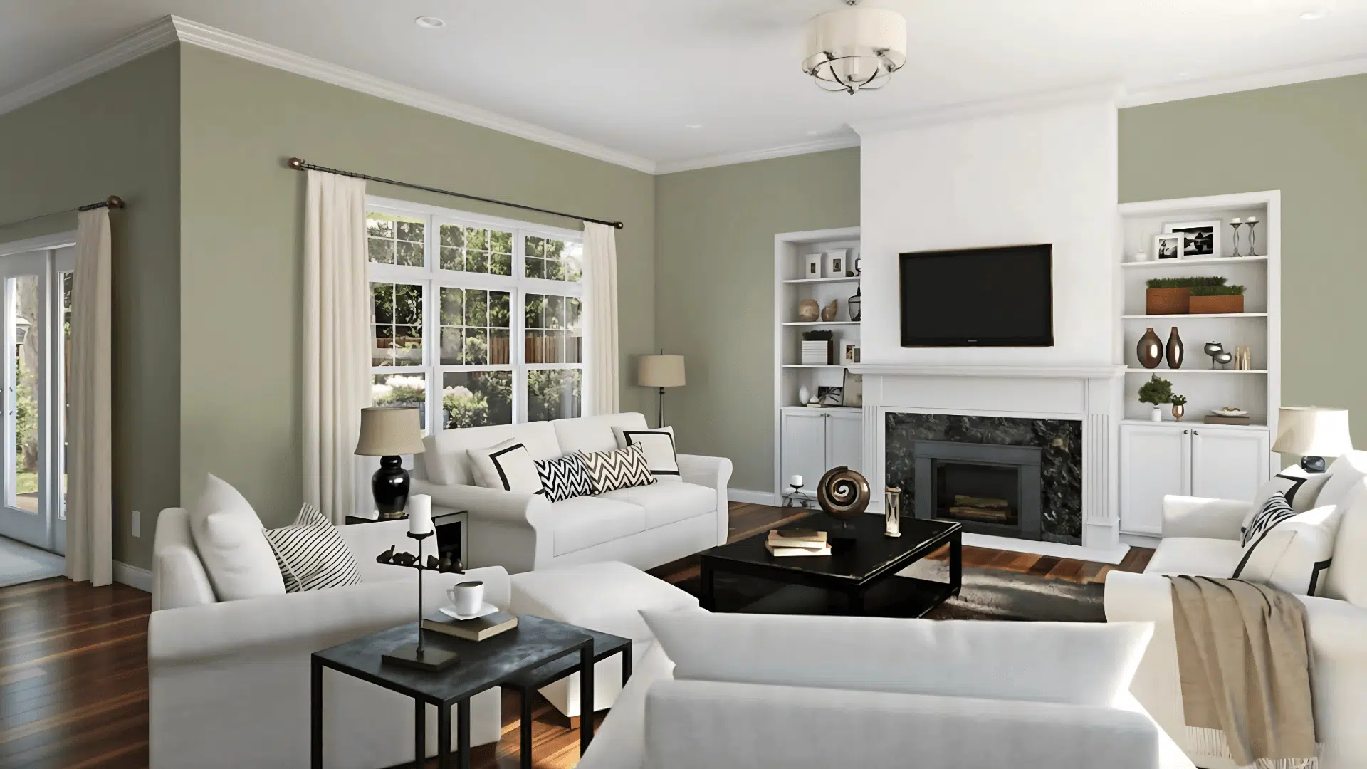
Makes the living room feel open and light, helping the space look bigger while letting your furniture stand out without being hidden.
The soft green color brings a calm feeling, especially when sunlight shines in through windows during the day.
For homes without walls between rooms, use this color in every space to help rooms connect, or add darker greens for a bit of change.
2. Bedrooms and Relaxation Areas
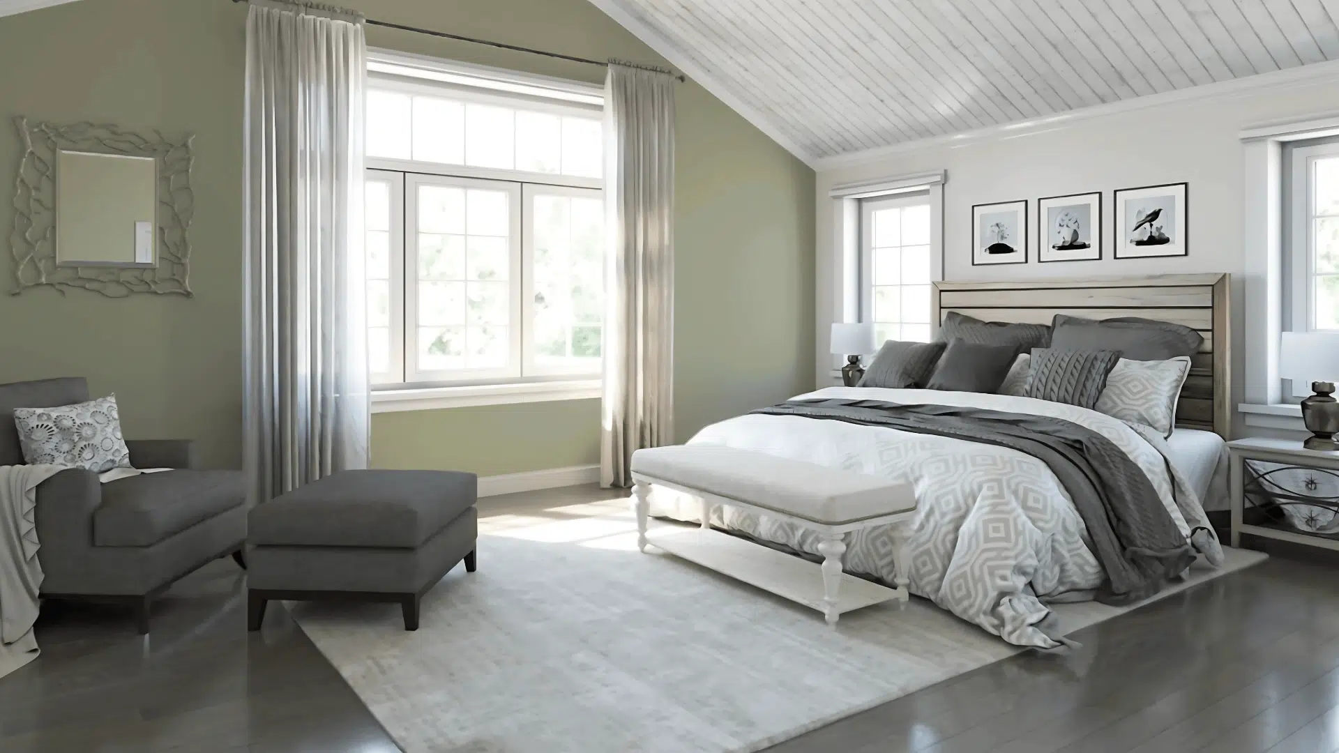
Helps the bedroom feel calm and quiet, making it a great place to rest, read, or get ready for sleep after a long day.
It looks bright and fresh in the morning, but turns soft and warm when the lights are low or in the evening.
Great for painting all the walls to feel close to nature, or you can use white trim to add a bit of lightness and balance.
3. Bathrooms and Spa-like Retreats
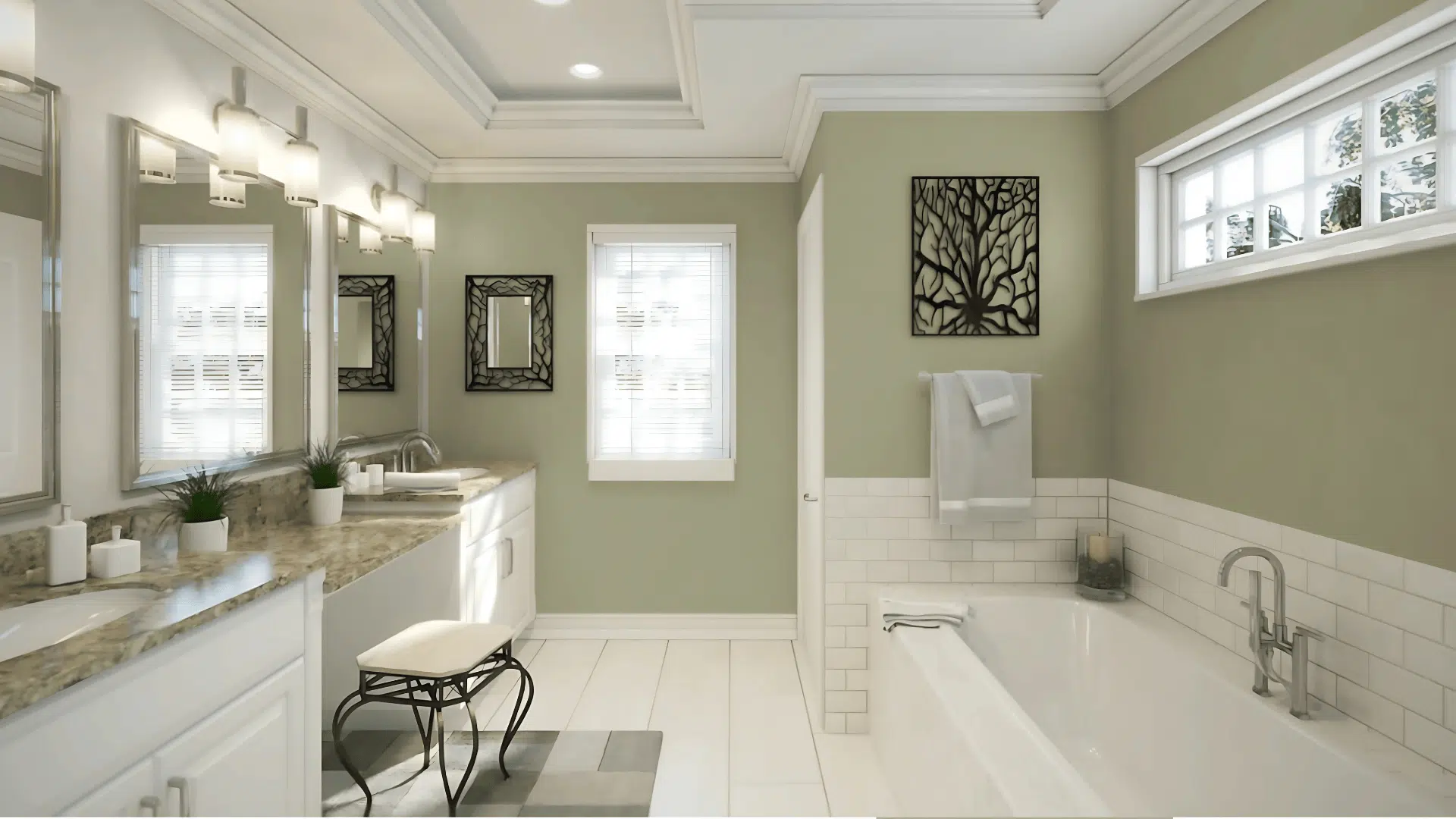
Turns the bathroom into a calm space, like a little retreat, without making it feel too cold or too strong.
The light green tone goes really well with wood, stone, or light tile, keeping the space simple and neat.
Add bronze taps and leafy green plants to give the room color and warmth, while still keeping it clean and easy to enjoy.
Color Pairings and Combinations for Sherwin-Williams Clary Sage
Clary Sage is a soft green with hints of yellow.
It makes spaces feel grounded and calm.
Here are the colors that work well with it.
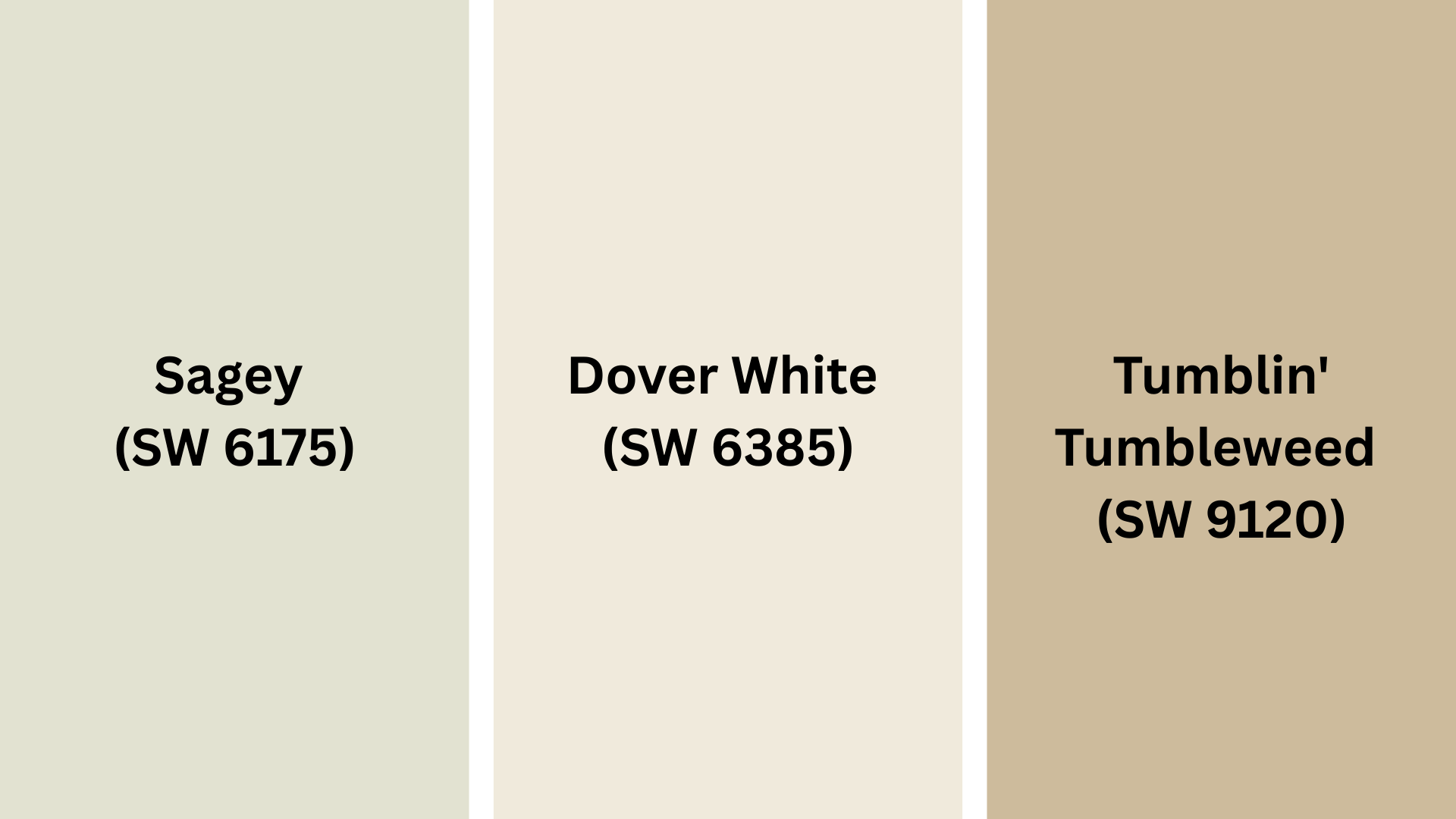
Complementary Trim Colors
The right trim color can change how this green looks on your walls.
These colors work very well with Clary Sage:
- Sagey (SW 6175): A bit lighter sage that looks good next to Clary Sage.
- Dover White (SW 6385): A warm, soft white that goes well with Clary Sage.
- Tumblin’ Tumbleweed (SW 9120): A warm, earth color that makes Clary Sage look even better.
Try small spots of each color to see which one looks best in your home’s light.
Creating Cohesive Color Schemes
This green works well with many colors to make your home look put-together.
Here are three sets of colors for Clary Sage:
| SCHEME | MAIN WALLS | TRIM / ACCENT | OTHER ROOMS |
|---|---|---|---|
| Earth | Clary Sage | Accessible Beige (SW 7036) | |
| Modern | Clary Sage | Agreeable Gray (SW 7029) | |
| Nature | Clary Sage | Sea Salt (SW 6204) |
NOTE: Colors look different in different lights.
Always try painting on your walls before buying a lot.
Coordinating with Furniture and Decor
Clary Sage works with almost all furniture and decor.
Its soft green tone makes a good background for your favorite things.
1. Wood Colors
Clary Sage looks great with all kinds of wood.
Dark woods like walnut look rich and fancy against these green walls.
Medium woods like oak add warmth while keeping the natural feel.
Light woods like maple make a fresh, clean feel with this soft green.
2. Metals
Brass and bronze look warm and nice, and work well with the yellow hints in Clary Sage.
Black steel makes sharp, modern lines that stand out on these green walls.
Silver adds a cool look, making a mix that feels both fresh and fancy.
3. Decor
Clay red, cream, and navy blue fabrics look great with Clary Sage.
Natural things like rope, rattan, clay pots, and stone add texture to rooms with this green.
Plants of all types look great against this background, making rooms feel more like nature.
Similar Paint Colors: Perfect Alternatives to Clary Sage (SW6178)
All these colors work well in many rooms.
They make spaces feel natural and welcoming.
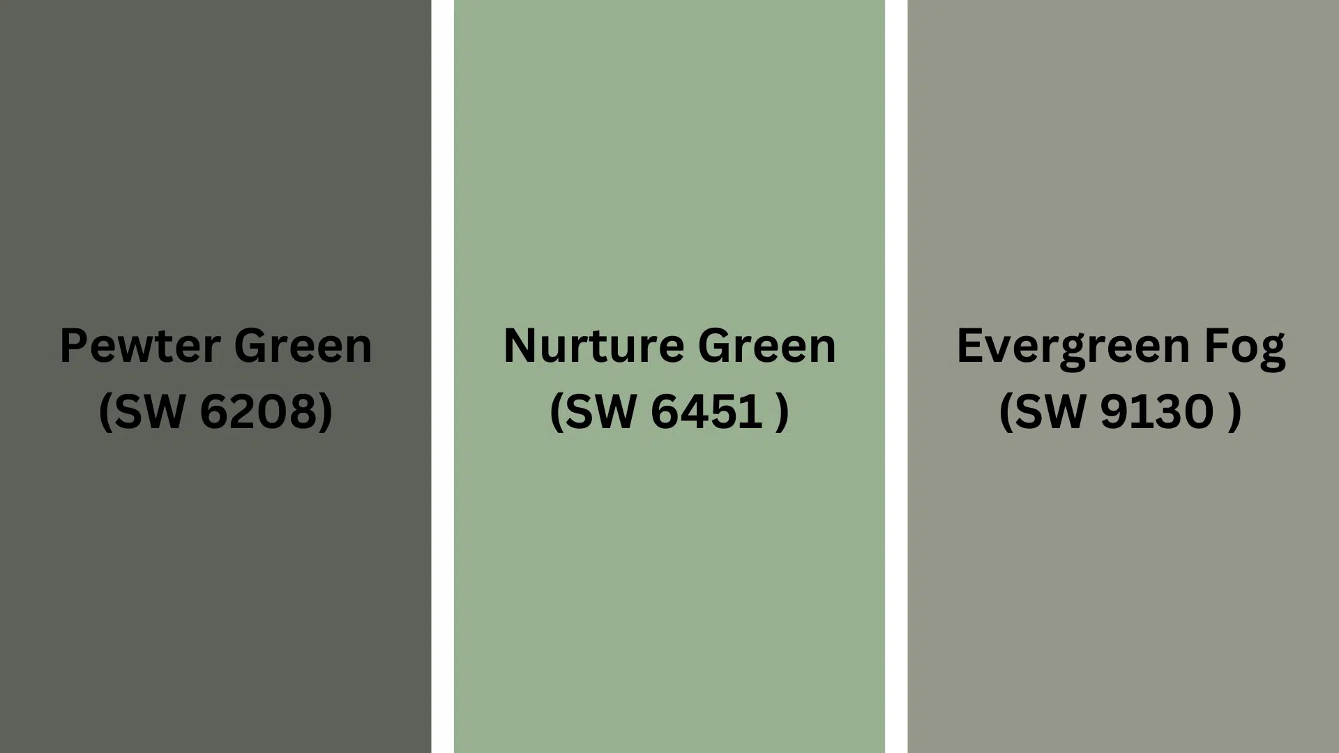
1. Pewter Green (SW 6208)
A bit darker green with more gray in it.
Darker color gives more depth and mood.
Works well in dining rooms and home offices.
2. Nurture Green (SW 6451)
Bright green with a fresh feel.
Has an earth feel but with more brightness.
Makes rooms feel fresh while still being natural.
3. Evergreen Fog (SW 9130)
A deeper, more gray-green with a misty look.
Makes a more cozy, wrap-around feel.
Good for accent walls or rooms where you want a cozy feel.
Last Thoughts
Clary Sage is a soft green that works in any home.
Its hints of yellow make a calm, nature-like feel.
From living rooms to bedrooms, this green works with many wood types, metals, and accent colors.
Try it with Dover White trim for a nice look or with natural things for more texture.
Ready to make a space that feels fresh and lasting?
This natural green might be your new favorite color!
Have you used this paint in your home?
We’d love to hear what you think – leave a comment below!
If you want more color reviews, click here to explore other blogs you might enjoy.

Alex Guerrero, a graduate with a Fine Arts degree from the Rhode Island School of Design, has been a visionary in the world of color and design for over 15 years. His professional journey began in the heart of the fashion industry in Milan, where he developed an acute sense for color harmonies and trends. Alex joined our team in 2018, offering fresh and innovative perspectives on color utilization in various spaces. Renowned for his ability to blend contemporary trends with timeless elegance. Outside of work, Alex is an accomplished painter and a volunteer art therapist, his artistic talents further enriching his professional insights.