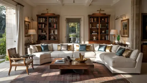
Color-drenched rooms have moved beyond being a passing design trend and are now seen as a considered way to shape mood, flow, and visual balance within a space.
By using a single color across walls, ceilings, and trim, this approach reduces visual breaks and allows color to define the room rather than décor alone.
Interior designers often use this technique to soften architectural lines, manage light, and create spaces that feel more intentional.
When planned carefully, color drenching can work across many room types, from living areas to hallways and private spaces.
Let’s look at some of my favourite colour-drenched room inpos list.
1. Deep Green Living Room
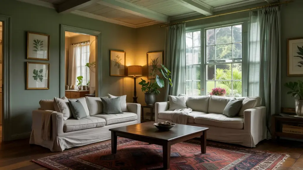
A deep green color-drenched living room feels grounded and steady without becoming heavy. When the walls, ceiling, and trim share the same green tone, furniture and artwork stand out more clearly.
Natural light enhances the richness of green, while evening light brings out its quieter, more intimate side.
This approach works especially well in rooms with wood furniture, neutral upholstery, and simple layered lighting.
2. Inky Blue Bedroom
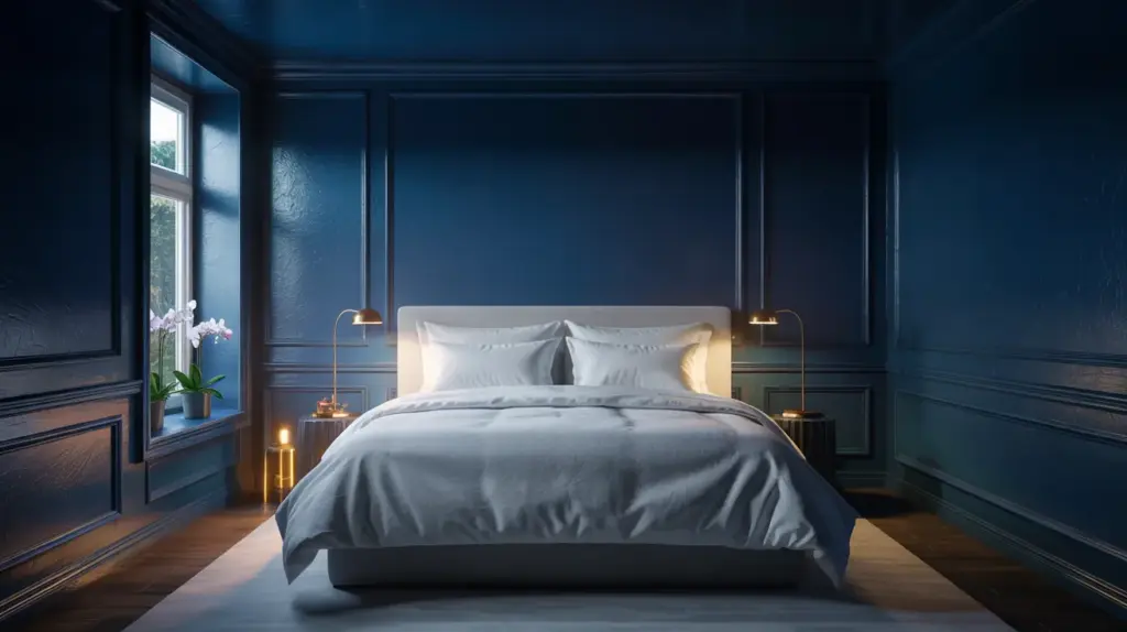
Color drenching a bedroom in an inky blue creates a sense of enclosure that supports rest.
With fewer visual breaks, the room feels calmer and less visually busy. Blue tones absorb light gently, which can soften sharp edges and make the room feel more settled at night.
Crisp bedding and subtle metallic accents help keep the space balanced.
3. Warm White Hallway
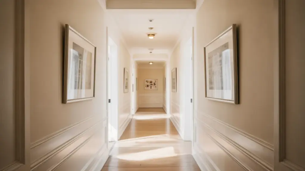
A warm, white, color-drenched hallway may sound subtle, but it can transform how the space reads. By painting walls, ceiling, and trim the same shade, the hallway feels longer and more fluid.
Shadows fall more softly, and architectural interruptions fade into the background. This works particularly well in homes with narrow or low-ceilinged corridors.
4. Burgundy Home Library
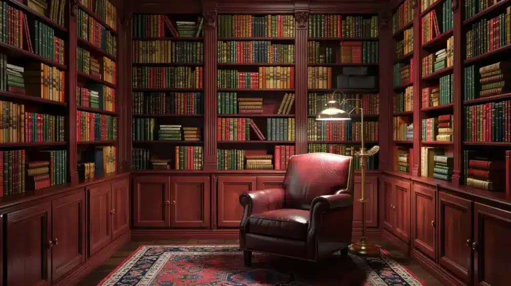
A burgundy or deep red color-drenched library creates a cocoon-like effect that suits reading and quiet work.
When shelves, trim, and walls blend together, books and decorative objects become the main points of interest.
The richness of the color deepens under warm lighting, making the room feel collected and purposeful rather than decorative.
5. Charcoal Dining Room
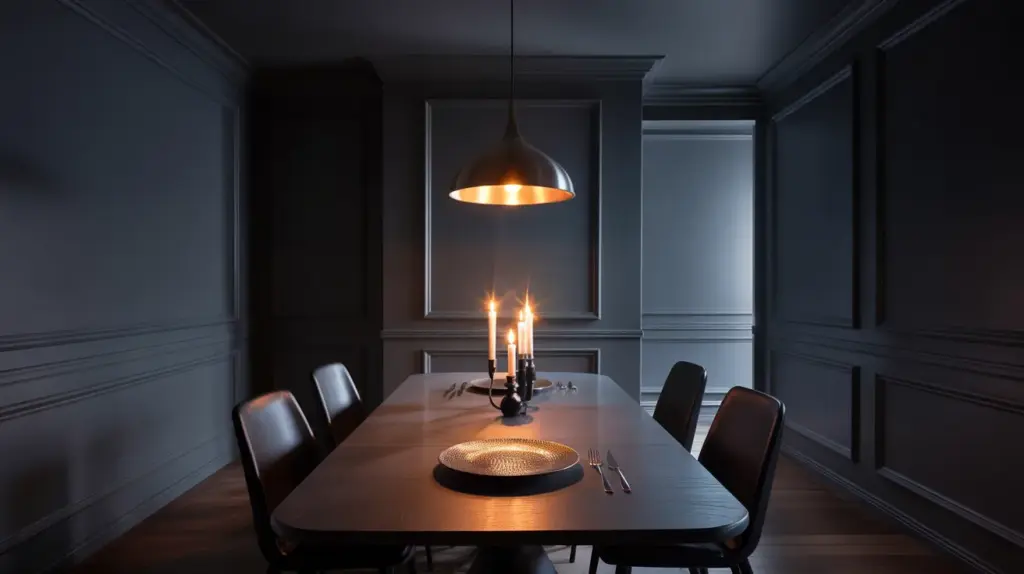
A charcoal color-drenched dining room feels intimate and focused, encouraging conversation rather than distraction.
Painting the ceiling and trim the same shade reduces contrast and gives the room a unified presence.
Candlelight and pendant lighting reflect softly against dark surfaces, adding warmth without brightening the space too much.
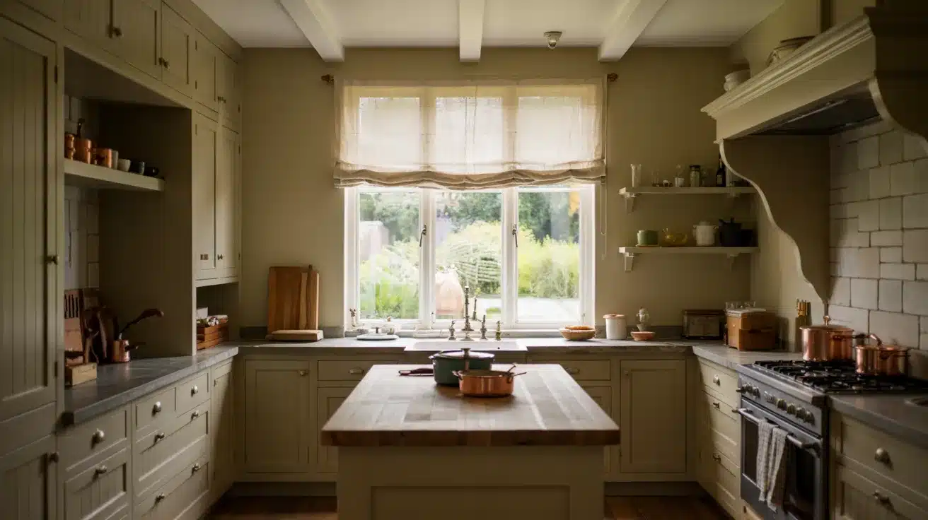
6. Olive Green Kitchen
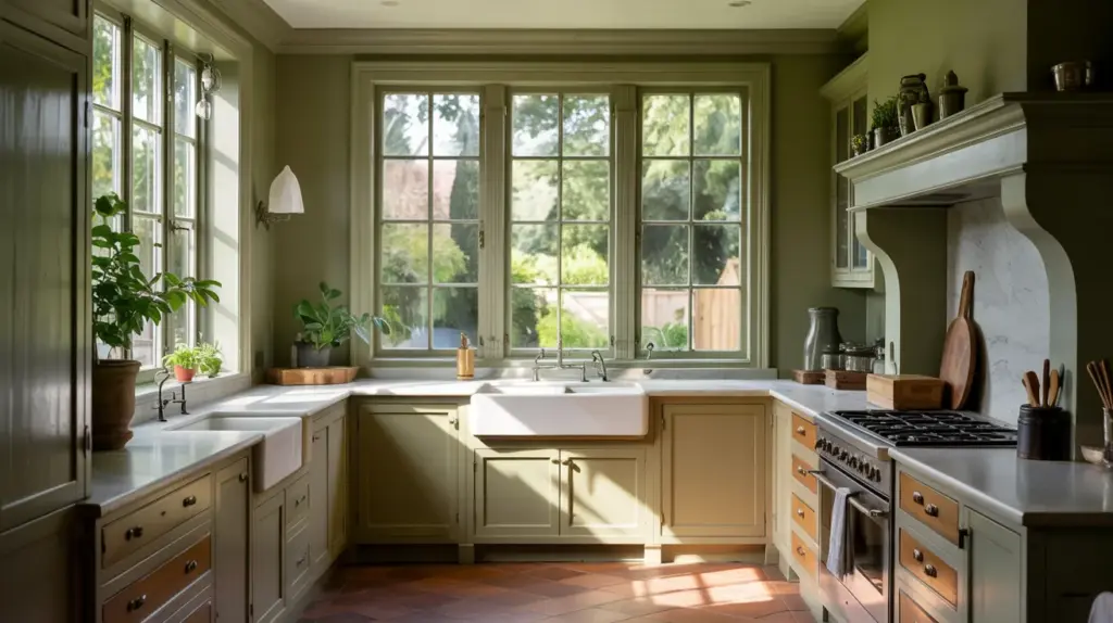
Color-drenching a kitchen in olive green can make cabinetry and walls feel more architectural. When everything shares the same tone, hardware, countertops, and appliances stand out more clearly.
The result is a kitchen that feels calm and cohesive rather than visually busy, especially when paired with natural materials like stone or wood.
7. Muted Pink Bedroom
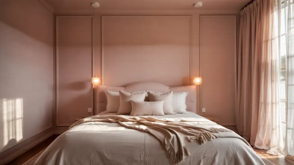
A muted pink or dusty rose bedroom feels soft without appearing overly decorative. When the color is applied across walls, ceiling, and trim, it becomes more atmospheric than playful.
The continuity allows the shade to read as a backdrop rather than a feature, making the room feel balanced and easy to live in.
8. Navy Powder Room
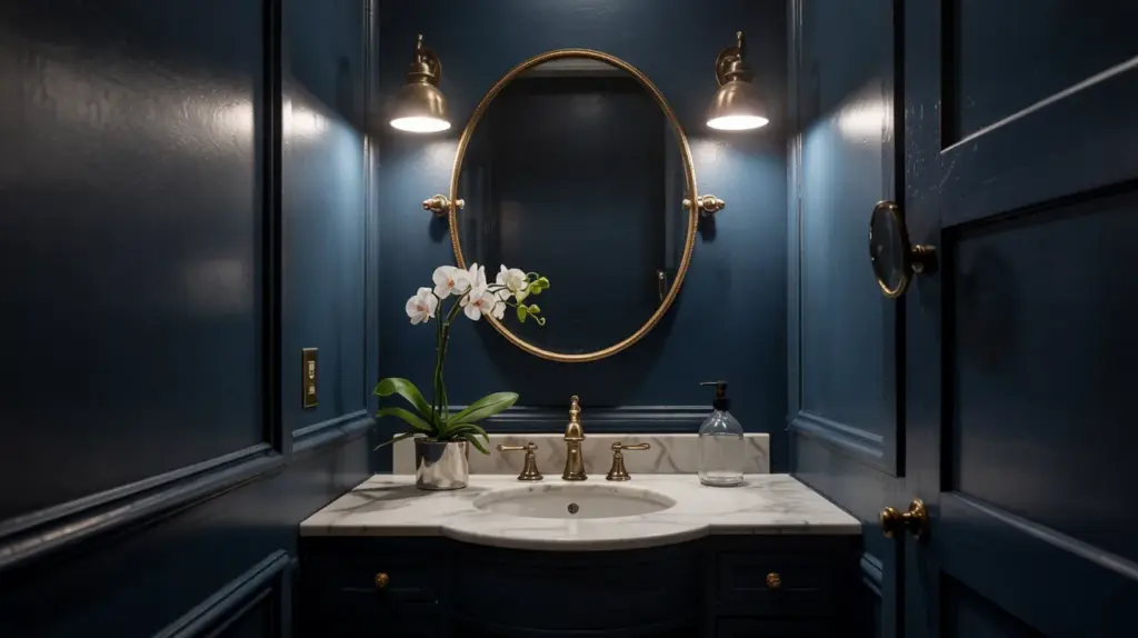
Powder rooms are ideal for color drenching because of their size. A navy shade wrapped around the entire space feels intentional and enclosed, turning a functional room into a design moment.
Mirrors and metal fixtures provide contrast, while the dark color helps disguise edges and corners.
9. Clay-Toned Guest Room
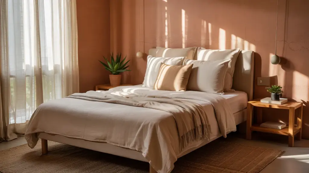
Clay or terracotta tones bring warmth and approachability to a guest room. When used as a color-drenched treatment, the shade feels grounded rather than bold.
The room reads as welcoming and settled, especially when paired with soft linens and simple furniture that does not compete with the color.
10. Forest Green Study
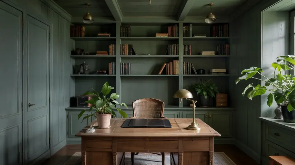
A forest green study or home office benefits from the visual calm of a single color envelope.
With fewer contrasts, the room feels focused and less distracting during long work sessions.
Matte finishes reduce glare from screens, while the depth of green supports a sense of concentration.
11. Soft Grey Sitting Room
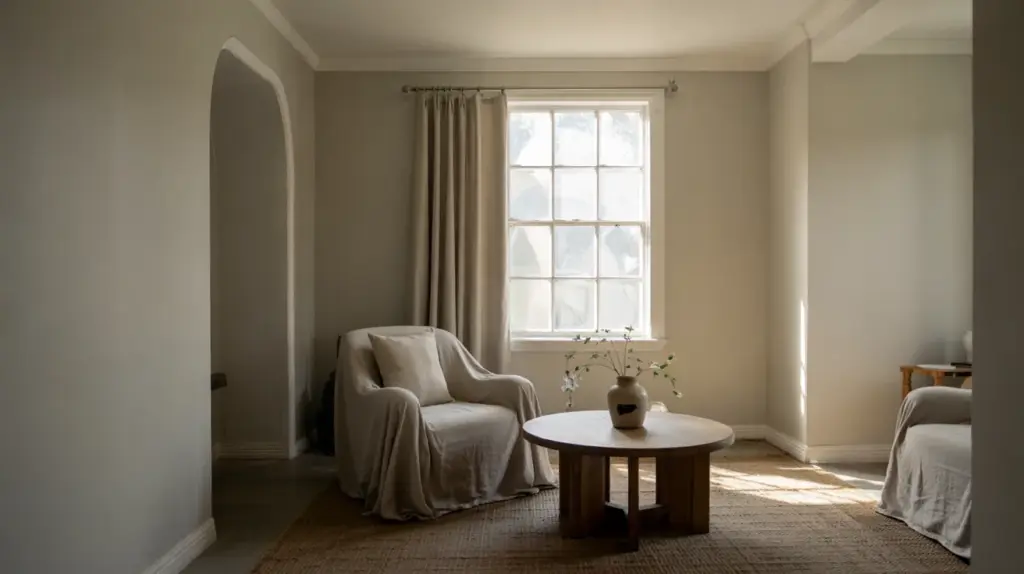
A soft, grey, color-drenched sitting room feels balanced and understated. By eliminating contrast between trim and walls, the space relies on furniture shapes and textures for interest.
This approach works well in rooms meant for casual use, where the goal is comfort rather than visual impact.
12. Lavender or Mauve Dressing Room
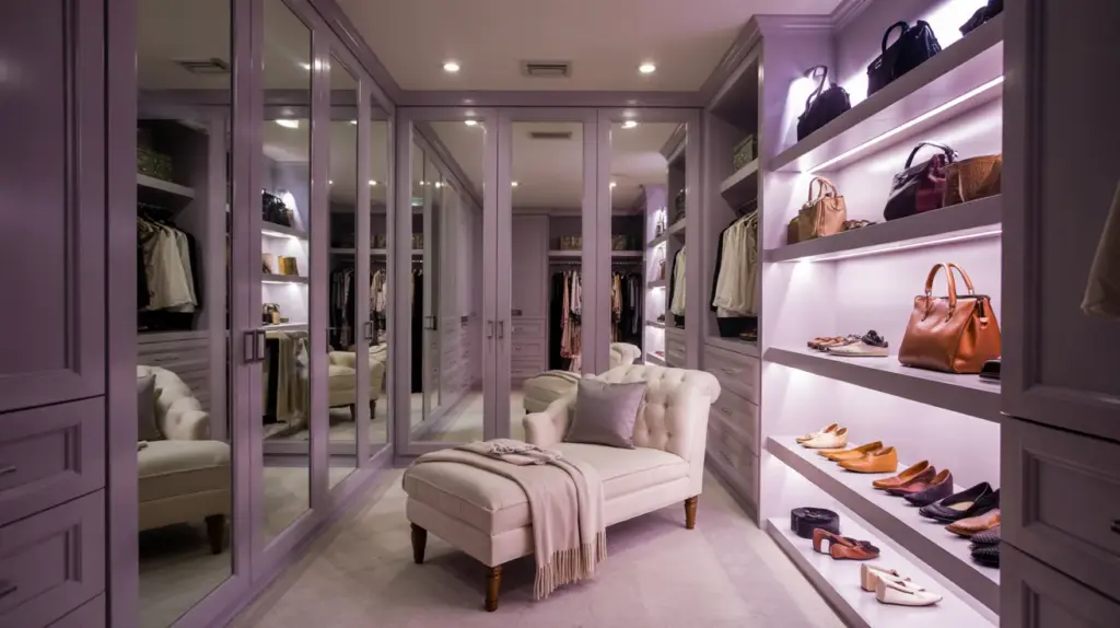
Muted lavender or mauve tones can feel personal and quiet when used in a fully color-drenched way.
In dressing rooms or walk-in closets, this creates a gentle enclosure that does not compete with clothing or mirrors. The color reads as soft and neutral once it surrounds the entire space.
13. Beige or Sand-Toned Bedroom
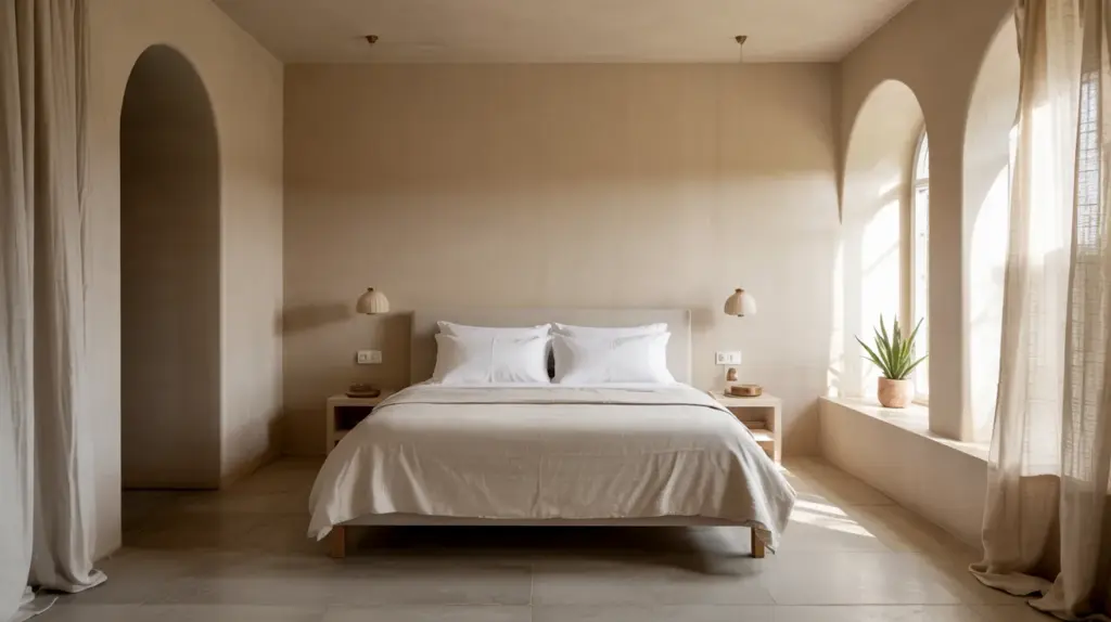
A beige or sand color-drenched bedroom shows how neutral does not have to mean flat. When walls, ceiling, and trim match, subtle shifts in light create depth throughout the day.
This approach works well for minimal interiors that rely on proportion and material rather than ornament.
14. Teal Media Room
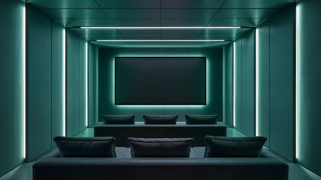
Teal works well in media rooms because it absorbs light without feeling overly dark. When the room is fully drenched, distractions fall away, and attention stays on the screen.
The color also pairs well with low, directional lighting that supports a relaxed viewing environment.
15. Black-Painted Entryway
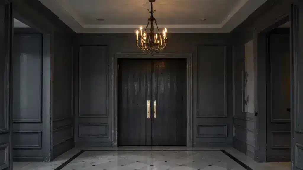
A black or near-black color-drenched entryway creates a strong first impression.
When applied consistently, the color feels deliberate rather than harsh. Good lighting is essential here, but when done well, the entry reads as confident and architectural instead of cramped.
What to Know Before Choosing a Color-Drenched Room?
Interior designers often point out that a color-drenched room requires more intention than a standard paint update.
When walls, ceiling, and trim share one shade, decisions around color, lighting, and finish become far more visible. The following expert insights outline what matters most before committing to this approach.
1. Color Selection Is More Complex Than It Looks
Professionals advise testing paint samples across multiple surfaces, not just one wall. In a color-drenched room, undertones become more noticeable because the color surrounds the space completely.
A shade that feels balanced on a small sample can shift warmer, cooler, or deeper once applied to ceilings and woodwork.
2. Lighting Should Be Planned in Advance
Experts treat lighting as part of the design process, not a final step. Natural light direction, time of use, and artificial lighting temperature all influence how a color-drenched room is perceived.
The same color can feel open in daylight and significantly heavier in the evening if lighting is not carefully considered.
3. Surface Preparation Affects the Final Result
Designers consistently stress the importance of preparation. When trim, doors, and walls are painted the same color, surface flaws become more apparent.
Proper sanding, patching, and priming help ensure the color reads as smooth and intentional rather than uneven.
4. Finish Choices Create Visual Balance
Although one color is used, experts rarely rely on a single finish. Matte or flat finishes on walls and ceilings help soften reflections, while satin or eggshell finishes on trim and doors add subtle definition.
This variation keeps architectural elements visible without breaking the unified look.
5. Room Function Should Guide Color Depth
Professionals match color depth to how a room is used. Smaller or enclosed spaces often suit deeper shades, while bedrooms and frequently used areas tend to work better with mid-depth colors that remain comfortable over time. The goal is longevity, not just initial impact.
6. Contrast Still Plays a Role
Even in a fully color-drenched room, some contrast is necessary for clarity and comfort. Designers rely on lighting fixtures, hardware, artwork, and soft furnishings to introduce variation.
These elements help prevent the space from feeling visually flat while preserving the overall cohesion.
Do’s and Don’ts of Color-Drenched Rooms
Choosing a color-drenched room works best when design decisions are intentional. These do’s and don’ts reflect common guidance shared by interior designers to help avoid costly or disappointing outcomes.
| Do’s | Don’ts |
|---|---|
| Test the chosen color on walls, ceiling, and trim before committing | Rely on a single wall swatch to judge the final look |
| Consider lighting conditions throughout the day | Assume the color will look the same in daylight and at night |
| Prepare surfaces carefully before painting | Skip sanding, patching, or priming |
| Use varied finishes to add subtle definition | Apply one finish everywhere and expect depth |
| Match color depth to the room’s purpose | Choose a shade based only on trends |
| Keep functional contrast through fixtures and décor | Remove all contrast and clarity from the space |
| Start with smaller rooms if unsure | Begin with large, open spaces without testing |
Conclusion
A color-drenched room is a design choice that rewards planning and restraint.
When walls, ceilings, and trim share one shade, color, light, and finish work together to shape how a space feels and functions.
The most successful examples balance depth with clarity, using lighting, surface preparation, and finish variation to support the overall look.
From subtle neutrals to deeper tones, color drenching can adapt to many room types when guided by function rather than impulse.
With thoughtful decisions, the result feels cohesive, confident, and designed to last rather than driven by trend alone.

Ava Taylor, holding a Bachelor’s degree in Interior Design from the Pratt Institute, has made her mark in creating engaging and functional living spaces for over 14 years. She began her career with a New York-based design studio, where she gained a reputation for her innovative and user-centric designs. Ava joined our team in 2019, bringing a blend of artistic flair and practicality to our home improvement section. Since the she has been the lead contributor to our room transformation series, inspiring readers with her unique approach to maximizing space utility and aesthetic appeal. Beyond her professional work, Ava is a passionate collector of vintage furniture, a hobby that enriches her design perspective.