Looking for a neutral paint color that feels modern, soft, and easy to live with? Sherwin-Williams Crushed Ice (SW 7647)might be just what your home needs.
This light gray shade walks the line between warm and cool, making it a flexible backdrop for all kinds of interior styles – from cozy farmhouse spaces to sleek, modern rooms.
It’s a favorite among homeowners, designers, and renovatorsalike because it works well in almost any space. Whether you’re painting an entire home or just updating a single room, Crushed Ice brings a calm, clean look without feeling too cold or too beige.
In this post, I’ll break down everything you need to knowabout this subtle yet stylish color. You’ll hear my take on its undertones, how it shifts in different lighting, and which colors I think pair well with it.
If you’re wondering whether Crushed Ice is the right neutral for your next project, stick with me – I’ve got you covered. Let’s take a closer look!
Basics of Crushed Ice by Sherwin-Williams
Sherwin-Williams’ Crushed Ice (SW 7647)is a refined, muted light graythat leans slightly warm, thanks to its greige undertones (a mix of gray and beige).
It’s not a pure gray, and it’s not beige either – it floats somewhere in between, giving it a soft, airy appearance without feeling cold or sterile.
Its subtle color profile makes it a popular neutral that can anchor a space without overwhelming it.
This paint color is part of the Sherwin-Williams Timeless Color Collection, which highlights enduring, dependable hues that work well across changing styles and trends.
Crushed Ice is one of those quiet neutrals that easily adapts to a range of design aesthetics – from transitional and modern to traditional and coastal.
Features of Crushed Ice
Crushed Ice is highly adaptable, changing its look based on lighting and nearby colors:
- South-facing rooms: Appears lighter and cooler, with hints of soft silver-gray.
- North-facing or dim rooms: Warmer greige tones show, creating a cozier vibe.
- Under warm lighting: The beige base softens the gray into a creamier shade.
- Surrounding colors: Looks grayer with cool tones, more beige with warm tones.
LRV (Light Reflectance Value)
With an LRV of 66, Crushed Ice reflects a moderate amount of light:
- Small rooms: Opens the space without feeling too pale.
- Large spaces: Acts as a soft backdrop for trim and décor.
- Not as bright as off-whites, but keeps things light, especially with white ceilings and light floors.
- This balance makes it a reliable pick for spaces with moderate natural or artificial light.
Understanding the Undertones of Crushed Ice
Neutral paint colors often come with hidden undertones that can shift dramatically depending on lighting and surroundings. Sherwin-Williams Crushed Ice (SW 7647)is no different.
Warm vs. Cool Balance
Crushed Ice sits comfortably in the greige category, balancing gray with subtle beige undertones. This duality allows it to flex between warm and cool tones, making it one of the more versatile shades in the Sherwin-Williams lineup.
- In warm lightingsuch as sunlight-filled south-facing rooms or areas lit with incandescent bulbs – Crushed Ice reveals its warmer side, showing hints of greige or soft taupe.
- In cooler lightinglike north-facing rooms or spaces lit with daylight LEDs, it leans cooler, taking on a silvery or misty gray tone.
This natural ability to adapt to its environment is what makes Crushed Ice feel harmonious with a wide range ofdesign elements.
It rarely feels too cold or too beige, instead offering a consistent softness that fits into both modern and traditional settings.
Common Pitfalls to Consider
Despite its flexibility, Crushed Ice’s undertones can be influenced by external factors, which may lead to unexpected results if not tested thoroughly.
- Surrounding colors: Warm wood floors, rich-toned furniture, or nearby walls can pull out the beige or taupe notes more strongly.
- Reflective surfaces: Shiny tiles, countertops, or metal fixtures may bounce light and subtly alter the way the color reads, sometimes introducing green or blue casts.
- Time of day: Morning and evening light can dramatically change the perceived temperature of the color.
Tip: Crushed Ice should always be tested in the actual space where it will be used. Applying large swatches on multiple walls and observing them throughout the day under various lighting conditions is the best way to avoid surprises.
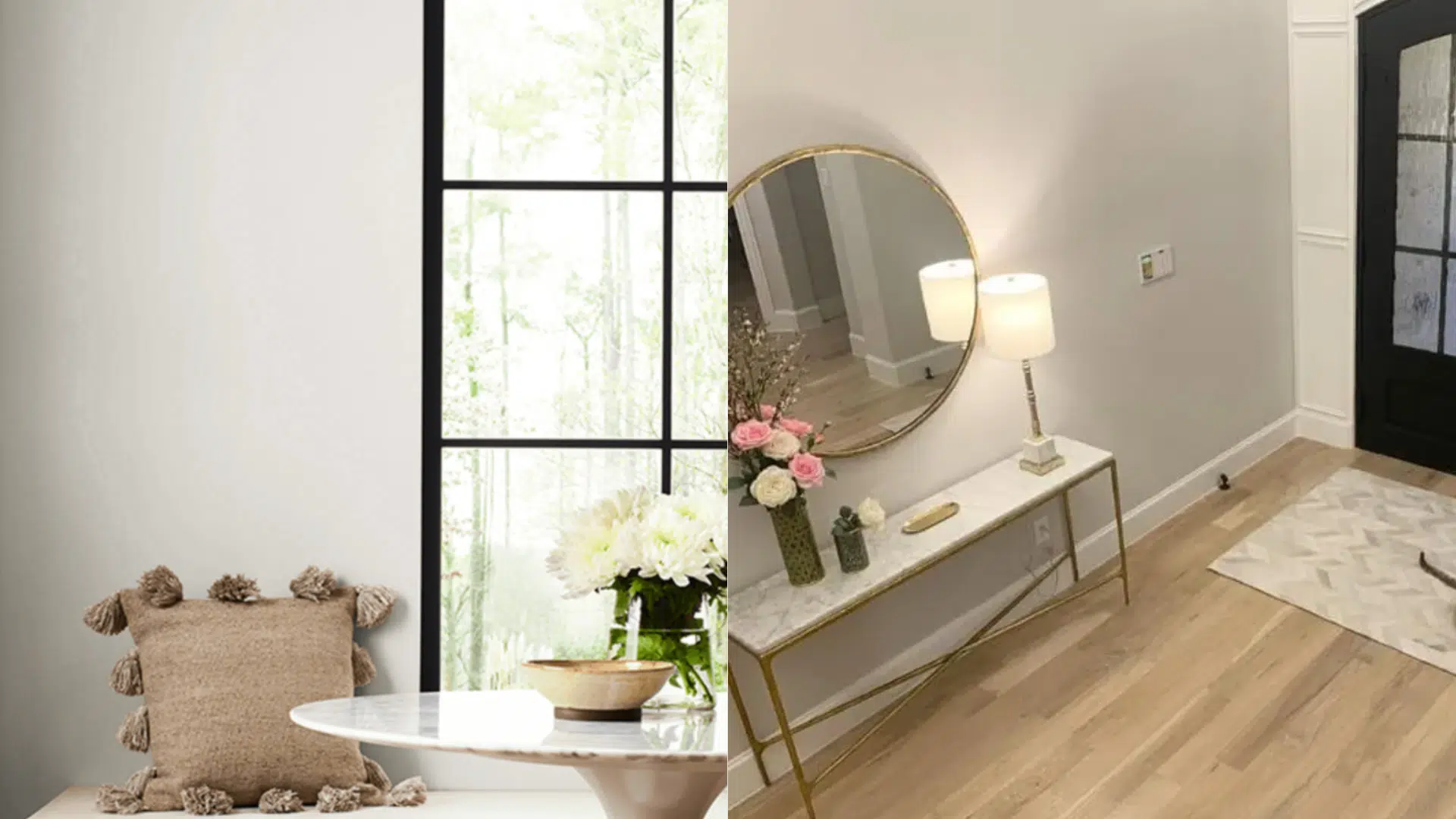
Where to Use Crushed Ice in Your Home
I’ve found that Sherwin-Williams Crushed Ice brings a soft, calm feel to almost any room. Its adaptable undertones make it perfect as a full-room color or a subtle backdrop, blending easily with both modern and classic styles.
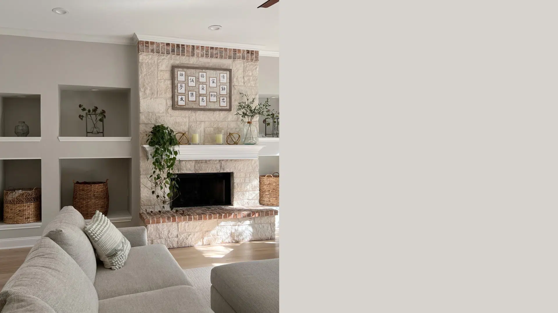
Living Room

Crushed Ice offers a relaxed, inviting backdrop for living spaces. It works especially well with warm wood tones, neutral upholstery, and natural materialslike rattan, jute, or woven fabrics.
When paired with beige sofas, linen curtains, and textural layers, it creates a grounded atmosphere that feels cohesive and comfortable. Its light reflectance also helps brighten the space without sacrificing warmth.
Kitchen
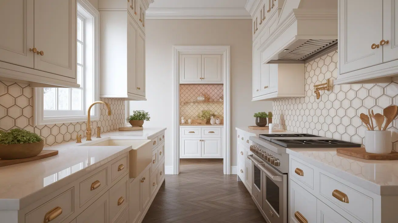
In the kitchen, Crushed Ice brings a crisp, tailored feel that still feels soft and livable. It pairs beautifully with white cabinetry, black or charcoal countertops, and brushed brass or matte black fixtures.
For those incorporating open shelving or mixed materials, this color provides a quiet, sophisticated backdrop that allows hardware, tile, and décor to stand out without clashing.
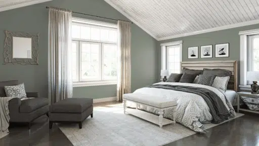
Bedroom
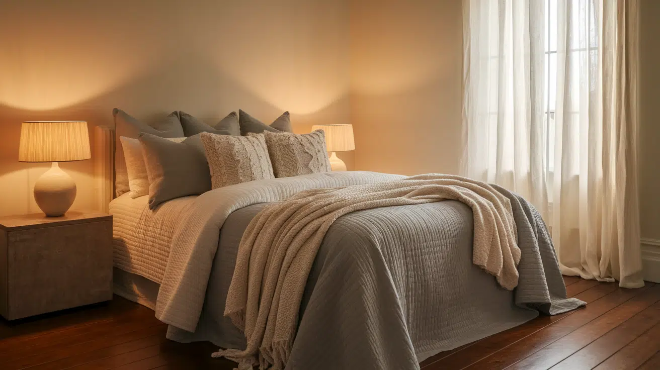
Crushed Ice adds a peaceful tone to bedrooms, especially when combined with plush textiles, soft whites, and muted accent colorslike dusty blue or sage green.
It creates a clean foundation for layering bedding, throw pillows, and subtle patterns. This makes it ideal for both minimalist bedrooms and more traditional spaces with layered decor and classic furniture pieces.
Bathroom
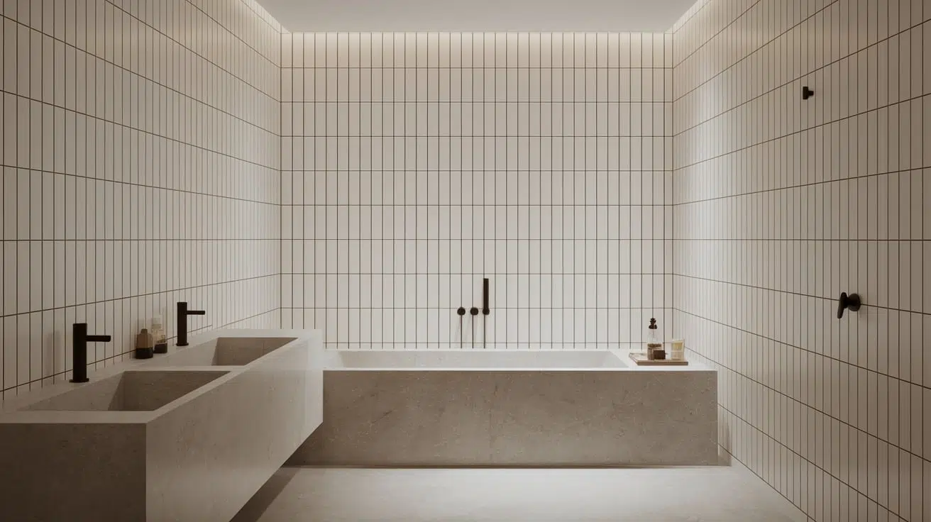
This color’s subtle undertones shine in bathrooms, where clean finishes and high contrast design elements are often present.
Crushed Ice works well as a neutral wall color against marble surfaces, glossy white tile, or matte black plumbing fixtures. It helps soften the often cold or sterile feel of hard finishes, contributing to a more spa-like, serene environment.
Here’s a simple table with an intro and outro to help guide pairing Sherwin-Williams Crushed Ice with trim, accents, and complementary palettes:
How to Pair Crushed Ice: Trim, Accent, and Palette Ideas
I’ve found that Crushed Ice looks its best when you choose colors that match its softness and flexibility.
| Use | Color | Description |
|---|---|---|
| Trim/Ceiling | Pure White (SW 7005) | Soft, clean white – works in any style |
| Alabaster (SW 7008) | Warm, creamy white – enhances Crushed Ice’s warmth | |
| Accent Walls | Peppercorn | Deep charcoal gray – bold and modern |
| Naval | Classic navy – rich and dramatic | |
| Evergreen Fog | Muted green-gray – calm and earthy | |
| Warm Pairings | Taupe, Sandy Beige, Terracotta | Cozy and inviting |
| Cool Pairings | Dusty Blue, Pale Sage, Soft Charcoal | Fresh, balanced, and modern |
I love how Crushed Ice can swing warm or cool depending on what you pair with it. Keeping the saturation consistent helps everything flow without clashing.
Conclusion
Sherwin-Williams Crushed Ice (SW 7647) is a soft, adaptable gray with warm undertones that blend easily into a wide range of interiors.
It complements both warm and cool color schemes, making it a reliable choice for whole-home palettes or individual rooms. Its light reflectance helps brighten spaces without creating harsh contrast.
However, it can appear slightly washed out in intense natural light and may shift subtly in tone depending on nearby materials and finishes.
Sampling it on the wall is recommended to ensure the right look for each space.
Crushed Ice works especially well for those who prefer warm neutrals, transitional styles, and subtle, timeless color schemes.
It’s a dependable, flexible option for creating calm, cohesive interiors that feel fresh but not trendy.

Alex Guerrero, a graduate with a Fine Arts degree from the Rhode Island School of Design, has been a visionary in the world of color and design for over 15 years. His professional journey began in the heart of the fashion industry in Milan, where he developed an acute sense for color harmonies and trends. Alex joined our team in 2018, offering fresh and innovative perspectives on color utilization in various spaces. Renowned for his ability to blend contemporary trends with timeless elegance. Outside of work, Alex is an accomplished painter and a volunteer art therapist, his artistic talents further enriching his professional insights.