When it comes to creating the perfect ambiance in your home, color plays a major role.
Dulux, a trusted brand in the world of home decoration, offers a wide range of warm neutral paint colors that can completely transform any space.
If you’re looking to bring a cozy vibe to your living room or a serene atmosphere to your bedroom, Dulux’s warm neutral shades have something for every style.
In this blog, I’ll walk you through some of the best warm-neutral shades from Dulux and give you tips on choosing the right one for your home.
Why Choose Warm Neutrals Paint Colors for Your Home?
Warm neutrals create a cozy and inviting atmosphere, making your space feel more comfortable and welcoming. These versatile shades work well with various decor styles, providing a timeless, calming backdrop.
- Cozy and Inviting Feel: Warm neutrals bring a cozy, welcoming atmosphere to any room. These colors are perfect for spaces where you want to create a sense of comfort and relaxation.
- Timeless and Versatile: Warm neutral tones are timeless. Unlike trendy colors that may come and go, warm neutrals can seamlessly fit into any home decor style, whether it’s modern, traditional, or rustic.
- Easy to Pair with Other Colors: Warm neutrals are incredibly versatile when paired with other colors. They serve as a perfect backdrop for bolder accent colors or work well with other neutrals for a sophisticated, layered look
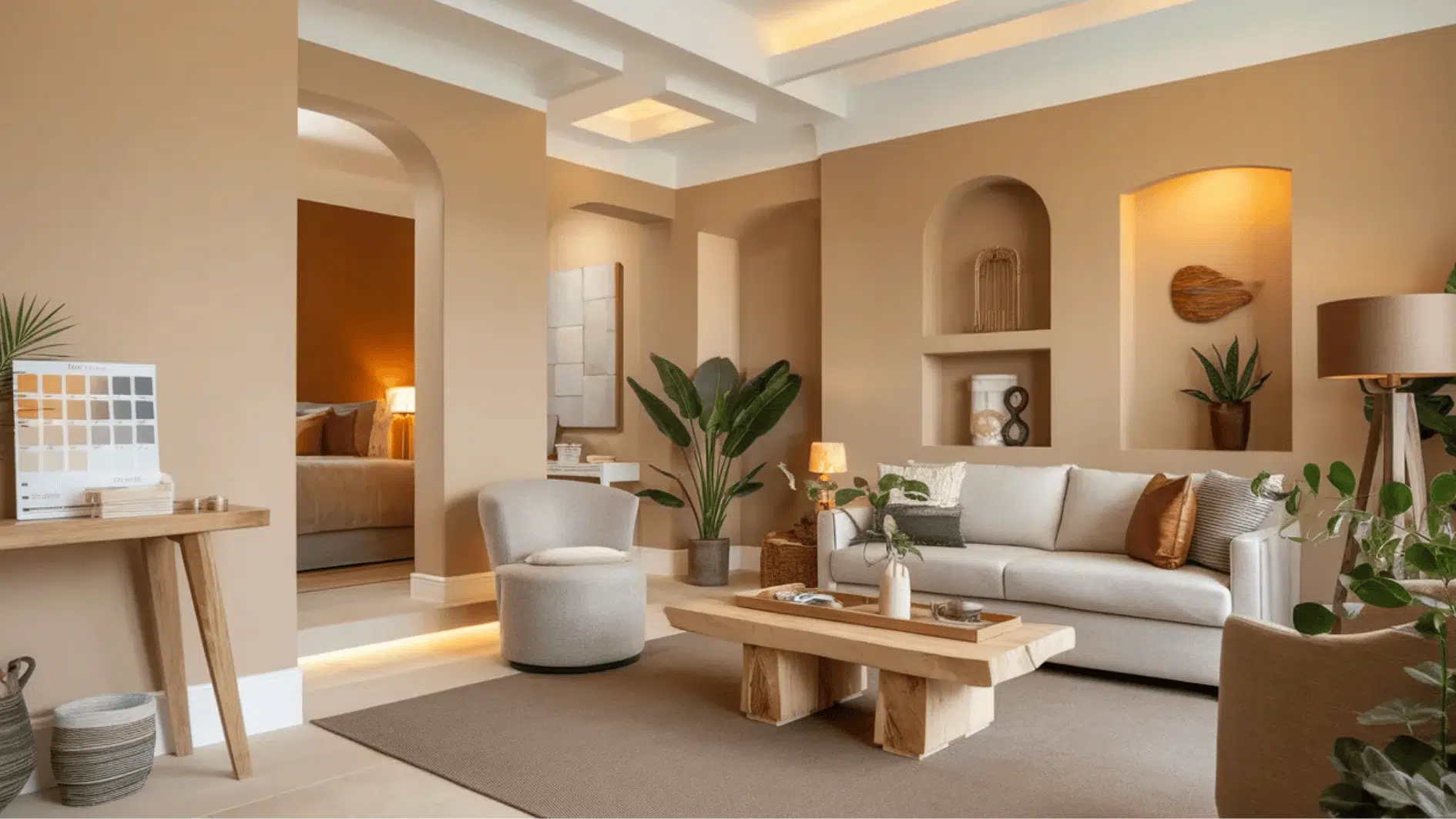
Dulux Warm Neutral Paints: Soft Shades for a Serene Space
Dulux offers a variety of warm neutral shades that can cater to every taste and design preference. Here are some warm neutral color options:
1. Light Taupe

Light Taupe is a subtle mix of beige and gray, offering a calming and warm atmosphere in any room. Its soft tone creates an airy feel while maintaining enough warmth to make spaces feel inviting.
Ideal for creating a serene backdrop, this neutral shade enhances the mood of both modern and traditional interiors.
Works Best In:
- Living Rooms & Bedrooms: Perfect for creating a relaxed, cozy environment.
- Kitchens: Pairs well with white trim and natural wood for a fresh, open look.
- Bathrooms: Adds sophistication without overwhelming the space.
- Hallways: Creates a seamless, airy flow between rooms.
Light Taupe brings warmth and tranquility to any room, working well with various styles and colors for a timeless, relaxed vibe.
2. Brown Mustache

Brown Mustache is a deep, rich brown with earthy undertones, perfect for adding warmth to kitchens and hallways. It works well with brass accents, cream furniture, and textured fabrics for a balanced, cozy finish.
Works Best In:
- Kitchens & Hallways: Adds a warm, grounded vibe to these spaces.
- Living Rooms: Pairs well with earthy tones and natural textures for a relaxed feel.
Brown Mustache brings a cozy, inviting touch to any room, effortlessly balancing dark and light elements.
3. Pigeon Isle

Pigeon Isle is a soft, muted green with gray undertones, creating a tranquil, nature-inspired vibe. It’s perfect for bedrooms or bathrooms where calmness is desired.
Works Best In:
- Bedrooms & Bathrooms: Ideal for creating a peaceful, restful atmosphere.
- Living Rooms: Pairs beautifully with light oak furniture and soft fabrics for a serene environment.
Pigeon Isle promotes relaxation and serenity, enhancing the mood of any space.
4. Audrey’s Auburn

Audrey’s Auburn is a warm, reddish-brown shade that creates a cozy, inviting atmosphere, making it perfect for a statement wall in living areas.
Works Best In:
- Living Rooms: Ideal for creating a focal point in open spaces.
- Bedrooms: Pairs well with neutral tones for a calming effect.
Audrey’s Auburn adds depth and warmth, making any room feel welcoming and comfortable.
5. Taupe Tower

Taupe Tower is a deeper taupe that blends warm beige and subtle gray tones, offering a calm yet rich backdrop in larger spaces.
Works Best In:
- Living Rooms & Dining Areas: Creates a warm, grounded atmosphere.
- Hallways: Provide a seamless transition between rooms.
Taupe Tower provides a rich, balanced backdrop, complementing a variety of interior styles.
6. Grey Tabby

Grey Tabby is a warm, light gray with subtle beige undertones, offering a soft, neutral backdrop. It’s perfect for creating a peaceful, contemporary look in any room.
Works Best In:
- Living Rooms & Bedrooms: Perfect for creating a calm, relaxed setting.
- Kitchens: Pairs nicely with modern fixtures and cabinetry.
Grey Tabby offers a soft, versatile neutral that pairs effortlessly with any decor.
7. Driftstone

Driftstone is a muted, earthy brown with gray undertones, perfect for creating a rustic, cozy atmosphere in any room.
Works Best In:
- Living Rooms & Dining Rooms: Ideal for adding warmth to larger spaces.
- Bedrooms: Pairs well with natural wood and textured fabrics.
Driftstone provides a warm, inviting feel, adding a rustic charm to any room.
8. Rose Stone

Rose Stone is a soft, warm pinkish-beige that exudes a soothing, delicate vibe, ideal for spaces where relaxation is key.
Works Best In:
- Bedrooms: Creates a tranquil, restful environment.
- Living Rooms: Pairs beautifully with soft gold finishes and plush textures.
Rose Stone adds warmth and calm to spaces, creating a welcoming and relaxed atmosphere.
9. Coffee Muffin

Coffee Muffin is a rich, warm brown with subtle red undertones, adding depth and richness to kitchens or living rooms.
Works Best In:
- Kitchens & Living Rooms: Creates a bold yet grounded feel.
- Dining Rooms: Pairs well with wood finishes and natural elements.
Coffee Muffin brings warmth and richness, making it perfect for creating a cozy, inviting space.
10. Woodhaven

Woodhaven is a deep, earthy brown with hints of green, adding warmth and a grounded, rustic feel to living rooms or dining areas.
Works Best In:
- Living Rooms & Dining Rooms: Complements stone textures and greenery for a nature-inspired feel.
- Kitchens: Pairs beautifully with natural wood and soft lighting.
Woodhaven provides a deep, earthy feel, creating a grounded, nature-inspired ambiance.
How to Choose the Right Warm Neutral for Your Home
Choosing the perfect warm neutral paint color can be tricky, but with a few key factors in mind, you can find the right shade.
- Room Size: For smaller rooms, lighter shades can create the illusion of more space and brightness. In larger spaces, deeper tones add warmth and intimacy, making the room feel cozy.
- Natural Light: Natural light plays a huge role in how a color appears. If your room gets limited light, consider warm shades that bring balance without overwhelming the space.
- Mood and Ambience: Think about the atmosphere you want to create. If you’re aiming for a cozy, inviting feel, rich, deep shades are perfect. On the other hand, if you’re after a softer vibe, opt for lighter hues to create a relaxed ambiance.
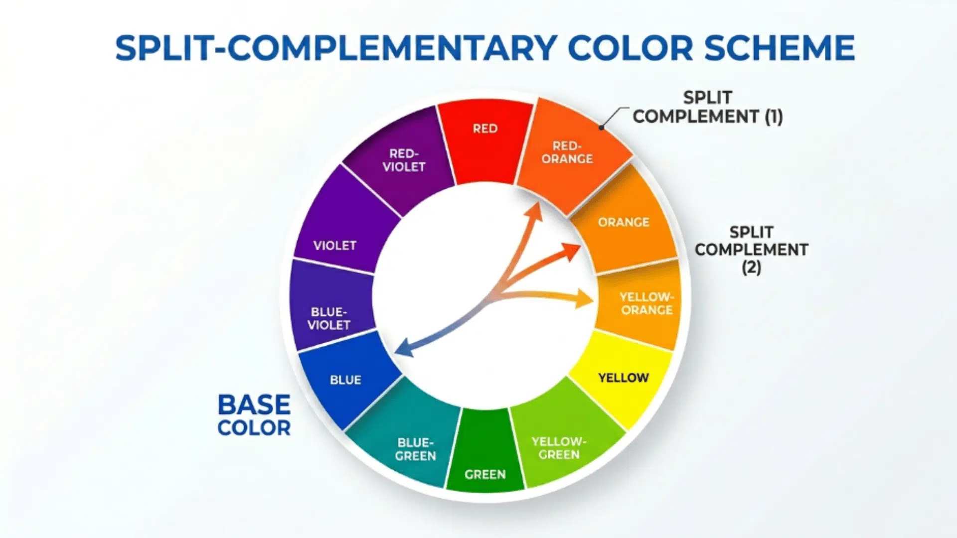
Complementary Colors and Finishes for Dulux Warm Neutrals
While these warm neutral shades are stunning on their own, pairing them with complementary colors and finishes can truly elevate the look.
Best Accent Colors
Accent colors add personality and vibrancy to your space, enhancing its overall design and creating focal points that stand out.
| Color Pairing | Description | Complementary Colors |
|---|---|---|
| Warm Neutrals with Earthy Greens | Pairing warm neutrals with earthy greens like Ionic Green and Khaki Green brings a natural, calming feel to the space. | Woodhaven, Pigeon Isle |
| Bold Accent Colors with Neutrals | Bold accents like deep blues or soft oranges add contrast and vibrancy to warm neutrals like Brown Mustache and Audrey’s Auburn. | Deep blues, Soft oranges |
Finishes That Enhance the Look
The right finish can elevate your space by adding depth, texture, and shine, creating a polished or cozy atmosphere depending on your style.
| Finish Type | Description | Best For |
|---|---|---|
| Satin/Gloss | Reflect more light, making walls brighter and more vibrant. Easier to wipe clean and maintain. | High-traffic areas like hallways, kitchens, and kids’ rooms. Adds a neat, refined touch. |
| Matte | Absorbs light for a smooth, velvety appearance, creating a soft and relaxed vibe. Hides small wall imperfections. | Bedrooms and living rooms, providing a cozy, laid-back mood with a seamless look. |
Additional Tips for Using Warm Neutrals in Different Spaces
Here’s how you can incorporate these warm neutrals into your home:
- Living Room: Choose mid-tone neutrals that create a cozy and welcoming vibe without feeling too dark. These shades offer flexibility, making it easy to style your furniture and décor around them.
- Bedroom: Go for soft, soothing tones that help you unwind at the end of the day. Gentle neutrals create a peaceful setting that supports rest and comfort.
- Kitchen: Opt for deeper, grounded shades to bring warmth and character into your cooking space. Rich neutrals add depth while still keeping the room feeling balanced and inviting.
- Bathroom: Light, warm neutrals in the bathroom create a serene and spa-like atmosphere. Use them for walls or accents to evoke a calm, clean feeling.
- Hallways: Light, airy neutrals work great for hallways, making them feel open and spacious while still maintaining a soft, inviting tone.
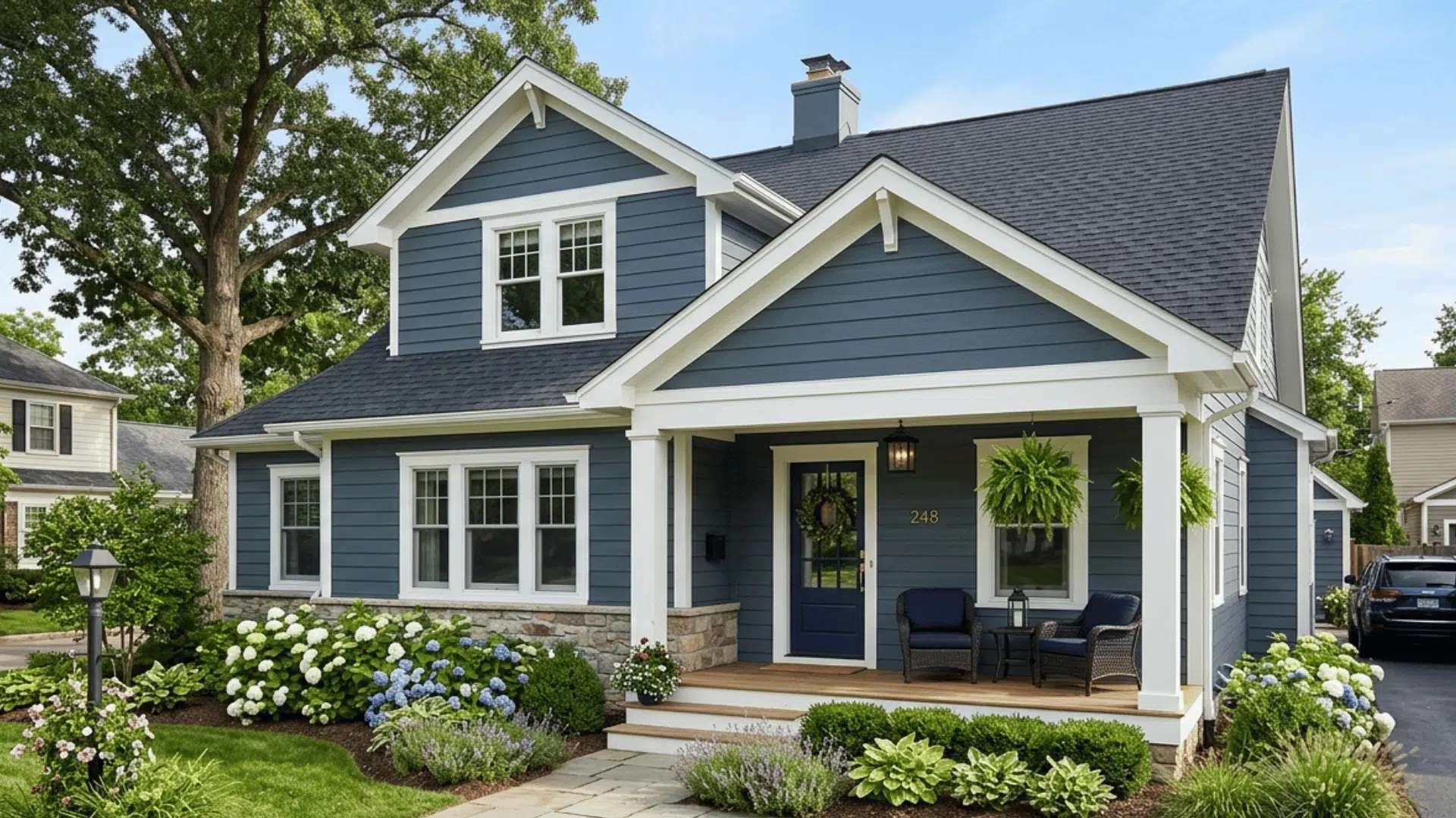
- Exteriors: Warm neutrals for the exterior of your home can create a timeless and welcoming curb appeal. Shades like taupe, beige, and soft brown can complement natural surroundings and add style.
Conclusion
Dulux warm neutral paint colors are an excellent choice for any home, bringing both elegance and comfort. Dulux offers a stunning range of shades, from soft beige tones to deeper, richer browns and taupes.
By considering the size, light, and mood of your space, you can easily find the perfect warm neutral to complement your style.
So, whether you’re looking to create a cozy living room or a peaceful bedroom, Dulux’s warm neutrals will help you achieve the look and feel you desire.

Alex Guerrero, a graduate with a Fine Arts degree from the Rhode Island School of Design, has been a visionary in the world of color and design for over 15 years. His professional journey began in the heart of the fashion industry in Milan, where he developed an acute sense for color harmonies and trends. Alex joined our team in 2018, offering fresh and innovative perspectives on color utilization in various spaces. Renowned for his ability to blend contemporary trends with timeless elegance. Outside of work, Alex is an accomplished painter and a volunteer art therapist, his artistic talents further enriching his professional insights.