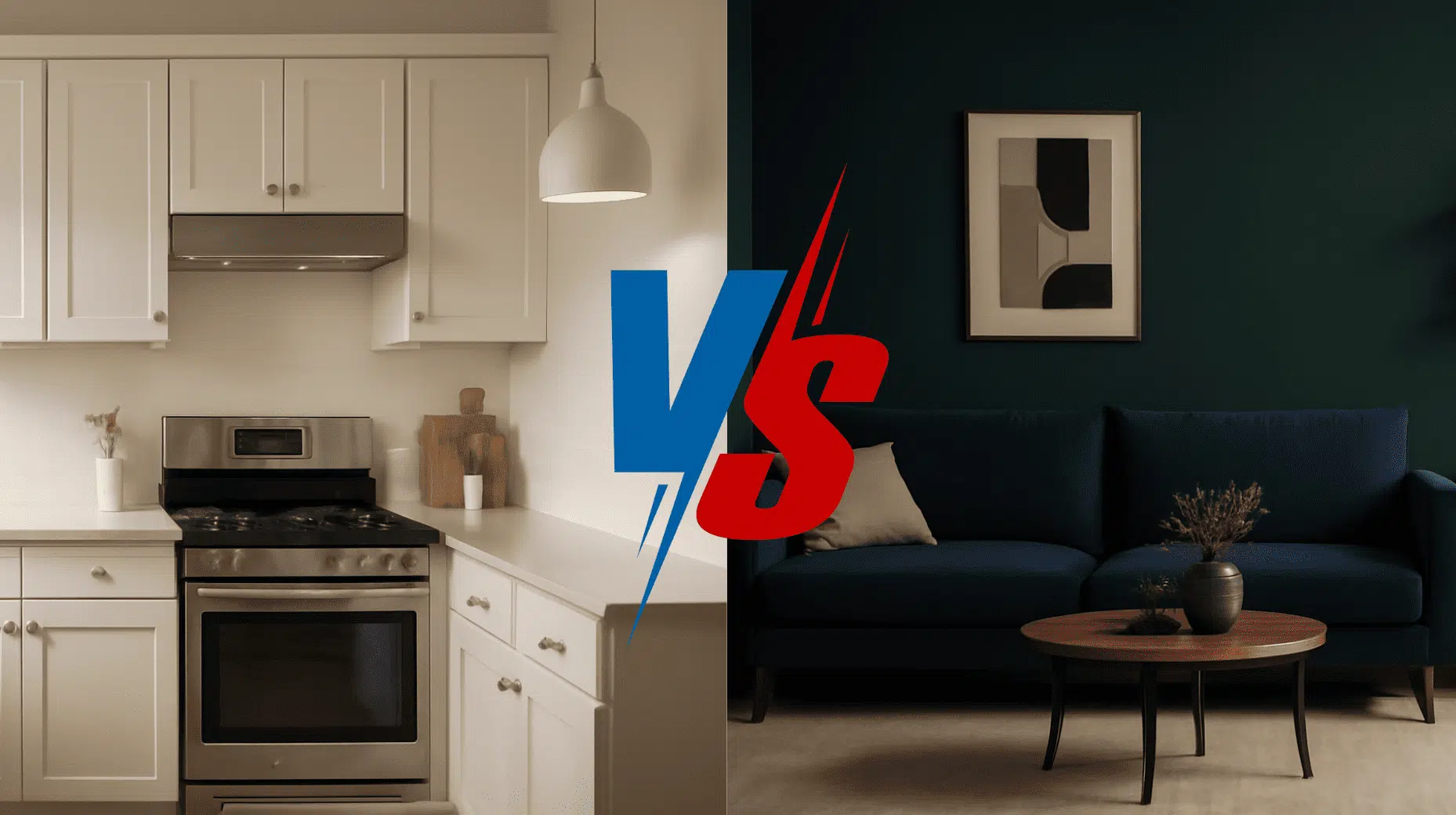
Looking for a paint color that feels graceful but cozy?
Elephant’s Breath by Farrow & Ball might be your perfect match.
This gorgeous greige converts plain walls into refined spaces that feel just right.
With subtle lilac and warm taupe undertones, it shifts beautifully as daylight changes.
It’s not a boring gray, but a complex color with real personality.
This versatile neutral makes decorating almost mistake-proof, creating peaceful rooms that work with everything from modern furniture to vintage pieces.
It feels timeless yet completely current, like a perfect cashmere sweater for your walls.
It forgives wall imperfections, matches everything, and looks expensive without trying too hard.
It’s the rare color that feels both fresh and classic at the same time.
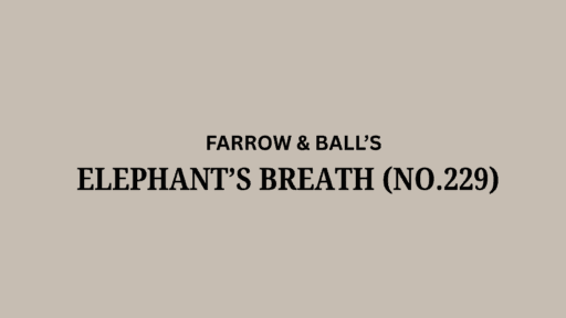
Understanding Farrow & Ball Elephant’s Breath
This is a gorgeous greige paint color by Farrow & Ball.
It alters ordinary walls into urbane, welcoming spaces that feel just right.
You can spot this color as No. 229 in the Farrow & Ball collection.
Color Terminology
Let’s explore what makes this paint color so special to many homeowners.
These numbers tell the real story behind this beautiful neutral shade.
| PROPERTY | VALUE |
|---|---|
| Color No. | 229 |
| RGB Color | 205, 195, 183 |
| HEX Code | #CDC3B7 |
Keep these RGB and Hex codes handy when shopping for matching decor online.
Undertones:
- It carries subtle lilac and warm taupe undertones that feel lavish
- It’s a friendly chameleon that shifts slightly as daylight changes
- Not a boring gray, but a complex, nuanced color with personality
Psychology of Neutral Colors
The paint colors on our walls shape how we feel in our homes.
- Balanced neutrals: Create peaceful, stress-free living spaces
- Refined greiges: Make decorating nearly mistake-proof
- Adaptable wall colors: Look beautiful in both morning and evening light
- Advantages: Forgives wall imperfections, matches everything, looks expensive
People love this color because it feels timeless yet completely current.
You can’t go wrong with this paint color – it’s like the perfect neutral for your walls!
Why Choose Farrow & Ball Elephant’s Breath?
Farrow & Ball Elephant’s Breath is a soft, graceful greige that makes any room feel calm and stylish.
This color works with almost any furniture you already have in your home.
1. Versatility
This paint changes throughout the day in beautiful ways you’ll love.
Morning sunshine brings out its warm taupe side, while evening light shows its cooler gray tones.
This friendly color works perfectly in living rooms, bedrooms, and even kitchens.
It looks amazing in both country cottages and modern apartments, making it super easy to use.
2. Key Features
It creates the perfect balance between warmth and enlightenment.
It brightens rooms without feeling too pale or washed out.
Designers have loved this color for years because it never looks outdated or too trendy.
Once painted, you’ll see how it makes your furniture and decor look even better.
3. Durability
Farrow & Ball’s quality formula stands up to real life in busy homes.
This neutral shade hides fingerprints and small marks better than bright white walls would.
The rich pigments keep their beautiful color even after cleaning, making your investment worthwhile.
Perfect for hallways and family rooms where walls get touched more often.
4. Texture Patterns
This color creates a soft, luxurious look that makes rooms feel instantly more expensive.
Its subtle lilac-taupe undertones add interest without taking over your space.
This color makes white trim and doors look extra crisp and clean.
It connects different rooms beautifully, creating flow while letting your special decor pieces shine.
Room Color Recommendations: Farrow & Ball Elephant’s Breath
This is a soft, refined greige that creates spaces that feel calm and urbane.
It shifts throughout the day, showing warmer tones in bright light and cooler gray notes in the evening.
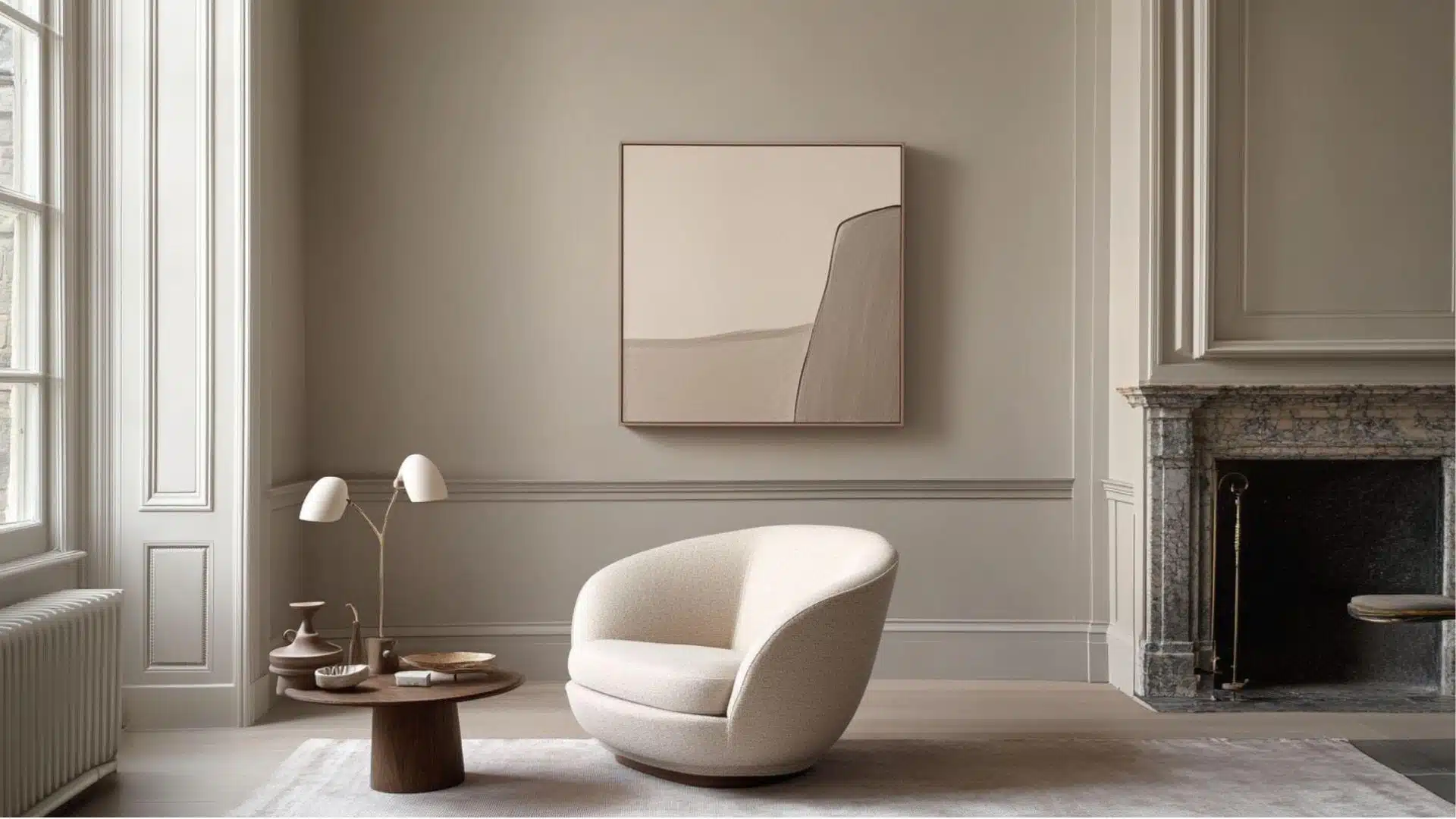
1. Living Spaces and Family Rooms
Living rooms need colors that make us feel relaxed but still look put together.
Elephant’s Breath does this perfectly. It creates a warm backdrop for daily life.
- Creates a beautiful neutral canvas that lets your colorful pillows, art, and rugs really stand out.
- Works with both modern and traditional furniture, making it perfect when you like to change your style.
- Pairs wonderfully with cream colored sofas and natural wood tables for a relaxed, welcoming living room.
Many homeowners say their living rooms feel more “finished” with this color.
It has a way of making even simple spaces look like they were professionally designed.
2. Kitchens and Dining Areas
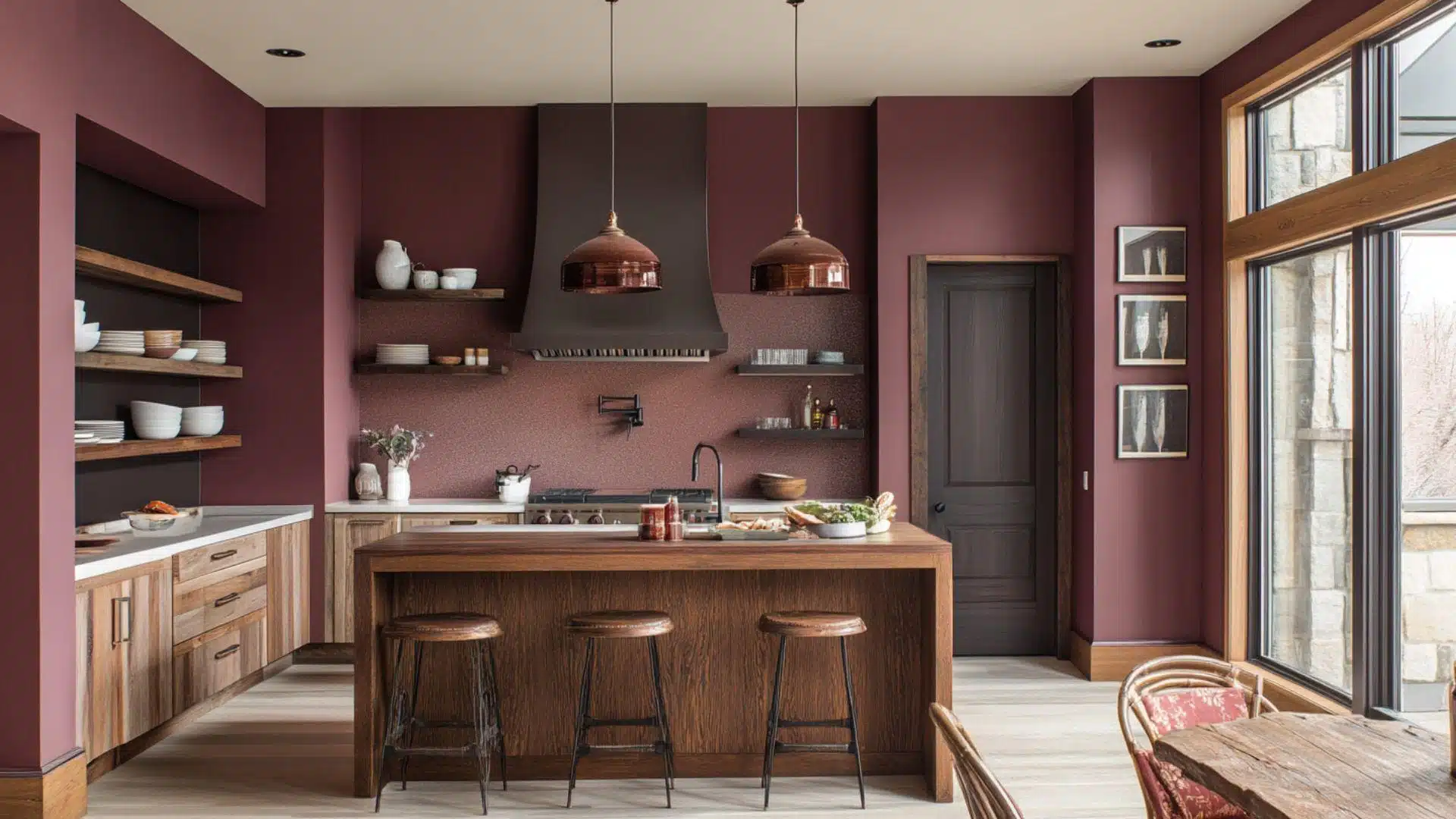
Kitchens and dining rooms benefit from colors that feel clean but still warm.
This greige adds just the right amount of color without being too bold.
- Makes kitchens feel warm and inviting without the coldness that comes with pure white walls.
- Looks amazing with both light marble countertops and darker granite or wood surfaces in any kitchen.
- Creates a dining room that feels special but not stuffy, perfect for both everyday meals and parties.
Your kitchen will feel more custom and thoughtfully designed with this paint color.
Food even looks better against these soft walls!
3. Bedrooms and Relaxation Spaces
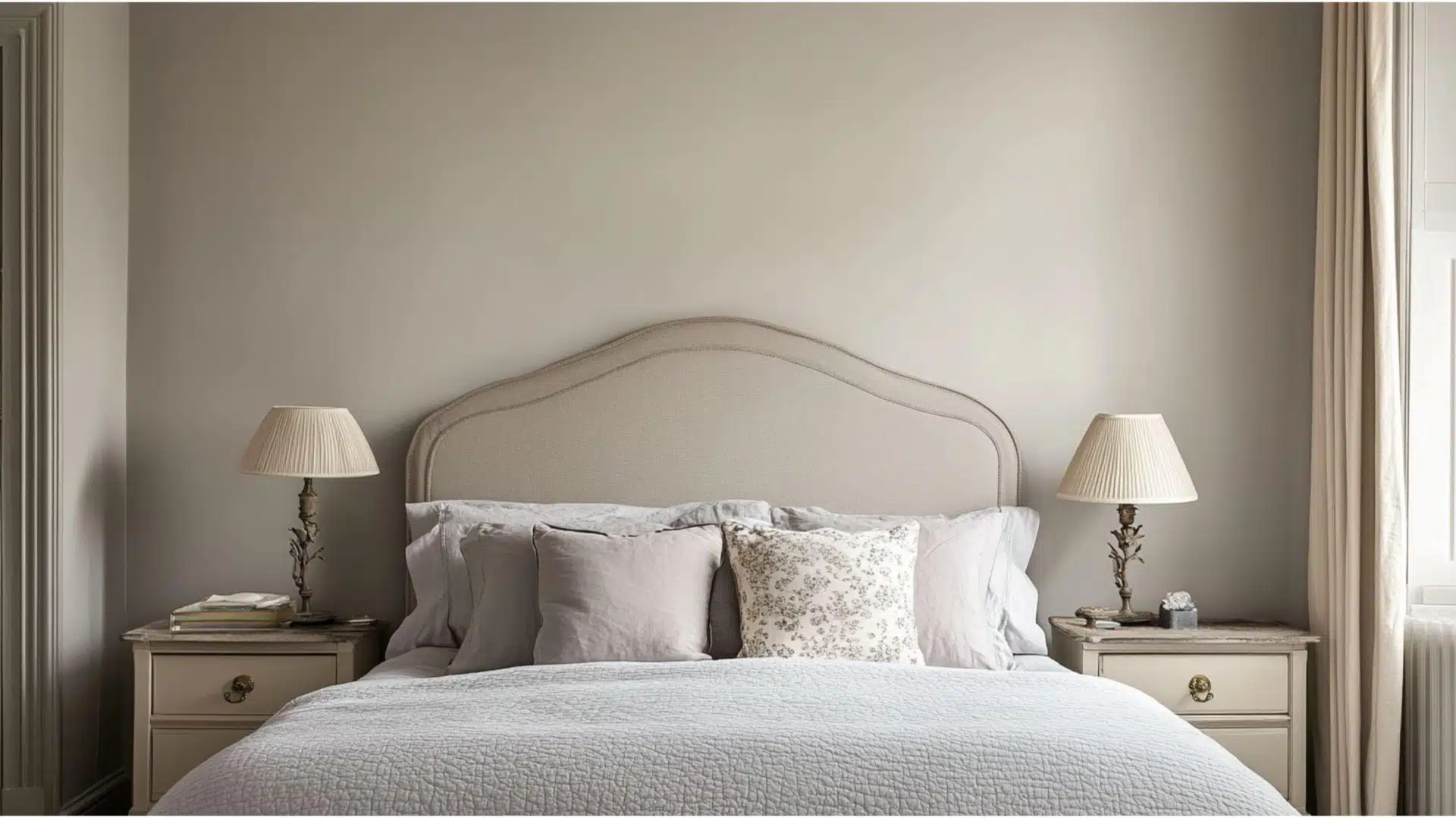
Bedrooms should feel peaceful and help us unwind.
It creates the perfect mood for rest and relaxation in any bedroom.
- Alters bedrooms into peaceful retreats that help you feel relaxed and ready for good sleep.
- Complements many bedding colors from crisp whites to soft blues, greens, and even rich purples.
- Makes master suites feel luxurious while keeping guest rooms welcoming and comfortable for everyone.
This color has a calming effect that many people notice right away.
Your bedroom will feel like a high-end hotel suite with this cultured neutral.
Color Pairings and Combinations for Farrow & Ball Elephant’s Breath (No. 229)
This is a beautiful soft greige that feels right at home in any room.
It creates bright, lavish spaces that never feel cold or unwelcoming.
Here are the perfect partner colors for this versatile neutral shade.
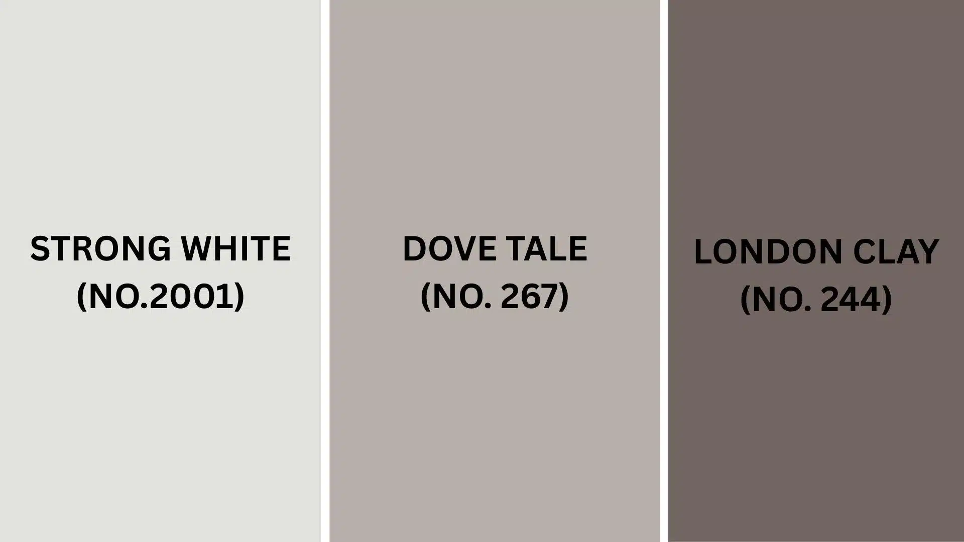
Complementary Trim Colors
Picking the right colors to go with the color can change your home.
These colors create gorgeous combinations that will make your rooms look amazing.
1. Strong White (No. 2001)
A clean, soft white that pairs beautifully with this paint color, creating a fresh look.
The gentle contrast feels cultured but still warm and welcoming.
Perfect for trim, ceilings, and doors throughout your home for a cohesive feel.
Many designers choose this pairing for its timeless appeal that never looks dated.
2. Dove Tale (No. 267)
A deeper greige that adds just the right amount of contrast with the color.
Use it on kitchen islands or built-ins while keeping this versatile paint on your walls.
This combination creates spaces that feel layered and thoughtfully designed.
Your home will have that custom look without hiring an expensive interior designer.
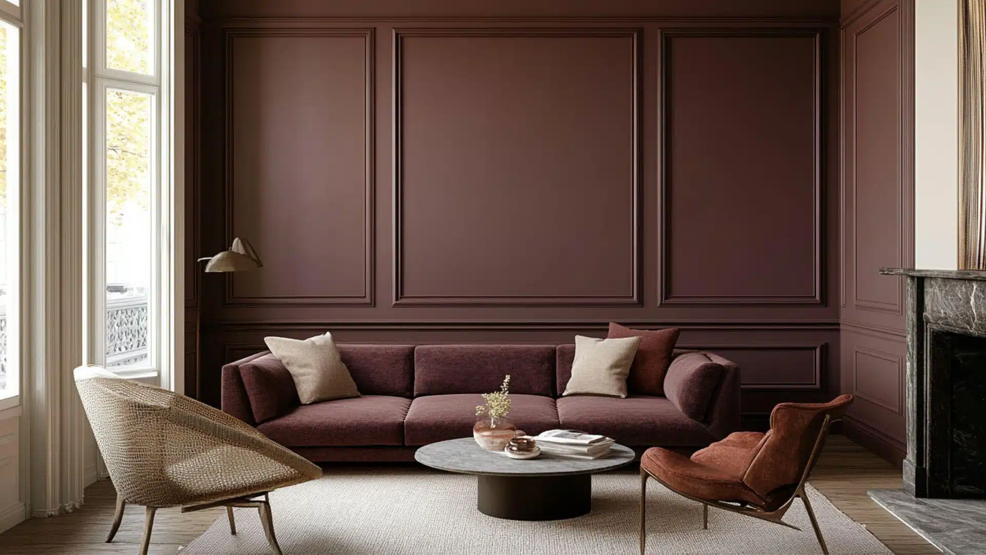
3. London Clay (No. 244)
A rich terracotta brown that makes a stunning accent with the walls.
This earthy color adds warmth and depth to dining rooms and living spaces.
Try it on a single wall or built-in bookcase for a touch of drama.
The combination feels grounded and natural, like something from a high-end design magazine.
Creating Cohesive Color Schemes
Farrow & Ball Elephant’s Breath works beautifully with many other colors to create a flowing home design.
This graceful greige makes a perfect starting point for creating your perfect color palette.
Here are three different ways to use it throughout your home.
Here is a helpful color scheme table:
| SCHEME | MAIN WALLS / AREAS | TRIM / ACCENT / CEILINGS | OTHER ROOMS / ACCENTS |
|---|---|---|---|
| Monochromatic | Elephant’s Breath (No. 229) | Strong White (No. 2001) | Skimming Stone (No. 241), Purbeck Stone (No. 275) |
| Warm | Elephant’s Breath (No. 229) | Dove Tale (No. 267) | Oxford Stone (No. 264), London Clay (No. 244) |
| Cool | Elephant’s Breath (No. 229) | Pavilion Gray (No. 242) | Cornforth White (No. 228), Lamp Room Gray (No. 88) |
NOTE: All colors shown are Farrow & Ball paints. Always test samples in your own space before painting your whole room.
Coordinating with Furniture and Decor
This paint creates a beautiful background that makes your furniture look amazing.
Its soft greige tone works like a perfect canvas for showing off your favorite things.
1. Wood Tones
This paint color pairs wonderfully with rich, dark woods like mahogany, walnut, and ebony.
These darker woods stand out against the lighter walls, creating a warm, luxury feel.
Medium-toned woods like oak and teak look natural and balanced with this neutral color.
Light woods such as ash, maple, or whitewashed pieces add a bright, airy feeling to rooms.
2. Metals
Polished brass and gold fixtures add warmth that enhances the subtle taupe undertones in Elephant’s Breath.
Silver and chrome hardware create a clean, modern contrast that feels fresh and updated.
Aged bronze and copper pieces give a vintage touch that feels right at home with this classic color.
Black metal accents stand out beautifully, adding definition to doorways, light fixtures, and furniture pieces.
3. Decor
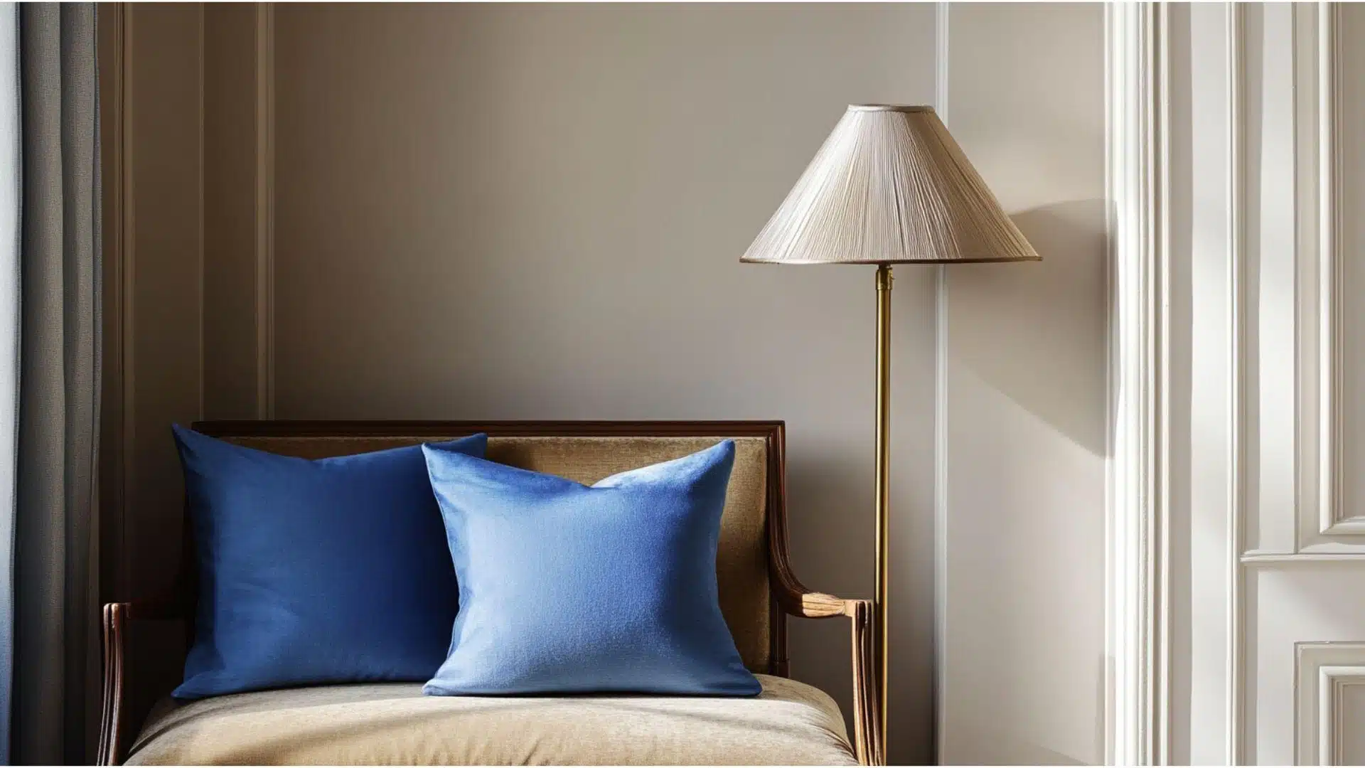
Rich blues, deep greens, and burgundy fabrics create stunning focal points against these soft walls.
Lighter colors like lavender, dusty blue, and soft coral blend perfectly for a gentle, calming effect.
Natural textures like linen curtains, wool throws, and jute rugs add depth without competing with the walls.
Patterned pillows, beautiful artwork, and unique lamps really shine when set against this versatile, forgiving color.
Alternative Paints Similar to Farrow & Ball Elephant’s Breath
These colors are great options if you like the color but want to explore similar choices.
They all have that soft, lavish feeling, but with their own special character.
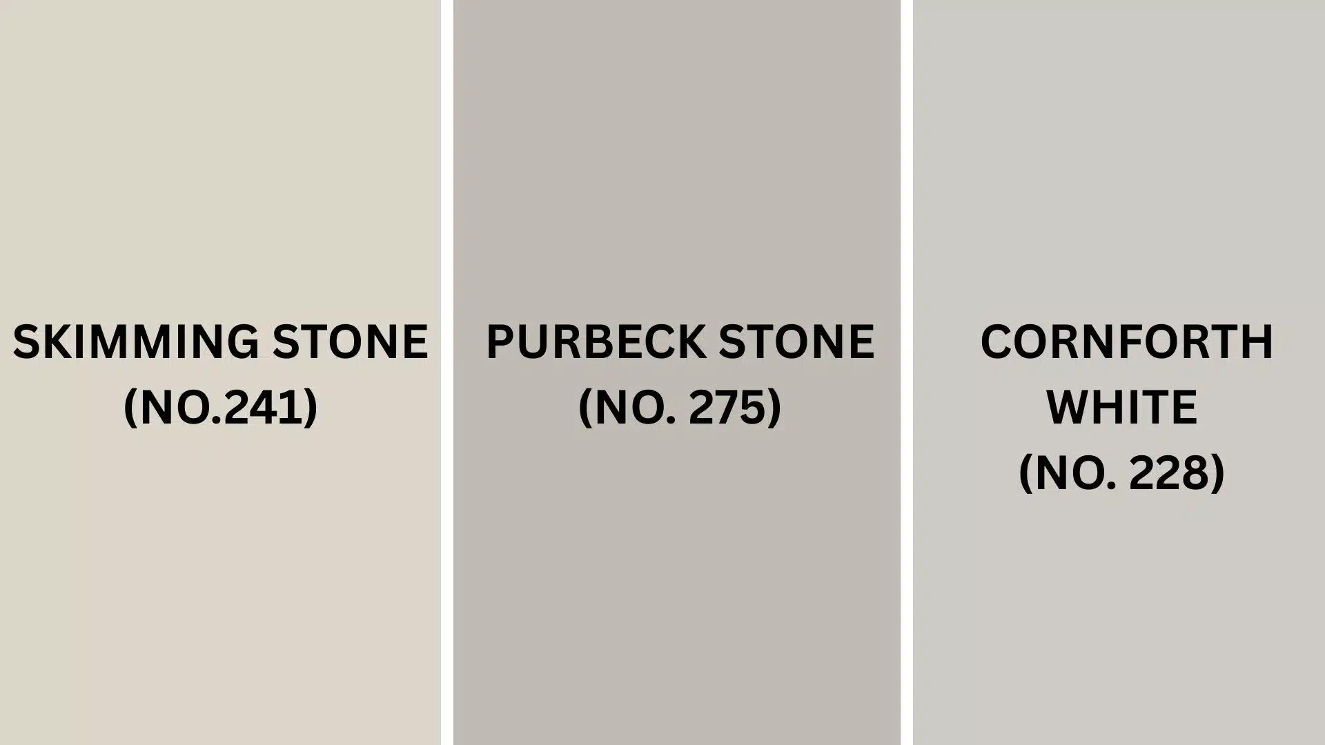
1. Skimming Stone (No. 241)
- Provides a slightly warmer, creamier version that feels sunny and welcoming.
- Creates spaces that feel bright and airy without being too stark.
- Works beautifully with natural fabrics, terracotta, and warm wood tones.
2. Purbeck Stone (No. 275)
- Offers a cooler, more true gray alternative with less of the taupe undertones.
- Creates a crisp, clean feeling that works well in modern homes.
- Pairs perfectly with white trim, blues, and sleek furniture pieces.
3. Cornforth White (No. 228)
- Provides a lighter, airier alternative that brightens up darker spaces.
- Creates rooms that feel open and fresh while keeping that cozy feeling.
- Looks stunning with both traditional and contemporary furnishings and accessories.
Final Thoughts
Elephant’s Breath works with almost any furniture you already own.
It changes throughout the day, showing warm taupe in morning light and cooler gray tones in evening.
This friendly color looks amazing in living rooms, bedrooms, and kitchens.
It creates the perfect balance between warmth and refinement that never goes out of style.
Dark woods like mahogany and walnut stand out against these walls, while metals from brass to chrome look perfectly at home.
The quality paint hides fingerprints and small marks, making it ideal for busy households with kids and pets.
Paired with Strong White trim or Dove Tale accents, you’ll create a designer look without the designer price tag.
Ready to alter your space with this color? Share your before and after photos in the comments below!
If you’re interested in more informational color review content, feel free to click here and explore other blogs that you might enjoy.

Alex Guerrero, a graduate with a Fine Arts degree from the Rhode Island School of Design, has been a visionary in the world of color and design for over 15 years. His professional journey began in the heart of the fashion industry in Milan, where he developed an acute sense for color harmonies and trends. Alex joined our team in 2018, offering fresh and innovative perspectives on color utilization in various spaces. Renowned for his ability to blend contemporary trends with timeless elegance. Outside of work, Alex is an accomplished painter and a volunteer art therapist, his artistic talents further enriching his professional insights.