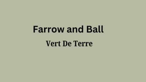
Like the first tender shoots emerging from forest floor moss, Farrow & Ball’s Vert de Terre (#233) wraps your space in nature’s most soothing hug.
This refined grey-green surpasses ordinary neutrals, carrying just a whisper of earthy undertones that ground its presence on your walls.
Vert de Terre creates a sanctuary of peace—a calming, contemplative atmosphere that allows both mind and space to settle into the natural theme.
Its subtle depth invites natural light to play across surfaces, changing throughout the day without ever losing its gentle, composed character.
More than just another neutral space, Vert de Terre is an experience—one that brings the peaceful balance of nature’s forest clearings into your everyday environment.
Understanding Farrow & Ball’s Vert de Terre (#233)
Color Terminology
| PROPERTY | VALUE |
|---|---|
| LRV (Light Reflectance Value) | 49 |
| Color Category | Considered a muted grey-green (LRV between 45-60) |
| Comparison | Pure white: ~90 LRV, Black: ~0 LRV |
| RGB Value | Red: 183 Green: 186 Blue: 165 |
| Hex Code | #B7BAA5 |
Undertones:
- Vert de Terre has subtle grey and earthy undertones
- It’s a muted green with a slight mineral influence
- Not a flat or one-dimensional green, but a refined, complex neutral with noticeable gentleness
Psychology of Muted Grey-Green Colors
Muted grey greens like Vert de Terre create a sense of balance and natural serenity.
- Grounding tones: Offer calming stability and visual softening of spaces
- Earth-tinted greens: Evoke quiet, contemplation, and organic grace
- Benefits: More subtle than stark neutrals, adds substantial presence to spaces, creates a natural backdrop for both contemporary furniture and organic elements
Vert de Terre provides the perfect balance for those seeking a considerable neutral that isn’t too clinical or overwhelming.
Its subtle earthy undertones make it particularly versatile in spaces with northern or eastern exposure, where it helps maintain warmth while contributing a sense of refined natural comfort.
Why Choose this Color?

The balanced depth of Vert de Terre evokes a sense of organic stability and refinement that promotes contemplation in any environment.
This enduring color carries complex undertones that shift subtly with changing light, ensuring your space feels both current and timelessly peaceful.
Key Features
Farrow & Ball Vert de Terre offers exceptional versatility across different lighting conditions. It maintains its subtle grey-green depth in brighter spaces while creating a soft, enveloping atmosphere in rooms with varied natural light.
Its timeless, neutral quality provides a refined backdrop that complements both colorful elements and natural textures without appearing overly stark or flat.
Adaptability
Farrow & Ball Vert de Terre demonstrates remarkable adaptability with existing elements like light-colored furniture and natural wood fixtures, creating balanced connections between spaces.
It provides enough depth to feel substantial and grounding while maintaining a refined, enduring quality that won’t quickly date your interior design choices.
This versatile grey-green works equally well as an all-over color for creating calm, atmospheric environments or as a complementary element to more saturated accent walls.
Durability
Farrow & Ball Vert de Terre, particularly in premium finishes like Estate Emulsion or Modern Eggshell, delivers outstanding durability with excellent coverage in both new and repainted areas.
Its muted tone and subtle grey-green undertones maintain a refined appearance throughout your home while providing a forgiving surface for everyday living.
This paint maintains color consistency even with regular cleaning when properly applied.
Texture Patterns
Farrow & Ball Vert de Terre creates a soft, velvety texture that adds subtle dimension to walls. Its complex undertones produce a stunning light play that enhances moldings and adds visual interest to even simple walls.
When applied to different finishes, it can highlight details while maintaining a consistent, refined appearance throughout connected spaces.
Room-by-Room Color Recommendations with Vert de Terre
1. Living Spaces and Open Floor Plans

- Vert de Terre works exceptionally well as an all-over color in open floor plans, creating a calm, cohesive space while maintaining a refined, natural palette.
- The 53.9 LRV of Vert de Terre provides a substantial, grounding feel that makes spaces appear more inviting and refined without feeling cold.
- Use Vert de Terre to unify different areas in larger spaces while allowing natural wood furnishings and artwork to stand out against its serene backdrop.
2. Bedrooms and Relaxation Areas

- Vert de Terre creates a soothing, restful atmosphere in bedrooms that promotes relaxation and sleep.
- The subtle grey-green undertones in Vert de Terre evoke a sense of nature while creating a refined backdrop for neutral bedding and furniture of any style.
- Consider Vert de Terre for all walls to create a serene sanctuary that feels both spacious and intimate without sacrificing warmth.
3. Kitchens

- Vert de Terre in Estate Eggshell finish on cabinets creates a soft, timeless element that pairs beautifully with marble islands or brass accent pieces.
- The muted depth of Vert de Terre enhances both light countertop materials and brass fixtures, making it adaptable to various kitchen styles from modern to rustic.
- Vert de Terre upper and lower cabinets paired with a subtle white accent wall create appealing harmony that grounds the kitchen while maintaining a refined, cohesive feel.
4. Bathrooms and Spa-like Retreats

- Farrow & Ball Vert de Terre creates a calm, refined atmosphere in bathrooms. Its subtle grey-green undertones establish a sense of serenity while complementing natural stone.
- This versatile shade pairs beautifully with both chrome and brass fixtures, marble, and natural wood, creating a timeless, refined retreat that feels both elegant and inviting.
- Use Vert de Terre on all walls in smaller bathrooms to create a sense of spaciousness without sacrificing character.
Vert de Terre Color Combinations
Vert de Terre is a muted, refined grey-green with subtle earthy undertones. Its moderate Light Reflectance Value (LRV) of 49 makes it a substantial, grounding foundation that adds balance and versatility to spaces while maintaining a refined natural presence.
Let me help you with color pairings and combinations for this shade.
Complementary Trim Colors
- All White (No. 2005) – A clean, pure white that creates a crisp distinction with Vert de Terre
- Pointing (No. 2003) – A soft off-white that balances Vert de Terre’s depth with subtle warmth
- Strong White (No. 2001) – A versatile white with grey undertones that harmonizes with Vert de Terre’s complexity
- Wimborne White (No. 239) – A warm white that enhances Vert de Terre’s earthy undertones
Coordinating Wall Colors
- Cornforth White (No. 228) – A light, refined grey that adds contrast while complementing Vert de Terre
- Joa’s White (No. 226) – A versatile warm neutral that creates a balanced, cohesive palette
- Elephant’s Breath (No. 229) – A light taupe that balances Vert de Terre’s muted qualities
- Skimming Stone (No. 241) – A soft neutral that creates serene harmony with Vert de Terre
Accent Colors
- Hague Blue (No. 30) – A deep blue that creates a dramatic contrast with Vert de Terre’s earthy tones
- Setting Plaster (No. 231) – A muted pink that provides a natural complement to Vert de Terre’s green depth
- Mole’s Breath (No. 276) – A medium warm grey that intensifies the elegance in a compatible palette
- Railings (No. 31) – A deep blue-black that grounds Vert de Terre’s gentle quality
Coordinating with Furniture and Decor

Wood Tones
Vert de Terre pairs beautifully with a wide range of wood tones, offering different aesthetic effects. Light oak, ash, and maple create a refreshing contrast against Vert de Terre’s muted backdrop.
Medium wood tones like walnut provide complementary warmth that enhances Vert de Terre’s earthy undertones.
For a more cohesive look, olive-toned or natural woods extend Vert de Terre’s refined quality and create a harmonious, organic aesthetic.
Raw, unstained wood creates a neutral, clean contrast that highlights Vert de Terre’s depth and richness.
Metals
Brass, antique gold, and bronze hardware enhance Vert de Terre’s warm undertones and create a rich, refined look.
Matte black fixtures create a dramatic contrast that emphasizes Vert de Terre’s subtle green qualities. While Vert de Terre works beautifully with warm metals, brushed nickel and pewter accents create a vibrant tension between cool and warm elements—opt for brushed or satin finishes for a more refined pairing.
Unlacquered brass and aged bronze finishes provide an elegant, timeless combination that complements Vert de Terre’s distinguished character with depth.
Decor
Natural fibers like linen, jute, and wool in neutral, textured tones create interest against Vert de Terre walls while providing necessary depth.
Colorful accents in terracotta, dusty rose, and navy offer a striking contrast against the muted backdrop.
Ceramic, stone, and leather elements add weight and prevent Vert de Terre from feeling too subdued in spaces with limited natural light.
Introducing natural elements with varied textures—like rattan, sisal, or cotton—reinforces the organic balance inherent in this versatile grey-green while adding tactile interest.
Similar Paint Colors: Perfect Alternative to Vert de Terre
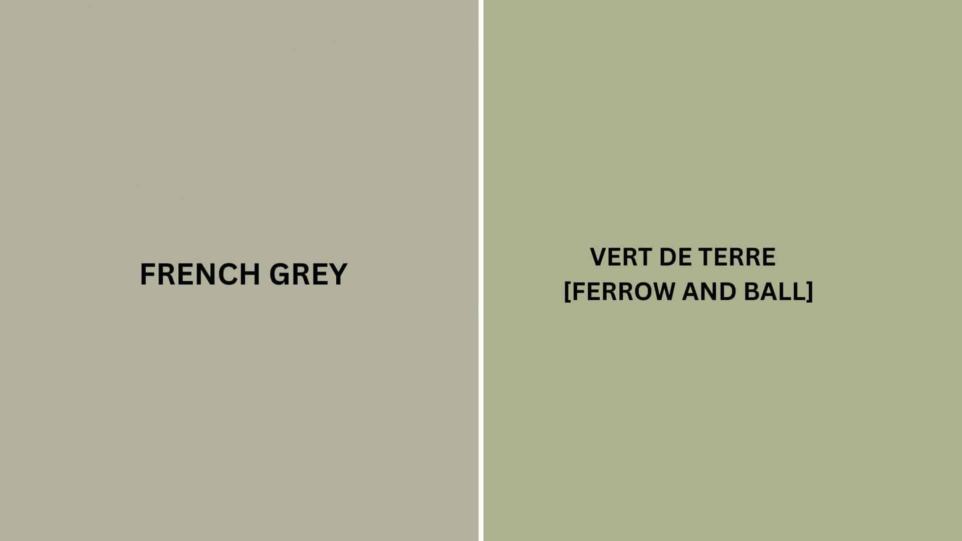
Vert de Terre vs. French Grey
Vert de Terre (Farrow & Ball #233)
- A muted grey-green with subtle earthy undertones
- Moderate LRV (Light Reflectance Value) that creates balanced, serene spaces
- Works well in contemporary, transitional, or nature-inspired interiors
- Best for spaces where you want a substantial, refined, natural presence
French Grey (Farrow & Ball #18)
- A versatile mid-tone neutral with slight green-grey undertones
- Medium LRV (around 54) that creates a balanced, adaptable backdrop
- It contains warm undertones that create a more traditional atmosphere
- Popular for creating refined, calming environments that work with many design styles
Key Differences:
- Vert de Terre has more noticeable green undertones, while French Gray has stronger grey undertones
- Vert de Terre appears slightly more natural in most lighting conditions
- Vert de Terre creates more organic comfort, while French Gray is more versatile and refined
- They serve similar roles in design – both as muted neutrals with slightly different characters and undertones
Final Thoughts
Vert de Terre (#233) surpasses trends, embodying the perfect balance between nature and refinement that makes it a perennial favorite among designers and homeowners seeking peaceful, cultured spaces.
Its subtle complexity allows it to adapt effortlessly to changing styles and seasonal accents, ensuring longevity in your design choices.
Whether grounding your walls in morning light or creating a canvas for contrasting elements, Vert de Terre delivers a timeless quality that both grounds and promotes a space.
In choosing this exceptional shade, you’re not simply selecting a color—you’re adopting a design philosophy that values balance, grace, and natural beauty in the spaces we call home.

Alex Guerrero, a graduate with a Fine Arts degree from the Rhode Island School of Design, has been a visionary in the world of color and design for over 15 years. His professional journey began in the heart of the fashion industry in Milan, where he developed an acute sense for color harmonies and trends. Alex joined our team in 2018, offering fresh and innovative perspectives on color utilization in various spaces. Renowned for his ability to blend contemporary trends with timeless elegance. Outside of work, Alex is an accomplished painter and a volunteer art therapist, his artistic talents further enriching his professional insights.