Are you struggling to find the perfect paint color that feels both cozy and modern? Warm gray paint colors might be exactly what you’re looking for.
These versatile shades bring comfort to any room, with their hints of beige or brown making spaces feel welcoming.
Unlike cool grays that can feel chilly, warm grays create an instant feeling of home. They work with almost any decorating style, from modern to farmhouse.
One of the best things about warm gray paint colors is how they change throughout the day as light shifts, giving your rooms subtle variety.
Warm grays are more interesting than plain white but still neutral enough to let your furniture shine. Whether for a bedroom, kitchen, or living room, they provide the perfect backdrop for your dream space.
Why Warm Gray Paint Colors Are Versatile
Warm gray paints, with their cozy undertones, bring comfort to any room. Unlike cool grays, which can feel chilly, warm grays have hints of beige or brown that make spaces feel welcoming.
These friendly neutrals work well with many styles, from modern to farmhouse. Warm grays help people feel calm and relaxed while being more interesting than plain white.
They also change with the seasons – appearing softer in summer light and richer in winter. Warm grays look different throughout the day as sunlight shifts, giving your rooms subtle variety.
Whether in bedrooms, kitchens, or living rooms, warm grays create a perfect backdrop that makes furniture and decorations shine.
Best Warm Gray Paint Colors by Benjamin Moore
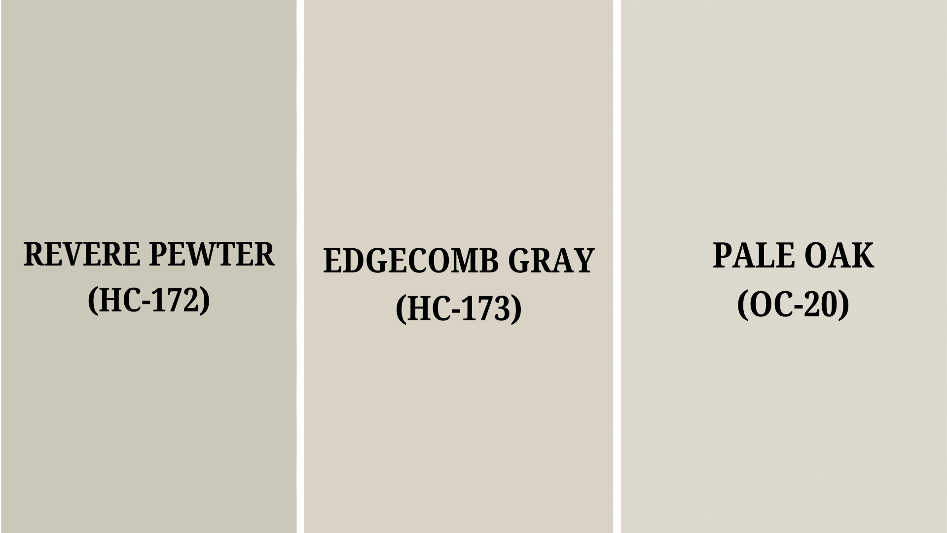
1. Revere Pewter (HC-172)
| PROPERTY | VALUE |
|---|---|
| HEX | #CCC4B8 |
| RGB | 204, 196, 184 |
| LRV | 55.98 |
Revere Pewter is a cozy, light-medium gray that feels warm and welcoming in any room. It’s popular because it works well with almost any style, from modern to traditional homes.
This color changes slightly throughout the day, appearing more beige in bright sunlight and grayer on cloudy days.
It pairs nicely with white trim and wood tones, making spaces feel pulled together without being too dark or boring.
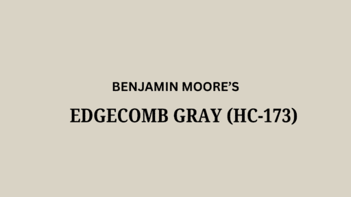
2. Edgecomb Gray (HC-173)
| PROPERTY | VALUE |
|---|---|
| HEX | #D9D3C3 |
| RGB | 217, 211, 195 |
| LRV | 63.09 |
Edgecomb Gray is a gentle, soft greige (mix of gray and beige) that creates a peaceful feeling in your home.
It’s lighter than Revere Pewter but still has enough color to make a room feel finished. This paint works great in living rooms, bedrooms, and hallways because it’s neutral without being plain white.
Many people love how it stays warm-looking even on gloomy days and doesn’t turn too pink or yellow in different lighting.
3. Pale Oak (OC-20)
| PROPERTY | VALUE |
|---|---|
| HEX | #D9D4C9 |
| RGB | 217, 212, 201 |
| LRV | 68.64 |
Pale Oak is a light, creamy warm gray that feels light and airy. It’s perfect if you want a barely-there color that still adds warmth to your walls.
This shade has tiny hints of green that make it unique and keep it from looking flat. Pale Oak works wonderfully in smaller spaces or rooms with less natural light because it brightens without feeling stark. It’s an easy color to live with that won’t go out of style quickly.
Best Warm Gray Paint Colors by Sherwin Williams
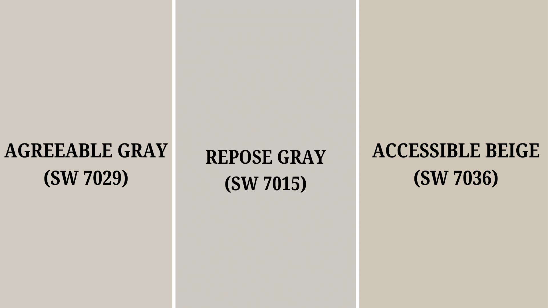
4. Agreeable Gray (SW 7029)
| PROPERTY | VALUE |
|---|---|
| HEX | #D1CBC1 |
| RGB | 209, 203, 193 |
| LRV | 60 |
Agreeable Gray is a wonderful middle-ground color that sits perfectly between gray and beige. It’s called “agreeable” for a reason – it goes with almost any style of furniture or decor.
This warm gray looks different throughout the day, showing more of its beige side in warm lighting and more gray tones in cooler light.
It’s great for living rooms and kitchens where you want a cozy feeling without going too dark or too light.
5. Repose Gray (SW 7015)
| PROPERTY | VALUE |
|---|---|
| HEX | #CCC9C0 |
| RGB | 204, 201, 192 |
| LRV | 58 |
Repose Gray is a calm, relaxing, warm gray that makes rooms feel peaceful. It’s a bit cooler than Agreeable Gray but still has enough warmth to feel welcoming rather than cold.
This color works beautifully in bedrooms and offices where you want a neutral background that isn’t boring.
Repose Gray pairs well with a white trim and can handle bright accent colors if you want to add pops of color. It’s a reliable choice that won’t overwhelm your space.
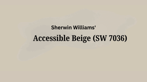
6. Accessible Beige (SW 7036)
| Property | Value |
|---|---|
| HEX | #D1C7B8 |
| RGB | 209, 199, 184 |
| LRV | 58 |
Accessible Beige is a friendly, warm neutral that leans more toward beige while keeping some gray undertones.
It’s an easy color to live with that makes rooms feel instantly comfortable. This shade works great in sunny rooms where other colors might look too bright or washed out.
Accessible Beige plays nicely with natural wood tones and stone surfaces, making it perfect for open floor plans. It’s a simple, no-fuss color that looks good year after year.
Best Warm Gray Paint Colors by Behr
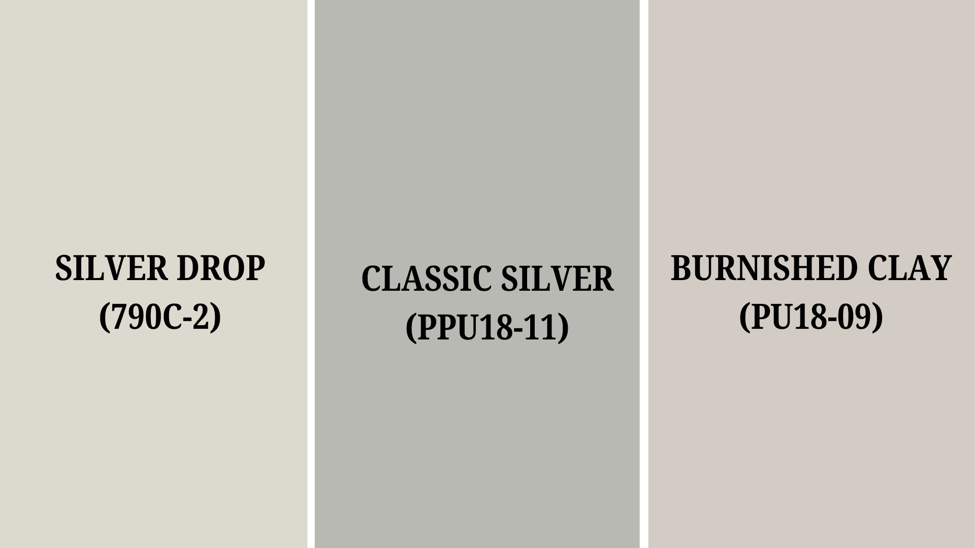
7. Silver Drop (790C-2)
| PROPERTY | VALUE |
|---|---|
| HEX | #DDD2CF |
| RGB | 221, 218, 207 |
| LRV | 70 |
Silver Drop is a light, airy, warm gray that brings a soft glow to any room. Its gentle beige undertones keep it from feeling cold or sterile.
This paint color works great in bedrooms and living rooms where you want a calm, clean look without using plain white.
Silver Drop changes slightly throughout the day, looking brighter in morning light and cozier in the evening. It pairs well with both light and dark furniture, making it an easy choice for most homes.
8. Classic Silver (PPU18-11)
| PROPERTY | VALUE |
|---|---|
| HEX | #B9B9B4 |
| RGB | 185, 185, 180 |
| LRV | 48 |
Classic Silver is a balanced, warm gray that feels both modern and timeless. It’s slightly darker than Silver Drop but still light enough to make rooms feel open.
This color has subtle, warm undertones that prevent it from looking too cool or icy. Classic Silver works wonderfully in kitchens, hallways, and bathrooms where you want a neutral that doesn’t show dirt easily.
It creates a perfect backdrop for colorful art or furniture without competing for attention.
9. Burnished Clay (PPU18-09)
| PROPERTY | VALUE |
|---|---|
| HEX | #D2CCC4 |
| RGB | 210, 204, 196 |
| LRV | 61 |
Burnished Clay is a rich, earthy, warm gray with noticeable taupe undertones. It has more depth than the lighter options, creating a cozy, wrapped-in-warmth feeling.
This color brings character to dining rooms and family spaces without being too dark or heavy. Burnished Clay has a slightly vintage quality that works well with both modern and traditional decor.
It looks especially good in rooms with lots of natural light, where its warm undertones can really shine through.
Common Mistakes to Avoid When Choosing Warm Gray Paint
Choosing the perfect warm gray paint can be tricky, even for experienced decorators. These subtle colors often change dramatically depending on your specific space and conditions.
- Not recognizing that most “warm grays” are actually greige (gray-beige hybrids) and will show more beige in warm lighting conditions.
- Do not neglect to check your paint color at different times of day—warm grays can look dramatically different from morning to evening.
- Picking a warm gray that clashes with your flooring, especially if you have wood floors with strong yellow or red undertones
- Assuming all warm grays will work well together – mixing different warm grays from different brands often results in clashing undertones.
- Using the same warm gray throughout your entire home without adjusting for rooms that face different directions (north-facing rooms often need warmer versions)
Taking your time to test and evaluate warm gray options properly will save you money and frustration in the long run.
Remember that what looks perfect in a store display or online photo might look completely different in your unique home environment.
Decor Tips with Warm Gray Paints
Warm gray paint creates a beautiful neutral canvas that works with many decorating styles. These versatile colors can be enhanced in several ways to make a polished, designer look.
- Bold accent colors like navy blue, emerald green, or mustard yellow create eye-catching contrast against warm gray walls without overpowering the space.
- Colorful artwork and textiles stand out beautifully against warm gray backgrounds, allowing you to showcase statement pieces without making the room feel busy.
- Varying shades of warm gray from light to dark can create depth when used on different walls, furniture pieces or across connected rooms.
- Crisp white trim and moldings make warm gray walls look more intentional and refined, creating clean lines that define the structure.
- Natural wood, stone, and plants bring life and texture to warm gray spaces, preventing the room from feeling flat or one-dimensional.
With warm gray as your foundation, you can easily update your decor over time without repainting. This neutral palette allows you to experiment with different accent pieces while maintaining a cohesive, refined look.
Summing It Up
Warm gray paint colors have earned their place as designer favorites for good reason. These adaptable neutrals solve many decorating challenges by working with various lighting conditions and complementing different furniture styles.
By avoiding mistakes like ignoring undertones or skipping sample tests, you can find the perfect warm gray for your home.
These colors create an excellent foundation that lets you update decor easily without repainting. From Benjamin Moore’s Revere Pewter to Sherwin Williams’ Agreeable Gray to Behr’s Silver Drop, there’s a warm gray perfect for every room.
The right shade can convert your space into something both refined and comfortable.
Ready to refresh your home with warm gray paint colors? Grab some samples this weekend and let us know which becomes your favorite in the comments below.
If you’re interested in more color ideas, feel free to click here and explore our collection of stylish palette combinations and inspiring home decor inspiration.

Alex Guerrero, a graduate with a Fine Arts degree from the Rhode Island School of Design, has been a visionary in the world of color and design for over 15 years. His professional journey began in the heart of the fashion industry in Milan, where he developed an acute sense for color harmonies and trends. Alex joined our team in 2018, offering fresh and innovative perspectives on color utilization in various spaces. Renowned for his ability to blend contemporary trends with timeless elegance. Outside of work, Alex is an accomplished painter and a volunteer art therapist, his artistic talents further enriching his professional insights.