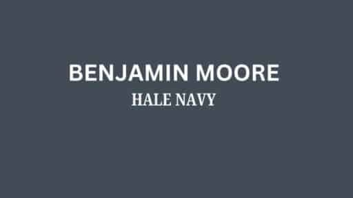
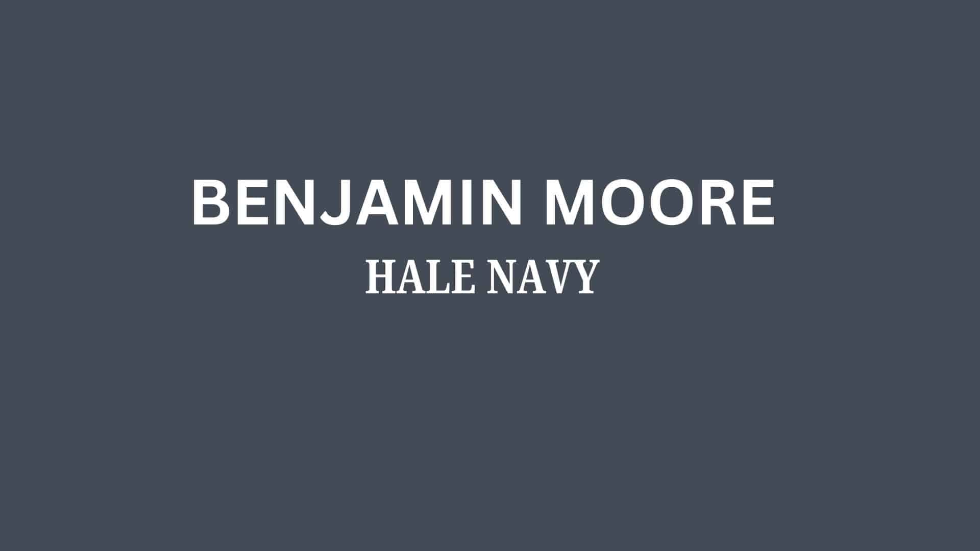
Like the steadfast depths of the ocean, Benjamin Moore’s Hale Navy (HC-154) anchors your space in distinguished grace.
This deep navy blue transcends ordinary dark colors, carrying just a whisper of charcoal undertones that deepen its presence on your walls.
Hale Navy creates a sanctuary of culture —a rich, grounding atmosphere that allows both mind and space to feel secure yet inspired.
Its substantial depth invites natural light to play across surfaces, transforming throughout the day without ever losing its confident, composed character.
More than just another navy, Hale Navy is an experience—one that brings the timeless authority of maritime tradition into your everyday environment.
It’s the perfect statement color for both contemporary designs seeking drama and traditional spaces celebrating classic American grace.
Understanding Benjamin Moore’s Hale Navy (HC-154)
Color Terminology
| PROPERTY | VALUE |
|---|---|
| LRV (Light Reflectance Value) | 6.3 |
| Color Category | Considered a dark navy blue (LRV below 10) |
| Comparison | Pure white: ~90 LRV, Black: ~0 LRV |
| RGB Value | Red: 67, Green: 75, Blue: 86 |
| Hex Code | #434B56 |
Undertones:
- Hale Navy has subtle charcoal undertones
- It’s a deep navy with a slight green influence
- Not a flat or one-dimensional navy, but a refined, complex neutral with noticeable depth
Psychology of Deep Navy Colors
Deep navies like Hale Navy create a sense of security and timeless sophistication.
- Anchoring tones: Offer grounding and visual definition of spaces
- Charcoal-tinted navies: Evoke confidence, stability, and classic elegance
- Benefits: More nuanced than stark black, adds substantial presence to spaces, creates a rich backdrop for both light furniture and metallic elements
Hale Navy provides the perfect balance for those seeking a significant dark color that isn’t too overwhelming or severe.
Its subtle charcoal undertones make it particularly versatile in spaces with western or southern exposure, where it helps maintain depth while contributing a sense of refined coolness.
Why Choose this Color?
The balanced depth of Hale Navy evokes a sense of permanence and refinement that promotes confidence in any environment.
This enduring color carries complex undertones that shift subtly with changing light, ensuring your space feels both current and timelessly sophisticated.
Key Features
Benjamin Moore Hale Navy offers exceptional depth and versatility across different lighting conditions. It maintains its subtle charcoal undertones in bright spaces while creating a cozy, intimate atmosphere in rooms with limited natural light.
Its timeless, neutral quality provides a sophisticated backdrop that complements both light elements and metallic accents without appearing overly stark or flat.
Adaptability
Benjamin Moore Hale Navy demonstrates remarkable adaptability with existing elements like light-colored furniture and natural wood fixtures, creating striking contrasts between spaces.
It provides enough depth to feel substantial and grounding while maintaining a refined, enduring quality that won’t quickly date your interior design choices.
This versatile navy works equally well as an accent wall to create dramatic focal points or as a complete room color to create intimate, enveloping environments.
Durability
Benjamin Moore’s Hale Navy, particularly in premium finishes like Aura or Regal Select, delivers outstanding durability with excellent coverage in both new and repainted areas.
Its deep tone and subtle charcoal undertones maintain a refined appearance throughout your home while providing a forgiving surface for everyday living.
This paint resists fading and maintains color consistency even with regular cleaning when properly applied.
Texture Patterns
Benjamin Moore Hale Navy creates a rich, velvety texture that adds substantial dimension to walls and architectural features.
Its complex undertones produce a beautiful light play that enhances moldings and adds visual interest to even simple walls.
When applied to different finishes, it can elegantly highlight architectural details while maintaining a consistent, refined appearance throughout connected spaces.
Room-by-Room Color Recommendations with Hale Navy
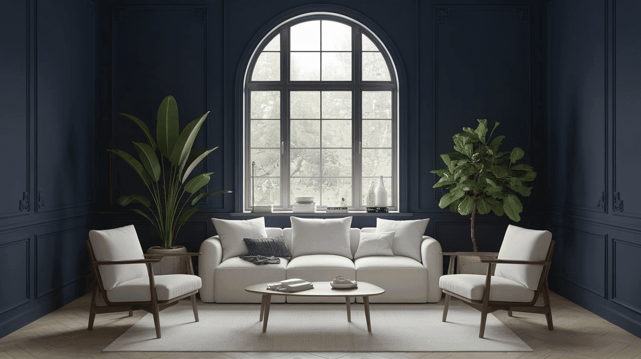
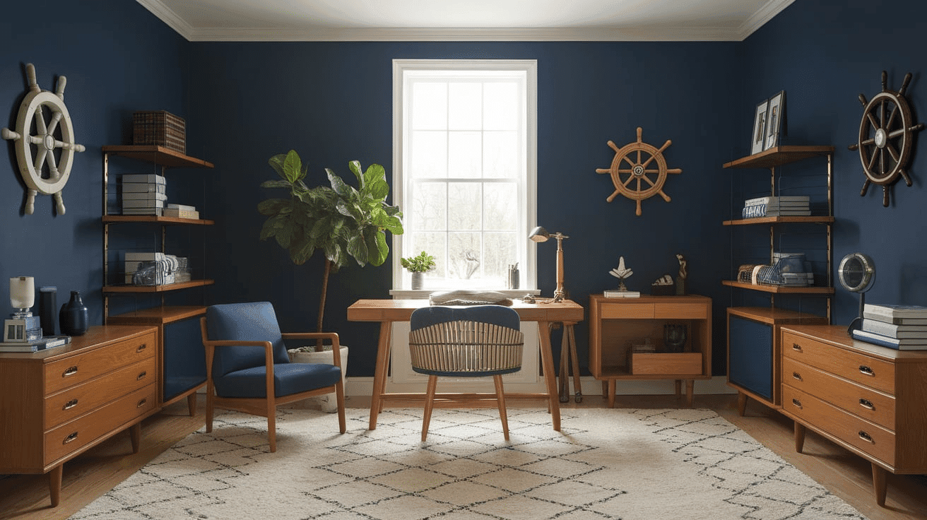
Living Spaces and Home Offices
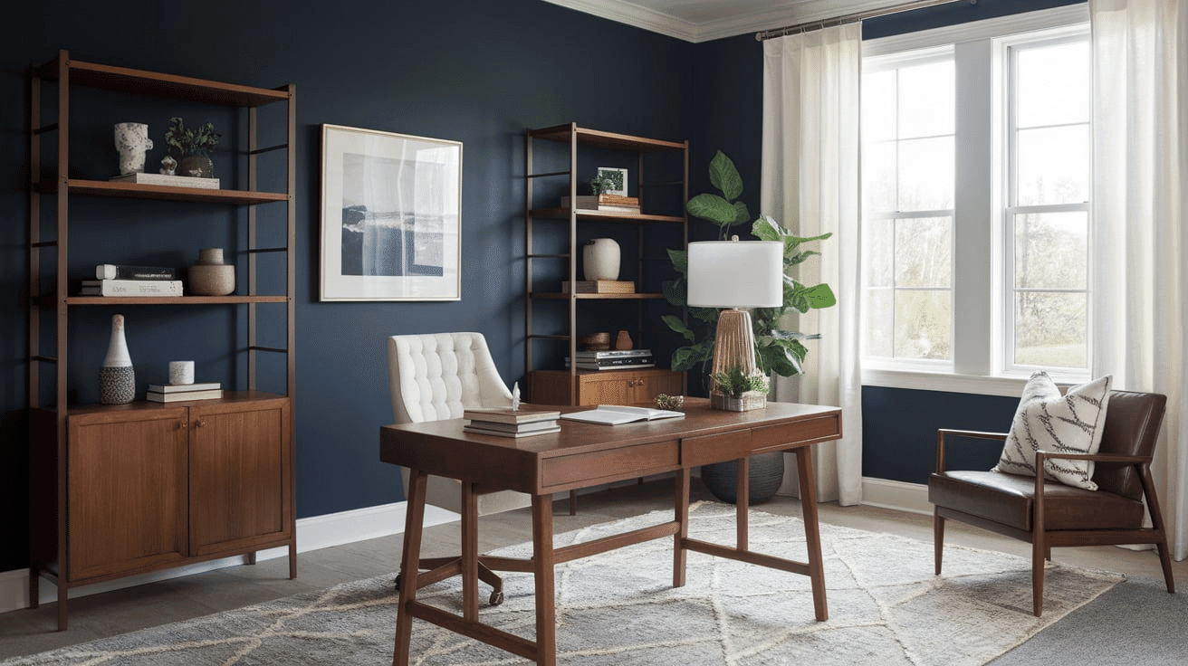
Hale Navy works exceptionally well as an accent wall in living rooms, creating a dramatic focal point while maintaining a refined, classic palette.
The 6.3 LRV of Hale Navy provides a substantial, grounding feel that makes spaces appear more distinctive and sophisticated without feeling gloomy.
Use Hale Navy to define different areas in larger spaces while allowing light-colored furnishings and artwork to stand out against its rich backdrop.
Bedrooms and Relaxation Areas
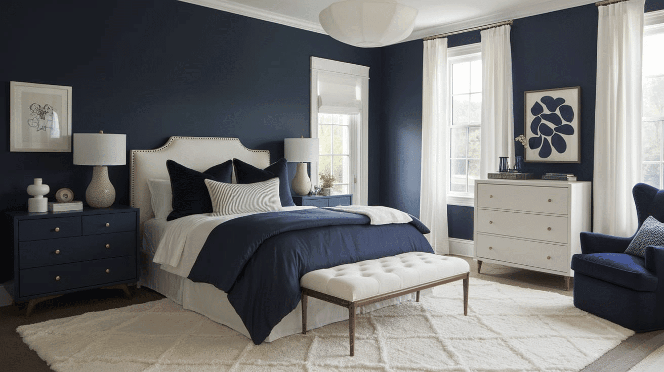
Hale Navy creates a cocooning, intimate atmosphere in bedrooms that promotes relaxation.
The subtle charcoal undertones in Hale Navy evoke a sense of security while creating a sophisticated backdrop for light-colored bedding and furniture of any style.
Consider Hale Navy for a feature wall behind the bed to create a dramatic sanctuary that feels both anchored and luxurious without sacrificing style.
Kitchens
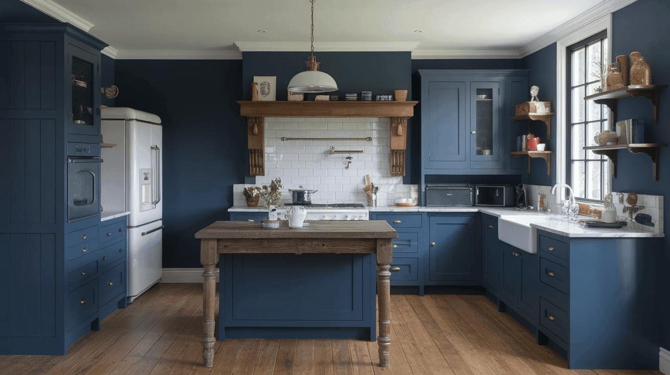
Hale Navy in satin or semi-gloss finish on islands or lower cabinets creates a grounding, timeless element that contrasts beautifully with white upper cabinets or marble countertops.
The rich depth of Hale Navy enhances both light countertop materials and brass fixtures, making it adaptable to various kitchen styles from contemporary to traditional.
Hale Navy lower cabinets paired with white upper cabinets create an appealing contrast that grounds the kitchen while maintaining a refined, cohesive feel.
Bathrooms and Powder Rooms
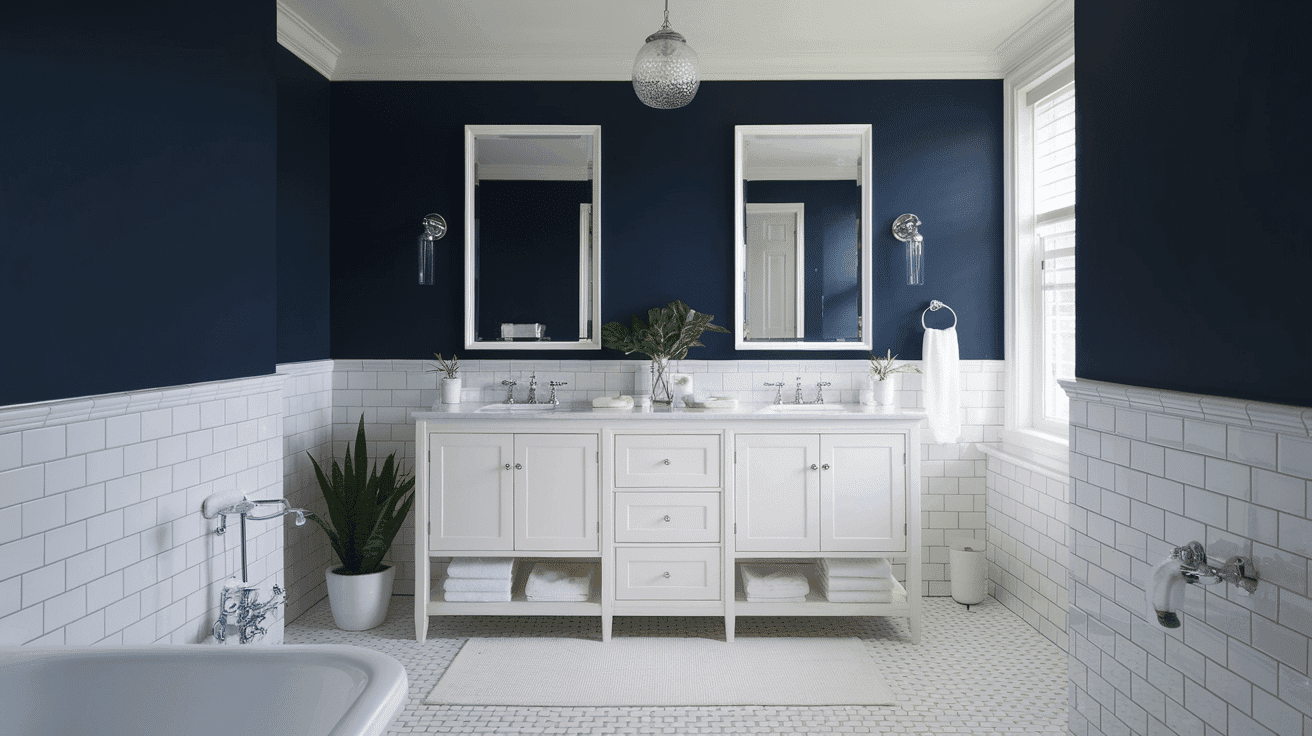
Benjamin Moore’s Hale Navy creates a dramatic, refined atmosphere in bathrooms. Its subtle charcoal undertones establish a sense of luxury while complementing white fixtures.
This versatile shade pairs beautifully with both chrome and brass fixtures, marble, and natural wood, creating a timeless, refined retreat that feels both elegant and inviting.
Use Hale Navy on all walls in powder rooms to create a jewel-box effect without sacrificing sophistication.
Hale Navy Color Combinations
Hale Navy is a deep, refined navy with subtle charcoal undertones. Its low Light Reflectance Value (LRV) of 6.3 makes it a substantial, grounding foundation that adds drama and versatility to spaces while maintaining a refined coolness.
Complementary Trim Colors
- Simply White (OC-117) – A bright, clean white that creates dramatic contrast with Hale Navy
- Cloud White (OC-130) – A soft white that balances Hale Navy with subtle warmth
- White Dove (OC-17) – A versatile off-white that softens Hale Navy’s dramatic quality
- Decorator’s White (OC-149) – A cooler white that enhances Hale Navy’s sophisticated undertones
Coordinating Wall Colors
- Revere Pewter (HC-172) – A light warm gray that adds balance while complementing Hale Navy
- Pale Oak (OC-20) – A versatile greige that creates a balanced, cohesive palette
- Gray Owl (OC-52) – A light blue-gray that echoes Hale Navy’s cool qualities in a lighter tone
- Balboa Mist (OC-27) – A soft, warm gray that createsa serene contrast with Hale Navy
Accent Colors
- Hale Navy (HC-154) – A deep navy that creates dramatic contrast with lighter colors
- Gold Leaf (200) – A rich gold that provides a luxurious complement to Hale Navy.
- Stonington Gray (HC-170) – A medium gray that intensifies the sophistication in a compatible palette
- Caliente (AF-290) – A vibrant red that energizes Hale Navy’s grounding quality
Coordinating with Furniture and Decor
Wood Tones
Hale Navy pairs beautifully with a wide range of wood tones, offering different aesthetic effects. Light oak, maple, and ash create a striking contrast against Hale Navy’s deep backdrop.
Medium wood tones like walnut provide complementary warmth that balances Hale Navy’s cool undertones. For a more cohesive look, gray-washed or navy-washed woods extend Hale Navy’s refined quality and create a harmonious, coastal aesthetic.
Natural, unstained wood creates an organic, clean contrast that highlights Hale Navy’s depth and richness.
Metals
Brass, gold, and copper hardware improve Hale Navy’s sophisticated undertones and create a warm, luxurious look.
Chrome and polished nickel fixtures create a bright contrast that emphasizes Hale Navy’s depth. While Hale Navy works beautifully with warm metals, silver and stainless steel accents create a dynamic tension between cool elements—opt for polished or brushed finishes for a more refined pairing.
Decor
Natural fibers like linen, cotton, and wool in light, neutral tones create textural interest against Hale Navy walls while providing the necessary contrast.
Colorful accents in coral, mustard, and sage offer vibrant contrast against the deep backdrop.
Ceramic, marble, and glass elements add lightness and prevent Hale Navy from feeling too imposing in spaces with limited natural light.
Introducing natural elements with varied textures—like rattan, jute, or wool—reinforces the organic balance inherent in this versatile navy while adding tactile interest.
Similar Paint Colors: Perfect Alternative to Hale Navy
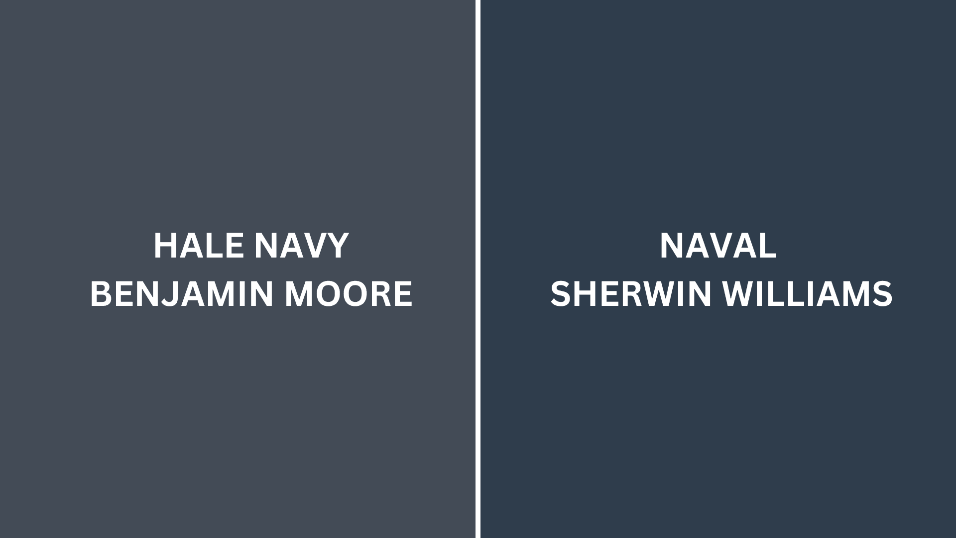
Hale Navy vs. Naval
Hale Navy (Benjamin Moore HC-154)
- A deep navy with subtle charcoal undertones
- Low LRV (Light Reflectance Value) that creates intimate, sophisticated spaces
- Works well in traditional, transitional, or coastal interiors
- Best for spaces where you want a substantial, refined depth
Naval (Sherwin Williams SW 6244)
- A versatile navy with slight indigo undertones
- Low LRV (around 4) that creates a balanced, adaptable backdrop
- Contains warm undertones that create a more approachable atmosphere
- Popular for creating dramatic, calming environments that work with many design styles
Key Differences
- Hale Navy has more noticeable charcoal undertones, while Naval has indigo undertones
- Hale Navy appears slightly more muted in most lighting conditions
- Hale Navy creates more sophistication and grounding, while the Naval is more versatile and rich
- They serve similar roles in design – both as deep navies with slightly different characters and undertones
Final Thoughts
Hale Navy (HC-154) transcends trends, embodying the perfect balance between depth and complexity that makes it a perennial favorite among designers and homeowners seeking sophisticated, refined spaces.
Its subtle complexity allows it to adapt effortlessly to changing styles and seasonal accents, ensuring longevity in your design choices.
Whether anchoring your walls in evening light or creating a canvas for contrasting elements, Hale Navy delivers a timeless quality that both grounds and elevates a space.
In choosing this exceptional shade, you’re not simply selecting a color—you’re embracing a design philosophy that values confidence, refinement, and enduring beauty in the spaces we call home.

Alex Guerrero, a graduate with a Fine Arts degree from the Rhode Island School of Design, has been a visionary in the world of color and design for over 15 years. His professional journey began in the heart of the fashion industry in Milan, where he developed an acute sense for color harmonies and trends. Alex joined our team in 2018, offering fresh and innovative perspectives on color utilization in various spaces. Renowned for his ability to blend contemporary trends with timeless elegance. Outside of work, Alex is an accomplished painter and a volunteer art therapist, his artistic talents further enriching his professional insights.