Choosing the right gray paint can dramatically change your home’s environment, but with so many options available, the decision can feel overwhelming.
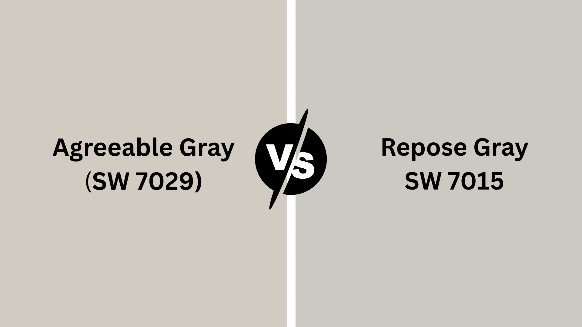
Two standout choices are Sherwin-Williams’ Agreeable Gray and Repose Gray. Although they may seem similar, these colors offer distinct characteristics that impact your space’s mood and style.
Agreeable Gray brings warm, greige undertones, creating a cozy, inviting atmosphere, while another Gray features cooler, blue undertones that work well in modern, minimalist designs.
This resource covers everything from undertone analysis and adaptability to lighting effects and color coordination, ensuring you choose the perfect gray for your home’s unique vibe.
Agreeable Gray vs Repose Gray: What’s the Difference?
When it comes to choosing the perfect gray for your space, Agreeable Gray and Repose Gray from Sherwin-Williams are both popular options, but they each have distinct characteristics.
Agreeable Gray is a warm, greige tone with subtle beige undertones, making it a great neutral that complements a wide range of home decor styles.
On the other hand, Repose Gray leans slightly cooler with more pronounced blue undertones, giving it a fresh, modern feel.
While Agreeable Gray is ideal for cozy and inviting spaces, another one suits more contemporary or minimalist designs.
Ultimately, the choice between these two depends on the ambiance you wish to create in your home.
Color Depth: Comparing the Undertones

Agreeable Gray
Agreeable Gray features warm undertones of beige and taupe, giving it a soft, greige appearance that works well in a variety of spaces.
The beige undertones make it feel inviting and cozy, perfect for creating a comfortable atmosphere in living rooms, bedrooms, and hallways.
Its neutral and warm tone allows it to easily complement both warm and neutral color palettes, providing great adaptability in design.
It also pairs well with natural wood tones, earthy accents, and fabrics, making it a popular choice for a wide range of home styles.
Overall, the warm undertones of Agreeable Gray bring balance and warmth to any space, creating a welcoming ambiance.
Repose Gray
Repose Gray features cool undertones of blue and subtle violet, which give it a sleek, modern feel.
The blue undertones create a calm, fresh atmosphere, making it an excellent choice for spaces with plenty of natural light, such as kitchens and bathrooms.
These cool tones bring a modern edge, ideal for contemporary and minimalist designs. It also pairs beautifully with cooler tones like whites, blues, and metals, enhancing its modern vibe.
Its cool undertones make it a adaptable color that can create a serene and clean look in any room.
Which Gray Works Best in Different Spaces?
When choosing the right gray for your home, it’s important to consider how the color will interact with the space and the mood you want to create.
Both colors offer adaptability, but their unique undertones make them better suited for different rooms. Let’s learn how each of these grays works in specific spaces.
Living Room

Agreeable Gray works wonderfully in the living room, as its warm, greige tone creates a cozy, inviting atmosphere.
The subtle beige undertones blend seamlessly with a variety of furniture styles, from traditional to modern. It’s ideal for creating a balanced, welcoming environment that feels comfortable.
Repose Gray, on the other hand, offers a cooler, more modern feel. Its blue undertones bring a fresh and modern vibe, perfect for minimalist living rooms.
It pairs beautifully with sleek furnishings and metallic accents, creating a clean, crisp atmosphere.
Kitchen

Agreeable Gray is a great choice for kitchens, as its warm undertones work well with natural wood finishes and a variety of cabinetry tones. It creates a cozy yet functional space without being overwhelming.
Repose Gray brings a cooler, more modern touch to kitchens. Its blue undertones complement stainless steel appliances, white cabinetry, and minimalist designs, helping create an open, fresh feel that beautify modern kitchens.
Room

Agreeable Gray is perfect for rooms that need warmth and relaxation. Its soft, warm undertones pair beautifully with natural wood tones, neutral furnishings, and soft lighting, creating a cozy, inviting atmosphere ideal for bedrooms or living rooms.
Repose Gray, with its cooler undertones, brings a sleek, modern feel to rooms. The color works well with contemporary furniture, metal accents, and minimalistic decor, offering a clean, fresh look that improves the room’s modern and serene ambiance.
How Both the Gray Pair with Other Colors

Agreeable Gray’s exceptional adaptability makes it a designer favorite for creating harmonious color schemes. This warm greige perfectly balances cool and warm undertones, allowing seamless integration with both traditional and contemporary palettes.
This pairs beautifully with
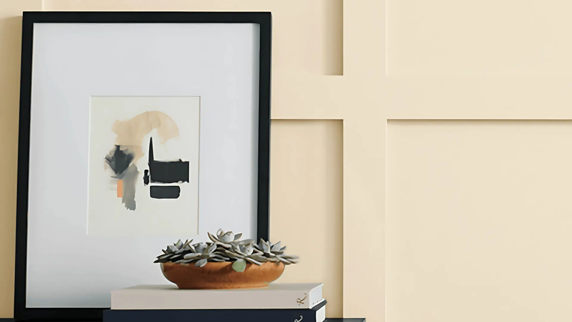
- Pure White (SW 7005) – Creates crisp, clean contrast
- Chantilly Lace (OC-65) – Adds brightness while maintaining warmth
- Naval (SW 6244) – Brings modern depth and richness

Repose Gray offers cooler undertones compared to Agreeable Gray, making it ideal for creating crisp, contemporary spaces.
When examining both the gray for color pairing, Repose Gray’s neutral coolness provides an excellent backdrop for both warm and cool accent colors.
This Gray coordinates perfectly with:
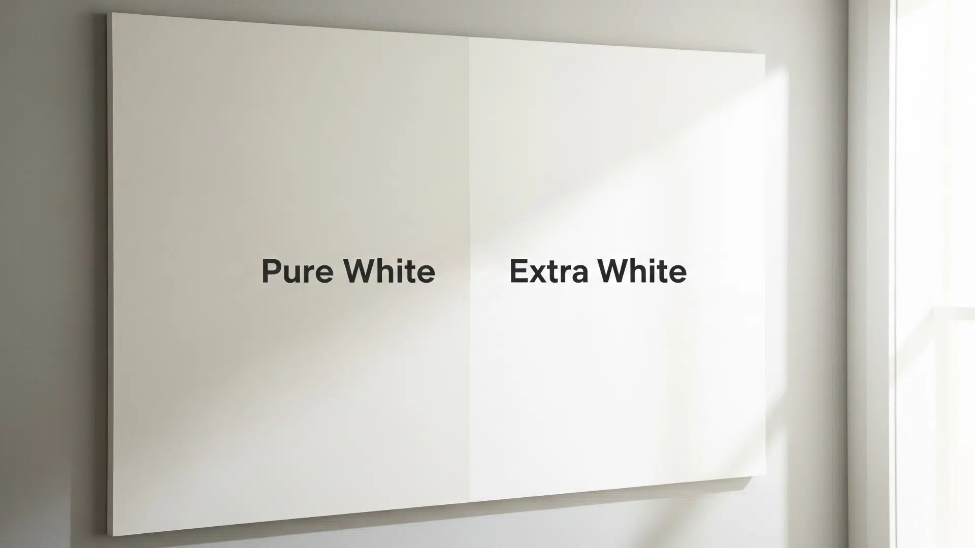
- Extra White (SW 7006) – Creates sharp, architectural contrast
- Alabaster (SW 7008) – Provides subtle warmth without overwhelming
- Iron Ore (SW 7069) – Delivers striking, contemporary drama
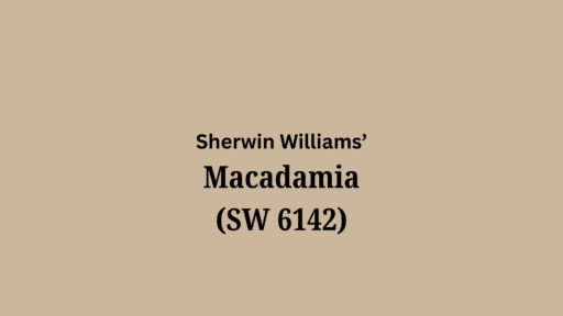
Accessible Beige vs Agreeable Gray
When comparing accessible beige vs agreeable gray, both colors offer warm neutrality but with distinct characteristics that suit different design preferences and interior style
| Feature | Accessible Beige (SW 7036) | Agreeable Gray (SW 7018) |
|---|---|---|
| Undertones | Warm beige with subtle gray hints | Balanced greige with gray presence |
| Color Temperature | Warmer, more traditionally beige | Cooler greige, more adaptable |
| Best Design Styles | Traditional, farmhouse, rustic | Modern, transitional, contemporary |
| Room Feel | Cozy, inviting, homey | m, flexible, clean |
| Lighting Response | Enriches warm, golden tones | Adapts to various lighting conditions |
| Pairing Potential | Works with warm wood tones | Coordinates with cool and warm elements |
Both work beautifully together in layered neutral schemes. Agreeable Gray’s cool greige base pairs well with the warmer tones of Accessible Beige, creating a modern contrast.
This combination adds depth and balance, making it perfect for multi-tonal interiors that feel both modern and inviting.
Lighting Effects on Both Grays
Understanding how light affects paint colors is crucial when choosing between both the Grays.
Both shades respond dramatically to different lighting conditions, revealing hidden undertones and shifting appearances throughout the day.
Agreeable Gray’s warm greige base shows beige undertones in soft lighting, while appearing more gray in bright conditions.
While another maintains cooler consistency but can appear blue-tinted in certain lights. Natural light exposure, room orientation, and artificial lighting choices significantly impact how these colors perform in your space.
Does Repose Gray Go with Agreeable Gray?
Yes, they both can work beautifully together in the same space when used strategically.
When comparing both for coordinated use, these colors create modern depth through their subtle temperature differences.
Agreeable Gray’s warm greige undertones pair harmoniously with another Gray’s cooler neutrality, allowing for seamless transitions between rooms or creating defined zones within open-concept layouts.
The key is using one as the dominant color and the other as an accent, ensuring proper lighting consideration and maintaining consistent undertone balance throughout the space for cohesive design flow.
Conclusion
Both Gray are adaptable shades that can change any space, each offering unique characteristics suited to different design preferences.
Agreeable Gray, with its warm greige undertones, creates a cozy, inviting atmosphere, making it ideal for living rooms, bedrooms, and traditional or transitional designs.
It’s perfect for minimalist spaces where a clean, crisp look is desired. Understanding how these colors interact with lighting and decor helps you choose the right shade for your home.
Ready to refresh your space? Test samples, trust your eye, and choose the gray that feels just right for your space!

Alex Guerrero, a graduate with a Fine Arts degree from the Rhode Island School of Design, has been a visionary in the world of color and design for over 15 years. His professional journey began in the heart of the fashion industry in Milan, where he developed an acute sense for color harmonies and trends. Alex joined our team in 2018, offering fresh and innovative perspectives on color utilization in various spaces. Renowned for his ability to blend contemporary trends with timeless elegance. Outside of work, Alex is an accomplished painter and a volunteer art therapist, his artistic talents further enriching his professional insights.