Stuck on picking the perfect paint color for your home? Hague Blue might be your answer!
This deep, rich blue with green undertones creates a cozy, calm space that changes throughout the day, from navy in the morning to an almost black-blue in the evening.
The blog covers what makes Hague Blue special, from its color codes to its psychology. It explains how this color works in different rooms like bedrooms and kitchens, maintenance tips, and finish options from matte to satin.
You’ll learn about pairing it with furniture and metals like brass and gold.
The blog even suggests similar alternatives to Hague Blue. Let’s discuss how this special blue can transform your home into a peaceful retreat!
Understanding Paint Color Basics
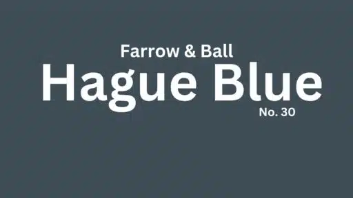
Hague Blue is a deep, rich blue with strong green undertones. In the morning light, it appears as a dark navy with hints of teal hiding beneath the surface.
By midday, the green undertones become more visible, giving it a complex teal-like quality that shifts as clouds pass overhead.
During evening hours, the color deepens dramatically to an almost black-blue, creating a cozy feeling that wraps around the room.
At night, with artificial lighting, Hague Blue takes on a softer, more mysterious tone, sometimes showing hints of purple depending on your light bulbs.
The color changes its personality throughout the day, showing different sides of itself as the light changes.
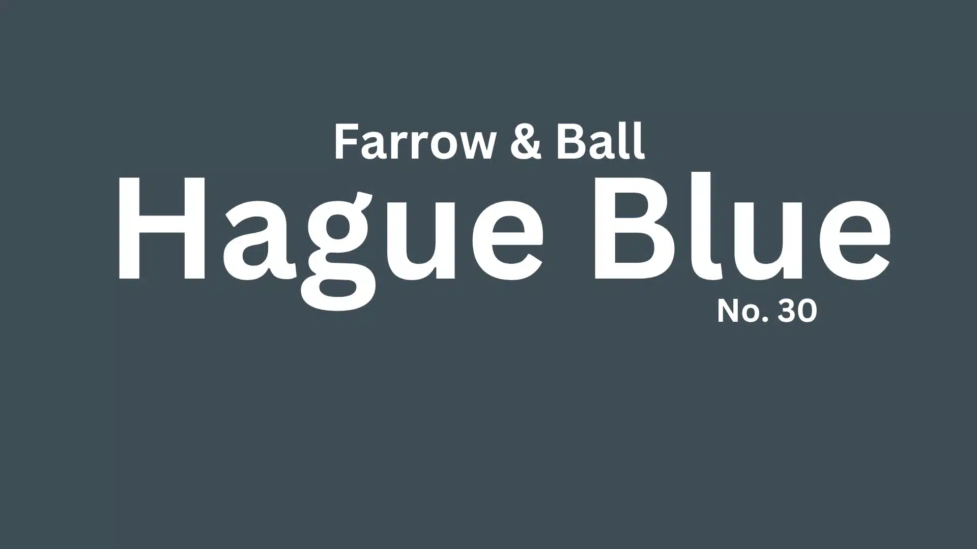
Color Terminology
| ATTRIBUTE | VALUE |
|---|---|
| Company Code | No. 30 |
| LRV | 7 |
| Hex Value | #3f4d57 |
| RGB | 63, 77, 87 |
What These Numbers Mean?
- Company Code (No. 30): This is the specific identifier used by Farrow & Ball for Hague Blue.
- LRV (7): The Light Reflectance Value indicates how much light the color reflects. With an LRV of 7, Hague Blue is a very dark color, absorbing the most light and creating a dramatic, moody effect.
- Hex Value (#3f4d57): A hexadecimal color code used in digital design and paint matching. It represents the exact mix of red, green, and blue in the color.
- RGB (63, 77, 87): The breakdown of red, green, and blue light levels that make up this color. The higher blue component gives it a deep, dark tone with cool undertones.
Psychology
Hague Blue can affect your feelings in powerful ways.
- Makes rooms feel calm and peaceful
- Helps you focus better when working or reading
- Creates a feeling of safety, like being wrapped in a warm blanket
- Pairs well with natural wood and brass for a balanced mood
This deep blue shade can turn any room into a space that feels both safe and special without trying too hard.
Why Choose This Color?
Hague Blue is a deep, rich blue that works well in many homes. It can make a room feel cozy and warm, like a hug for your walls. This dark blue has hints of green that change how it looks as the light shifts during the day.
It works great in rooms that need a bold touch, like dining rooms or small reading nooks. Hague Blue pairs nicely with white trim for a clean look or with wood tones for something more natural.
This color is perfect for people who want their walls to stand out without being too bright or loud.
1. Key Features
Hague Blue has a deep blue-green tone that adds depth to any room. This color hides wall flaws better than light colors.
It works in both sunny and dark rooms, but shows its best self in natural light. The color looks different as daylight changes, giving your room a new feel throughout the day.
Hague Blue pairs well with brass, gold, and wooden items.
2. Durability & Maintenance
Hague Blue paint holds up well over time with proper care. Use these steps to make your paint last longer:
- Wipe walls with a soft, damp cloth to remove dust and spots
- Avoid harsh cleaning products that can damage the finish
- Touch up small marks right away to keep walls looking fresh
- Keep paint can for future touch-ups
- Clean areas around light switches more often as they collect fingerprints
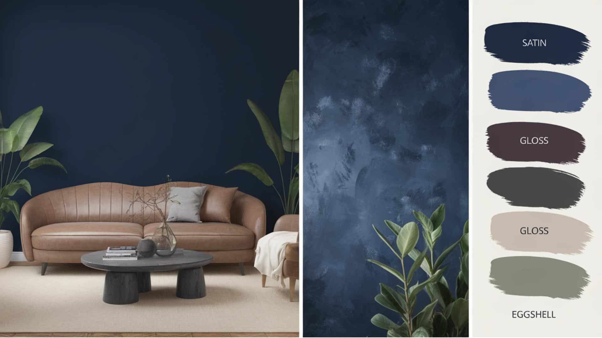
3. Texture & Finish Recommendations
- Matte finish – hides wall flaws but is harder to clean
- Eggshell finish – good for kitchens and bathrooms where walls need cleaning
- Satin finish – adds a soft shine and works well in busy areas
- Estate finish – gives a rich, deep look in formal dining rooms
- Modern finish – best for rooms that get lots of natural light
Room-by-Room Recommendations
Living Spaces & Open Floor Plans
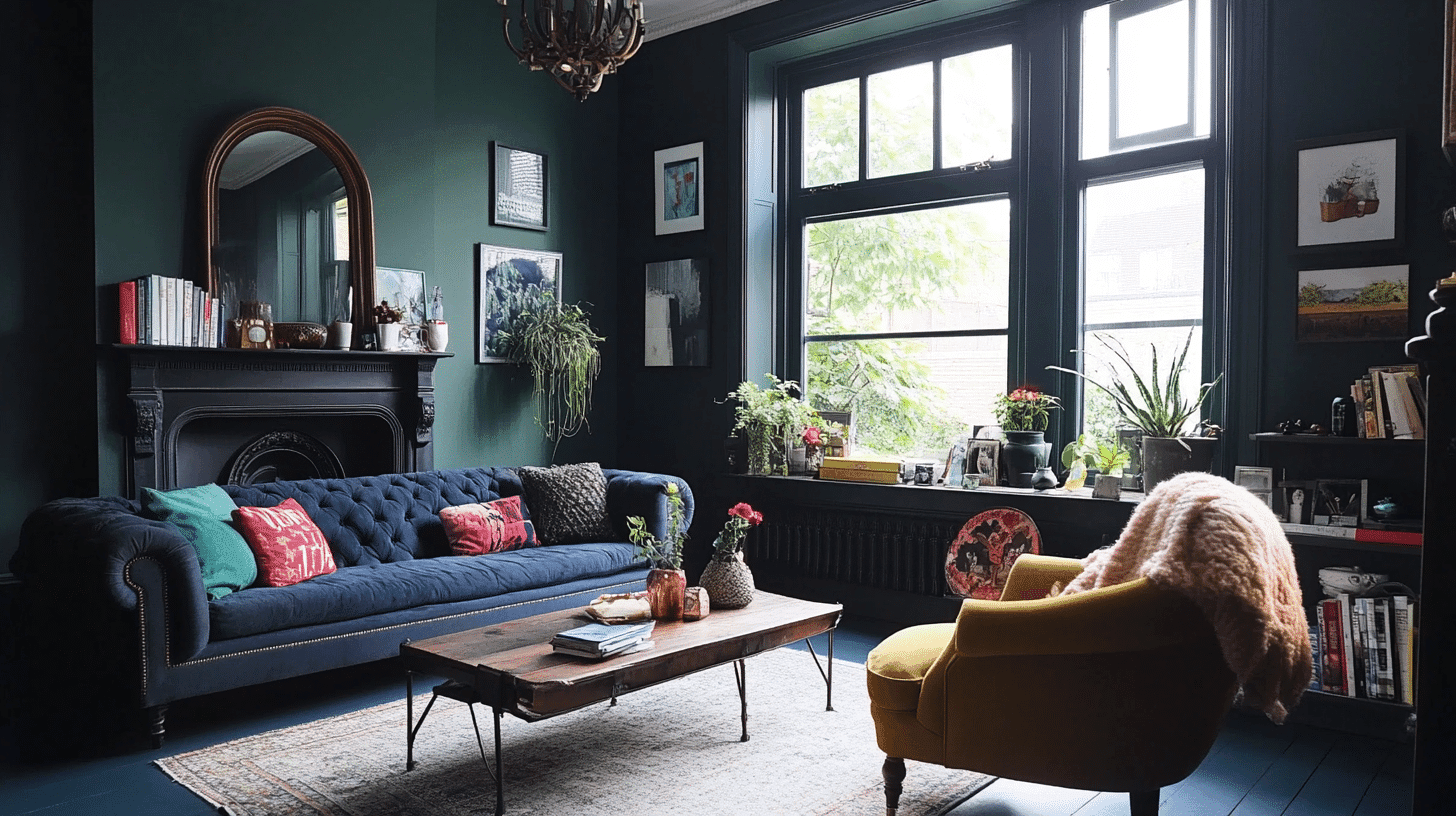
Hague Blue makes living rooms feel warm and cozy, perfect for family gatherings. Its deep tone creates a calm feeling in open spaces, helping big rooms feel more friendly.
Additional Tips:
- Add gold or brass lamps and picture frames to make the blue pop
- Use light-colored rugs and curtains to balance the dark walls
Bedrooms & Relaxation Areas
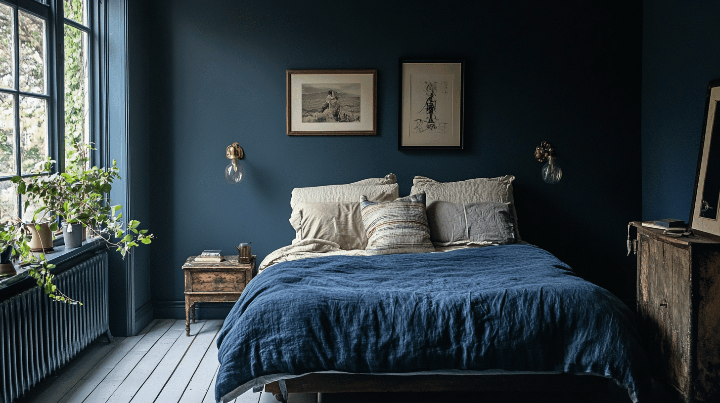
This deep blue color works great in bedrooms, creating a peaceful feeling that helps with sleep. The dark shade also makes a nice background for light-colored beds and furniture.
Additional Tips:
- Paint just one wall blue to create a focal point in the room
- Pair with soft lighting for a calm nighttime feeding
Kitchens & High-Traffic Areas
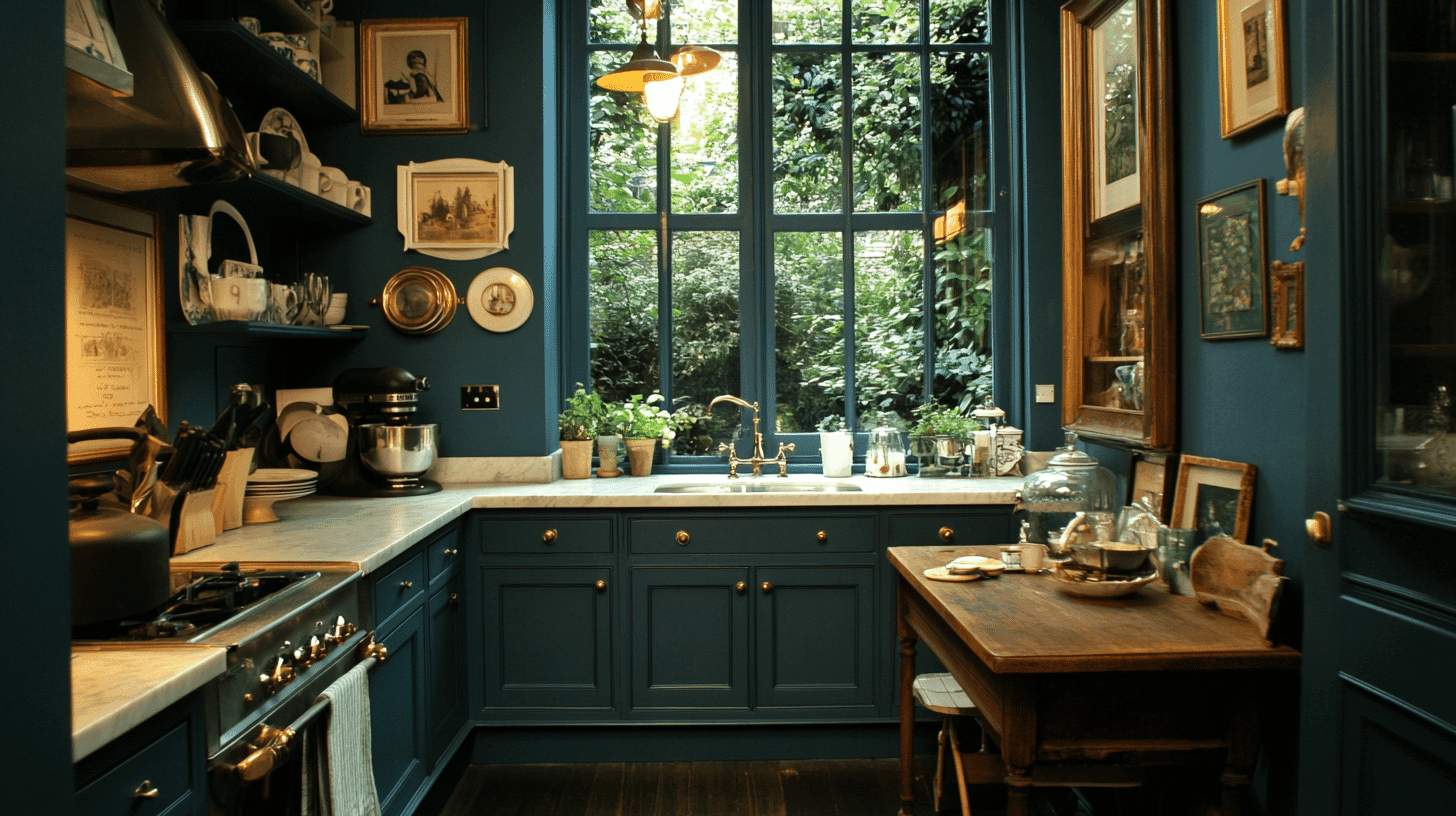
Hague Blue can make kitchens feel rich and welcoming, especially on cabinets or an island. This dark color also hides marks and spots well in busy areas of your home.
Additional Tips:
- Use in pantries or on lower cabinets where fingerprints might show
- Clean with a soft damp cloth to keep the finish looking fresh
Bathrooms & Spa-like Retreats
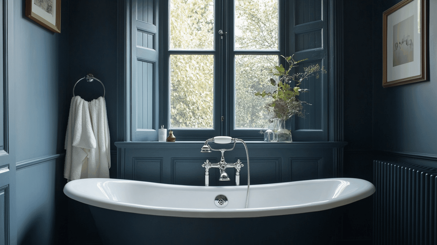
This color turns bathrooms into calm, special spaces that feel like fancy hotels. Hague Blue pairs well with white fixtures and tiles for a clean look.
Additional Tips:
- Add plants to bring life to the rich blue background
- Use good bathroom fans since dark colors can show water spots more easily
Note: These images are just for sample. Actual color may vary.
Color Pairings & Combinations
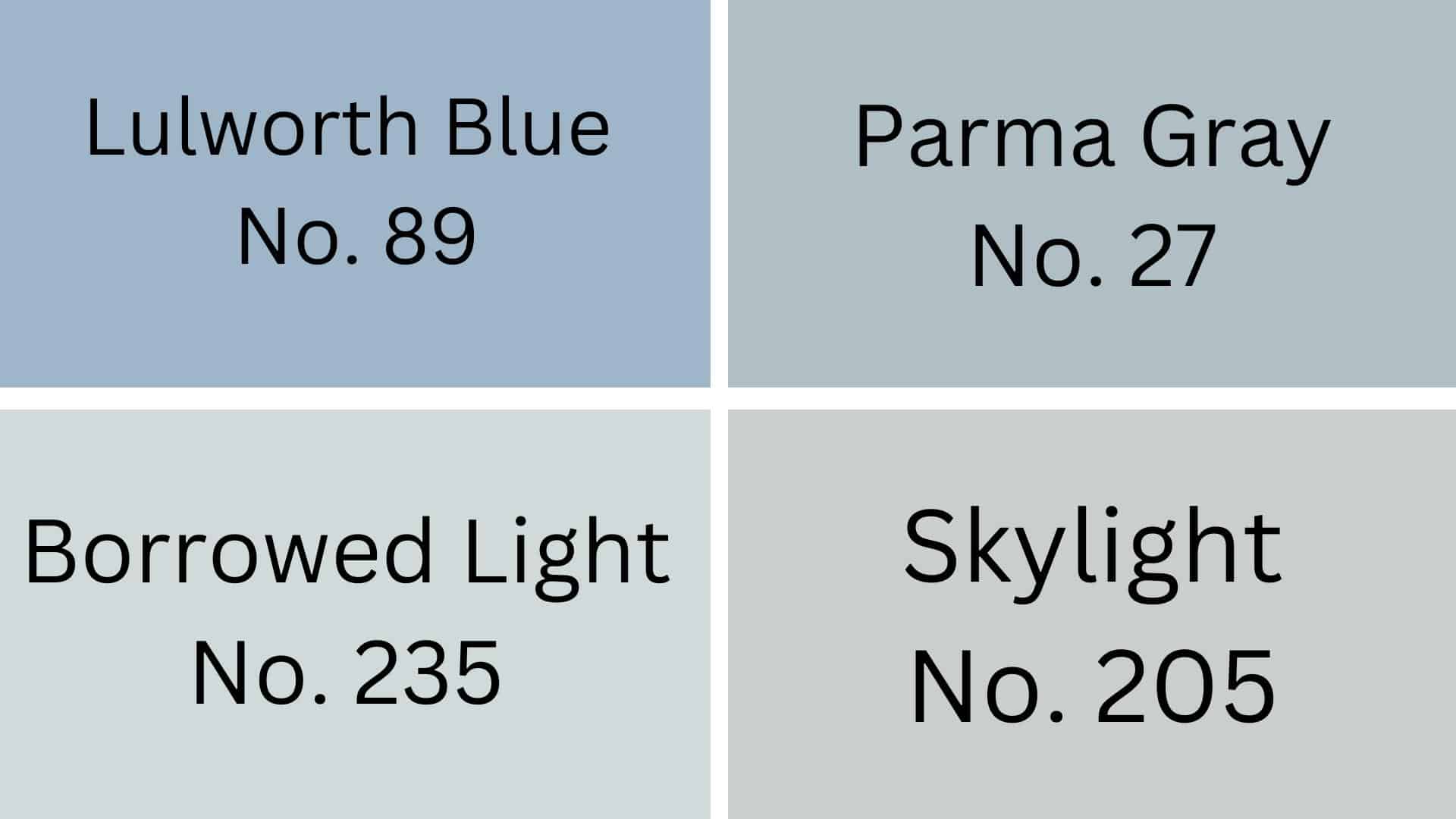
1. Lulworth Blue (No. 89):When used together, Lulworth Blue makes Hague Blue look less dark. These blues work well in rooms where you want to feel calm and relaxed.
2. Parma Gray (No. 27):Parma Gray is a soft color that makes Hague Blue stand out more. When you put these colors next to each other, your room will feel both cozy and clean.
3. Borrowed Light (No. 235):Borrowed Light is very light and makes Hague Blue pop when used on a nearby wall. These colors remind people of the sky on a partly cloudy day.
4. Skylight (No. 205):Skylight is a gentle blue that works well with Hague Blue in bedrooms or bathrooms. Together, these two colors make a room feel bigger and more peaceful.
Creating Cohesive Color Schemes
1. Monochromatic Scheme
A monochromatic scheme uses different shades of the same color. Hague Blue works well with lighter and darker blues to create a calm feeling.
- Pair Hague Blue with light blue for walls and trim
- Add navy blue accents through pillows or throws
- Use sky blue for a softer touch in the same room
- Try blue-gray paint for connecting spaces
2. Warm Color Scheme
Warm colors like reds, oranges, and yellows can balance the coolness of Hague Blue. This mix creates rooms that feel both cozy and balanced.
- Match Hague Blue with rust orange for a bold look
- Add gold picture frames or lamps for shine
- Use cream or off-white trim to brighten the space
- Try tan or beige furniture to soften the dark blue
3. Cool Color Scheme
Cool colors work naturally with Hague Blue to create a peaceful space. Green and purple shades mix well with this deep blue.
- Combine Hague Blue with sage green for a nature feel
- Add silver or chrome fixtures for a clean look
- Use gray flooring to ground the blue walls
- Try lavender accents for unexpected color pops
Coordinating with Furniture & Decor
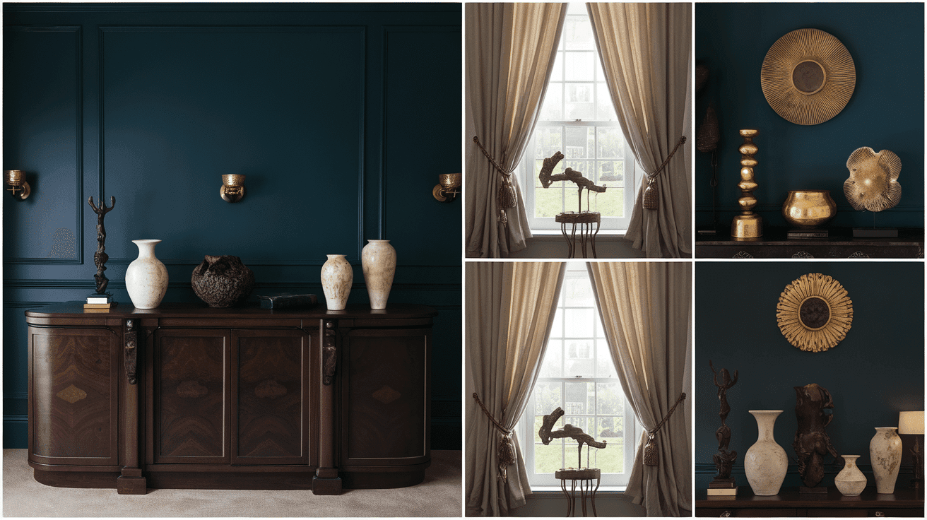
1. Wood Tones
Hague Blue looks great with both light and dark wood. Light woods like oak or maple create a nice contrast, while dark woods like walnut blend well for a cozy feel.
Key Tip: Test your wood furniture against a Hague Blue paint sample before painting the whole room.
2. Metals
Gold and brass metals pop against Hague Blue walls, making them shine more. Silver and chrome also work well, giving a cool and clean look against the deep blue.
Key Tip: Mix different metals in the same room for more interest, but limit to 2-3 types.
3. Decor
White or cream-colored items stand out nicely against Hague Blue. Artwork with gold frames looks extra special on these deep blue walls.
Key Tip: Add some items in similar blue shades to tie the room together.
Similar Colors & Alternatives
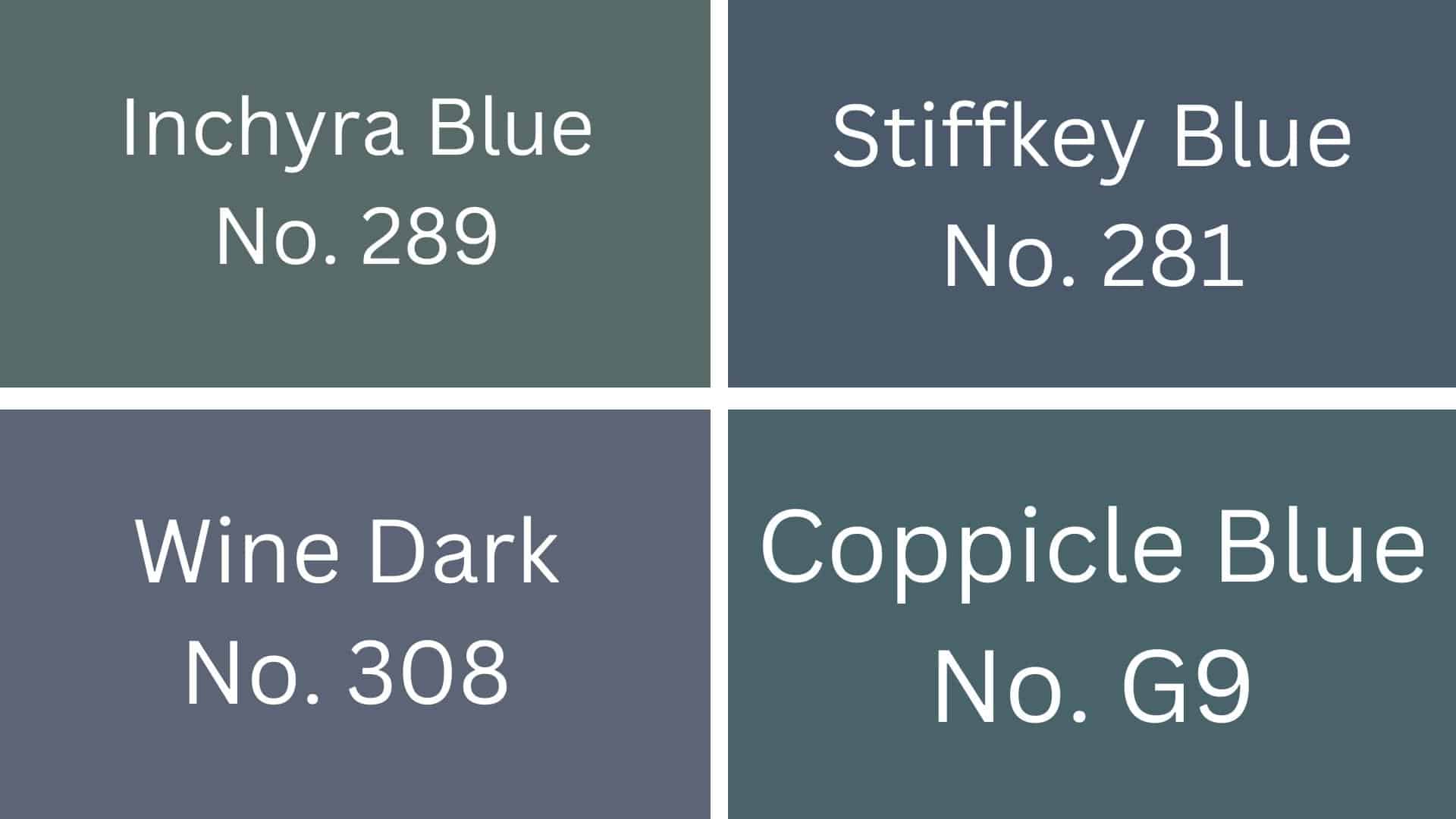
1. Inchyra Blue (No.289):Inchyra Blue is a dark blue-gray color that looks great in both sunny and shaded rooms. It changes throughout the day, sometimes looking more green and sometimes more blue.
2. Stiffkey Blue (No. 281): Stiffkey Blue is a deep navy blue that feels cozy when used in living rooms or bedrooms. It’s a bit lighter than Hague Blue but still gives rooms a calm, peaceful feeling.
3. Wine Dark (No. 308): Wine Dark is a rich purple-blue that reminds people of deep red wine. It pairs well with wooden furniture and creates a warm feeling in dining rooms.
4. Coppicle Blue (No. G9): Coppicle Blue has hints of green mixed with blue that make it feel like a forest shade. It works well in bathrooms and hallways where you want a cool, calm color.
Final Thoughts
Hague Blue is a deep blue-green paint that changes throughout the day, showing different sides as light shifts.
It works well in many rooms, from living rooms to bathrooms to kitchens. Pair it with light woods like oak or maple for contrast or with gold and brass metals to make them pop.
Hague Blue hides wall marks better than light colors and comes in many finishes, such as matte, eggshell, and satin, to match your needs. For the best effect, use soft lighting with it.
If you want something similar to Hague Blue, try Stiffkey Blue or Inchyra Blue. Both give the same calm feeling but with small differences in tone.
Explore our color schemes section for more detailed reviews and to select the ideal option for your home!

Alex Guerrero, a graduate with a Fine Arts degree from the Rhode Island School of Design, has been a visionary in the world of color and design for over 15 years. His professional journey began in the heart of the fashion industry in Milan, where he developed an acute sense for color harmonies and trends. Alex joined our team in 2018, offering fresh and innovative perspectives on color utilization in various spaces. Renowned for his ability to blend contemporary trends with timeless elegance. Outside of work, Alex is an accomplished painter and a volunteer art therapist, his artistic talents further enriching his professional insights.