Finding the perfect gray for your home can change every space with refined grace and timeless appeal.
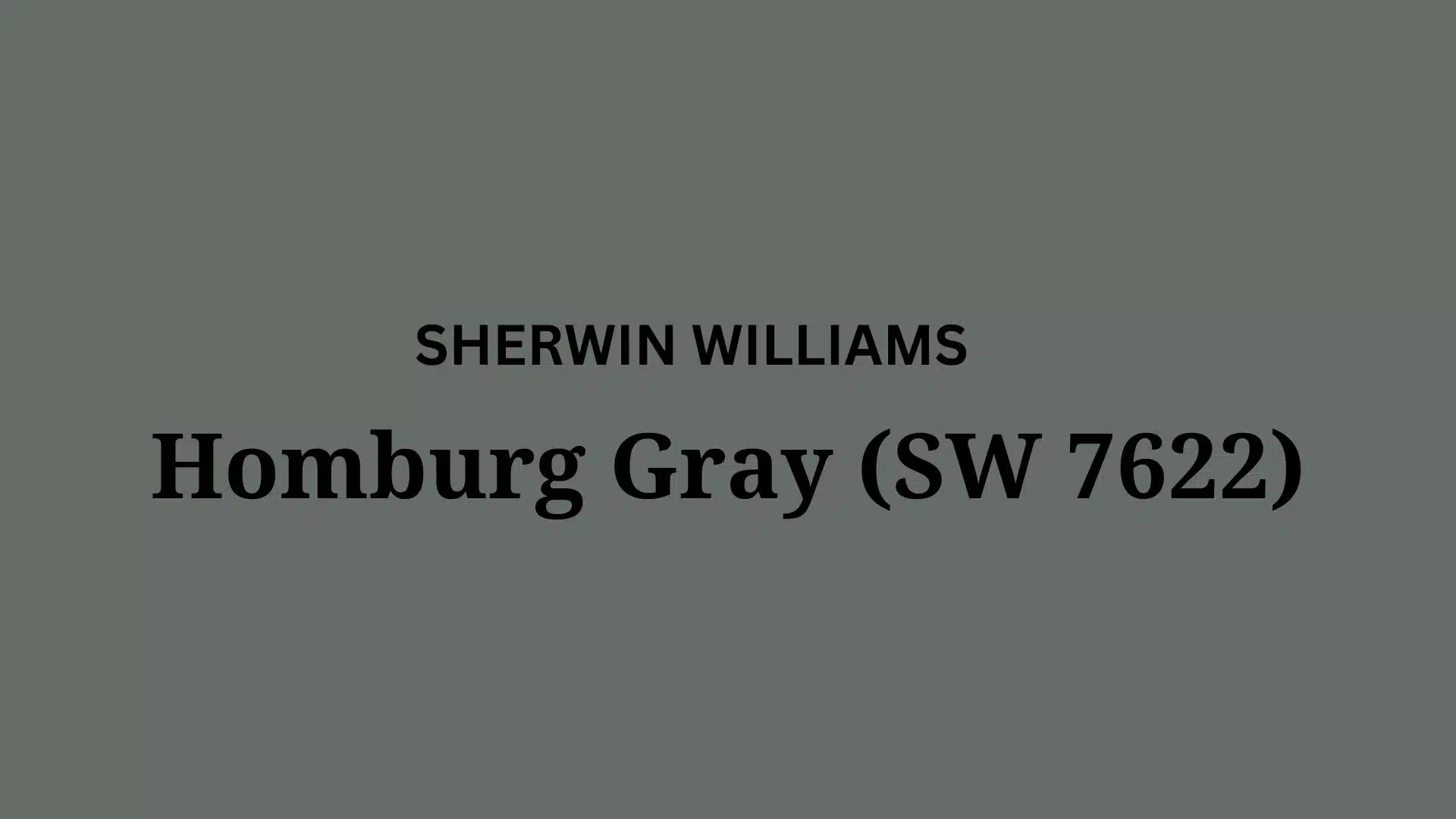
Sherwin-Williams Homburg Gray (SW 7622) is a top selection for homeowners who desire a rich, grounding presence in their living spaces.
This versatile gray adds depth to any room, especially when complemented by natural light.
Homburg Gray establishes a cozy, intimate atmosphere that makes even larger spaces feel more comfortable and inviting.
Its balanced undertones prevent the cold effect that some grays can produce, instead offering a warm, soothing presence.
Whether covering entire walls or accentuating architectural details, Homburg Gray improves surrounding elements and décor pieces.
Throughout this blog, we’ll explore how this refined gray can elevate your home’s character while providing the perfect backdrop for your unique style.
Understanding Sherwin-Williams’ Homburg Gray
Before diving into Homburg Gray’s distinctive qualities, let’s explore the fundamental elements that make each paint color unique and how they influence your space.
Color Terminology
Before examining Homburg Gray, here’s a guide to essential color terminology to understand this shade’s uniqueness:
| Property | Value for Homburg Gray SW 7622 |
|---|---|
| LRV | 14.7–15 (dark color category) |
| RGB Value | 102, 109, 105 |
| Hex Code | #666D69 |
| Undertones | Cool gray with clear green and subtle blue/olive notes |
| Psychology | Grounded, refined, rich, and calming |
| Comparison | Pure white: ~90 LRV, Black: ~0 LRV |
Undertones:
- Homburg Gray has complex, warm undertones with taupe influences.
- It’s a balanced gray with subtle green and brown notes.
- Not a stark or cool gray, but a nuanced, warm-leaning neutral gray.
Psychology of Warm Gray Colors
Warm grays, like Homburg Gray, establish a sense of stability and a refined atmosphere.
- Taupe-gray tones: Deliver grace and versatility.
- Medium-dark gray tones: Evoke depth, richness, and timelessness.
- Benefits: Less cold than blue-grays, improves visual warmth, and creates a grounding backdrop.
Why Choose Sherwin-Williams’ Homburg Gray?
Sherwin-Williams Homburg Gray’s versatility excels in varying lighting situations.
It maintains its warm character in south-facing rooms while avoiding flatness in dimmer, north-facing spaces.
Its adaptable nature provides a refined neutral foundation that complements both traditional and modern design elements.
Key Features
Sherwin-Williams Homburg Gray offers exceptional harmony with fixed elements like wood furnishings and stone surfaces.
It creates cohesive transitions between rooms while maintaining visual interest.
It provides enough depth to feel grounded while preserving a refined quality that won’t quickly date.
Durability
Sherwin-Williams Homburg Gray, particularly in premium finishes like Emerald or Duration, delivers outstanding longevity with excellent coverage.
Its medium-dark depth helps anchor spaces while maintaining its refined appearance.
When properly applied, this paint resists fading and maintains color consistency even with regular maintenance.
Texture Patterns
Sherwin-Williams Homburg Gray creates a rich, dimensional texture that adds depth to walls without overwhelming the space.
Its balanced undertones produce subtle light variations that soften harsh lighting and add interest to textured surfaces.
When applied to different finishes, it can highlight architectural features while maintaining a consistent, refined appearance.
Room-by-Room Color Recommendations with Homburg Gray
1. Living Spaces and Open Floor Plans

Homburg Gray (SW 7622) functions beautifully in living areas due to its versatile warm undertones that create balance.
The 26.00 LRV of Homburg Gray provides excellent depth, making spaces feel cozy while offering natural warmth.
For contrast, pair Homburg Gray walls with lighter trim in Extra White SW 7006 or Greek Villa SW 7551.
2. Bedrooms and Relaxation Areas

Homburg Gray creates a cozy, refined atmosphere in bedrooms without feeling too heavy or overwhelming.
The warm undertones in Homburg Gray promote relaxation while maintaining enough depth to keep the space grounded.
Consider Homburg Gray for bedroom walls while using lighter accent colors like Alabaster SW 7008 on furniture.
3. Kitchens

Homburg Gray in eggshell or satin finish offers practicality in busy kitchens while its depth improves architectural details.
The neutral warmth complements both light quartz countertops and rich wood cabinetry without becoming overbearing.
Homburg Gray works wonderfully with brass, copper, or brushed nickel hardware, making it adaptable to various styles.
4. Bathrooms and Spa-like Retreats

Sherwin-Williams Homburg Gray creates a grounded, spa-like atmosphere in bathrooms with refined appeal.
Its warm gray undertones improve the natural feel of fixtures while adding depth to larger spaces.
This versatile shade pairs beautifully with white porcelain, marble, and light wood elements, creating a timeless retreat.
For master bathrooms, consider using Homburg Gray as an accent wall to create visual interest and depth.
Color Pairings and Combinations for Homburg Gray

Homburg Gray is a refined, nuanced gray that embodies the essence of timeless grace.
This versatile shade blends the richness of gray with the warmth of taupe, creating a grounding and adaptable color.
Color Characteristics
Undertones: Warm gray with subtle taupe and green undertones
Mood: refined, grounding, and elegant
Best Used In: Dining rooms, offices, bedrooms, accent walls, exterior accents
Light Reflectance Value (LRV): 26.00, providing balanced depth with just enough warmth
Complementary Trim Colors
- Extra White (SW 7006) – A bright white that creates dramatic contrast against Homburg Gray
- Greek Villa (SW 7551) – A warm white that softens the transition between wall and trim
- Alabaster (SW 7008) – A creamy off-white that harmonizes with the warmth of Homburg Gray
- Repose Gray (SW 7015) – A lighter gray that creates subtle dimension and a layered effect
Coordinating with Furniture and Decor
Recommended Wood Pairings
Light Woods: Maple and ash create a contemporary, striking contrast
Medium Woods: Cherry and oak complement the warmth of Homburg Gray naturally
Dark Woods: Espresso and mahogany create a rich, luxurious palette
Weathered Woods: Reclaimed timber improves the refined quality of this color
Styling Recommendations
Incorporate natural wood furniture for an organic, grounded look
Use lighter wood accents to create brightness and visual relief
Mix wood elements with varied textures to add dimension to the space
Metal Finishes
Brass: Warm brass fixtures improve the taupe undertones in Homburg Gray
Copper: Creates a rich, warm contrast with striking appeal
Brushed Nickel: Provides a modern, clean complement that doesn’t compete
Matte Black: Offers a bold, contemporary statement against the gray backdrop
Chrome: Adds bright, reflective contrast for a more modern aesthetic
Metal Mixing Techniques
Blend multiple metal finishes for a collected, designer-curated look
Use metal accents to add definition against the refined gray backdrop
Consider metallic elements in lighting, hardware, and decorative accessories for cohesion
Similar Paint Colors: Perfect Alternative to Homburg Gray

Color Comparison: Homburg Gray vs. Dovetail Gray (Sherwin-Williams)
Homburg Gray
Warm gray with complex taupe undertones
Medium-dark Light Reflectance Value (LRV) of 26.00
Offers a nuanced, refined interpretation of gray
Balances between gray and taupe, creating a versatile appeal
Ideal for spaces seeking depth with inviting warmth
Dovetail Gray
Medium gray with subtle warm undertones
Medium LRV in the 39.00 range
Evokes a slightly lighter, more versatile appearance
Provides a balanced, transitional feel to interior spaces
More adaptable for whole-home applications
Color Undertones
- Homburg Gray: More complex, with taupe undertones that add distinctive warmth
- Dovetail Gray: Clearer gray with minimal warm undertones for a more neutral appearance
Lighting Impact
- Homburg Gray: Shifts beautifully with lighting, appearing more taupe or gray depending on exposure
- Dovetail Gray: Maintains a more consistent gray appearance across different lighting conditions
Final Words
Imagine a color that’s like twilight captured in a paint can; that’s Homburg Gray.
This exceptional paint color is remarkable because it transitions beautifully throughout changing light.
It sometimes looks rich and refined, and sometimes feels warm and inviting, making it incredibly versatile.
It’s like a color chameleon that can improve nearly any space with its depth.
Designers appreciate Homburg Gray because it makes rooms feel grounded yet refined.
It reminds people of classic architecture with timeless appeal and enduring classiness.
This color is a superb choice for painting a dining room, home office, or even exterior accents.
It’s the perfect balance of sophistication and warmth, ideal for making any space look distinguished and polished.

Alex Guerrero, a graduate with a Fine Arts degree from the Rhode Island School of Design, has been a visionary in the world of color and design for over 15 years. His professional journey began in the heart of the fashion industry in Milan, where he developed an acute sense for color harmonies and trends. Alex joined our team in 2018, offering fresh and innovative perspectives on color utilization in various spaces. Renowned for his ability to blend contemporary trends with timeless elegance. Outside of work, Alex is an accomplished painter and a volunteer art therapist, his artistic talents further enriching his professional insights.