Ever wonder how colors can change your residence without breaking the bank?
Home color schemes are like magic wands that remake the way rooms feel with just a few paint cans and some new pillows.
The right mix of colors can make small rooms look larger, dark rooms brighter, and boring spaces more exciting.
When colors work together, they evoke emotions, creating calmness in bedrooms, energy in kitchens, or a cozy atmosphere in living rooms.
If you love earthy tones or cool blues, finding your perfect color combination is easier than you think.
Let’s explore some amazing color teams that can make your house truly yours!
Balanced Color Palettes for Home Spaces
These carefully curated color combinations change everyday spaces through a thoughtful balance of warm and cool tones.
Each palette evokes a unique psychological effect and offers practical design solutions, creating rooms that are both lovely and functional.
1. Greige, White, Soft Charcoal
This versatile color scheme combines the warmth of beige with the coolness of gray.
The beige acts as a perfect neutral base, while white brightens the space and charcoal adds depth and contrast.
Designer insights: Use the darker charcoal sparingly as an accent to prevent the space from feeling heavy.
Psychological Effects: Creates a sense of calm and stability while remaining interesting enough to avoid feeling boring.
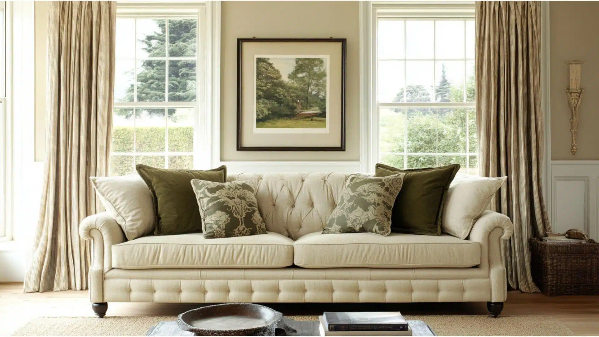
2. Warm Beige, Cream, Deep Brown
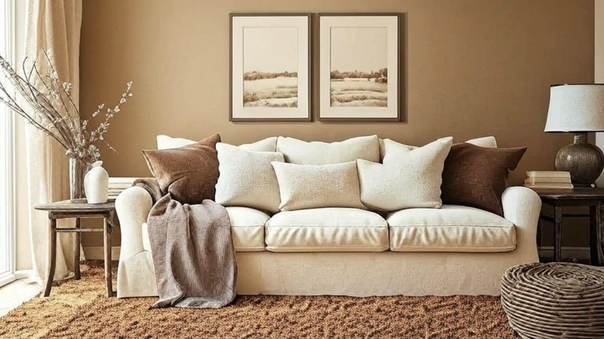
This timeless color palette brings cozy warmth to any space.
The warm beige walls provide a neutral backdrop while cream lightens the mood and deep brown grounds the space.
Designer insights: To enhance the organic feel of this scheme, incorporate textural elements such as woven baskets or wooden furniture.
Psychological Effects: Promotes feelings of comfort and security, making it perfect for family rooms and bedrooms.
3. Ivory, Soft Taupe, Slate Gray
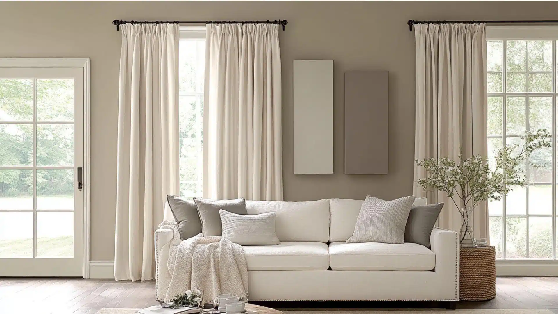
This refined palette combines the softness of ivory and taupe with the strength of slate gray.
It works beautifully in both traditional and contemporary residences.
Designer insights: To keep the space feeling open, use slate gray for larger furniture pieces and ivory for walls.
Psychological Effects: Encourages thoughtfulness and calm reflection while maintaining a graceful atmosphere.
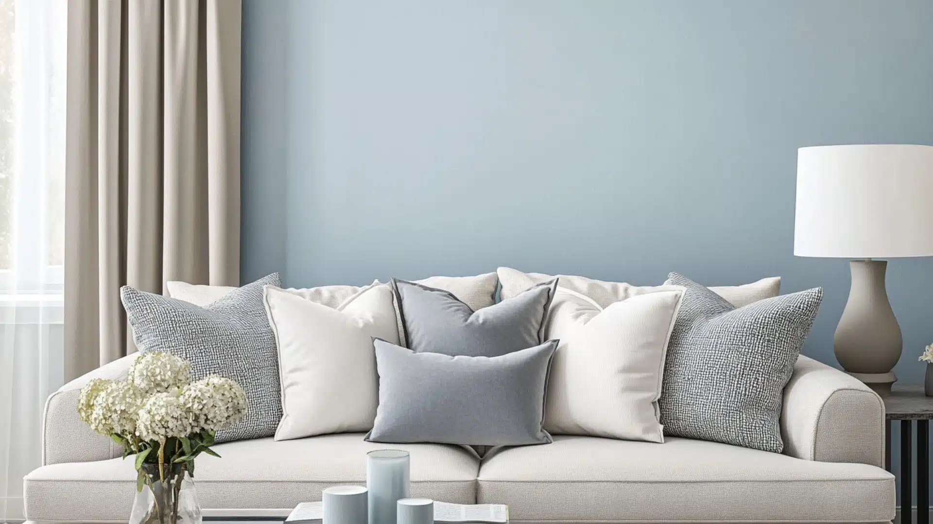
4. Pale Gray, Navy, Crisp White
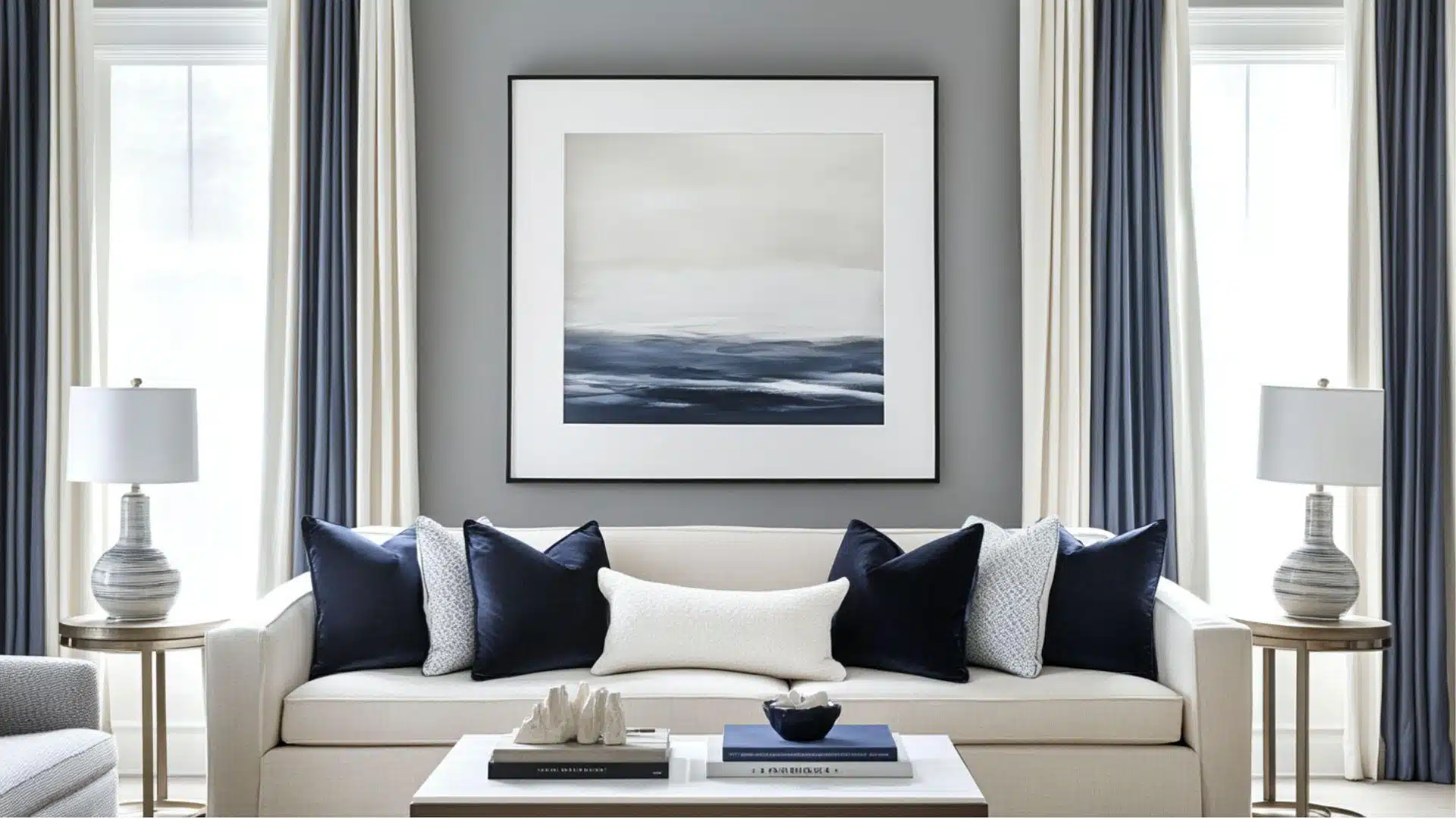
This fresh and timeless scheme offers a modern take on classic colors.
The pale gray provides a soft backdrop while navy adds drama, and white keeps everything clean.
Designer insights: Try navy on a single accent wall or large furniture pieces for maximum impact.
Psychological Effects: Promotes focus and clarity while creating a sense of order and cleanliness.
5. Sand, Sage Green, Off-White
This nature-inspired palette brings the outdoors in.
Sand creates a warm foundation, sage green adds a gentle natural element, and off-white keeps the space feeling airy.
Designer insights: Add natural wood accents and plants to enhance the organic, earthy feeling of this scheme.
Psychological Effects: Encourages relaxation and connection with nature, reducing stress and promoting well-being.
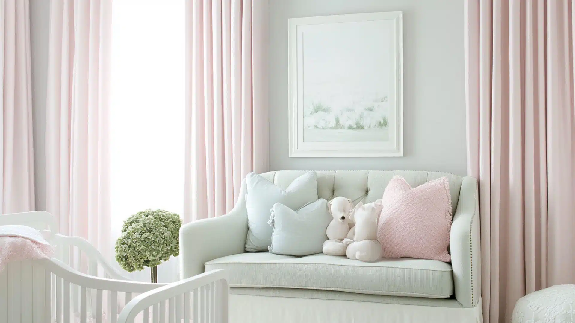
6. Mushroom, Dusty Rose, Almond
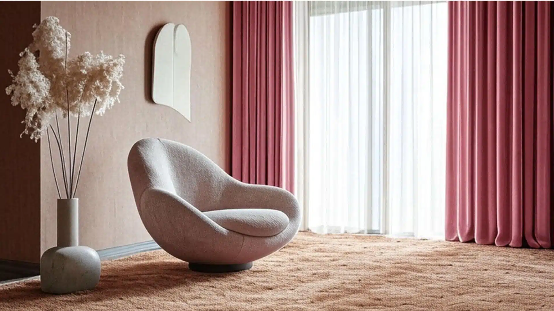
This soft, refined scheme pairs neutral mushroom with feminine dusty rose and warm almond.
It’s subtle yet interesting, perfect for creating quietly graceful spaces.
Designer insights: Use dusty rose as an accent color on smaller items, such as pillows or art, for a balanced look.
Psychological Effects: Creates a nurturing environment that feels both comforting and gently uplifting to the spirit.
7. Bone, Fog Gray, Black
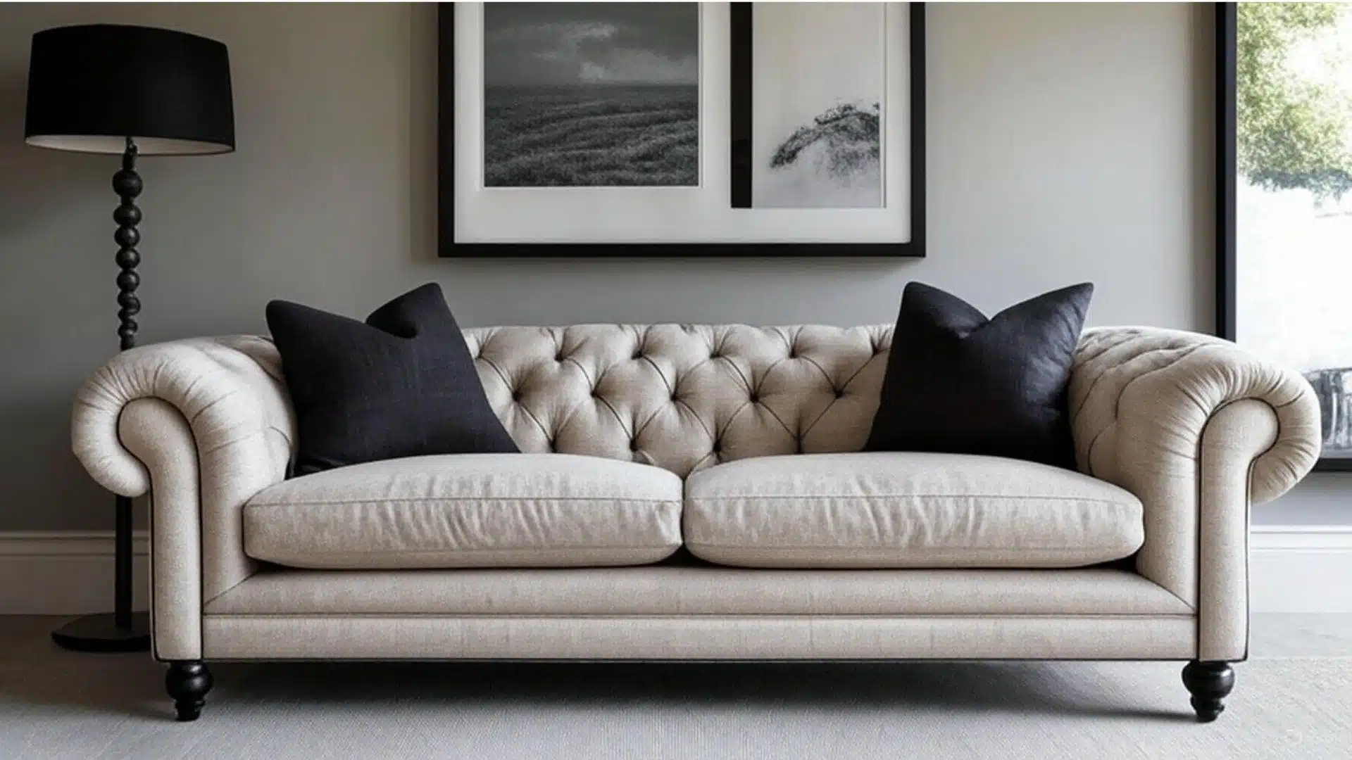
This high-contrast scheme offers dramatic flair while remaining versatile.
Bone provides warmth, fog gray adds softness, and black brings strong definition and refinement.
Designer insights: Balance black accents throughout the room rather than concentrating them in one area.
Psychological Effects: Provides clarity and definition to spaces while creating an atmosphere of refined confidence.
8. Putty, Olive, Warm White
This earthy, organic palette feels both current and timeless.
Putty creates a soft neutral base, olive adds natural color, and warm white keeps everything feeling fresh.
Designer insights: Incorporate metal accents in brass or bronze to enhance the natural richness of this color scheme.
Psychological Effects: Promotes groundedness and connection to the earth while maintaining a sense of simple enlightenment.
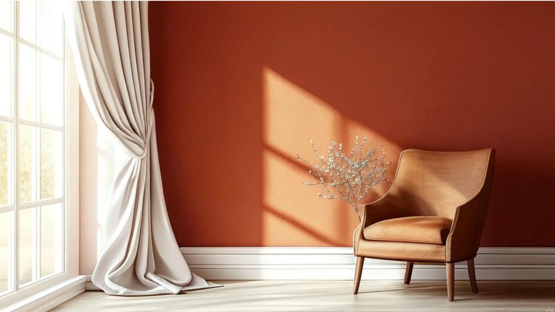
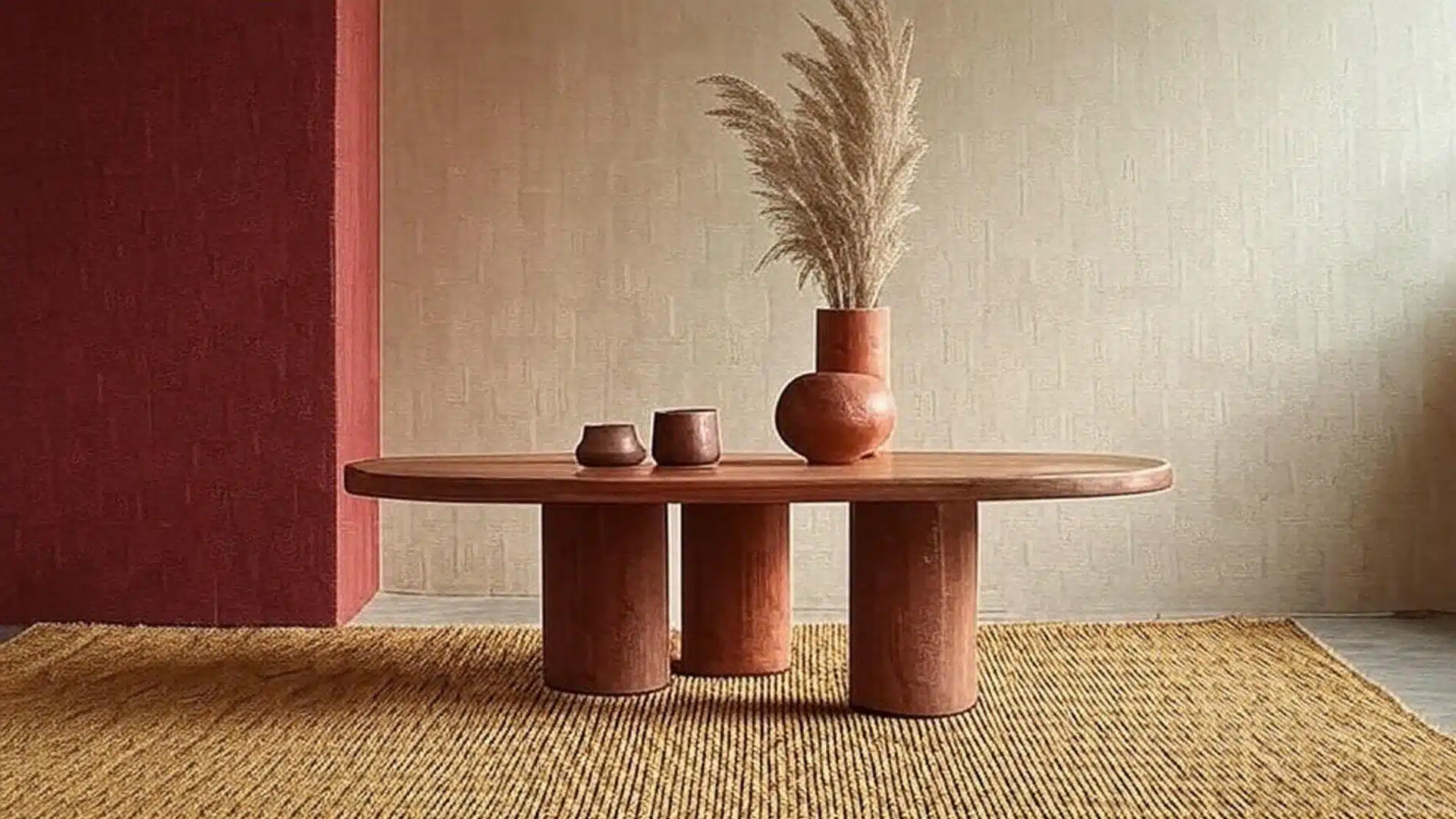
9. Warm Taupe, Terracotta, Bone
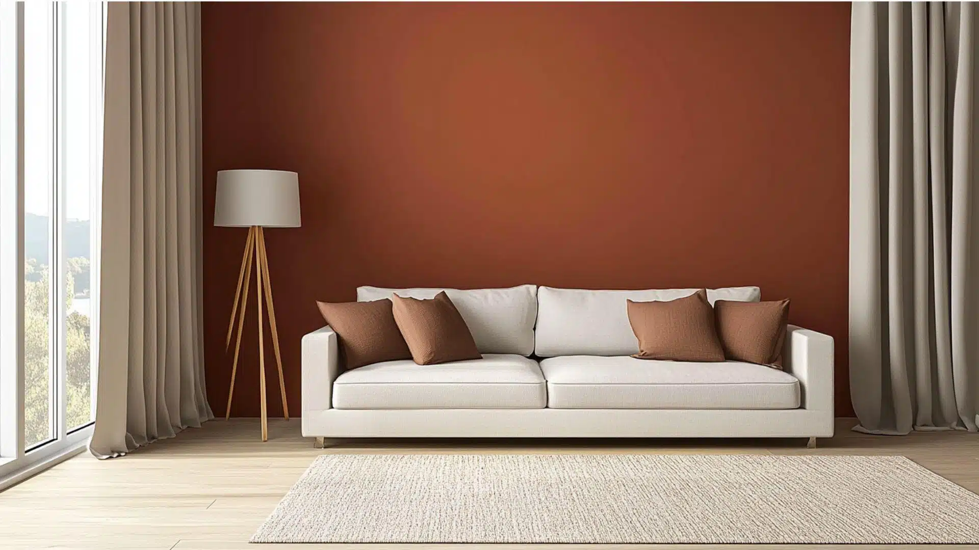
This sun-baked palette brings Mediterranean warmth to any space.
Warm taupe walls provide a neutral base while terracotta adds rich color and bone keeps things light.
Designer insights: Add textural elements like rough pottery or woven textiles to enhance the artisanal feel.
Psychological Effects: Evokes feelings of warmth and hospitality, creating spaces that feel welcoming and lived-in.
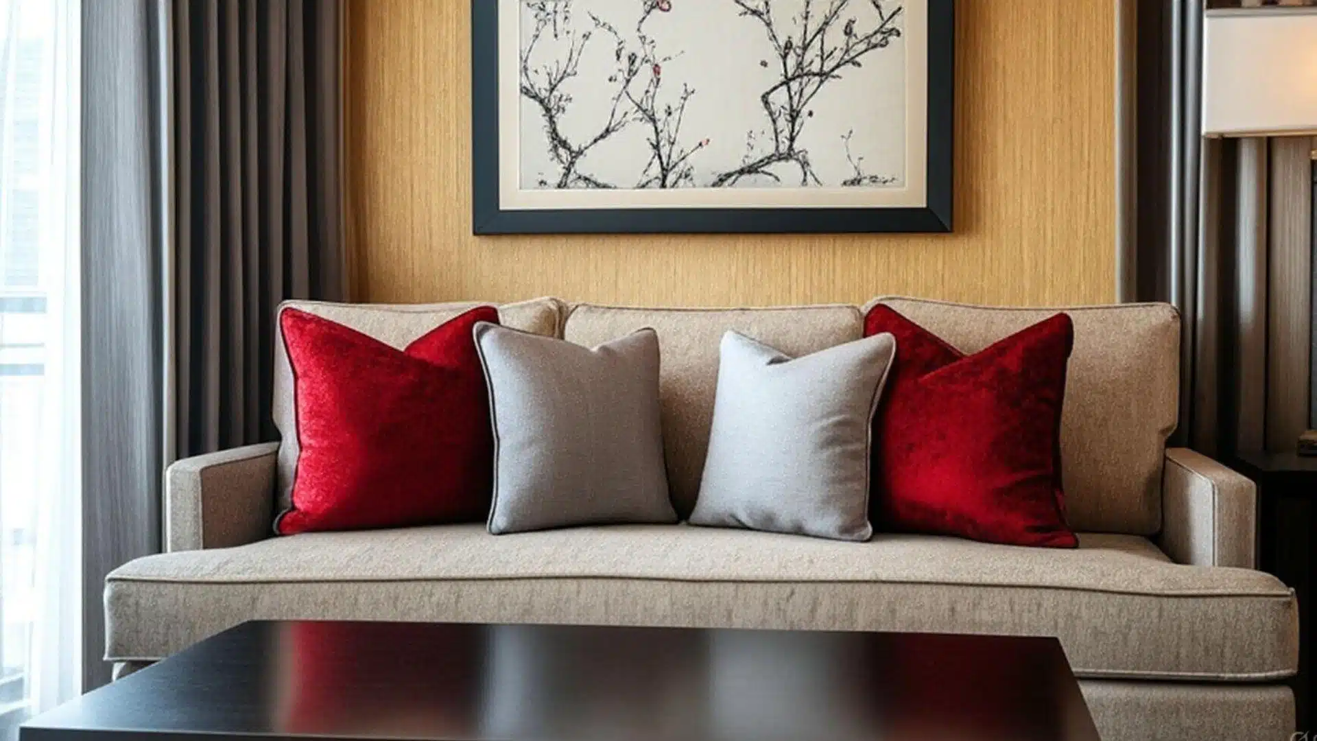
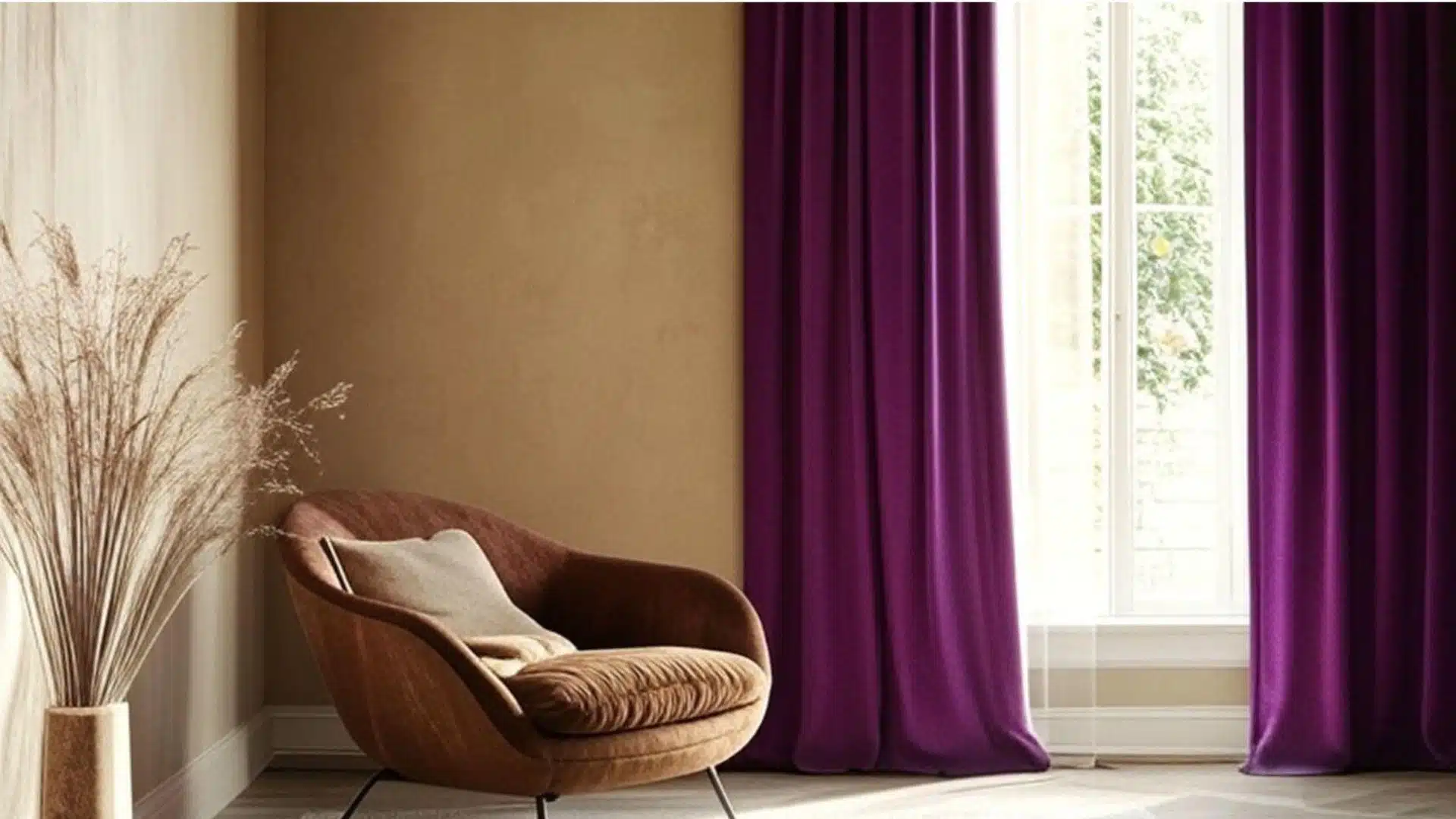
10. Charcoal, Soft Peach, Light Wood
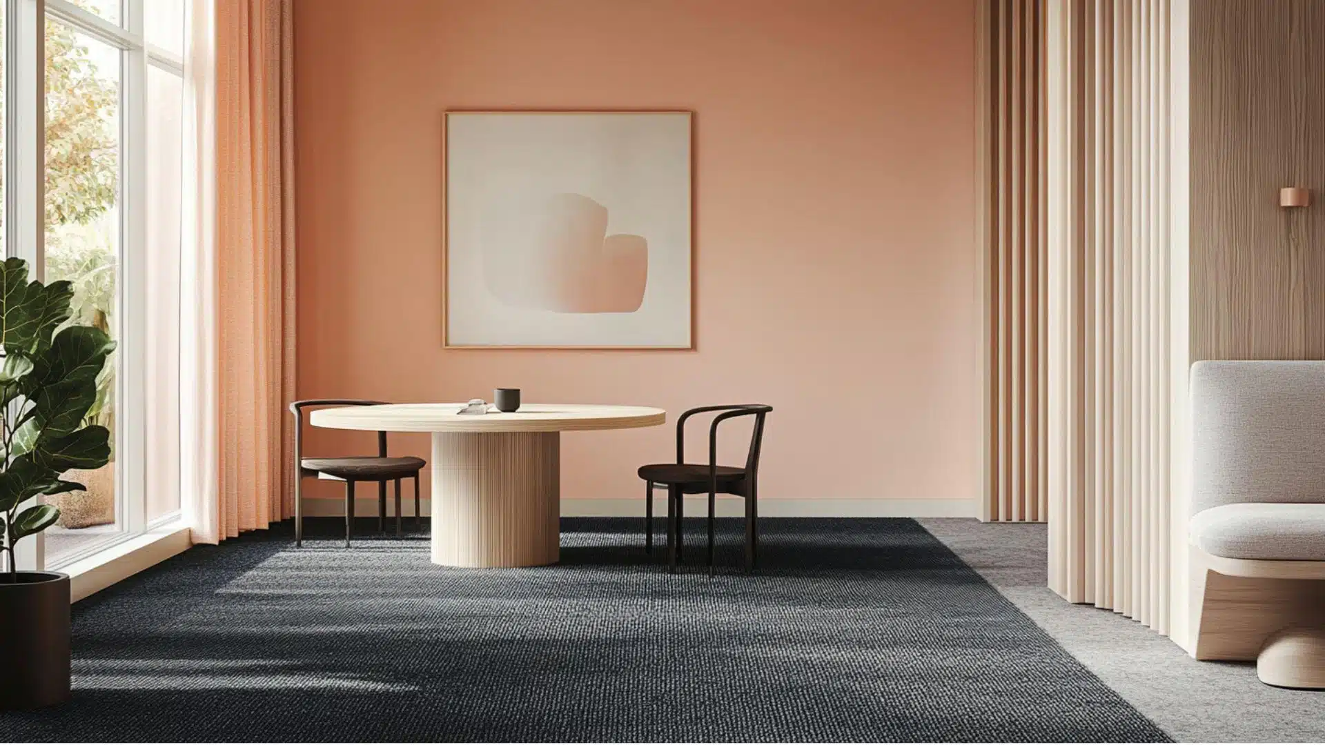
This unexpected combination pairs strong charcoal with soft peach and natural wood tones.
It’s modern yet warm, dramatic yet livable, with perfect balance.
Designer insights: Use charcoal as a grounding element on larger surfaces with peach as a light accent color.
Psychological Effects: Creates dynamic energy while maintaining balance between strength and softness in the space.
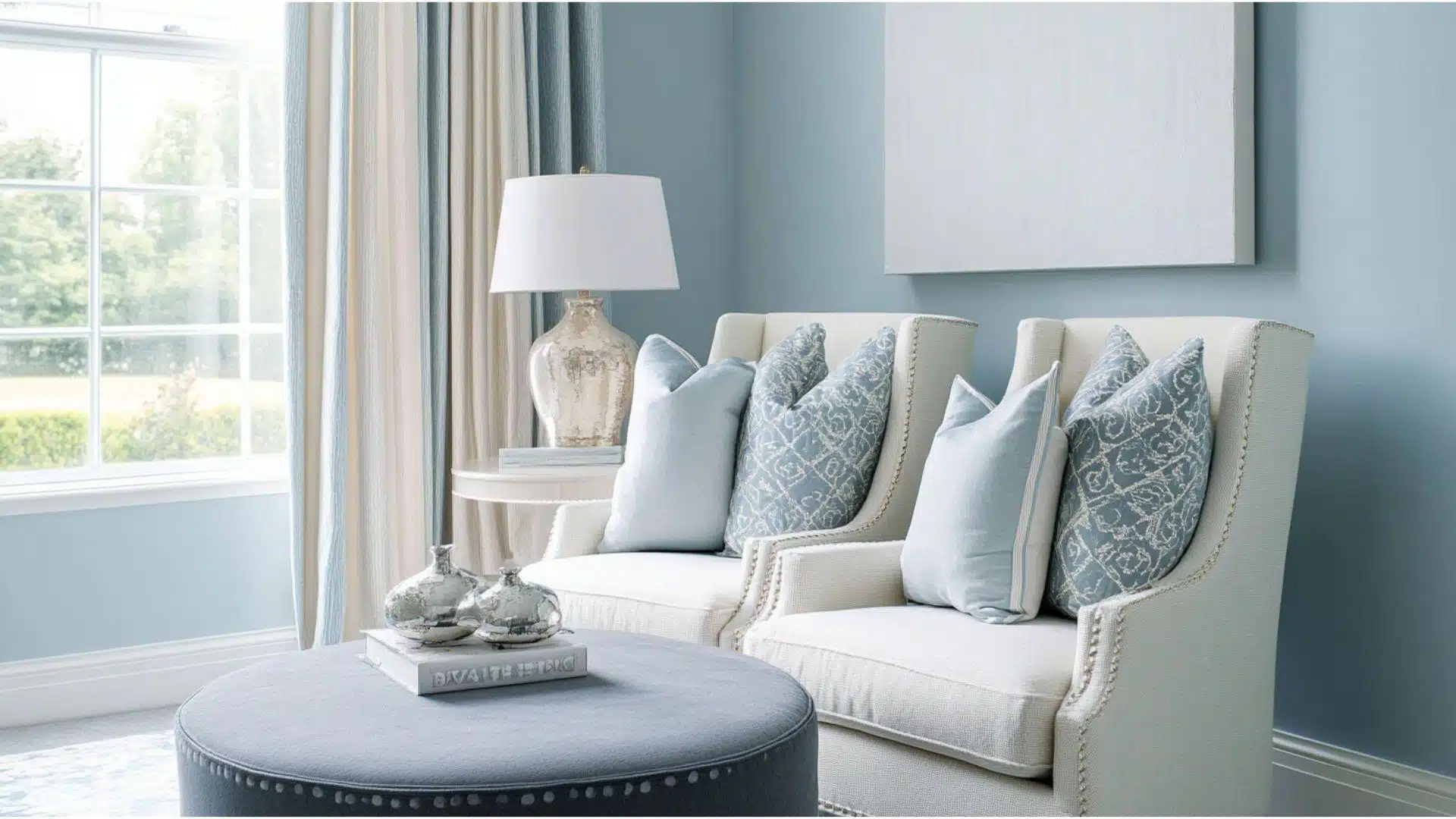
11. Light Blue, Cool Gray, Soft White
Light Blue, Cool Gray, and Soft White create a clean, airy feeling.
This color scheme feels refreshing and organized, perfect for spaces where you need easy-to-find tools and storage solutions.
Designer Insights: The cool tones help your storage features stand out, making it easier to find what you need when cooking.
Psychological Effects: Light blue and white make small spaces feel larger and less cluttered when organizing everyday items.
12. Aqua, Pale Beige, Silver
Aqua, Pale Beige, and Silver blend coastal charm with modern practicality.
This relaxing color combination adds visual interest while creating a subtle beachy vibe to your living space.
Designer Insights: The aqua tones create pleasant focal points that draw the eye to important storage areas.
Psychological Effects: These colors promote calm and order while hiding clutter that might otherwise cause stress.
13. Sky Blue, White, Navy
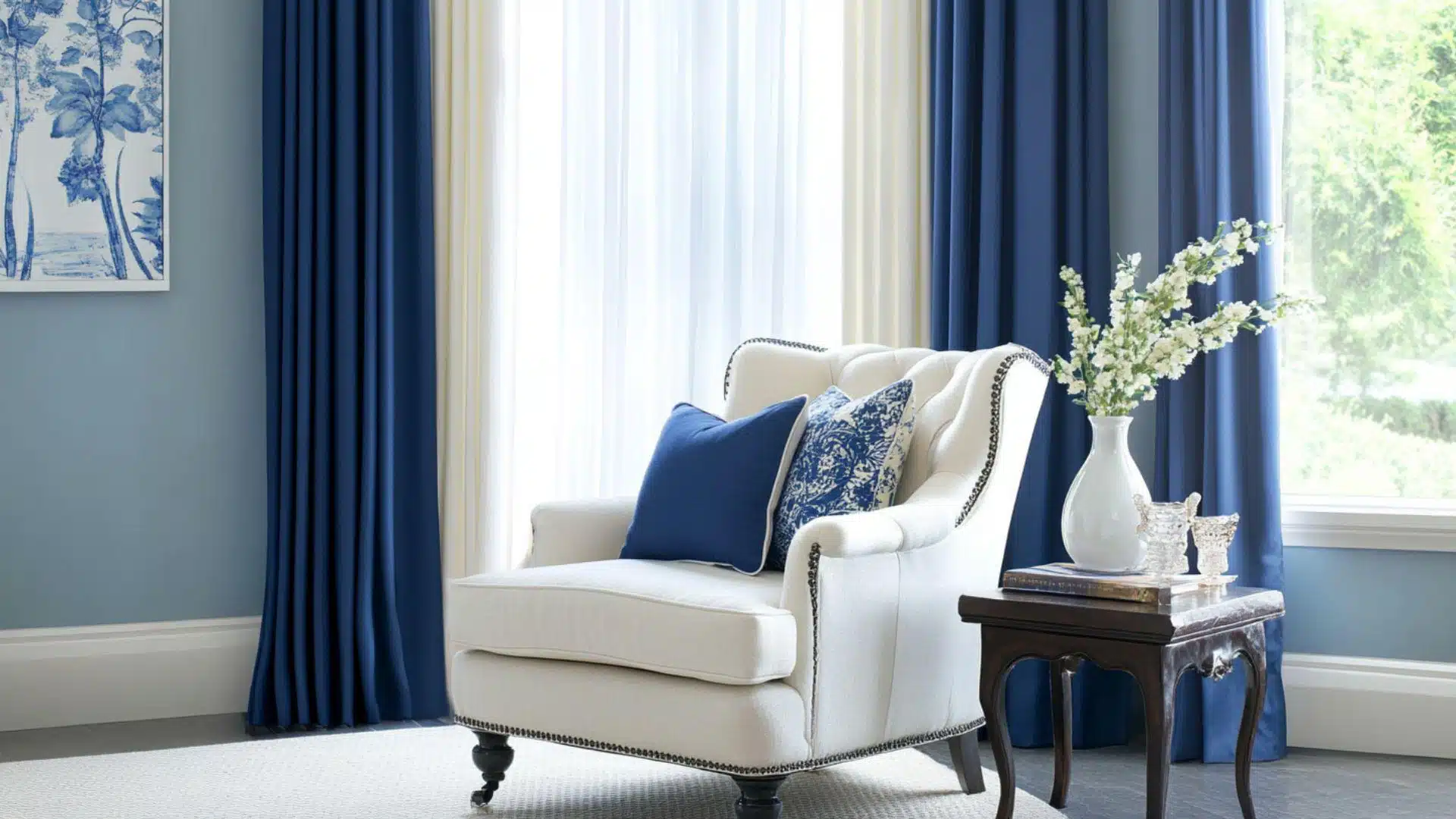
Sky Blue, White, and Navy offer a classic nautical theme.
This timeless color trio brings a clean, fresh feeling to your room while maintaining an organized appearance.
Designer Insights: The blue and white combination naturally signals cleanliness for food preparation and storage areas.
Psychological Effects: Navy accents create clear visual boundaries that help family members respect your organization’s system.
14. Soft Mint, Light Gray, Pale Pink
Soft Mint, Light Gray, and Pale Pink create a subtle, modern pastry-shop feeling.
This gentle color scheme makes finding items enjoyable while adding warmth to your dining or living space.
Designer Insights: Mint backgrounds make labels and container contents easier to identify quickly when cooking.
Psychological Effects: These soft colors subtly enhance the cooking experience by creating a pleasant visual environment.
15. Pale Lavender, Soft Blue, Snow White
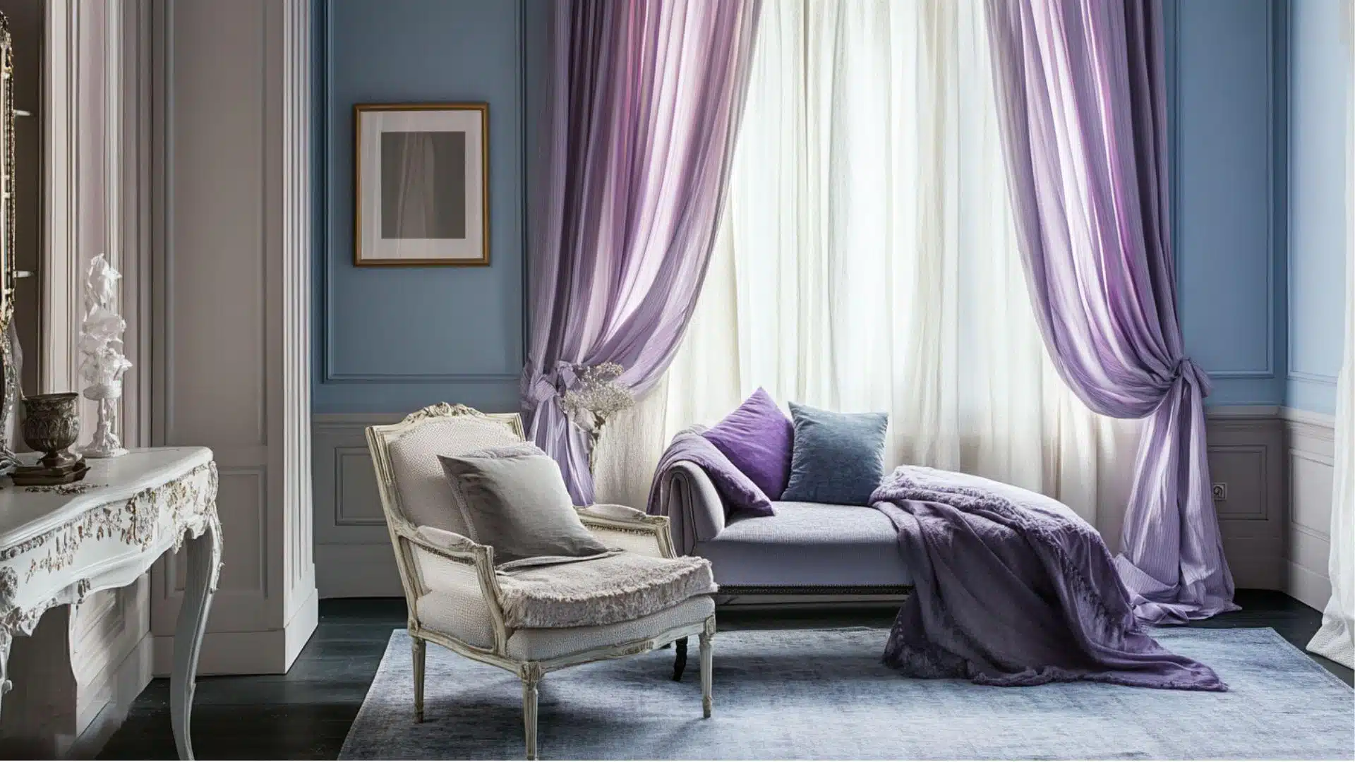
Pale Lavender, Soft Blue, and Snow White offer a dreamy, cloud-like aesthetic.
This soothing color palette keeps your residence looking clean and organized.
Designer Insights: The lavender and blue tones create visual separation between different storage zones without harsh dividing lines.
Psychological Effects: These soft colors create a sense of calm when searching for the right cooking items during meal prep.
16. Ice Gray, Dusty Lilac, Cloud White
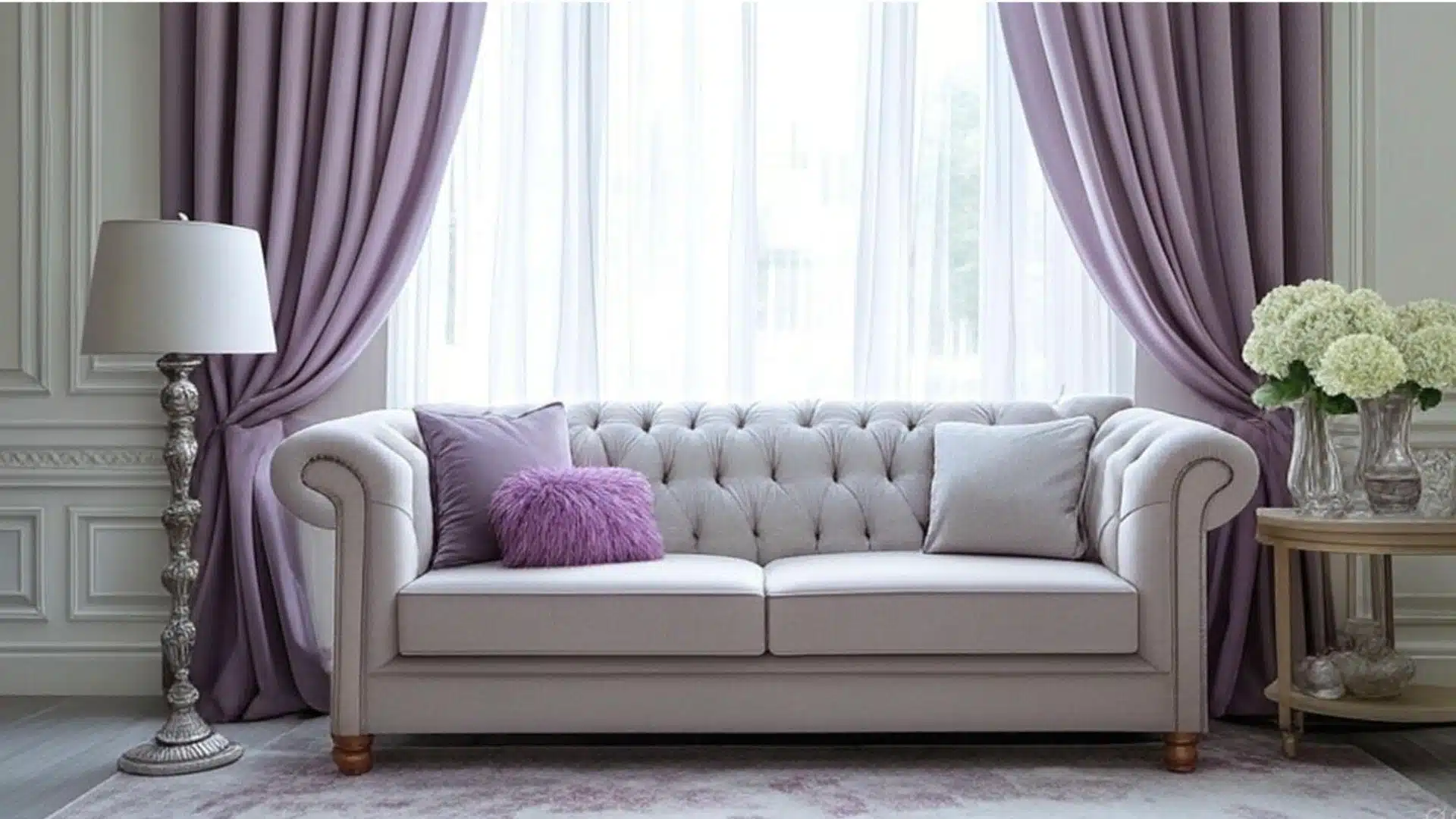
Ice Gray, Dusty Lilac, and Cloud White combine for a refined yet approachable look.
This modern color scheme feels both trendy and timeless in storage areas.
Designer Insights: The subtle contrast between these colors helps define storage areas without overwhelming the eye.
Psychological Effects: This color palette creates a sense of orderliness that encourages maintaining kitchen organization.
17. Baby Blue, Buttercream, Ash Gray
Baby Blue, Buttercream, and Ash Gray blend vintage charm with contemporary simplicity.
This warm yet fresh combination brings comfort to your bungalow storage solutions.
Designer Insights: The buttercream softens the cool blues and grays, creating an inviting feeling in practical storage spaces.
Psychological Effects: This color scheme produces happy memories of traditional kitchens while supporting modern organization needs.
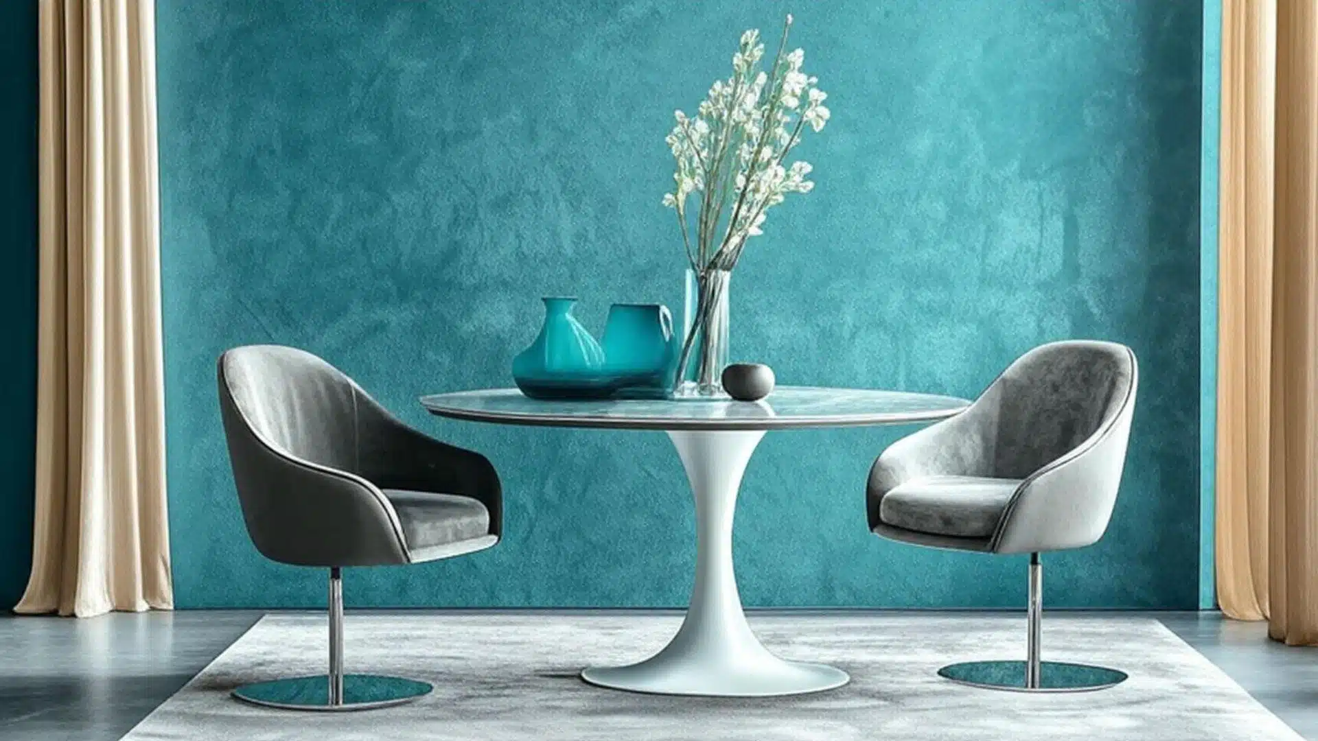
18. Seaglass, Misty Gray, Ocean Blue
Seaglass, Misty Gray, and Ocean Blue create a coastal sanctuary feeling.
This nature-inspired palette brings the calming energy of the beach into your residence.
Designer Insights: These colors naturally complement food colors, making organized ingredients look even more appealing.
Psychological Effects: The watery blue tones promote a sense of flow and movement through your living spaces.
19. Periwinkle, Pale Yellow, Cream
Periwinkle, Pale Yellow, and Cream combine for a cheerful yet urbane look.
This uplifting color scheme brightens storage areas while maintaining a put-together appearance.
Designer Insights: The contrast between cool periwinkle and warm yellows creates natural focal points in storage areas.
Psychological Effects: These colors stimulate positive energy while cooking without becoming visually overwhelming or distracting.
20. Stormy Blue, Pale Taupe, White
Stormy Blue, Pale Taupe, and White offer a balanced, grounding aesthetic.
This versatile color scheme works well in both traditional and modern storage solutions.
Designer Insights: The deeper blue adds drama to otherwise neutral spaces, making organization systems feel intentional and designed.
Psychological Effects: This color combination promotes focus and clarity when searching for items in your organized kitchen.
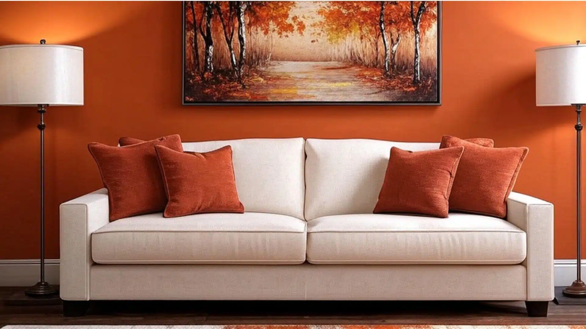
21. Terracotta, Cream, Dusty Olive
Terracotta, Cream, and Dusty Olive create a warm Mediterranean atmosphere.
This earthy color scheme brings natural warmth to storage spaces while feeling timeless and grounded.
Designer Insights: The terracotta adds rich warmth to practical storage elements, making everyday items feel special and intentional.
Psychological Effects: These earth tones promote a connection to nature and tradition when organizing your room.
22. Burnt Sienna, Soft White, Walnut
Burnt Sienna, Soft White, and Walnut blend rustic charm with clean simplicity.
This rich color combination adds depth while maintaining visual clarity.
Designer Insights: The contrast between dark walnut and soft white creates natural organization zones in storage areas.
Psychological Effects: These colors evoke a sense of craftsmanship and durability that makes kitchen organization feel more permanent.
23. Warm Caramel, Moss Green, Linen
Warm Caramel, Moss Green, and Linen offer a natural woodland-inspired palette.
This organic color scheme brings the outdoors inside while keeping storage spaces inviting.
Designer Insights: The moss green becomes a stunning accent against warm caramel tones in house organization systems.
Psychological Effects: These nature-inspired colors create a sense of abundance and freshness in food storage areas.
24. Rust, Bone, Mustard
Rust, Bone, and Mustard combine for a bold, vintage-inspired look.
This warm color trio adds personality while remaining surprisingly versatile.
Designer Insights: These colors work exceptionally well in metal or wood storage elements, adding character to functional pieces.
Psychological Effects: This palette stimulates creativity in the rooms while providing clear visual signals for organization.
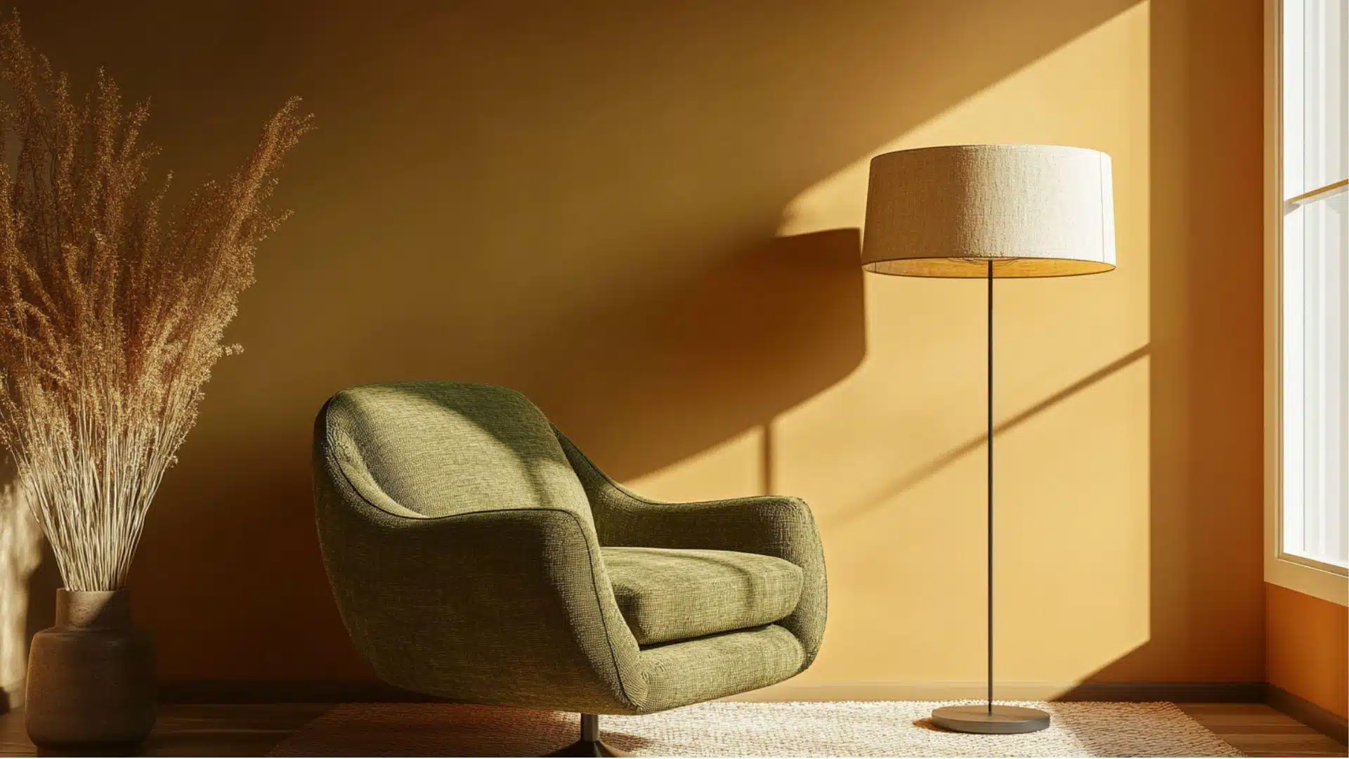
25. Goldenrod, Warm Gray, Sage
Goldenrod, Warm Gray, and Sage create a balanced, nature-inspired aesthetic.
This harmonious color scheme feels sunny yet grounded in applications.
Designer Insights: The warm gray neutralizes the stronger goldenrod, creating a cultured backdrop for organized items.
Psychological Effects: These colors promote both energy and calm, an ideal combination for efficient hall organization.
26. Deep Red, Wheat, Gray
Deep Red, Wheat, and Gray blend traditional warmth with modern simplicity.
This classic color combination adds richness to quarters without overwhelming the space.
Designer Insights: The deep red becomes a striking accent that draws attention to important storage features.
Psychological Effects: This color scheme creates a sense of confidence and precision in organization systems.
27. Clay, Buttercream, Soft Green
Clay, Buttercream, and Soft Green combine for a gentle, pottery-inspired palette.
This soothing color scheme adds subtle interest to the storehouse while feeling naturally cohesive.
Designer Insights: These colors mimic handmade pottery, adding artisanal charm to even the most practical storage solutions.
Psychological Effects: This palette promotes a nurturing atmosphere that encourages care in organizing items.
28. Maple, White, Dusty Orange
Maple, White, and Dusty Orange create a bright, cheerful organization system.
This warm-toned combination brings energy while remaining visually balanced.
Designer Insights: The natural maple tones ground the brighter orange, creating a playful yet urbane organization scheme.
Psychological Effects: These colors stimulate appetite and conversation, making organized kitchens feel more sociable and welcoming.
29. Spiced Peach, Ivory, Forest Green
Spiced Peach, Ivory, and Forest Green offer a botanical-inspired color story.
This unexpected combination brings natural beauty to your room organization with rich contrast.
Designer Insights: The forest green provides depth against softer peach and ivory, creating a natural visual hierarchy in storage.
Psychological Effects: This color scheme encourages mindfulness and appreciation of natural materials in living spaces.
30. Copper, Pale Tan, Dusty Plum
Copper, Pale Tan, and Dusty Plum blend metallic warmth with subtle color depth.
This refined palette adds unexpected richness to kitchen storage solutions.
Designer Insights: The metallic copper elements highlight important storage features while adding timeless luxury to everyday items.
Psychological Effects: These colors create a sense of refinement that elevates the experience of using organized spaces.
Some More Home Color Schemes
These color palettes offer fresh inspiration for your house interior design.
From bold combinations like Navy, Gold, and White to soft palettes like Pale Mint, Rose, and Bone, there’s something for every style preference.
Browse through these carefully curated trios to find the perfect color theme for your next home makeover project.
31. Navy, Gold, White
32. Emerald, Black, Brass
33. Slate, Burnt Orange, Cream
34. Graphite, Rose Gold, White
35. Teal, Rust, Pale Gray
36. Forest Green, Camel, White
37. Black, Olive, Taupe
38. Burgundy, Charcoal, Pale Pink
39. Ink Blue, Cool White, Pewter
40. Mustard, Navy, Cloud White
41. Sage, Cream, Brown
42. Olive, Clay, Natural Linen
43. Forest Green, Charcoal, Birch White
44. Khaki, Soft Moss, Cream
45. Eucalyptus, Terracotta, Beige
46. Dusty Green, Sandstone, Bone
47. Spruce, Light Wood, Fog
48. Stone Gray, Fern, Ivory
49. Earth Brown, Olive, Putty
50. Pine Green, Tan, Eggshell
51. Blush Pink, White, Light Gray
52. Soft Peach, Pale Aqua, Snow
53. Lavender, Misty Blue, Cream
54. Baby Yellow, White, Sky
55. Powder Blue, Vanilla, Ice Gray
56. Pale Mint, Rose, Bone
57. Frosted Lilac, Sage, White
58. Dusty Rose, Sand, Pale Blue
59. Lemon Chiffon, Ice Blue, Dove Gray
60. Coral, Blush, Pearl White
61. Mauve, Olive, Ivory
62. Mustard, Teal, Rust
63. Dusty Rose, Warm Gray, Pale Yellow
64. Aqua, Cream, Cherry Red
65. Sepia, Dusty Blue, Tan
66. Forest Green, Burnt Orange, Vanilla
67. Muted Plum, Beige, Soft Gold
68. Peacock Blue, Coral, Linen
69. Tobacco, Pale Pink, Antique White
70. Soft Olive, Warm Brick, Bone
71. Black, White, Emerald Green
Final Words
Home color schemes do more than make rooms pretty; they create the backdrop for all your daily moments.
From peaceful grays in your reading nook to cheerful yellows in your breakfast area, colors shape how you experience your space.
Remember that the best palettes balance warm and cool colors while reflecting your style.
Start small with pillows or picture frames before committing to wall colors.
Take photos of your room at different times of day to see how light affects your color choices.
Your perfect house color scheme is waiting to be uncovered!
What colors make you feel most at home?
Please share your favorite combinations in the comments below, and let’s inspire each other’s color trips!
If you’re interested in more informational color schemes content, feel free to click here and explore other blogs that may interest you.

Alex Guerrero, a graduate with a Fine Arts degree from the Rhode Island School of Design, has been a visionary in the world of color and design for over 15 years. His professional journey began in the heart of the fashion industry in Milan, where he developed an acute sense for color harmonies and trends. Alex joined our team in 2018, offering fresh and innovative perspectives on color utilization in various spaces. Renowned for his ability to blend contemporary trends with timeless elegance. Outside of work, Alex is an accomplished painter and a volunteer art therapist, his artistic talents further enriching his professional insights.