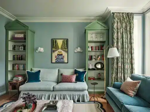
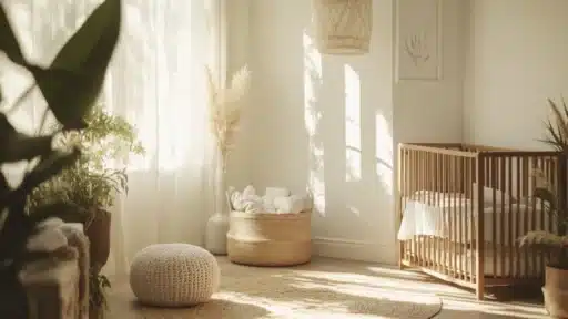
Picking the perfect paint color from a small sample can feel overwhelming.
I know how hard it is to visualize how that tiny color swatch will look on your walls, especially with Farrow & Ball’s rich collection of 132 shades to choose from.
I’m here to help you find colors that will turn your home into a space you’ll love.
I’ve gathered real-world examples of the 19 most sought-after Farrow & Ball colors, showing you exactly why I love them.
In this guide, I’ll walk you through each shade’s unique qualities, share expert tips on choosing colors for different light conditions, and help you find the perfect match for any room in your house.
What Makes Farrow and Ball Colors So Popular?
Farrow & Ball paints stand out due to their rich pigments and water-based formulas. I’ve noticed how these paints add character to walls with their unique color depth.
Key factors behind their popularity:
- The company makes small batches of paint with high-quality ingredients
- Their water-based paints are safe for the environment
- Each color shows different tones as light changes through the day
- The paint gives walls a soft, matte finish
When I work with clients, they often tell me how the colors feel more natural and true compared to other brands.
The paints also last longer and maintain their rich look even after years of use.
This balance of quality, safety, and beauty makes Farrow & Ball a favorite among both homeowners and designers.
Classic Farrow and Ball Colors I Love
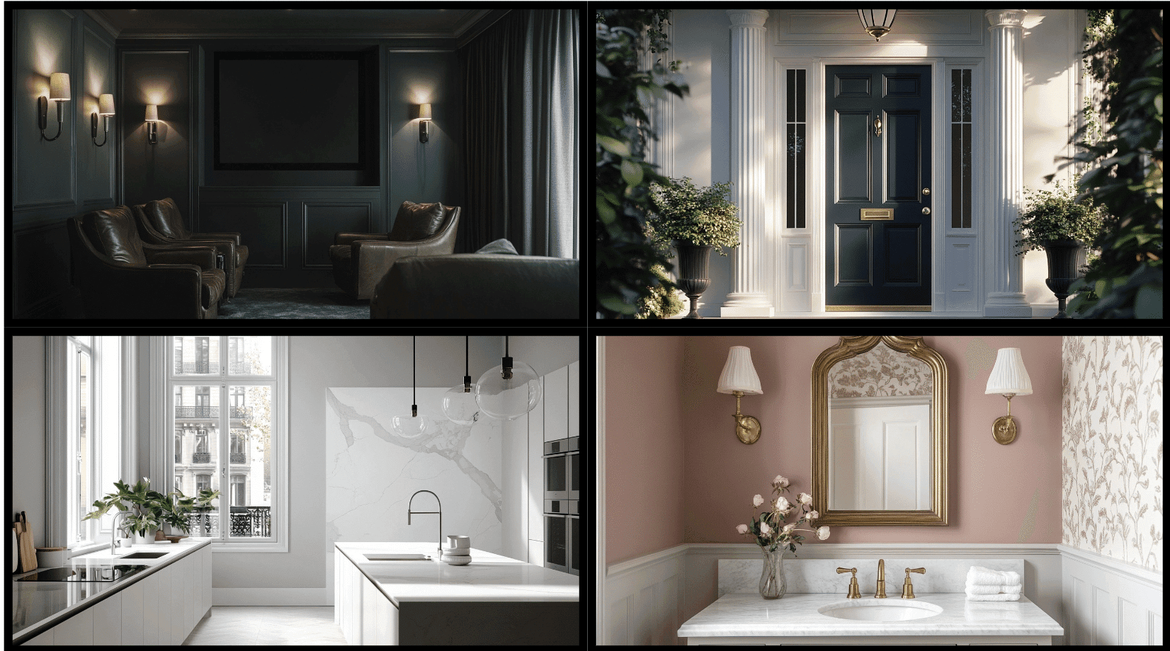
1. Skimming Stone
I first used this gentle gray shade in my living room five years ago.
Since then, I can’t count how many of my clients have fallen in love with its soft, calming effect. It reminds me of smooth pebbles on a beach.
Best Rooms to Use This Paint: Perfect for living rooms, dining rooms, and entrance halls where you want to create a warm welcome.
Lighting Suggestions: Works best in rooms with lots of natural light, but also holds its charm in spaces with warm artificial lighting.
2. Elephant’s Breath
This color has been my go-to choice for clients who want something different from plain white walls. It’s a cozy gray that makes me think of early morning mist – not too warm, not too cool.
Best Rooms to Use This Paint: Great for bedrooms, home offices, and hallways where you want a peaceful feel.
Lighting Suggestions: Shines in north-facing rooms and spaces with morning light.
3. Setting Plaster
The first time I used this color was in a Victorian home’s reading nook. The soft pink tint made the space feel like a warm hug.
I’ve noticed it makes people smile when they walk into a room.
Best Rooms to Use This Paint: Works well in living rooms, bedrooms, and powder rooms.
Lighting Suggestions: Beautiful in rooms with afternoon sun or spaces with table lamps.
4. Hague Blue
I remember painting my study in this color during lockdown. The deep, rich tone helped me focus and made my video calls look amazing. It’s like being wrapped in a cozy blanket.
Best Rooms to Use This Paint: Ideal for dining rooms, libraries, and feature walls in bedrooms.
Lighting Suggestions: Best in rooms with good natural light or spaces with lots of lamps.
5. Cornforth White
I used this in my kitchen, and it’s like having clouds on your walls. It shifts between gray and white as the day goes on. The color feels clean but not cold.
Best Rooms to Use This Paint: Works in kitchens, bathrooms, and any space needing a light, airy feel.
Lighting Suggestions: Looks good in any light, especially bright natural sunlight.
6. Ammonite
My client’s beach house came alive with this shade. It’s like sea foam captured on a wall – gentle and fresh without being too coastal.
Best Rooms to Use This Paint: Perfect for sunrooms, coastal homes, and bright bathrooms.
Lighting Suggestions: Loves natural daylight but stays soft under artificial light.
7. Green Smoke
I painted my reading corner in this color, and it feels like sitting in an old library. The green has a smokiness that makes books look amazing against it.
Best Rooms to Use This Paint: Great for studies, dining rooms, and cozy dens.
Lighting Suggestions: Does well with both natural light and warm lamps.
8. Sulking Room Pink
The name made my clients laugh, but the color made them stay. It’s like sunset on your walls – not too girly, just warm and welcoming.
Best Rooms to Use This Paint: Beautiful in bedrooms, dressing rooms, and sitting rooms.
Lighting Suggestions: Glows in evening light and looks soft under lamps.
9. Railings
My front door wears this color, and it makes such a statement. It’s darker than black but not as harsh – like the sky just before stars come out.
Best Rooms to Use This Paint: Perfect for doors, window frames, and bold accent walls.
Lighting Suggestions: Looks best with good lighting to show its depth.
10. De Nimes
This reminds me of old jeans – comfortable and classic. I used it in a home office and it helped create a focused space.
Best Rooms to Use This Paint: Ideal for home offices, family rooms, and hallways.
Lighting Suggestions: Works well in rooms with steady natural light.
11. Light Blue
The softest blue I’ve ever used. In my guest bedroom, it makes everyone feel like they’re sleeping under an open sky.
Best Rooms to Use This Paint: Perfect for bedrooms, bathrooms, and sunny sitting rooms.
Lighting Suggestions: Loves morning light and cool-toned bulbs.
12. India Yellow
This color brings sunshine inside. When I used it in a north-facing room, it added warmth without being too bright.
Best Rooms to Use This Paint: Great for kitchens, dining rooms, and dark hallways.
Lighting Suggestions: Beautiful in spaces with limited natural light.
13. Mole’s Breath
This deep gray feels like velvet on walls. I used it to create a cozy movie room, and it worked perfectly.
Best Rooms to Use This Paint: Perfect for media rooms, studies, and accent walls.
Lighting Suggestions: Needs good lighting to show its rich depth.
14. Stiffkey Blue
My favorite coastal blue. It reminds me of stormy seas but feels calm at the same time.
Best Rooms to Use This Paint: Works in bathrooms, bedrooms, and living rooms.
Lighting Suggestions: Looks best with natural or bright white light.
15. Clunch
This off-white has been my secret weapon for bright spaces. It’s warm without being yellow, clean without being stark.
Best Rooms to Use This Paint: Perfect for living rooms, kitchens, and whole-house schemes.
Lighting Suggestions: Shines in any light condition.
16. Calke Green
This rich green brings old country houses to mind.
When I painted kitchen cabinets with it, the space felt like a classic English garden room – full of life but still peaceful.
Best Rooms to Use This Paint: Works in kitchens, garden rooms, and studies needing depth.
Lighting Suggestions: Looks rich in natural light and warm artificial lighting.
17. Middleton Pink
I painted a small powder room with this shade, and it’s like being inside a seashell. The pink isn’t sweet – it’s grown-up and sophisticated with a subtle warmth.
Best Rooms to Use This Paint: Perfect for bathrooms, dressing rooms, and small spaces.
Lighting Suggestions: Beautiful with both natural and warm artificial light.
18. Oxford Stone
This color feels like old stone walls warmed by the sun.
In my dining room, it creates the perfect backdrop for art and makes everything look more expensive.
Best Rooms to Use This Paint: Great for dining rooms, entryways, and living spaces.
Lighting Suggestions: Works well in both bright and dim lighting conditions.
19. Pigeon
Every time I use this green-gray, it surprises me with its versatility. It shifts between sage and pewter depending on the light, making spaces feel alive.
Best Rooms to Use This Paint: Perfect for living rooms, kitchens, and bedrooms.
Lighting Suggestions: Best in rooms with changing natural light.
Tips for Choosing the Perfect Farrow & Ball Colour
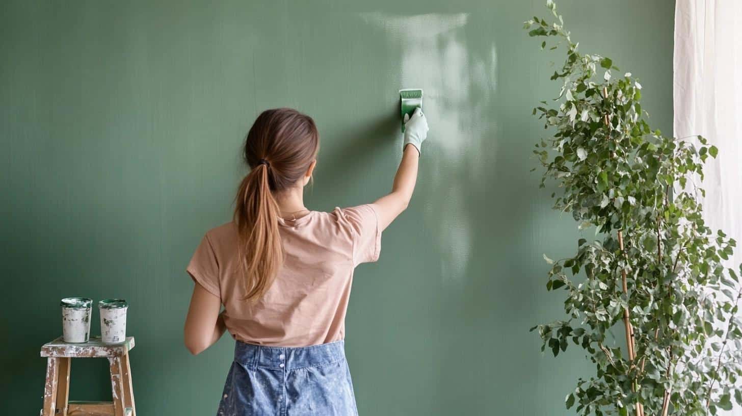
Picking a paint color is more than just finding a shade you like.
Through my years of working with these paints, I’ve learned that light, room size, and even furniture can change how a color looks on your walls.
The good news is, you don’t need to be a color expert to make great choices.
Here are some simple tips I’ve gathered that will help you find your perfect match.
- Test paint samples on each wall of your room – colors look different as light changes.
- Paint your sample next to your furniture, curtains, or rugs to see how they work together.
- Look at the paint in morning, afternoon, and evening light before deciding.
- Consider which direction your room faces – north light brings out greens, south light adds warmth.
- Think about when you use the room most – evening rooms can handle deeper colors.
- Start with lighter shades if you’re new to strong colors.
- Check how the color looks against your trim and ceiling white.
- Remember that colors appear stronger on your walls than on sample cards.
- Consider the size of your room – darker colors can work well in small spaces.
- Think about connecting rooms – colors should flow well together.
- Look at the full color family on the color card to understand the undertones.
- Ask for a color consultation if you’re stuck – Farrow & Ball offers this service.
Wrapping It Up
Looking back at these 19 Farrow & Ball colors, I’m reminded that paint is more than just a wall covering – it’s the foundation of how we experience our homes.
Each shade, from the soft whisper of Setting Plaster to the bold statement of Railings, has its own way of bringing rooms to life.
I’ve shared the colors I’ve come to trust, but your perfect shade might be something completely different.
Start with small samples, trust your instincts, and don’t be afraid to try something unexpected. The right color will feel like it was made for your space.
Share your painting plans in the comments below, or ask any questions about these timeless shades.

