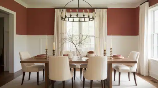
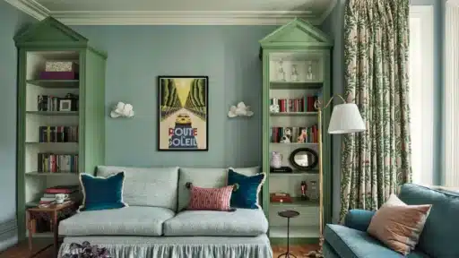
I’m excited to tell you about Redend Point, a cozy blush-beige from Sherwin-Williams that feels like a warm hug for your walls. As their 2023 color choice, it’s bringing a fresh take on neutral colors to our homes.
After spending countless afternoons watching how this color changes from sunrise to sunset in my test spaces, I fell in love with its versatility.
This mid-toned clay shade has quickly become my go-to recommendation for friends who want their rooms to feel both current and comfortable.
Let me walk you through why this color might be the perfect fit for your home too.
What Exactly is Redend Point?
As Sherwin-Williams’s choice for 2023, Redend Point came as a refreshing shift in color trends.
This mid-toned clay color shows different faces throughout the day. Sometimes it reads as a soft pinky-brown, other times as a gentle terracotta. I like to describe it to my clients as a rosy brown that brings warmth to any room.
Why Was It Chosen for 2023?
Sue Wadden, who leads color marketing at Sherwin-Williams, picked this color to reflect our renewed focus on connection and comfort at home. I see why – it’s a color that makes spaces feel lived-in and welcoming.
Color Details You Should Know:
- LRV (Light Reflectance Value): 30
- Main undertones: Pink and peach
- Color family: Warm neutrals
- Finish options: Available in various paint finishes for different uses
When my clients want a neutral, not the usual beige or gray, I often point them to Redend Point. It offers something different while staying grounded in familiar territory.
What Makes Sherwin-Williams Redend Point a Popular Choice?
Let me tell you what I find special about Redend Point.
This blush-beige color has a friendly personality that works in so many ways. It sits right in the sweet spot—not too light, not too dark—and brings a gentle warmth to any space. (How great is that?)
I love how it plays with other colors. Its rosy undertones peek through with a subtle wink when paired with pure white. But what I find most interesting is how it acts like a reliable neutral when left to shine on its own.
The color has an LRV of 30, which means it absorbs more light than it reflects. That’s perfect if you want to create a cozy feeling in your space. (Plus, it brings that earthy, clay-like warmth that reminds me of peaceful desert sunsets.)
Here’s what makes me recommend it to my clients:
- It works wonderfully on kitchen cabinets
- Makes bedrooms feel extra cozy
- Can even make a statement on ceilings
- Pairs beautifully with natural wood and textiles
Can Redend Point Work in Small Spaces?
Let me share my honest thoughts about using Redend Point in smaller rooms. With an LRV of 30, it sits in the mid-tone range, which means you’ll want to think carefully about where you use it.
Here’s what I’ve learned from working with this color in compact spaces:
In tiny rooms with lots of natural light, Redend Point can create a warm, snug feeling without making the space feel closed in. I like to use it on a single wall as a soft backdrop for artwork or mirrors – this adds depth without overwhelming the room.
However, in small spaces with limited windows, I suggest using it sparingly. You might try:
- Painting just one accent wall
- Using it on built-in shelves
- Adding it to ceiling trim
- Incorporating it through smaller decor items
I find it pairs perfectly with lighter neutrals like Agreeable Gray or Accessible Beige on the other walls.
This combo helps maintain the room’s sense of space while still giving you that warm, rosy glow Redend Point is known for.
A Stunning Home Entry Using Redend Point by Sherwin-Williams
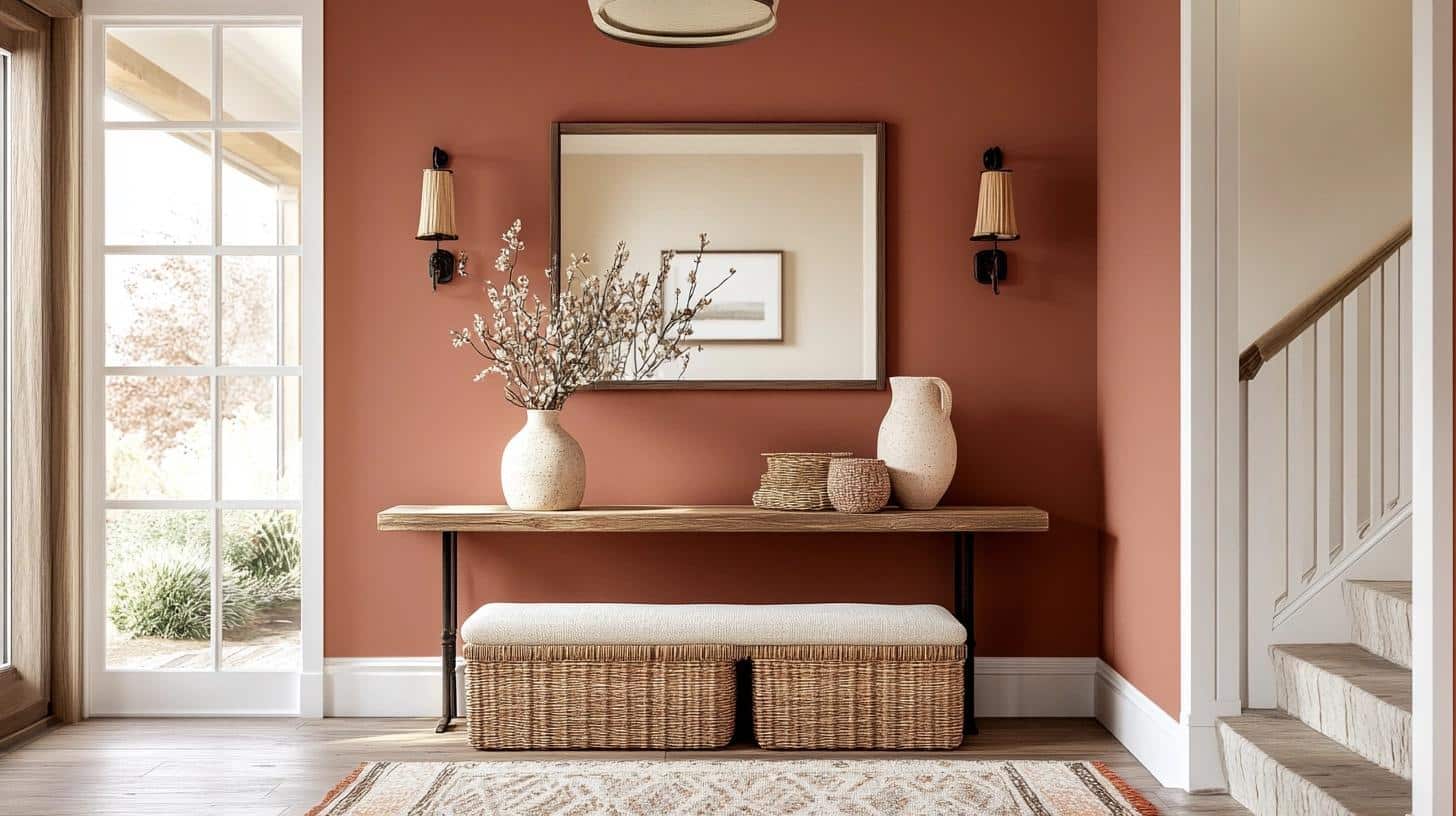
I painted my own entryway with Redend Point last spring, and it’s been a joy to come home to every day.
The color creates such a welcoming first impression – warm but not overwhelming. What I love most is how it changes throughout the day, starting soft in the morning and growing richer as the sun moves across the sky.
Mood Board Tips:
- Choose a large mirror with a simple frame to reflect light
- Select brushed gold or matte black door hardware
- Bring in a slim console table in natural wood tones
- Add woven baskets for both style and storage
- Pick light-colored ceramic vases for contrast
- Install wall hooks in oil-rubbed bronze
- Place a neutral runner with subtle patterns
- Include simple white frames for family photos
- Keep lighting warm with brass wall sconces
- Add a small bench with cream-colored cushions
Here’s my favorite tip: Paint both walls and trim in Redend Point, but use different finishes. I prefer eggshell for walls and semi-gloss for trim.
Redend Point: The Perfect Bedroom Palette
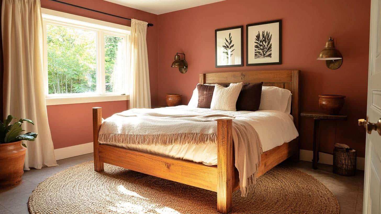
When I first painted a client’s bedroom with Redend Point, I was taken by how the morning light made the walls glow like a gentle sunrise. As evening approached, the color shifted to create the coziest atmosphere for winding down.
It’s become my go-to bedroom recommendation because it sets such a peaceful mood – like being wrapped in a warm blanket.
- Lighting Suggestions: Soft, warm lighting like bedside lamps, wall sconces, or string lights to create a serene ambiance.
- Ideal Materials to Use: Velvet or linen bedding for comfort, wooden or metal furniture for balance, and clay pots for decor.
- Extra Ideas: Add a woven rug and sheer curtains to enhance the cozy and airy feel.
Mood Board Tips:
- Mix in creamy whites for bedding to balance the warmth
- Add natural wood furniture to bring out the clay undertones
- Include tan or beige curtains to create a soft, layered look
- Bring in bronze or copper light fixtures – they pair wonderfully with this shade
- Place a neutral area rug with subtle patterns to ground the space
- Choose cream-colored lampshades to cast a gentle, filtered light
- Layer different textures in similar tones through pillows and throws
- Keep artwork simple with black-and-white prints or nature-themed pieces
Want to know a designer secret? I love using Redend Point on the ceiling too. It creates a cocoon-like feeling that’s perfect for rest and relaxation.
Redend Point for Living Room Makeovers? (spoiler alert: I am obsessed)
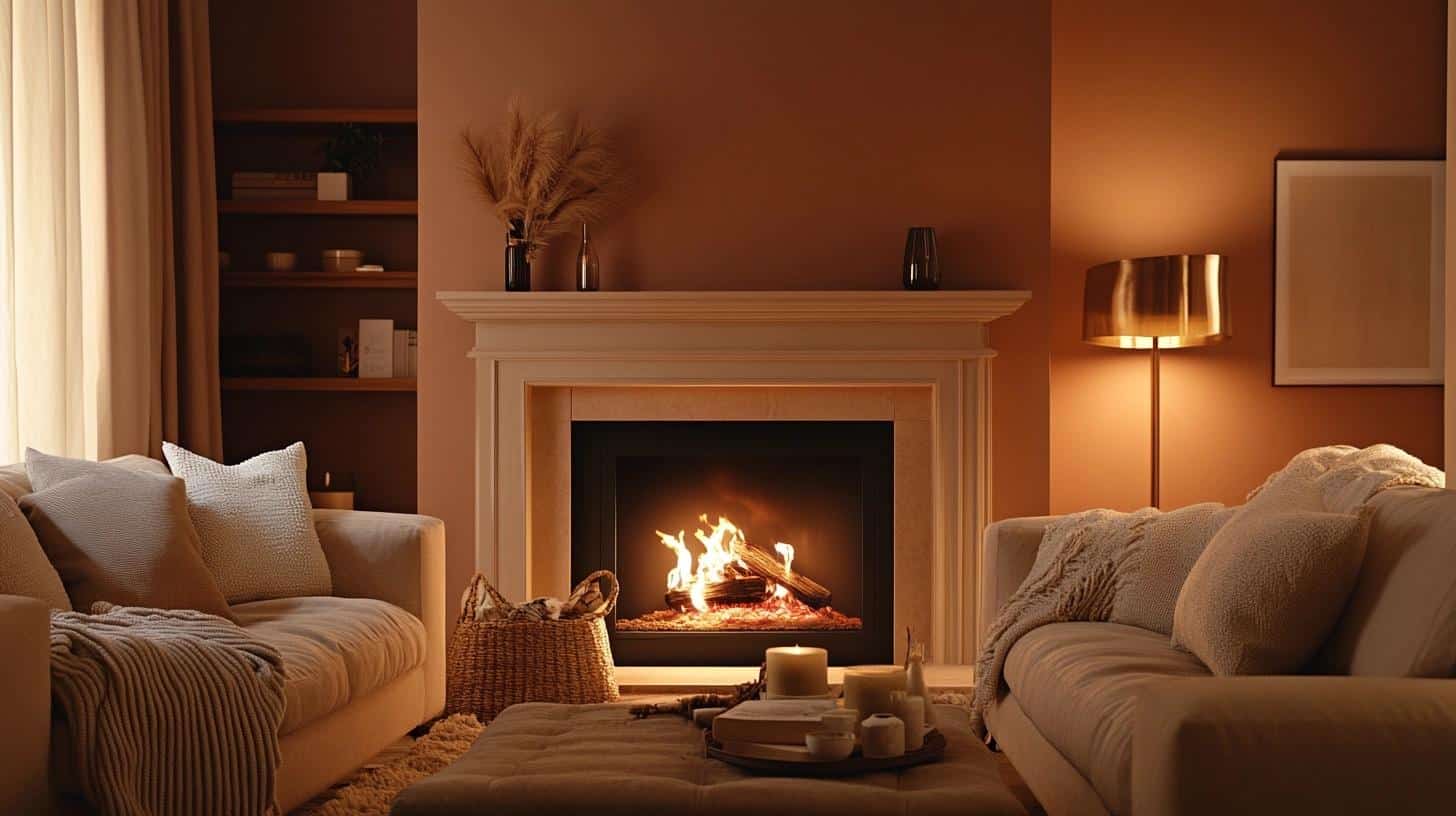
Can I tell you about my love affair with this color in living rooms? Ever since I painted my first living room with Redend Point, I’ve been hooked.
This rosy-brown shade turns ordinary walls into the perfect backdrop for daily life. During morning coffee, it feels fresh and bright, and by evening, it creates this cozy sanctuary that makes me want to curl up with a good book.
Why I’m Smitten:
The mid-tone depth (LRV 30) means it can handle both bright and dim lighting without losing its charm. I particularly love how it sets the mood without stealing the show.
My Favorite Ways to Use It:
- Paint all walls for a full, warm hug
- Create an accent wall behind the sofa
- Use it on built-ins for subtle depth
- Try it on the ceiling for extra coziness
Designer’s note: I often suggest painting just the fireplace wall in Redend Point. It creates a beautiful focal point without overwhelming the space. (Try pairing it with Accessible Beige or Agreeable Gray on other walls for a balanced look.)
How Does Redend Point Work in Kitchen Ambiance?
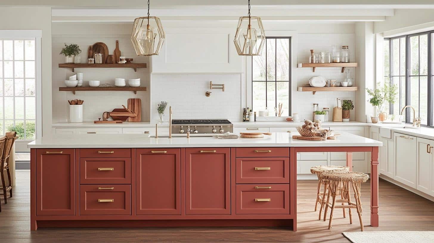
You know those kitchens that just make you want to stay and chat over coffee? That’s what Redend Point does to a space.
When I first used this color in my sister’s kitchen, we noticed everyone lingered longer during family gatherings. There’s something about its warm undertones that makes even quick meals feel more special.
Let me break down where it works best:
On Cabinets: I’ve found Redend Point turns ordinary cabinets into statement pieces. Lower cabinets especially look rich and grounded in this shade, while keeping the uppers white maintains brightness.
On Walls: Between white cabinets, this color creates a cozy backdrop that doesn’t compete with food or decor. It’s like adding a soft filter to your kitchen photos – everything looks better!
On Islands: Here’s my favorite trick – paint just the island in Redend Point. It becomes a beautiful focal point without overwhelming the space.
My Tried-and-True Pairings:
- White quartz or marble countertops
- Brushed gold hardware
- Matte black faucets
- Natural wood open shelving
- Cream-colored backsplash tiles
- Clear glass pendant lights
- Woven bar stools in natural tones
Try Using Redend Point in The Dining Room (trust me!!)
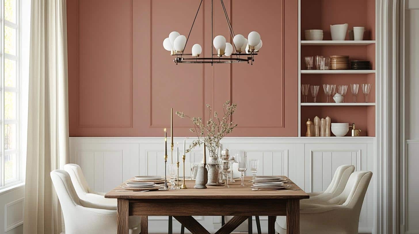
After hosting my first dinner party in my Redend Point dining room, I became a true believer!
The color creates this perfect backdrop for both daytime brunches and evening gatherings.
I’ve noticed how candlelight plays off these walls in the most flattering way – it makes everyone and everything look bathed in a warm, welcoming glow. It’s like the color was made for creating memorable meal-time moments.
- Lighting Suggestions: A bold chandelier or cluster of pendant lights to set the mood.
- Ideal Materials to Use: Wooden dining tables, linen or cotton tablecloths, and clay vases for a rustic touch.
- Extra Ideas: Use muted-colored dinnerware and candles to enhance the table setting.
Mood Board Tips:
- Select a solid wood dining table to anchor the space
- Choose cream-colored upholstered chairs
- Hang a black metal chandelier for contrast
- Add a large mirror to reflect natural light
- Place white table linens for fresh contrast
- Include clear glass vases for centerpieces
- Select natural fiber rugs in neutral tones
- Install white wainscoting for architectural interest
- Choose bronze or brass cabinet hardware
- Add white china cabinet or hutch for contrast
- Place vintage brass candlesticks on display
- Select cream-colored curtains for softness
Personal tip: I love pairing Redend Point with built-in cabinets painted in bright white. The contrast makes both colors sing, and it’s perfect for showing off special dishes and glassware.
Home Exterior Featuring Redend Point (it’s awesome)
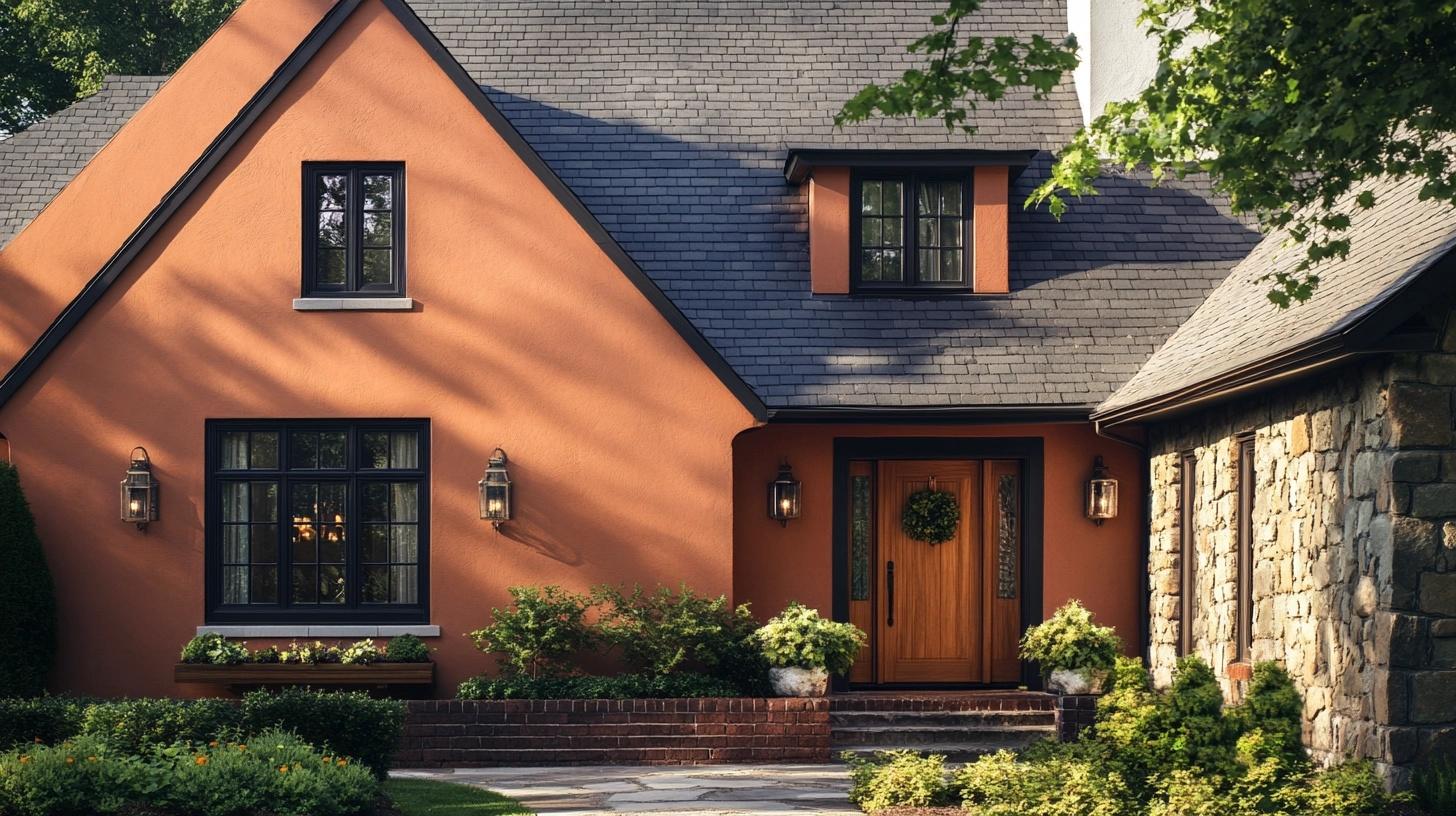
Whenever I drive by a house painted in Redend Point, I notice how beautifully it blends into its natural surroundings.
Last fall, I helped a client paint their craftsman-style home with this color, and the results were stunning.
The way this clay-tinted shade catches sunlight makes the house look grounded yet fresh, and it changes subtly with the shifting daylight.
Mood Board Tips:
- Paint trim in crisp white for clean contrast
- Select black or oil-rubbed bronze light fixtures
- Choose dark gray or black roof shingles
- Add natural wood front door or stain existing door
- Install window boxes in matching trim color
- Select black or dark bronze house numbers
- Use natural stone accents for foundation or pillars
- Plant greenery that complements the warm tones
- Choose patio furniture in light neutral colors
- Add copper or bronze rain gutters
- Select tan or brown outdoor rugs
- Install warm-toned brick or stone pathways
My top tip: Test this color on different sides of your house. I always tell clients to look at it at different times of day—the LRV of 30 means it will read differently as the sun moves around their home.
Color Combinations with Redend Point I Love
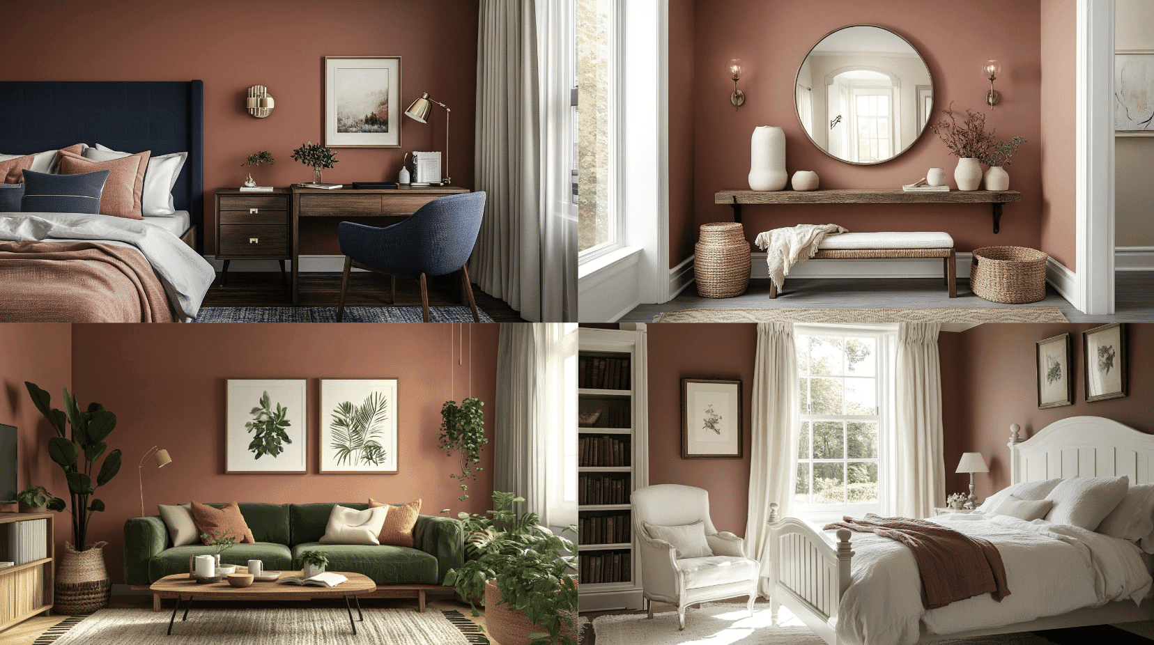
1. Redend Point and Olive Green
- Why It Works: Olive green complements the rosy undertones of Redend Point, adding depth and an organic feel.
- Best Rooms/Where to Use This Idea: Living rooms, dining rooms, or offices for a cozy yet sophisticated look.
- Furniture to Use: Green velvet sofas, natural wood coffee tables, and terracotta planters.
2. Redend Point and Deep Navy
- Why It Works: Deep navy adds a bold contrast, making the muted tones of Redend Point stand out.
- Best Rooms/Where to Use This Idea: Accent walls in bedrooms, home offices, or libraries.
- Furniture to Use: Navy upholstered chairs, dark wood desks, and brass-accented pieces.
3. Redend Point and Light Gray
- Why It Works: Light gray softens the boldness of Redend Point, creating a subtle, sophisticated palette.
- Best Rooms/Where to Use This Idea: Hallways, offices, or dining rooms.
- Furniture to Use: Light gray sectional sofas, whitewashed dining tables, and chrome fixtures.
4. Redend Point and Teal Blue
- Why It Works: Teal adds a vibrant contrast, giving a modern and dynamic look to Redend Point’s muted tones.
- Best Rooms/Where to Use This Idea: Accent walls in living rooms or creative spaces.
- Furniture to Use: Teal armchairs, walnut sideboards, and patterned area rugs.
5. Redend Point and Creamy White (of course)
- Why It Works: The neutral creamy white enhances Redend Point’s warmth, creating a balanced, calming atmosphere.
- Best Rooms/Where to Use This Idea: Bedrooms, bathrooms, or nurseries for a serene feel.
- Furniture to Use: White wooden bed frames, linen armchairs, and light-colored bookshelves.
6. Redend Point and Charcoal Gray
- Why It Works: Charcoal gray offers a modern, grounding effect against the soft hues of Redend Point.
- Best Rooms/Where to Use This Idea: Bathrooms, living rooms, or modern kitchens.
- Furniture to Use: Black or charcoal cabinets, steel-framed coffee tables, and minimalist shelving.
Top Interior Designer Insights on Using Redend Point
After talking with several design professionals and using this color in countless projects, I’ve gathered some fascinating insights about Redend Point.
What stands out most is how this color brings versatility to modern spaces while keeping them feeling personal and lived-in.
Here’s what top designers are saying:
- Works beautifully in south and west-facing rooms
- Creates an excellent transition between indoor and outdoor spaces
- Makes a perfect backdrop for both modern and traditional furniture
The most interesting feedback I’ve heard is about its lighting behavior. During morning hours, the color reads more like a soft neutral, while evening light brings out its warmer, rosier side.
Many designers pair it with:
- Natural materials like wood and stone
- Cream and white textiles
- Matte black or bronze fixtures
- Textured wallpapers in adjacent rooms
Wrapping It Up
Coming to the end of my color exploration, I want to share why Redend Point has become more than just another neutral in my design toolkit.
This warm, clay-tinted shade proves that colors can be both current and timeless.
I’ve seen this colour create magic in both small apartments and spacious homes.
Ready to try it in your space? Start with a test patch and watch how it changes throughout the day.
And if you’ve used Redend Point in your home, I’d love to hear your story – drop a comment below about your experience with this versatile color.
You might also enjoy these color guides:
- Shade Grown by Sherwin-Williams: A Rich Earth Tone Guide
- Muted Sage by Behr: Creating Calm with Color
Let’s keep the color conversation going!

