As an experienced painter, I’ve spent years exploring the incredible world of paint and color, discovering shades that transform spaces and evoke emotions.
Among the countless hues I’ve worked with, Upward (SW 6239) by Sherwin Williams is a true gem.
This soft, airy blue with subtle gray undertones can create inviting spaces while remaining versatile across styles and lighting conditions.
Whether you’re thinking of a serene bedroom retreat, a refreshing living room, or a charming exterior, Upward delivers a calming vibe without overpowering your design.
On my journey to master the art of color, Upward has become one of my favorite shades for its balance and flexibility.
In this blog, I’ll share my insights on why Upward is such a standout choice, real-life examples of its use, and practical tips to help you incorporate this beautiful shade into your own home.
What Makes Sherwin Williams Upward Unique?
1. Soft and Subtle Blue Tones
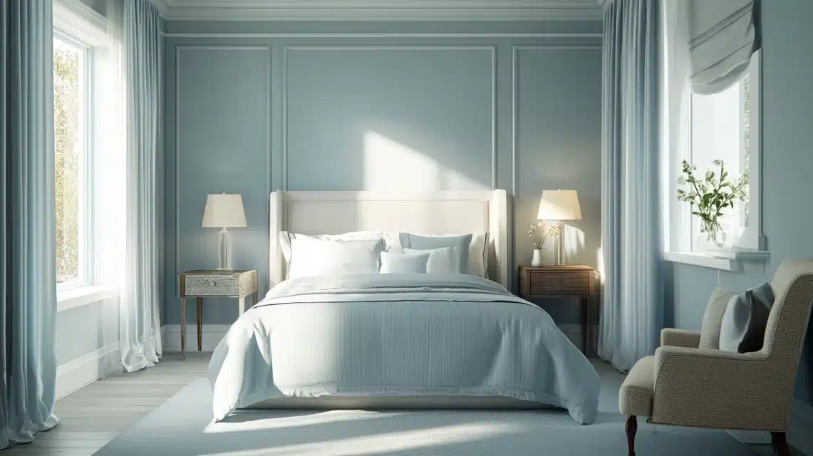
As a painter who’s danced with colors for over two decades, I’ve fallen deeply in love with Sherwin Williams Upward.
Imagine the gentlest whisper of blue you’ve ever seen. That’s what I’m to talk about here.
It’s not your typical blue; it’s like catching glimpses of a morning sky through a gossamer veil.
The gray undertones add this sophisticated dimension that prevents it from feeling too sweet or nursery-like.
In my latest project, the moment this color went up, my client’s shoulders literally relaxed. That’s the power of a perfectly balanced blue.
2. Versatility in Design
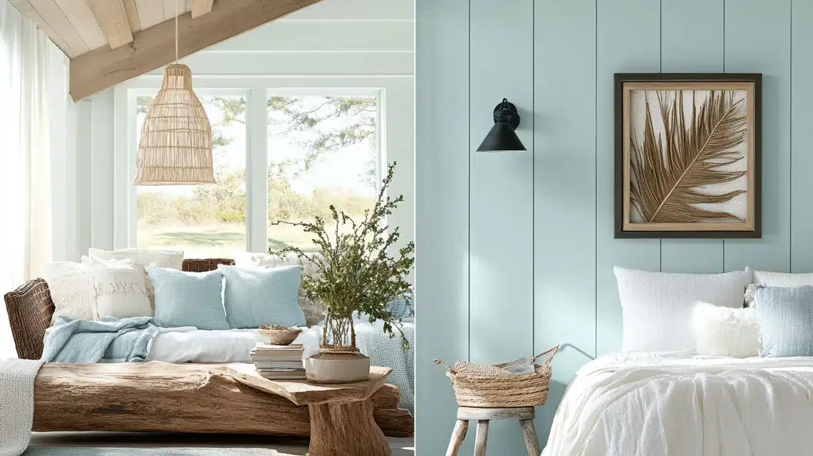
This is where Upward really shows off its genius. In a coastal home I worked on last summer, it captured that perfect beach-glass essence, playing happily with driftwood accents and crisp white trim.
Then, surprisingly, it transformed a modern farmhouse into this incredibly calm space, complementing black hardware and weathered beams like they were made for each other.
I’ve even used it in a minimalist loft, where it provided just enough color without overwhelming the industrial elements.
3. Balance of Warm and Cool Undertones
What truly sets Upward apart?
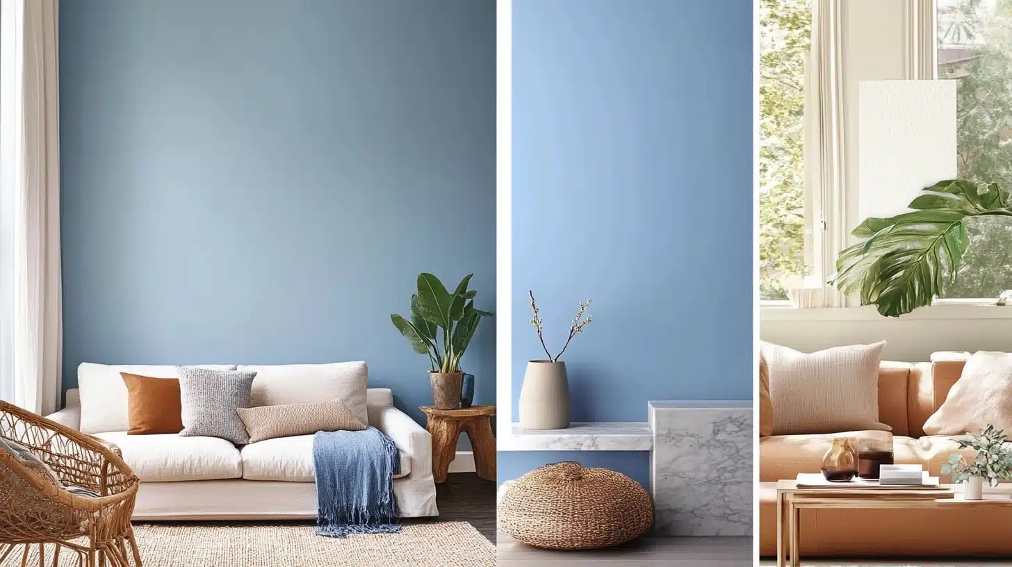
Its remarkable relationship with light. During my morning coffee, I love watching how it warms up with the sunrise, taking on almost a hint of periwinkle.
By midday, it settles into this perfect neutral blue that keeps spaces feeling alive and fresh. And as evening approaches? That’s when the magic really happens.
The color deepens slightly, creating this cozy atmosphere that’s neither too cool nor too warm. It’s like it instinctively knows what your space needs at any moment.
In my painting journal, I’ve nicknamed it “The Diplomat” because it gets along with nearly every other color you introduce.
Whether you’re pairing it with warm woods, cool marbles, or mixed metals, Upward maintains its composure while enhancing everything around it.
It’s become my go-to recommendation for clients who want a confident and considerate color, much like a perfect host at a dinner party.
The more I work with Upward, the more I discover its subtle nature. It’s one of those rare colors that is trendy and timeless, bold and subtle, sophisticated and approachable.
In a world where we’re often torn between making a statement and creating calm, Upward effortlessly achieves both.
Where to Use Sherwin Williams Upward?
1. Bedrooms and Bathrooms
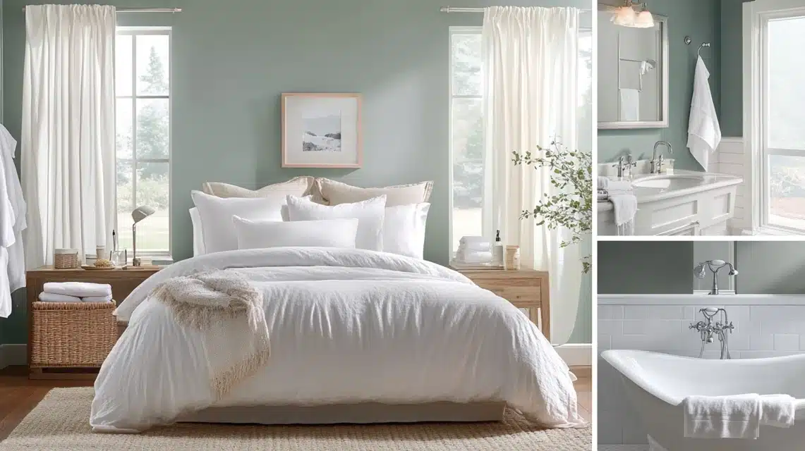
There is something remarkable about Upward in intimate spaces. In bedrooms, it creates this cocoon-like atmosphere that’s pure magic.
Last month, I transformed a client’s master bedroom, and now it feels like sleeping in a cloud. In bathrooms, it’s absolutely transportive.
Pair it with white tiles and chrome fixtures, and suddenly, you’ve got this luxurious spa retreat.
The color seems to soften the morning light just enough to make those early wake-ups a bit more gentle.
2. Living Rooms and Common Areas
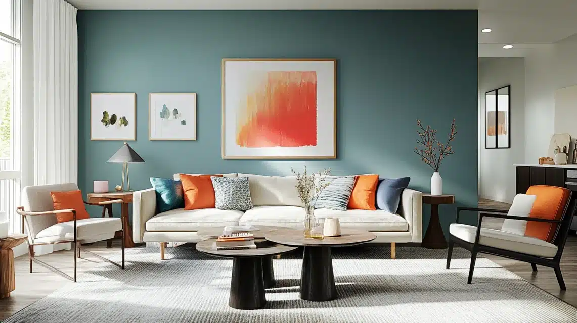
Upward really shows its versatility. I recently painted a large open-concept space, and this color did something incredible.
It made the room feel both expansive and cozy at the same time. It flows seamlessly from room to room without overwhelming the space.
What I love most is how it creates this perfect backdrop for artwork and furniture, almost like a gallery wall but with warmth and personality.
3. Exteriors and Front Doors
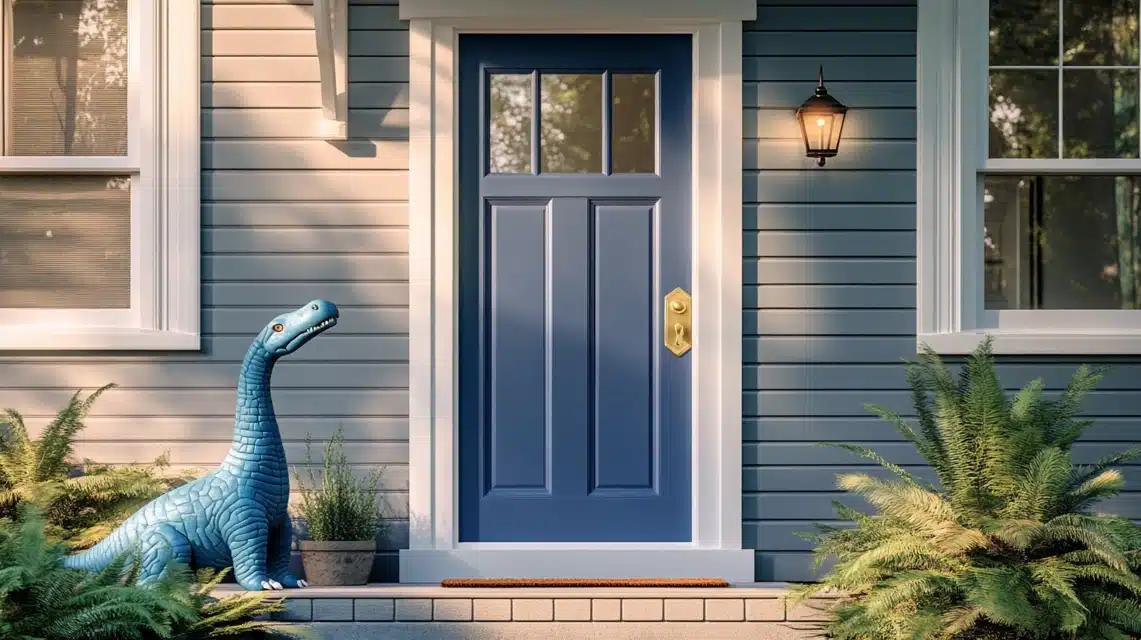
On the exterior, it’s subtle enough to please the neighbors but unique enough to stand out.
I recently painted a front door in Upward, and it’s become the talk of the neighborhood. It catches the light beautifully and offers this welcoming presence that’s hard to resist.
Against white trim or gray siding, it creates this sophisticated curb appeal that feels both classic and contemporary.
What’s particularly fascinating is how it changes throughout the day, from a soft morning blue to a deeper, more dramatic shade at dusk.
When clients ask me about exterior colors that won’t go out of style, Upward is always one of my top recommendations.
It’s one of those rare colors that manages to be both timeless and current, making it perfect for any home’s exterior elements.
Perfect Color Pairings for Upward
After years of experimenting with Upward, let me share my most successful color pairings and finish combinations that truly make spaces sing.
1. Strategic Trim Colors
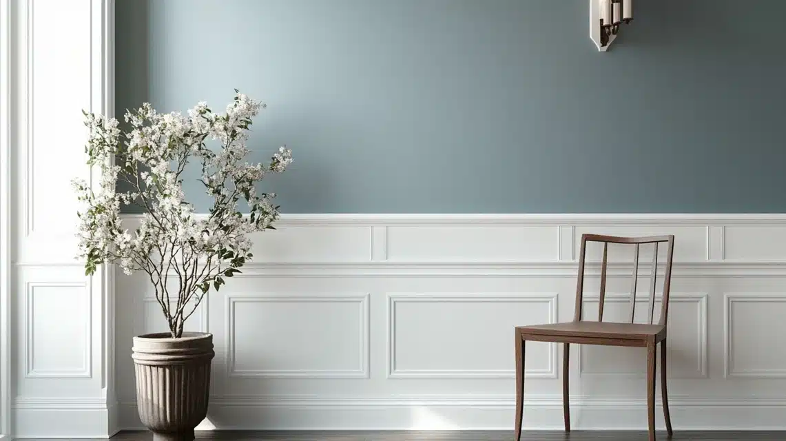
Pure White (SW 7005) is my go-to trim color with Upward. In a recent craftsman-style home renovation, this combination created stunning contrast without feeling harsh.
For a softer look, I’ve found Extra White (SW 7006) creates this beautiful, cloud-like transition.
The key is maintaining a crisp, clean line between colors – it makes all the difference.
2. Ceiling Combinations
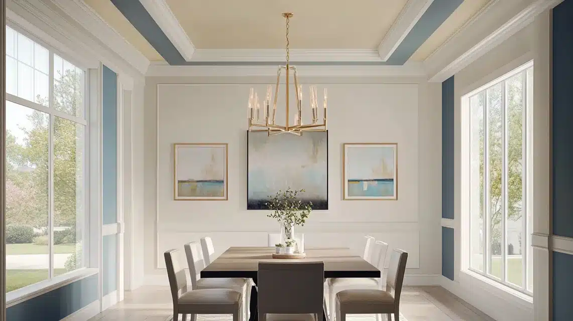
Painting ceilings, a 50% lighter version of Upward, create this incredible sense of height and flow.
However, for more traditional spaces, I’ve found that Ceiling Bright White (SW 7007) provides that perfect balance between warmth and brightness.
In a recent dining room project, this combination made the room feel endlessly tall.
3. Accent Wall Success
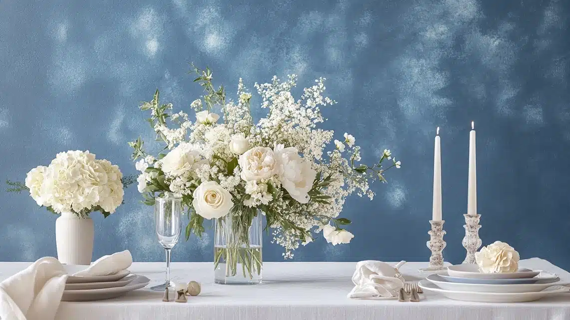
For accent walls, Naval (SW 6244) has become my favorite dramatic pairing. It’s like capturing the moment when the sky meets the ocean.
I recently used this combination in a home office, and the client said it felt both energizing and calming.
For a softer approach, Distance (SW 6243) creates a beautiful tonal story.
Finish Selection Tips Let me share something I’ve learned through trial and error: Upward shows its best personality in different finishes for different spaces:
- Living areas: Eggshell finish brings out its subtle undertones while maintaining durability
- Bathrooms: Satin finish helps manage moisture while enhancing the color’s depth
- Trim work: Semi-gloss creates beautiful contrast with Upward’s matte walls
4. Metallic Hardware Pairings
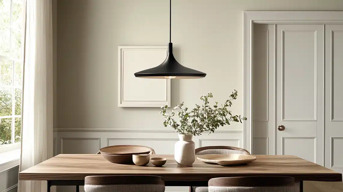
Through numerous projects, I’ve discovered that Upward has an amazing relationship with different metal finishes:
- Brushed nickel: Creates a modern, sophisticated look
- Oil-rubbed bronze: Adds warmth and traditional elegance
- Matte black: Makes a contemporary statement that never feels harsh
5. Textile and Decor Coordination
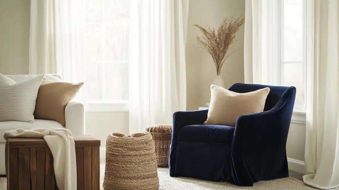
The beauty of Upward lies in its versatility with fabrics and decor. I’ve seen it shine with the following:
- Natural linens in warm beiges
- Crisp white cottons
- Navy blue velvets for dramatic contrast
- Greige upholstery for subtle sophistication
6. Flooring Compatibility
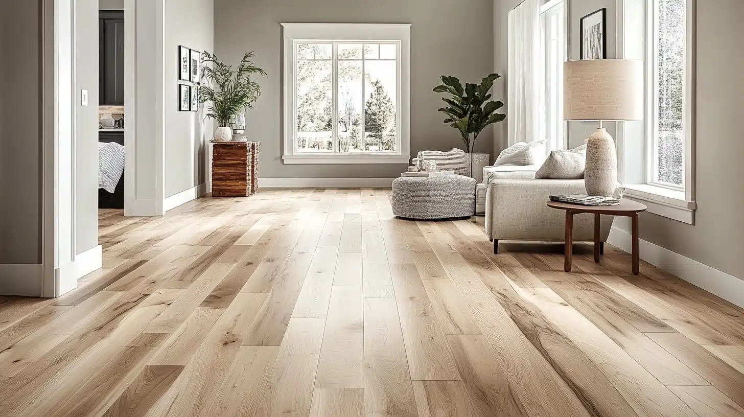
In my experience, Upward pairs beautifully with:
- Light oak hardwoods (brings out the warm undertones)
- Gray-washed woods (creates a cohesive modern look)
- White marble or tile (adds sophistication)
- Dark hardwoods (creates dramatic contrast while maintaining balance)
Coordinating Colors with Sherwin Williams Upward
1. Neutral Pairings
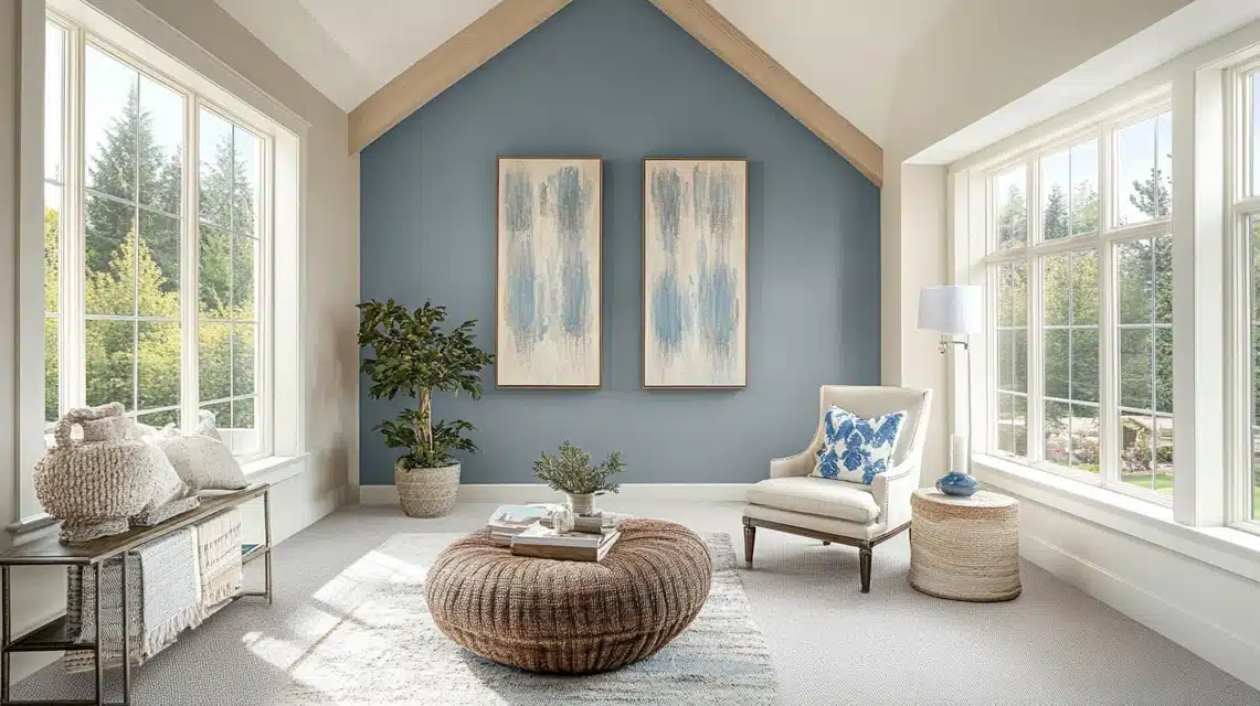
After years of experimenting with color combinations, I’ve found that Upward truly shines when paired with thoughtfully chosen neutrals.
Pure White (SW 7005) is like its perfect dance partner. It creates this crisp, clean look that never fails to delight.
I recently used this combo in a sunlit home office, and the result was breathtaking. Agreeable Gray (SW 7029) is another favorite of mine.
It grounds Upward while maintaining that airy feeling. Think of it as adding a touch of earthiness to a sky-inspired palette.
2. Bold Accents
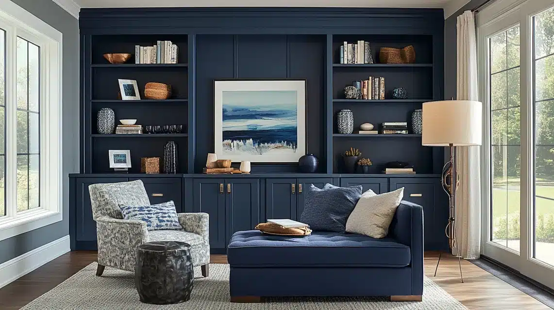
Naval (SW 6244) alongside Upward is like watching the sky meet the ocean, dramatic yet completely natural.
I love using Naval for built-ins or accent furniture, while Upward covers the walls. Tricorn Black (SW 6258) adds modern sophistication to picture black window frames or door hardware against Upward walls.
In a recent project, I used black metal light fixtures against Upward, and the contrast was simply stunning.
3. Complementary Soft Colors
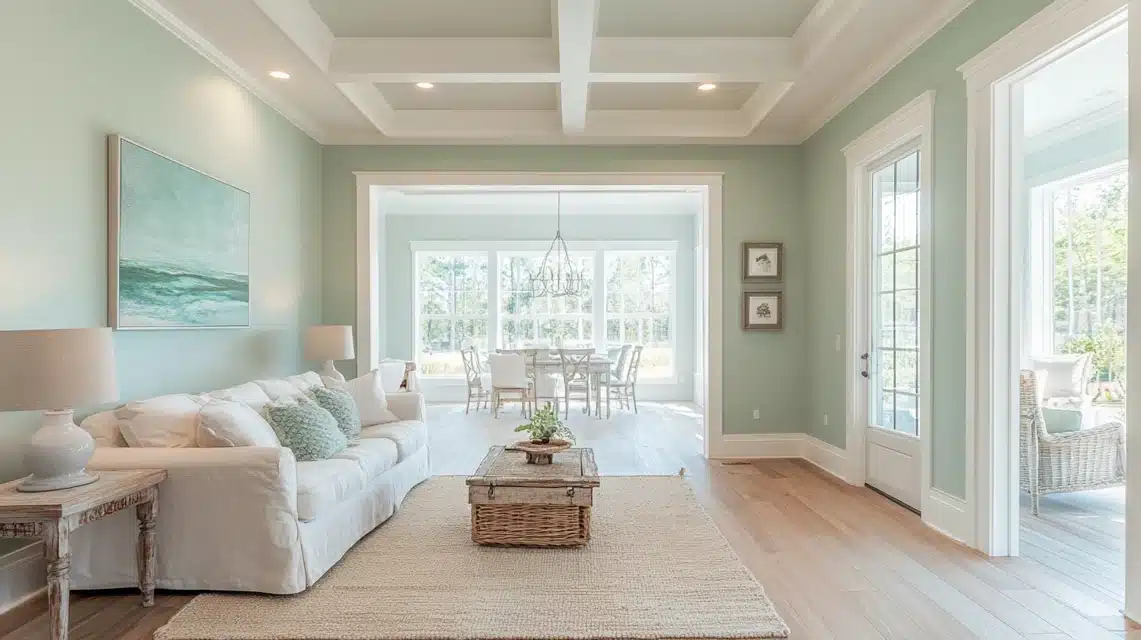
When clients want to create a serene, flowing color story, I immediately reach for Sea Salt (SW 6204) and Rainwashed (SW 6211).
These colors are like cousins to Upward. They share that same ethereal quality, but each brings its own personality.
Sea Salt adds this gorgeous coastal vibe, while Rainwashed introduces a subtle green undertone that feels fresh and organic.
I recently designed a home where we used all three colors, transitioning from room to room, and it felt like walking through a perfectly misty morning.
What makes these combinations work so beautifully is how they all respect Upward’s gentle nature while adding their own distinctive voice to the conversation.
Whether you’re creating contrast or harmony, Upward plays well with others while maintaining its unique character.
Comparisons with Similar Colors
1. How Upward Differs from Other Blues?
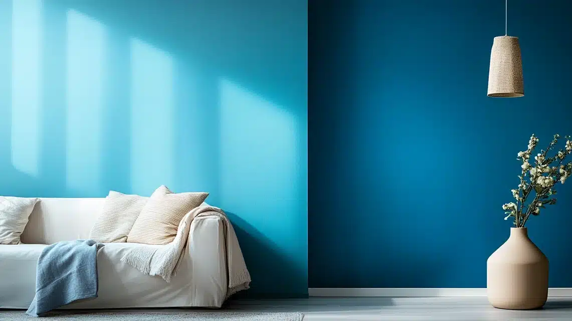
After spending countless hours studying these blues, I can tell you that Upward has its own special character.
While Misty (SW 6232) leans more toward a true gray with just a whisper of blue, Upward confidently embraces its blue identity while keeping things sophisticated.
In my recent color consultation, I placed these side by side and Upward showed more vibrancy without being overwhelming.
Now, Benjamin Moore’s Horizon (OC-53) is like Upward’s cooler cousin. It is grayer and feels slightly more reserved. Upward brings more warmth and life to a space, making rooms feel more welcoming.
2. Choosing the Right Blue for Your Space
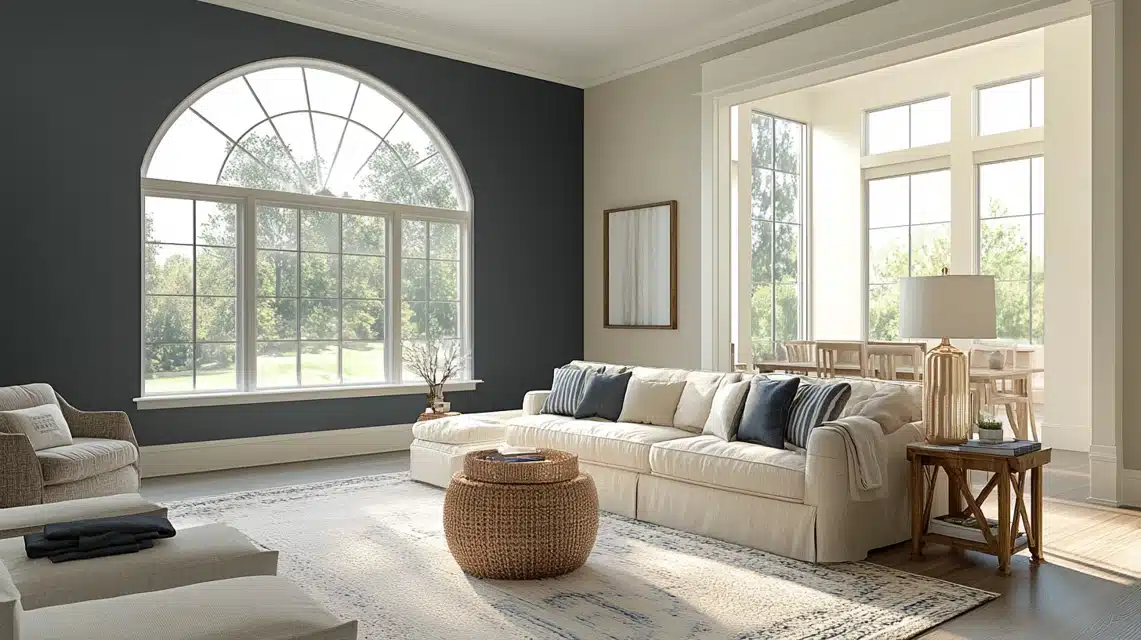
This is where my painting journey has taught me the most valuable lessons. When selecting between these blues, natural light is your best friend.
Upward shows its true beauty in rooms with good Natural light. North-facing rooms allow its warm Undertones to shine, while south-facing spaces bring out its cooler notes.
For spaces with limited natural light, I often test Upward against other blues during different times of the day. Pay attention to how the color shifts.
Consider your Room’s purpose, too. In my experience, Upward works brilliantly in spaces where you want to feel both energized and calm.
If you’re dealing with a space that needs to feel more formal, you might lean toward Horizon. For rooms where you want that perfect balance between gray and blue, Upward is often the answer.
Something I always tell my clients, the undertones make all the difference. Upward has this beautiful balance of warm and cool undertones that makes it more versatile than its competitors.
I’ve seen it transform from a soft morning blue to a sophisticated gray blue as the day progresses – it’s like getting multiple colors in one.
Remember, choosing the right blue isn’t just about the color itself – it’s about how it brings your entire space together. Upward has this remarkable ability to adapt while maintaining its distinct personality.
Customer Reviews and Feedback
1. Positive Reviews
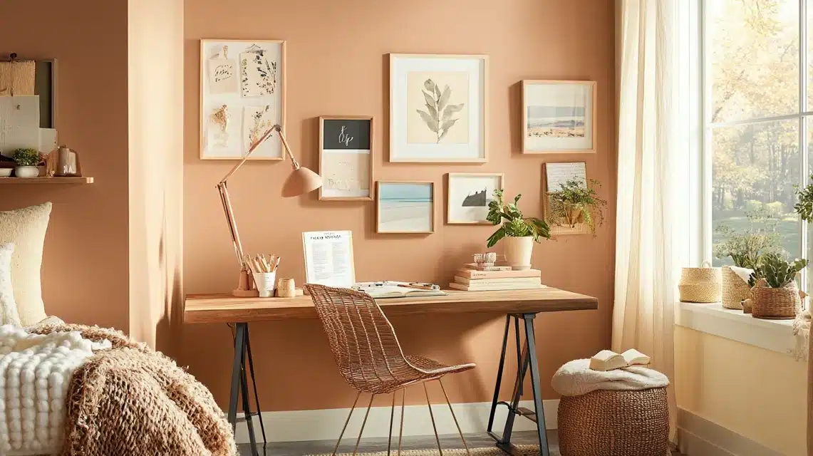
In my 15 years of painting, I’ve never seen a color generate quite the buzz that Upward does. There was this wonderful moment last spring when a client, an author, chose it for her writing studio.
Two weeks later, she called me almost emotional, saying the color had transformed her creative space into this magical realm where words just flowed. It’s these kinds of stories that make me love what I do.
I remember a young couple who were renovating their first home – they were absolutely terrified of using any color beyond white.
After some gentle convincing, they tried Upward in their living room. Now they joke that it’s like living on a perfect summer day.
Their Instagram posts about the transformation actually brought me three new clients.
One of my most memorable projects was a beachside bed and breakfast. The owner wanted something that would make guests feel instantly relaxed without being too “beachy obvious.”
They’ve since reported that guests frequently photograph their walls and ask for the color of the name.
Even better, their booking rates increased after the renovation, which they partially attribute to how the color photographs in their online listings.
2. Common Challenges
Lighting Sensitivity Considerations
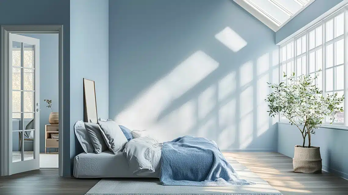
In my years of working with Upward, I’ve noticed how this color dances with light throughout the day. During dawn, it might appear as a soft gray-blue, while by midday, it transforms into a clearer blue tone.
Some clients initially find this shifting nature surprising. In north-facing rooms, it can sometimes pull more gray than expected, while in south-facing spaces, its blue undertones become more pronounced.
This sensitivity to light isn’t a flaw – it’s part of Upward’s character – but it does require thoughtful consideration during the planning phase.
Color Perception Variations
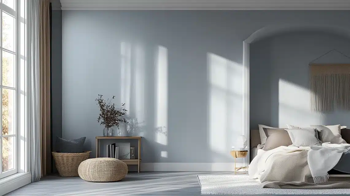
Upward can look strikingly different depending on your viewing angle and surrounding colors.
On screens and color charts, it often appears more straightforward than it truly is. In real spaces, it reveals subtle complexities that can surprise homeowners.
I’ve had clients who expected a consistent pale blue but discovered a color that shifts between blue, gray, and even slight violet undertones depending on the time of day and surrounding decor.
Application and Coverage Challenges
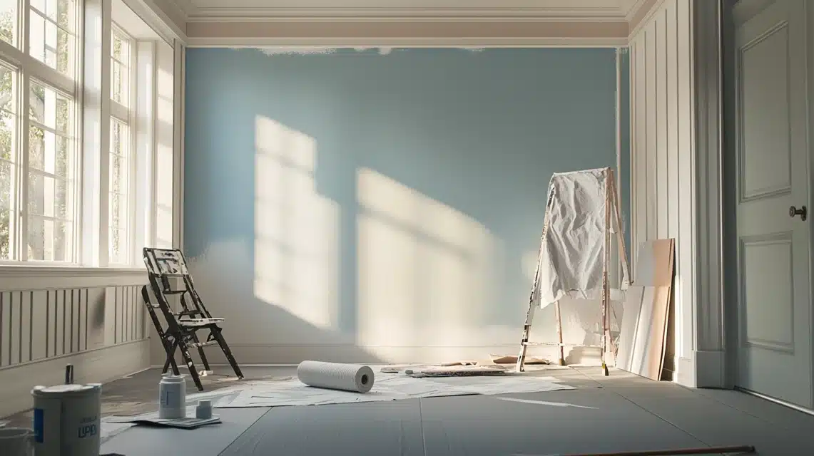
Upward sometimes requires careful application techniques to achieve its full potential. In my experience, proper surface preparation is crucial, as any underlying colors or wall imperfections can affect its final appearance.
It typically needs two full coats for optimal coverage, and in some lighting conditions, a third coat might be necessary to achieve that perfect, uniform finish we’re looking for.
Environmental Factors
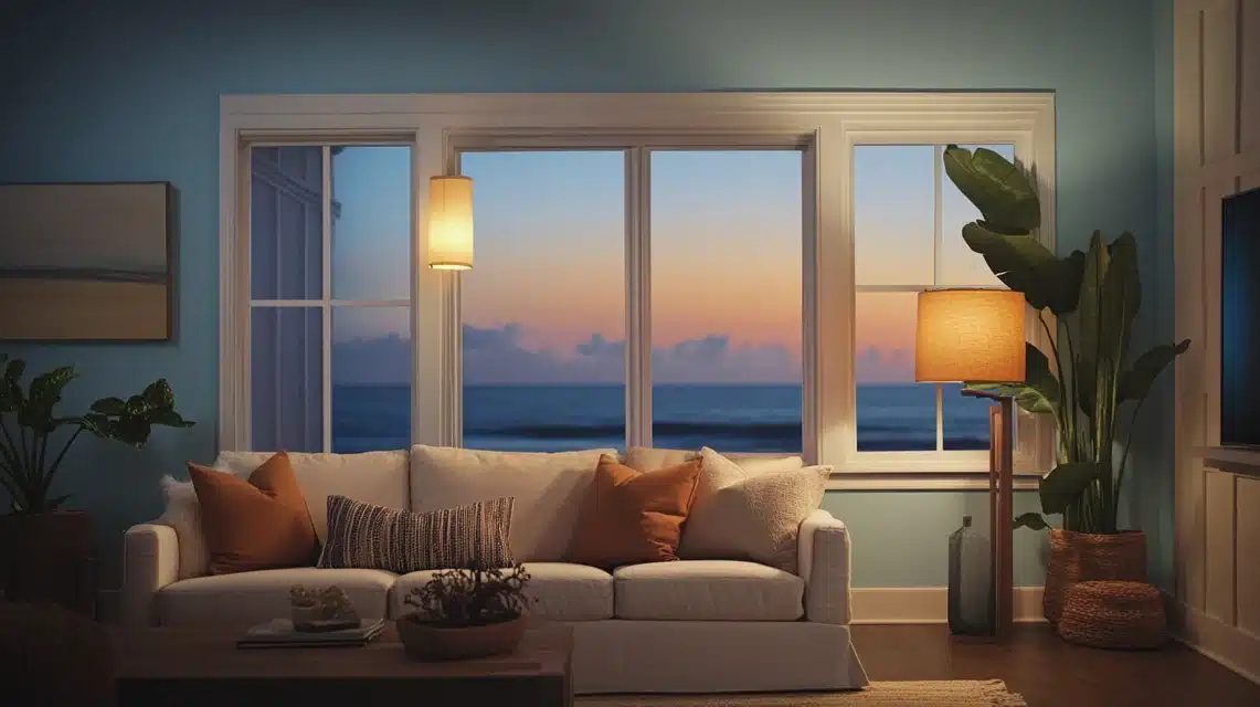
Through countless projects, I’ve observed how environmental elements can impact Upward’s appearance. Artificial lighting can particularly affect its character. LED lights might bring out its cooler tones, while incandescent bulbs can warm it slightly.
Humidity levels and seasonal changes can also subtly influence how the color presents itself, something I always discuss with clients in coastal or variable climate areas.
Coordination Challenges
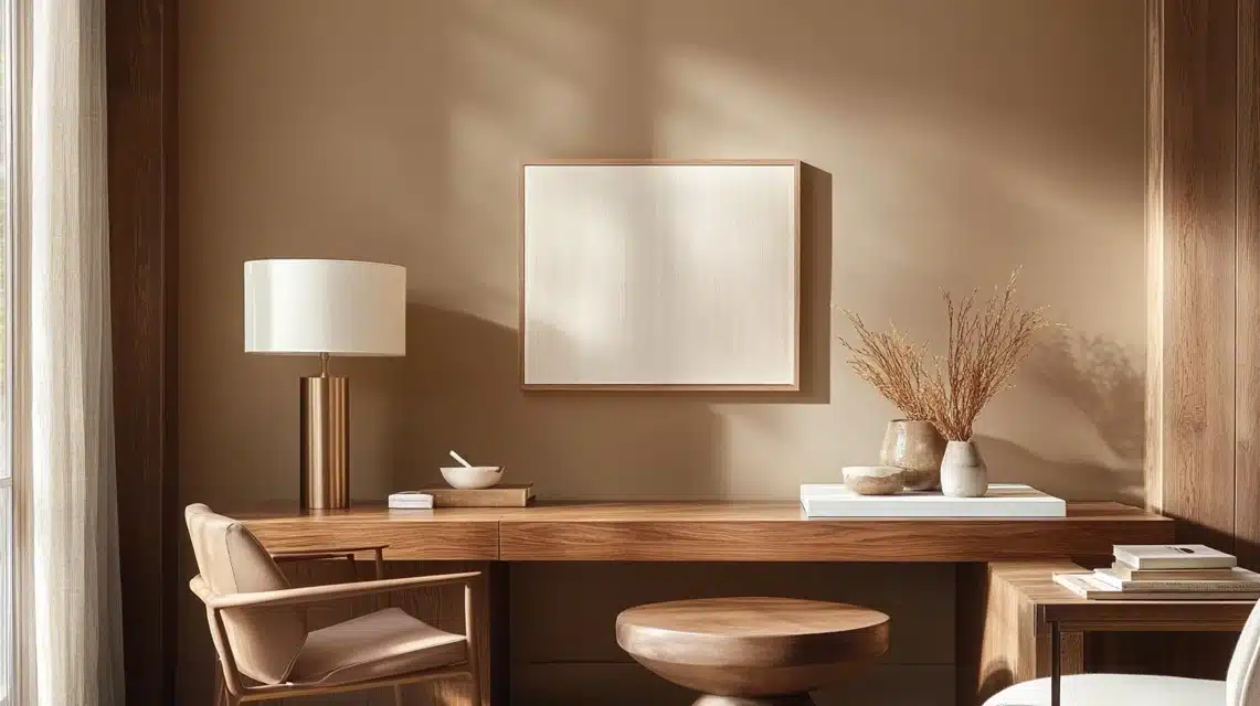
While Upward is generally versatile, there are some nuances to consider when coordinating with existing elements.
I’ve found that certain wood tones or metallic finishes might not complement it as expected. This isn’t necessarily a limitation but rather an opportunity to be strategic about color pairings and finish selections.
Conclusion
As a painter passionate about exploring the endless possibilities of color, I’ve come to truly appreciate the subtle magic of Upward (SW 6239) by Sherwin Williams.
Its soft blue-gray tones strike a perfect balance between calming and versatile, making it a go-to choice for spaces where comfort and style meet.
Whether you’re refreshing a bedroom, brightening up a living room, or adding charm to your home’s exterior, Upward offers the flexibility to adapt to your vision.
Its ability to work seamlessly with neutrals, bold accents, and natural textures makes it a standout shade in my palette.
The journey of discovering great colors like Upward is what keeps me inspired as a painter.
I hope this blog has sparked ideas for how you can bring this tranquil and timeless color into your own home. If you’ve used Upward in your space, I’d love to hear your experience in the comments below.
Frequently Asked Questions
Is Upward Too Blue for a Whole House Color?
As someone who’s painted entire homes with Upward, I can confidently say it works beautifully as a whole-house color.
It’s subtle enough to avoid feeling overwhelming yet has enough character to keep spaces interesting.
I recently completed a project where I used it throughout, and each room felt unique due to different lighting conditions.
Will Upward Make My Small Room Look Darker?
This is one of my favorite questions to answer! Actually, Upward has a lovely light reflectance value that helps maintain brightness in smaller spaces.
A recent tiny powder room project created an airy feel that actually made the space appear larger. The key is proper lighting – natural or artificial.
Does Upward Work Well with Warm Wood Tones?
Absolutely! One of Upward’s hidden talents is its ability to complement warm wood tones. I’ve seen it pair beautifully with everything from rich walnut to light oak.
The gray undertones help bridge the gap between cool and warm elements. Just last month, I used it in a room with dark hardwood floors, and the combination was stunning.
Is Upward Suitable for Exteriors?
Having used Upward on several exterior projects, I can confirm it’s an excellent choice for outdoor applications. It holds up well and provides a sophisticated presence that enhances curb appeal.
Just keep in mind that intense direct sunlight might make it appear lighter than expected – always test a sample on your exterior wall first.
How does Upward Compare to Other Popular Gray Blues?
While similar to colors like Misty or Horizon, Upward has its own unique personality. I find it carries more warmth than many other gray blues while maintaining a sophisticated presence. What sets it apart is its balanced undertones – it never feels too cold or too warm.
