Looking to transform your space with the perfect balance of stability and vibrancy? Sherwin Williams’ blue-green color palette offers an exceptional range of shades that flawlessly blend the calming qualities of blue with the refreshing nature of green.
These versatile shades create simultaneously vitalizing and peaceful environments—ideal for nearly any room in your home.
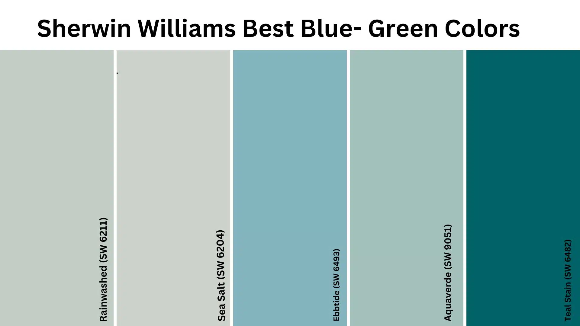
From the soft, barely-there whispers of Sea Salt to the bold, statement-making depth of Teal Stain, Sherwin Williams has mastered the art of blue-green colors that complement various design styles.
Even if you’re aiming for a coastal retreat, a spa-like sanctuary, or a refined modern space, these carefully formulated blue-green paints provide the perfect foundation.
Let’s explore the best blue-green colors in Sherwin Williams’ collection, which designers consistently recommend for their timeless appeal and remarkable versatility.
Best Sherwin Williams Paints that I Recommend
- Sea Salt (SW 6204)
- Rainwashed (SW 6211)
- Aquaverde (SW 9051)
- Teal Stain (SW 6482)
- Ebbtide (SW 6493)
Why I Love These Sherwin Williams Blue-Green Paints?
In this section, I’ll explain why I recommend each of these shades for different spaces in my home, what makes them unique, and how they bring out the best in my interior design.
1. Sea Salt (SW 6204)
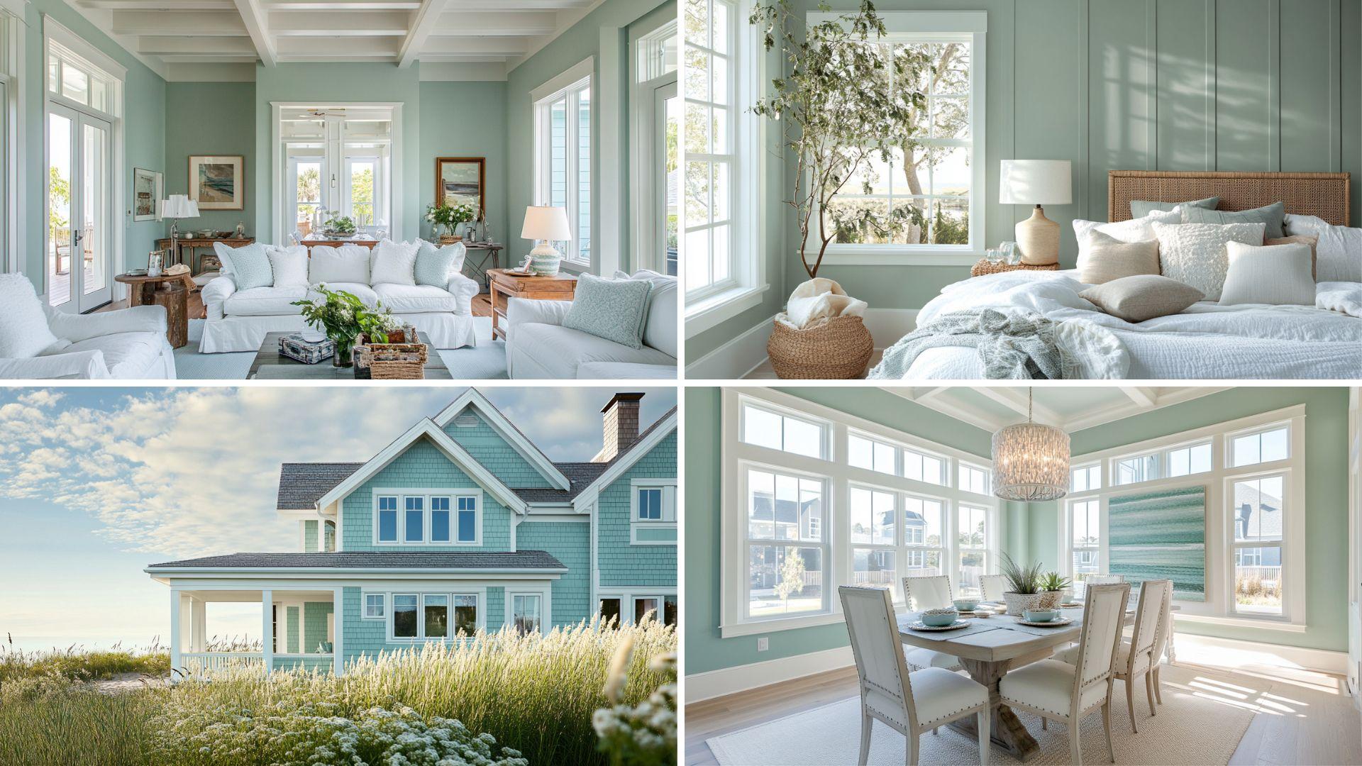
Sea Salt (SW 6204) is my ultimate choice for creating a serene, spa-like atmosphere in any room. It’s perfect for spaces where you want to feel instantly relaxed and refreshed without committing to a more saturated color.
Quiet Culture
- Sea Salt is a delicate blue-green with gray undertones that create a soft, misty appearance reminiscent of coastal fog.
- This versatile chameleon color shifts beautifully throughout the day, appearing green in warm and blue in cool light.
Ideal for Any Space
- Bathrooms transform into personal spa retreats that promote daily relaxation and rejuvenation.
- Bedrooms become peaceful sanctuaries conducive to restful sleep and morning calm.
- Living areas feel more expansive and connected to the outdoors, especially when paired with natural elements.
Versatile Companion
- Natural wood tones create stunning organic contrast against this soft backdrop.
- White trim appears crisp and defined, enhancing architectural details.
- Brushed nickel and chrome fixtures reflect beautifully against its subtle blue-green canvas.
Emotional Benefits
- Promotes a sense of calm and tranquility in busy households.
- Creates a feeling of gentle spaciousness even in smaller rooms.
- Inspires a connection to nature and the restorative qualities of coastal environments.
| Attribute | Value |
|---|---|
| RGB Value | (205, 210, 202) |
| HEX Code | #CDD2CA |
| LRV (Light Reflectance Value) | 63 |
What These Values Mean?
The RGB values show how Sea Salt gets its special look:
- The balanced green and blue values create this color’s chameleon-like quality.
- The relatively high values across all channels give it that airy, light appearance.
Digital Uses
Sea Salt provides an excellent soft backdrop for wellness websites, lending a peaceful ambiance while maintaining excellent readability for text content.
2. Rainwashed (SW 6211)
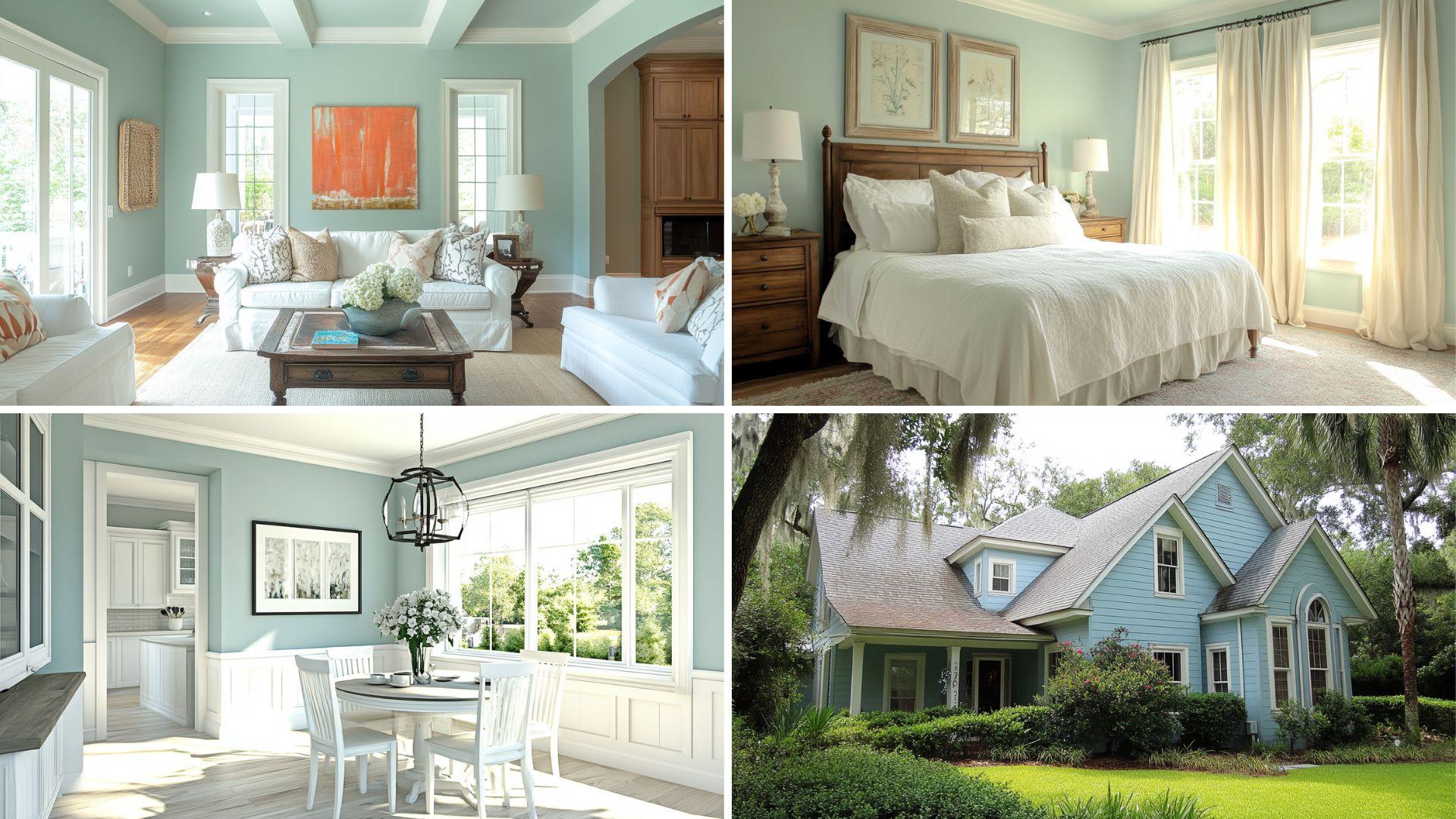
Rainwashed (SW 6211) is my go-to for creating a fresh and uplifting atmosphere that remains grounded and refined. It’s perfect for spaces that benefit from a touch of color without overwhelming the senses.
Refreshing Grace
- Rainwashed is a light blue-green with subtle gray undertones that create a clean, washed appearance reminiscent of sea glass.
- This adaptable color shifts beautifully in different lighting, appearing more blue in northern exposure and more green in warm afternoon light.
Ideal for Any Space
- Home offices become more productive and focused environments without feeling sterile.
- Kitchens appear cleaner and more inviting with a hint of nature-inspired color.
- Sunrooms and enclosed porches create a seamless transition between indoor and outdoor living.
Versatile Companion
- Crisp white cabinetry and trim create stunning definition and architectural interest.
- Warm wood tones balance its cool undertones for a harmonious palette.
- Brushed brass accents add unexpected warmth and sophistication against its cool canvas.
Emotional Benefits
- Promotes mental clarity and focus in work environments.
- Creates a feeling of freshness and cleanliness in gathering spaces.
- Inspires creativity while maintaining a sense of calm organization.
| Attribute | Value |
|---|---|
| RGB Value | (188, 212, 209) or (194, 205, 197) |
| HEX Code | #C2CDC5 and #C0CCC4 |
| LRV (Light Reflectance Value) | 58.13% to 59% |
What These Values Mean?
The RGB values show how Rainwashed gets its special look:
- The slightly higher green and blue values than red create a cool, refreshing appearance.
- The relatively balanced green and blue values contribute to its chameleon-like quality.
Digital Uses
Rainwashed is a perfect background for health and wellness applications, providing a clean, refreshing aesthetic while maintaining excellent contrast for important information.
3. Aquaverde (SW 9051)
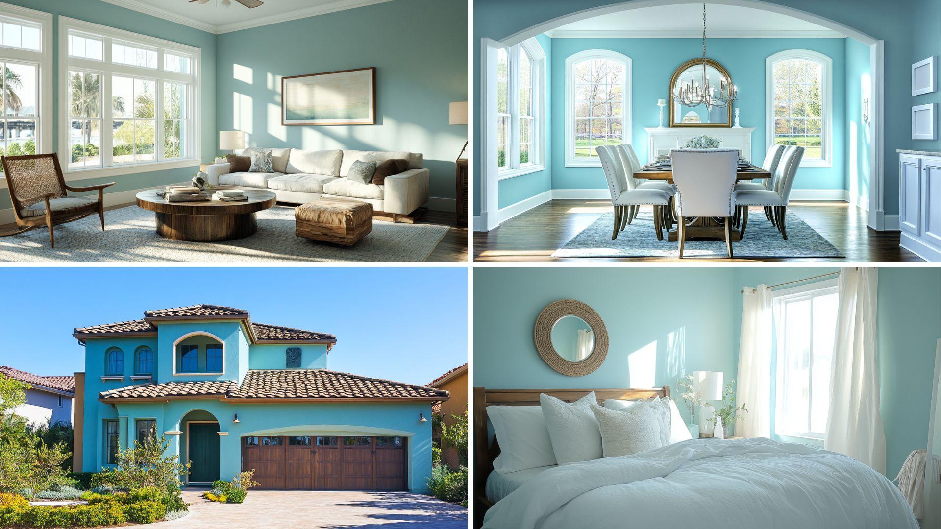
Aquaverde (SW 9051) is my statement color for spaces that deserve dramatic sophistication without becoming overwhelming. It’s perfect for rooms where you want to create a focal point or establish a rich, jewel-toned atmosphere.
Luxurious Depth
- Aquaverde is a rich, saturated blue-green with subtle black undertones that create a moody, refined appearance.
- This bold color adds instant character and depth to any space, creating a cocoon-like feeling of grace intimacy.
Ideal for Any Space
- Dining rooms transform into dramatic entertainment spaces perfect for evening gatherings.
- Libraries and reading nooks become cozy retreats that encourage lingering conversations.
- Powder rooms make bold statements that surprise and delight guests.
Versatile Companion
- Crisp white trim creates stunning contrast that highlights architectural details.
- Gold and brass accents add warmth and luxury against its cool, rich backdrop.
- Natural stone like marble introduces organic patterns that complement its depth.
Emotional Benefits
- Promotes a sense of luxury and indulgence in formal spaces.
- Creates a feeling of intimacy and connection in gathering areas.
- Inspires thoughtful contemplation and meaningful conversation.
| Attribute | Value |
|---|---|
| RGB Value | (163, 192, 189) |
| HEX Code | #A3C0BD |
| LRV (Light Reflectance Value) | 49.58% |
What These Values Mean?
- The relatively low values across all channels create its rich, saturated appearance.
- The slightly higher green and blue values compared to red give it that distinctive blue-green quality.
Digital Uses
Aquaverde provides refined contrast for luxury brand websites, lending depth and elegance while creating memorable visual impact for users.
4. Teal Stain (SW 6482)
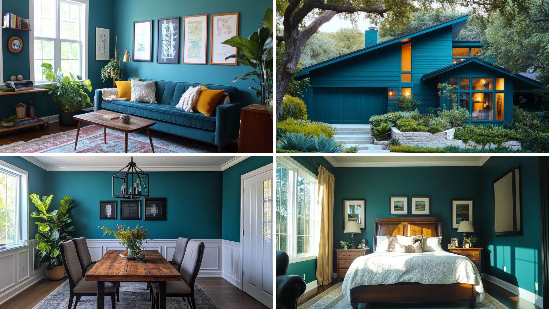
Teal Stain (SW 6482) is my vibrant choice for spaces that benefit from the energetic color that still feels grounded. It’s perfect for rooms where you want to make a bold statement without sacrificing sophistication.
Vibrant Character
- Teal Stain is a rich, saturated blue-green with enough depth to avoid feeling overwhelming even in larger applications.
- This confident color adds instant personality and contemporary flair to any space it graces.
Ideal for Any Space
- Living rooms become conversation-starting gathering spaces with unmistakable personalities.
- Accent walls create focal points that anchor and define open-concept spaces.
- Kitchen islands or cabinetry make unexpected statements that promote the entire design.
Versatile Companion
- Warm neutrals balance their cool intensity for a harmonious overall palette.
- Natural wood introduces organic warmth that complements its jewel-toned richness.
- Matte black hardware and fixtures create a modern contrast against its vibrant canvas.
Emotional Benefits
- Promotes energy and engagement in social gathering spaces.
- Creates a feeling of confidence and self-expression in personal spaces.
- Inspires creativity and breaks conventional color boundaries.
| Attribute | Value |
|---|---|
| RGB Value | (50, 124, 124) |
| HEX Code | #327C7C |
| LRV (Light Reflectance Value) | 21 |
What These Values Mean?
The RGB values show how Teal Stain gets its special look:
- The relatively low red value compared to green and blue creates its distinctive teal appearance.
- The balanced green and blue values give it that perfect equilibrium between blue and green.
Digital Uses
Teal Stain makes an excellent accent color for creative portfolio websites, providing vibrant energy while maintaining professional sophistication for creative professionals.
5. Ebbtide (SW 6493)
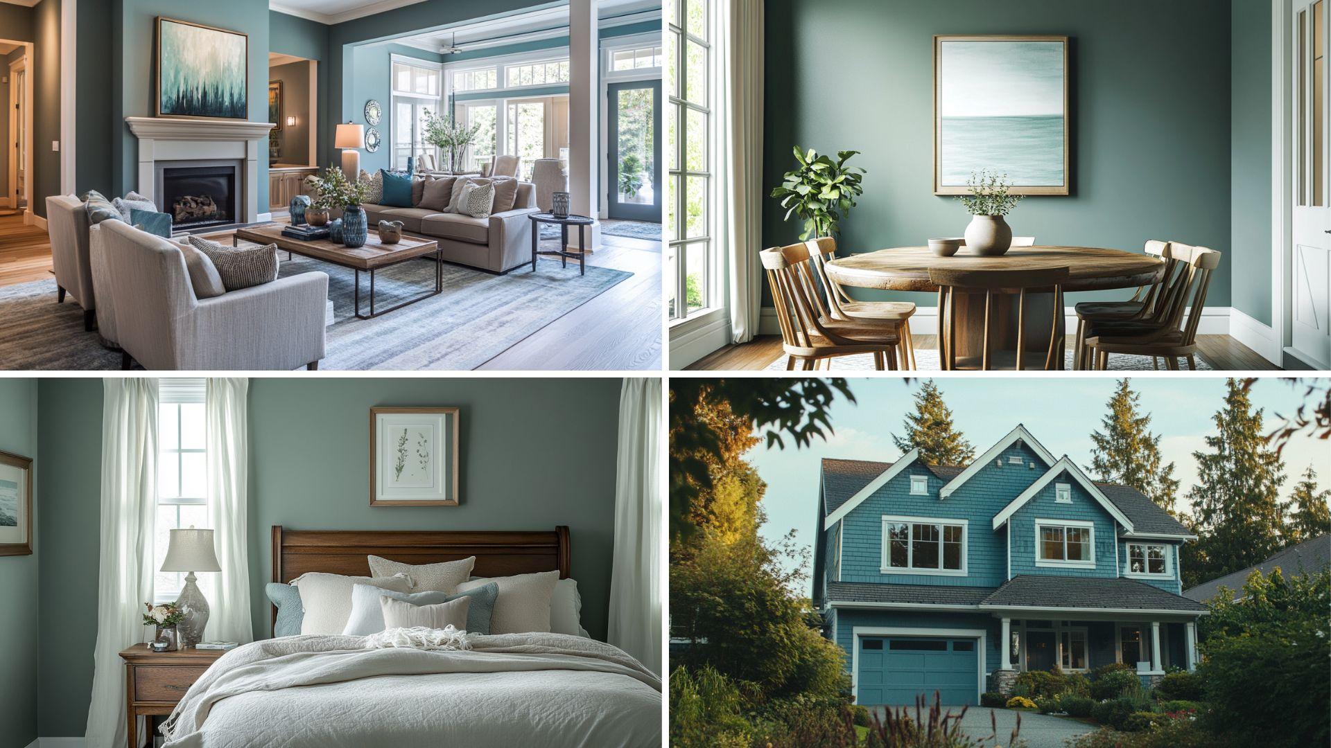
Ebbtide (SW 6493) is my versatile middle-ground choice bridging the subtle and bold gap. It’s perfect for spaces where you want a noticeable color that remains livable and adaptable over time.
Balanced Harmony
- Ebbtide is a medium-toned blue-green with gray undertones that create a muted, refined appearance.
- This versatile color provides enough saturation to make a statement while remaining neutral enough to serve as a backdrop for changing decor.
Ideal for Any Space
- Primary bedrooms become restful retreats with just the right amount of color personality.
- Home offices create productive environments with a touch of creative inspiration.
- Open-concept living areas establish a cohesive color flow that connects different functional zones.
Versatile Companion
- Warm whites create a gentle contrast that highlights architectural details.
- Natural linens and textiles layer beautifully against its muted backdrop.
- Mixed metals from silver to brass find harmony against its versatile canvas.
Emotional Benefits
- Promotes a sense of balance and harmony in transitional spaces.
- Creates a feeling of timeless sophistication that won’t quickly date.
- Inspires creative expression within a defined color framework.
| Attribute | Value |
|---|---|
| RGB Value | (132, 180, 190) |
| HEX Code | #84B4BE |
| LRV (Light Reflectance Value) | 41 |
What These Values Mean?
The RGB values show how Ebbtide gets its special look:
- The higher green and blue values compared to red create a cool, coastal appearance.
- The slightly higher blue-than-green value gives it that distinctive leaning toward the blue side of blue-green.
Digital Uses
Ebbtide provides a perfect background for hospitality and travel websites, creating a sense of coastal escape while maintaining excellent readability for important information.
Best Dark Colors to Pair with Blue-Green Colors
Here’s a table with the 10 dark colors that go well with your blue-green shades:
| Color Name | Sherwin Williams Code | Description |
|---|---|---|
| Iron Ore | SW 7069 | A deep charcoal that provides a sleek contrast. |
| Urbane Bronze | SW 7048 | A rich, warm bronze with deep undertones that complements blue-green hues. |
| Naval | SW 6244 | A classic navy blue, offering a deeper, bold contrast. |
| Sea Serpent | SW 7615 | A deep, rich teal that complements the blue-green shades without clashing. |
| Gravel Gray | SW 7073 | A neutral gray with dark tones that work well with oceanic hues. |
| Peppercorn | SW 7674 | A dark, cool gray with subtle undertones that pair nicely with blue greens. |
| Caviar | SW 6990 | A luxurious, deep black with a slight warmth that complements the cool tones. |
| Cloak | SW 6275 | A dark forest green that pairs beautifully with blue-green hues. |
| Mysterious | SW 6986 | A rich, dark purple that provides an unexpected and bold contrast to the blues and greens. |
| Tricorn Black | SW 6258 | A solid, true black that grounds the softer blue-green tones, creating a striking balance. |
Summing It Up
Sherwin Williams’ blue-green color collection stands as a testament to the power of this harmonious color combination to transform any space.
Each shade—from the soft Sea Salt to the commanding Teal Stain—offers unique characteristics while maintaining the inherent balance that makes blue-green colors so universally appealing.
These versatile hues work beautifully across different lighting conditions and complement numerous design styles, from coastal casual to contemporary classiness.
When selecting your perfect blue-green, consider the existing elements in your space and the atmosphere you wish to create.
Remember that these colors can appear differently depending on light exposure and surrounding colors.
By choosing from Sherwin Williams’ exceptional blue-green palette, you’re investing in a timeless color that will continue to inspire calm and refined style for years to come, making your space truly unique.

Alex Guerrero, a graduate with a Fine Arts degree from the Rhode Island School of Design, has been a visionary in the world of color and design for over 15 years. His professional journey began in the heart of the fashion industry in Milan, where he developed an acute sense for color harmonies and trends. Alex joined our team in 2018, offering fresh and innovative perspectives on color utilization in various spaces. Renowned for his ability to blend contemporary trends with timeless elegance. Outside of work, Alex is an accomplished painter and a volunteer art therapist, his artistic talents further enriching his professional insights.