
Looking for a paint color that brings instant happiness to your home?
Sherwin-Williams Hazel might be exactly what you need!
This cheerful green shade alters ordinary rooms into joyful, welcoming spaces.
It’s like having sunshine on your walls every single day.
The color works beautifully in any room, from cozy bedrooms to busy kitchens.
You’ll love how it makes your furniture stand out and your whole house feel more vibrant.
This playful yet calming hue complements both modern and traditional decorating styles perfectly.
If you’re painting one accent wall or your entire home, this color delivers amazing results.
Get ready to find why homeowners everywhere are choosing this delightful shade for their favorite spaces.
Understanding Sherwin-Williams Hazel (SW 6471)
This delightful blue-green shade adds charm and happiness to every space.
It converts basic walls into lively, welcoming areas that feel both fun and peaceful.
You can locate this hue as SW 6471 in Sherwin-Williams’ paint lineup.
This joyful option shines beautifully in bathrooms and cozy nooks.
Color Terminology
Let’s explore what makes this shade so appealing.
These codes help you grasp the real character of this lovely paint choice.
| PROPERTY | VALUE |
|---|---|
| LRV | 50 |
| RGB | 168 / 193 / 183 |
| Hex Value | #A8C1B7 |
With its balanced LRV, it illuminates spaces while maintaining gentle color depth.
Save these numbers when hunting for coordinating accessories and furniture pieces online.
Undertones:
- It holds soft green hints within its blue foundation
- It shifts gently during different times, appearing varied in the morning versus the evening
- Not a simple blue, but a layered, joyful sage that seems organic
Psychology of Green Colors
Our paint selections significantly impact our everyday emotions and living environment.
- Aqua-green shades: Build joyful, calming surroundings
- Playful tones: Simplify decorating with various furniture pieces
- Bright wall hues: Shine beautifully in sunshine and artificial lighting
- Benefits: Adds character indoors, matches most styles, and stays current
Homeowners adore this shade because it feels both lively and classic.
It’s like discovering the ideal mix of energy and serenity!
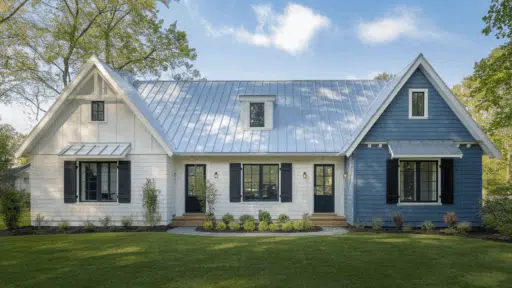
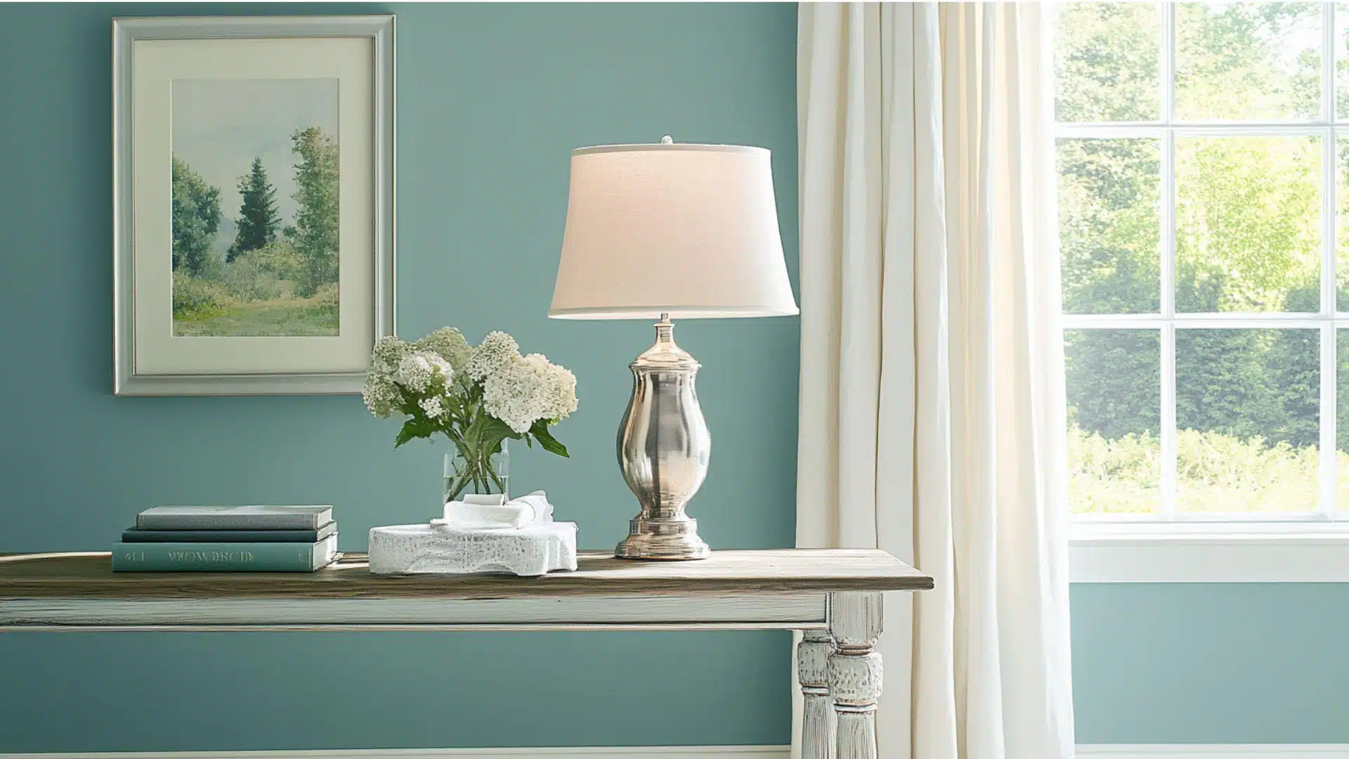
Why Choose Sherwin-Williams Hazel (SW 6471)?
Hazel is a delighted blue-green that makes spaces feel happy and relaxed.
It works perfectly with different decorating styles and adds a playful touch to your home.
1. Versatility
This fun blue-green shifts beautifully as the day goes by.
Morning light reveals its bright blue personality, while evening brings out warmer, greenish hints.
This color feels perfect in bathrooms, bedrooms, and cozy reading corners.
It looks amazing in cottage homes or modern apartments.
2. Key Features
It hits the perfect balance between bold and gentle. With its nice brightness level, it adds personality without taking over your room.
This shade stays popular because it feels both current and lasting.
When you paint your walls, it makes your furniture look more vibrant.
3. Durability
Sherwin-Williams makes this color in tough paint that handles everyday wear.
The blue-green tone hides small scuffs better than pure white walls do.
It keeps its lovely color even after washing, so your rooms stay beautiful longer for active families.
4. Texture Patterns
This color gives walls a polished, welcoming look that makes rooms feel complete.
Its blue-green mix adds richness that plain colors cannot provide.
This makes your white trim and ceiling details really stand out while connecting rooms nicely together.
Room Color Recommendations: Sherwin-Williams Hazel
Hazel (SW 6471) is a light-hearted, blue-green paint that brings happiness and calm to your home.
It changes gently throughout the day, showing brighter blues in sunlight and softer greens at night.
1. Living Spaces and Family Rooms
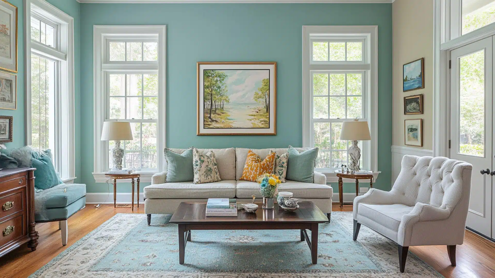
This happy blue-green makes living rooms feel welcoming, where your family gathers most often.
It fits beautifully in any home style, from cozy cottages to sleek apartments.
- The playful color adds joy indoors, making your space feel lively and fresh.
- It looks stunning with beige furniture, dark wood, and natural textures.
- Pair it with bright white trim and light floors for a clean, updated look.
Your living room will become everyone’s favorite hangout spot.
Guests always comment on how bright and relaxing the space feels.
2. Kitchens and Dining Areas
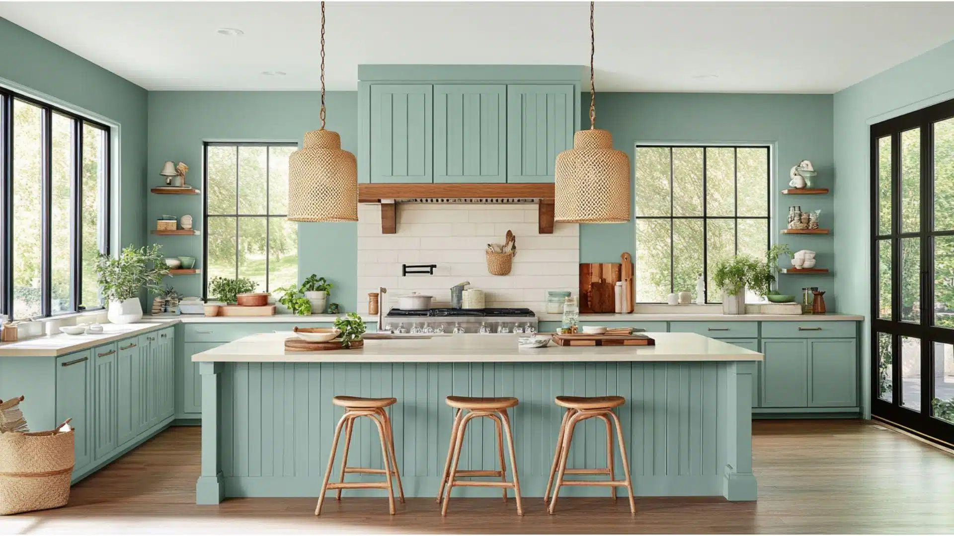
This shade makes kitchens feel bright and joyous without being too bold or overwhelming.
This color works nicely with different cabinet styles and finishes.
- It brightens white cabinets by adding personality while keeping things refined and polished.
- The blue-green tone matches perfectly with both silver and gold kitchen fixtures.
- In dining rooms, this color creates happy vibes that make family meals more fun.
Your kitchen becomes the heart of your home with this uplifting color.
Even cooking feels more enjoyable in this bright, welcoming space.
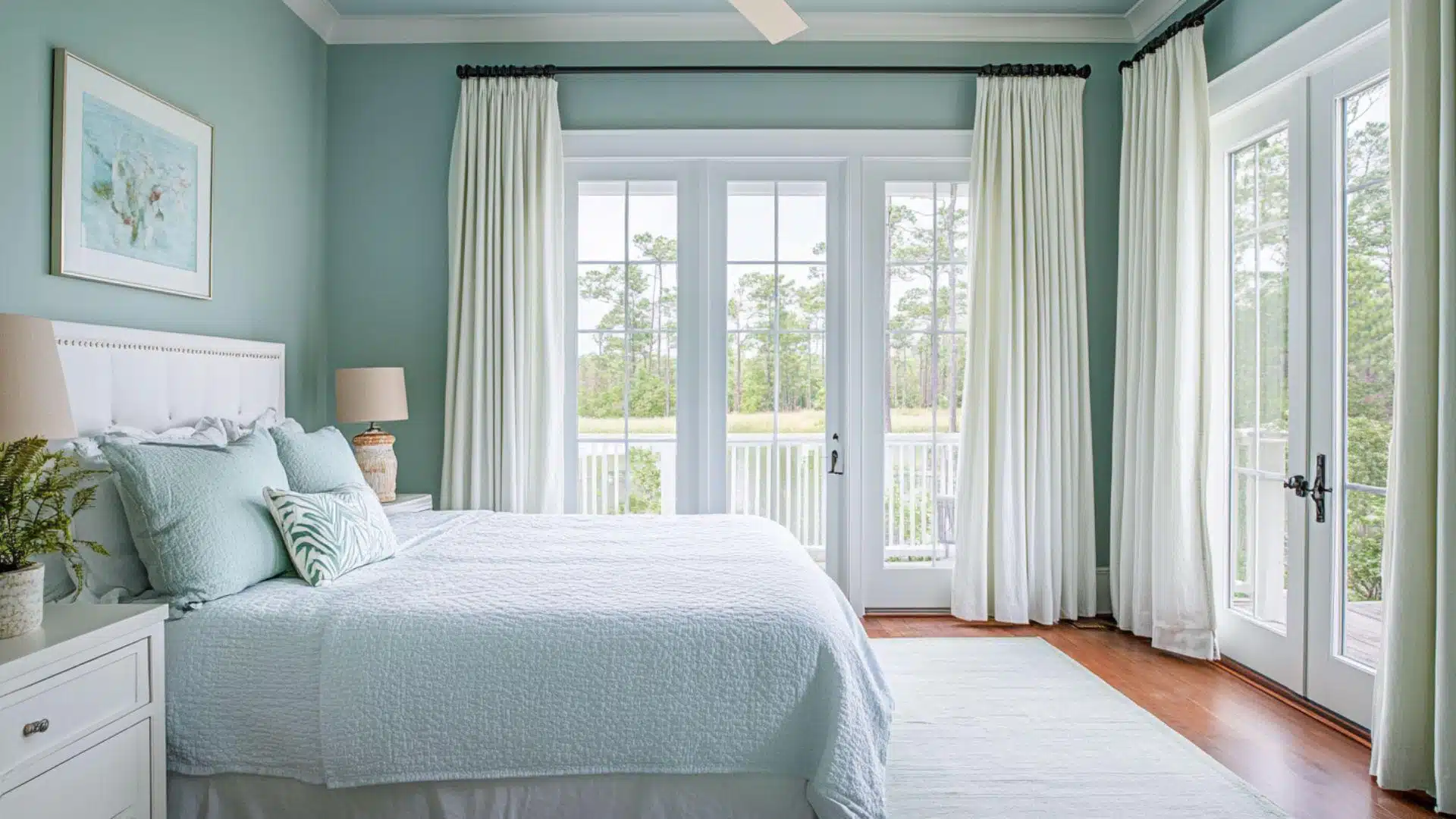
3. Bedrooms and Relaxation Spaces
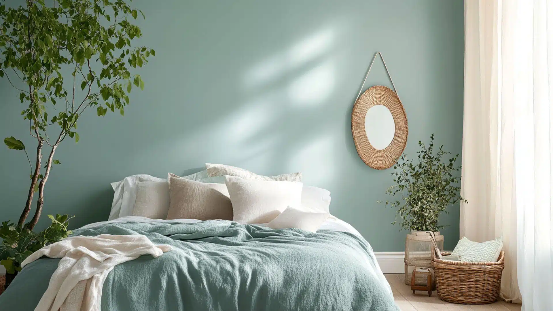
This color changes bedrooms into joyful spaces that still help you feel calm and rested.
The gentle blue-green shades encourage peaceful sleep.
- It creates a delighted backdrop that’s neither too bright nor too dark, providing a comfortable rest.
- This shade pairs beautifully with white, soft gray, or cream bedding for spa-like comfort.
- The color makes tiny bedrooms feel bigger while maintaining a cozy, safe atmosphere.
You’ll wake up feeling happier in this cheerful yet calming room.
Your bedroom becomes a perfect retreat from busy days.
Color Pairings and Combinations for Hazel (SW 6471)
This is a joyous blue-green that adds happiness and whimsy to your home.
Its playful tone creates joyful, uplifting spaces that feel fresh and alive.
Here are the perfect partner colors for this delightful shade of blue-green.
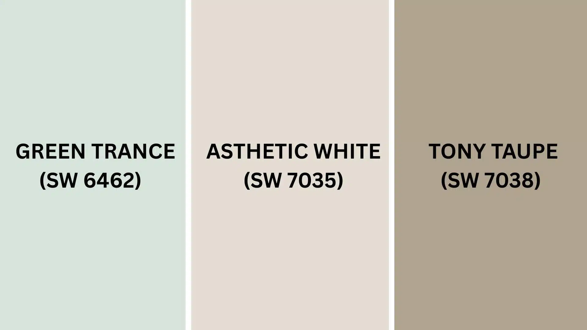
Complementary Trim Colors
The right trim color can totally alter how this blue-green looks in your room.
These specific colors make stunning combinations with their bright personalities.
1. Green Trance (SW 6462)
A deeper, richer green that creates beautiful layered looks when paired with the color’s lighter tone.
This combination works amazingly in bathrooms and bedrooms where you want nature-inspired vibes.
Together, they make spaces feel like peaceful garden retreats that never go out of style.
2. Aesthetic White (SW 7035)
A bright, clean white that makes its blue-green pop with fresh energy and life.
This pairing shines beautifully in kitchens, bathrooms, and playrooms where you want crisp, happy feelings.
The contrast creates spaces that feel both modern and timeless at once.
3. Tony Taupe (SW 7038)
A warm, cozy taupe that balances the playful energy with grounding, earthy warmth perfectly.
This combination creates comfortable and welcoming spaces, ideal for living rooms and family areas.
They make rooms feel both fun and urbane without being too serious.
Creating Cohesive Color Schemes
This works beautifully with many other colors to create a happy flow throughout your home.
This aqua tone can serve as the perfect foundation for various decorating styles.
Here are three color schemes that use this lovely hue as the star color.
| SCHEME | MAIN WALLS / AREAS | TRIM / ACCENT / CEILINGS | OTHER ROOMS / ACCENTS |
|---|---|---|---|
| Monochromatic | Hazel (SW 6471) | Green Trance (SW 6462) | Refreshing (SW 6751), Rainwashed (SW 6211) |
| Warm | Hazel (SW 6471) | Tony Taupe (SW 7038) | Accessible Beige (SW 7036), Balanced Beige (SW 7037) |
| Cool | Hazel (SW 6471) | Iron Ore (SW 7069) | Misty (SW 6232), Sea Salt (SW 6204) |
NOTE: All colors shown are Sherwin-Williams paints. Colors will appear different in your home’s lighting, so always test samples first before purchasing full gallons.
Coordinating with Furniture and Decor
This aqua shade creates a perfect background that makes your furniture and accessories shine brightly.
Its playful tone works like a fun neutral but with more character than boring beige or gray.
1. Wood Tones
Dark woods, such as walnut and cherry, create a beautiful contrast against these happy walls.
The rich wood stands out, while the green walls add a touch of cheerfulness to your space.
Medium woods such as oak blend perfectly with this color, feeling natural together.
Light woods add fresh, airy vibes when paired with this delightful shade.
2. Metals
Brass and gold fixtures sparkle warmly against the aqua background, creating an graceful, classic look throughout your home.
Silver and chrome hardware offer crisp contrast that feels current without being harsh or unfriendly.
Copper elements highlight the playful qualities in the paint, making rooms feel cozy and welcoming.
3. Decor
White, cream, and soft gray fabrics create a fresh palette that lets the wall color steal the show completely.
Coral and warm yellows make stunning accent colors that really pop against these walls beautifully.
Natural textures like cotton rugs, wooden bowls, and canvas curtains boost the fun quality of this happy color choice.
Alternative Paints Similar to Hazel
These colors are great options if you love this light-hearted blue-green but want to explore other choices.
They all have that happy, uplifting quality with their own special charm.
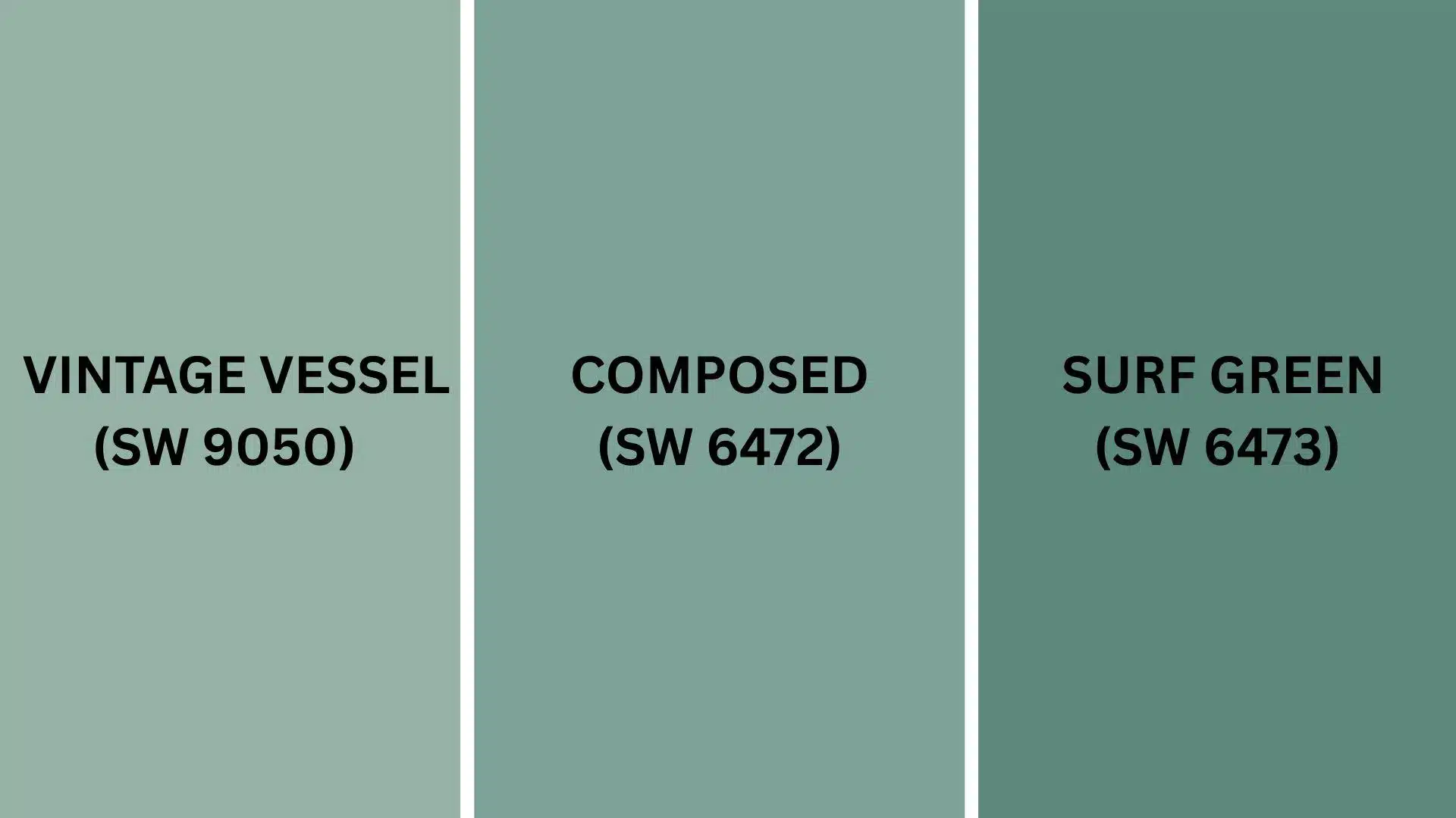
1. Vintage Vessel (SW 9050)
This color offers a softer, more muted version of its playful personality.
It creates calm spaces that still feel joyful and welcoming.
- Gives a gentler, more vintage feel that works beautifully in bedrooms and living rooms.
- Creates peaceful spaces that feel both modern and timeless without being too loud.
- Works perfectly with white trim, natural wood, and soft fabric textures throughout your home.
Your rooms will feel cozy and relaxed with this gentle choice.
It’s like the color’s quieter, more refined cousin.
2. Composed (SW 6472)
This shade provides a deeper, richer version of its lively spirit.
It makes rooms feel more grounded while keeping that happy vibe.
- Offers a stronger color that feels confident and bold without being overwhelming or harsh.
- Creates spaces that feel urbane, calm, and perfect for dining rooms or offices.
- Pairs with gold accents, dark wood furniture, and graceful fabric choices.
This color makes any room feel more put-together and polished.
It’s perfect when you want something bolder than the color.
3. Surf Green (SW 6473)
This option gives a brighter, more energetic version of the color’s joyful character.
It creates spaces that feel fresh and lively.
- Provides more vibrant color that feels perfect for kitchens, bathrooms, or playful spaces.
- Creates rooms that feel alive, joyful, and ideal for areas where families gather.
- Looks amazing with white cabinets, bright accents, and fun decorative pieces throughout.
Your home will feel more energetic and fun with this lively choice.
Final Words
This amazing Sherwin-Williams Hazel proves that the right paint color can completely transform the way your home feels.
From creating peaceful bedrooms to energizing kitchens, it works magic in every space.
The color pairs wonderfully with almost any furniture style and decorating choice you love.
You’ll enjoy how it brightens your days and makes guests feel instantly welcome.
Plus, it’s durable enough to handle busy family life while staying gorgeous for years.
If you choose bold accent walls or subtle whole-room coverage, you can’t go wrong.
This cheerful shade brings the perfect mix of calm and energy to modern living.
Ready to alter your space with this fantastic color?
Share your painting plans in the comments below!
If you want more color reviews, click here to explore other blogs you might enjoy.

Alex Guerrero, a graduate with a Fine Arts degree from the Rhode Island School of Design, has been a visionary in the world of color and design for over 15 years. His professional journey began in the heart of the fashion industry in Milan, where he developed an acute sense for color harmonies and trends. Alex joined our team in 2018, offering fresh and innovative perspectives on color utilization in various spaces. Renowned for his ability to blend contemporary trends with timeless elegance. Outside of work, Alex is an accomplished painter and a volunteer art therapist, his artistic talents further enriching his professional insights.