Want a paint color that brings instant peace and natural beauty to your home?
Liveable Green Sherwin-Williams might be the ideal choice for your next project!
This gorgeous gray-green shade changes ordinary rooms into peaceful, welcoming spaces that feel connected to nature.
It performs beautifully in any room, from cozy bedrooms to busy family kitchens.
You’ll love how it makes your furniture pop while creating a soothing backdrop for daily life.
This versatile color fits perfectly with both modern and traditional decorating styles throughout your home.
If you’re painting an accent wall or altering your entire space, this shade delivers stunning results.
Get ready to know why homeowners everywhere are choosing this calming color for their favorite rooms.
Understanding Sherwin-Williams’ Liveable Green
This is a gorgeous, fresh green paint color by Sherwin-Williams.
It converts boring walls into peaceful, natural spaces that suit nearly every home style.
You can locate this shade as SW 6176.
Color Terminology
Here’s an easy breakdown of the color details you need to know about this paint.
This chart helps you understand the Light Reflectance Value (LRV), RGB, and HEX numbers quickly.
| PROPERTY | VALUE |
|---|---|
| LRV | 61 |
| RGB | 206 / 206 / 189 |
| Hex Value | #CECEBD |
These numbers show the color is a medium-toned, earthy green, excellent for cozy, comfortable rooms.
It shines in farmhouse or casual interiors that want a fresh but grounding backdrop.
Undertones:
- It has gentle gray undertones that keep it refined
- It shifts beautifully as natural light moves throughout your day
- Not a bright green, but a muted, soothing green that feels relaxing
Psychology of Neutral Colors
The paint we choose impacts our daily mood at home, especially adaptable shades like this.
- Soft greens: Build relaxing, nature-inspired environments
- Earthy neutral shades: Make room design so much simpler
- Adaptable wall colors: Change beautifully but stay gorgeous as lighting shifts throughout the day
- Advantages: Covers minor wall imperfections, matches most furniture, creates instant style
Homeowners choose this shade because it feels both classic and fresh today.
It’s like your favorite comfy sweater for your walls, always reliable!
Why Choose Sherwin-Williams Liveable Green (SW 6176)?
Sherwin-Williams Liveable Green is a comforting, natural paint that makes any space feel serene and grounded.
It’s incredibly versatile because it works wonderfully with almost any decor or furniture you already own.
1. Versatility
This shade changes beautifully throughout the day.
Morning light reveals its fresh, nature-inspired qualities, while evening brings out warmer, earthier tones.
You can paint it anywhere, such as family rooms, master suites, or even home offices.
It suits rustic cabins, contemporary lofts, or traditional houses perfectly.
2. Key Features
This hits the perfect balance between subtle and urbane gray tones.
With its moderate LRV of 61, it adds character without overwhelming your space completely.
This shade stays popular because it feels both current and enduring over time.
After painting, you’ll see how it enhances your existing furniture and art.
3. Durability
When applied using Sherwin-Williams’ premium paint lines, it handles daily wear exceptionally well.
This muted gray conceals minor scuffs and daily wear better than lighter shades do.
The high-quality formula maintains its gorgeous appearance even through regular washing and touch-ups over the years.
4. Texture Patterns
This paint gives walls a polished, cohesive appearance that immediately boosts any room’s style.
Its slightly green undertones provide freshness while the gray brings enlightenment without being overwhelming.
It highlights structural details and molding with subtle, graceful contrast throughout your home.
It connects spaces flawlessly while allowing your personal style to shine as the focal point.
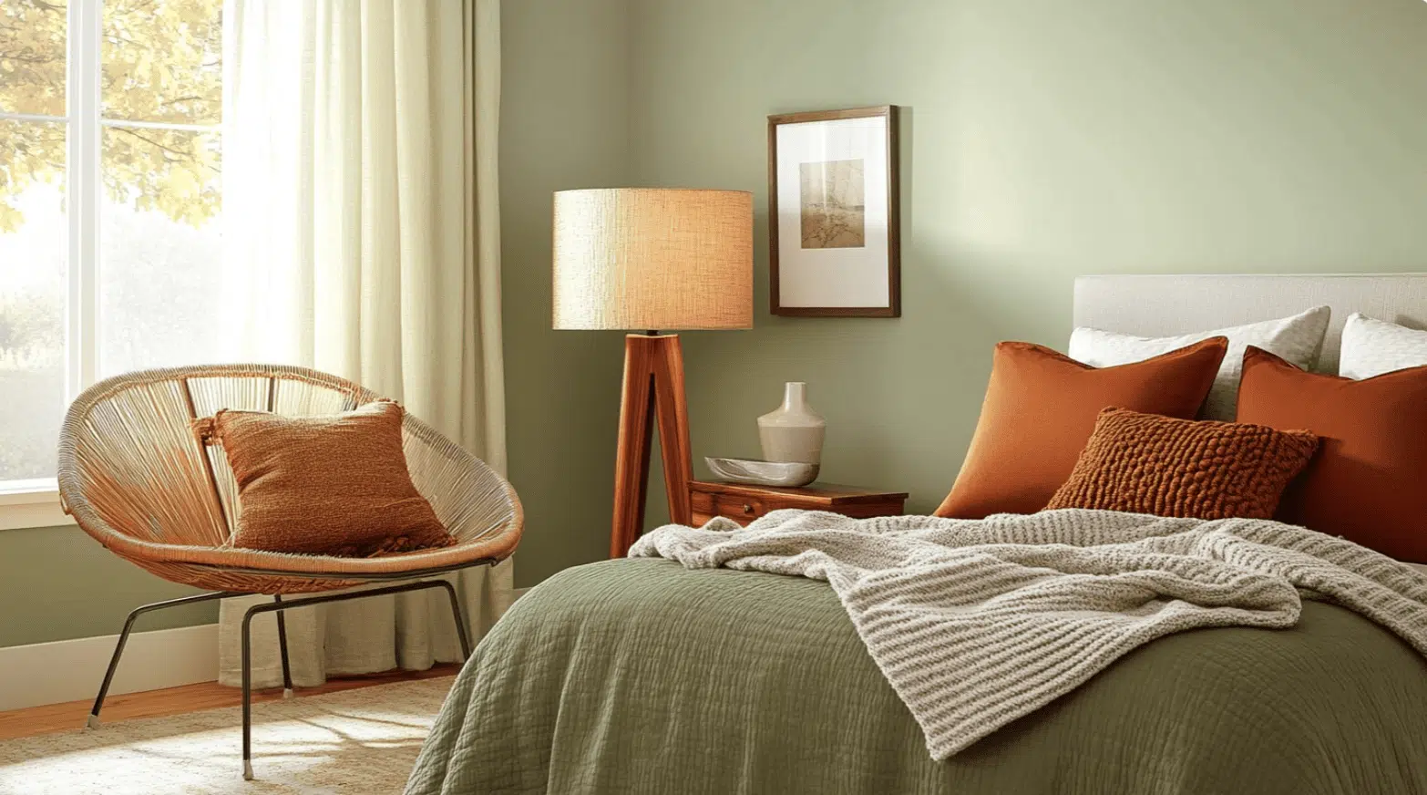
Room Color Recommendations: Sherwin-Williams Liveable Green
This paint makes any room feel peaceful and natural.
It shifts subtly during the day, looking more gray in bright light and greener in softer evening hours.
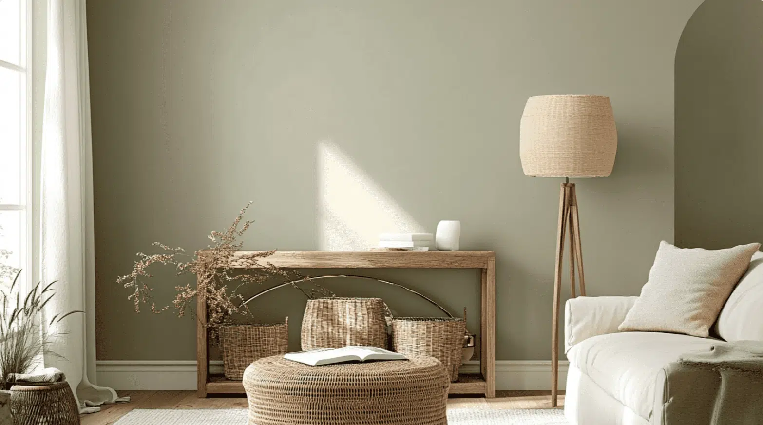
1. Living Spaces and Family Rooms
This shade performs nicely in living areas where your family gathers daily for relaxation and fun.
It creates a soothing backdrop that makes the room feel grounded and comfortable.
- This gentle color helps your bright artwork and colorful accessories pop against the walls.
- It suits both rustic farmhouse and sleek contemporary styles, so it grows with your taste.
- Pair it with warm wood furniture and cream accents for a look that feels earthy yet polished.
Your guests will love how instantly relaxed and welcoming your space feels.
The soft color creates a restful atmosphere that encourages good conversations and quality time together.
2. Kitchens and Dining Areas
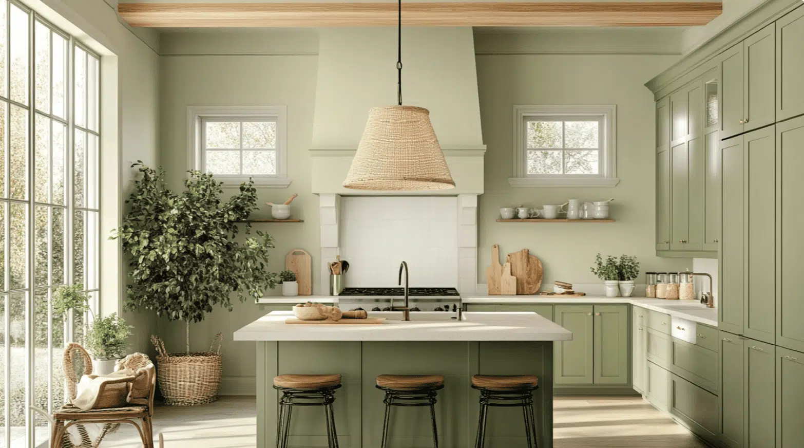
Kitchens painted in this hue feel fresh and natural without being too bright or overwhelming.
It’s ideal for creating a warm gathering spot in your home.
- The muted tone makes kitchens feel spacious and airy while staying cozy and inviting.
- It complements white, cream, or natural wood cabinets perfectly, offering lots of design flexibility.
- In dining areas, this gentle shade sets a relaxed mood for enjoyable family dinners.
Meals feel more special against this soothing background color.
Your kitchen becomes a place where everyone wants to linger and chat over coffee.
3. Bedrooms and Relaxation Spaces
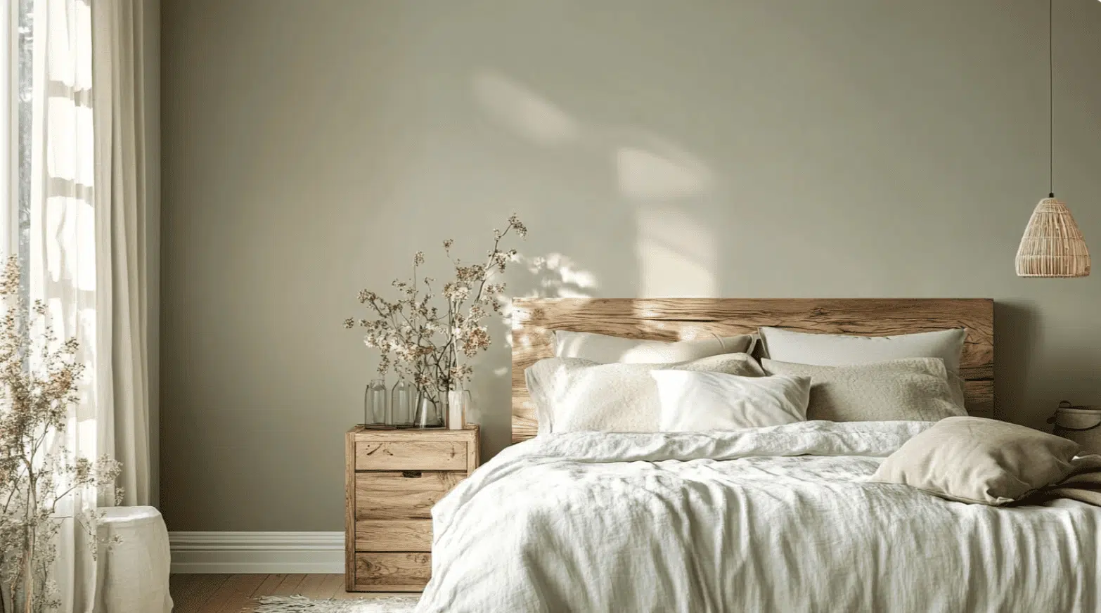
Bedrooms benefit from colors that promote rest and help you feel truly peaceful.
This shade creates the ideal environment for quality sleep and relaxation.
- It alters bedrooms into tranquil retreats that help ease stress after long, busy days.
- This versatile paint color pairs beautifully with white, navy, or warm beige bedding choices.
- It makes tiny bedrooms appear larger while maintaining that cozy sanctuary feeling you crave.
You’ll sleep better in a room painted this restful color.
It’s like wrapping your bedroom in nature’s most calming hug every single night.
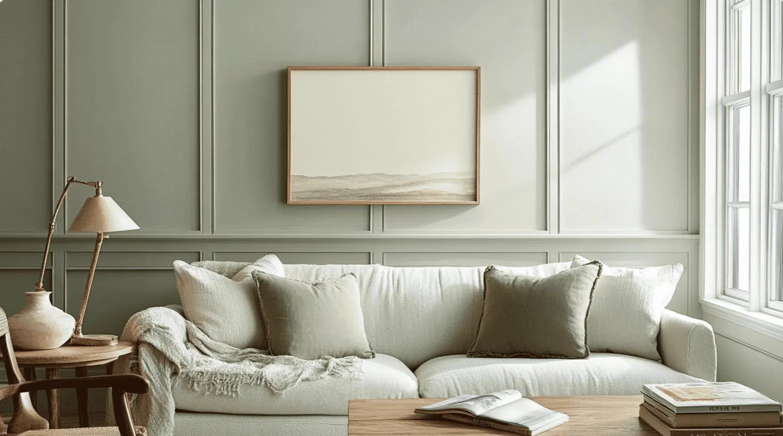
Color Pairings and Combinations for Liveable Green (SW 6176)
This is a calming color that works beautifully in almost every space of your home.
Its balanced tone creates peaceful rooms that feel both natural and cultured throughout your day.
Here are some partner colors for this wonderfully adaptable shade.
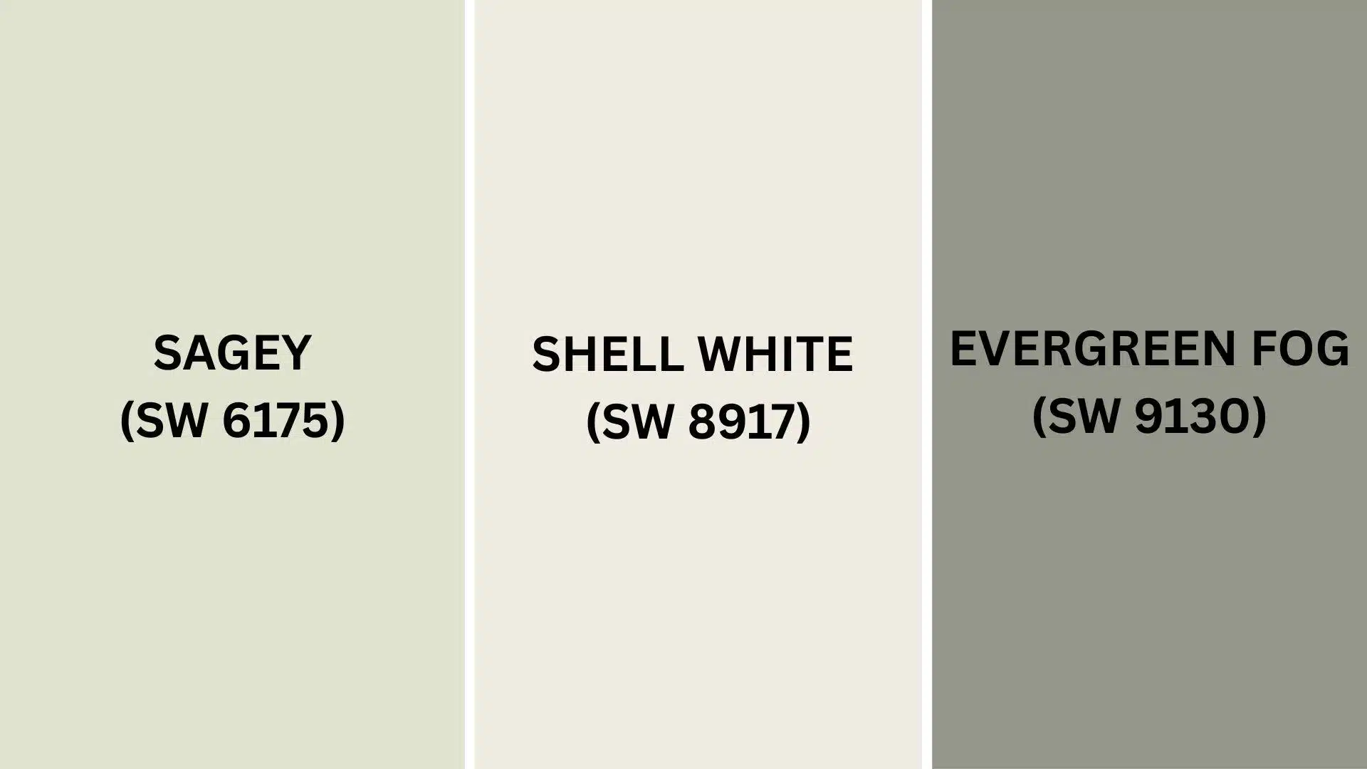
Complementary Trim Colors
Choosing the right colors to pair with this hue can significantly alter the appearance of your space.
These specific colors make stunning combinations with this gentle, loamy gray-green.
1. Sagey (SW 6175)
A deeper, richer green that creates beautiful layered depth when used alongside this main color.
It works completely as accent trim or cabinet color when the walls feature the lighter shade.
This pairing brings nature indoors while maintaining a refined, pulled-together appearance that feels both current and timeless.
2. Shell White (SW 8917)
A warm, creamy white that makes this color really shine and stand out beautifully.
It highlights doorframes and ceiling details without creating harsh contrast that feels jarring or uncomfortable.
Your trim will look crisp and clean while keeping the overall mood soft and inviting.
3. Evergreen Fog (SW 9130)
A moody, deeper gray that adds drama and richness when used as accent elements.
It creates gorgeous contrast on feature walls or built-in shelving when paired with the main color.
This combination feels like bringing a peaceful forest into your home with luxury, designer-level refinement.
Creating Cohesive Color Schemes
Sherwin-Williams Liveable Green pairs beautifully with many other colors to create a balanced flow throughout your home.
This relaxing, gray-green serves as an excellent foundation for various decorating approaches and personal styles.
Here are three different color schemes that feature this versatile hue as the star.
| SCHEME | MAIN WALLS / AREAS | TRIM / ACCENT / CEILINGS | OTHER ROOMS / ACCENTS |
|---|---|---|---|
| Monochromatic | Liveable Green (SW 6176) | Sagey (SW 6175) | Evergreen Fog (SW 9130), Clary Sage (SW 6178) |
| Warm | Liveable Green (SW 6176) | Shell White (SW 8917) | Whole Wheat (SW 6121), Natural Linen (SW 9109) |
| Cool | Liveable Green (SW 6176) | Iron Ore (SW 7069) | Tradewind (SW 6218), Rainwashed (SW 6211) |
NOTE: All colors shown are Sherwin-Williams paints. Colors will appear different depending on your lighting, so always test samples on your walls before buying full gallons.
Coordinating with Furniture and Decor
Sherwin-Williams Liveable Green creates a perfect canvas that makes your furniture and accessories shine beautifully.
Its gray-green tone provides a calming foundation that highlights your favorite pieces without overpowering the space.
1. Wood Tones
Rich woods like cherry, walnut, and dark oak create gorgeous warmth against these earthy walls perfectly.
The combination feels both refined and welcoming at once.
Lighter woods such as birch and pine bring fresh, airy vibes when paired with this gentle shade.
Natural wood tones complement the color’s organic feeling wonderfully.
2. Metals
Brass and copper fixtures glow beautifully against the gray-green background, adding graceful warmth throughout your space.
Silver and stainless steel hardware offer crisp contrast that feels contemporary without being harsh or cold.
Black iron accents create striking definition on the walls, bringing bold style that enhances any room’s character.
3. Decor
Warm colors like terracotta, golden yellow, and burnt orange create stunning focal points against these soothing walls.
They add personality and energy without feeling overwhelming or too busy for daily living.
Cool tones, such as soft blues, lavender, or cream, blend seamlessly with this paint, creating serene, spa-like atmospheres.
Natural textures like woven baskets, linen curtains, and ceramic vases enhance the color’s earthy, organic appeal.
Alternative Paints Similar to Sherwin-Williams Liveable Green
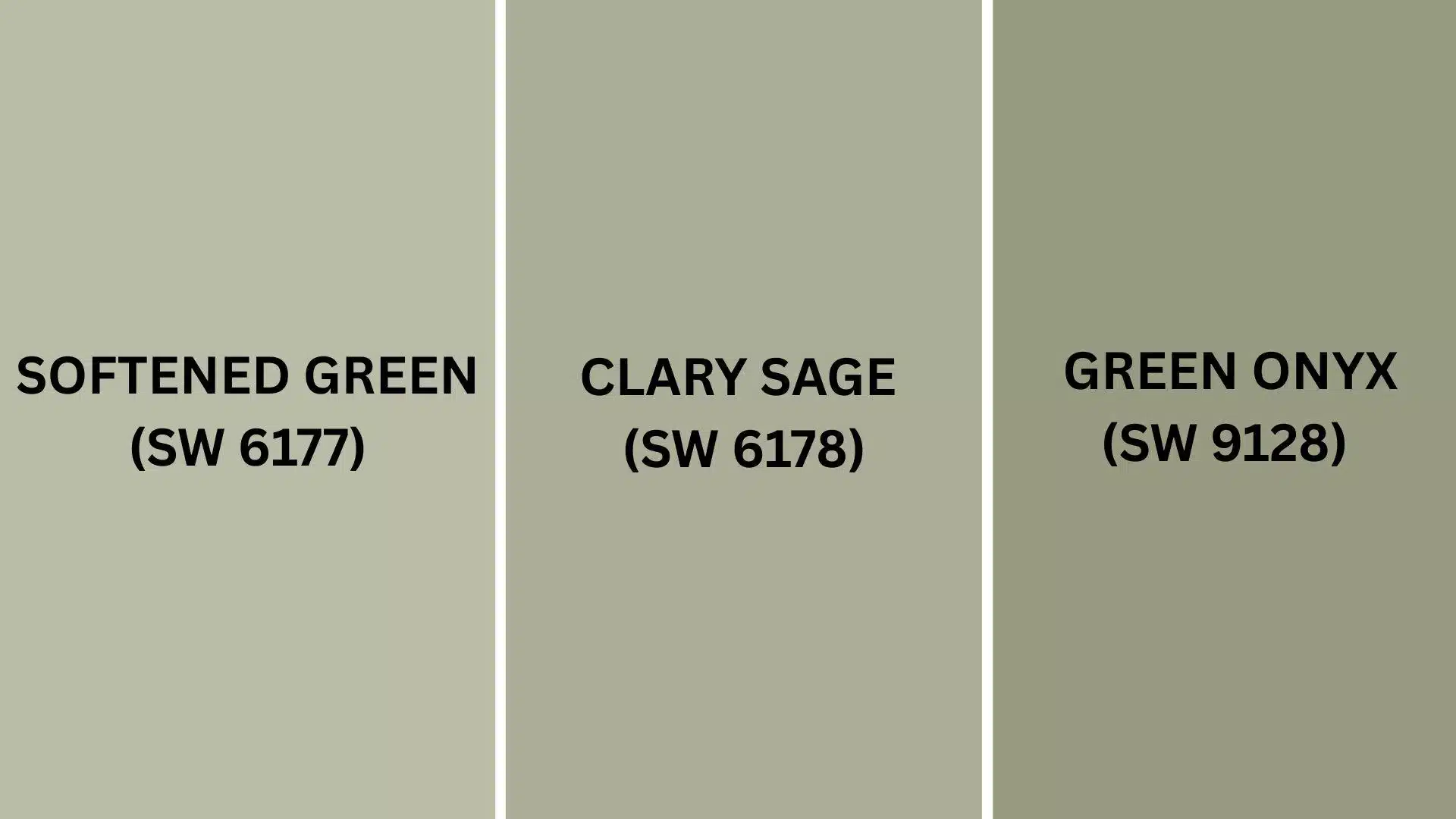
If you enjoy this shade but want to see other possibilities, explore these related options.
Each offers the same soothing nature but adds its unique character to your rooms.
1. Softened Green (SW 6177)
Softened Green provides a gentler, more peaceful take with subtle gray hints woven throughout.
It alters rooms into quiet, breathable spaces.
- Brightens areas while maintaining that organic, nature-inspired feel you love so much.
- Shines especially well in darker corners where you need extra freshness and vitality.
- Complements ivory, beige, or natural stone elements for a pleasant, balanced appearance.
This option works wonderfully when you prefer something quieter and more understated overall.
It delivers the same peaceful energy but with a softer, more whispered presence.
2. Clary Sage (SW 6178)
Clary Sage delivers a richer take with stronger botanical undertones coming through beautifully.
It brings warmth and substance to every corner.
- Establishes inviting environments that connect you to the outdoors without overwhelming your senses.
- Reveals lovely complexity that enhances boring surfaces and built-in features throughout your home.
- Shifts gently with daylight, offering new moods as shadows dance across your walls.
Your space will feel grounded and welcoming with this thoughtful selection.
It’s ideal for establishing cozy retreats where memories are made and stories unfold.
3. Green Onyx (SW 9128)
Green Onyx presents a bolder choice with richer charcoal influences for enhanced visual impact.
It creates urbane, museum-quality atmospheres.
- Enriches compact areas while preserving a gentle, approachable quality that invites conversation.
- Contains sufficient complexity to captivate without becoming overwhelming or too intense for daily living.
- Blends beautifully with various accent shades from pastels to deep jewel tones throughout.
This selection establishes rooms that feel curated and professionally designed with care.
It’s like Liveable Green’s worldly sibling, bringing high style to every space.
Final Thoughts
Liveable Green by Sherwin-Williams proves that choosing the right paint can completely transform the way your home feels every day.
From creating tranquil bedrooms to energizing kitchens, it works magic in every single space you paint.
The color pairs beautifully with almost any furniture style and decorating choice you already love.
You’ll enjoy how it brightens your mood and makes guests feel instantly welcome in your home.
Plus, it’s durable enough to handle a busy family life while staying gorgeous for many years to come.
If you choose bold feature walls or subtle whole-room coverage, you simply cannot go wrong with this choice.
This peaceful shade brings the perfect mix of calm and refinement to modern living spaces.
Ready to convert your home with this fantastic color?
Share your painting ideas in the comments below!
If you’re interested in more color review content, feel free to click here and explore other blogs that you might like.

Alex Guerrero, a graduate with a Fine Arts degree from the Rhode Island School of Design, has been a visionary in the world of color and design for over 15 years. His professional journey began in the heart of the fashion industry in Milan, where he developed an acute sense for color harmonies and trends. Alex joined our team in 2018, offering fresh and innovative perspectives on color utilization in various spaces. Renowned for his ability to blend contemporary trends with timeless elegance. Outside of work, Alex is an accomplished painter and a volunteer art therapist, his artistic talents further enriching his professional insights.