
Searching for the perfect gray paint that’s neither too warm nor too cold?
Sherwin Williams March Wind might be exactly what you’ve been looking for.
This popular shade has been winning over homeowners and designers alike.
Its balanced undertones and versatile nature make it special.
If you’re updating your living room, creating a calming bedroom retreat, or refreshing your kitchen, March Wind delivers.
It provides a graceful yet approachable backdrop that works with nearly any decorating style.
Unlike many grays that can feel flat or harsh, March Wind brings a subtle depth.
It changes beautifully throughout the day.
You’ll find out why it might be the perfect choice for your next painting project.
Understanding Sherwin Williams’ March Wind
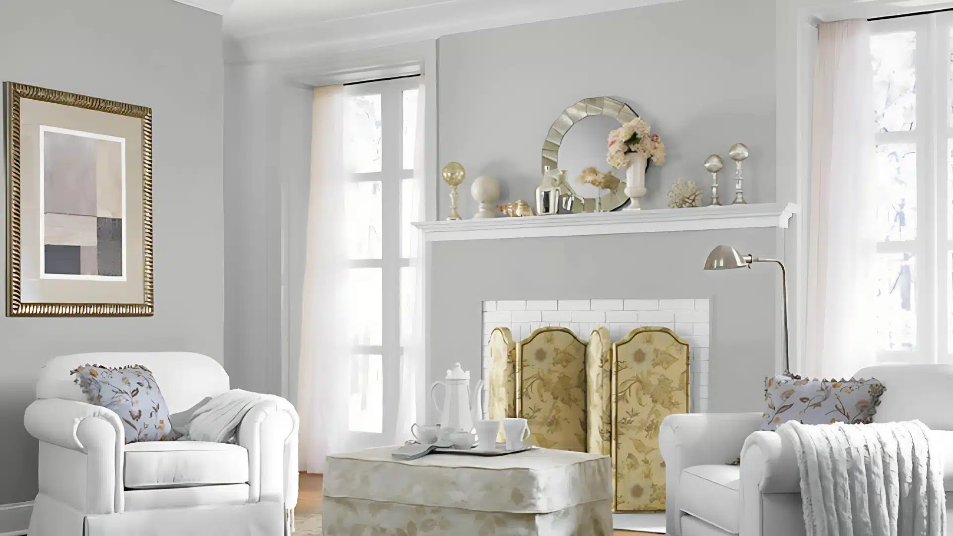
March Wind SW 7668 is a light gray shade with subtle blue undertones from Sherwin Williams.
It creates a calm, airy feeling in any space while maintaining a neutral versatility.
This popular color works beautifully in living rooms, bedrooms, and home offices where a serene atmosphere is desired.
Color Terminology
Understanding the technical aspects of March Wind helps explain its versatile appeal in modern homes.
Every shade has specific measurements that define its character and performance.
| PROPERTY | VALUE |
|---|---|
| LRV | 49 |
| RGB | 186 / 185 / 182 |
| Hex Value | #BAB9B6 |
The moderate LRV indicates March Wind will maintain its color depth while still reflecting enough light to feel welcoming.
Designers often reference these exact values when creating cohesive color schemes across different materials.
Undertones of March Wind SW 7668
- Soft blue undertones give this gray a cool, refreshing quality.
- Slight lavender hints emerge in certain lighting conditions, adding depth.
- Subtle green undertones may appear when paired with warm woods or beige elements.
The Psychology of March Wind SW 7668
March Wind SW 7668 affects our emotions and behavior in subtle but meaningful ways.
The psychological impact of this refined gray extends far beyond simple aesthetics into how we experience our living spaces.
- Instantly creates a sense of peaceful intricacy in any space.
- Reduces anxiety through its balanced gray-blue undertones.
- Adapts to your mood as natural light changes throughout the day.
- Promotes focused thinking while maintaining a welcoming atmosphere.
Many homeowners report feeling more centered and present in rooms painted with March Wind.
This connection explains why this color remains a favorite for those seeking beauty and emotional comfort in their homes.
Why Choose Sherwin Williams March Wind
March Wind SW 7668 stands out as one of Sherwin Williams’ most popular gray paint colors.
This gentle shade offers many benefits for homeowners looking to refresh their spaces.
Below are the key reasons why designers and homeowners alike continue to select this timeless color for their projects.
1. Versatility
March Wind works beautifully in almost any room of your home.
It shines in living rooms, creating a calm backdrop for colorful furniture. In bedrooms, it helps create a restful environment.
This adaptable gray also looks great in kitchens, bathrooms, and hallways.
It pairs well with white trim, wood tones, and most accent colors, making it easy to match with existing decor.
2. Key Features
This paint color offers excellent coverage with typically just two coats needed.
Its soft gray tone has subtle blue undertones that change slightly throughout the day as light shifts.
March Wind has a smooth finish that hides minor wall imperfections.
The color appears slightly lighter in big, sunny rooms and a bit deeper in smaller spaces or rooms with less natural light.
3. Durability
Sherwin Williams formulates March Wind to last for years without fading or yellowing.
The paint resists common household stains and can be gently cleaned without damaging the color.
Its quality ingredients mean walls stay looking fresh longer than with budget paints.
Many homeowners report their March Wind walls still looking great after 5+ years, even in busy family homes.
4. Texture Patterns
March Wind adapts beautifully to different wall textures. On smooth walls, it appears clean and modern.
With a light texture, it creates subtle depth that adds interest.
The color works well with specialized techniques like color washing or rag rolling for custom effects.
Even on textured ceilings, March Wind maintains its balanced gray tone without becoming too dark or overwhelming.
Room Color Recommendations: Sherwin Williams March Wind
March Wind SW 7668 brings a special touch to different rooms in your home. This gentle gray can convert spaces based on how you use it.
Here’s how to best use this versatile color throughout your house.
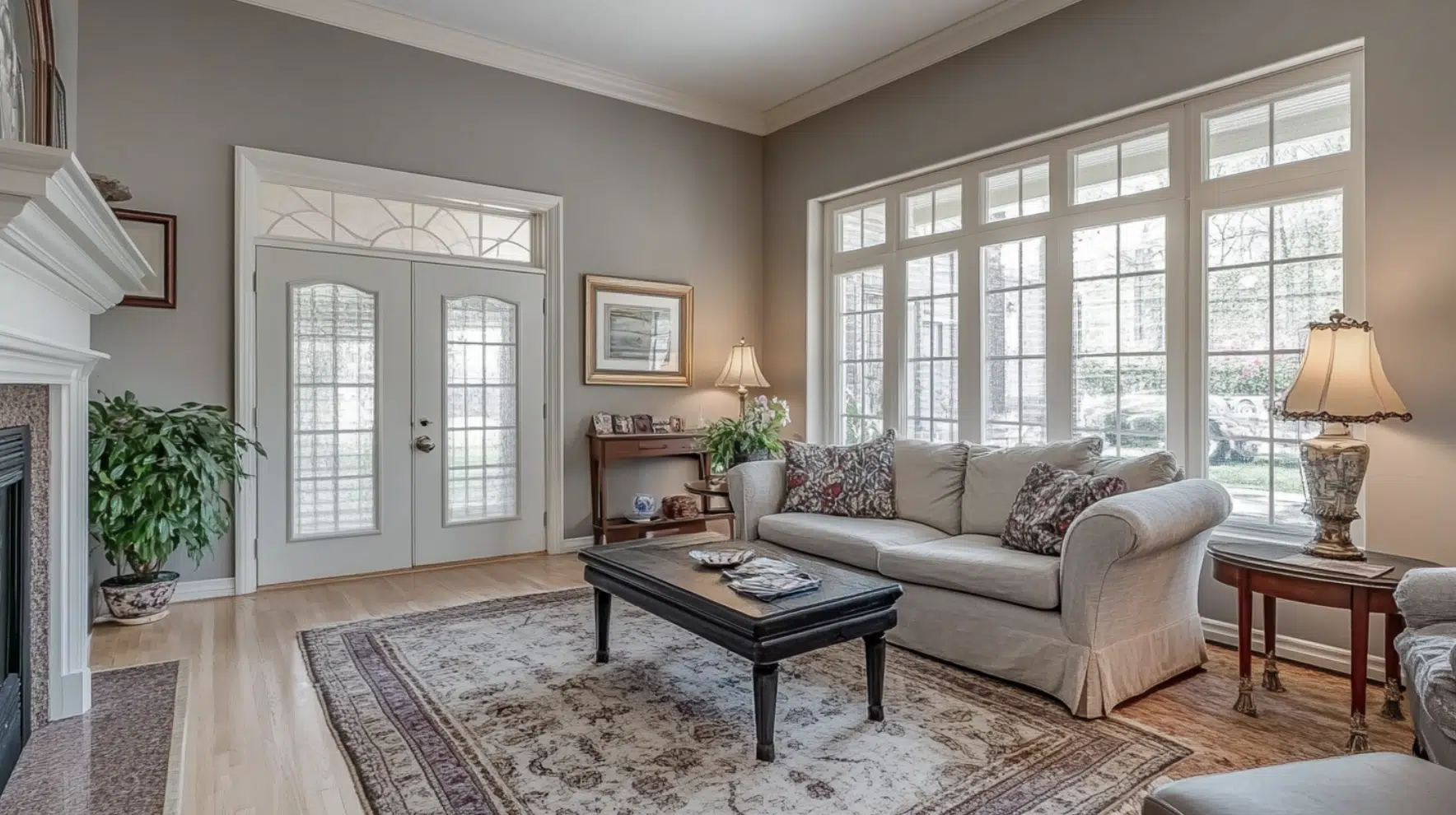
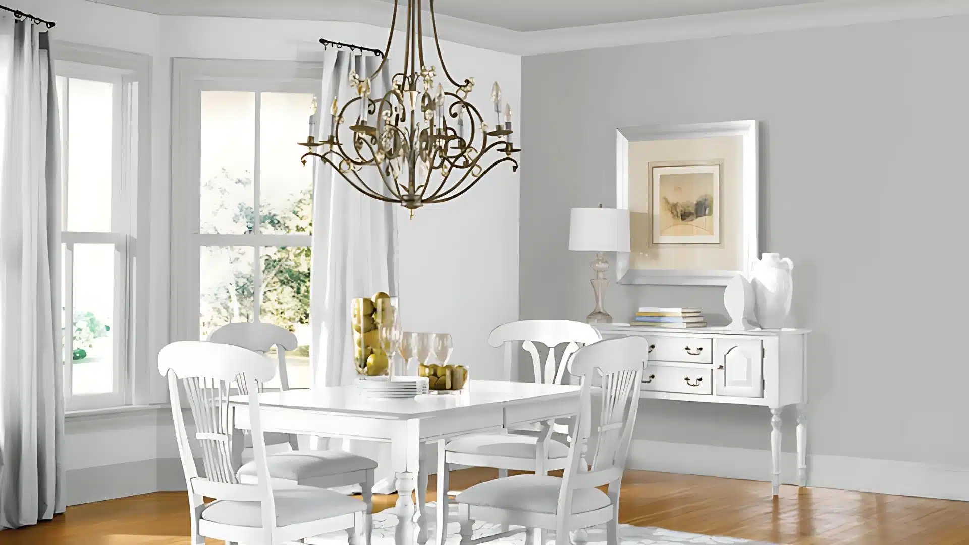
1. Living Spaces and Family Rooms
Living rooms and family areas need colors that make everyone feel welcome while handling daily activities.
March Wind creates a perfect backdrop for these busy spaces without overwhelming them.
- Pairs beautifully with navy blue or burgundy accent pieces for a classic, cozy feel.
- Creates a neutral canvas that allows colorful artworks to stand out.
- Looks especially striking with natural light from large windows or sliding doors.
Many homeowners find that March Wind helps their living spaces feel both put-together and relaxed.
This balance makes it ideal for rooms where you entertain guests and spend time with family.
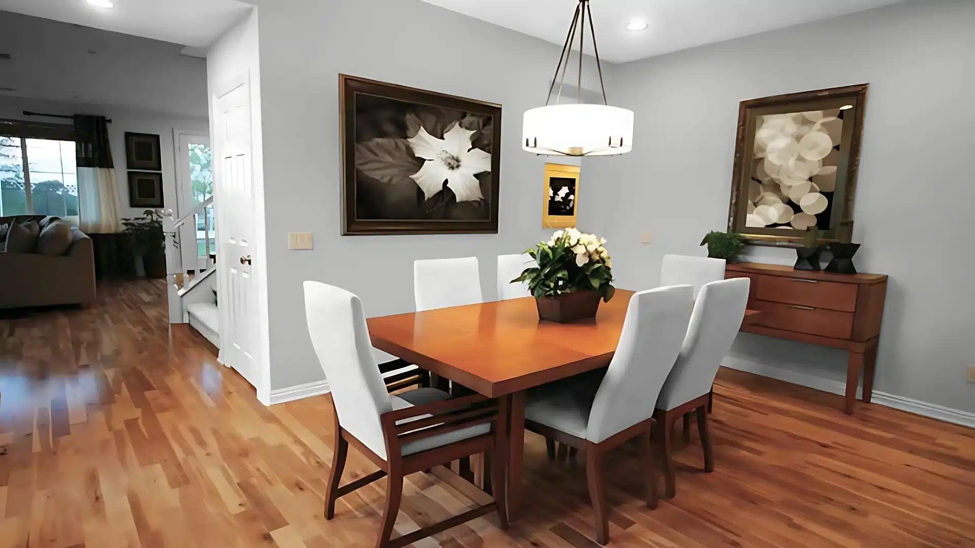
2. Kitchens and Dining Areas
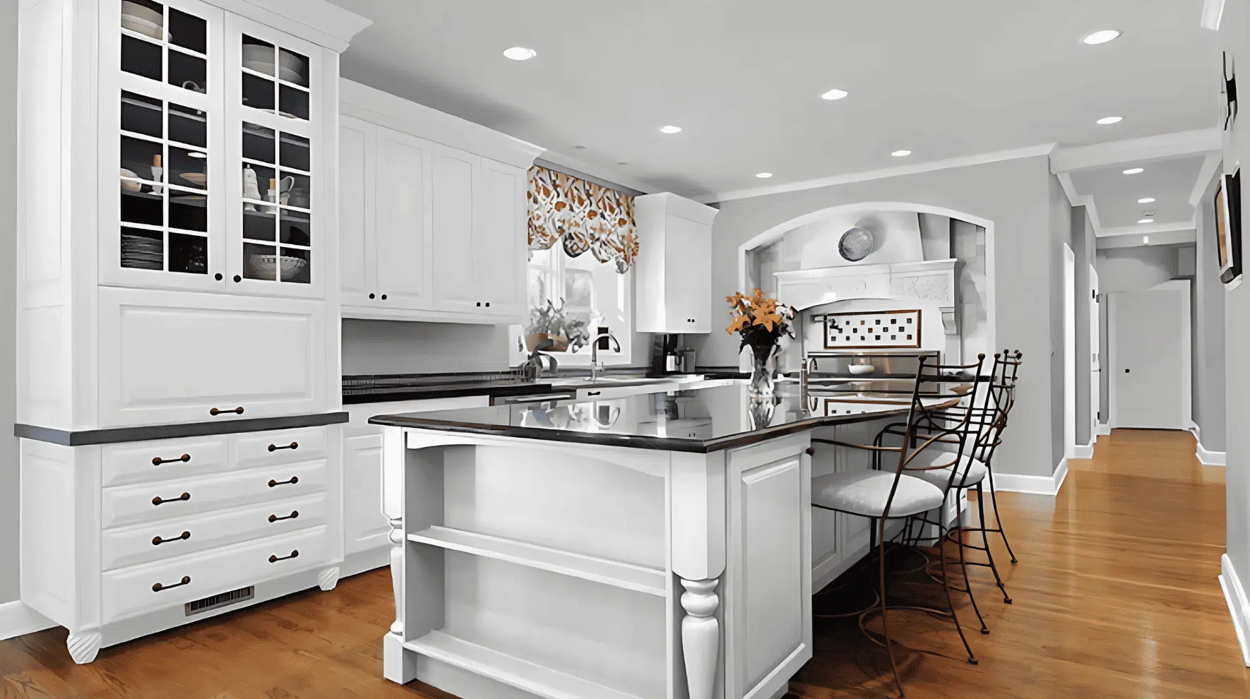
Food-focused spaces benefit from clean yet warm colors.
March Wind offers these qualities while complementing the materials typically found in kitchens and dining rooms.
- Contrasts nicely with white cabinets while being softer than stark white walls.
- Makes stainless steel appliances look more integrated with the rest of the kitchen.
- Creates a pleasant atmosphere for meals without competing with food colors.
Kitchens painted in March Wind tend to feel more spacious and organized.
The subtle depth of the colors helps dining areas feel intentional and pulled together without being too formal.
3. Bedrooms and Relaxation Spaces
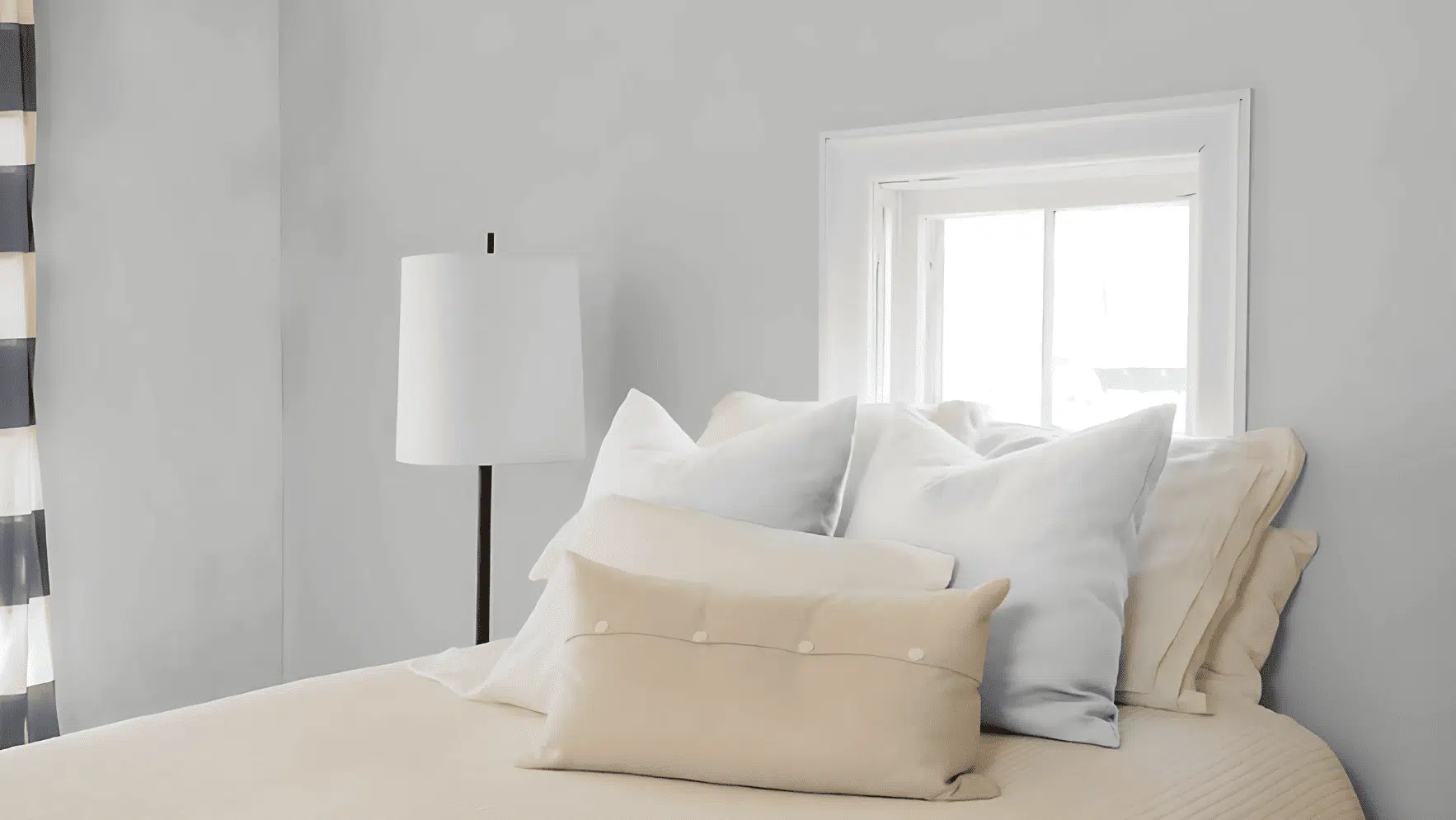
Rest areas need colors that help calm the mind and promote peaceful feelings.
March Wind’s soft gray tones create the perfect environment for unwinding and sleeping.
- Creates a cocoon-like feeling when used on all four walls of a bedroom.
- Serves as an excellent background for soft bedding in whites, blues, or greens.
- Helps reduce visual noise that might interfere with relaxation and good sleep.
People often comment that bedrooms painted with March Wind feel like peaceful retreats.
This soothing quality makes it an excellent choice for any space dedicated to rest and rejuvenation.
Color Pairings and Combinations for Sherwin Williams March Wind
March Wind SW 7668 truly shines when paired with complementary colors that enhance its subtle beauty.
The right color combinations can change this versatile gray into either a cool, contemporary backdrop or a warm, inviting foundation.
Here are some excellent trim color options that work with March Wind.
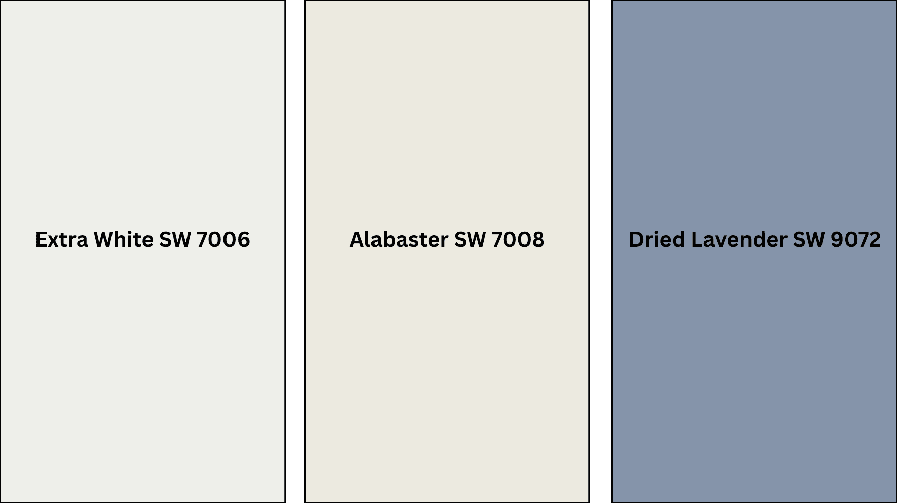
Complementary Trim Colors
Selecting the right trim color is essential for highlighting March Wind’s subtle beauty and defining your space’s architectural features.
The perfect trim creates visual definition while enhancing the wall color rather than competing with it.
1. Extra White (SW 7006)
Extra White creates a crisp, clean contrast against March Wind’s soft gray tones.
This bright white trim helps define structural details and makes the wall color appear richer and defined.
The combination feels fresh and contemporary, perfect for modern homes that still want warmth and character.
2. Alabaster (SW 7008)
Alabaster offers a softer white option with subtle warmth that gently complements March Wind.
This creamier white creates a more cohesive look that feels refined and timeless.
Many designers choose this pairing for traditional homes or spaces where a slightly softer transition between wall and trim is desired.
3. Dried Lavender (SW 9072)
Dried Lavender brings out the subtle purple undertones that can appear in March Wind under certain lighting conditions.
This unexpected pairing creates a refined, unique look that feels both current and timeless.
The combination works especially well in bedrooms, reading nooks, or any space where you want to create a sense of calm creativity.
Creating Cohesive Color Schemes
Designing with March Wind SW 7668 opens up endless possibilities for creating flow between rooms.
This versatile gray serves as an excellent foundation color that supports various design directions.
Consider these thoughtfully coordinated palettes to maximize this refined neutral’s potential.
| SCHEME | MAIN WALLS / AREAS | TRIM / ACCENT / CEILINGS | OTHER ROOMS / ACCENTS |
|---|---|---|---|
| Natural | March Wind (SW 7668) | Pure White (SW 7005) | Agreeable Gray (SW 7029), Sea Salt (SW 6204) |
| Warm | March Wind (SW 7668) | Accessible Beige (SW 7036) | Balanced Beige (SW 7037), Repose Gray (SW 7015) |
| Cool | March Wind (SW 7668) | Misty (SW 6232) | North Star (SW 6246), Rainwashed (SW 6211) |
NOTE: All colors shown are Benjamin Moore paints. Colors will look different in your home’s lighting, so always test samples first before buying full gallons.
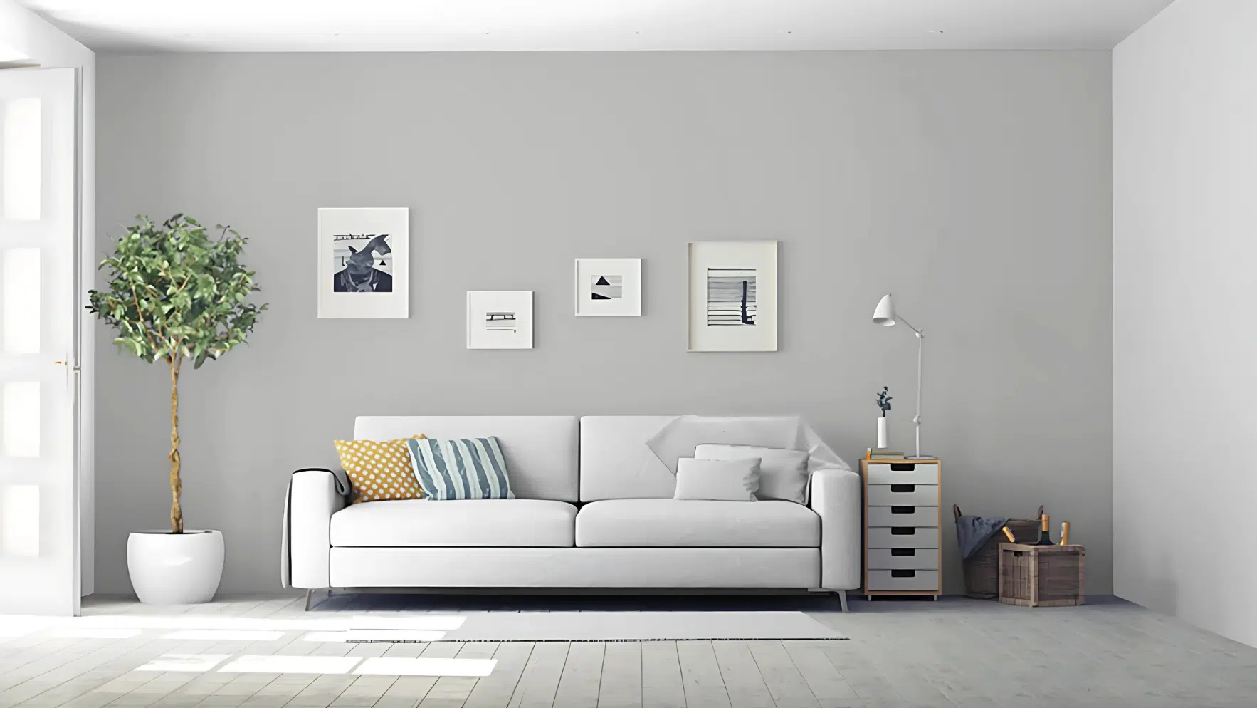
Coordinating with Furniture and Decor
March Wind SW 7668 creates a beautiful backdrop for your furniture and decorative items.
This versatile gray works with many different styles and materials.
Getting the right combinations will help your room look pulled together and professionally designed.
Here’s how to pair this popular paint color with various elements in your home.
1. Wood Tones
March Wind looks stunning with most wood finishes.
Medium-toned woods like oak and walnut create a balanced, natural look against this gray.
Darker woods like mahogany or espresso provide a dramatic contrast that feels refined.
Even lighter woods such as maple or birch work well, bringing warmth to balance the cool undertones of March Wind.
2. Metals
Brushed nickel and chrome hardware pop beautifully against March Wind walls, enhancing the cool undertones.
Brass and gold accents create a pleasing contrast and add warmth to spaces painted in this gray.
Matte black metal pieces look refined and modern when set against this color, perfect for contemporary design styles.
3. Decor
Blue and green textiles complement March Wind’s subtle undertones, creating a cohesive look.
Patterns with gray backgrounds and colorful accents help tie a room together while adding visual interest.
White ceramics, glass elements, and natural materials like woven baskets stand out nicely against this paint color, adding texture and dimension to your space.
Alternative Paints Similar to March Wind SW 7668
If you like March Wind SW 7668 but want to explore other options, Sherwin Williams offers several similar colors.
These alternatives share qualities with March Wind, but each has its own unique character.
Comparing these options can help you find the perfect shade for your specific lighting conditions and design goals.
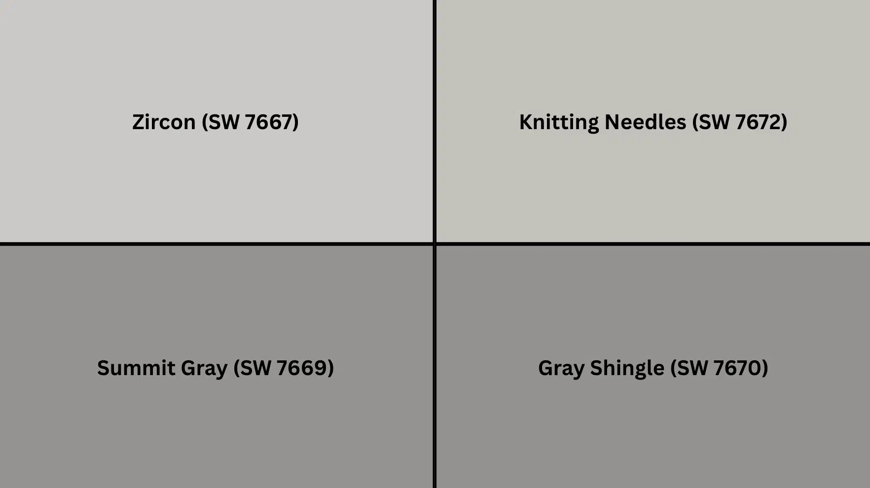
1. Zircon (SW 7667)
Zircon is slightly lighter than March Wind with similar cool undertones.
This paler gray creates an airier feel while maintaining the refined look you love.
Zircon works particularly well in smaller rooms or spaces with limited natural light, where March Wind might appear too dark.
Many homeowners choose this shade for a more subtle, bright approach to gray.
2. Knitting Needles (SW 7672)
Knitting Needles offers a deeper, more saturated version of March Wind’s gray palette.
This medium-toned gray has similar undertones but with added richness and depth.
It creates a cozier, more intimate atmosphere in living rooms and bedrooms.
Knitting Needles provides more dramatic contrast with white trim while still maintaining a versatile neutral quality.
3. Summit Gray (SW 7669)
Summit Gray leans more blue than March Wind, creating a cooler, crisper feeling.
This gray appears more active, shifting noticeably as light changes throughout the day.
Summit Gray pairs beautifully with cool whites and silver accents.
Many designers choose this shade for bathrooms and kitchens where its cleaner undertones complement tile and fixtures.
4. Gray Shingle (SW 7670)
Gray Shingle introduces warm undertones that March Wind doesn’t have.
This creates a softer, more welcoming gray that feels less modern and more traditional.
Gray Shingle works wonderfully with warm wood tones and beige accents.
This color is perfect for living spaces where you want to maintain gray’s refinement while adding approachable warmth.
Wrapping It Up
Sherwin Williams March Wind stands as one of the most versatile gray paint colors available today.
Its balanced undertones make it special.
The middle-range light reflectance value makes it suitable for nearly any room in your home.
It pairs well with crisp whites, warm woods, or bold accent colors. March Wind creates a foundation that’s both current and lasting.
Consider it for your next painting project. This refined gray offers a rare combination of character and neutrality.
It works across different lighting conditions and decorating styles.
March Wind adapts to various environments while maintaining its polished quality.
Sherwin Williams March Wind truly deserves its place among today’s most sought-after paint colors.
If you want more color reviews, click here to explore other blogs you might enjoy.

Alex Guerrero, a graduate with a Fine Arts degree from the Rhode Island School of Design, has been a visionary in the world of color and design for over 15 years. His professional journey began in the heart of the fashion industry in Milan, where he developed an acute sense for color harmonies and trends. Alex joined our team in 2018, offering fresh and innovative perspectives on color utilization in various spaces. Renowned for his ability to blend contemporary trends with timeless elegance. Outside of work, Alex is an accomplished painter and a volunteer art therapist, his artistic talents further enriching his professional insights.