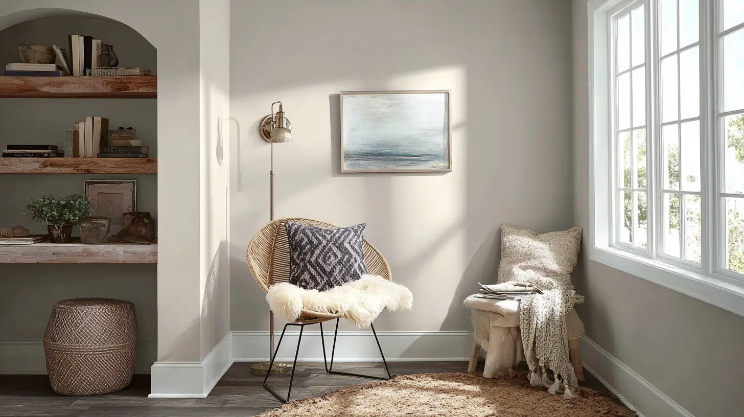
In a world of infinite paint choices, few colors achieve the perfect balance between refinement and serenity like Sherwin-Williams Misty.
It’s a carefully crafted neutral that changes ordinary spaces into havens of calm and grace.
With its soft blue foundation and subtle gray undertones, Misty captures the essence of coastal tranquility while maintaining contemporary refinement.
This versatile, timeless design adapts beautifully to your lifestyle needs.
Whether you’re crafting a serene spa getaway or planning grand entertaining spaces.
Misty serves as the perfect backdrop for artwork, allowing your collections to shine while providing visual cohesion throughout your home.
This is more than just paint; it’s the foundation for creating spaces that feel both current and enduring.
Welcome to your new favorite neutral.
Understanding Paint Color Basics
Paint color success depends on three key factors.
Light Reflectance Value (LRV) determines brightness levels.
Undertones affect how colors appear in different lighting conditions.
Complementary relationships create visual symmetry between colors.
Understanding these fundamentals helps you choose colors that work beautifully together.
This knowledge ensures you achieve your desired mood and aesthetic in every space.
Color Terminology
Understanding essential color terminology empowers you to make confident paint decisions and communicate effectively with designers about your vision and preferences.
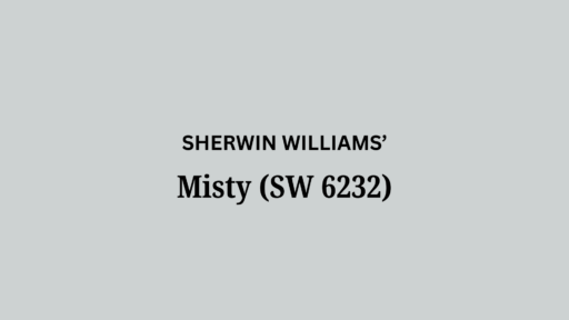
These numbers help you understand the true nature of this beautiful paint.
| PROPERTY | VALUE |
|---|---|
| LRV | 64 |
| RGB | 205 / 210 / 210 |
| Hex Value | #CDD2D2 |
Armed with this color knowledge, you can steer paint selection with confidence, creating refined spaces that reflect your style while achieving professional-quality results.
Keep these codes handy when shopping for matching furniture and decor online.
Undertones
Undertones are the subtle hues beneath a paint’s surface that dramatically influence how colors appear and interact in your space.
Here are Misty’s undertones:
- Misty has primary blue undertones with secondary gray undertones.
- It also has a subtle green undertone.
- The undertones are definitely cool in temperature.
Understanding Misty’s undertones will surely help to make confident design choices.
Psychology of Dark Colors
Colors powerfully influence our emotions and behavior, making an understanding of color psychology essential for creating spaces that truly support your lifestyle and well-being.
- Misty creates a complex environment that primarily promotes calm, focus, and culture.
- Its blue-gray composition offers the stress-reducing benefits of blue combined with the refined stability of gray.
- Ideal for spaces where tranquility and refinement are desired.
People love Misty because it feels both timeless and peaceful at once.
By harnessing color psychology, you can intentionally design environments that improve mood, productivity, and comfort.
This converts your home into a sanctuary that nurtures your daily life.
Why Choose Sherwin-Williams Misty?

Sherwin-Williams Misty offers the perfect balance of calming blue and urbane gray, creating spa-like tranquility while maintaining extravagant neutrality that works beautifully in any room.
1. Key features
Misty is a soft and cool blue-gray color that is unsure whether it’s more blue or more gray.
Misty is in the blue color family; however, it also has a lot of gray.
This dual nature makes it incredibly adaptable to different design styles and lighting conditions.
Misty makes spaces feel larger and brighter while maintaining color depth.
It functions as both a color statement and a neutral backdrop
2. Durability
Light colors like Misty with higher LRV values typically show better fade resistance over time.
Misty is an easy choice for a beach or coastal home because it will look tropical in warm sunlight.
It’s best suited for protected exterior applications or coastal environments.
Its light-reflective quality makes Misty an excellent choice for hallways and entryways.
The color helps brighten and open up these transitional spaces.
3. Versatility
Sherwin-Williams Misty’s blue-gray tone beautifully supplements various texture patterns.
On smooth walls, it creates a clean, modern look.
With subtle textures like eggshell or satin finishes, it adds gentle depth while maintaining serenity.
The color complements natural textures beautifully.
It works well with wood grain and stone surfaces.
This adds coastal grace to any space.
4. Texture Patterns
Sherwin-Williams Misty improves various texture patterns beautifully.
On smooth walls, it creates a clean, modern look.
With subtle textures like eggshell or satin finishes, it adds gentle depth while maintaining serenity.
The color complements natural textures, enhancing wood and stone surfaces for coastal refinement.
Room-by-Room Color Recommendations with Misty
Misty converts every space: bedrooms become serene retreats, bathrooms feel spa-like, living areas gain calm, and kitchens achieve timeless grace.
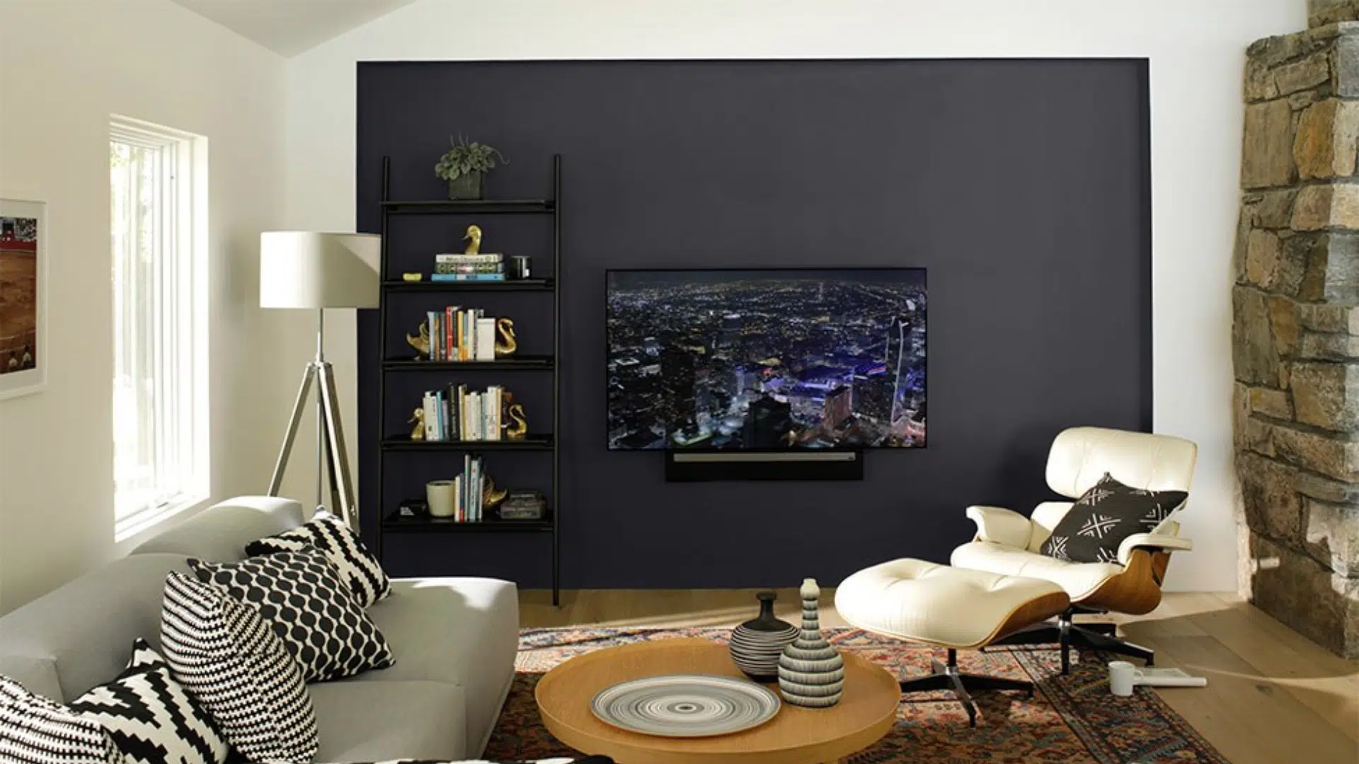
1. Living Spaces and Open Floor Plans

Open floor plans require colors that create a sense of flow and cohesion, making Misty’s refined neutrality ideal for connecting diverse living spaces.
Misty proves its versatility by unifying different functional areas while maintaining the cultured classiness that makes every space feel intentionally designed.
2. Bedrooms and Relaxation Areas

Bedrooms should be sanctuaries of calm, and Misty’s spa-like qualities make it the perfect foundation for creating truly restful, restorative spaces.
It converts any bedroom into a comfortable retreat, offering hotel-quality luxury and a calming, sleep-friendly atmosphere.
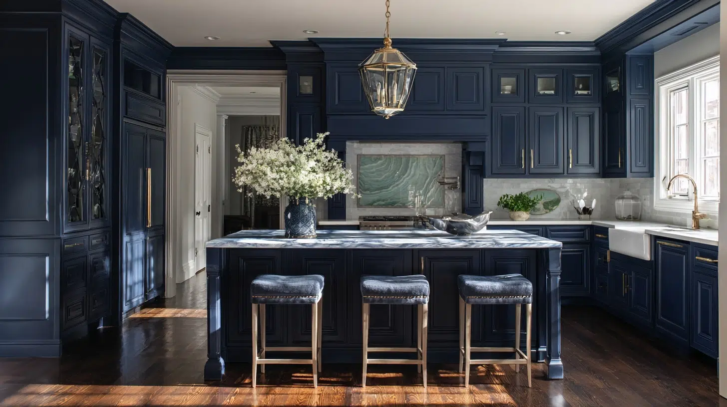
3. Kitchens and High-Traffic Zones

High-traffic areas need colors that remain beautiful under pressure, and Misty’s durability makes it ideal for busy kitchens and active spaces.
In kitchens, Misty proves that practical doesn’t mean boring, delivering timeless dignity that withstands daily life while maintaining its serene nature.
4. Bathrooms and spa-like retreats

Bathrooms offer the perfect opportunity to create personal spa experiences, and Misty’s naturally calming blue-gray tones make this modification effortless and graceful.
In bathrooms and spa-like retreats, Misty creates the ultimate escape, changing daily routines into moments of tranquil luxury that rejuvenate both body and spirit.
Color Pairings and Combinations
Misty’s refined blue-gray nature makes it remarkably versatile.
It creates beautiful symmetries with both warm and cool color families, offering lasting design possibilities.

With its exceptional compatibility, Misty serves as the perfect foundation for any color story, whether you prefer subtle monochromatic classiness or bold contrasting drama.
From warm neutrals to bold accents, Misty ensures worldly palettes for any design style.
Complementary Trim Colors
Choosing the right trim color can make or break your paint scheme.
With Misty’s cool blue-gray nature, the perfect trim creates beautiful contrast while enhancing the color’s refined character.
1. Rock Candy (SW 6231)
Rock Candy (SW 6231) has major morphing power, changing from off-white to pastel blue to pale gray depending on the light.
The cool blue undertone in this bright white imparts a sweet and gentle mood to any room.
In natural light, the color appears as a serene light blue-gray, and the subtle green undertone may become more evident.
2. Dover White (SW 6385)
A warm, sun-splashed white, this hue makes any room breezy and welcoming.
With an LRV just over 82, Dover White is white but not bright white. It’s considerably soft, bordering on the high end of the off-white range.
Its warm, creamy look creates spaces that feel both bright and cozy.
3. Convivial Yellow (SW 6393)
Convivial Yellow is a warm, welcoming hue that leans toward a buttery, sunlit yellow.
This high LRV means it reflects significant light while maintaining vibrant color presence.
The color brightens spaces while remaining urbane for various interiors due to its balanced saturation and high light reflectance.
Creating Cohesive Color Schemes
Misty’s blue-gray foundation enables effortless color schemes that work beautifully in any style.
The possibilities are continuous with Misty as your foundation.
Every scheme works beautifully, from serene monochromatic palettes using deeper strip colors to balanced combinations with warm neutrals and bold accent pops.
Use monochromatic approaches with Samovar Silver and Uncertain Gray for refined depth.
| SCHEME | MAIN WALL COLOR | TRIM / ACCENT / CEILING SHADES | OTHER ROOMS / ACCENT SHADES |
|---|---|---|---|
| Warm | Misty (SW 6232) | Mustard Yellow, Cobalt Blue, Black, Dark Gray | |
| Cool | Misty (SW 6232) | Can use the same or lighter blue-grays for trim like Sea Salt (SW 6204) | North Star (SW 6246) |
| Monochromatic | Misty (SW 6232) | Samovar Silver (SW 6233) Uncertain Gray (SW 6234) | Uncertain Gray (SW 6234) |
You can also balance out cool undertones with warm brass and wood elements.
Pair with Dover White trim and Balanced Beige accents for timeless grace throughout your home.
This gives your home a peaceful and calm look.
Coordinating with Furniture and Decor
Misty’s blue-gray canvas upgrades any decor style, but strategic coordination with furniture and accessories converts good design into exceptional interiors.
1. Wood Tones

Misty leans cool, so try blending it with brass or the warmth of wood, and you’ll love how the warmth balances out.
The cool blue-gray undertones of Misty create beautiful contrast with warm wood elements.
Natural wood dining tables, dressers, and bed frames add refinement to Misty’s style.
Wood shelving and cabinetry add warmth to Misty’s walls
2. Metals

Misty leans cool, so try blending it with brass or the warmth of wood.
You’ll love how the warmth balances out. It can be used with cool grays and warm brass.
Using a gray metal can harmonize with Misty’s undertones.
3. Decor

Pair this color with wooden textures, rattan, and jute for a balanced environment.
These soft, natural textures complement Misty’s serene quality perfectly.
Incorporate mustard yellows for energy and darker grays for refined balance.
These combinations create the perfect balanced look.
Through thoughtful furniture and decor coordination, Misty evolves from beautiful paint into something much more significant.
It becomes the foundation of a cohesively designed home that feels effortlessly graceful and intentionally curated.
Similar Paint Colors: Perfect Alternative to Misty (SW 6232)
While Misty is exceptional, sometimes you need subtle variations or can’t find the exact shade, these carefully selected alternatives capture similar grace.

Each alternative offers its personality while maintaining the serene character that makes this blue-gray family so universally beloved and timeless.
1. Samovar Silver (SW 6233)
Samovar Silver sits just one step deeper on Misty’s color strip, offering cultivated drama while maintaining the same cool blue-gray DNA.
- More saturated and deeper than Misty’s light, airy quality.
- Samovar Silver’s LRV is 51 compared to Misty’s 62-64, making it noticeably darker.
- More dramatic presence while maintaining the same cool blue-gray family.
For those seeking Misty’s grace with more presence and depth, Samovar Silver delivers refined intricacy that commands attention while remaining beautifully versatile.
2. Uncertain Gray (SW 6234)
Uncertain Gray sits two shades below Misty on the same color strip, offering more saturated blue-gray refinement for those wanting additional depth.
- Uncertain Gray (SW6234) is a foggy blue-gray medium paint color.
- This shade is more of a cool gray with blue undertones, giving it a worldly, neutral look.
- Works as a primary neutral with more depth than Misty.
When you love Misty’s family but need more substantial presence, Uncertain Gray provides the perfect balance of approachable classiness and confident character.
3. Grays Harbour (SW 6236)
Grays Harbor takes the blue-gray family to its most dramatic depths, offering bold intricacy for those who want serious design impact.
- Grays Harbor (SW 6236) is a bold and dark blue-gray color that can make a space feel dramatic, cool, refined, and crisp.
- Pairs well with warm whites and natural wood tones.
- The color maintains its blue-gray identity consistently across different lighting conditions.
For those ready to clasp drama while maintaining refinement, Grays Harbor changes spaces from merely beautiful to unforgettably striking and timelessly tasteful.
Final Thoughts
Sherwin-Williams Misty stands as a testament to the power of refined neutrals in modern interior design.
This isn’t just another blue-gray paint; it combines calming blue and refined gray, creating a special hue for contemporary homes.
This sleek color has a calming and soothing effect, making it a great choice for bedrooms, bathrooms, or any space where you want to create a peaceful atmosphere.
It’s urbane enough for formal spaces yet comfortable enough for family living.
It’s neutral enough to work with various design styles yet distinctive enough to feel intentional and curated.
Misty does exactly what a great paint color should do: it makes your home feel more beautiful, more peaceful, and more like you.
If you want more color reviews, click here to explore other blogs you might enjoy.

Alex Guerrero, a graduate with a Fine Arts degree from the Rhode Island School of Design, has been a visionary in the world of color and design for over 15 years. His professional journey began in the heart of the fashion industry in Milan, where he developed an acute sense for color harmonies and trends. Alex joined our team in 2018, offering fresh and innovative perspectives on color utilization in various spaces. Renowned for his ability to blend contemporary trends with timeless elegance. Outside of work, Alex is an accomplished painter and a volunteer art therapist, his artistic talents further enriching his professional insights.