Looking for a paint color that brings calm and style to your home?
Sherwin-Williams Niebla Azul might be exactly what you need.
This pale blue-gray paint evokes the feeling of morning mist on a peaceful day, instantly making rooms feel more relaxing and put together.
If you’re painting your bedroom, living room, or kitchen, this gentle color works beautifully in any space.
It’s not too bold or overwhelming, but it’s definitely more interesting than plain white or beige walls.
Niebla Azul changes as light moves through your rooms, looking fresh in the morning and cozy in the evening.
This versatile shade works with both modern and traditional home styles, making it perfect for any homeowner.
Understanding Sherwin-Williams’ Niebla Azul
This is a dull blue paint that feels like morning mist on a peaceful day.
Sherwin-Williams’ Niebla Azul (SW 9137) adds gentle beauty and peaceful vibes to your home’s walls.
It resembles early morning fog or a quiet beach on an overcast day, with its calm, soothing appeal.
Color Terminology
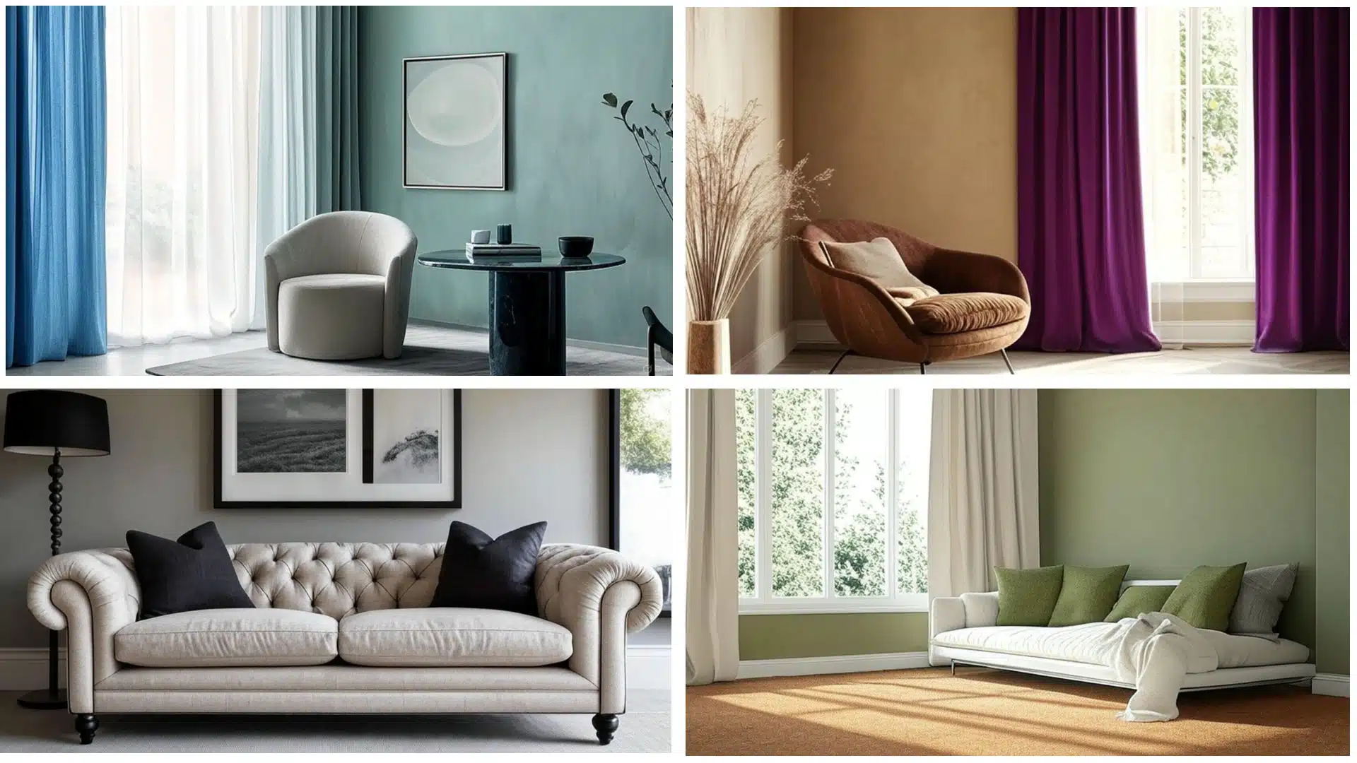
Here’s what makes this shade so loved by homeowners and decorators alike.
These numbers help you understand how this color works in different rooms and lighting situations.
| PROPERTY | VALUE |
|---|---|
| LRV | 43 |
| RGB | 166 / 178 / 181 |
| Hex Value | #A6B2B5 |
This higher light reflection keeps rooms bright and airy while giving you that perfect soft color.
Painters and designers use these RGB and Hex numbers when they’re picking colors that work well together.
Undertones:
- This color features gentle gray and lavender hints, which keep it from looking too cold or stark.
- It shows purple touches in warm evening light, especially when the sun sets.
- Although it’s called blue, it’s actually a smart mix that works well in both modern and traditional homes.
Psychology of Soft Blue Tones
The colors we choose for our walls truly impact how we feel in our rooms.
- Soft blues evoke a sense of relaxation and peace.
- Misty shades turn busy spaces into quiet spots where you can relax and unwind.
- Blue-gray mixes help messy homes feel more put-together and intentional
- Benefits: Reduce stress, fits most furniture, ideal for bedrooms and living rooms.
It turns regular rooms into peaceful getaways.
This gentle color enhances the appearance of your furniture while providing the perfect backdrop for family photos and artwork.
Why Choose Sherwin-Williams Niebla Azul (SW 9137)?
This is a soft, soothing blue-gray that brings instant peace and style to any room.
It works great with different decorating styles and adds a touch of gentle, sky-like beauty to your home.
1. Versatility
This lovely blue-gray changes beautifully as light moves through your rooms during the day.
Morning sunshine makes it look fresh and airy, while afternoon light brings out warmer, cozier feelings.
It looks perfect in bedrooms, bathrooms, and living spaces where you want to relax.
This shade works well in farmhouse homes, modern apartments, or anywhere you need relaxed vibes.
2. Key Features
It strikes the perfect balance between having a personality and being easy to live with every day.
This lighter shade creates interest without making your rooms feel dark or cramped.
People love this color because it feels modern but won’t go out of style quickly.
Once it’s on your walls, it makes your furniture and decorations look more expensive and carefully chosen than before.
3. Durability
When you buy quality paint, this shade handles busy family life and daily wear really well.
The blue-gray tone hides small marks and dirt better than pure white or very light colors usually do.
It remains beautiful even after regular cleaning, ensuring your walls stay in good condition for many years.
This makes it perfect for kids’ rooms and busy hallways.
4. Texture Patterns
This color creates a quiet, peaceful atmosphere that makes rooms look more finished and put-together immediately.
Its gentle gray hints add depth that plain colors can’t match or copy.
It makes white trim and ceiling details stand out with lovely, clean contrast that looks really nice.
It ties rooms together while letting your style shine through as the main focus.
Room Color Recommendations: Sherwin-Williams Niebla Azul
This is a pale blue-gray paint that creates a peaceful and fresh atmosphere in rooms.
It changes gently throughout the day, looking brighter in morning light and warmer in the evening.
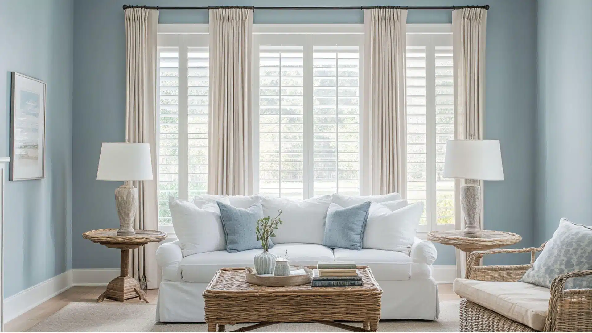
1. Living Spaces and Family Rooms
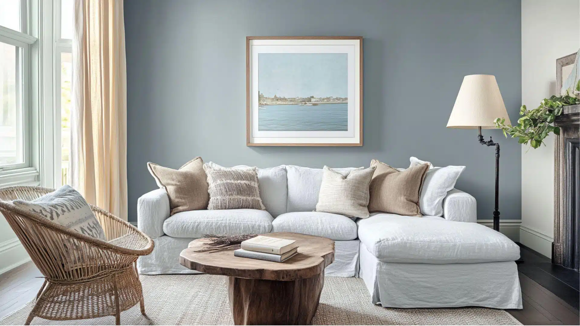
This gentle blue-gray creates a serene feeling in living rooms where families spend time together.
It works great in both modern and traditional home styles.
- The sky-inspired color adds softness and interest, making your space feel more relaxing and welcoming.
- It looks beautiful with white furniture, silver accents, and light wood coffee tables or bookshelves.
- Pair it with soft, white curtains and cozy rugs for a balanced look that feels inviting and comfortable.
This shade helps your room feel peaceful without being boring or plain.
Your family will appreciate how peaceful and inviting the space feels every day.
2. Kitchens and Dining Areas
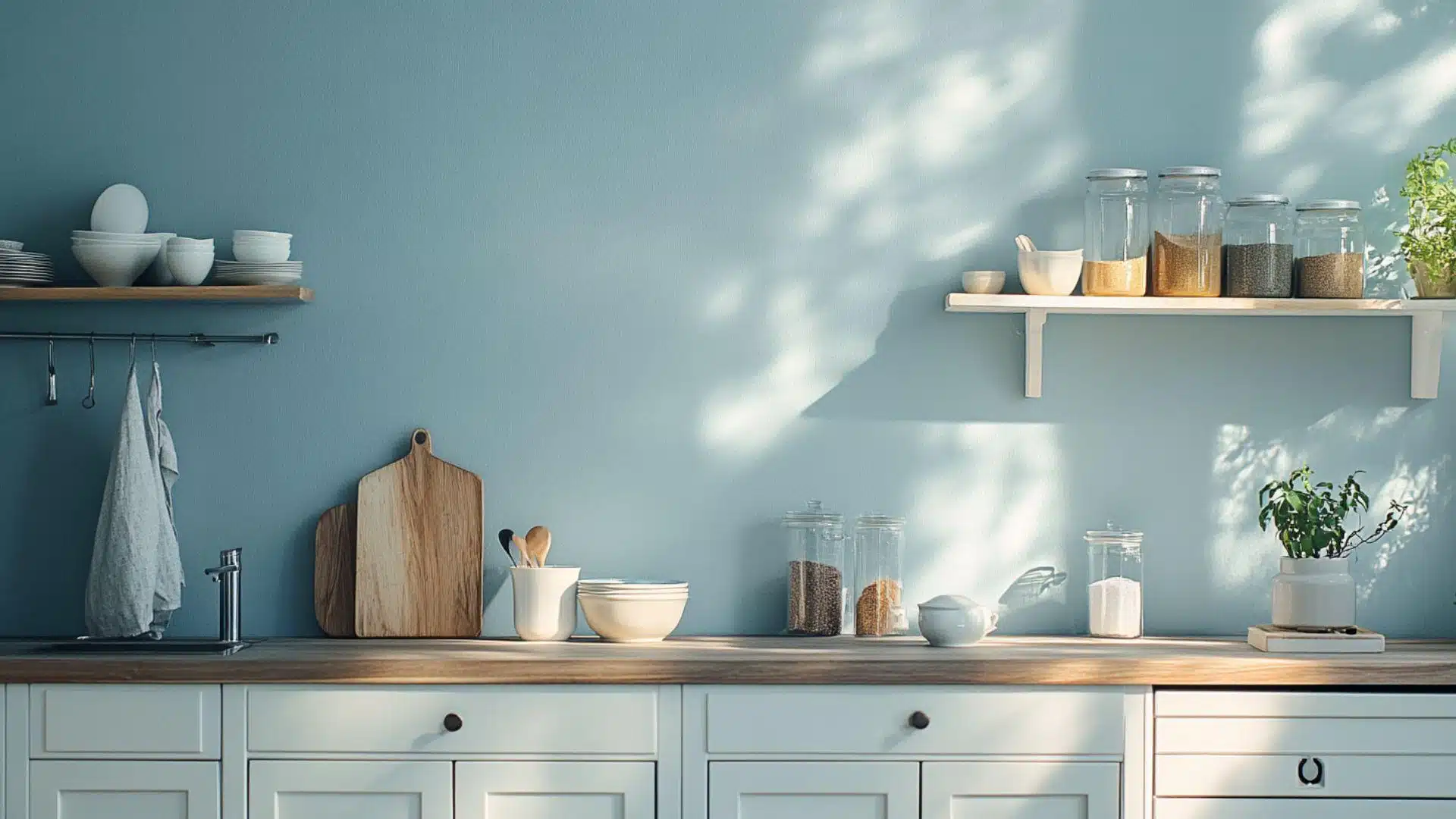
This blue-gray color makes kitchens feel fresh without being too bold, unlike some colors.
It works well with a variety of cabinet and counter styles.
- It creates a nice contrast with white or cream-colored cabinets, adding charm and personality.
- The blue-gray tone looks good with both chrome fixtures and warm gold or brass hardware.
- In dining rooms, this color creates a calm mood that makes family meals feel special.
Food tastes better when you eat in a room with this soft, relaxing wall color.
Your kitchen becomes a favorite spot that friends always notice and love.
3. Bedrooms and Relaxation Spaces
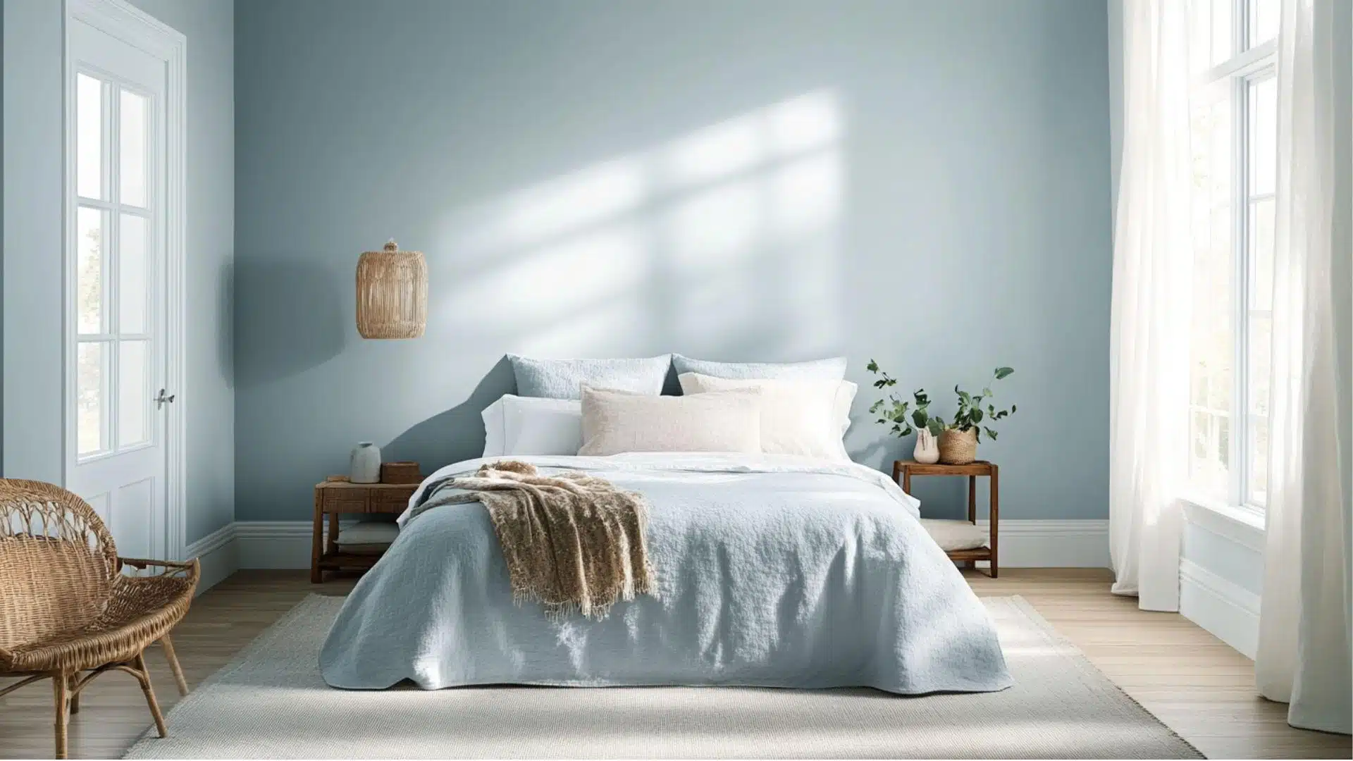
This color remakes bedrooms into serene spaces that help you unwind after busy days.
The dull blue tones naturally evoke a sense of relaxation and restfulness.
- It creates a cozy sleeping space that isn’t too bright or cluttered, promoting a restful night’s sleep.
- This blue-gray works with white, cream, or light gray bedding for a spa-like feel.
- The color makes big bedrooms feel cozier while adding charm to smaller rooms.
You’ll rest better in a room painted with this naturally comforting, peaceful color.
Your bedroom becomes a quiet space where you love to spend relaxing time.
Color Pairings and Combinations for Niebla Azul (SW 9137)
This is a dull blue-gray that adds instant peace to any room.
Its gentle tone creates peaceful, comfortable spaces that feel both relaxing and stylish.
Here are some great partner colors for this beautiful sky-inspired shade.
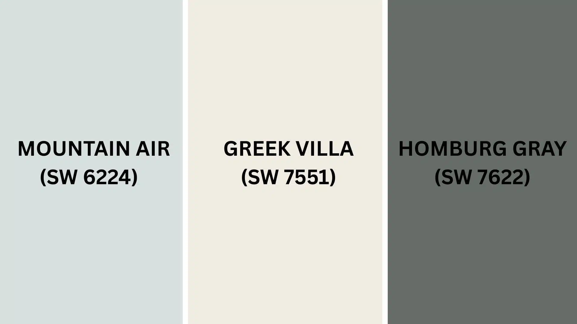
Complementary Trim Colors
Picking the right trim color can really make this blue-gray look amazing in your space.
These carefully chosen colors work perfectly with this soft, relaxing blue-gray tone.
1. Mountain Air (SW 6224)
A clean, crisp white that makes the blue-gray walls look fresh and bright.
This combo works great in bathrooms, bedrooms, and living rooms where you want a clean, airy feeling.
2. Greek Villa (SW 7551)
A warm, creamy white that creates a cozy balance when used with blue-gray on trim or cabinets.
This pair makes a soft, welcoming atmosphere perfect for family rooms and breakfast nooks.
3. Homburg Gray (SW 7622)
A deeper, charcoal gray that adds richness when paired with the lighter blue-gray shade.
This combination creates a modern, refined look that works great for home offices and accent walls.
Creating Cohesive Color Schemes
Sherwin-Williams Niebla Azul pairs well with other colors to create a balanced look throughout your home.
This color can serve as the perfect starting point for various decorating styles.
Here are three color palettes that use this lovely blue-gray as the main color.
| SCHEME | MAIN WALLS / AREAS | TRIM / ACCENT / CEILINGS | OTHER ROOMS / ACCENTS |
|---|---|---|---|
| Monochromatic | Niebla Azul (SW 9137) | Morning Fog (SW 6255) | Krypton (SW 6247), Distance (SW 6243) |
| Warm | Niebla Azul (SW 9137) | Creamy (SW 7012) | Accessible Beige (SW 7036), Natural Linen (SW 9109) |
| Cool | Niebla Azul (SW 9137) | Extra White (SW 7006) | Misty (SW 6232), Agreeable Gray (SW 7029) |
NOTE: All colors shown are Sherwin-Williams paints. Colors look different based on your home’s lighting. Always test paint samples first before buying full gallons.
Coordinating with Furniture and Decor

Sherwin-Williams Niebla Azul creates a peaceful backdrop that enhances the style of your furniture and decorations.
Its soft blue tone works like a relaxing neutral but with more personality than regular white or beige.
1. Wood Tones
Light woods like oak and pine look great against these gentle blue-gray walls.
The pale wood keeps spaces bright while the blue-gray adds softness and charm.
Medium woods such as maple and cherry blend naturally with this color, making rooms feel balanced and cozy.
Dark woods like walnut and mahogany beautifully contrast with this soft shade in your home.
2. Metals
Silver and chrome fixtures look crisp and clean against the blue-gray background, creating a modern style without being too cold.
Gold and brass hardware add warmth to the cool blue-gray, making spaces feel cozy and welcoming inside.
Copper and bronze accents bring extra charm to the gentle blue, perfect for creating inviting rooms.
These metal choices work great in kitchens, bathrooms, and lighting fixtures throughout your entire house.
3. Decor
White, cream, and soft gray fabrics create gentle combinations that let the wall color look beautiful and peaceful.
Soft yellows and warm peaches make lovely accent colors that create happy energy against blue-gray walls everywhere.
Natural materials like woven baskets, linen curtains, and cotton pillows enhance the peaceful feeling of this relaxing color.
Your artwork stands out against these walls, making your pictures look more special.
Alternative Paints Similar to Sherwin-Williams Niebla Azul
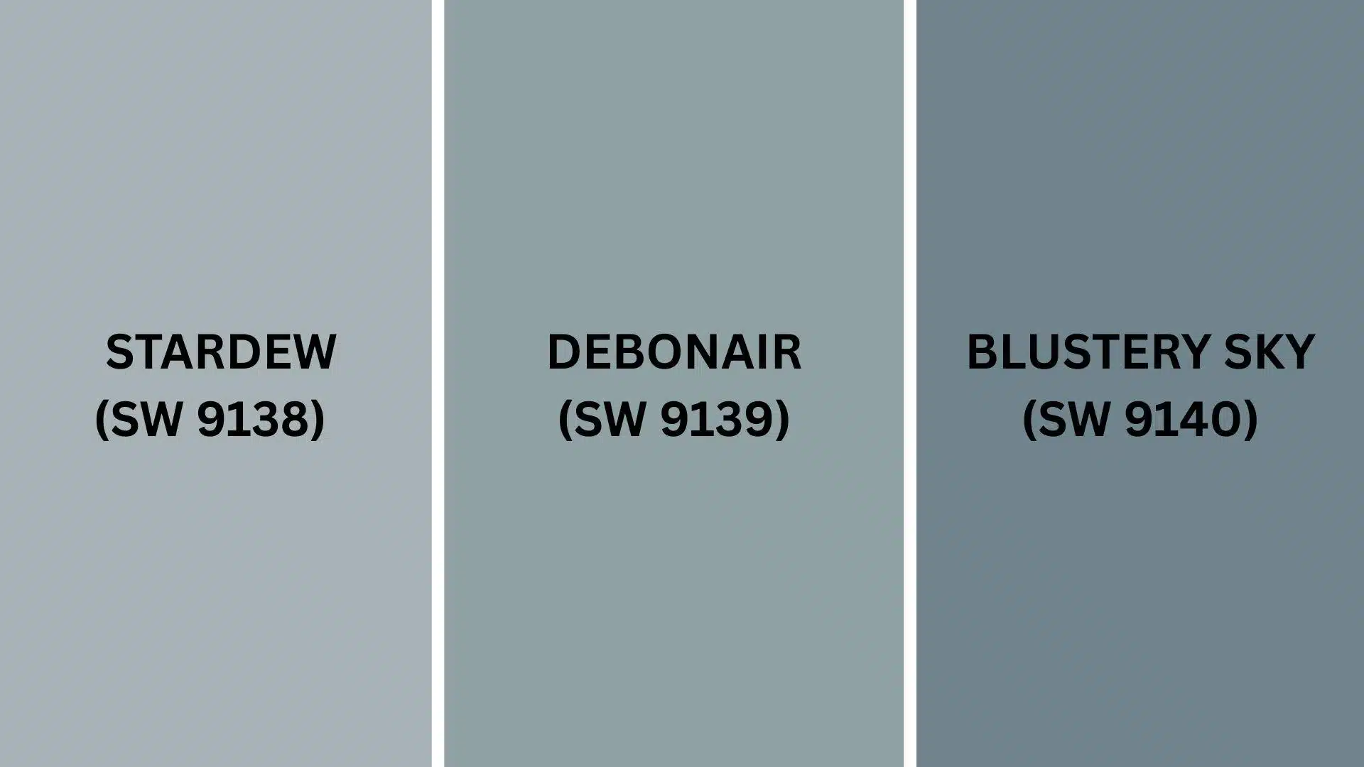
These colors are perfect if you love that soft, cloudy feeling.
They each bring their own special charm to any room.
All of them create that gentle vibe you’re looking for.
1. Stardew (SW 9138)
This crisp blue-white looks like fresh snow with tiny blue shadows underneath.
It’s much brighter and cleaner than most soft blues.
- Changes kitchens into cheerful spaces where cooking feels fun and easy every day
- Complements farmhouse sinks and subway tile backsplashes in country-style homes perfectly
- Works well in laundry rooms to make chores feel less boring and more pleasant
Stardew reflects lots of light around your rooms.
It’s the perfect choice when you need more brightness.
2. Debonair (SW 9139)
This smoky blue reminds you of twilight just before stars come out at night.
It’s much deeper and more mysterious than typical pastels.
- Turn your home libraries into cozy reading nooks where you want to spend hours.
- Pairs well with leather chairs and brass table lamps for a scholarly feel
- Makes powder rooms feel luxurious without spending lots of money on fancy fixtures
Debonair adds drama without being too bold or overwhelming.
It’s urbane enough for grown-up spaces.
3. Blustery Sky (SW 9140)
This weathered blue looks like old denim that’s been washed many times.
It has a comfortable, lived-in quality that feels instantly familiar.
- Perfect for playrooms where kids can be messy without you worrying constantly
- Goes great with colorful toys and bright artwork on gallery walls
- Makes basements feel less like dungeons and more like actual living spaces
Blustery Sky hides fingerprints and scuff marks really well.
It’s practical for families with young children.
Final Thoughts
Sherwin-Williams Niebla Azul proves that the perfect paint color can truly alter your home.
This pale blue-gray adds peace and style to any room, complementing various furniture and decor choices.
From busy kitchens to quiet bedrooms, this versatile color creates spaces where you actually want to spend time.
It hides everyday wear better than lighter colors, making it practical for real family life.
Plus, it pairs well with everything from white trim to natural wood, giving you plenty of decorating freedom.
It’s the kind of color that makes guests ask what shade it is and makes you smile every time you walk into the room.
What do you think about this dreamy blue-gray?
Comment below your thoughts about this color!
If you’re interested in more informational color review content, click here and explore other blogs that you might enjoy.

Alex Guerrero, a graduate with a Fine Arts degree from the Rhode Island School of Design, has been a visionary in the world of color and design for over 15 years. His professional journey began in the heart of the fashion industry in Milan, where he developed an acute sense for color harmonies and trends. Alex joined our team in 2018, offering fresh and innovative perspectives on color utilization in various spaces. Renowned for his ability to blend contemporary trends with timeless elegance. Outside of work, Alex is an accomplished painter and a volunteer art therapist, his artistic talents further enriching his professional insights.