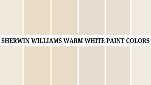

Are you tired of bright whites that feel too stark or cool grays that lack warmth?
Sherwin-Williams Oyster White (SW 7637) might be the perfect solution for your home.
This versatile off-white creates spaces that feel fresh and cozy.
Unlike pure whites, which can feel clinical, or beiges, which sometimes look dated, Oyster White offers a modern light beige that works in nearly any room.
With its subtle green-gray undertones and warm character, this chameleon-like color shifts beautifully throughout the day, creating different moods as the light changes.
If you’re painting a small bathroom or refreshing your entire home, Oyster White provides that perfect balance of character and neutrality that makes decorating easy.
Understanding Paint Color Basics
Sherwin-Williams Oyster White (SW 7637) is a versatile off-white paint color that creates peaceful and balanced spaces.
It gives rooms a soft, gentle feeling without being too plain or stark.
Color Terminology
Let’s look at the technical details of Sherwin-Williams Oyster White.
These numbers help you understand exactly what makes this color special.
| PROPERTY | VALUE |
|---|---|
| LRV | 72 |
| RGB | 226 / 221 / 208 |
| Hex Value | #E2DDD0 |
The high LRV of 72 shows why Oyster White brightens rooms so well.
This puts it in the “light color” category, reflecting a good amount of light back into the space.
You can use the RGB and Hex values to match this color for digital designs or order custom items.
Undertones:
- Oyster White has subtle green undertones with hints of gray and beige
- It’s a soft, warm off-white that isn’t stark or bright
- Many people call it a “chameleon color” because it can look different depending on your lighting
Psychology of Off-White Colors
Colors affect how we feel in a room, even light ones like Oyster White.
The right off-white can make a big difference in your home.
- Warm off-whites like Oyster White create a feeling of comfort without being too colorful.
- Greige-leaning whites: Bring a modern yet welcoming feeling to any room
- Natural off-whites: Enlarges rooms without the harshness of pure white
- Benefits: Hides dirt, soothes eyes, and complements various colors and woods.
Oyster White is especially good for exterior use because it won’t wash out as much as lighter whites in bright sunlight.
Inside, it creates a perfect backdrop for furniture and decorations without feeling too plain.
Why Choose Sherwin-Williams Oyster White (SW 7637)?
Sherwin-Williams Oyster White is a soft off-white that creates relaxed and soothing spaces.
Despite its name, it’s actually a light beige (gray-beige) that works in many different home styles.
1. Versatility
Oyster White changes beautifully throughout the day as lighting shifts.
Morning light brings out its warmer tones, while evening light highlights its subtle gray undertones.
This adaptable color works in every room, from kitchens to bedrooms.
It looks especially good on exteriors because it doesn’t wash out in bright sunlight like brighter whites do.
2. Key Features
With an LRV of 72, Oyster White brightens rooms nicely without being too stark or clinical.
Its soft green-gray undertones help it stay neutral while still having character.
This color pairs well with wood tones, crisp whites, and natural materials.
It’s modern enough for today’s homes but timeless enough to look good for many years.
3. Durability
Oyster White shows less dirt and fingerprints than brighter whites, making it practical for busy family homes.
Its light beige tone hides dust and small imperfections well.
In quality Sherwin-Williams paints like Duration or Emerald, this color maintains its soft appearance over time and cleans easily when walls need refreshing.
4. Texture Patterns
Oyster White creates a gentle backdrop that lets your furniture and artwork stand out.
Its slight green undertones add depth that plain whites lack.
This color catches light beautifully throughout the day, softening corners and making spaces feel more finished.
When used throughout the home, it connects rooms smoothly.
Room-by-Room Color Recommendations with Sherwin-Williams Oyster White (SW 7637)
Oyster White is a versatile off-white that works well in every room of your home.
It shifts subtly throughout the day, maintaining its soft, warm appearance in different lighting conditions.
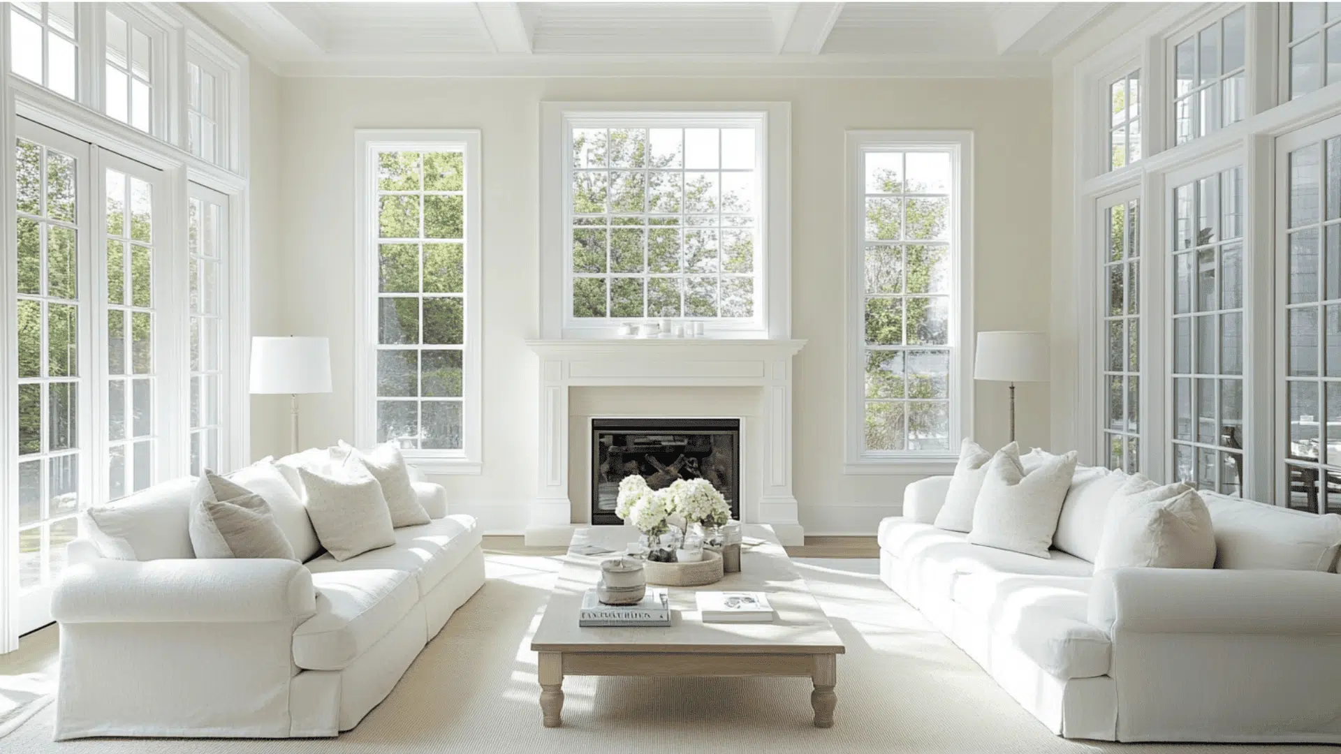
1. Living Spaces and Open Floor Plans
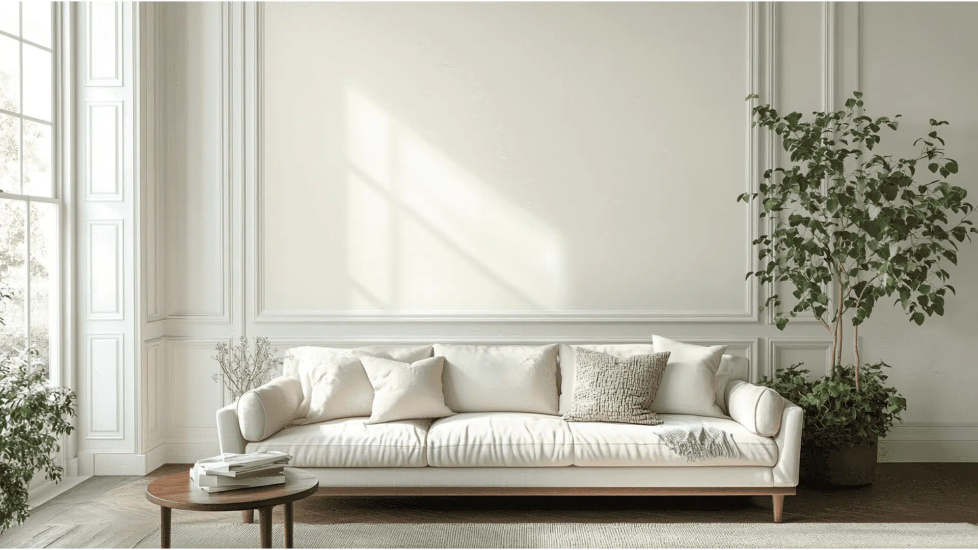
- Oyster White creates a balanced foundation in living areas, offering enough color to feel cozy while still keeping spaces feeling open and bright.
- The subtle green-gray undertones help calm busy living spaces and provide a refined backdrop that makes furniture stand out beautifully.
- For open floor plans, use Oyster White throughout to create an effortless flow, or pair with slightly darker greiges like Analytical Gray (SW 7051) for gentle definition between spaces.
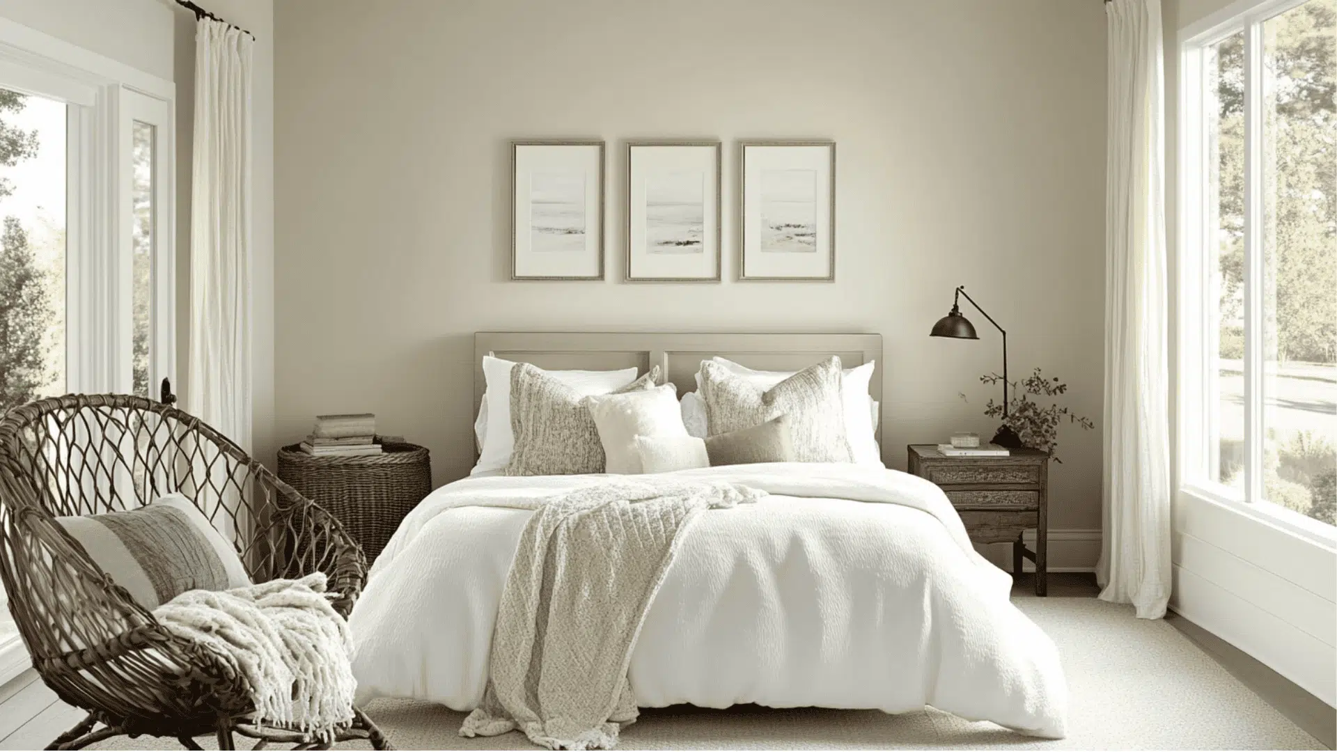
2. Bedrooms and Relaxation Areas
- Oyster White offers the perfect balance in bedrooms – not too stark like bright whites, but light enough to keep the space feeling open and restful.
- With an LRV of 72, it reflects enough light to brighten rooms during the day while creating a soft, cozy glow in the evening with warm lighting.
- Consider using Oyster White on all walls for a calm, unified look, or combine with soft sage greens or light blues for a nature-inspired color combination.
3. Kitchens and High-Traffic Zones

- Oyster White in a satin or semi-gloss finish is durable and easy to clean, making it practical for busy kitchens and hallways where walls may need frequent wiping.
- This versatile off-white works beautifully with both white and wood-toned cabinets, creating a cohesive look that lets your kitchen features be the focal point.
- The beige color helps hide minor smudges and fingerprints better than brighter whites, making it perfect for high-traffic areas with children or busy family life.
4. Bathrooms and Spa-like Retreats
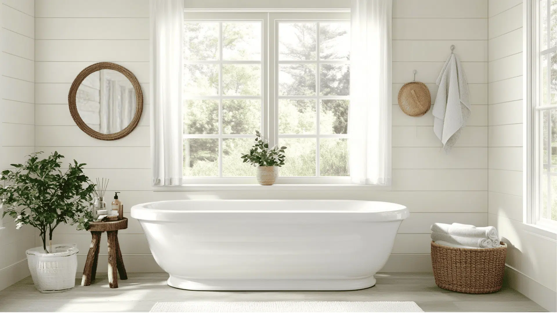
- Oyster White changes bathrooms into bright, clean spaces that feel fresh without the harsh quality of stark whites.
- The light tone helps small bathrooms feel more spacious while providing enough depth to create contrast with white fixtures and tile.
- Pair with brushed nickel or bronze fixtures and natural elements like wood accents or plants to enhance Oyster White’s warm, inviting quality.
Color Combinations for Sherwin-Williams Oyster White (SW 7637)
Oyster White is a versatile off-white with subtle green, gray, and beige undertones.
Its Light Reflectance Value (LRV) of 72 makes it a light neutral that brightens spaces while adding just enough warmth and dimension to avoid feeling stark.
Here are color pairings and combinations for this adaptable shade.
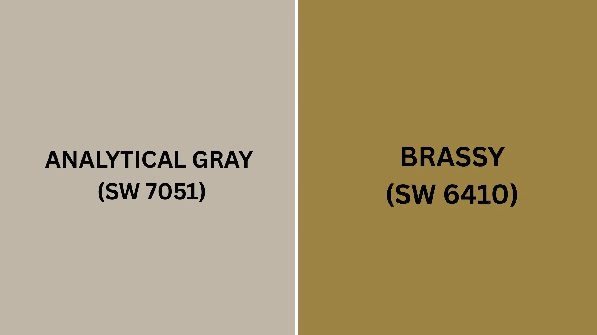
Complementary Trim Colors
Choosing the right trim color can make a significant difference when using Oyster White.
These colors work especially well with Oyster White and help bring out its different qualities.
- Analytical Gray (SW 7051) – A mid-tone warm slate gray that creates graceful contrast with Oyster White without being too harsh. Perfect for trim, doors, or an accent wall when you want some depth without overwhelming the space.
- Brassy (SW 6410) – A weathered brass shade with a dark yet vivid yellow-green-brown quality that adds warmth and character. This rich accent color creates a urbane pop against Oyster White’s softness.
Each of these colors brings out different sides of Oyster White.
Try a few sample pairings to see which one looks best in your specific lighting and space.
Creating Cohesive Color Schemes
Sherwin-Williams Oyster White works beautifully with many other colors to create a pulled-together look throughout your home.
Here are three different color schemes that use Oyster White as the main color.
1. Monochromatic Scheme
- Oyster White (SW 7637) for main walls
- Pure White (SW 7005) for trim
- Ceiling Bright White (SW 7007) for ceilings
- Useful Gray (SW 7050) for accent pieces or adjoining rooms
2. Warm Color Scheme
- Oyster White (SW 7637) for main living areas
- Accessible Beige (SW 7036) for dining room
- Greek Villa (SW 7551) for hallways
- Analytical Gray (SW 7051) for bedrooms
3. Cool Color Scheme
- Oyster White (SW 7637) for main walls
- Sea Salt (SW 6204) for bathrooms
- Uncertain Gray (SW 6234) for bedrooms
- Naval (SW 6244) for home office
Coordinating with Furniture and Decor
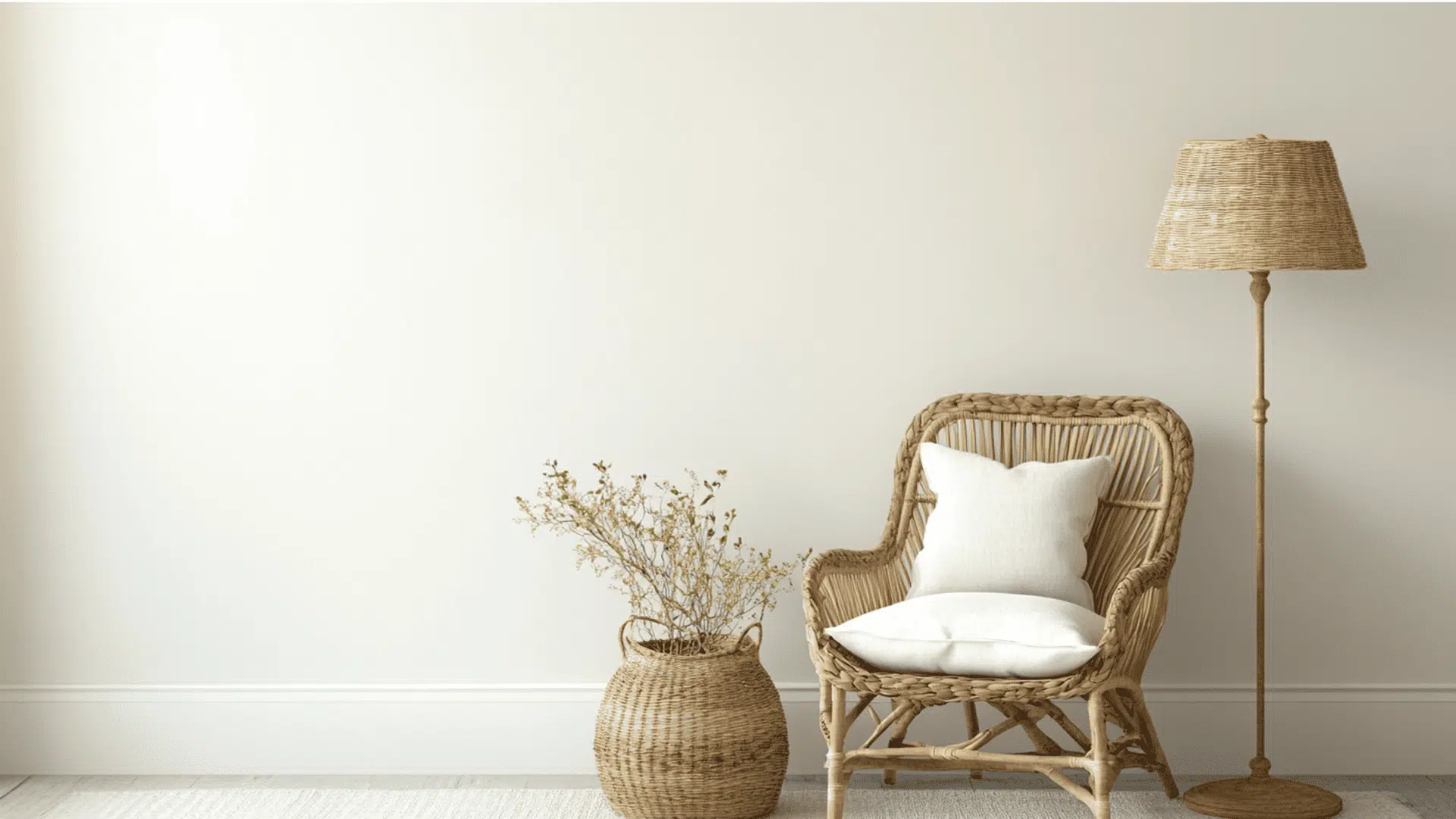
Sherwin-Williams Oyster White is a versatile color that complements many different styles of furniture and decorations.
Its light greige tone creates an ideal backdrop for showcasing your favorite pieces.
1. Wood Tones
Oyster White works wonderfully with a variety of wood finishes, from dark wood cabinets to lighter wooden accents.
Dark woods create a dramatic contrast that makes the walls appear lighter and the wood richer.
Medium-toned woods like oak and cherry add warmth that balances Oyster White’s cooler undertones.
Light woods create a fresh, airy look that’s perfect for coastal or farmhouse styles.
2. Metals
Oyster White pairs nicely with shiny metals to highlight its graceful side, creating a cultured look that works in both traditional and modern spaces.
Matte black hardware creates crisp definition against Oyster White walls, perfect for modern farmhouse styles.
Brass and bronze fixtures add warmth and vintage charm that complements the subtle green undertones in Oyster White.
Chrome and nickel keep spaces feeling bright and fresh, working well in bathrooms and kitchens.
3. Decor
Natural elements like wood, from honey to golden brown tones, work perfectly with Oyster White to create warm, inviting spaces.
Blue and gray accents complement Oyster White beautifully, bringing out its subtle undertones without overwhelming the space.
Woven textures like baskets, jute rugs, and natural fabrics enhance Oyster White’s connection to nature and add visual interest.
Similar Paint Colors: Perfect Alternatives to Oyster White (SW 7637)
All these colors work well in many different rooms.
They create spaces that feel warm and welcoming while still looking clean and fresh.
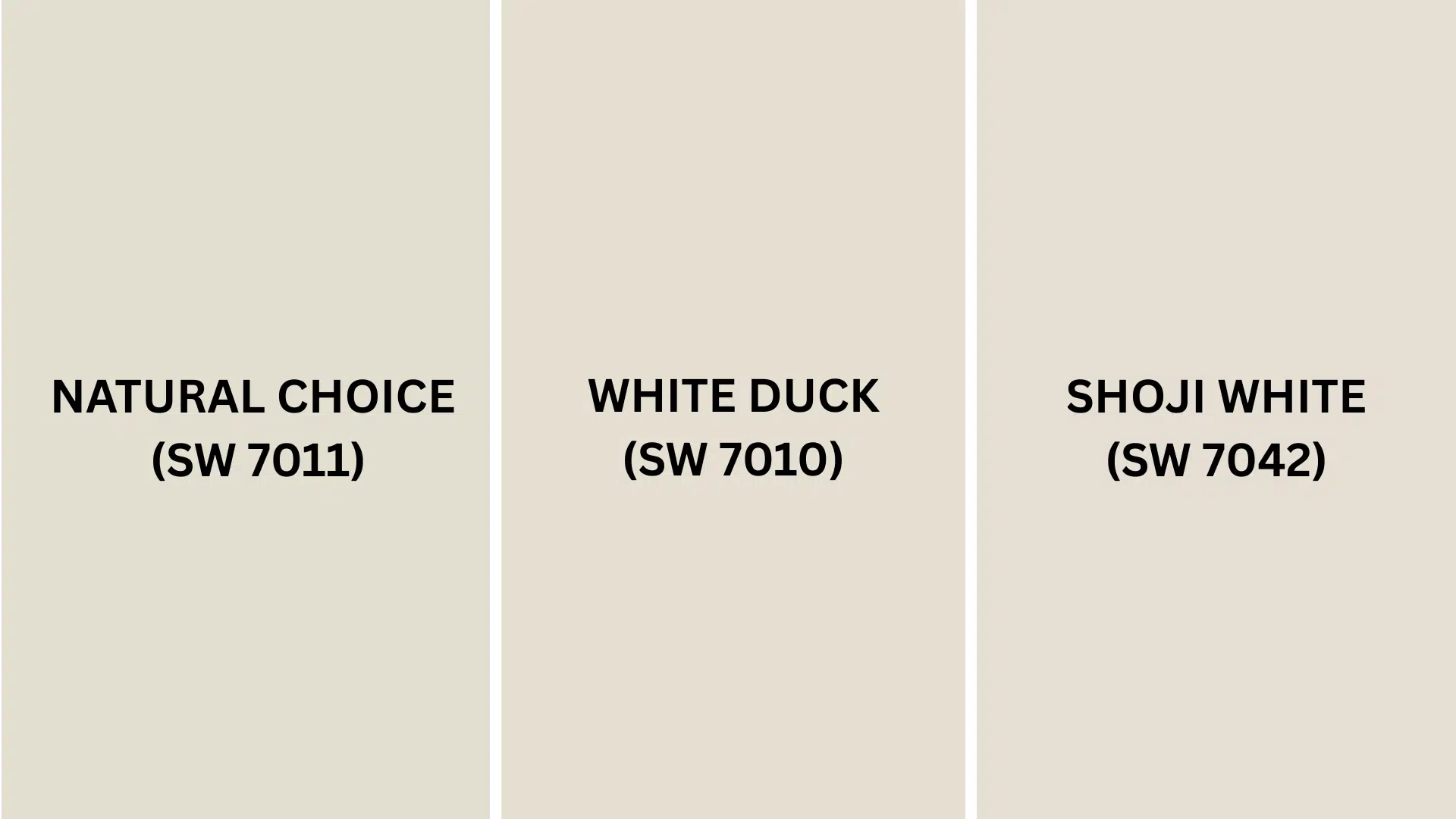
1. Natural Choice (SW 7011)
- A slightly higher LRV of 73 makes it appear a touch lighter than Oyster White in the same lighting
- Warmer undertones give it a creamier appearance than Oyster White’s more neutral look
- Might show more yellow in bright light, while Oyster White stays more consistently neutral
2. White Duck (SW 7010)
- A warm, neutral paint with a cream base that’s toned down with beige and gray
- Higher LRV of 74 makes it slightly brighter than Oyster White in the same space
- Less likely to show green undertones, making it a safer choice with pink or red-toned furnishings
3. Shoji White (SW 7042)
- A warm-leaning off-white with grey undertones that give it a creamy appearance
- LRV of 74 makes it slightly lighter and brighter than Oyster White
- More likely to show warm undertones in certain lights, sometimes with the faintest pink hint
Final Words
Sherwin-Williams Oyster White (SW 7637) changes ordinary spaces into inviting, urbane rooms that feel both contemporary and timeless.
This versatile paint color works beautifully with wood tones, metals, and various accent colors, making it perfect for any decorating style.
It brightens rooms without the harshness of pure white, creating an ideal backdrop for furniture and decor.
If in living rooms, bedrooms, kitchens, or bathrooms, Oyster White creates a consistent flow while allowing each space its personality.
It hides fingerprints better than brighter whites and maintains its beauty through everyday wear and tear.
Ready to create a home that’s both fresh and cozy?
Try Sherwin-Williams Oyster White and see the difference!
Which room would you paint first? Comment below with your plans!
If you’re interested in more informational color review content, feel free to click here and explore other blogs that you might enjoy.

Alex Guerrero, a graduate with a Fine Arts degree from the Rhode Island School of Design, has been a visionary in the world of color and design for over 15 years. His professional journey began in the heart of the fashion industry in Milan, where he developed an acute sense for color harmonies and trends. Alex joined our team in 2018, offering fresh and innovative perspectives on color utilization in various spaces. Renowned for his ability to blend contemporary trends with timeless elegance. Outside of work, Alex is an accomplished painter and a volunteer art therapist, his artistic talents further enriching his professional insights.