
Are you tired of staring at plain white walls but nervous about choosing a color with too much personality?
Sherwin-Williams Rainwashed (SW 6211) might be exactly what you’re looking for.
This gentle blue-green shade brings the peaceful feeling of nature indoors without overwhelming your space.
Unlike bold colors that can feel trendy or tiresome, Rainwashed offers a timeless quality that works in any room of your home.
With its perfect balance of blue, green, and gray undertones, this versatile paint creates spaces that feel fresh, clean, and calming.
For a small bathroom or entire home repaint, Rainwashed offers the perfect color to make rooms feel complete and designed without drawing excessive attention.
Understanding Paint Color Basics
Sherwin-Williams Rainwashed (SW 6211) is a soft blue-green paint color that brings a calm, refreshing feel to any room.
It creates spaces that feel clean and peaceful, like the air after a gentle spring rain.
Color Terminology
Let’s check out the technical details of Sherwin-Williams Rainwashed.
These numbers help you understand exactly what makes this color special.
| PROPERTY | VALUE |
|---|---|
| LRV | 59 |
| RGB | 194 / 205 / 197 |
| Hex Value | #C2CDC5 |
The LRV of 59 shows why Rainwashed brightens rooms nicely while still having enough color depth to stand out.
It is a medium-light color that reflects a good amount of light.
You can use the RGB and Hex values when matching colors for digital designs or ordering custom items.
Undertones:
- Rainwashed has blue, green, and gray undertones that blend beautifully together.
- It’s a soft, muted color that feels fresh but never too bold
- While classified as green, there’s a noticeable amount of blue in it, making it remind many people of the ocean.
Psychology of Blue-Green Colors
Colors affect how we feel in a room, and Rainwashed has a special way of changing the mood.
- Blue-green shades like Rainwashed create feelings of calm and freshness
- Soft, watery colors: Bring a peaceful, spa-like feeling to any room
- Gray-toned pastels: Make spaces feel more open and clean without being too cold
- Benefits: Gentle on vision, versatile in any light, complements whites and woods.
Rainwashed is perfect if you live in an apartment and miss having nature around.
It brings the feeling of the outdoors inside with its gentle, natural color.
It’s a timeless choice that won’t go out of style.
Why Choose Sherwin-Williams Rainwashed?
Sherwin-Williams Rainwashed is a gentle blue-green color that brings a sense of calm to any room.
It feels like a breath of fresh air and makes spaces feel clean and peaceful without being too bold or bright.
1. Versatility
Rainwashed adapts beautifully to different lighting conditions.
In southern exposure, it might show more green, while in other rooms it can lean more blue.
This flexible nature makes it work in bedrooms, bathrooms, living rooms, and even kitchens.
You can use it as a whole-house color or just for special rooms where you want a peaceful feeling.
It works well in both modern and traditional homes.
2. Key Features
With an LRV of 59, Rainwashed is a medium-light color that reflects enough light to brighten spaces while still having enough color to stand out on your walls.
It’s not too dark or too light – just right for most rooms.
The soft blue-green tone with gray undertones helps it stay neutral enough to match many decorating styles while still adding gentle color to your space.
3. Durability
While not commonly used for exteriors, Rainwashed is a hit on interior walls, where it withstands everyday life well.
It shows less dirt than bright whites, making it practical for busy families.
Its medium tone hides minor scuffs and marks better than very light colors.
When paired with quality Sherwin-Williams paint, it maintains its soft color for years.
4. Texture Patterns
Rainwashed creates rooms that feel connected to nature.
The soft color mimics the outdoors, giving your space a fresh, airy feeling even without many windows.
This paint color adds depth to walls without being overwhelming.
It catches light, making rooms feel larger and more open, especially when paired with white trim and natural wood accents.
Room-by-Room Color Recommendations with SW Rainwashed
Rainwashed is a soothing blue-green color that brings a breath of fresh air to any room.
Depending on the lighting, it shifts between soft blue and gentle green, creating spaces that feel connected to nature.
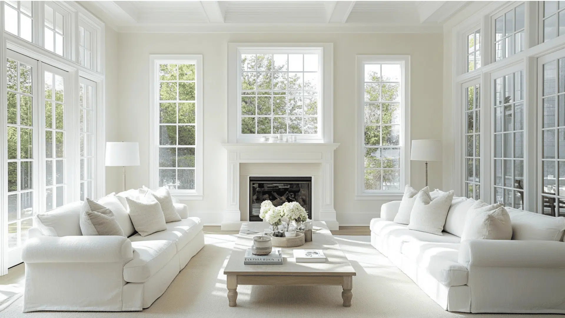
1. Living Spaces and Open Floor Plans
- Rainwashed walls create a peaceful backdrop in living rooms, helping people relax after a busy day while still providing enough color to make the space feel finished and thoughtfully designed.
- This blue-green shade pairs beautifully with natural wood furniture, white trim, and both light and dark flooring, making it flexible enough for many decorating styles and existing pieces.
- In open floor plans, Rainwashed offers a gentle color that doesn’t overwhelm but still adds personality, especially when accessorized with cream curtains, natural baskets, and touches of navy blue.
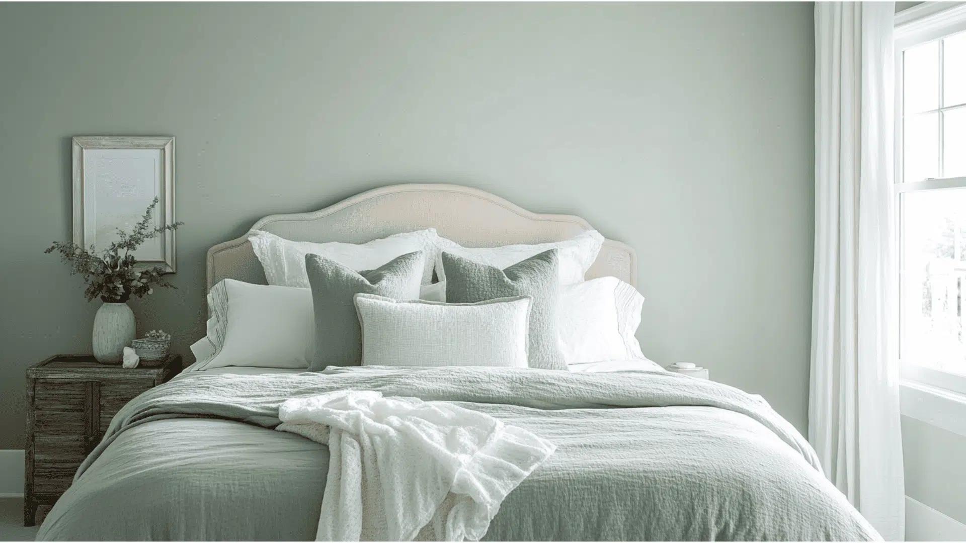
2. Bedrooms and Relaxation Areas
- Rainwashed alters bedrooms into calm retreats that feel like a gentle rainy day, perfect for unwinding and getting better sleep in our often busy and stressful lives.
- The soft color looks beautiful with white bedding, creating a clean, hotel-like feel. It also works well with light woods and darker furniture pieces for a balanced look.
- Morning light brings out Rainwashed’s greener tones while evening light enhances its blue qualities, giving your bedroom different peaceful moods throughout the day as the light changes.
3. Kitchens and High-Traffic Zones
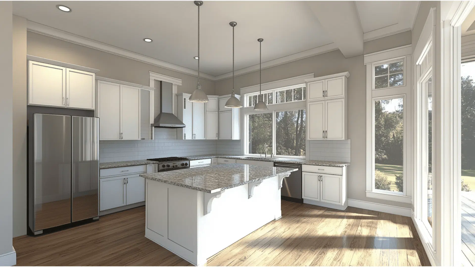
- Rainwashed kitchens feel clean and fresh without the harshness of white, creating a space that looks neat even when life gets messy with cooking and gathering.
- The blue-green color balances well with stainless steel appliances and stone countertops, while bringing a subtle pop of color that makes your kitchen feel special rather than basic.
- With an LRV of 59, Rainwashed is dark enough to hide minor smudges and splatters that happen in busy kitchens, making it both beautiful and practical for family homes.
Color Pairings and Combinations for the SW Rainwashed
Rainwashed is a gentle blue-green color with soft gray undertones.
Its Light Reflectance Value (LRV) of 59 makes it a medium-light shade that brings a fresh, airy feeling to spaces while adding just enough color to be noticeable.
Here are color pairings and combinations for this refreshing shade.
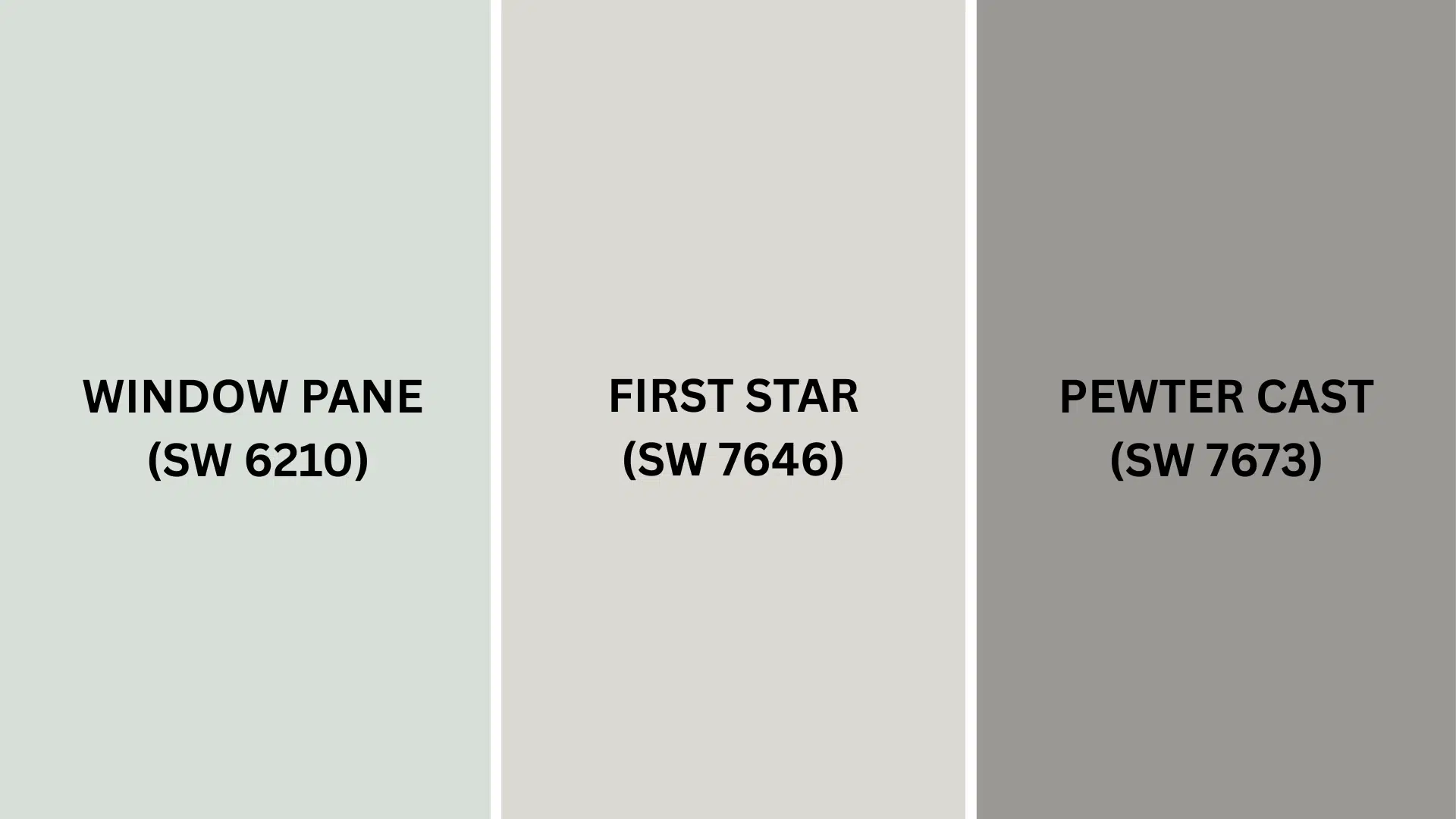
Complementary Trim Color
Choosing the right trim color can make Rainwashed really shine in your space.
These three colors are particularly well-suited to complement Rainwashed’s unique blue-green personality.
- Window Pane (SW 6210) – A slightly lighter version of Rainwashed that works as a wonderful companion, adding depth and freshness to a space without creating stark contrast. Perfect for a soft, flowing look throughout a room.
- First Star (SW 7646) – A gentle gray with soft undertones that creates a subtle contrast with Rainwashed, providing a neutral backdrop that lets the blue-green shine without overwhelming it. Works beautifully for trim and doors.
- Pewter Cast (SW 7673) – A medium-to-dark gray with a neutral base and subtle bluish hint that helps balance the coolness of Rainwashed while adding nice contrast to make details pop. Great for more defined trim work.
Test these colors in your lighting before making your final choice.
The way these colors interact with Rainwashed can change throughout the day as natural light shifts in your home.
Creating Cohesive Color Schemes
Sherwin-Williams Rainwashed works beautifully with many other colors to create a pulled-together look throughout your home.
This blue-green shade serves as a perfect starting point for several design approaches.
Here are three different color schemes that use Rainwashed as the main color.
1. Monochromatic Scheme
- Rainwashed (SW 6211) for main walls
- Window Pane (SW 6210) for adjoining rooms or accent walls
- Pure White (SW 7005) for trim
- Misty (SW 6232) for ceilings
2. Warm Color Scheme
- Rainwashed (SW 6211) for main living areas
- Agreeable Gray (SW 7029) for the dining room
- Creamy (SW 7012) for hallways
- Sandbar (SW 7547) for bedrooms
3. Cool Color Scheme
- Rainwashed (SW 6211) for main walls
- Sea Salt (SW 6204) for bathrooms
- First Star (SW 7646) for bedrooms
- Pewter Cast (SW 7673) for home office
Coordinating with Furniture and Decor
Sherwin-Williams Rainwashed is a versatile blue-green color that creates a beautiful backdrop for your furniture and decorations.
Its soft, nature-inspired tone helps showcase your favorite pieces while adding a feeling of calm to any room.
1. Wood Tones
Rainwashed works wonderfully with many types of wood, making it easy to use with furniture you already own.
Dark woods, such as walnut or mahogany, create a dramatic contrast against the light blue-green walls, making both colors look richer.
Medium woods like oak or cherry add warmth that balances Rainwashed’s cool tones.
Light woods such as maple or pine create a fresh, natural look that feels beachy and relaxed.
2. Metals
Brushed nickel and chrome fixtures look crisp and clean against Rainwashed, enhancing its cool, spa-like qualities.
Brass and gold add unexpected warmth, helping to balance the coolness of the walls while creating a slightly more formal feeling.
Matte black hardware offers modern contrast that makes both the hardware and wall color stand out, perfect for contemporary spaces where you want clean lines.
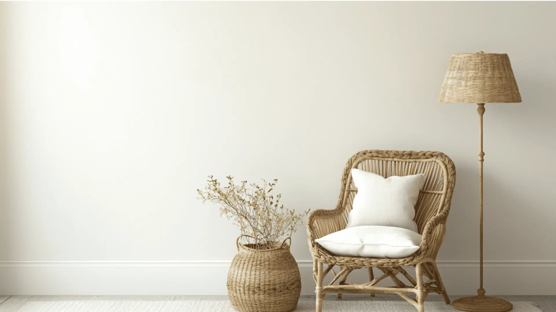
3. Decor
Natural materials like woven baskets, jute rugs, and cotton textiles enhance Rainwashed’s connection to nature and create a relaxed, organic feeling.
Coral, blush pink, or soft terracotta accents provide a beautiful contrast against blue-green on the color wheel.
White, cream, and light gray furnishings create a clean, fresh look against Rainwashed walls, perfect for coastal or farmhouse styles that feel open and airy.
Similar Paint Colors: Perfect Alternatives to the Rainwashed
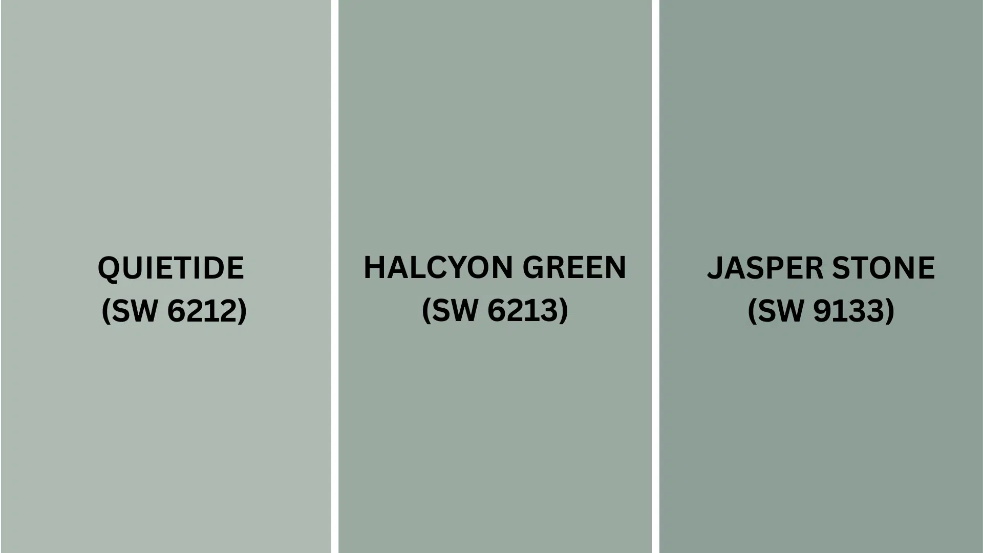
These colors all share a blue-green quality but have important differences.
Knowing how they compare can help you pick the perfect shade for your home.
1. Quietude (SW 6212)
- Similar hue to Rainwashed but slightly darker, creating a deeper, more grounded feeling in a space
- Shows more gray undertones, making it appear more neutral and refined than Rainwashed
- A medium blue-green shade with a balanced quality and noticeable depth that works well in rooms where you want more color presence
2. Halcyon Green (SW 6213)
- A more intense version of the blue-green color family with stronger pigmentation than Rainwashed
- A muted green with cooler undertones that brings a peaceful vibe to any room
- Darker than both Rainwashed and Quietude, making it perfect for spaces where you want more color impact
3. Jasper Stone (SW 9133)
- A much darker variation of the blue-green family with stronger gray notes for an urbane look
- Adds depth and character to a space, making it perfect for accent walls or areas where you want more drama
- Creates a more formal or cozy atmosphere while still maintaining the calming quality of the blue-green color family
Final Thoughts
Sherwin-Williams Rainwashed (SW 6211) changes ordinary rooms into peaceful retreats that feel connected to nature.
Its blue-green color brings calm to bedrooms, makes bathrooms feel like luxury spas, and gives living spaces a fresh atmosphere.
This versatile shade works with many decorating styles – from coastal to farmhouse.
It pairs beautifully with wood tones, crisp whites, and natural textures, making it easy to use with furniture you already own.
With its medium-light LRV of 59, Rainwashed brightens spaces while still having enough color to make an impact.
Ready to bring this refreshing shade home?
Grab a sample and see how it changes throughout the day in your lighting.
Which room would you paint with Rainwashed first?
Share your plans below!
If you’re interested in more informational color review content, feel free to click here and explore other blogs that you might enjoy.

Alex Guerrero, a graduate with a Fine Arts degree from the Rhode Island School of Design, has been a visionary in the world of color and design for over 15 years. His professional journey began in the heart of the fashion industry in Milan, where he developed an acute sense for color harmonies and trends. Alex joined our team in 2018, offering fresh and innovative perspectives on color utilization in various spaces. Renowned for his ability to blend contemporary trends with timeless elegance. Outside of work, Alex is an accomplished painter and a volunteer art therapist, his artistic talents further enriching his professional insights.