Choosing the perfect white paint shouldn’t feel like solving a puzzle.
Still, with countless options available, many homeowners find themselves overwhelmed by subtle differences that can significantly impact a room’s atmosphere.
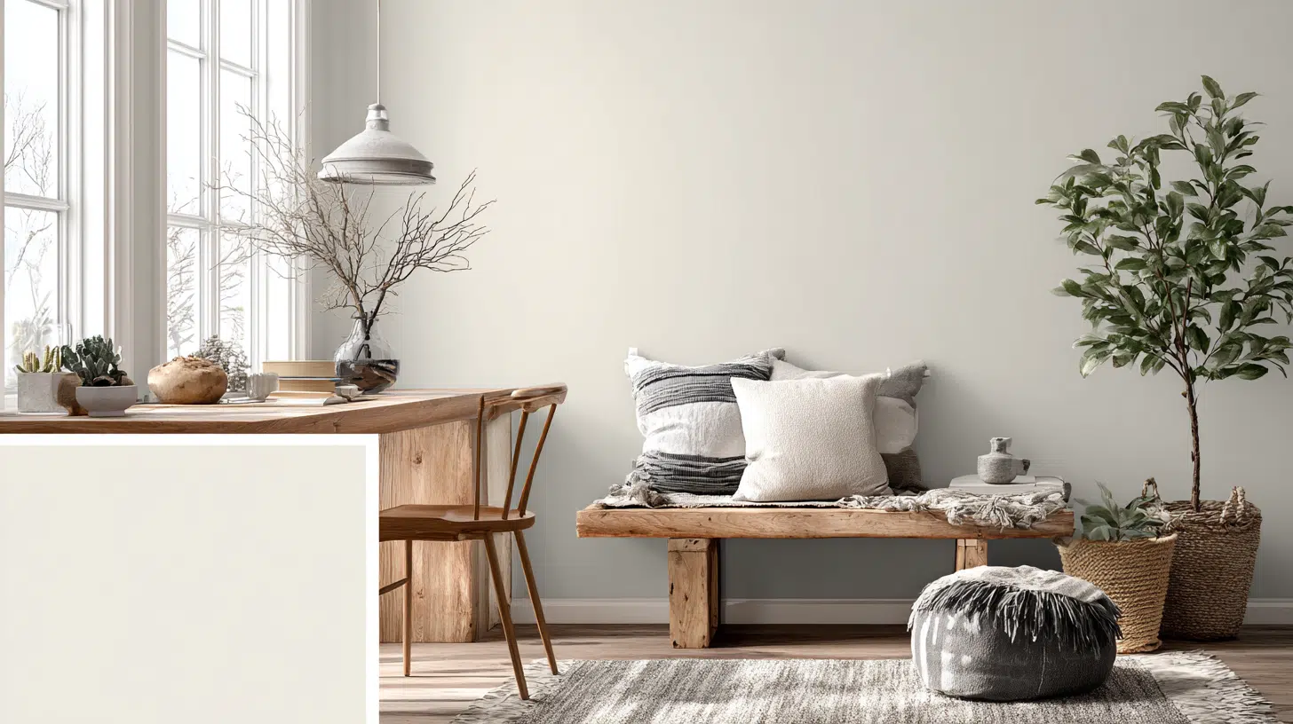
Enter Snowbound Sherwin-Williams (SW 7004), the white paint that has quietly become a designer favorite for its ability to feel both fresh and welcoming without the harshness of stark whites.
This suave color offers the perfect balance of coolness and warmth, thanks to its subtle gray undertones and impressive LRV of 83.
If you’re refreshing a single room or planning a whole-house makeover, Snowbound delivers classic grace that works beautifully.
It works across various design styles, lighting conditions, and color palettes, making it a wise investment for any home.
Understanding SW Snowbound and Its Characteristics
Sherwin-Williams Snowbound presents itself as a suave, cool white that brings subtle beauty to any space.
The gentle gray undertones prevent it from appearing too bright or clinical, making it perfect for creating serene environments.
This paint color sits comfortably in the off-white category, offering enough brightness to open up rooms while maintaining a cozy feel.
Its balanced tone makes it suitable for various lighting conditions, though it performs best in spaces with good natural light.
Key Color Features:
- Temperature consistency – maintains its cool character throughout different lighting conditions
- flexible neutrality – works equally well with warm wood tones and cool metal finishes
Light Reflectance and Undertone Details

Snowbound’s technical specifications reveal why it works so well in different settings. The color’s LRV of 83 places it in the lighter range without being overwhelming, while its undertones add depth and character.
The cool gray undertones give Snowbound its distinctive personality, helping it feel fresh and contemporary.
These subtle hints prevent the color from appearing flat or one-dimensional, creating visual interest without being distracting.
| Color Specification | Snowbound Details |
|---|---|
| Color Code | SW 7004 |
| LRV Rating | 83 |
| RGB Values | 237, 234, 229 |
| Hex Code | #EDEAE5 |
| Primary Undertone | Cool gray |
Technical Advantages:
- High light reflection – the LRV of 83 brightens rooms without harsh glare
- Undertone stability – gray base prevents color shifting in different light sources
Fun Fact: Paint color perception can shift up to 30% based on the time of day, which is why Snowbound’s gray undertones help it maintain consistency in changing light
Best Applications for SW Snowbound in Your Home

Snowbound’s flexibility makes it suitable for numerous applications throughout your living space.
If you’re planning a complete makeover or simple updates, this color adapts to your needs.
Interior walls benefit greatly from Snowbound’s light-reflecting properties, especially in smaller rooms or areas with limited natural light. The color also excels as a ceiling choice, creating a sense of height and openness.
Room-by-Room Applications
Snowbound performs consistently across various lighting conditions, making it ideal for open-concept spaces where maintaining color continuity is crucial.
1. Living Areas – Creates suave, open atmospheres that make spaces feel larger and more organized.
2. Kitchens – Cabinet doors and walls maintain crisp, clean appearances while complementing both warm and cool finishes.
3. Bedrooms – Promotes restful environments with calming gray undertones that feel peaceful without being cold.
4. Bathrooms – Reflects light beautifully around mirrors and vanities, creating a spa-like freshness.
5. Trim Work – Provides subtle contrast against colored walls or blends flawlessly with other whites.
| Application | Best Finish | Why It Works |
|---|---|---|
| Wall Paint | Matte/Eggshell | Hides imperfections, soft appearance |
| Cabinetry | Semi-gloss | Easy cleaning, durability |
| Trim | Semi-gloss | Contrast and protection |
| Ceilings | Flat | Reduces glare, creates height |
Fun Fact: Professional painters often use a “color memory trick” – they look at pure white paper for 30 seconds, then at their paint sample to better detect undertones
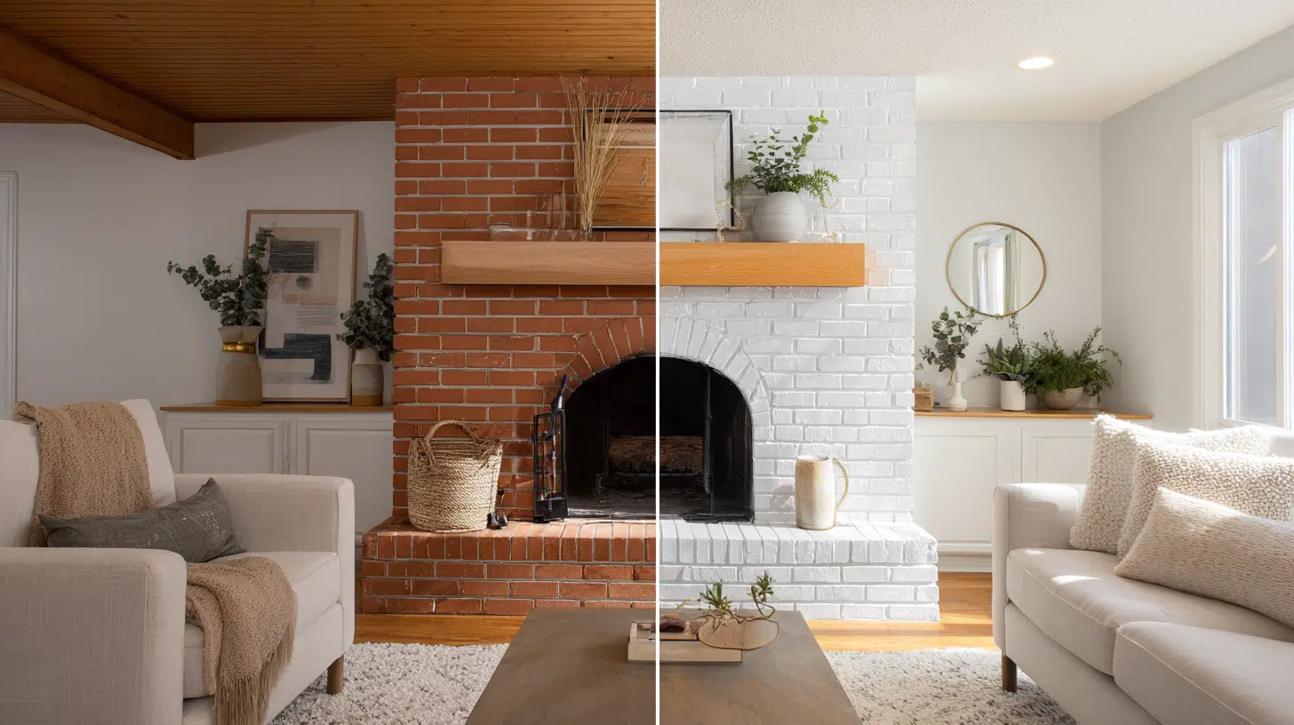
Snowbound vs Pure White: A Comparison

Understanding the differences between Snowbound and Pure White helps you make the right choice for your project.
Both colors offer unique benefits depending on your design goals and room conditions.
| Paint Color | LRV | Undertone | Best For |
|---|---|---|---|
| Snowbound SW 7004 | 83 | Cool gray | Modern, transitional spaces |
| Pure White SW 7005 | 84 | Neutral-warm | Classic, flexible applications |
PurWhitete leans slightly warmer and reflects a bit more light with its LRV of 84, while Snowbound provides a cooler, more relaxed feeling.
The choice between them often comes down to personal preference and existing decor.
The Character Test: How These Whites Behave
Think of Snowbound as the calm, collected friend who always looks put-together without trying too hard.
It’s the white that whispers rather than shouts, creating spaces that feel intentionally designed rather than simply painted.
In contrast, Pure White acts like the confident extrovert – a bit brighter, more social, and ready to work with anyone.
The magic happens when you understand that choosing between these whites isn’t about right or wrong – it’s about personality.
Snowbound suits homeowners who appreciate subtle suaveness, while Pure White appeals to those who prefer classic flexibility.
In morning light, Snowbound maintains its calm composure while Pure White warms up slightly. Both colors soften beautifully under warm artificial lighting, creating inviting evening atmospheres.
Color Combinations That Work with Snowbound

Snowbound pairs beautifully with various color families, making it easy to create cohesive design schemes. Its cool undertones complement both warm and cool accent colors effectively.
Natural wood tones bring warmth to Snowbound’s coolness, creating balanced and inviting spaces that feel both modern and welcoming.
The contrast between cool paint and warm wood creates visual interest without overwhelming the senses.
1. Warm Companions
Natural oak flooring and cabinetry create a stunning contrast against Snowbound walls, with the wood’s honey tones warming up the cool paint beautifully.
Walnut furniture pieces add rich, chocolate undertones that make Snowbound appear brighter and more suave.
Cherry wood accents bring a warm, reddish tone that prevents spaces from feeling too sterile or cold.
2. Cool Harmonies
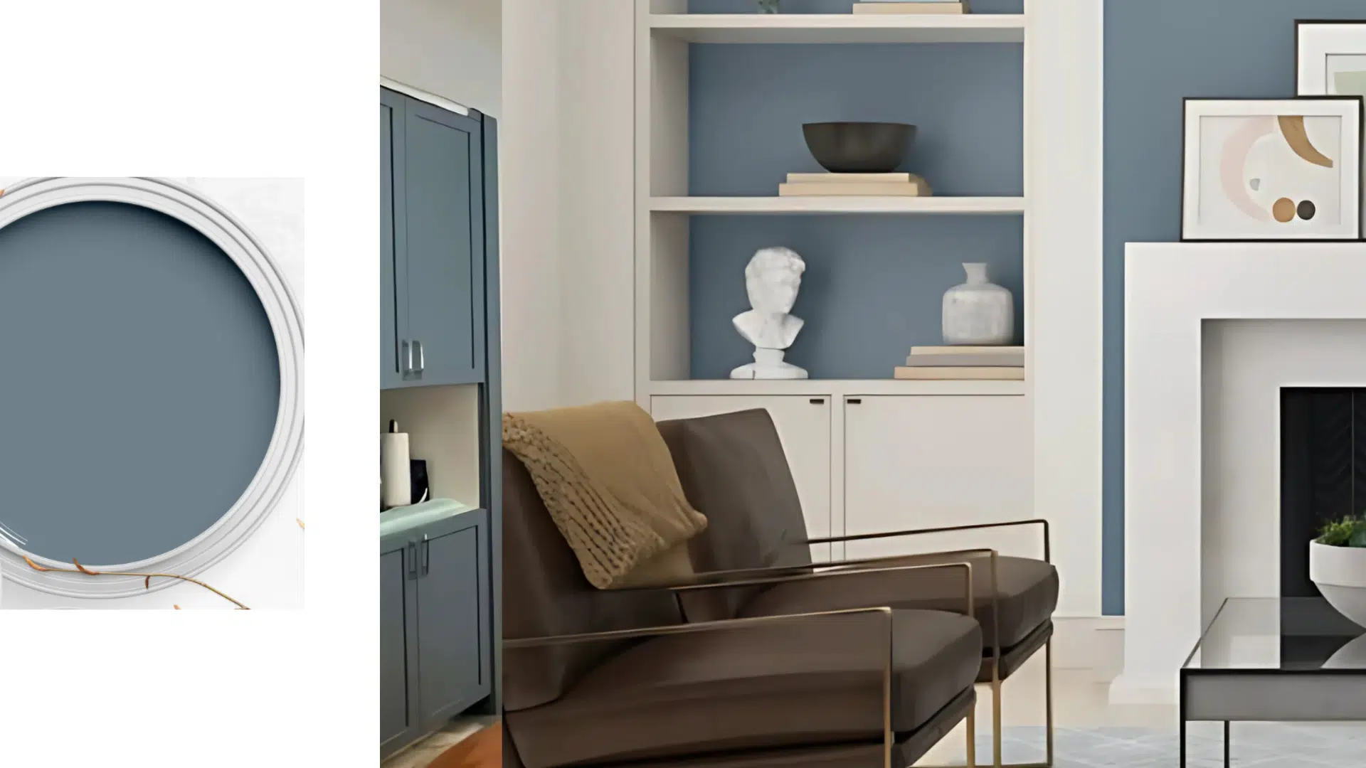
Soft blues and greens strengthen Snowbound’s serene quality and create spa-like atmospheres throughout the home.
Navy blue creates a suave contrast in dining rooms and bedrooms, while sage green brings natural tranquility to living spaces.
Charcoal gray provides striking drama when used as an accent wall or in furniture pieces.
3. Gentle Palettes
Soft pastels create a gentle, calming effect throughout the home when paired with Snowbound’s neutral base.
Blush pink, lavender, and pale yellow work particularly well in bedrooms and nurseries.
Earthy neutrals, such as taupe and mushroom gray, harmonize well with Snowbound’s gray undertones, creating suave color schemes that feel both contemporary and timeless.
Pro Tip: Paint large sample swatches (at least 2×2 feet) on different walls and observe them for 48 hours before deciding – small samples lie about true color
Shopping Options and Finish Choices
Snowbound comes in various sizes and finishes to meet your specific project needs. Planning helps you choose the correct quantity and finish type for optimal results.
Available Sizes and Finishes
Different finishes serve different purposes, from matte walls to semi-gloss trim work. Consider the room’s function and traffic level when selecting your finish option.
| Size Option | Best For | Finish Types Available |
|---|---|---|
| Sample pot | Testing color | All finishes |
| Quart | Small projects, touch-ups | Matte, satin, semi-gloss |
| Gallon | Standard rooms | All finish options |
| 5-gallon | Large projects | Custom order available |
Where to Buy
Snowbound is available at all Sherwin-Williams retail locations and through their online store. You can also order peel-and-stick sample stickers for easy color testing before committing to larger quantities.
Many locations offer color matching services to help you match existing paint or coordinate with other brands.
Savvy shoppers often start with sample pots to test the color in different lighting conditions before purchasing full-size containers.
This approach prevents costly mistakes and ensures satisfaction with the final results.
Pro Tip: Buy paint one shade lighter than you think you want – most rooms need less brightness than homeowners initially expect
How Snowbound Compares to Other Popular Whites

Snowbound stands out among Sherwin-Williams’ extensive collection of white paints. Its unique position between cool and neutral makes it stand out from brighter or warmer alternatives.
Compared to stark whites, Snowbound feels more livable and forgiving. It doesn’t show imperfections as readily and creates a more relaxed atmosphere than ultra-bright options.
Quick White Comparisons
Understanding how Snowbound performs in comparison to its popular counterparts helps you make the right choice for your specific project needs.
Snowbound vs. Competitors:
- Pure White: Snowbound is cooler, Pure White is slightly warmer
- Extra White: Snowbound has depth, Extra White maximizes brightness
- Alabaster: Snowbound stays consistent, Alabaster shifts with lighting
The color’s gray undertones provide suave depth while maintaining consistent character throughout the day. It bridges modern and traditional styles without sacrificing warmth or livability.
Creating Cohesive Design Schemes
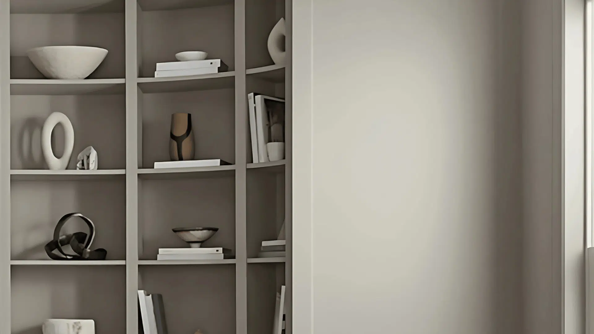
Snowbound serves as an excellent foundation for building layered, interesting design schemes. Its neutral nature allows other elements to shine while providing necessary visual rest areas.
Mixing different whites and off-whites with Snowbound creates depth without complexity; the key lies in varying textures and finishes rather than relying solely on color contrast.
Use Snowbound as your primary neutral base throughout connecting spaces – layer in natural textures through fabrics and materials to add visual interest.
Colorful accessories and artwork gain more impact against Snowbound’s subtle backdrop. Balance the cool undertones with warm lighting choices to create inviting atmospheres.
Pro Tip: Use the “iPhone flashlight test” – shine your phone’s light on the sample at night to see how it looks under LED lighting, which is cooler than traditional bulbs
Conclusive Thoughts
Sherwin-Williams Snowbound proves that the right white paint can modify any space from ordinary to extraordinary.
Its cool gray undertones and LRV of 83 create the perfect balance between brightness and suaveness, making it suitable for every room in your home.
This flexible color works beautifully with various design styles and color combinations, providing endless possibilities for creating spaces that feel both current and timeless.
Its forgiving nature and ability to complement both warm and cool accents make it a reliable choice for homeowners seeking that elusive perfect white.
Order your Snowbound sample today and find out why designers love this flexible white.

Alex Guerrero, a graduate with a Fine Arts degree from the Rhode Island School of Design, has been a visionary in the world of color and design for over 15 years. His professional journey began in the heart of the fashion industry in Milan, where he developed an acute sense for color harmonies and trends. Alex joined our team in 2018, offering fresh and innovative perspectives on color utilization in various spaces. Renowned for his ability to blend contemporary trends with timeless elegance. Outside of work, Alex is an accomplished painter and a volunteer art therapist, his artistic talents further enriching his professional insights.