

Looking for a white paint that delivers brightness without the harshness?
Snowbound by Sherwin-Williams (SW 7004) has become a go-to choice for designers and homeowners who want clean, refined spaces.
With its light reflection value of 83, Snowbound effectively brightens up rooms. Its soft gray and slight purple undertones give it a clean, cool-leaning quality that feels fresh.
Unlike stark bright whites, Snowbound offers a refined look that makes spaces feel bigger and more polished while providing the perfect backdrop for your furniture and decorations.
This timeless choice won’t go out of style and works wonderfully in any room of your house, from kitchens and bedrooms to living rooms and bathrooms.
Ready to see how this versatile white can redesign your space? Let’s find what makes Snowbound special.
Understanding Paint Color Basics
Are you searching for a clean and versatile white that brightens your home without feeling too stark? Snowbound by Sherwin-Williams (SW 7004) is a popular soft white paint color that creates bright, airy spaces that feel fresh and inviting.
Color Terminology
Let’s look at the technical details of Snowbound by Sherwin-Williams. These numbers help designers and painters understand exactly what this color looks like.
| PROPERTY | VALUE |
|---|---|
| LRV | 83 |
| RGB | 237 / 234 / 229 |
| Hex Value | #EDEAE5 |
The light reflection value of 83 shows why Snowbound brightens up rooms so effectively. You can use the RGB and Hex values to match this color for digital designs or order custom items.
Undertones:
- Snowbound has soft gray and slight purple undertones
- It’s a clean, cool-leaning off-white that feels fresh
- Not a pure bright white, but a soft, urbane white
Psychology of White Colors
Colors affect how we feel in a room, even subtle whites like Snowbound. The right white can make a big difference in your home.
- Soft whites like Snowbound create a feeling of freshness and cleanliness
- Cool-leaning whites: Bring a crisp, modern feeling to any room
- Refined whites: Make spaces feel bigger, brighter, and more polished
- Benefits: Creates a clean backdrop, reflects light beautifully, and pairs well with both bold colors and subtle neutrals.
Snowbound is a timeless choice that won’t go out of style. It is the perfect background for your favorite furniture and decorations.
Why Choose Snowbound Sherwin-Williams (SW 7004)?
Sherwin-Williams Snowbound is a bright white that makes rooms feel open and airy. It’s simple to decorate with because it works with so many other colors.
1. Versatility
Snowbound (SW 7004) stays true in different lighting situations. In morning light, it looks crisp and clean, while evening light brings out its subtle warmth.
This color is suitable for any room in your house—kitchens, bedrooms, living rooms, or bathrooms. It looks right at home in farmhouse styles, modern spaces, or traditional homes.
2. Key Features
Snowbound brightens spaces and makes small rooms feel bigger. Its soft white tone with subtle gray undertones works with almost any furniture or accent color.
This timeless shade won’t quickly go out of style, saving you from frequent repainting.
3. Durability
When used in quality Sherwin-Williams finishes, Snowbound handles everyday life well. It’s perfect for busy areas like hallways and family rooms.
This clean white keeps its fresh look even with normal wear and tear. Regular cleaning keeps it looking new for years to come.
4. Texture Effects
Snowbound gives walls a fresh, clean appearance. Its soft white tone beautifully reflects light, making rooms feel more open and welcoming.
Using this color throughout your home creates a consistent background that allows your colorful decorations and furniture to stand out and shine.
Room-by-Room Color Recommendations with Snowbound Sherwin-Williams (SW 7004)
Snowbound is a versatile white that works beautifully throughout your home. It shifts subtly with lighting changes, maintaining its crisp, clean appearance from morning to evening.
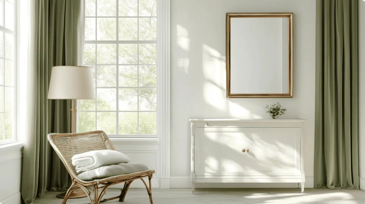
1. Living Spaces and Open Floor Plans
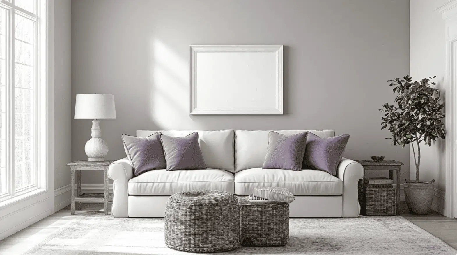
- Snowbound (SW 7004) creates a bright, clean canvas in living areas, making rooms feel more spacious while providing a fresh backdrop for colorful furniture and art.
- The slight gray undertones add refinement to your space without feeling cold, especially in rooms with plenty of natural light.
- For open-concept homes, Snowbound provides a consistent, cohesive look. Pair it with soft grays like Repose Gray (SW 7015) to define different areas while maintaining flow.
2. Bedrooms and Relaxation Areas
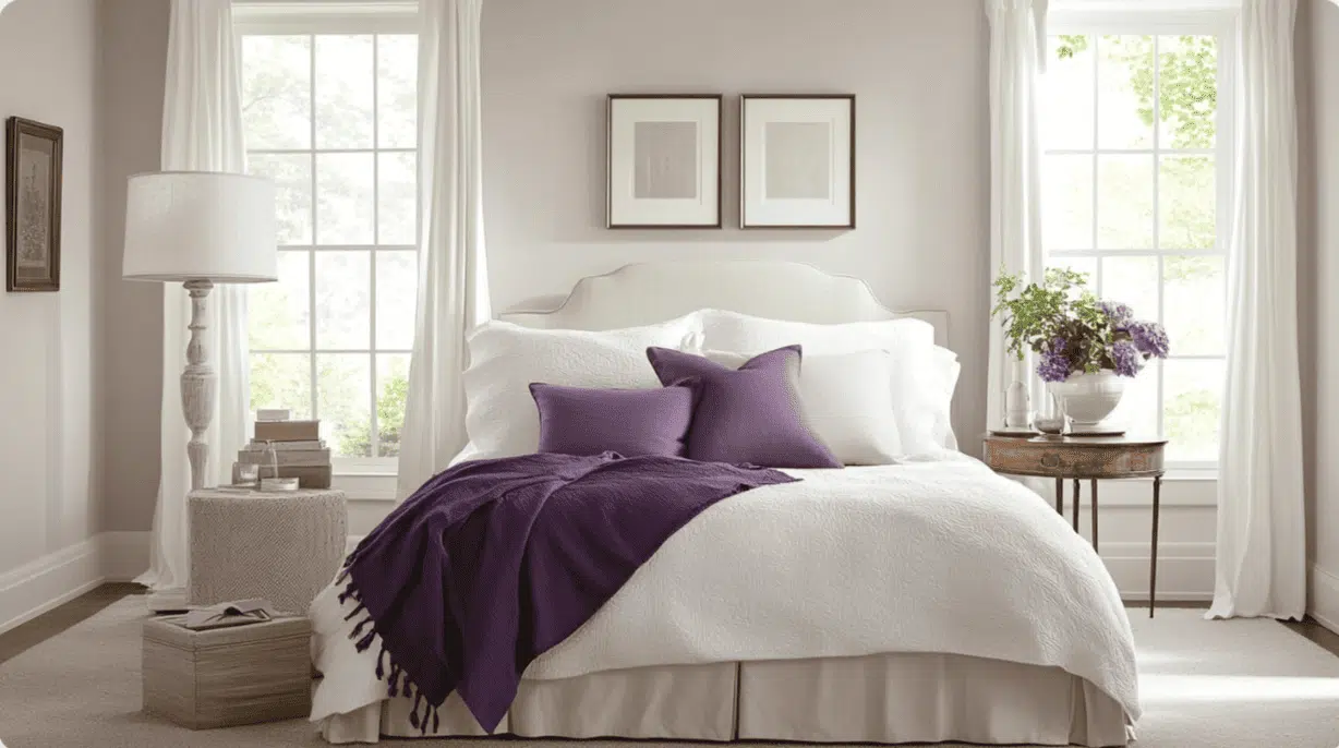
- Snowbound offers a clean and tranquil environment in bedrooms, helping create a restful retreat from busy life.
- Its excellent light reflection brightens dark corners while maintaining a soft, calming quality that’s perfect for sleep spaces.
- Try Snowbound on walls with warm wood furniture for a balanced look, or combine with soft blues like Rainwashed (SW 6211) for a gentle, peaceful atmosphere.
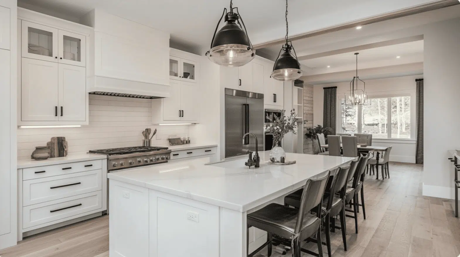
3. Kitchens and High-Traffic Zones
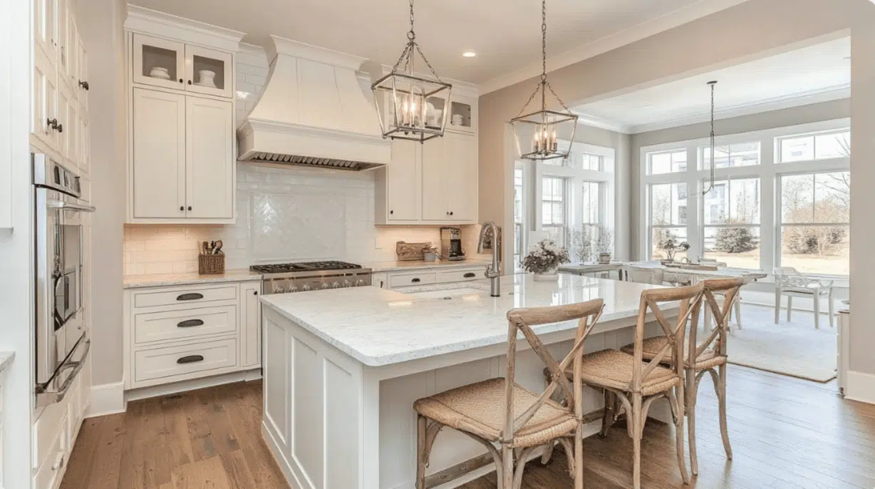
- Snowbound, in a satin or semi-gloss finish, resists stains and wipes clean easily, keeping busy areas looking fresher longer.
- This crisp white makes kitchen cabinets pop, if they’re navy blue, black, or natural wood, allowing your kitchen features to become the focal point.
- The clean undertones work well with modern stainless appliances, marble countertops, and subway tile backsplashes for a timeless kitchen style.
Color Pairings and Combinations for Snowbound Sherwin-Williams (SW 7004)
Snowbound is a bright, clean white with subtle gray undertones that brings a fresh feel to any space. Its excellent light reflective properties make rooms feel more open and airy.
Here are complementary colors that pair beautifully with this versatile white.
Complementary Trim Colors
The right trim colors can enhance Snowbound’s clean, refined look. These specific colors create striking combinations with Snowbound:
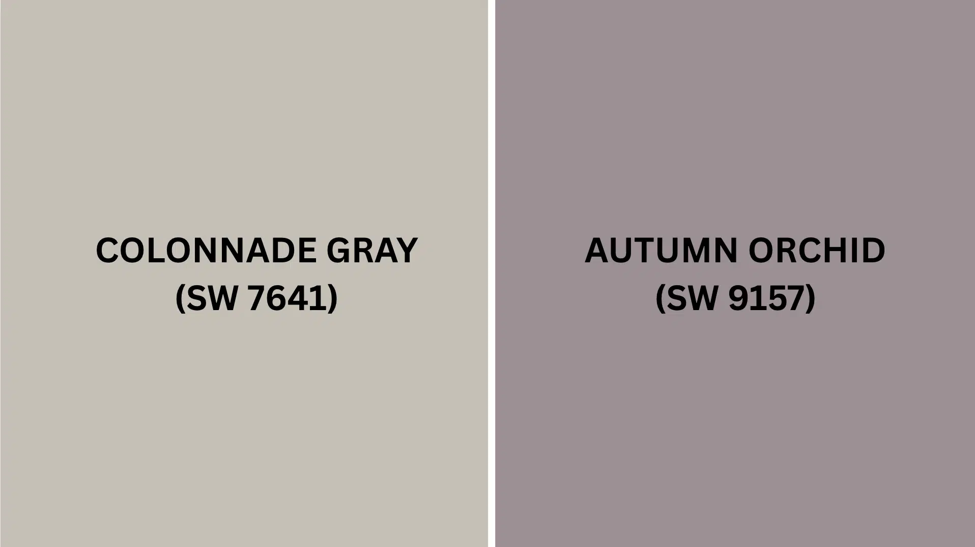
- Colonnade Gray (SW 7641) – This warm-toned medium gray creates a refined contrast against Snowbound walls, bringing depth without heaviness. It works particularly well for door frames and baseboards in contemporary spaces.
- Autumn Orchid (SW 9157) – This muted purple adds an unexpected touch of color that complements Snowbound’s cool undertones. Use it for accent moldings or doors to create a subtle yet distinctive design statement in bedrooms or dining areas.
Both colors bring out different qualities in Snowbound. Try a few sample pairings to see which one looks best in your home’s lighting and with your existing decor.
Creating Cohesive Color Schemes
Snowbound works beautifully with many other colors to create a pulled-together look throughout your home. Here are three different color schemes that use Snowbound as the main color.
1. Monochromatic Scheme
- Snowbound (SW 7004) for main walls
- Pure White (SW 7005) for trim
- Extra White (SW 7006) for ceilings
- Repose Gray (SW 7015) for accent pieces or adjoining rooms
2. Warm Color Scheme
- Snowbound (SW 7004) for main living areas
- Colonnade Gray (SW 7641) for dining room
- Alabaster (SW 7008) for hallways
- Agreeable Gray (SW 7029) for bedrooms
3. Cool Color Scheme
- Snowbound (SW 7004) for main walls
- Autumn Orchid (SW 9157) for bathrooms
- Sea Salt (SW 6204) for bedrooms
- Silverpointe (SW 7653) for home office
Coordinating with Furniture and Decor
Snowbound is a versatile color that complements nearly any furniture and decoration. Its crisp, clean white tone creates a perfect backdrop for showcasing your favorite pieces.
1. Wood Tones
Snowbound creates striking combinations with various wood finishes, making it adaptable to your existing furniture.
Dark woods, such as espresso and walnut, create a dramatic contrast against Snowbound’s bright walls, adding depth and refinement to living spaces.
Medium woods such as oak and hickory balance warmth with Snowbound’s clean backdrop. Light woods, including blonde maple and ash, create a modern, Scandinavian feel that emphasizes Snowbound’s fresh quality.
2. Metals
Gold and brass fixtures add warmth that softens Snowbound’s cooler undertones, creating a graceful, balanced look throughout your home. Matte black hardware offers a sharp, contemporary contrast that makes fixtures stand out boldly against white walls.
Silver, nickel, and chrome maintain Snowbound’s clean, fresh aesthetic while adding brightness and reflection. This combination is perfect for kitchens and bathrooms where a crisp look is desired.
3. Decor
Textured fabrics like bouclé, velvet, and linen create visual interest against Snowbound’s smooth, bright background, adding depth without competing with the clean palette.
Navy, green, and charcoal accents provide urbane contrast against Snowbound, creating focal points in an otherwise neutral space.
Natural elements, including houseplants, driftwood, and stone, bring organic warmth and life to rooms painted in this versatile white.
Similar Paint Colors: Perfect Alternative to Snowbound (SW 7004)
These colors work well in many different rooms. They create bright, clean spaces that feel fresh and refined.
Choosing the right white paint can significantly change how your room feels, so comparing these alternatives can help you find the perfect match for your home’s lighting and style.
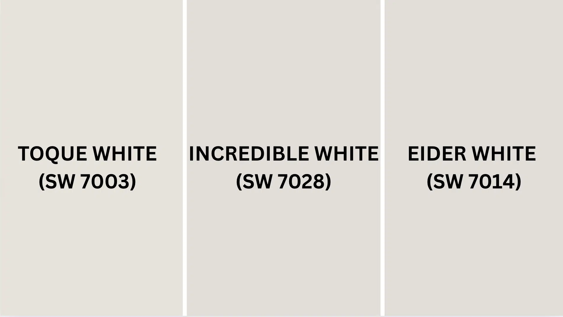
1. Toque White (SW 7003)
- Warm-leaning white with light beige undertones that soften spaces and create an inviting, cozy atmosphere.
- Bright enough to open up small rooms while offering more warmth than Snowbound for north-facing spaces.
- Pairs beautifully with natural wood tones and traditional furniture pieces for a timeless, welcoming look.
2. Incredible White (SW 7028)
- Soft white with noticeable yellow-beige undertones that add warmth and gentle character to any space.
- Creates a more traditional feeling than Snowbound, perfect for homes with antiques or classic structural details.
- Works exceptionally well in rooms with warm-toned flooring or in spaces that need a cozier, less stark atmosphere.
3. Eider White (SW 7014)
- Distinctive beige white with visible gray-beige undertones that add subtle depth and refinement to walls.
- Offers a more muted, softer appearance that works beautifully in bedrooms and contemplative spaces.
- Creates a graceful contrast with white trim while maintaining enough brightness to keep rooms feeling open and airy.
Final Thoughts
Snowbound Sherwin-Williams (SW 7004) truly stands out as a versatile white that adapts beautifully to different lighting conditions throughout the day.
If you’re painting kitchen cabinets, bedroom walls, or creating a spa-like bathroom retreat, this crisp white creates a timeless backdrop that makes your special pieces shine.
Pair it with dark woods for drama, gold fixtures for warmth, or add pops of navy, green, or natural elements to bring life to your freshly painted space.
With its perfect balance of brightness and warmth, Snowbound proves that the right white can make all the difference in creating a home that feels both fresh and inviting.
Ready to change your home with this designer-favorite white? Grab a sample of Snowbound SW 7004 today!
Share your painting projects in the comments below. I’d love to hear your Snowbound success stories!
If you’re interested in a more informational color review blog, feel free to click here and explore other blogs that you might enjoy.

Alex Guerrero, a graduate with a Fine Arts degree from the Rhode Island School of Design, has been a visionary in the world of color and design for over 15 years. His professional journey began in the heart of the fashion industry in Milan, where he developed an acute sense for color harmonies and trends. Alex joined our team in 2018, offering fresh and innovative perspectives on color utilization in various spaces. Renowned for his ability to blend contemporary trends with timeless elegance. Outside of work, Alex is an accomplished painter and a volunteer art therapist, his artistic talents further enriching his professional insights.