Are you searching for the perfect green-gray paint to change your home into a natural, serene retreat?
Sherwin-Williams Soft Sage might be exactly what you’re looking for.
This popular muted green creates a calm, earthy atmosphere while providing a universal backdrop for furniture and decor.
With gentle gray undertones and moderate light reflectance, this color adds warmth to spaces without feeling overwhelming.
This adaptable green-gray shifts throughout the day, appearing more green in morning light and softening to a subtle gray by evening.
It works with modern, farmhouse, or coastal styles, creating a grounded, natural canvas for your unique home design.
Understanding Sherwin-Williams’ Soft Sage
This is a popular muted green paint color by Sherwin-Williams.
It creates serene and balanced spaces that feel connected to nature and peaceful.
Color Terminology
Let’s look at the technical details of this color.
These numbers help designers and painters understand exactly what this color looks like.
| PROPERTY | VALUE |
|---|---|
| LRV | 47 |
| RGB | 188 / 190 / 177 |
| Hex Value | #BCBEB1 |
You can use the RGB and Hex values when trying to match this color for online designs or when ordering things for your home.
Undertones:
- It has soft gray undertones
- It’s a muted, earthy green that feels natural
- Not a bright green, but a subtle, gentle sage tone
Psychology of Sage Green Colors
When you paint your walls with this color, you’ll notice it has a grounding effect.
This color can actually change your mood when you enter a room.
- Sage greens: Create a feeling of balance and connection to nature
- Gray-based greens: Bring a peaceful, organic feeling to any room
- Muted greens: Make spaces look cozier, more inviting, and pleasant
- Benefits: Works in any light, disguises imperfections, complements natural materials, and most decor styles.
This versatile green-gray is a good choice that won’t go out of style. It works as a perfect background for your favorite things in your home.
Why Choose Sherwin-Williams Soft Sage (SW 9647)?
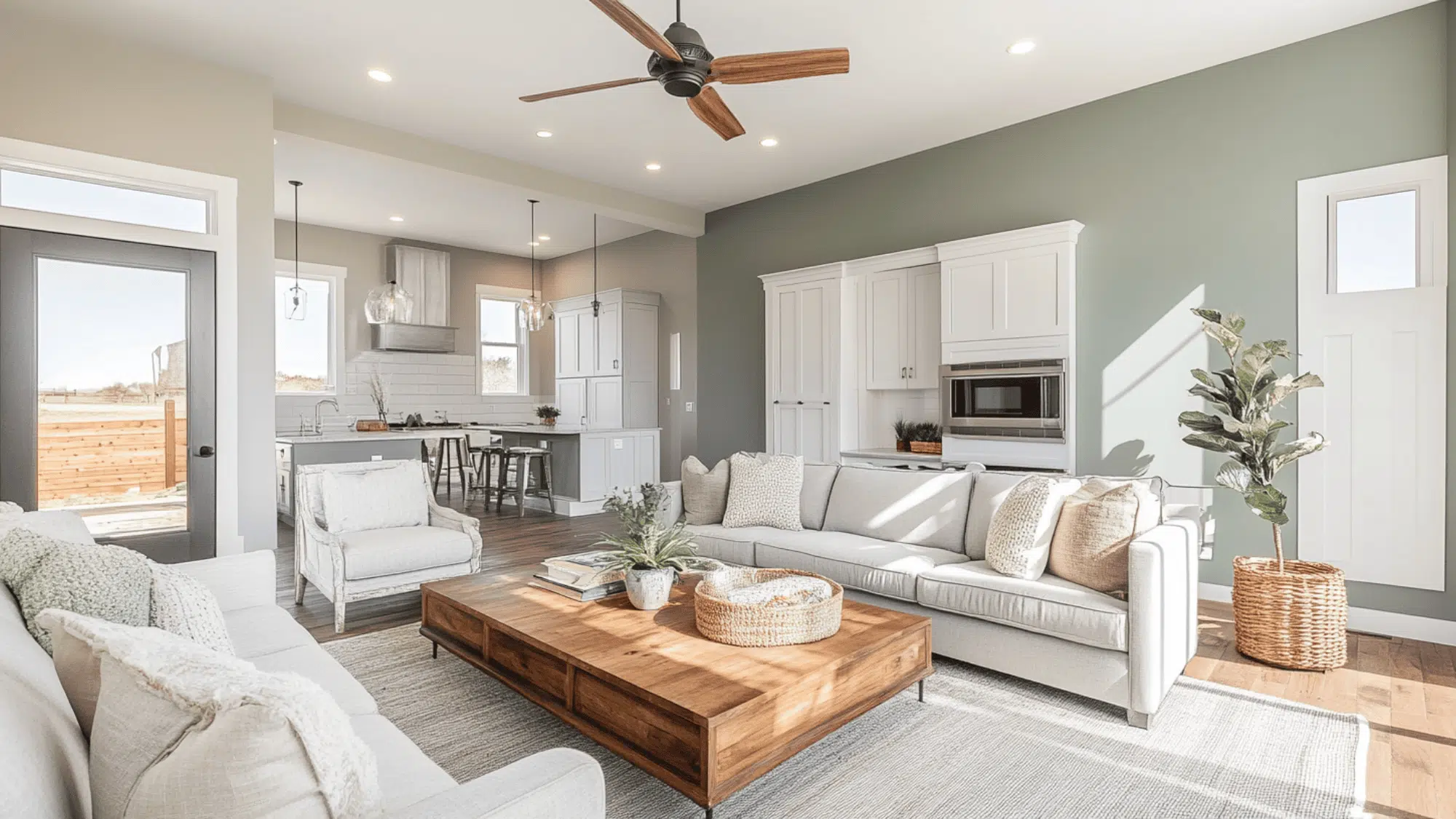
Sherwin-Williams Soft Sage is a calming green-gray that adds natural warmth to spaces while keeping them grounded.
It’s a go-to color when you want something earthy that still has subtle character.
1. Versatility
It adapts beautifully to changing lighting throughout the day.
In morning light, it shows its green side, while evening lamps bring out its softer gray tones.
This color works in living rooms, kitchens, or even bedrooms.
If your style is farmhouse, modern, or coastal, it provides the perfect backdrop.
2. Key Features
Its neutral, green-gray tone makes it a versatile choice that pairs well with most furniture colors.
Its LRV of 47 creates a balanced brightness, not too dark or too light for most spaces.
Unlike trendy colors that quickly date your home, this timeless green-gray will look stylish for years to come.
3. Durability
When applied in Sherwin-Williams’ Cashmere or Emerald finishes, the color resists scuffs and marks.
The muted green-gray color hides minor imperfections while maintaining its clean appearance.
A simple wipedown keeps walls looking freshly painted even after years of daily life.
4. Texture Patterns
This paint color creates a velvety, soft appearance that adds subtle depth to your walls.
Its gray undertones respond beautifully to changing light, creating gentle shadows and highlights throughout the day.
This color provides a consistent flow when used in connected spaces while allowing your artwork and furnishings to stand out.
Room Color Recommendations: Sherwin-Williams Soft Sage
This is a pleasant, green-gray shade that works well in every room of your home.
It changes slightly throughout the day, staying balanced and calm in any lighting.
1. Living Spaces
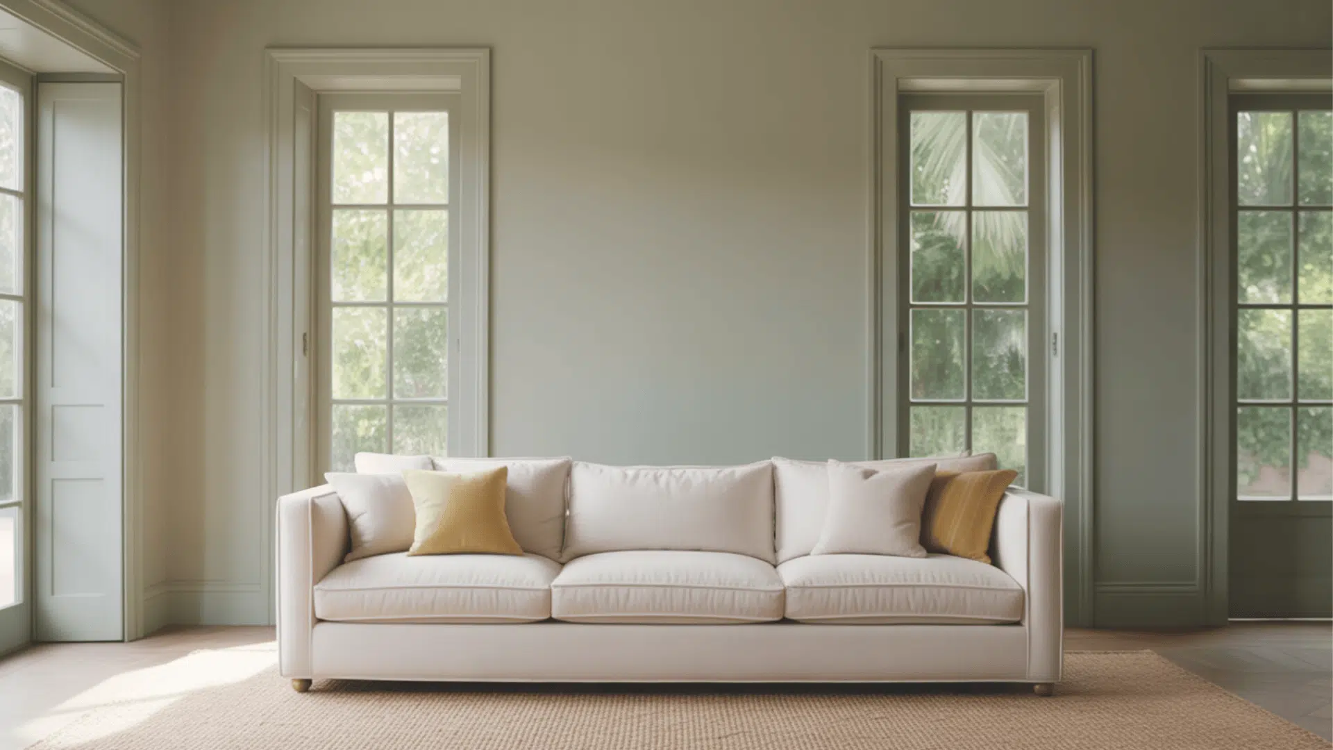
- Creates a grounded, natural feeling in living rooms, making your space feel connected to the outdoors.
- The green-gray tone brings a peaceful vibe to your room, especially when paired with natural materials.
- For open homes, use the color everywhere to make rooms flow together, or mix it with slightly darker greens for some variety.
- Plants and wooden furniture look especially beautiful against these walls, enhancing the natural aesthetic.
2. Bedrooms and Relaxation Areas
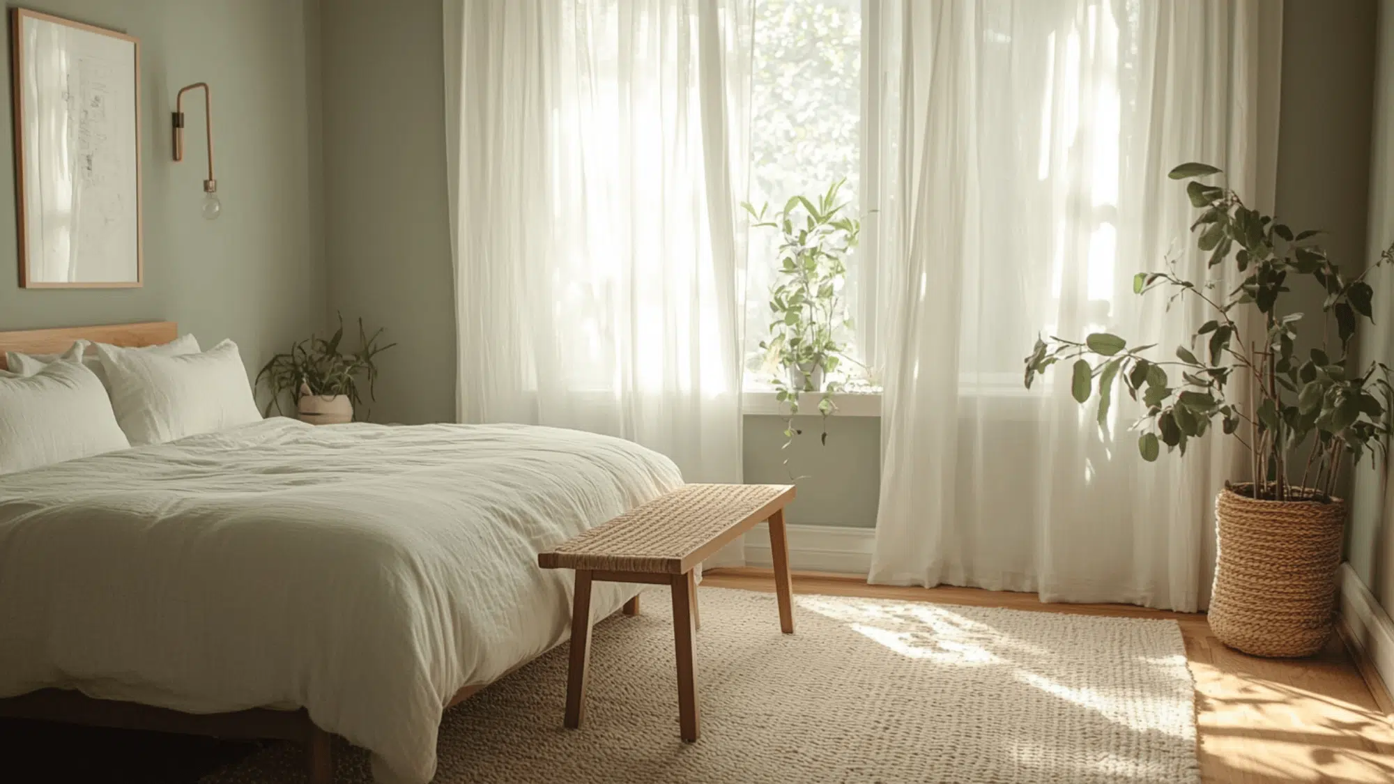
- Helps make your bedroom feel like a calm retreat where nature-inspired colors promote better sleep and relaxation.
- The moderate LRV (47) creates a cozy atmosphere without making the room feel dark or small.
- Try this on all walls for a soothing look, or pair it with creams like Alabaster for a gentle contrast.
- Natural fibers like linen and cotton bedding enrich the organic quality of this beautiful green-gray.
3. Kitchens and Dining Spaces
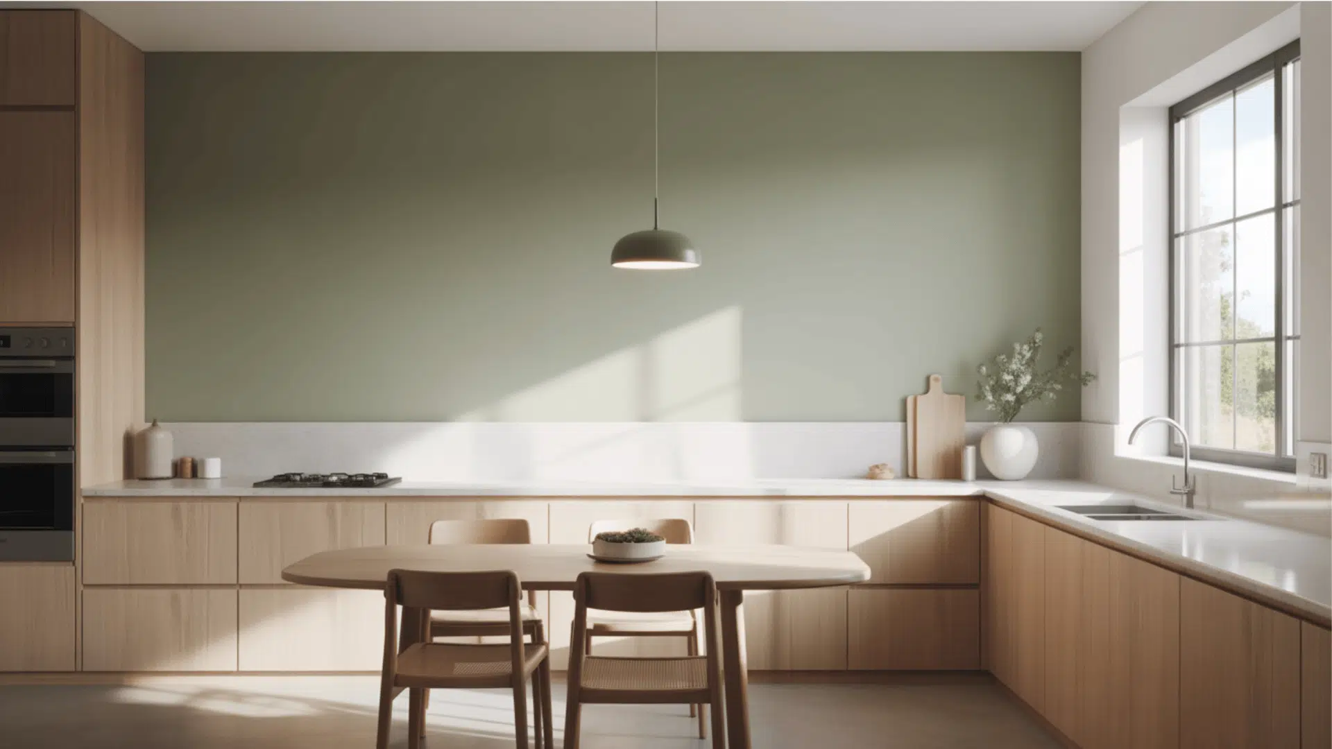
- This beautiful color changes kitchens into warm, inviting spaces that feel connected to nature and homey.
- The green-gray tone provides a perfect background for both white and wood cabinets, creating a balanced look.
- Pair with brass or matte black hardware to improve the earthy quality while adding a touch of sophistication.
- Natural stone countertops like marble or quartz complement the organic feel of Soft Sage beautifully.
Color Pairings and Combinations for Sherwin-Williams Soft Sage
This is a gentle green-gray with soft gray undertones.
Its Light Reflectance Value (LRV) of 47 makes it a balanced neutral that adds warmth to spaces while creating a calm, natural feeling.
Here are color pairings that work great with it.
Complementary Trim Colors
Picking the right trim color can really change how a color looks on your walls.
These colors work especially well with Soft Sage and can highlight its earthy undertones.
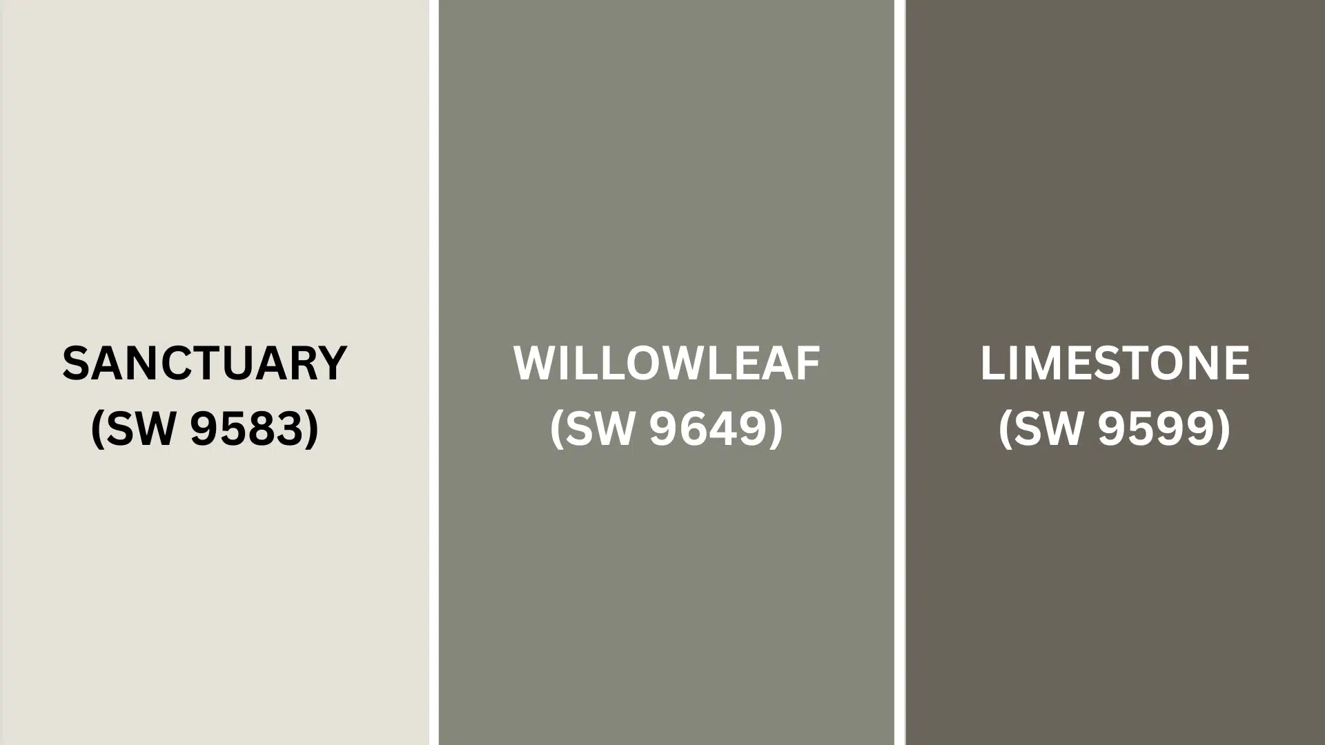
1. Sanctuary (SW 9583)
This versatile greige offers the perfect backdrop for Soft Sage’s gentle green undertones, creating a seamless transition between walls and trim.
Its warm neutral base prevents the space from feeling too cool while maintaining the serene, spa-like surroundings that make Soft Sage so appealing.
2. Willowleaf (SW 9649)
This deeper sage tone creates beautiful monochromatic depth when paired with Soft Sage, allowing you to play with tonal variation without jarring contrast.
It’s ideal for accent elements, such as kitchen islands, bathroom vanities, or interior doors, where you want subtle definition within the same color family.
3. Limestone (SW 9599)
This soft, creamy neutral brings just enough warmth to balance the cooler undertones of Soft Sage without competing for attention.
Its subtle beige base works particularly well in spaces with natural light, where it can highlight architectural details while keeping the overall palette calm and cohesive.
Before finalizing, test small areas with each color pairing to see which best showcases it in your home’s lighting.
Creating Cohesive Color Schemes
This perfect neutral works beautifully with many other colors to create a pulled-together look throughout your home.
Here are three different color schemes for the color:
| SCHEME | MAIN WALLS / AREAS | TRIM / ACCENT / CEILINGS | OTHER ROOMS / ACCENTS |
|---|---|---|---|
| Monochromatic | Soft Sage (SW 9647) | Pure White (SW 7005), Alabaster (SW 7008) | Escape Gray (SW 6185) |
| Warm | Soft Sage (SW 9647) | Accessible Beige (SW 7036), Kilim Beige (SW 6106) | Perfect Greige (SW 6073) |
| Cool | Soft Sage (SW 9647) | Sea Salt (SW 6204), Silvermist (SW 7621) | Oyster Bay (SW 6206) |
NOTE: All colors shown are Sherwin-Williams paints. Colors will look different depending on your lighting, so always test samples on your walls before buying full gallons.
Coordinating with Furniture and Decor
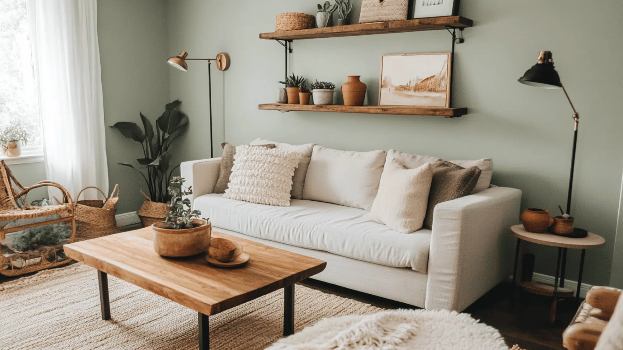
Soft Sage is a versatile color that complements almost any furniture and decoration.
Its earthy green-gray tone creates a perfect backdrop for showcasing your favorite things.
1. Wood Tones
This Sherwin-Williams color looks great with all kinds of wood, from dark to light.
Dark woods like walnut create a rich contrast against these muted green walls.
Medium woods like oak add warmth while maintaining the natural aesthetic.
Light woods like maple or pine improve the fresh, organic feel when paired with this soft green-gray.
2. Metals
Brass and gold fixtures add warmth and elegance, complementing the earthy undertones.
Matte black hardware creates contemporary contrast that grounds the softer green-gray walls.
Brushed nickel adds a subtle modern touch without competing with the calming color palette.
3. Decor
Cream and ivory fabrics create a soft, natural palette that enriches the peaceful quality of Soft Sage.
Terracotta, rust, and clay accents add warmth and depth, connecting beautifully with the earthy green.
Natural elements like woven baskets, clay pots, and stone bring texture and genuineness to spaces painted in this versatile green-gray.
Similar Paint Colors: Perfect Alternatives to Soft Sage (SW 9647)
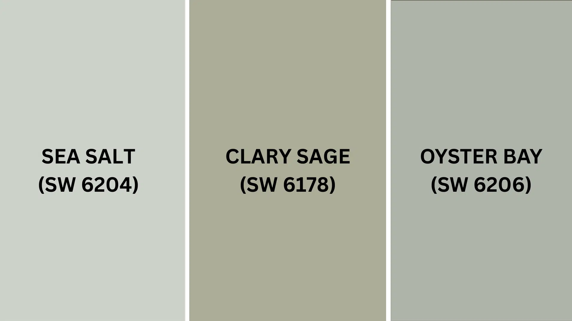
All these colors work well in many different rooms.
They create balanced, natural spaces that feel welcoming and serene.
1. Sea Salt (SW 6204)
- Lighter green-gray with subtle blue undertones
- Higher LRV (63) gives a brighter, airier feel while maintaining the natural aesthetic
- Creates a fresher, more coastal look that works great in bedrooms and bathrooms
2. Clary Sage (SW 6178)
- Slightly deeper sage with stronger green undertones
- Similar LRV (44) but feels more definitively green
- Creates a cozier, more defined natural feeling that’s perfect for living rooms and dining areas
3. Oyster Bay (SW 6206)
- Green-gray with stronger blue undertones
- Creates a cooler, coastal feeling while still keeping spaces earthy
- Looks especially good in rooms with natural light and coastal-inspired decor
Final Words
Sherwin-Williams Soft Sage truly stands out as a versatile green-gray that can work wonders in any home.
Its earthy undertones create a peaceful, natural atmosphere.
From living rooms to kitchens, bedrooms to home offices, this adaptable shade complements various wood tones, metals, and accent colors.
Pair with Pure White trim for a fresh look or warm accents for added depth; it provides the perfect backdrop for your home story.
Ready to create a space that feels both connected to nature and timeless?
This perfect neutral might be your new favorite color!
Have you used this paint color in your home?
We’d love to hear about your experience – drop a comment below and share your thoughts!
If you’re interested in more informational color review content, feel free to click here and explore other blogs that you might enjoy.

