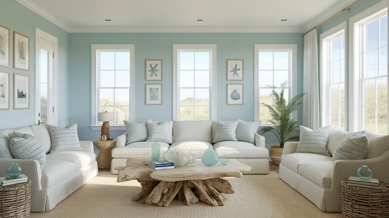
Coastal paint colors make your home feel light, calm, and fresh, just like a day at the beach. They’re soft, simple, and perfect for creating a peaceful space.
If you love cool blues, sandy beiges, or light seafoam greens, these shades bring that breezy feeling indoors.
I’ve always found that using these colors helps a room feel more open and relaxing, even if you’re far from the coast.
In this post, I’ll walk you through what coastal paint colors are, show you the best ones to try, and share easy tips for using them.
You don’t have to live near the ocean to get that airy, beachy look.
All it takes is the right color on your walls and a few simple changes. Let’s get started and find the perfect coastal shades for your home.
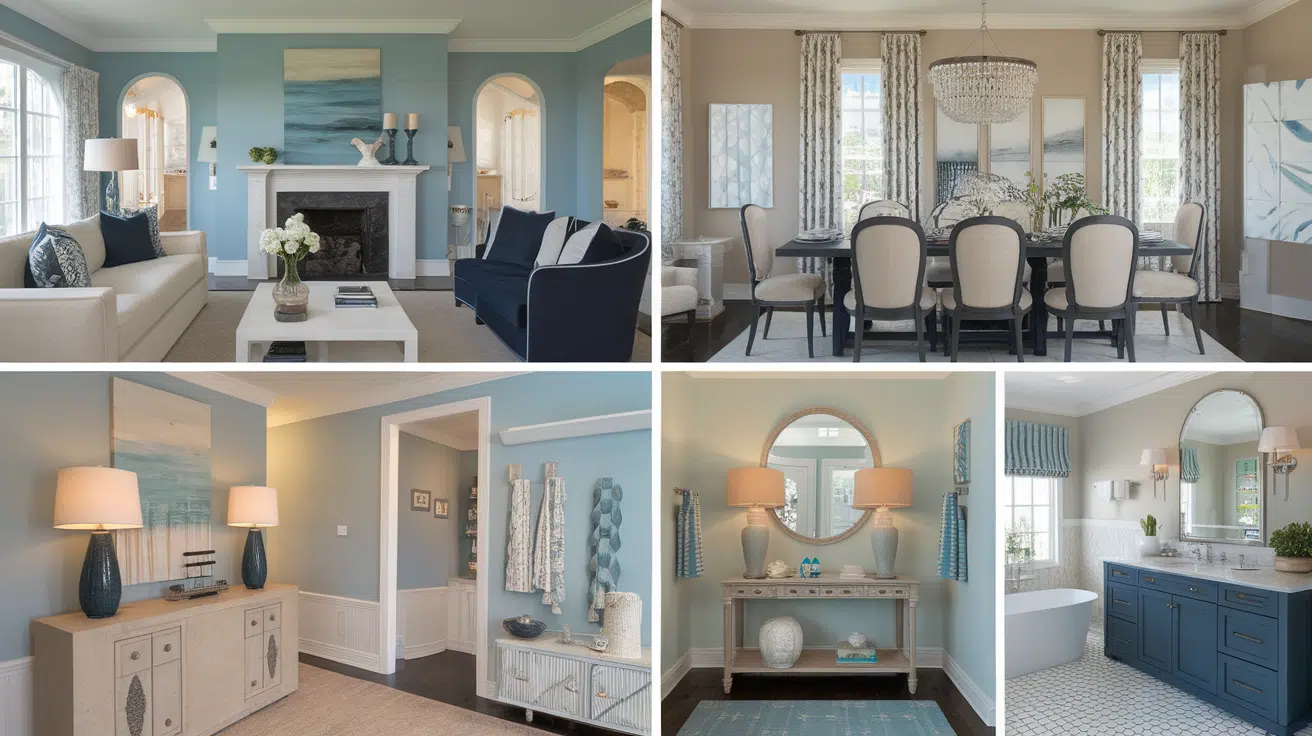
Characteristics and Benefits of Coastal Color Schemes
Coastal colors are soft and soothing. Think of the colors you see at the beach: light blue skies, sandy shores, and gentle waves.
These shades are usually light blues, greens, whites, and tans. They help make a room feel calm, open, and airy.
You won’t find bold or dark colors in this style. Everything stays soft and natural, just like the coast.
One significant benefit of coastal colors is their relaxing effect. These colors are great if you want your home to feel peaceful and stress-free.
They also make rooms look bigger and brighter, especially if there’s natural light. Another bonus? They’re easy to match with other colors and styles.
Top Coastal Paint Colors by Leading Brands
The right shades can make any space feel like a getaway by the sea, even if you’re far from the shore. Below are some of the most loved and my top favourite coastal paint colors from trusted brands:
Sherwin-Williams Coastal Colors
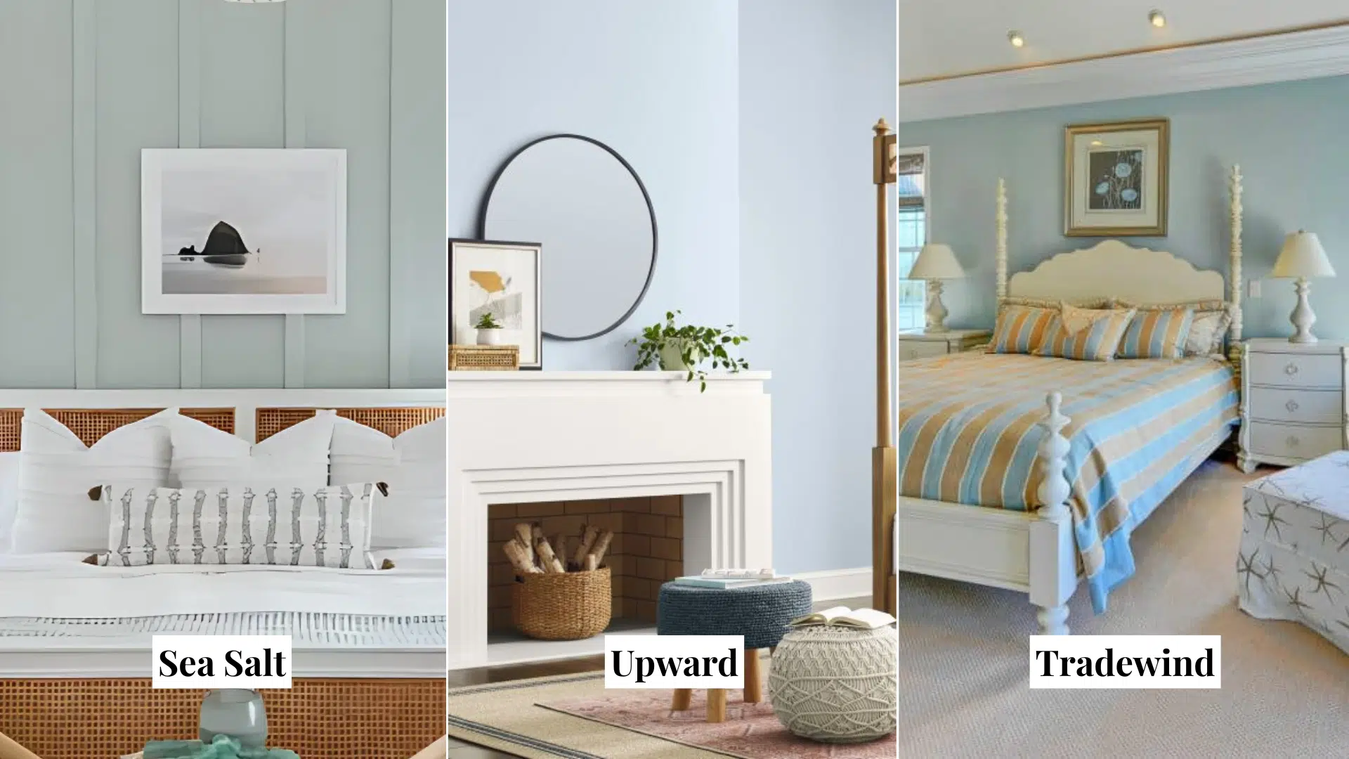
1. Sea Salt (SW 6204)
This is a top favorite for coastal-style homes. Sea Salt has a soft mix of green, gray, and a hint of blue. It shifts depending on the lighting, giving your walls a fresh, cool tone throughout the day.
- Looks light and airy in natural light
- Calms down bright spaces
- Works well in bathrooms, bedrooms, and kitchens
- Matches white trim and sandy beige décor
2. Upward (SW 6239)
Upward is a pale, sky blue with cool undertones. Sherwin-Williams named it their 2024 Color of the Year for its breezy, relaxed feel.
- Great for walls in living rooms or home offices
- Pairs beautifully with crisp whites or natural woods
- Offers a clean, open feeling
- Reflects a soft brightness without being too bold
3. Tradewind (SW 6218)
Tradewind is another soft blue with a gray base. It feels cool and relaxing, just like ocean air.
- Adds a subtle color to neutral spaces
- Perfect for guest bedrooms or reading nooks
- Works well with beachy accents like driftwood or rattan
- Doesn’t overpower the room, even in smaller spaces
Benjamin Moore Coastal Colors
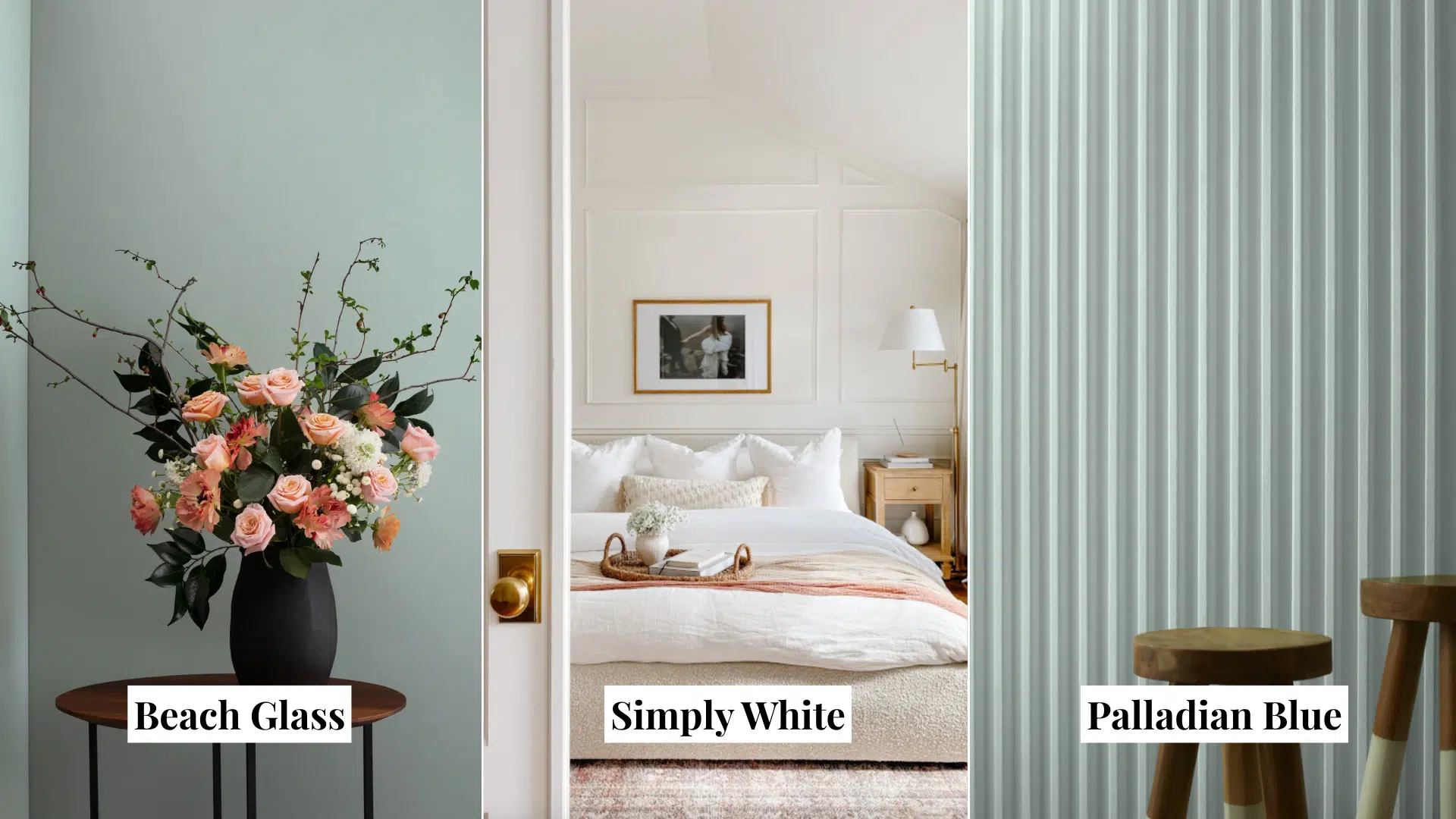
4. Beach Glass (1564)
This color is a soft blue-green with just enough gray to tone it down. It’s soothing and reminds you of foggy coastal mornings.
- Ideal for bedrooms or calm living spaces
- Pairs nicely with white, cream, and wood tones
- Feels fresh and modern without being too trendy
- Works great in both bright and low-light rooms
5. Simply White (OC-117)
Simply White is one of Benjamin Moore’s most popular whites. It has a slight warmth that keeps it from feeling too stark.
- Perfect for trim, ceilings, or full walls
- Balances well with soft coastal blues and greens
- Makes small rooms feel larger
- Adds brightness to any color palette
6. Palladian Blue (HC-144)
Palladian Blue is a classic coastal paint color. It blends blue, green, and gray into one relaxing tone.
- Looks especially beautiful in natural light
- Works well in bathrooms, laundry rooms, and bedrooms
- Matches white, soft grays, and beach-style wood furniture
- Gives off a breezy, vintage coastal feel
Behr Coastal Colors
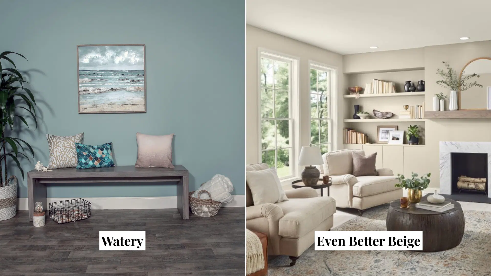
7. Watery (HDC-CT-26)
Watery is a soft, gray-blue that brings a splash of ocean color without feeling too cold.
- Works well in bathrooms and entryways
- Adds a coastal feel to even a small space
- Easy to pair with whites and neutral beige
- Great for a whole-room color or accent wall
8. Even Better Beige (DC-010)
This warm beige feels like sandy shores under your feet. It’s neutral and calm, which makes it a great backdrop for brighter accents.
- Good for open floor plans or living rooms
- Blends well with seafoam greens, blues, or whites
- Adds warmth to a coastal palette
- Simple and timeless choice for a beachy base color
Farrow & Ball Coastal Colors
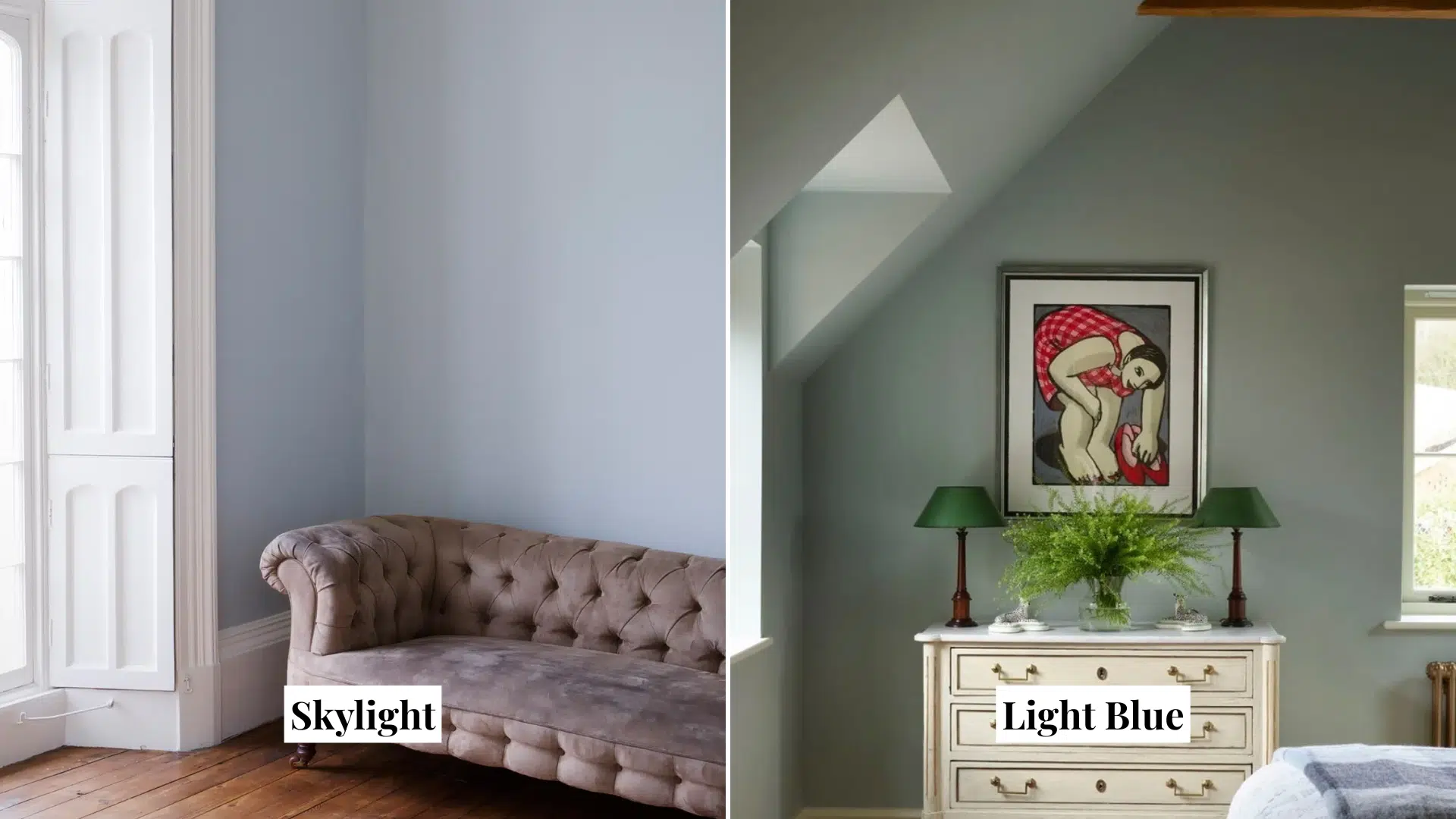
9. Skylight (No. 205)
Skylight is a light gray-blue that feels cool and calm. It works beautifully in coastal-style homes, especially in rooms with lots of natural light.
- Feels soft and airy in open spaces
- Adds a fresh touch without being too bright
- Looks lovely in bedrooms or bathrooms
- Pairs well with whites and sandy tones
10. Light Blue (No. 22)
This is a soft, muted blue with a slightly green undertone. It shifts in tone during the day, giving the room a gentle, peaceful vibe.
- Great for living rooms or coastal kitchens
- Works nicely with neutral fabrics and wood
- Adds depth without feeling heavy
- Gives a soft, misty look that fits beachy styles
PPG (Pittsburgh Paints) Coastal Colors
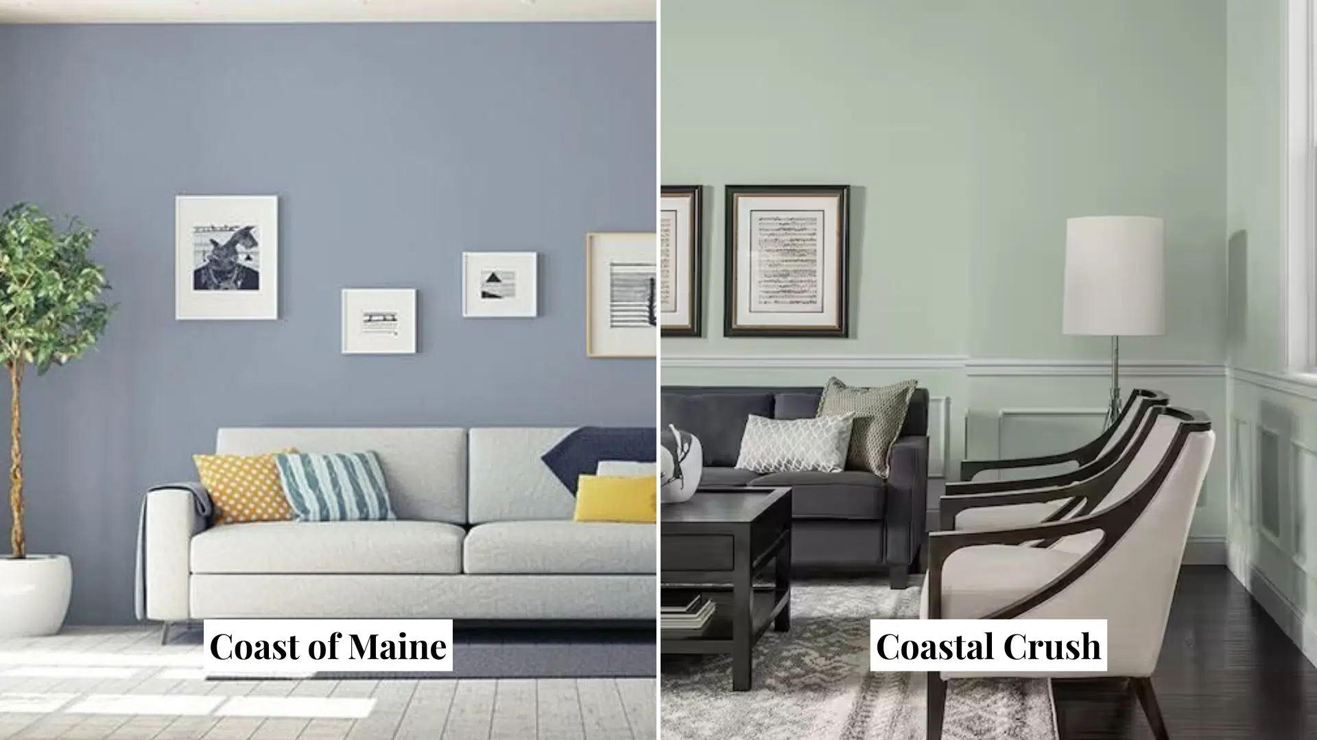
11. Coast of Maine (PPG10-20)
Coast of Maine is a rich, deep blue inspired by the bold beauty of ocean waves. It brings a moody yet calming feel to any room.
- Great for accent walls or full-room color in bedrooms and dens
- Pairs well with crisp white trim and natural wood textures
- Adds depth and drama without feeling too dark
- Creates a cozy, coastal vibe for modern or classic styles
12. Coastal Crush (PPG1129-4)
Coastal Crush is a midtone, shaded, mature green with a holly undertone.It is a perfect paint color for a bedroom suite.Pair it with warm honeyed woods or white trim.
- Ideal for bedrooms, living rooms, or dining rooms
- Complements warm honeyed woods and white trim
- Adds a serene, coastal ambiance to any space
- Versatile for both traditional and modern interiors
Valspar Coastal Colors
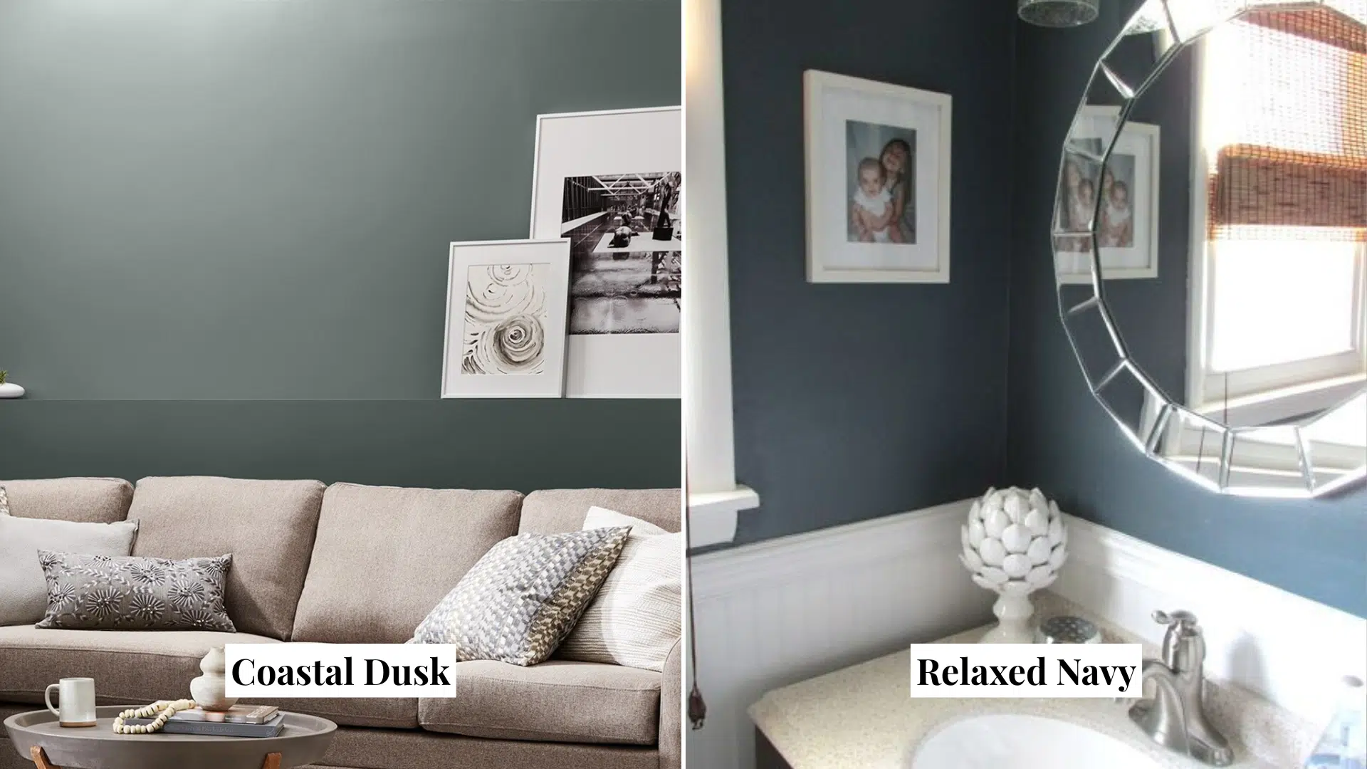
13. Coastal Dusk (5002-2B)
Coastal Dusk is a soft, stormy gray with a touch of green. It brings a cool and calming look to your walls and works well with white or driftwood-style trim.
- Great for bedrooms, hallways, and cozy living spaces
- Looks modern but still feels warm and coastal
- Pairs well with light woods and soft whites
- A good pick if you want depth without going too dark
14. Relaxed Navy (5001-2B)
Relaxed Navy is a deep, calm blue with cool gray undertones. It’s bold but not too overpowering, giving rooms a rich, beach-inspired feel.
- Makes a great statement on accent walls or cabinets
- Looks sharp with white trim and brass or wood accents
- Adds a cozy, nautical touch to bedrooms or studies
- Works well in both large and small spaces
Choosing the right coastal paint color comes down to the ambiance you want to create in your home.
Try a few samples and see how they look in your light. Once you find your favorite, your home will feel like a relaxing beach retreat every single day.
Incorporating Coastal Colors into Your Home
I’ve used these shades in different parts of my home, and they always make the rooms feel brighter, softer, and more relaxing. You can start small or go big; either way, coastal colors can work in every room.
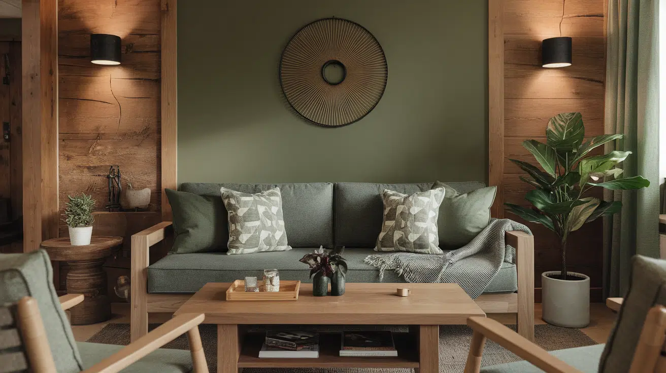
Living Room
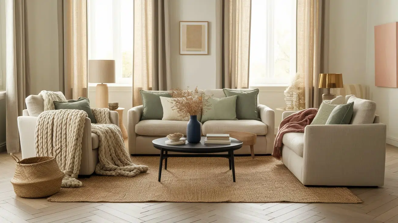
The living room is a great place to start. Soft blues or sandy beige shades on the walls can create a calm and cozy atmosphere.
If you already have neutral furniture, these colors will blend in perfectly.
I like adding light white trim or natural wood pieces to bring out the beachy feeling even more. A coastal living room feels like a place you can really unwind.
Kitchen
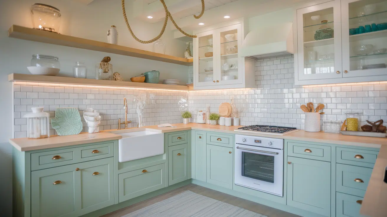
The kitchen might not be the first place you think of for coastal colors, but it’s actually a great spot.
Painting your cabinets in a shade like seafoam or pale gray-blue gives the whole room a fresh, clean look.
You can also try a soft blue or creamy white on the walls. I’ve even seen light turquoise used for kitchen islands – it adds just enough color without going over the top.
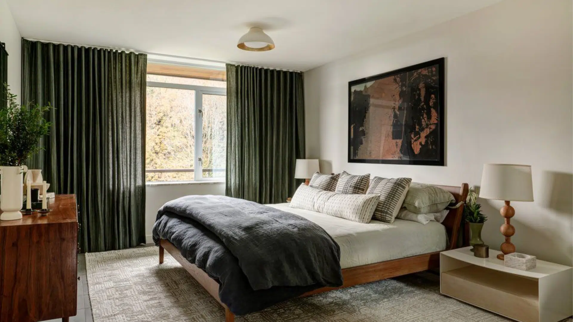
Bedroom
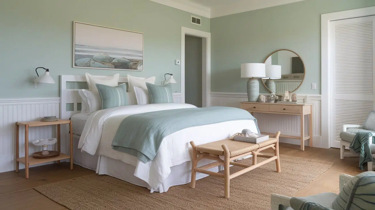
Coastal colors are perfect for bedrooms because they help you relax. Soft green-blues and whites are great choices for the walls.
I like using crisp white bedding with a pop of sea-glass green or sky blue in the pillows and curtains.
The whole room feels peaceful, like a quiet morning at the beach. If you want an even softer feel, try using a pale gray with warm undertones to keep things cozy.
Bathroom
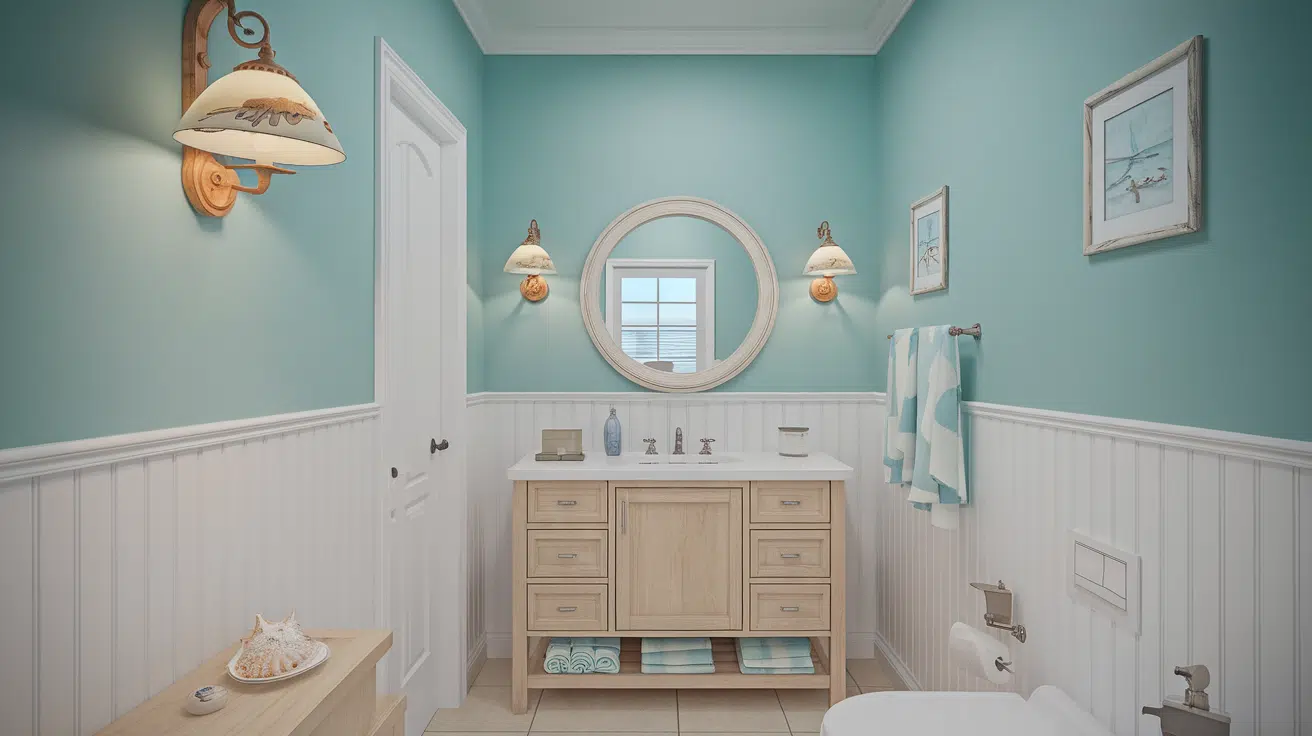
Bathrooms are a natural match for coastal paint colors. Pale aqua, ocean blue, and light sandy beige look clean and fresh in smaller spaces.
I’ve seen bathrooms that use white walls with blue or green accents, and they always feel spa-like.
You don’t have to repaint everything either – a new wall color and a few matching towels or accessories can make a big difference.
Coastal paint colors are more than just pretty shades – they set the mood. They help your home feel easygoing and light, like a never-ending beach vacation.
Choosing the Right Coastal Paint Colors
Choosing the right coastal paint color can be a bit tricky, especially since lighting and decor can alter how a color appears. However, don’t worry; I’ve a few helpful tips that make the process a lot easier.
- Test paint samples in your space: Always paint a few swatches directly on your wall. Try to check them at different times of the day. Morning light, afternoon sun, and evening lamps all make colors look different.
- Pay attention to natural lighting: Rooms with lots of sunlight may make colors appear lighter, while darker rooms can make them look duller.
- Match with what you already have: Look at your furniture, flooring, and decor. If you have warm tones, pick a coastal color with a warm base. For cooler-toned rooms, go with cool coastal shades like soft aqua or misty blue.
- Don’t forget the finish: A flat or matte finish gives a relaxed look, while satin or eggshell adds a little polish. I usually go for satin in kitchens and bathrooms, where walls need to be easy to clean.
- Start small: If you’re nervous about bold changes, try painting an accent wall or a hallway first. It gives you a feel for the color without the commitment of a whole room.
Take your time, try a few samples, and trust your gut. Once you land on the right color, your home will feel like a peaceful escape every day.
Conclusion
Coastal paint colors are a simple way to bring peace and light into your home.
If you love soft blues, sandy neutrals, or light greens, these shades can make any room feel more open and calming.
They work well in every space, living rooms, kitchens, bedrooms, and even bathrooms. The best part is how flexible they are.
You can match them with wood, white trim, or natural textures for that perfect beachy look.
I’ve found that even small changes, like painting one wall or freshening up a room with a coastal accent, can make a big difference.
Don’t be afraid to try out a few samples before making a final choice.
With the right coastal color, your home can feel like a relaxing getaway all year round. It’s a fresh, timeless look that’s easy to enjoy every day.
For more ideas on combining coastal shades beautifully, check out this post on inspiring coastal color palette combinations.

Alex Guerrero, a graduate with a Fine Arts degree from the Rhode Island School of Design, has been a visionary in the world of color and design for over 15 years. His professional journey began in the heart of the fashion industry in Milan, where he developed an acute sense for color harmonies and trends. Alex joined our team in 2018, offering fresh and innovative perspectives on color utilization in various spaces. Renowned for his ability to blend contemporary trends with timeless elegance. Outside of work, Alex is an accomplished painter and a volunteer art therapist, his artistic talents further enriching his professional insights.