Looking to refresh your walls but tired of plain white?
I know the struggle of staring at countless paint swatches, feeling lost about which color will actually work in your space.
Those Pinterest-perfect rooms seem impossible to recreate, and picking the wrong shade could be a costly mistake.But here’s something interesting: Sherwin Williams Oyster Bay might be exactly what you need.
This stunning grayish-green with slate-blue hints brings the calming essence of nature indoors. I’ve found it creates spaces that feel both modern and timeless, without being too bold or boring.
Let me show you how this versatile color can turn your home into a peaceful retreat.
If you’re curious how a comparable hue performs, check out Comfort Gray Sherwin Williams: A Complete Review, which explains another blue-gray neutral with a similar calming vibe.
What Makes Oyster Bay a Popular Choice?
I’ve seen many colors come and go, but Oyster Bay stands out for several good reasons. Let me tell you why this color has won so many hearts, including mine.
First off, it’s a perfect mix of gray and green with hints of blue. This blend makes it more than just another neutral – it’s like bringing a soft whisper of nature into your home.
When I first used it in my own space, I noticed how it shifts subtly throughout the day, looking fresh in morning light and cozy as evening falls.
What I love most about Oyster Bay is its flexibility.
It plays well with whites, woods, and metals without being pushy. Unlike plain grays that can feel cold, or pure greens that might be too strong, this color sits right in the sweet spot.
The color works wonders in any room. I’ve seen it make large living rooms feel warm and welcoming. It’s gentle enough for a bedroom but has enough personality for a kitchen or dining room.
Color Profile – LRV and Undertone
Oyster Bay’s LRV of 44 places it in the perfect middle range – not too dark, not too light. This means it reflects about 44% of light, keeping rooms bright while adding depth.
The magic lies in its undertones: a green base layered with gray and blue. In cool light, the gray-blue creates a calming slate look. In warm light, the green undertones come alive with natural vibes.
This “chameleon effect” ensures Oyster Bay never looks flat, adapting beautifully to your room’s lighting and decor throughout the day.
Rooms Best Suited for Oyster Bay
1. Living Room
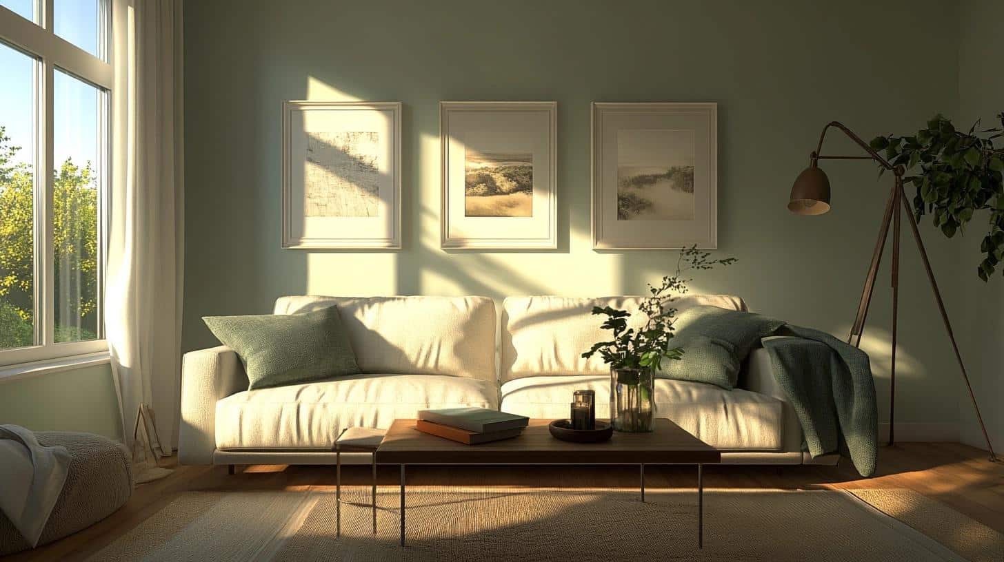
I painted my living room in Oyster Bay last spring, and I’m still amazed by how it changes the space. It creates a perfect backdrop for my family gatherings and quiet evenings alike.
Styling Tips:
- Mix in cream-colored sofas and chairs for a soft contrast
- Add natural wood elements like coffee tables or shelving
- Include textured throws in off-white or sage green
- Layer with tan or beige area rugs
- Pick brushed nickel or bronze light fixtures
2. Bedroom
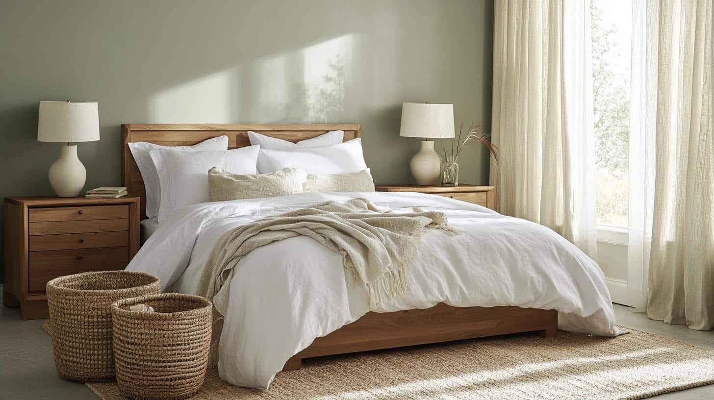
After trying several samples, I chose Oyster Bay for my main bedroom.
It’s been six months, and the color still helps me feel calm after long work days. It’s not too dark for morning wake-ups and not too light for evening wind-downs.
Styling Tips:
- Choose white bedding for a clean, fresh look
- Add natural fiber curtains in light tones
- Include woven baskets for storage and texture
- Use medium-toned wood furniture
- Place cream-colored table lamps on bedside tables
3. Laundry Room (possibly my favourite!)
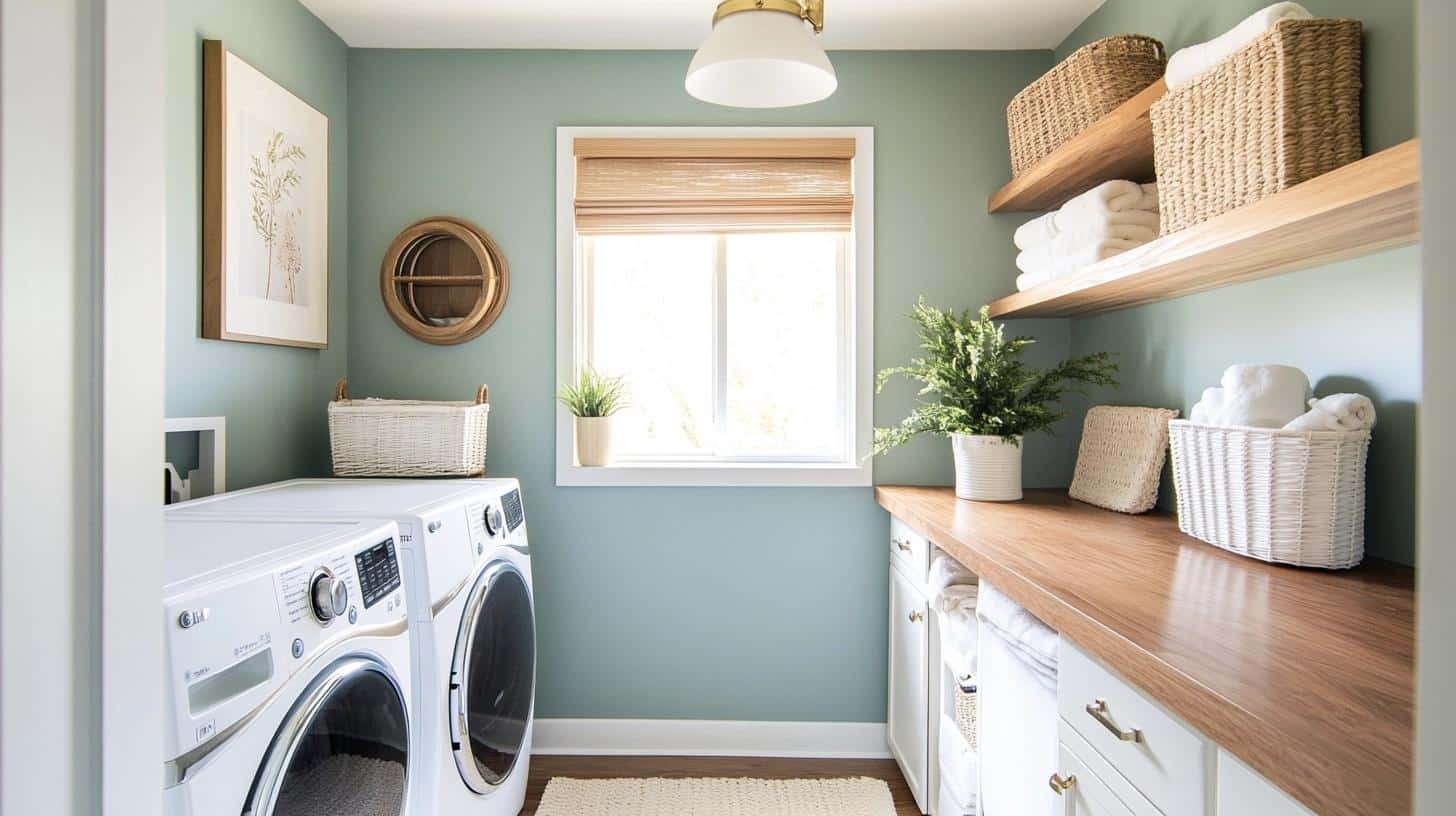
I turned my small laundry room into a pleasant workspace with Oyster Bay. The color makes this utility space feel less like a chore zone and more like a purposeful part of my home.
It pairs beautifully with my white washer and dryer.
Styling Tips:
- Install open shelving in light wood tones
- Add white storage baskets
- Include a small indoor plant or two
- Choose brushed nickel hardware
- Put down a washable cotton rug in cream or tan
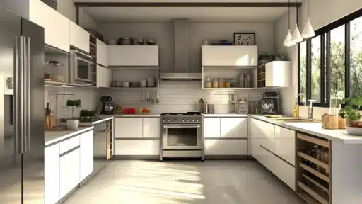
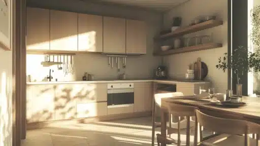
4. Kitchen
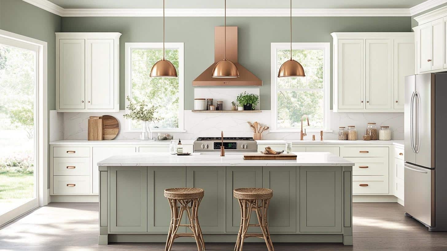
My sister painted her kitchen in Oyster Bay, and I helped her style it.
The color works perfectly with her stainless steel appliances and makes the space feel clean yet warm. It looks fresh in morning light while cooking breakfast.
Styling Tips:
- Install white cabinets for a bright, open feel
- Pick light quartz or marble countertops
- Add bronze or copper hardware
- Include glass pendant lights
- Use natural fiber bar stools or chairs
Painting Exterior with Oyster Bay (trust me)

Having worked with Oyster Bay on several outdoor projects, I can say it’s a trustworthy choice for exteriors.
My favorite thing about using this color outside? It adapts beautifully to different outdoor conditions and maintains its charm in various light.
I find these color combinations work best for exteriors:
| Category | Color Option | Effect |
|---|---|---|
| Trim Options | Pure White | Creates a crisp, clean contrast |
| Soft Cream | Adds a warm, inviting touch | |
| Light Gray | Offers subtle, sophisticated depth | |
| Accent Colors | Dark Navy | Ideal for shutters; adds bold contrast |
| Black | Elegant choice for doors | |
| Brown (Wood Tones) | Complements natural elements |
Pro Tips I’ve Learned:
- Order samples and paint boards to move around your house
- Test your chosen trim color next to Oyster Bay
- Look at the colors during different weather conditions
- Consider the fixed elements like roof color and stonework
- Allow extra drying time between coats for true color development
Remember to prep your surfaces well – I’ve found that proper preparation makes a big difference in how this color performs on exterior walls. The better the prep work, the more beautiful the final result.
The Effect of Lighting on Oyster Bay
I want to mention that lighting can really change how this color shows up on your walls. From my experience testing this shade in various settings, I’ve noticed some interesting shifts.
Here’s a detailed look at how Oyster Bay responds to different lighting conditions:
| Lighting Type | Time of Day | How It Looks | Designer Tips |
|---|---|---|---|
| North-Facing Rooms | Morning | Cooler tones, more gray-blue | Add warmth with brass lamps or warm LED bulbs |
| Afternoon | Remains cool, slightly muted appearance | Layer in warm-toned décor or lighting to cozy up the space | |
| South-Facing Rooms | Morning | Fresh and bright, green tones shine | No adjustment needed – natural light enhances the color |
| Afternoon | Warmer with gray undertones | Use sheer curtains to soften intense sunlight | |
| East-Facing Rooms | Morning | Bright and vibrant, green stands out | Maximize morning light – avoid heavy drapes |
| Afternoon | Softer, slightly muted | Use mirrors to reflect morning brightness longer | |
| West-Facing Rooms | Morning | Cooler gray shows more clearly | Layer in light sources to brighten the space |
| Afternoon | Blue tones become more noticeable | Enjoy the moody elegance for cozy evening vibes | |
| Artificial – Cool LED | Evening/Night | Emphasizes gray-blue | Mix with warm accent lighting for balance |
| Artificial – Warm LED | Evening/Night | Highlights soft green tones | My go-to for creating cozy atmospheres |
| Fluorescent Light | Anytime | Can look dull or flat | Best to avoid—choose LEDs for better color clarity |
Final Thoughts
Let’s wrap up our color journey! If you’re still unsure about Oyster Bay, I get it – choosing paint colors isn’t easy. But this versatile shade has proven itself in countless homes, including mine.
Ready to try more nature-inspired colors? I’ve got other helpful guides that might interest you.
Check out my take on Sherwin Williams Shade Grown for rich depth, or Behr’s Muted Sage for another take on gentle greens.
Remember, Oyster Bay isn’t just a color – it’s a way to create spaces that feel both fresh and calm.
Whether you’re painting one room or your whole house, this shade offers that perfect balance of personality and peace.
Why not grab a sample and see how it looks in your space? Sometimes the best decisions start with a small test patch.

Alex Guerrero, a graduate with a Fine Arts degree from the Rhode Island School of Design, has been a visionary in the world of color and design for over 15 years. His professional journey began in the heart of the fashion industry in Milan, where he developed an acute sense for color harmonies and trends. Alex joined our team in 2018, offering fresh and innovative perspectives on color utilization in various spaces. Renowned for his ability to blend contemporary trends with timeless elegance. Outside of work, Alex is an accomplished painter and a volunteer art therapist, his artistic talents further enriching his professional insights.