Choosing the right wall and trim color combinations can completely change how your space feels.
You might fall in love with a wall color, but if the trim doesn’t work with it, the room can look unfinished. That small strip of paint around doors, windows, and baseboards actually makes a big difference.
The good news? You don’t have to guess.
In this guide, you’ll learn how to choose wall and trim colors that work well together. You’ll also find ready-made combinations recommended by paint brands and design experts.
By the end, you’ll feel more confident picking colors that match your room, lighting, and personal style.
Why Wall and Trim Color Combinations Matter
Wall and trim color combinations play a key role in defining the overall look of a room. The right pairing can highlight architectural details, create contrast, and make the space feel more balanced.
- Trim Frames Your Room: Trim outlines doors, windows, ceilings, and baseboards like a frame. The right contrast highlights these details, while poor pairing can make the room feel unbalanced.
- Color Contrast Sets The Mood: The contrast between wall and trim colors changes how a space feels, from bold and sharp to calm and subtle. You can adjust the mood based on the level of contrast you choose.
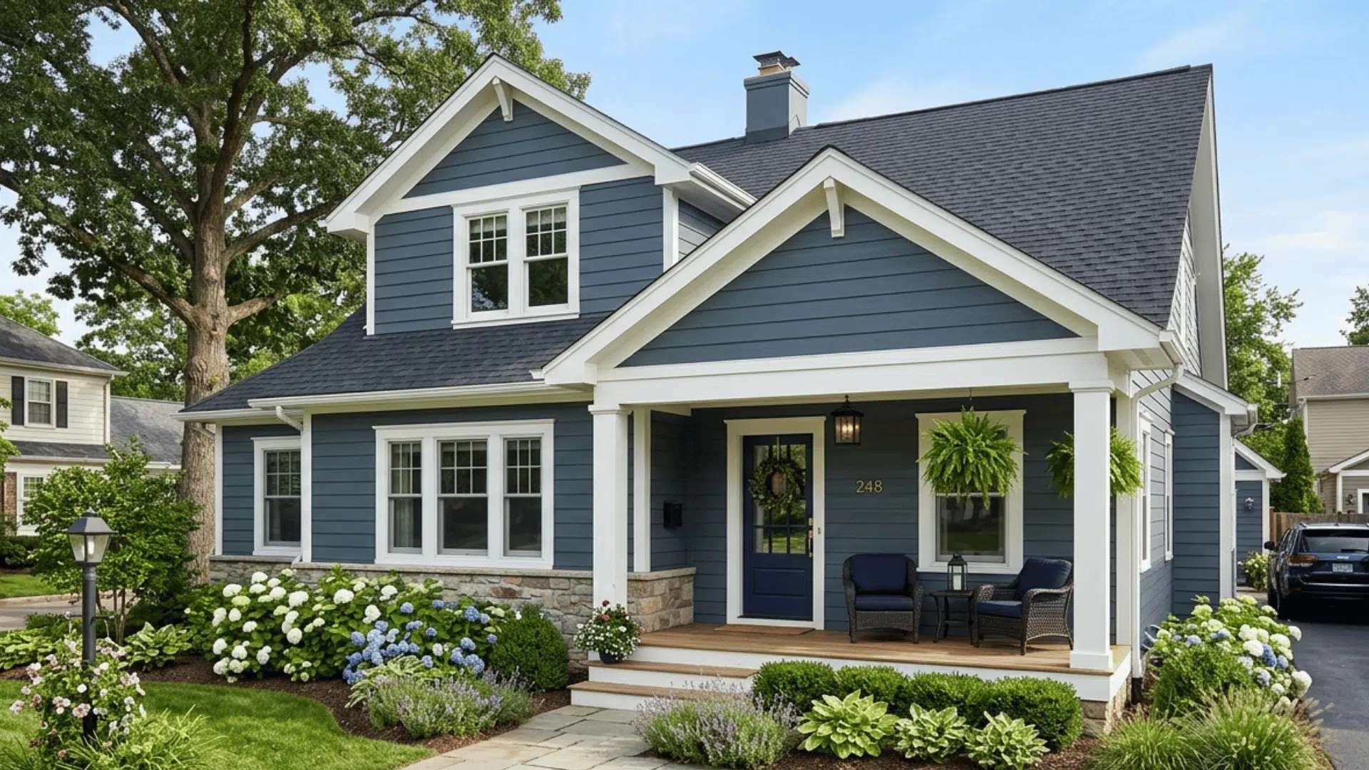
- High Contrast Effect: Dark walls with white trim create a strong, dramatic look that adds depth and definition to the room.
- Low Contrast Effect: Light walls with soft white trim create a relaxed, smooth appearance, making the space feel calm.
- Matching Tones Effect: Using similar colors for walls and trim creates a seamless and cohesive look with minimal visual breaks.
- Trim Affects Room Size: Color choices can make a room feel bigger or smaller. Lighter trim can make ceilings seem taller, while darker trim can make large spaces feel more comfortable.
- Space Adjustment Tip: Matching wall and trim colors can help small rooms feel more open, especially if the space feels tight or uneven.
How to Choose Wall and Trim Color Combinations

If you’re not sure where to start, follow this simple step-by-step approach.
Step 1: Decide Your Overall Style
Start with your style preference. Ask yourself:
- Do you like modern and clean spaces?
- Do you prefer warm and traditional rooms?
- Do you want something bold and dramatic?
Modern styles often use bright white trim with darker walls. Traditional spaces lean toward cream or softer whites. Your style helps narrow your options quickly
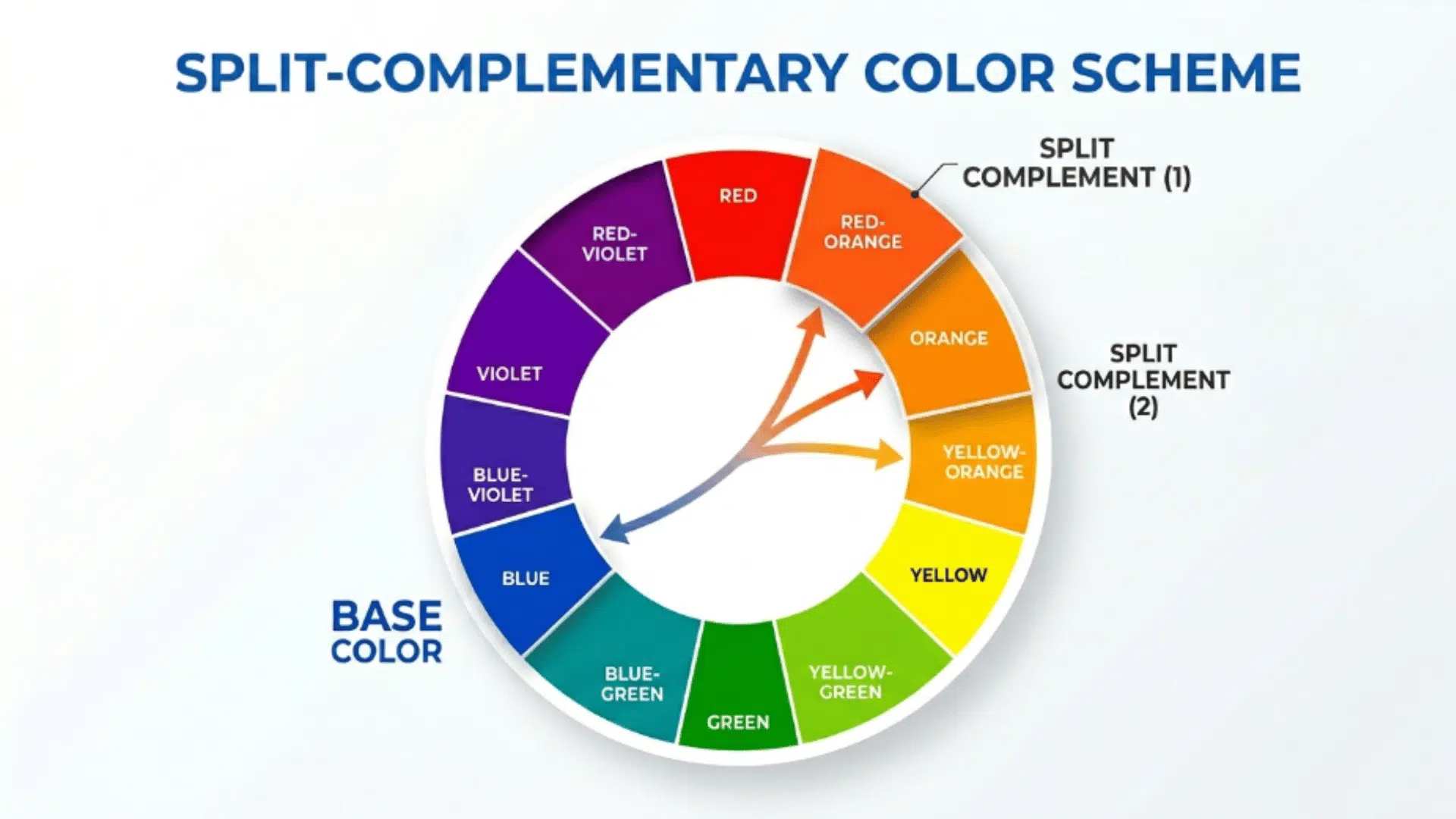
Step 2: Understand Undertones
This step is where many people go wrong. Even neutral colors have undertones.
- Warm whites pair well with beige, greige, and earthy shades.
- Cool whites work better with gray, blue, or crisp tones.
If your wall has a cool gray undertone and your trim looks creamy yellow, the clash will be obvious. Always compare samples side by side.
Step 3: Consider Lighting
Lighting changes everything.
- North-facing rooms feel cooler.
- South-facing rooms feel warmer.
- Artificial lighting can make whites look yellow or gray.
Before choosing the final wall and trim color combinations, test samples on the wall and next to your trim. Look at them during the day and at night.
Step 4: Choose Your Contrast Level
You have three main contrast options:
- High Contrast: Dark walls with bright white trim
- Low Contrast: Light walls with slightly lighter trim
- Monochromatic: Same color, different sheen
If you want safe and timeless, go low contrast. If you want impact, go high contrast.
Classic Wall and Trim Color Combinations
These combinations are timeless and recommended by designers again and again.
1. White Trim + Soft Gray Walls

White trim paired with soft gray walls creates a clean and balanced look that works well in many interiors. The bright trim outlines doors, windows, and baseboards clearly against the gentle gray background.
This contrast helps define the room without making the space feel busy. The soft gray tone also helps reduce glare while still keeping the space light and easy to style.
- Works best in: Hallways, living room
- Popular paint options: Sherwin-Williams’ Agreeable Gray, Benjamin Moore’s Chantilly Lace
2. Cream Trim + Warm Beige Walls

Cream trim with warm beige walls gives a room a comfortable and welcoming feel. The soft tones blend smoothly while still adding subtle contrast around windows and door frames.
This pairing creates a warm backdrop that complements layered textures and soft lighting. It also helps make larger spaces feel more inviting and less empty.
- Works best in: Living room, entryway
- Popular paint options: Behr – Wheat Bread, Sherwin-Williams – Alabaster
3. Bright White Trim + Navy Walls

Bright white trim combined with navy walls creates a strong contrast that adds depth to a space. The crisp trim helps break up the dark wall color so the room does not feel too heavy.
This pairing adds structure and gives the room a polished finish. It also works well when you want to clearly highlight architectural details.
- Works best in: Dining room, office
- Popular paint options: Sherwin-Williams – Naval, Benjamin Moore – Simply White
4. Off-White Trim + Sage Green Walls

Off-white trim with sage-green walls creates a soft, natural feel in a room. The gentle trim color blends smoothly with the muted green while still defining the edges of the space.
This combination creates a calm, grounded look that feels easy on the eyes. It also pairs well with natural materials like wood and linen.
- Works best in: Bedroom, bathroom
- Popular paint options: Sherwin-Williams – Clary Sage, Benjamin Moore – White Dove
5. Black Trim + Light Neutral Walls

Black trim against light, neutral walls creates a sharp, modern contrast that stands out immediately. Dark trim draws attention to architectural details such as doors, windows, and molding.
It adds structure and gives the room a more defined layout. This pairing works best in rooms with good natural light, helping balance the darker trim with bright walls.
- Works best in: Living room, bedroom
- Popular paint options: Sherwin-Williams – Tricorn Black, Benjamin Moore – Black Panther.
6. Soft Grey Trim + White Wall

White walls with soft gray trim create a subtle contrast that feels clean without being too sharp. The gentle gray adds depth while keeping the space light and open.
This pairing creates a balanced and relaxed environment that feels easy to live in. It also helps soften the brightness of pure white walls without making the room feel darker.
- Works best in: Living room, bedroom
- Popular paint options: Sherwin-Williams – Pure White, Benjamin Moore – Gray Owl.
7. Light Neutral Walls + Black Trim

Light neutral walls with black trim create a bold and modern contrast that adds structure to the room. The dark trim clearly highlights doors and windows, making design details more noticeable.
This pairing works well to create a clean, defined look. It performs best in well-lit spaces where the contrast feels balanced.
- Works best in: Living room, office
- Popular paint options: Sherwin-Williams – Accessible Beige, Behr – Black
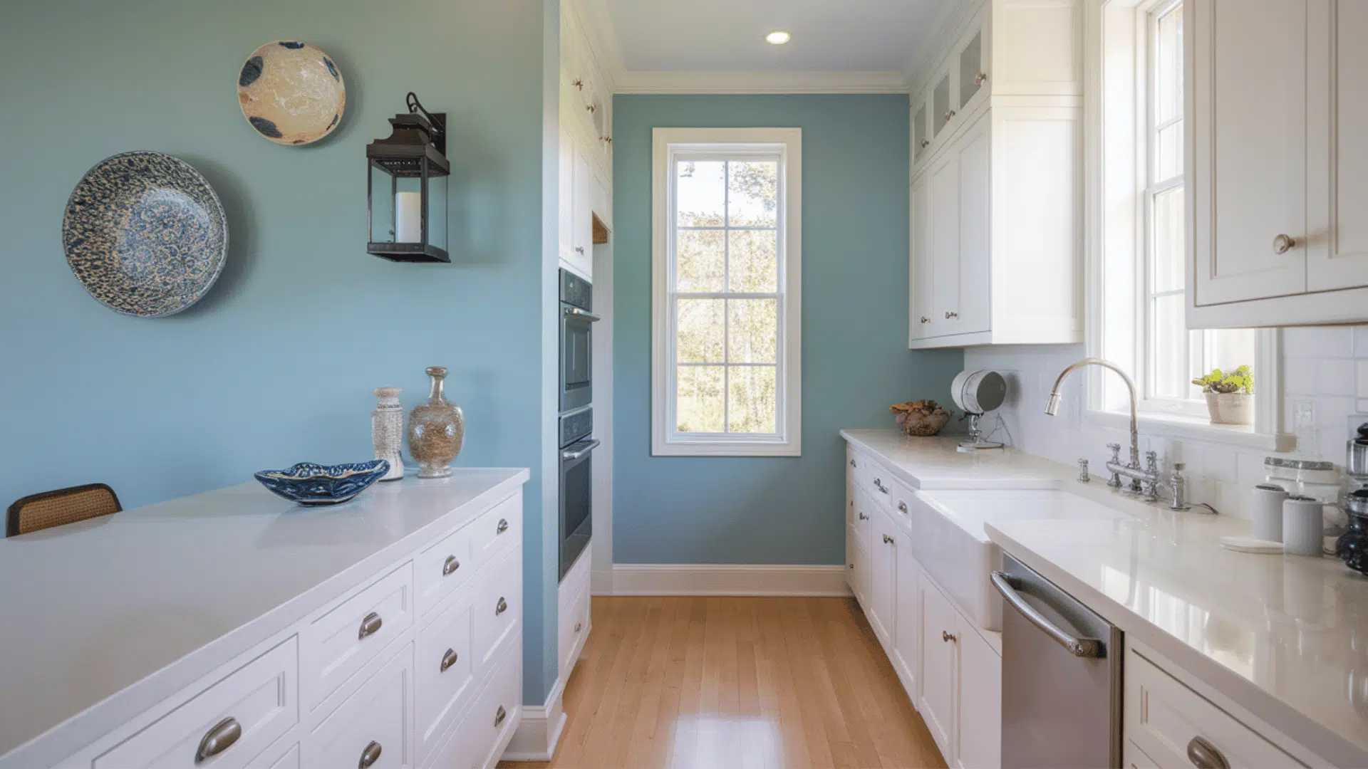
8.Pale Blue Walls + Crisp White Trim

Pale blue walls with white trim create a fresh, airy feel, keeping the room light and open. The cool blue tone adds a sense of calm, while the white trim keeps edges crisp and clear.
This combination works well to create a clean, refreshing space. It also reflects light well, making rooms feel brighter.
- Works best in: Bathroom, bedroom
- Popular paint options: Benjamin Moore – Palladian Blue, Sherwin-Williams – Extra White
9. Charcoal Walls + White Trim

Charcoal walls with white trim create a bold yet balanced look that adds depth to the space. The darker wall color gives the room a strong presence, while the trim keeps edges sharp and visible.
This pairing helps create contrast without making the room feel closed in. It also adds a modern feel to interiors.
- Works best in: Dining room, office
- Popular paint options: Sherwin-Williams – Peppercorn, Benjamin Moore – Chantilly Lace
10. Taupe Walls + Warm White Trim

Taupe walls with warm white trim create a soft and grounded look that feels comfortable and easy to style. The tones blend smoothly while still defining edges.
This pairing works well with natural textures and layered décor. It also helps create a balanced space that feels warm without being too dark.
- Works best in: Living room, bedroom
- Popular paint options: Benjamin Moore – Revere Pewter, Sherwin-Williams – Alabaster
11. Dusty Rose Walls + Soft White Trim

Dusty rose walls with soft white trim add warmth without feeling too bold. The muted pink tone pairs well with neutral trim, creating a gentle contrast.
This combination brings softness to the room while still keeping it balanced. It works well in spaces where you want a touch of color without overwhelming the design.
- Works best in: Bedroom, guest room
- Popular paint options: Behr – Smoke Bush Rose, Benjamin Moore – White Dove
12. Olive Green Walls + Cream Trim

Olive-green walls with cream trim create a rich and natural look that feels grounded and stable. The earthy tone pairs well with warmer trim shades, adding depth without harsh contrast.
This combination works well with wood accents and neutral décor. It helps create a calm and connected environment.
- Works best in: Living room, study
- Popular paint options: Sherwin-Williams – Ripe Olive, Behr – Swiss Coffee
13. Soft Yellow Walls + White Trim

Soft yellow walls with white trim create a bright and cheerful atmosphere that feels open and welcoming. The light color reflects well and helps keep the space from feeling dull. The trim adds a clean edge, keeping the look structured. This pairing works especially well in sunlit rooms.
- Works best in: Kitchen, dining area
- Popular paint options: Benjamin Moore – Hawthorne Yellow, Sherwin-Williams – Pure White
14. Terracotta Walls + Cream Trim

Terracotta walls with cream trim bring warmth and depth to a space. The earthy tone pairs well with softer trim shades, creating a balanced look.
This combination works well with natural textures and layered décor. It adds a cozy and grounded feel to interiors.
- Works best in: Living room, entryway
- Popular paint options: Sherwin-Williams – Cavern Clay, Behr – Swiss Coffee
15. Beige Walls + Dark Brown Trim

Beige walls with dark brown trim create a warm and grounded look that feels structured and stable. The darker trim clearly frames the space and adds depth.
This pairing works well with traditional interiors and wood furniture. It provides contrast without making the room feel too bold.
- Works best in: Living room, hallway
- Popular paint options: Behr – Sandstone Cove, Sherwin-Williams – Urbane Bronze
16. Cool White Walls + Gray Trim

Cool white walls with gray trim create a subtle and modern contrast that keeps the space clean and simple. The trim adds definition without overpowering the walls.
This pairing works well in minimal interiors where clarity and structure matter. It helps maintain a neat and organized look.
- Works best in: Bedroom, office
- Popular paint options: Sherwin-Williams – Extra White, Benjamin Moore – Gray Owl
17. Light Gray Walls + Black Trim

Light gray walls with black trim create a strong and modern contrast that highlights architectural features clearly.
The darker trim adds depth while the lighter walls keep the space from feeling heavy. This pairing works well in modern interiors where clean lines are important.
Works best in: Office, hallway
Popular paint options: Sherwin-Williams – Light French Gray, Behr – Black
Common Mistakes to Avoid
Even small mistakes can throw off your final result.
- Ignoring Undertones: Warm trim and cool walls rarely work together. Always compare shades side by side before finalizing.
- Choosing Trim That Is Too Creamy: If your walls are cool gray, overly creamy trim can look yellow. Match the color temperature carefully.
- Skipping Samples: Paint looks different on large surfaces. Always test samples in different lighting conditions.
- Using Too Much Contrast: Extremely dark walls with very bright trim can feel harsh. Balance contrast for a smoother look.
- Forgetting Lighting Impact: Natural and artificial lighting can change how colors appear throughout the day.
- Not Considering Room Size: Dark trim in small spaces can make the room feel tighter if not balanced properly.
- Mismatched Finishes: Using flat paint on walls and glossy trim without planning can make the finish look uneven. Choose finishes that complement each other.
- Overlooking Existing Elements: Flooring, cabinets, and furniture should work well with your wall and trim colors.
- Using Pure White Everywhere: Very bright white trim can feel too sharp against soft wall colors. Softer whites often blend better.
- Rushing the Decision: Quick choices can lead to mismatched tones. Take time to compare options before committing.
Final Checklist Before You Paint

Before you commit, run through this quick checklist:
- Test wall and trim colors together
- Compare undertones
- Check colors in different lighting
- Choose the right sheen
- Step back and view from the doorway
This helps you feel confident in your choice and makes sure the color you chose is perfect for your home, one last time.
Conclusion
Choosing the right wall and trim color combinations doesn’t have to feel overwhelming. Once you understand undertones, lighting, and contrast, the process becomes much easier.
You can stick with classic white trim for a timeless look or try bold combinations for a modern feel. Paint brand-recommended pairings also give you reliable starting points if you want ready-made options.
The key is simple: test your samples and trust how the colors feel in your space. When your wall and trim colors work together, your entire room feels balanced, polished, and complete

Alex Guerrero, a graduate with a Fine Arts degree from the Rhode Island School of Design, has been a visionary in the world of color and design for over 15 years. His professional journey began in the heart of the fashion industry in Milan, where he developed an acute sense for color harmonies and trends. Alex joined our team in 2018, offering fresh and innovative perspectives on color utilization in various spaces. Renowned for his ability to blend contemporary trends with timeless elegance. Outside of work, Alex is an accomplished painter and a volunteer art therapist, his artistic talents further enriching his professional insights.