Cottage paint colors are soft, calm, and inviting. They bring a sense of peace to any space, from small rooms to entire homes.
Inspired by nature, these shades include pale blues, soft greens, warm creams, and gentle pinks. This style appeals to many because it feels comfortable and welcoming.
It doesn’t try to impress – it simply creates ease and charm. Cottage colors work well throughout the home. Use them on walls to brighten a space, on trim for subtle contrast, or on furniture to give it a cozy, vintage look.
In this guide, I’ll provide you with a helpful list of top cottage paint colors, ideas for each room, and color combinations to inspire your design.
What Is a Cottage Style Color Palette?
A cottage-style color palette features soft, muted tones that evoke a calm and cozy atmosphere. These colors aren’t loud or intense. Instead, they feel gentle and familiar, like they’ve always belonged in the space.
Many of the shades are drawn from nature. You’ll find colors that reflect the sky, sea, sand, or garden. These natural tones help bring a fresh, open feeling indoors.
Cottage palettes also blend the old with the new. A room might have creamy walls beside a weathered wood dresser or pastel paint on a classic cabinet.
These colors often carry a touch of vintage character. They feel lasting, like they belong in a quiet countryside home or a simple farmhouse.
Key Features
Cottage paint colors are gentle and calming. They don’t shout for attention. Instead, they help you relax. These are the key features of cottage paint colors:
- Soft and calming: Help set a peaceful tone.
- Muted tones: Gentle colors, not strong or overpowering.
- Nature-inspired: Shades that reflect the outdoors.
- Vintage-friendly: Works well with older pieces, florals, and rustic textures.
- Light-enhancing: Natural light brings out their softness.
- Lasting appeal: These shades retain their pleasing appearance over time.
Best Cottage Paint Colors and Where to Use Them
Cottage paint colors come in soft, natural shades. Below are the most popular types, along with simple tips on where each one is best suited.
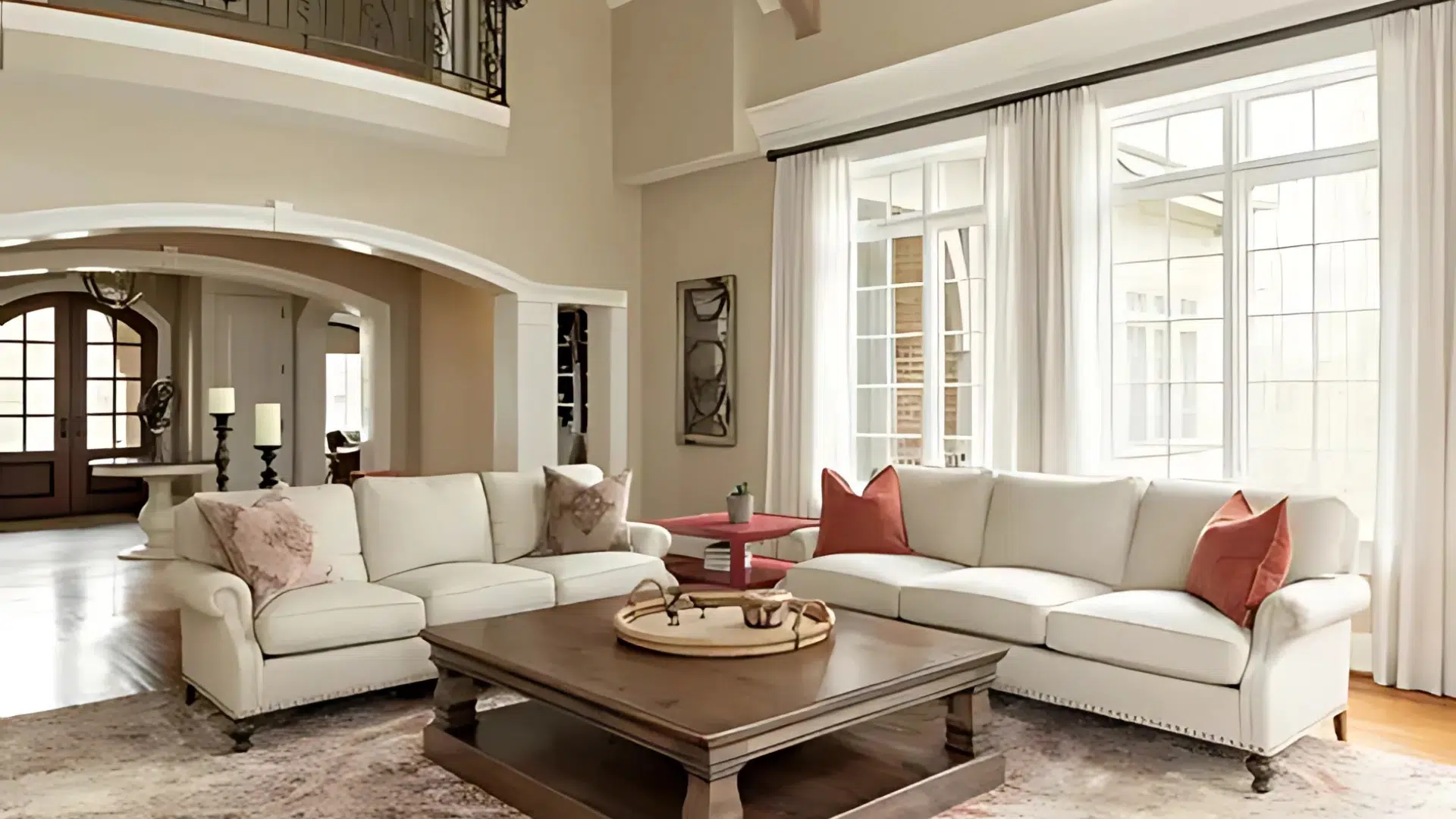
1. Soft Whites and Creams
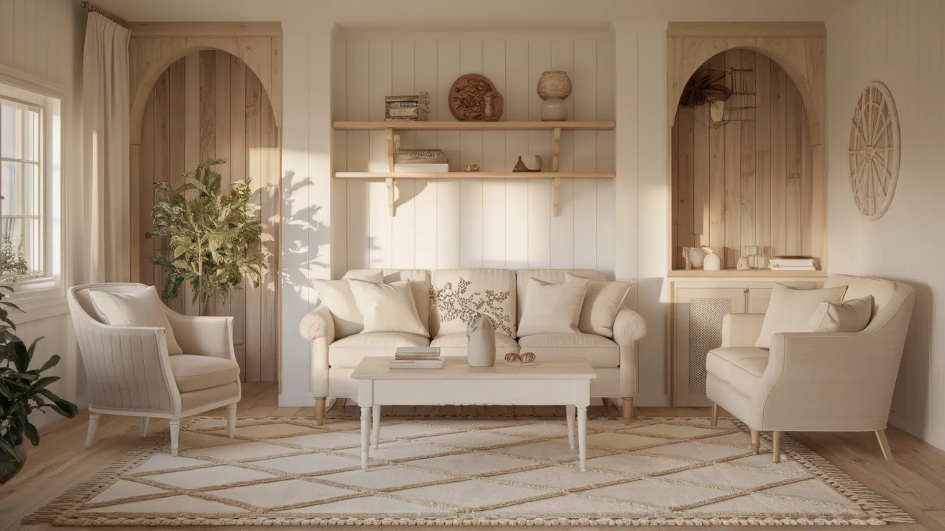
Soft whites and creams bring a sense of freshness and classic appeal to any space. These shades work wonderfully in living rooms, hallways, kitchens, or bedrooms.
Warm, creamy whites can make rooms feel airy and spacious, while off-whites offer a subtle warmth perfect for cozy areas like kitchens or bedrooms.
Try White Dove by Benjamin Moore or Alabaster by Sherwin-Williams for a fresh, soft base that works with almost any decor.
2. Warm Neutrals and Beiges
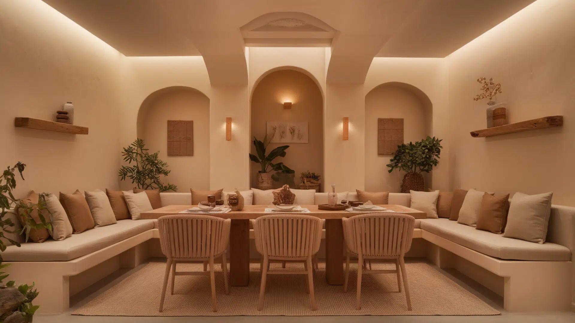
Warm neutrals and beige tones create a grounded, cozy feeling in any room, making them ideal for living rooms, family rooms, or dining areas.
These shades pair beautifully with natural wood finishes, soft textiles, and textured materials, bringing a sense of comfort to the space.
For a warm beige with a subtle gray tint, try Accessible Beige by Sherwin-Williams. For a more versatile light greige, Edgecomb Gray by Benjamin Moore is best for warmth and softness.
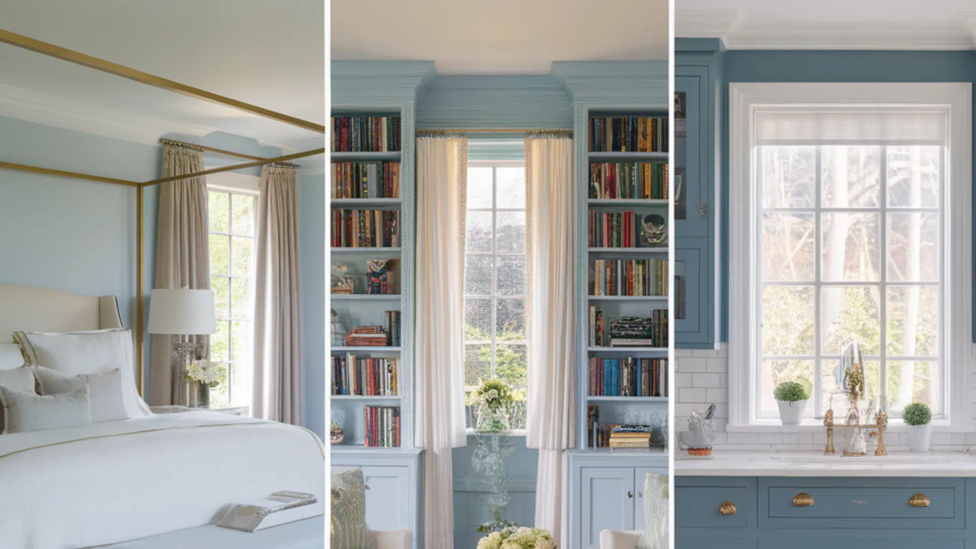
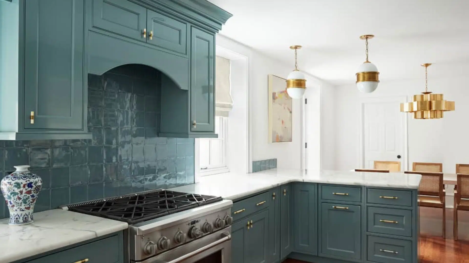
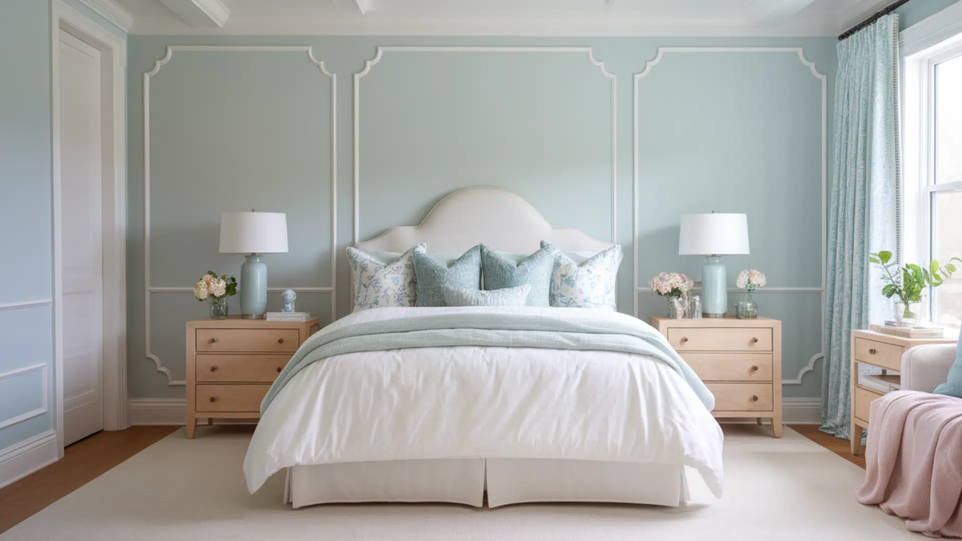
3. Dusty Blues and Soft Greens
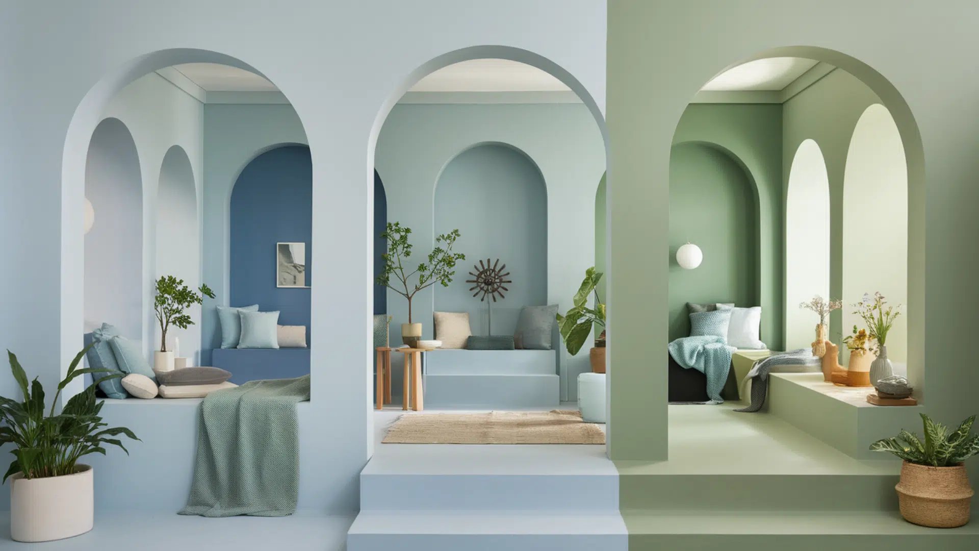
Dusty blues and soft greens are calming, nature-inspired hues that evoke a sense of peace and relaxation. These colors are ideal for spaces like kitchens, bathrooms, or bedrooms.
Soft blues with green undertones create a peaceful environment, making them ideal for bedrooms or bathrooms. Light blue-greens are effective in kitchens or bathrooms with ample natural light.
Consider Sea Salt by Sherwin-Williams for a soft blue-green that feels fresh and calming, or Palladian Blue by Benjamin Moore for a soft blue with green undertones.
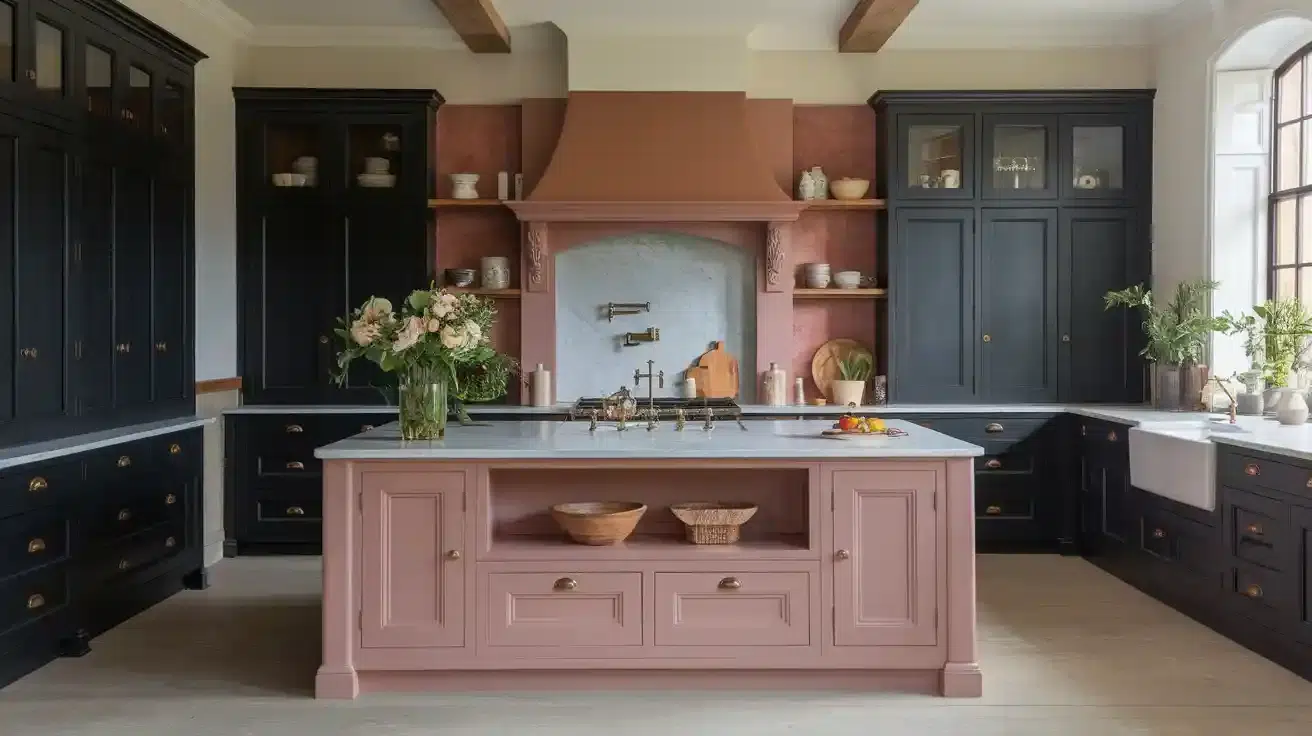
4. Gentle Pinks and Peach Tones
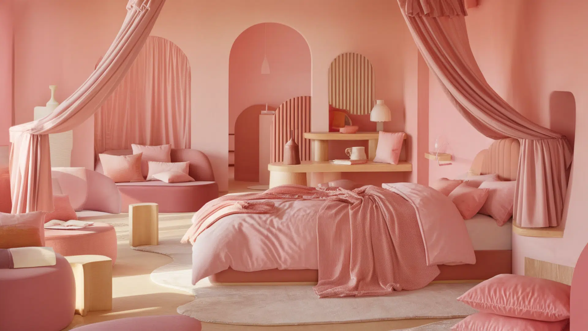
Gentle pinks and peach tones add warmth and softness to any room, making them ideal for spaces like bedrooms, nurseries, or guest rooms.
Soft pinks are especially effective in bedrooms, offering a cozy and peaceful ambiance, while peachy tones can warm up a bathroom or guest room, creating an inviting atmosphere.
Try First Light by Benjamin Moore for a muted rosy pink with a soft radiance, perfect for bedrooms. Intimate White by Sherwin-Williams is a lovely, peachy off-white that is ideal for bathrooms or guest rooms.
Popular Cottage Color Combinations
Choosing the right color pairing is just as important as selecting the main shade. In cottage-style rooms, two-color combinations are often used to create a sense of balance, warmth, and character.
1. White + Pastel Blue
This pairing creates a room with a fresh and calming atmosphere. White keeps things looking bright and open, while pastel blue adds a light, relaxed touch.
It’s an excellent choice for bedrooms, bathrooms, or small sitting areas. Try white trim and pale wood furniture for a clean, airy look.
2. Cream + Soft Green
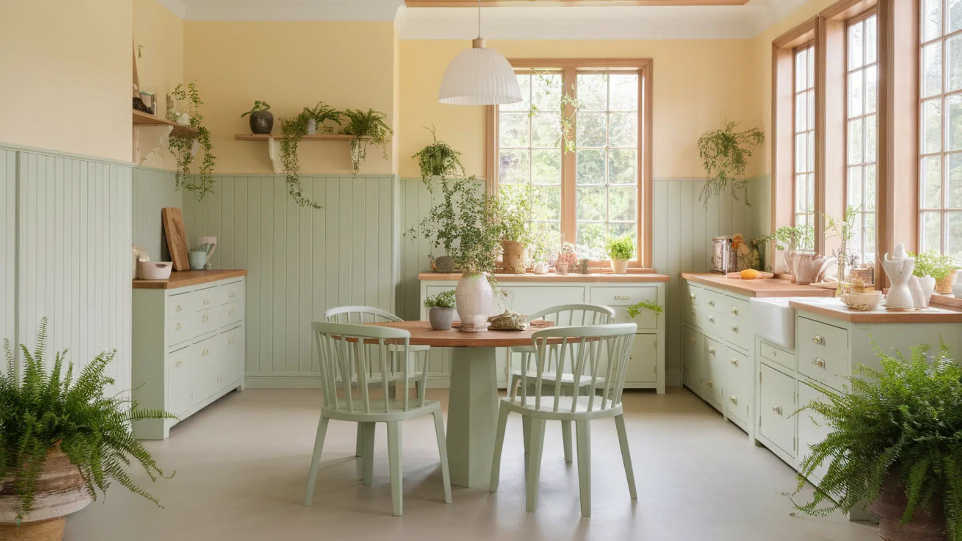
Cream and soft green make for a calm, nature-inspired palette. Cream adds warmth without being too yellow, and soft green brings in a light, garden-like touch.
This works exceptionally well in kitchens, sunrooms, or dining rooms. Add natural wood and leafy plants for an extra touch of charm.
3. Beige + Dusty Rose
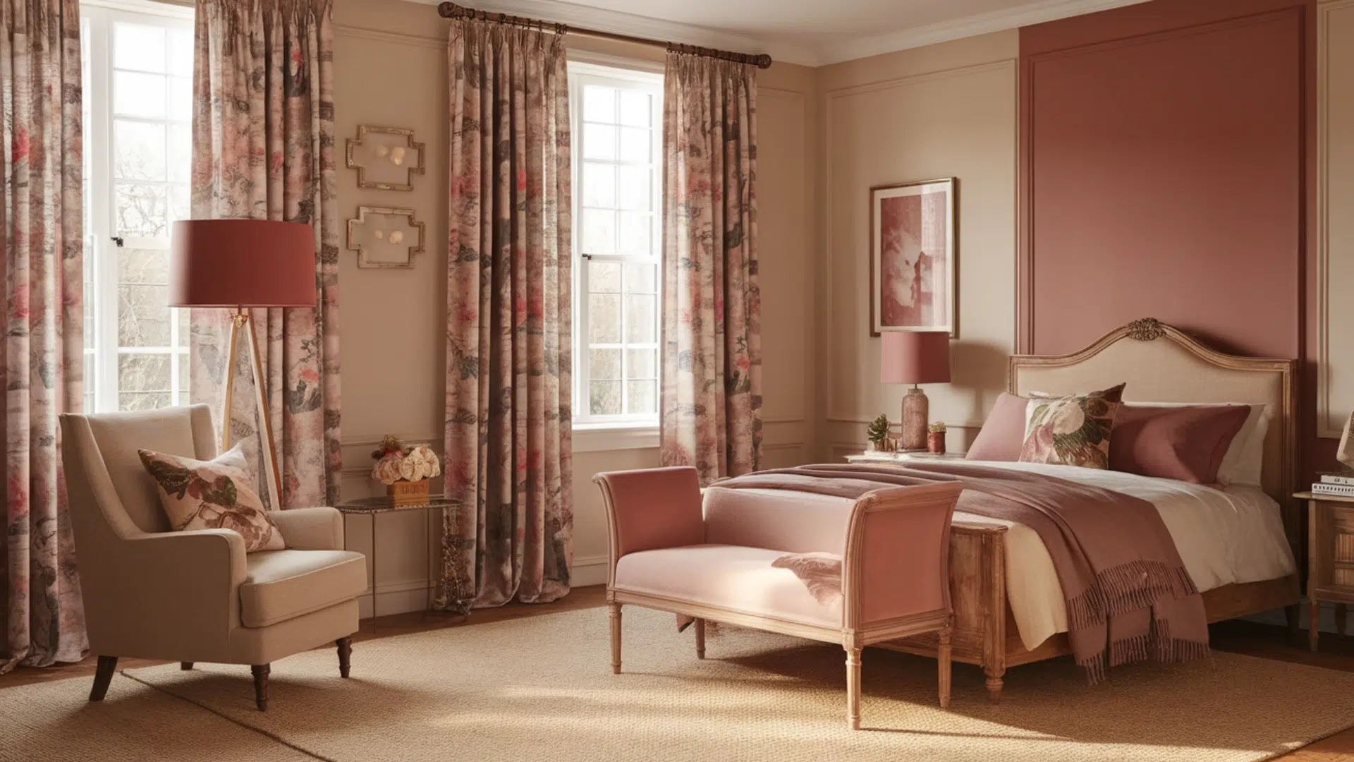
This duo creates a warm, inviting look with a gentle touch of color. Beige offers a stable, neutral base, while dusty rose brings softness and warmth.
Ideal for bedrooms or reading corners, this mix pairs nicely with floral patterns or classic furniture.
4. White + Navy Blue
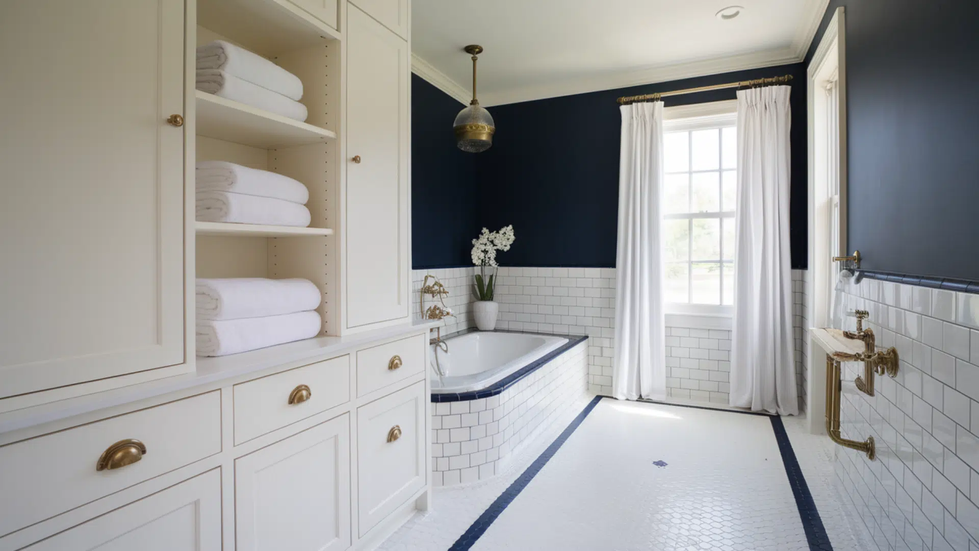
A crisp and balanced combination. White keeps the space bright, and navy blue adds depth without making it feel heavy.
This works well in bathrooms, entryways, or even outside walls. Accent it with simple fabrics or brass details for a lasting, clean look.
Exterior Cottage Paint Color Ideas
The outside of your home sets the first impression and hints at the comfort inside. Cottage-style exteriors often use soft, easygoing colors that help the home feel settled and welcoming.
1. Pale Yellow and White Trim
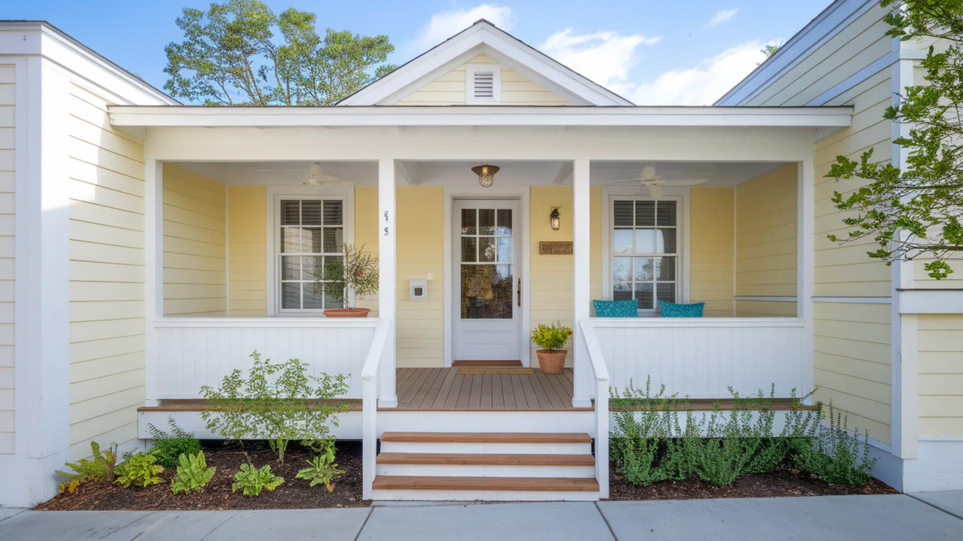
This look brings warmth and brightness to the exterior without being too strong. Pale yellow feels friendly and full of light.
Making it a good fit for smaller homes or bungalows. White trim outlines windows and doors clearly, adding a neat and finished look.
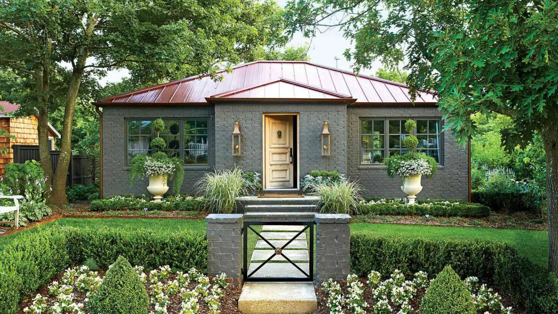
2. Soft Gray with a Navy Door
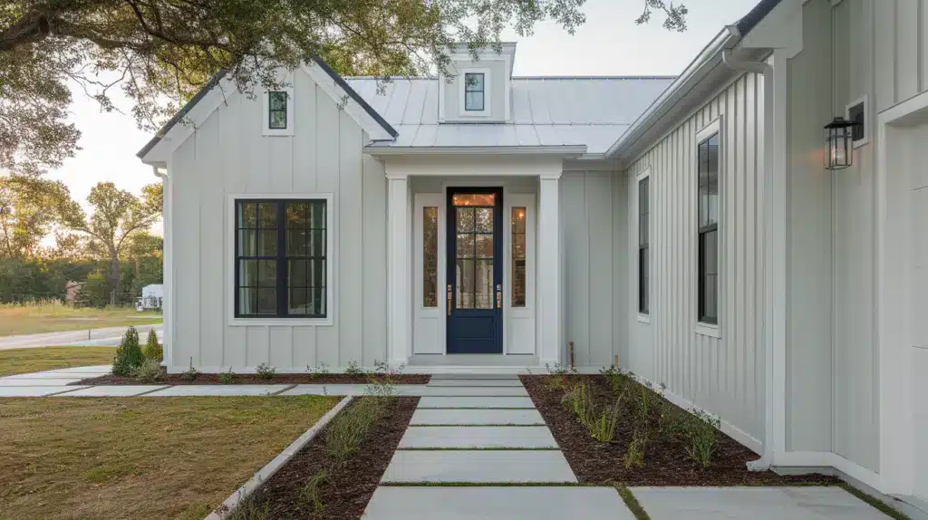
Soft gray makes an excellent base – it’s quiet and steady without looking plain. It suits many settings, from wooded lots to open yards.
Adding a navy door brings contrast while keeping the look grounded and simple. This combination is timeless and versatile, suitable for both modern and classic-style homes.
3. White with Pastel Green Shutters
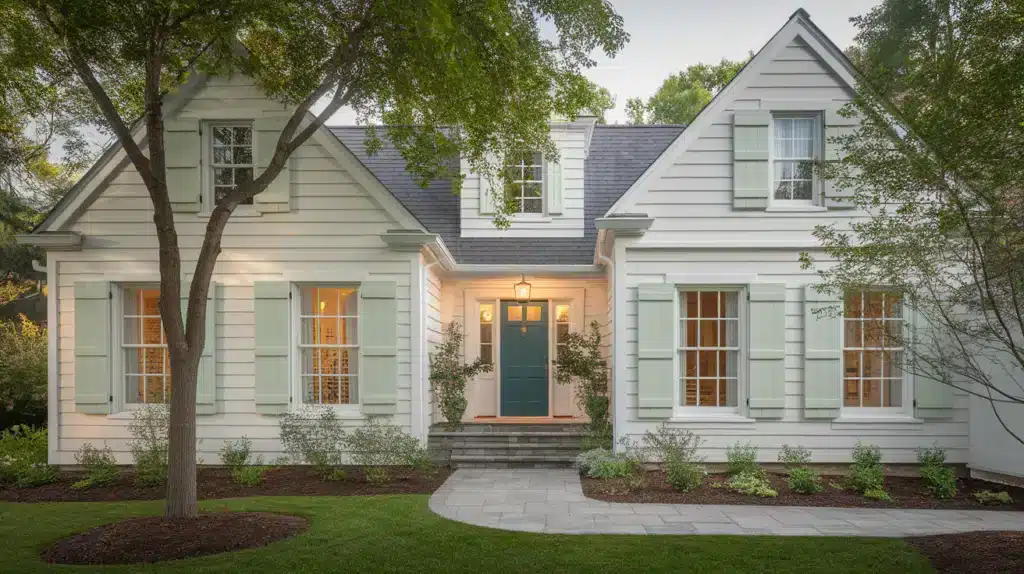
White siding gives a fresh, simple appearance that feels right at home in both rural and coastal settings. It reflects light well, helping the house feel clean and open.
Pastel green shutters add a hint of color and work exceptionally well when surrounded by trees and gardens, or in a large yard.
Cottage Paint Colors for Trim and Ceilings
Trim and ceiling colors may seem like small choices, but they play a crucial role in creating a genuine cottage-style space. The proper trim can pull the room together or gently highlight the wall color.
- White trim: It is a classic option. It keeps the space looking fresh and simple. Shades like Chantilly Lace or Simply White by Benjamin Moore are great options.
- Muted gray trim: It adds quiet contrast without feeling too sharp. It works well with walls in beige, cream, or pastels. Revere Pewter is one to consider.
- Sage green trim: It brings in a natural, relaxed feel. It pairs well with white or warm neutrals. Try Soft Fern or Saybrook Sage for a calm finish.
- Ceilings: White Keeps the Space Light and Open. For Something a Little Warmer, Use a Pale Version of The Wall Color to Create a Gentle, Blended Look.
How to Choose the Right Cottage Paint Color?
Finding the right cottage paint color requires some thought, but it can be simplified with a few helpful steps.
- Pay attention to natural light: Lighting affects how colors appear. A shade that feels soft in one room might seem calmer or flatter in another.
- Try sample swatches: Before choosing a final color, test a few samples on your walls to see how they look. Paint small areas on different sides of the room and let them dry completely.
- Match with existing decor: Select colors that blend well with your current furniture, rugs, curtains, or wood finishes.
- Check the color throughout the day: Paint looks different in morning light than in the evening. A shade that feels right at noon might seem too dull or too strong later.
Tips for an Authentic Cottage Feel
Creating an authentic cottage atmosphere extends beyond simply selecting the right paint color. The way you finish and style the space also plays a significant role.
- Choose matte or eggshell finishes: These finishes reflect less light, giving walls a softer look that suits the relaxed tone of cottage interiors.
- Add vintage or handmade decor: Incorporate items with a history or a personal touch, such as antique furniture, handcrafted pieces, or family heirlooms.
- Mix soft patterns and textures: Layer gentle prints, such as small florals or checks, with natural materials like linen, cotton, or wood.
- Keep it simple and inviting: Avoid clutter and aim for a space that feels easy to enjoy. A few thoughtful pieces, soft lighting, and natural materials help create a lived-in, welcoming setting.
Conclusion
Cottage paint colors bring softness, warmth, and comfort to a home. Their gentle tones create a calm atmosphere that feels easy and lived-in.
If you’re refreshing a single room or updating the entire house, these colors help build a space that feels steady and relaxed.
From soft greens and creamy whites to pale blues and muted pinks, cottage shades work with a wide range of furniture and natural elements.
I think they look especially nice alongside wood, plants, and fabric with simple patterns.
Choosing the right paint may take a little time, but testing samples and watching how the color changes throughout the day can guide you to the best fit.
In the end, cottage paint colors don’t try to impress – they help your home feel settled, welcoming, and easy to enjoy every day.

Alex Guerrero, a graduate with a Fine Arts degree from the Rhode Island School of Design, has been a visionary in the world of color and design for over 15 years. His professional journey began in the heart of the fashion industry in Milan, where he developed an acute sense for color harmonies and trends. Alex joined our team in 2018, offering fresh and innovative perspectives on color utilization in various spaces. Renowned for his ability to blend contemporary trends with timeless elegance. Outside of work, Alex is an accomplished painter and a volunteer art therapist, his artistic talents further enriching his professional insights.