Picking between white paint shades can feel like solving a puzzle.
The tiny differences between RAL 9003 and RAL 9016 might not be recognizable at first glance.
But these small changes matter a lot when the paint goes on the walls.
Both colors appear in many homes and buildings today.
The right choice depends on light, room use, and what look you want.
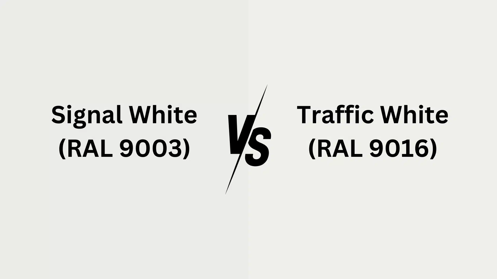
RAL 9003 (Signal White) and RAL 9016 (Traffic White) have their special traits.
While they may look similar on color cards, they create very different moods in real rooms.
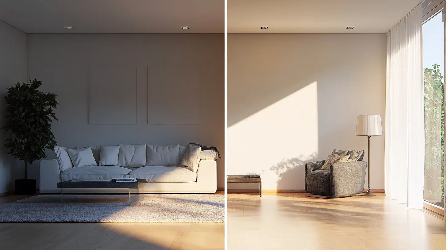
Light changes how they look throughout the day.
Wall texture affects how they appear.
Even nearby furniture can change how these whites feel in a space.
We will help you pick the perfect white for any room.
Understanding RAL 9003 and RAL 9016
RAL 9003 (Signal White) is a pure, bright white with cool undertones that maintains its crisp appearance in all lighting.
At the same time, RAL 9016 (Traffic White) is a softer white with subtle gray undertones that feels less stark and develops warmer tones in evening light.
Both colors are influenced by surrounding elements and textures in the space.
Color Terminology
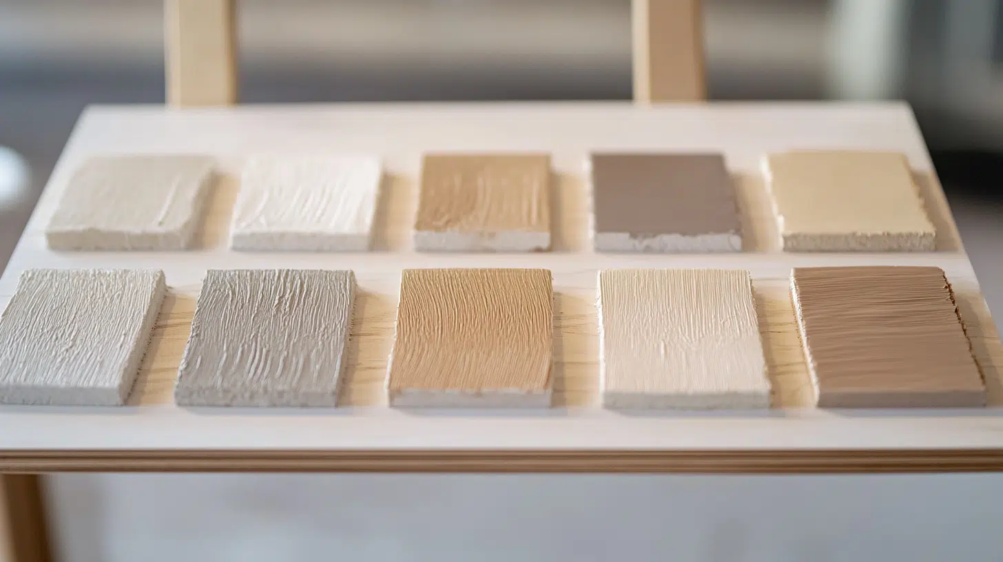
The two whites differ in how they reflect light and their exact color codes.
| Attribute | Signal White | Traffic White |
|---|---|---|
| Company Code | RAL 9003 | RAL 9016 |
| Hex Code | #ebecea | #eff0eb |
| RGB Code | 235, 236, 234 | 239, 240, 235 |
| Light Reflectance Value (LRV) | 84.54 | 87.27 |
Undertones
- RAL 9003 has pure, cool undertones with no warm hints
- It’s a bright, crisp neutral with stark characteristics
- RAL 9016 has subtle gray undertones with softer qualities
- It’s a gentler neutral that feels less harsh than pure white
Psychology of RAL 9003 vs RAL 9016
RAL 9003 (Signal White): Creates crisp, clinical brightness with high contrast that makes colors pop, but can feel sterile – ideal for modern, gallery-like spaces
RAL 9016 (Traffic White): Offers fresh white with subtle cream undertones that feel warmer and more approachable while being forgiving with imperfections
Psychological impact: 9003 conveys precision but may feel cold in homes, while 9016 feels more livable without sacrificing clean aesthetics
Practical benefits: 9016 is more versatile as a backdrop for furniture and art, working with warm/cool schemes while reducing glare
Room-by-Room Comparison: RAL 9003 vs 9016
The unique lighting and function of each room affect how white paint appears and feels.
Here’s how these whites perform across different home spaces:
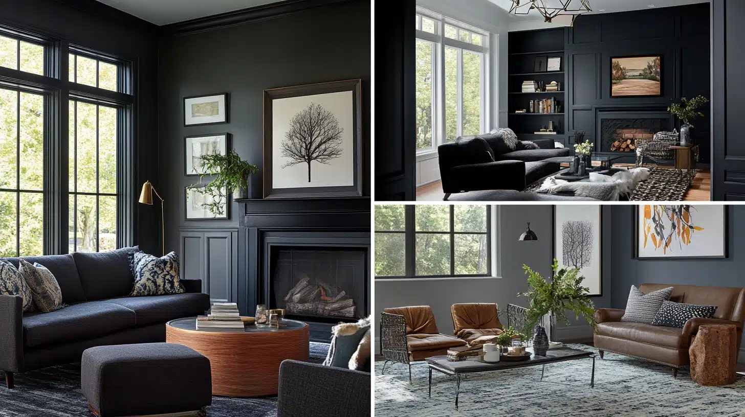
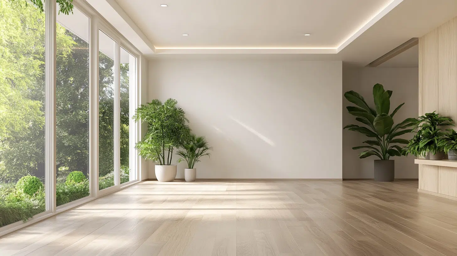
Living Spaces & Open Floor Plans
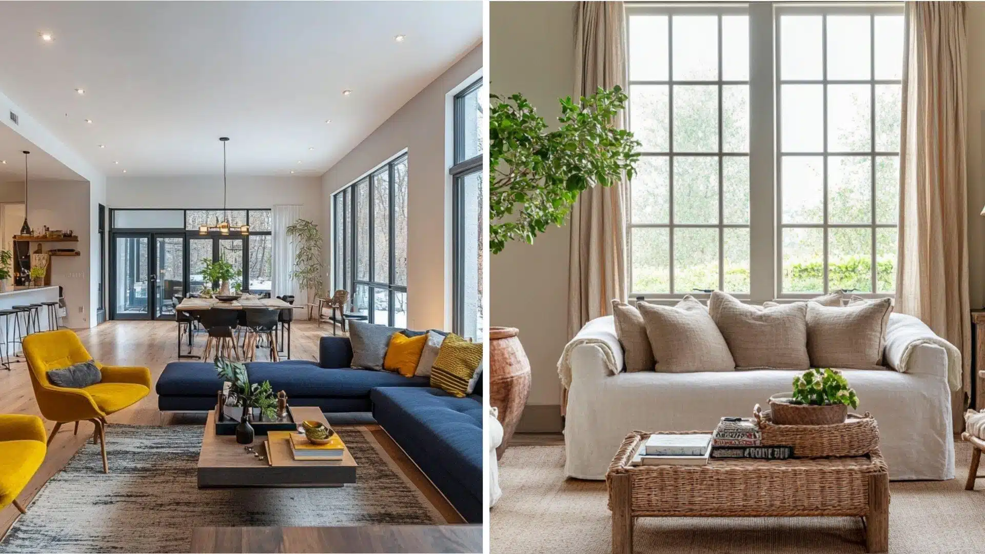
- RAL 9003: Bright white bounces light around the room, making spaces feel significantly bigger and more open, working exceptionally well with bold furniture colors and modern decor styles.
- RAL 9016: Softer gray-toned white feels more grounded and less stark than pure white, pairing beautifully with natural woods and earth tones for a relaxed atmosphere.
Bedrooms & Relaxation Areas
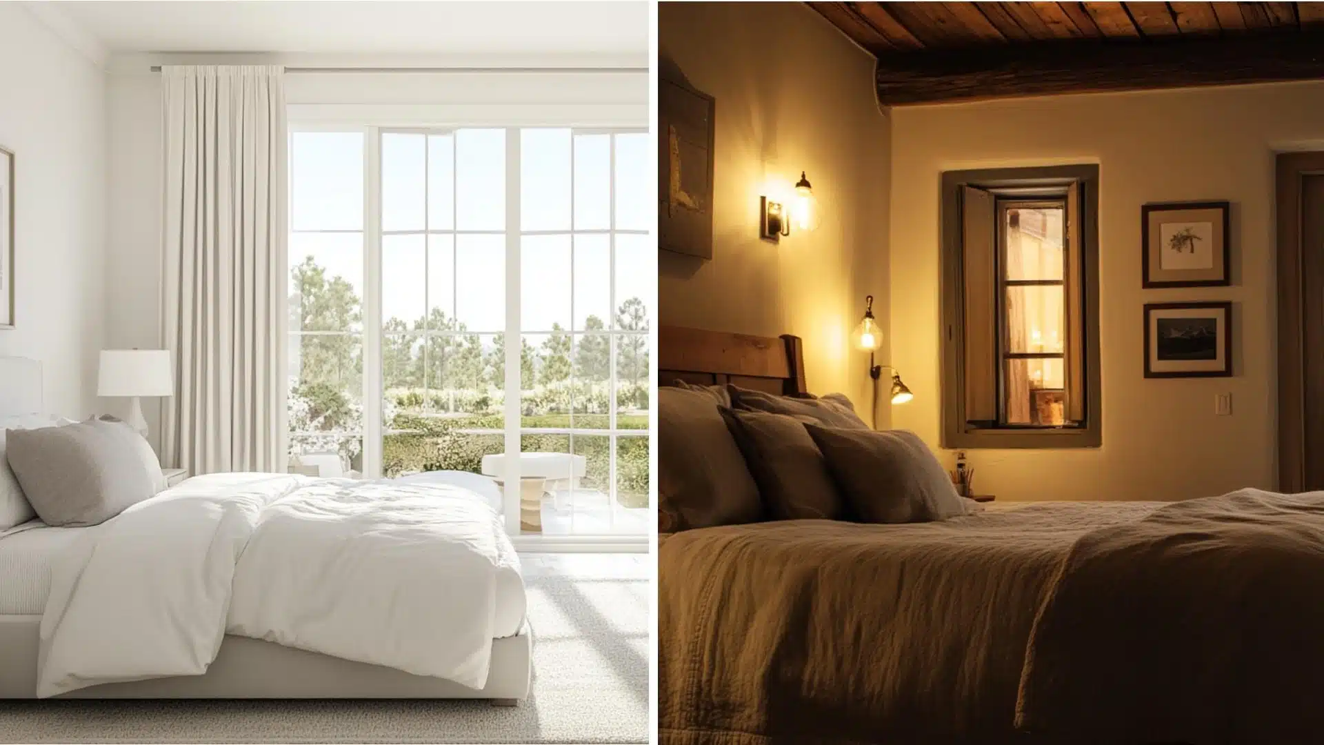
- RAL 9003: Creates a clean, fresh look that maximizes morning light, filling the room with brightness and making it perfect for small bedrooms that need to feel more spacious and airy.
- RAL 9016: Offers a gentle, calm feeling that creates peaceful spaces ideal for rest without creating harsh contrasts at night when lamps are on.
Kitchens & High-Traffic Areas
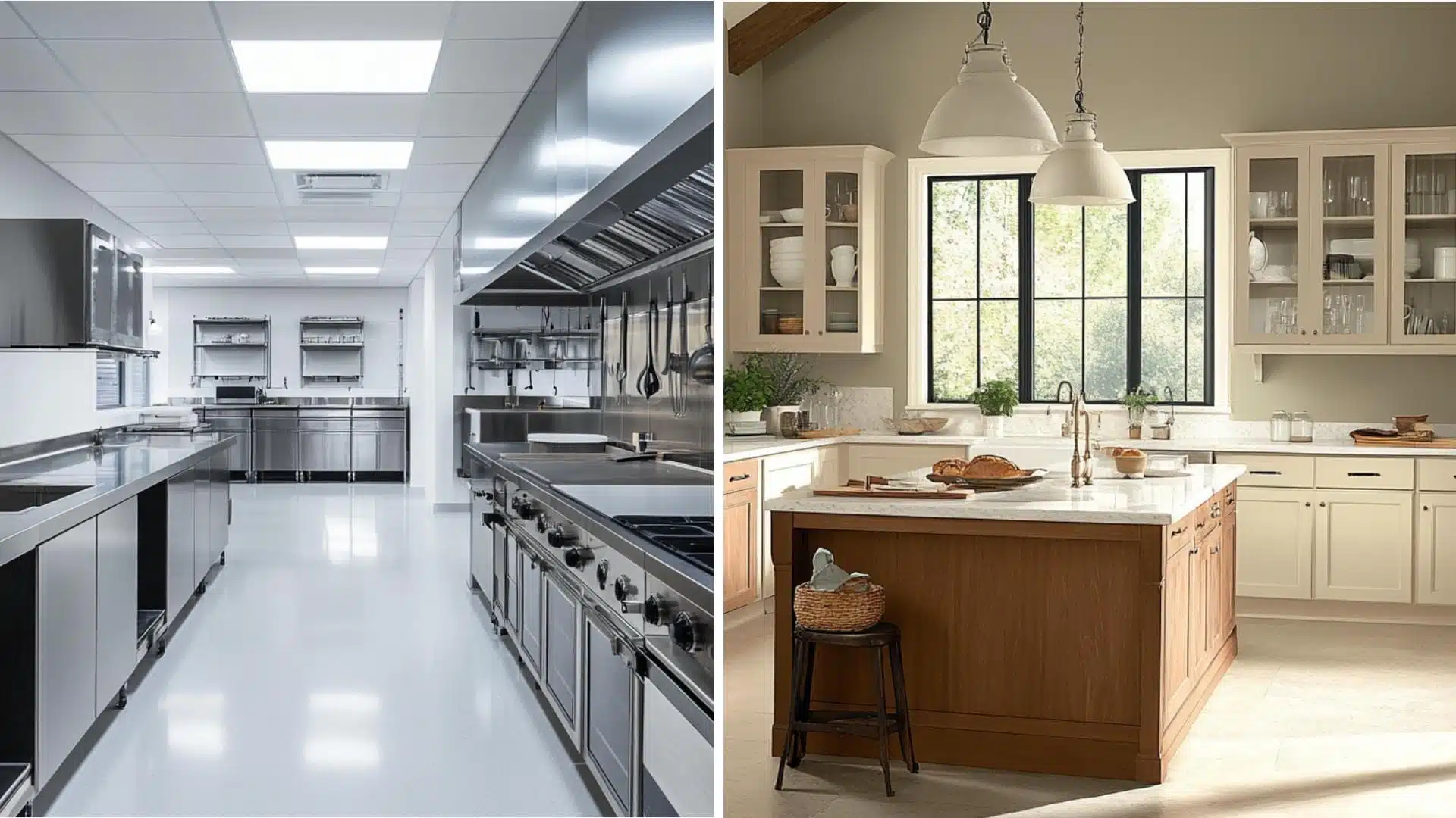
- RAL 9003: Delivers a super clean appearance that pairs perfectly with stainless steel appliances and makes food colors appear more vibrant, creating a bright, energetic cooking environment.
- RAL 9016: Provides a more lived-in, cozy kitchen atmosphere that’s practical for busy families, hiding minor marks and fingerprints better while feeling less clinical than stark white.
Bathrooms & Spa-like Retreats
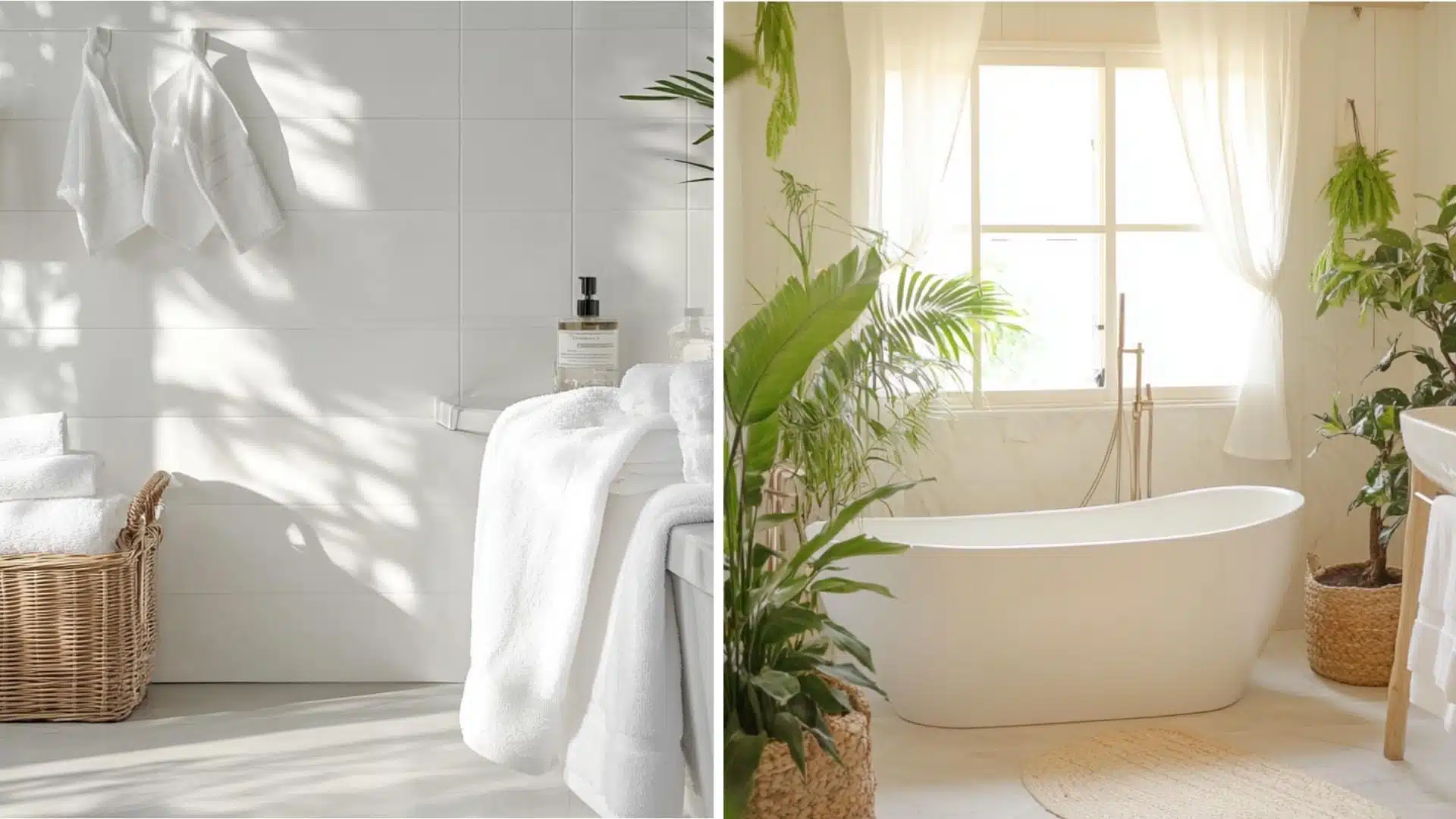
- RAL 9003: Creates a crisp, pristine look that makes bathrooms feel like luxurious hotel spaces, maximizing cleanliness and appearance, and reflecting light beautifully off tiles and fixtures.
- RAL 9016: Establishes a softer, spa-like atmosphere that promotes relaxation and wellness, working harmoniously with natural stone, plants, and warm lighting to create a therapeutic retreat feel.
Best Finishes for RAL 9003 and RAL 9016
Choosing the right paint finish impacts not just durability and lighting, but also how cozy or sleek a space feels.
Here’s a breakdown for RAL 9003 and RAL 9016:
| FINISH TYPE | BEST FOR | RAL 9003 EFFECT | RAL 9016 EFFECT |
|---|---|---|---|
| Matte (Flat) | Bedrooms, living rooms, and ceilings | Less stark, still clean | Soft and cozy |
| Eggshell (Low-Sheen) | Dining rooms, low-traffic walls | Crisp without being sharp | Smooth and warm |
| Satin (Soft Gloss) | Kitchens, bathrooms, high-touch areas | Reflects light well, feels modern | Subtle warmth with easy cleaning |
| Semi-Gloss | Trim, doors, cabinets | Sleek and modern | Practical and inviting for active homes |
| Gloss (High Shine) | Feature walls, accents | Bold and bright | Graceful with a softer touch |
Using the right paint finish helps RAL 9003 and RAL 9016 enhance both the performance and beauty of your space.
It’s the perfect final touch for combining color with function.
RAL 9003 vs RAL 9016: Which One to Choose
Still not sure which white is right for you?
Consider how you utilize your space and the feeling you want to evoke.
Do you want a bright, energetic room that feels super clean and modern?
Go with RAL 9003, it’s perfect for kitchens and bathrooms.
Want something softer and more relaxing that won’t show every little mark?
RAL 9016 is the perfect choice for bedrooms and living rooms.
You can even mix both throughout your home, using each white where it works best!
Can You Use RAL 9003 and RAL 9016 Together in One Home?
Absolutely! Using both whites in one home is actually a smart design choice.
Try RAL 9003 in your kitchen and bathrooms where you want that super clean, bright look.
Then use RAL 9016 in bedrooms and living rooms where you want to relax.
The trick is keeping them in separate areas so they don’t clash.
This way, each room gets the perfect white for its purpose.
Your home will feel balanced, energizing where you need it, calming where you want it!
Common Mistakes to Avoid While Choosing Paint

Taking time to test and compare prevents costly mistakes and disappointing results.
People often make these mistakes when picking white paint:
- Testing paint only under store lights, not in the actual room
- Forgetting to check how the color looks at different times of day
- Not considering how furniture colors will work with the white
- Picking the same white for every room, regardless of light levels
- Using too many different whites that clash slightly
- Ignoring how the flooring color affects how white paint looks
- Not testing a sample patch on the wall before buying gallons
Avoiding these common errors helps ensure the white you choose looks as good on your walls as it did on the sample card.
Take time with this important decision for the best results.
Final Thoughts on RAL 9003 vs 9016
RAL 9003 and RAL 9016 might look similar at first glance, but they each bring something special to your home.
RAL 9003 gives you that bright, clean energy perfect for kitchens and bathrooms.
RAL 9016 offers the calm, cozy feeling you want in bedrooms and living spaces.
The best part?
You don’t have to choose just one!
Use both throughout your home to create the perfect mood in every room.
Ready to alter your space?
Pick up some paint samples today and see which white speaks to you!
Check out more color reviews to find the perfect shade for every room in your home.

Alex Guerrero, a graduate with a Fine Arts degree from the Rhode Island School of Design, has been a visionary in the world of color and design for over 15 years. His professional journey began in the heart of the fashion industry in Milan, where he developed an acute sense for color harmonies and trends. Alex joined our team in 2018, offering fresh and innovative perspectives on color utilization in various spaces. Renowned for his ability to blend contemporary trends with timeless elegance. Outside of work, Alex is an accomplished painter and a volunteer art therapist, his artistic talents further enriching his professional insights.