

White Heron (OC-57) by Benjamin Moore stands as a testament to timeless elegance in interior design. This classic bright white has the slightest cool cast, creating a crisp, clean foundation that brings sophistication and versatility to any space.
Like its namesake bird—graceful and pure—the White Heron offers a sense of serenity and lightness that opens up rooms while providing a perfect neutral backdrop for both traditional and contemporary design elements.
Neither stark nor creamy, this thoughtfully balanced white strikes the ideal middle ground for those seeking a fresh, airy atmosphere without the harshness of pure white or the warmth of cream tones.
Understanding Benjamin Moore’s White Heron (OC-57)
Color Terminology
| PROPERTY | VALUE |
|---|---|
| LRV (Light Reflectance Value) | 84.50 |
| Color Category | Considered a light color (LRV between 75-85) |
| Comparison | Pure white: ~90 LRV, Black: ~0 LRV |
| RGB Value | Red: 238 Green: 237 Blue: 235 |
| Hex Code | #EEEEEB |
Undertones:
- White Heron has subtle cool undertones
- It’s a bright white with the slightest blue/gray influence
- Not a stark or clinical white, but a refined, crisp neutral with soft depth
Psychology of Cool White Colors
- Cool whites like White Heron create a sense of spaciousness and contemporary elegance.
- Bright tones: Offer clarity and visual expansion of spaces
- Slightly cool whites: Evoke freshness, sophistication, and modern simplicity
- Benefits: Brighter than creamy whites, adds subtle coolness to spaces, creates a clean backdrop for both colorful accents and neutral furniture pieces
White Heron provides the perfect balance for those seeking a bright white that isn’t too stark or clinical. Its subtle cool undertones make it particularly versatile in spaces with northern or eastern exposure, where it helps maintain brightness while contributing a sense of refreshing clarity.
Why Choose this Color?
The gentle coolness of White Heron evokes a sense of clarity and purity that promotes tranquility in any environment.
This enduring color carries delicate undertones that shift gracefully with changing light, ensuring your space feels both current and timelessly tasteful.
Key Features
Benjamin Moore White Heron offers exceptional brightness and versatility across different lighting conditions. It maintains its gentle coolness in south-facing spaces while creating a bright, expansive atmosphere in rooms with varied natural light.
Its timeless neutral quality provides a refined backdrop that complements both warm wooden elements and colorful accents without appearing overly stark or clinical.
Adaptability
Benjamin Moore White Heron demonstrates remarkable adaptability with existing elements like wooden furniture and colorful textiles, creating seamless transitions between spaces.
It provides enough brightness to feel open and airy while maintaining a clean, enduring quality that won’t quickly date your interior design choices.
This versatile white works equally well as an all-over color for creating bright, open environments or as a complementary tone to more dramatic accent walls.
Durability
Benjamin Moore White Heron, particularly in premium finishes like Aura or Regal Select, delivers outstanding durability with excellent coverage in both new and repainted areas.
Its light tone and subtle cool undertones maintain a fresh appearance throughout your home while providing a forgiving surface for everyday living.
This paint resists yellowing and maintains color consistency even with regular cleaning when properly applied.
Texture Patterns
Benjamin Moore White Heron creates a smooth, crisp texture that adds subtle dimension to walls and architectural features.
Its gentle undertones produce beautiful light play that enhances moldings and adds visual interest to even simple walls.
When applied to different finishes, it can elegantly highlight architectural details while maintaining a consistent, refined appearance throughout connected spaces.
Why It Works
Benjamin Moore’s White Heron works because it perfectly balances brightness and coolness, providing enough character to create an atmosphere without feeling too stark or sterile.
Its subtle cool undertones complement warm woods, metal fixtures, and colorful textiles, while its higher LRV (84.50) ensures rooms feel spacious and bright.
This versatile white adapts beautifully to changing decor styles, maintaining its distinguished character throughout the seasons.
Room-by-Room Color Recommendations with White Heron
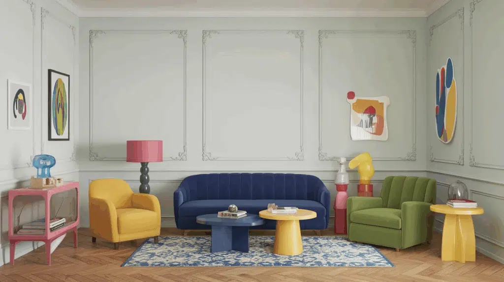
Living Spaces and Open Floor Plans
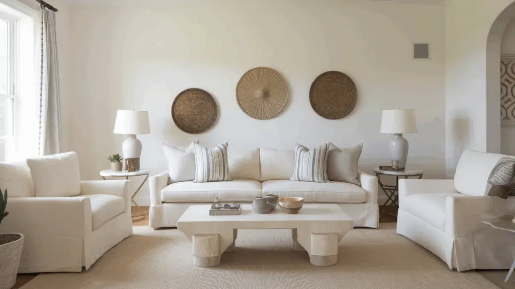
- White Heron works exceptionally well as an all-over color in open floor plans, creating a bright, cohesive flow while maintaining a clean, contemporary palette.
- The 84.50 LRV of White Heron provides an airy, expansive feel that makes spaces appear larger and more sophisticated without feeling cold.
- Use White Heron to unify different functional areas in open-concept spaces while allowing furniture and decor to define each zone.
Bedrooms and Relaxation Areas
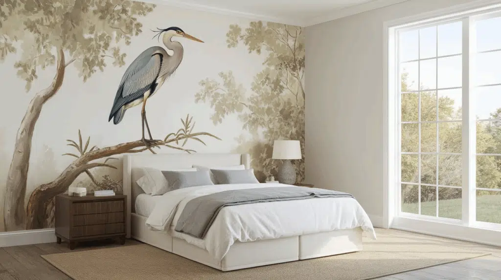
- White Heron creates a serene, peaceful atmosphere in bedrooms that promotes relaxation and rest.
- The subtle cool undertones in White Heron evoke a sense of calm while creating a versatile backdrop for bedding and furniture of any style.
- Consider White Heron for all walls in bedrooms with colorful accents, or pair with deeper colors on an accent wall for visual interest without sacrificing brightness.
Kitchens
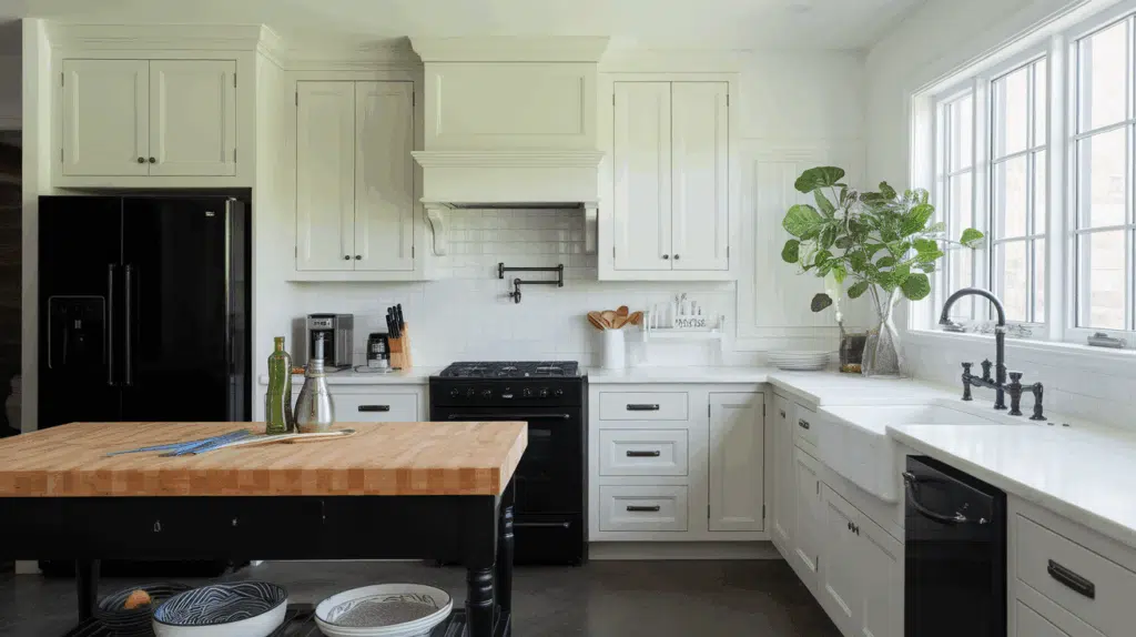
- White Heron in eggshell or satin finish on kitchen cabinets creates a timeless, clean aesthetic that brightens the space while complementing colorful backsplashes or countertops.
- The gentle coolness of White Heron improves both light and dark countertop materials, making it adaptable to various kitchen styles from contemporary to transitional.
- White Heron cabinets paired with darker islands or lower cabinets create appealing contrast without sacrificing the kitchen’s bright, airy feel.
Bathrooms and Spa-like Retreats
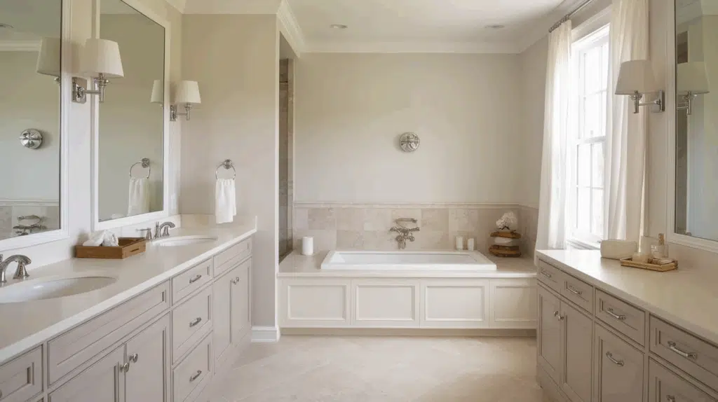
- Benjamin Moore White Heron creates a fresh, crisp atmosphere in bathrooms. Its subtle, cool undertones establish a sense of cleanliness while complementing white fixtures.
- This versatile shade pairs beautifully with both chrome and matte black fixtures, marble, and natural wood, creating a timeless, refined retreat that feels both clean and inviting.
- Use White Heron on walls and trim for a cohesive look that maximizes the sense of space in smaller bathrooms.
White Heron Color Combinations
White Heron is a bright, crisp white with subtle cool undertones. Its high Light Reflectance Value (LRV) of 84.50 makes it a luminous, airy foundation that adds sophistication and versatility to spaces while maintaining a gentle freshness. Let me help you with color pairings and combinations for this shade.
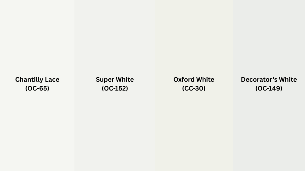
Complementary Trim Colors
- Chantilly Lace (OC-65) – A pure white that creates a seamless, barely-there transition with White Heron
- Super White (PM-1) – A clean, bright white that enhances White Heron’s crisp quality
- Oxford White (CC-30) – A versatile white that maintains White Heron’s fresh appearance
- Decorator’s White (OC-149) – A cool white that complements White Heron’s subtle blue undertones
Coordinating Wall Colors
- Stonington Gray (HC-170) – A cool gray that extends White Heron’s sophisticated character
- Paper White (OC-55) – A light gray with blue undertones that creates a refined, cohesive palette
- Wickham Gray (HC-171) – A soft gray with subtle blue-green tones that balances White Heron’s crispness
- Gray Owl (OC-52) – A versatile light gray that complements White Heron’s cool undertones
Accent Colors
- Hale Navy (HC-154) – A deep blue that creates classic contrast against White Heron’s brightness
- Caldwell Green (HC-124) – A rich green that grounds White Heron’s lightness with natural elegance
- Van Deusen Blue (HC-156) – A medium blue that enhances White Heron’s cool undertones
- Chelsea Gray (HC-168) – A versatile mid-tone gray that provides sophisticated contrast
Coordinating with Furniture and Decor
Wood Tones
White Heron pairs beautifully with a wide range of wood tones, offering different aesthetic effects. Light oak, ash, and maple create a Scandinavian-inspired look against White Heron’s crisp backdrop.
Medium wood tones like walnut and cherry provide warming contrast that balances White Heron’s cool undertones.
For a more dramatic look, ebony or espresso woods create striking contrast while maintaining a sophisticated atmosphere.
White-washed or gray-toned woods extend White Heron’s contemporary quality and create a cohesive, modern aesthetic.
Metals
Chrome, stainless steel, and polished nickel hardware enhance White Heron’s cool undertones and create a fresh, contemporary look.
Matte black fixtures create dramatic contrast that highlights White Heron’s brightness. While White Heron works with warm metals, brass and gold accents should be carefully selected to ensure they don’t clash with the cool undertones—opt for antiqued or brushed finishes rather than highly polished varieties.
Silver and pewter finishes provide an elegant, timeless pairing that complements White Heron’s sophisticated nature.
Decor
Natural fibers like linen, cotton, and wool in cool-toned neutrals create textural interest against White Heron walls while maintaining a cohesive palette.
Colorful accents in jewel tones like sapphire, emerald, and amethyst stand out beautifully against the crisp backdrop.
Glass, acrylic, and mirrored elements enhance White Heron’s light-reflecting properties and amplify its spacious feel.
Introducing natural elements with cool undertones—like weathered driftwood, slate, or concrete—reinforces the sophisticated coolness inherent in this versatile white while adding organic texture.
Similar Paint Colors: Perfect Alternatives to White Heron (OC-57)
.png)
All these colors work well in many different rooms. They create spaces that feel warm and welcoming while still looking clean and fresh.
1. Cloud White (OC-130)
- A slightly higher LRV of 85 makes it appear brighter than White Heron in the same lighting
- Cooler undertones give it a crisper appearance than White Heron’s warmer look
- Might show more blue in north-facing rooms, while White Heron stays more consistently warm
2. Simply White (OC-117)
- A clean, neutral paint with a subtle warm base that’s balanced with cool gray hints
- Higher LRV of 91 makes it significantly brighter than White Heron in the same space
- Less likely to show yellow undertones, making it a safer choice with cool-toned furnishings
3. Moonshine (OC-56)
- A warm-leaning off-white with subtle beige undertones that give it a soft appearance
- LRV of 66.53 makes it slightly lighter and more reflective than White Heron
- More likely to show warm undertones in certain lights, sometimes with the faintest cream hint
Final Thoughts
White Heron (OC-57) transcends trends, embodying the perfect balance between coolness and neutrality that makes it a perennial favorite among designers and homeowners alike.
Its subtle sophistication allows it to adapt effortlessly to changing styles and seasonal accents, ensuring longevity in your design choices.
Whether washing your walls in morning light or creating a canvas for your personal expression, White Heron delivers a timeless quality that both grounds and elevates a space.

Alex Guerrero, a graduate with a Fine Arts degree from the Rhode Island School of Design, has been a visionary in the world of color and design for over 15 years. His professional journey began in the heart of the fashion industry in Milan, where he developed an acute sense for color harmonies and trends. Alex joined our team in 2018, offering fresh and innovative perspectives on color utilization in various spaces. Renowned for his ability to blend contemporary trends with timeless elegance. Outside of work, Alex is an accomplished painter and a volunteer art therapist, his artistic talents further enriching his professional insights.