Choosing paint colors can feel confusing, right? I’ve been there too. You stare at tiny swatches and wonder how they’ll look on your walls.
One popular color I kept hearing about was Sherwin-Williams Alabaster. People said it was “perfect,” “creamy,” and “just right.” But I wanted to know why.
So I looked deeper. What made it work in so many rooms? The secret is in its undertones, which give Alabaster its warm, cozy feel. I’ll explain that in this post.
If you’re thinking about painting your home, this post is for you. I’ll show you what Sherwin-Williams Alabaster really looks like, how it acts in different lights, and what undertones you can expect.
I’ll also share my tips from using it in my living room and bathroom.
What is Sherwin-Williams Alabaster?
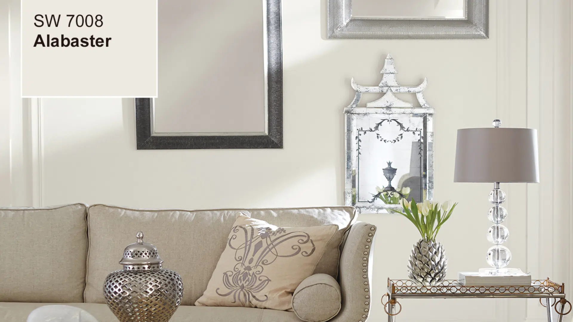
Sherwin-Williams Alabaster (SW 7008) is a soft, warm, and not too bright white paint color. It’s not too yellow. And it’s definitely not cold or icy.
You can find it in homes all over. Designers love it. People use it on walls, cabinets, trim, and even exteriors. Why? Because it’s calm, clean, and inviting.
It was even named Color of the Year back in 2016 by Sherwin Williams.
So what makes it different from other whites? Alabaster gives off a gentle glow that makes any room feel peaceful.
It works well in both old homes and new builds. The color feels timeless, like it’s always been there.
If you’re looking for something easy to live with and that always looks good, Alabaster is a smart pick.
Understanding the Undertones of Sherwin-Williams Alabaster
Alabaster may look like a simple white at first, but its soft undertones give it warmth and character. Understanding these undertones helps you know how it will feel in your space.
Warm Beige Undertones
Alabaster has gentle beige undertones that give it a warm and soft look. These undertones stop it from looking too sharp or cold.
Instead of feeling clinical like some whites, Alabaster brings a quiet warmth to a room. It’s similar to the look of natural materials like sand, linen, or unbleached cotton.
This makes it a good option if you want a space to feel calm and inviting without adding strong color.
A Hint of Yellow
Alabaster also includes a small amount of yellow in its undertone. This yellow is very subtle. It doesn’t jump out, and it won’t make your walls look yellow. But it’s just enough to soften the white and make it feel less stark.
You might only notice it when you place Alabaster next to other white paints. This soft yellow tone helps prevent the color from feeling cold or dull, especially in rooms with little natural light.
No Strong Pink or Green
Some white paints can surprise you with pink or green undertones, especially when the light changes during the day. These unexpected undertones can clash with your flooring, furniture, or trim colors.
Alabaster does not have strong pink or green tones. That makes it more reliable and easier to use in a wide range of spaces. It stays neutral and creamy, which helps it blend well with both warm and cool elements in a room.
How Alabaster Looks in Different Light
Lighting can change the way any paint color looks, including Alabaster. Knowing how it reacts to different light sources will help you decide where to use it in your home.
In Natural Light
When Alabaster is used in a room with plenty of sunlight, it appears bright and light.
The natural daylight brings out its soft white base while the beige undertones gently tone down any harsh brightness. This creates a pleasant and balanced look that doesn’t feel too stark.
It’s especially useful in large, open rooms like living areas or kitchens that get lots of sun.
In Low Light
Alabaster shifts slightly in spaces that don’t get much natural light, such as hallways, closets, or small bathrooms.
The creamy side of the color becomes more noticeable, and the hint of yellow in its undertone is easier to see. It gives the room a warmer and cozier feel without turning yellow or dull.
This makes it a good choice for dim corners where you still want a soft, welcoming vibe.
With Artificial Light
The type of light bulbs you use can also affect how Alabaster looks.
Under warm artificial lighting, such as soft white or incandescent bulbs, the beige and yellow undertones become more visible, making the space feel snug and relaxed.
On the other hand, cooler lights like daylight LEDs reduce the warmth a little, making the color appear more neutral while still avoiding any blue or gray tones.
It remains soft and balanced in both cases. In my own space, I use warm LED bulbs.
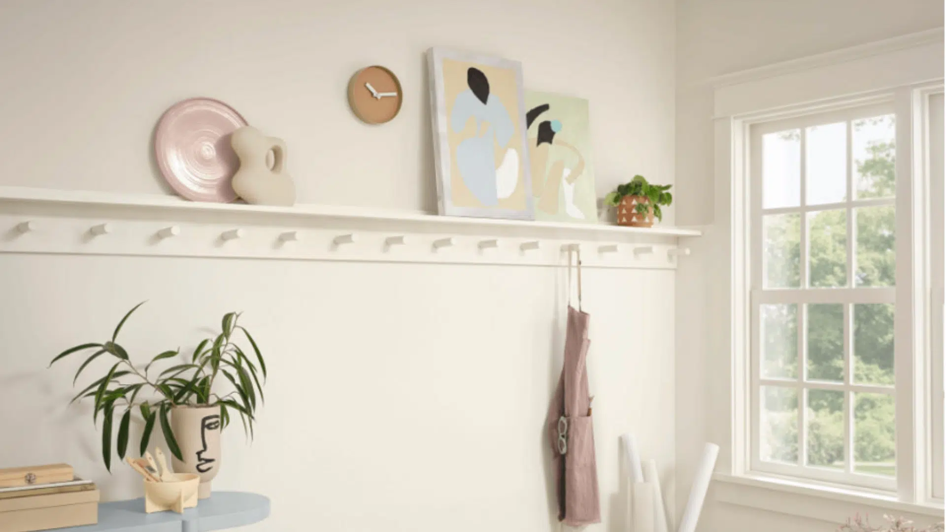
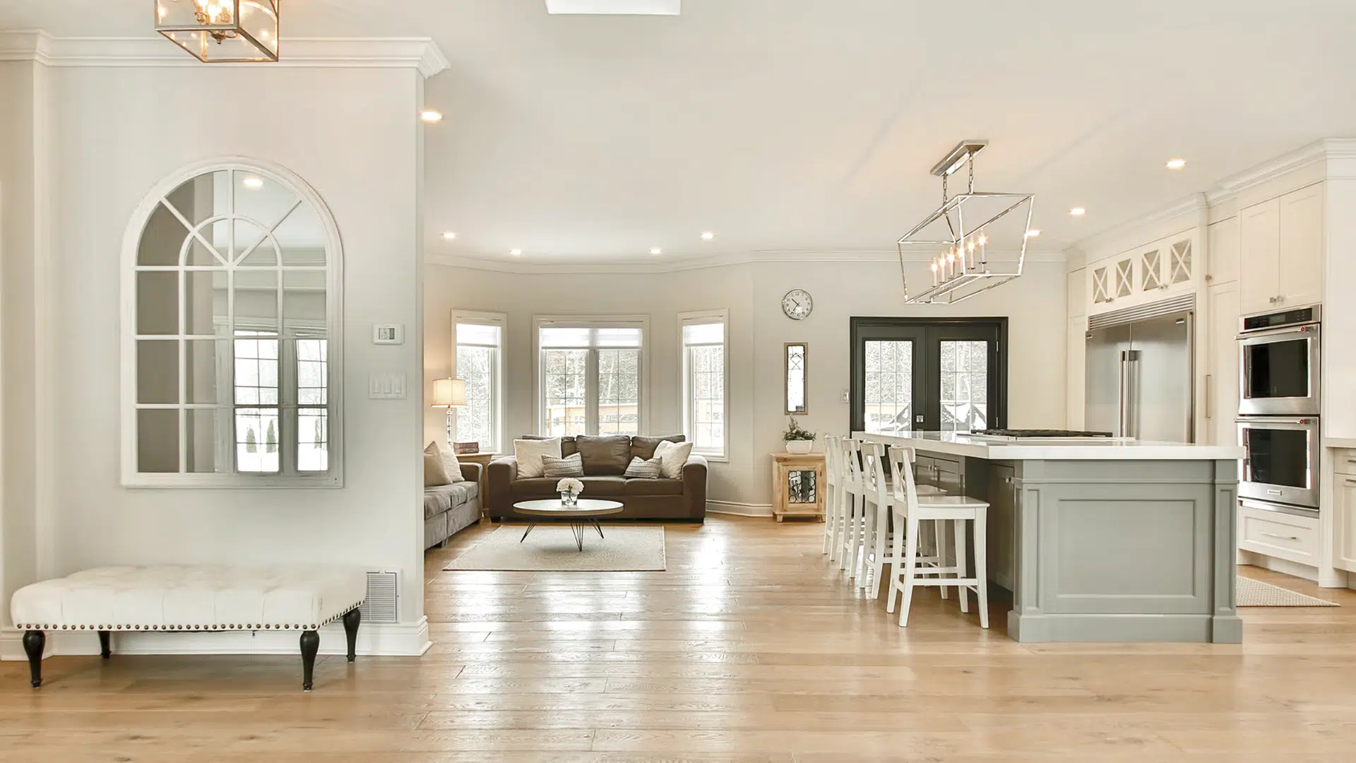
Where to Use Sherwin-Williams Alabaster
Alabaster’s soft and balanced tone makes it suitable for many areas in the home. Whether you’re painting walls, cabinets, or trim, it adapts well to different spaces and styles.
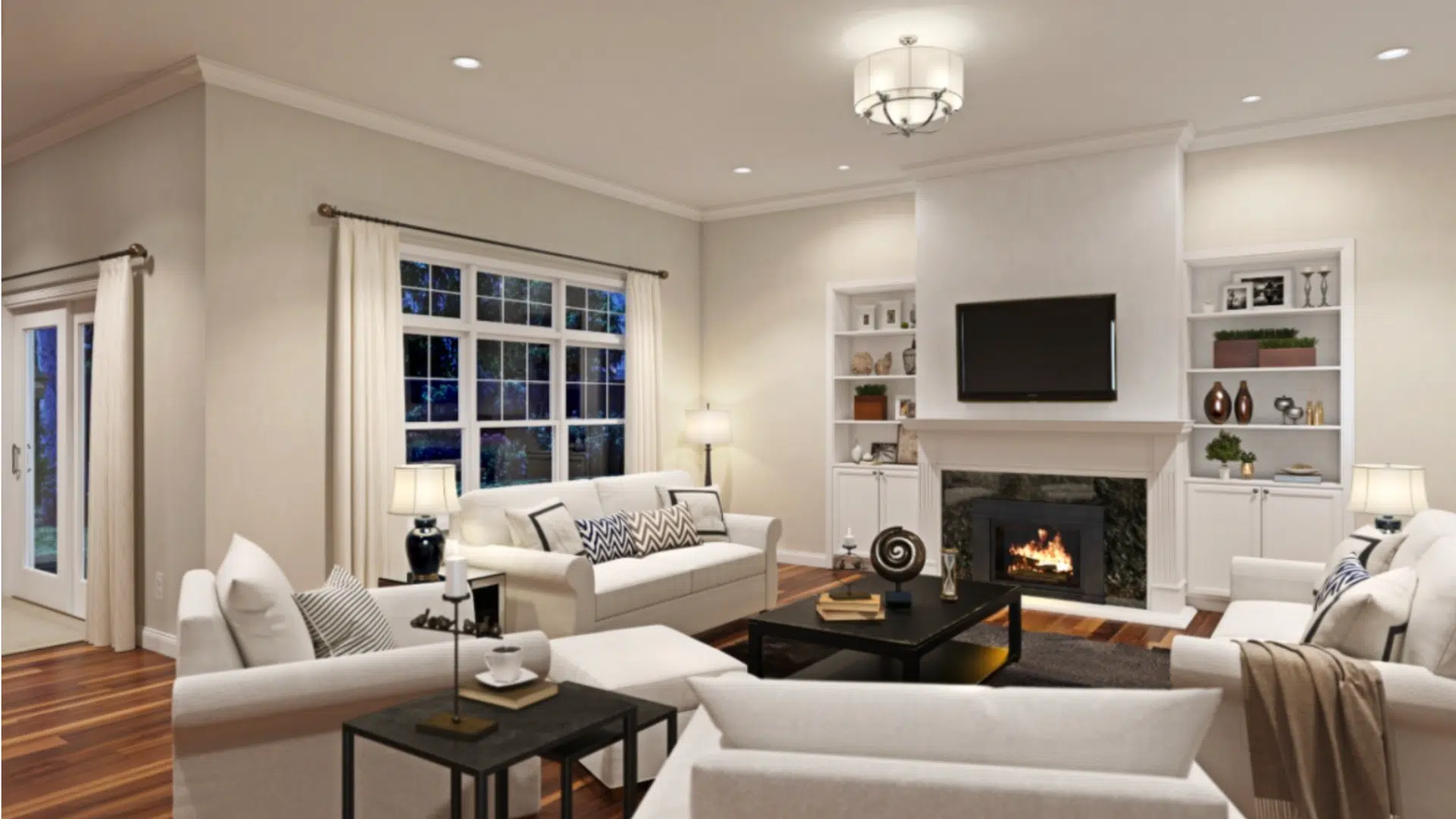
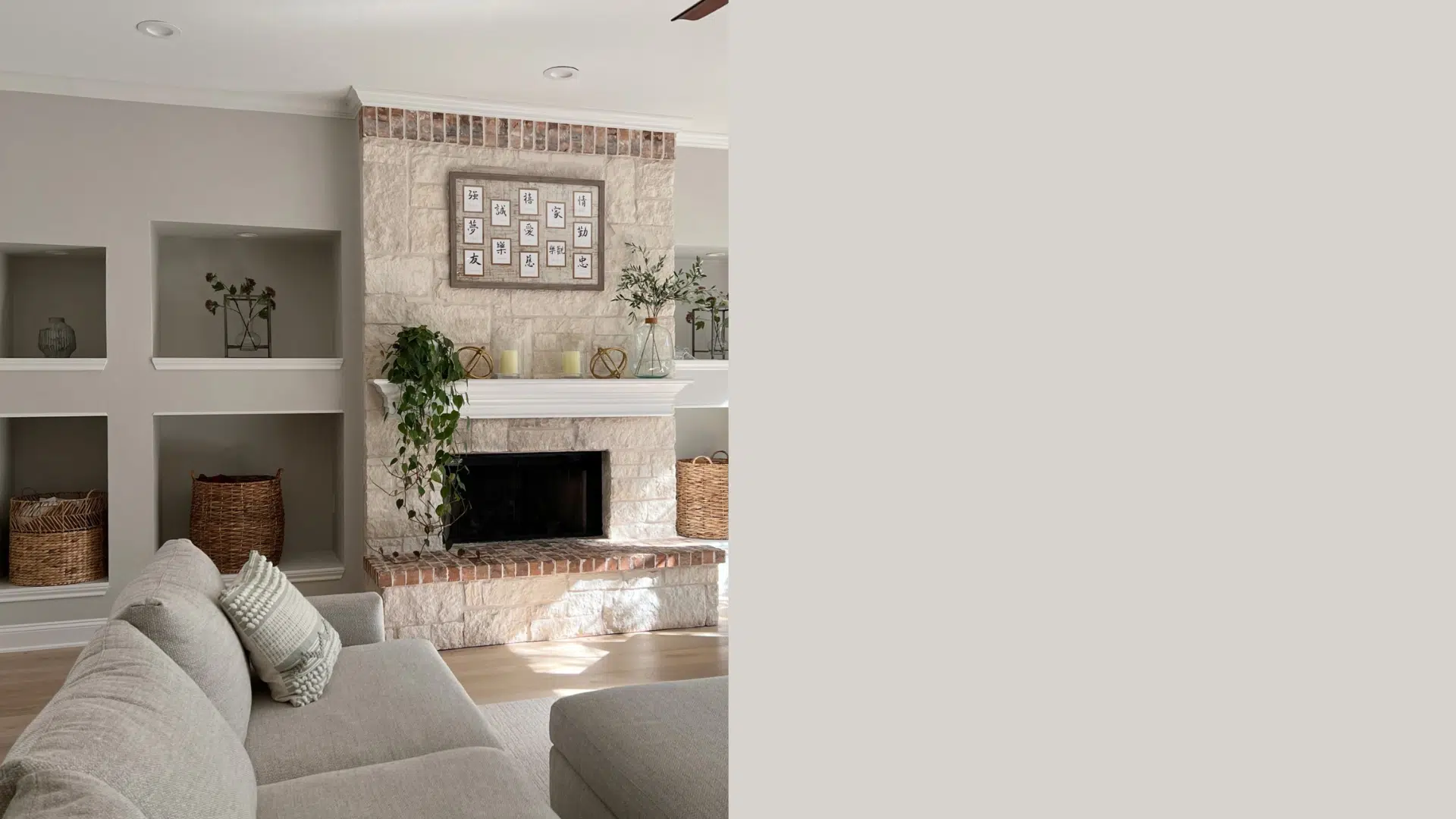
1. Living Room Walls
Alabaster is a great choice for living rooms, especially if you’re trying to warm up a space that feels a bit dull or cool.
When I used it in my living room, the change was instant. The soft warmth made the space feel more welcoming.
It worked especially well with neutral furniture and wood tones, making everything feel more connected.
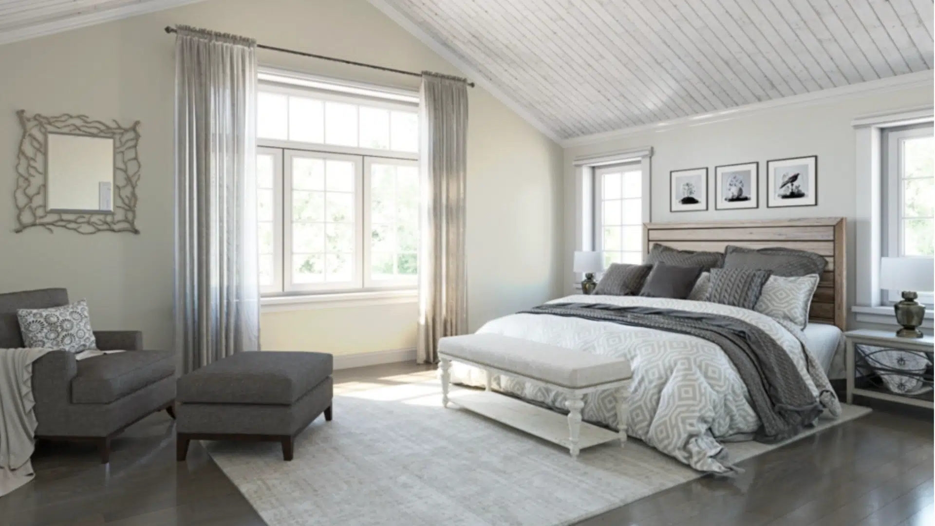
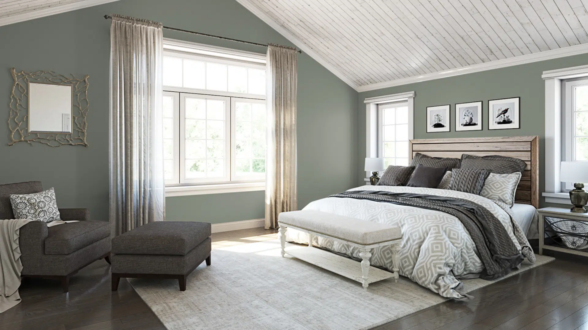
2. Bedroom
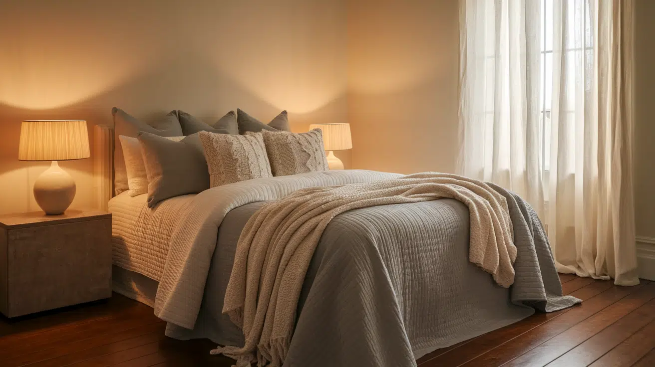
Alabaster’s gentle warmth is beneficial for bedrooms. It creates a calm, relaxing environment that is easy to decorate.
Whether you use soft pastels or darker accents, Alabaster works well as a backdrop.
I saw this firsthand when helping my cousin repaint her nursery, paired with wood furniture and cozy fabrics, the room felt peaceful and bright without being too white.
3. Kitchen Cabinets
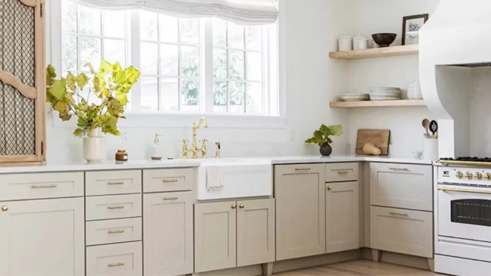
Alabaster is a smart option for kitchen cabinets if you want a clean but not too stark color.
Unlike brighter whites, which can feel cold or sterile, Alabaster brings a soft warmth that fits modern, traditional, or transitional kitchens.
It pairs nicely with metal hardware, brass gives it a warmer feel, while black adds contrast.
4. Trim and Doors
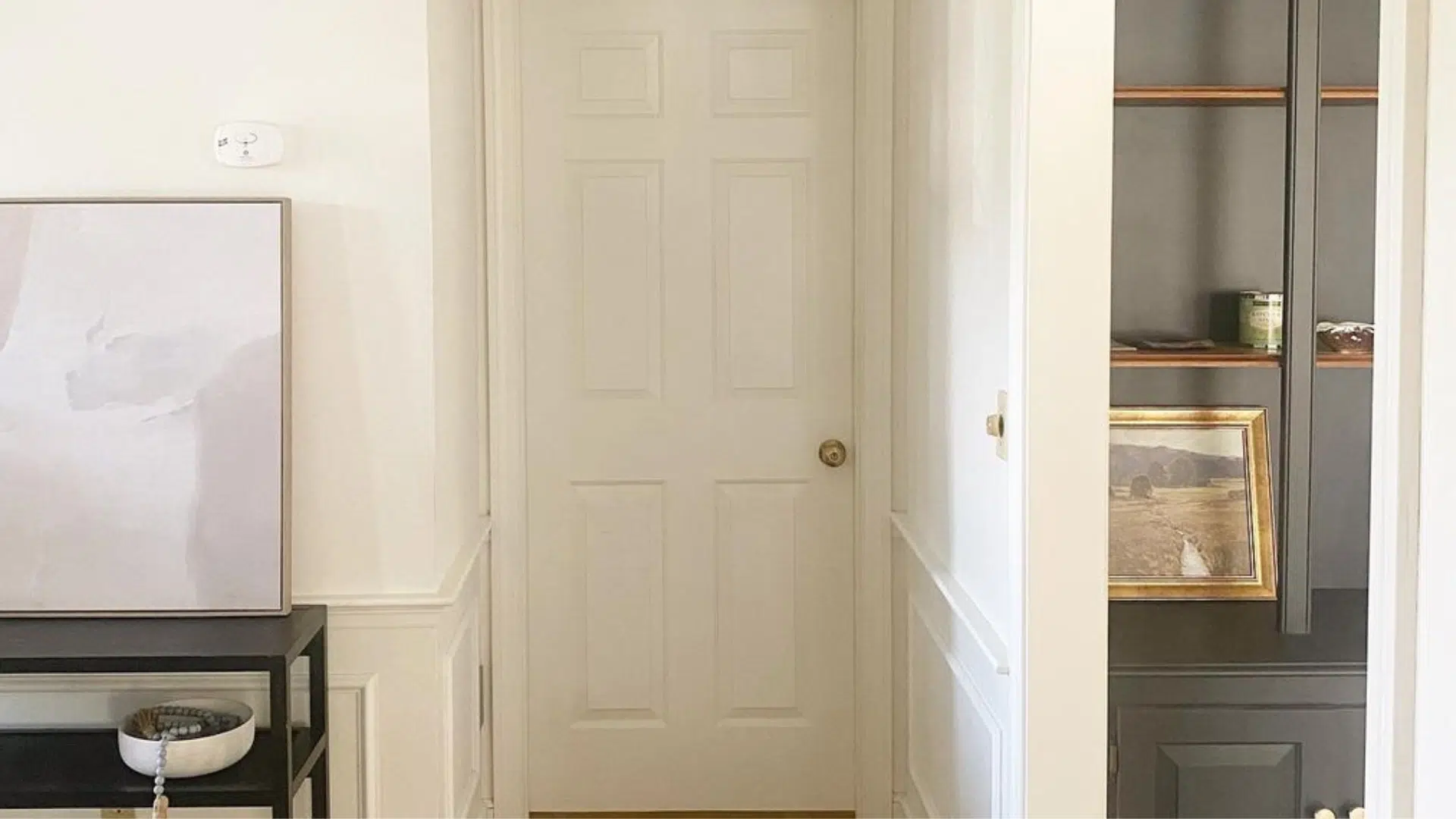
While many people choose bright whites for trim, Alabaster also works well in that role.
It blends smoothly with both light and darker wall colors. Using it for trim and doors creates a soft, seamless look.
On the other hand, if you use Alabaster on the walls, you can pair it with a brighter white like Sherwin Williams Pure White on the trim for a clean contrast that still feels balanced.
5. Exterior

Alabaster isn’t just for interiors; it can also be used on the outside of your home.
It holds up well in natural light and looks crisp without being too bright.
Whether on siding, stucco, or brick, it gives a clean look that doesn’t feel harsh.
However, it’s important to test it outdoors first, since strong sunlight can bring out undertones differently than inside your home.
Alabaster tends to stay soft and pleasant even in full sun, making it a popular exterior choice.
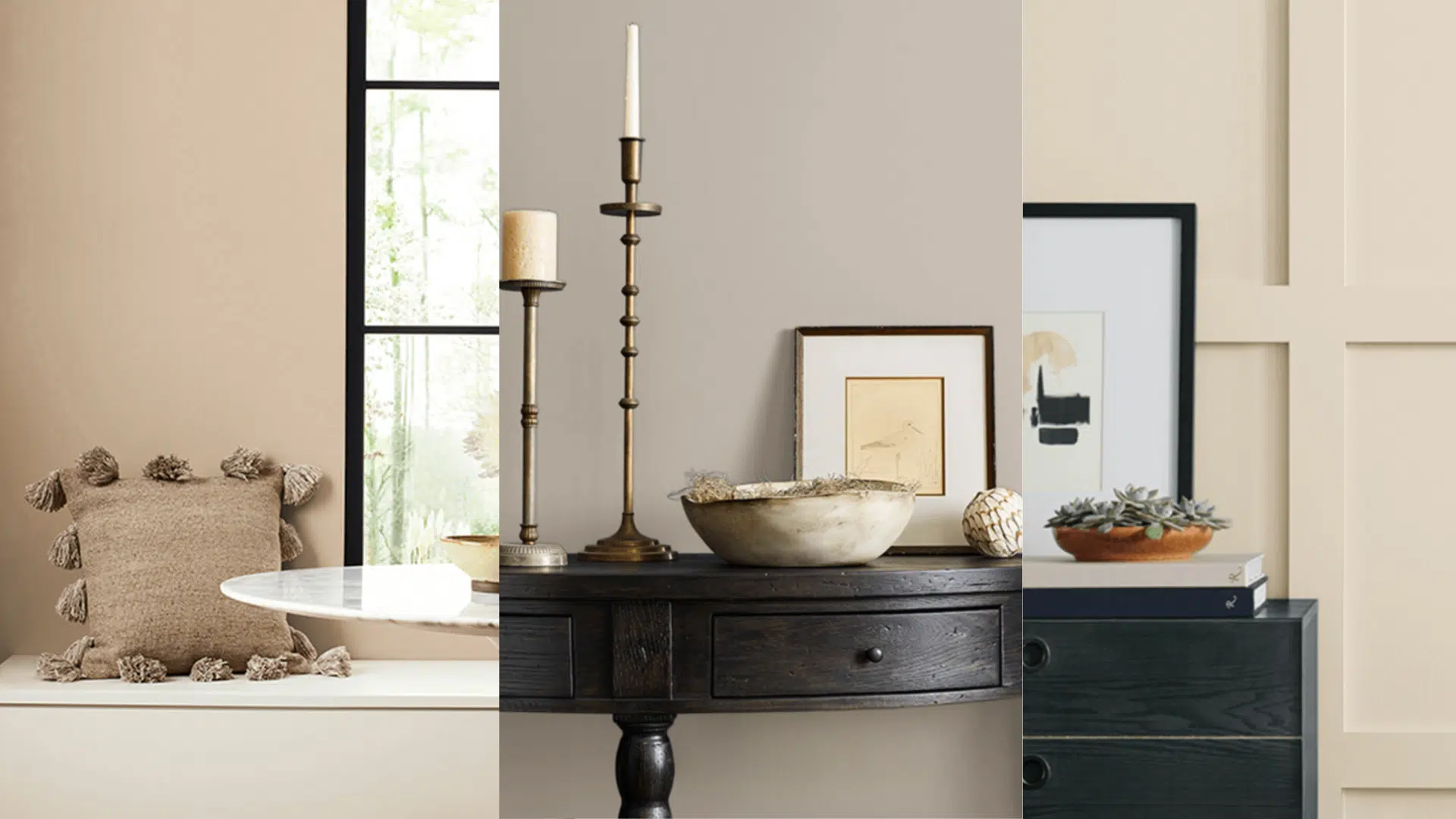
Colors That Pair Well with Alabaster
Alabaster’s soft warmth makes it easy to match with other colors and textures. Whether you like calm neutrals or bold contrast, it blends in beautifully.
- Soft Neutrals: These work well with beige, greige, and taupe tones and pair well with Sherwin Williams Accessible Beige or Repose Gray.
- Bold Colors: Stands out nicely next to navy, forest green, or black and looks especially striking with deep accent walls like Naval SW 6244.
- Wood and Natural Materials: Wood furniture, wicker accents, stone, and indoor plants complement wood and natural materials, bringing a cozy, grounded feeling to any room.
Alabaster vs. Other Whites
Not all white paints are the same. Here’s how Sherwin-Williams Alabaster compares to other popular whites in terms of warmth, undertones, and overall feel.
| Color | Undertones | Temperature | Feels Like |
|---|---|---|---|
| Alabaster | Beige/yellow | Warm | Soft, cozy |
| Pure White | Slight gray | Neutral | Clean, crisp |
| Snowbound | Pink/gray | Cool | Light and icy |
| Greek Villa | Cream | Warm | Brighter cream |
| Oyster white | Green-beige | warm | Soft, creamy |
Tips for Using Sherwin-Williams Alabaster
Planning is key to getting the best results with Alabaster. These simple tips will help you make the most of its soft, warm beauty.
- Sample First: Test a large swatch on your wall and check it at different times of day to see how the undertones change.
- Pair with the Right Lighting: Use warm bulbs for a cozy feel, or cooler bulbs to keep the color looking more neutral.
- Mix with Texture: To enhance alabaster’s warmth, combine it with wood, woven rugs, and natural fabrics.
- Don’t Overdo Yellow: Avoid pairing it with too many yellow tones, or it may start to feel overly warm. Use soft neutrals or cool accents instead.
Conclusion
Choosing a white paint is tricky. But once you know about undertones, it gets easier.
It’s cozy, calming, and classic. It works in bedrooms, kitchens, living rooms, and even outside. Best of all, it complements many other colors and textures.
If you’re like me and want a white that feels soft, not sterile, Sherwin-Williams Alabaster might be the perfect fit.
It’s warm without being yellow, clean without feeling cold, and easy to pair with other colors, textures, or styles.
I’ve used it in my own home, and it brought a peaceful, lived-in feel I hadn’t gotten from any other white.
Whether you’re painting a single room or your whole house, it’s worth trying a sample on your wall. See how it looks in your light, next to your furniture, and through your own eyes.
If this post helped you feel more confident about picking a paint color, I’d love to hear about it. Leave a comment below or send me a message, I’m always happy to chat about home projects.

Alex Guerrero, a graduate with a Fine Arts degree from the Rhode Island School of Design, has been a visionary in the world of color and design for over 15 years. His professional journey began in the heart of the fashion industry in Milan, where he developed an acute sense for color harmonies and trends. Alex joined our team in 2018, offering fresh and innovative perspectives on color utilization in various spaces. Renowned for his ability to blend contemporary trends with timeless elegance. Outside of work, Alex is an accomplished painter and a volunteer art therapist, his artistic talents further enriching his professional insights.

Hi Alex ,
Thank you for your advice and recommendations. Alabaster is actually a favorite of mine. For an accent wall with a book case in dark toned wood, what color would you recommend?