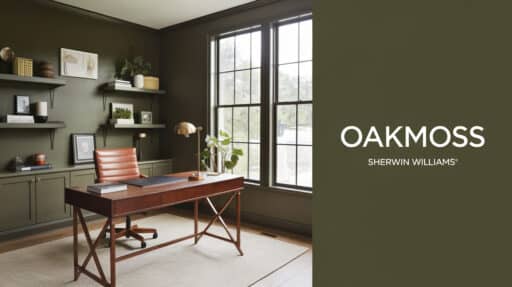
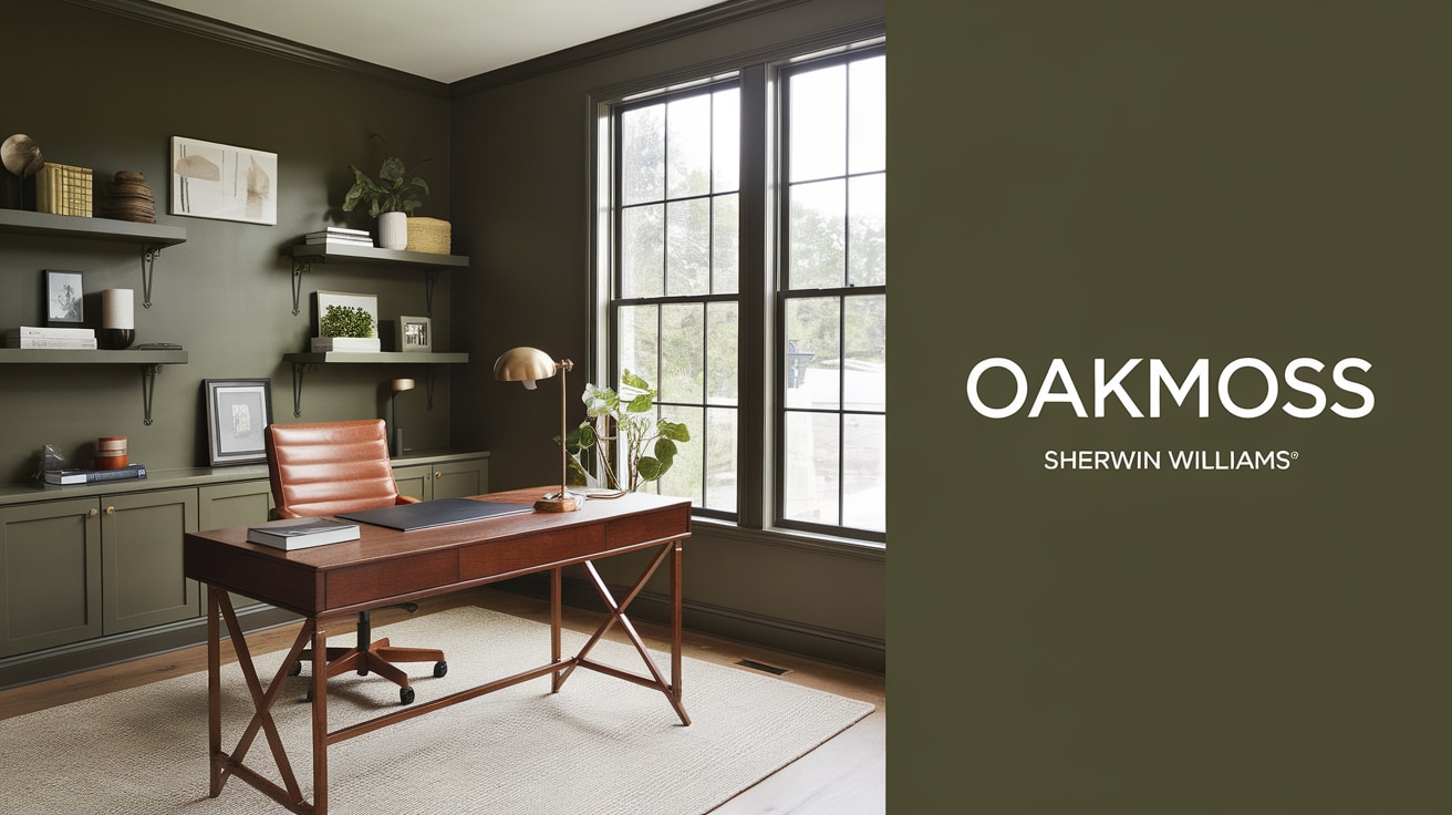
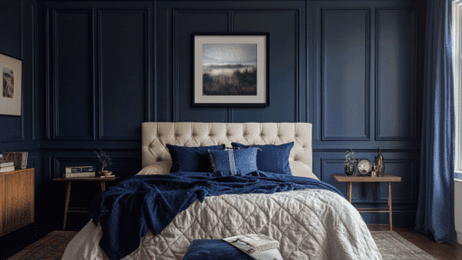
Is your living space making you feel bored every time you walk in? I know that feeling – I had the same problem until I found Oakmoss (SW 6180) by Sherwin Williams.
This deep, muted green paint took my walls from dull to delightful.
What most people don’t realize about this color is its special magic: it’s not just green.
I’ve tested this paint in many homes and learned all its secrets.
Now, I can help you understand how to use this earthy color to create a space you’ll love coming home to.
Want to know how this perfect mix of green can bring new life to your rooms? So, without wasting further time, let’s jump into our blog.
If you're considering other green options, read our review of Sherwin Williams Dried Thyme (SW 6186) to see how it compares to Oakmoss
Oakmoss Sherwin-Williams: Color Description
Are you looking to understand exactly what type of shade Oakmoss is? Let me break down every detail of this unique green shade for you.
Oakmoss (SW 6180) is a deep, muted green that brings natural tones inside. I’d describe it as a mature green that sits between forest and sage, making it easy on the eyes.
Color Behavior: In bright spaces, this paint shows its gray side, feeling crisp and clean.
When the light dims, brown undertones come forward, creating a cozy feel. This shifting nature makes it versatile for any room in your house.
Undertones & LRV
The most interesting thing I’ve noticed about Oakmoss is its rich mix of undertones.
The base green gets extra depth from gray and brown notes
With an LRV of 24, this paint soaks up light rather than bouncing it back. This means it can make large rooms feel more intimate while still keeping smaller spaces from feeling dark.
Warm or Cool?
I find Oakmoss fascinating because it’s actually a balanced neutral green. While green typically falls in the cool category, the brown undertones in Oakmoss add warmth.
This balance helps it work well in both sunny south-facing rooms and cooler north-facing spaces.
What Makes Oakmoss a Popular Choice?

Oakmoss catches attention because it’s not your typical green.
I’ve noticed how this color brings warmth to spaces while staying soft and natural.
Think of it as that perfect middle ground between bold and subtle.
What makes people pick this shade again and again?
- It works like a neutral – the mix of gray and brown undertones helps it blend with many color schemes.
- It changes throughout the day. It looks different but stays beautiful as light shifts.
- It fits many rooms – from living spaces to bedrooms to offices
- It makes both small and large spaces feel cozy
- Works with any design style – modern, rustic, or classic
My favorite thing about Oakmoss is how it plays a supporting role – it adds richness to your walls while making your furniture and decor pop
Redesigning Space with Oakmoss Sherwin Williams
Let me walk you through how Oakmoss can change the look and feel of every room in your home.
I’ve seen this color work like magic in many spaces, and I’m excited to share these real transformations with you.
1. Magic of Oakmoss in the Living Room
I still remember walking into this living room after the final coat of Oakmoss dried.
The shift from lifeless beige to this rich green made me stop in my tracks. What really got me was how the afternoon sun hit the walls – the color seemed to change with every hour, making the space feel alive.
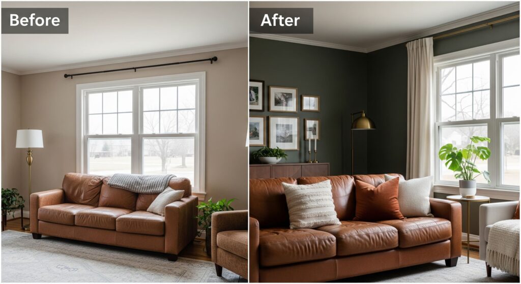
Before
- Beige walls lacked energy and made the room feel dated
- The brown leather sofa appeared worn and tired against the pale background
- Brass picture frames and fixtures looked dull and lifeless
- Large windows washed out the space rather than enhancing it
- Family photos and artwork blended into walls, losing their impact
- The room had good structure but felt more like a waiting room than a living space
After the Transformation
Oakmoss changed everything. The deep, muted green brought life while staying sophisticated.
Here’s what worked:
- The leather sofa now looks richer against the green backdrop
- Brass light fixtures and picture frames pop with extra warmth
- Cream curtains soften the look and balance the depth of the walls
- Added textured throw pillows in ivory and rust tones
- Placed green plants to echo the wall color
- Natural light plays with the walls, showing gray tints during the day and warm brown notes at night
2. Modifying Kitchen
The kitchen redesign honestly surprised me. I was worried the green might make the space feel dark, but it did just the opposite. The moment we paired it with the white cabinets, everything clicked.
I love how the morning coffee routine feels more special in this space now.
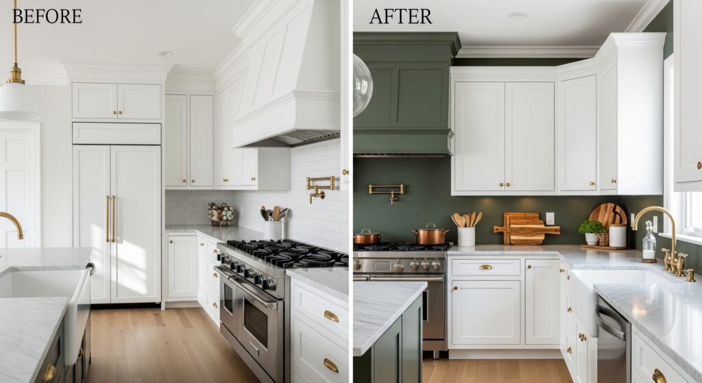
Before
- All-white walls merged with white cabinets, creating a flat look
- Stainless steel appliances stood out awkwardly in the white space
- The marble countertops’ beautiful veining disappeared against the white
- Space felt clinical and uninviting
- The lack of depth made the kitchen feel two-dimensional
- Morning light couldn’t add warmth to the cool environment
After the Transformation
Oakmoss walls added depth without darkening the space. The changes made include:
- White cabinets now stand out against the green background
- Added copper cookware and wooden cutting boards for display
- Installed under-cabinet lighting to highlight the color shifts
- The marble countertops’ gray veining ties in perfectly with the wall color
- Put in brass hardware on cabinets to add warm metal accents
- Natural light makes the space feel fresh and open
3. Bedroom Retreat
This bedroom makeover taught me something new about Oakmoss. At night, under soft lamp light, the walls take on this cocoon-like quality that I hadn’t expected.
It’s like the color knows exactly when to shift from energizing to calming.
Before
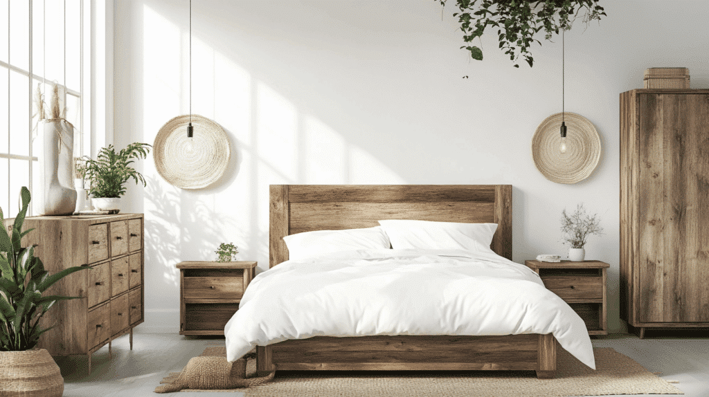
- White walls created a cold, impersonal atmosphere
- Wooden furniture looked disconnected from the space
- Art pieces seemed to float without purpose
- The room lacked any sense of coziness or comfort
- Natural light felt harsh against the white walls
- The space felt more like a hotel room than a personal retreat
After the Transformation
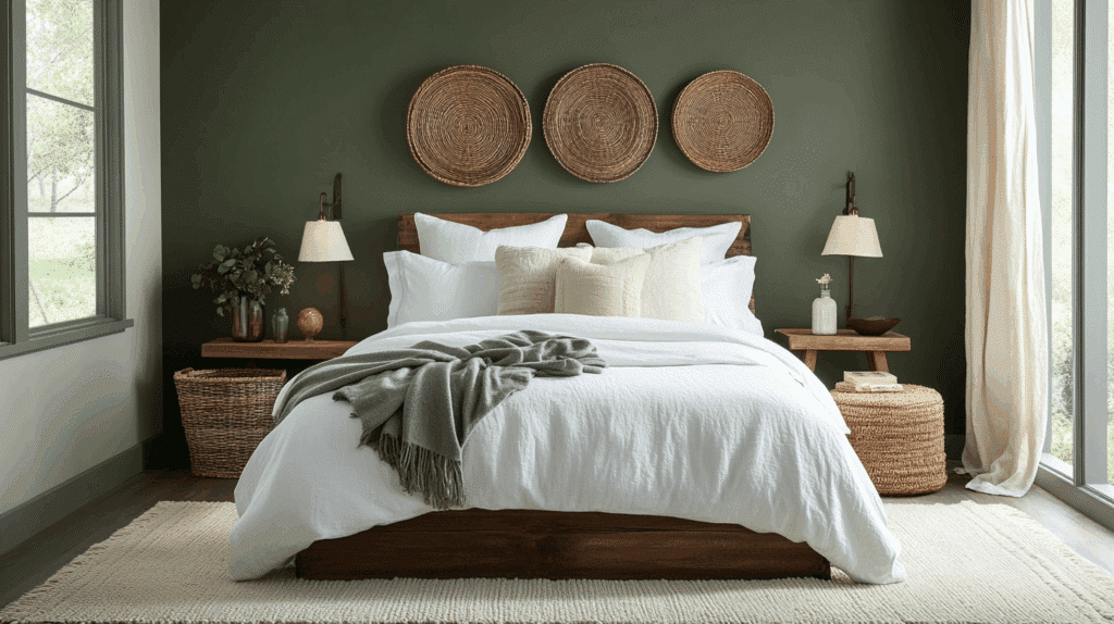
Oakmoss turned the bedroom into a natural-looking Space:
- Added layers of white bedding for contrast
- Brought in natural wood side tables
- Put up woven baskets as wall art
- Added table lamps with warm light bulbs
- Placed cream-colored area rug to soften the space
- The green walls make everything feel connected and intentional
4. Balancing the Interior of the Bathroom
Watching this bathroom come together was fascinating.
The moment we painted above the white tile line, the space felt instantly more expensive. I particularly love how the morning light makes the green look crisp and spa-like.
Before
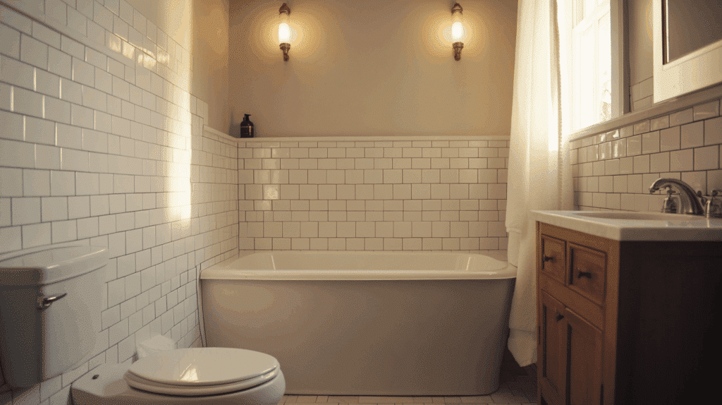
- Builder-grade white tile halfway up the walls looked basic
- Plain white upper walls showed every imperfection
- Chrome fixtures appeared harsh and uninviting
- Visual disconnect between tile and wall sections
- Lighting created unflattering shadows
- Space lacked character and warmth
After the Transformation
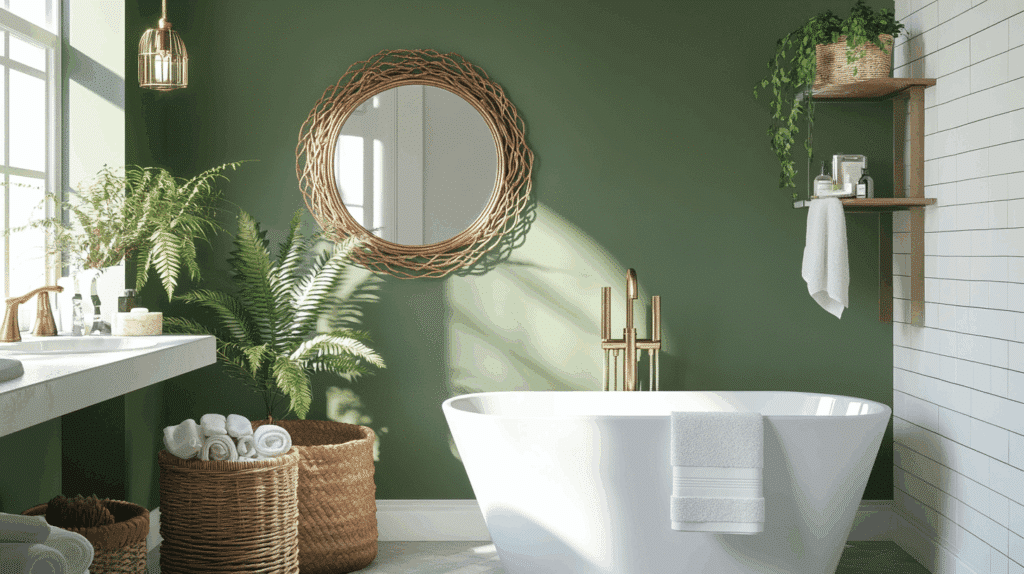
Oakmoss above the tile line created a whole new feel:
- The color makes chrome fixtures shine brighter
- Added white fluffy towels for contrast
- Put in a vintage brass mirror
- Added woven storage baskets
- Placed small potted ferns on the counter
- The mix of white tile and green walls now feels purposeful
5. Exterior Enhancement
Standing at the curb after finishing this exterior project was a proud moment.
The way Oakmoss reads differently on each side of the house, responding to natural light, taught me new things about this color. It’s become one of my favorite exterior transformations to date.
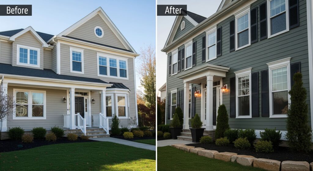
Before
- Beige siding made the house fade into the street
- White trim had no contrast to stand out
- Architectural details got lost in the bland color
- Windows looked flat against the plain backdrop
- Landscaping seemed disconnected from the house
- Overall curb appeal was minimal
After the Transformation
Oakmoss siding made this house a standout:
- White trim now frames windows and doors perfectly
- Added black shutters for extra contrast
- Put in copper outdoor lighting fixtures
- Planted evergreen shrubs to complement the wall color
- Added natural stone planters
- The house changes through the day – gray-green in bright sun, deeper and moodier at dusk.
What are the Best Lighting Options for Oakmoss?
Let me share what I’ve learned about how different lighting affects Oakmoss. I’ve studied this color in various homes throughout the day, and here’s what you need to know:
Natural Light Options:
- Large windows: Let in plenty of sunlight to show off color changes
- Skylights: Create interesting shadows and highlight depth
- French doors: Allow wide light exposure that shows the true color
- Bay windows: Offer multiple light angles for rich color display
Artificial Light Choices:
- Wall sconces: Soft white LED fixtures at eye level
- Pendant lights: Clear glass with warm bulbs
- Table lamps: Fabric shades with 2700K bulbs
- Floor lamps: Adjustable options with dimmers
- Track lighting: Directional spots to create depth
My top tip? Mix lighting types and add dimmers where possible. I’ve found that layered lighting helps Oakmoss show its full range of beauty from day to night.
How Does Oakmoss Compare to Other Green Shades?
| Paint Color | Description | Undertones | Best Applications | Key Difference from Oakmoss |
|---|---|---|---|---|
| Oakmoss (SW 6180) | Deep, muted green with strong earthy undertones. | Gray, Brown | Versatile for living rooms, kitchens, and bedrooms. Creates a neutral, timeless ambiance. | Neutral, earthy tone; adapts to lighting with gray or brown shifts. |
| Clary Sage (SW 6178) | Softer, sage-like green with a natural, calming feel. | Yellow, Gray | It is ideal for kitchens, bathrooms, or accents. Brings a light, airy vibe. | Lighter and softer, with a warmer yellow undertone. |
| Shade Grown (SW 6188) | Dark, rich green with blue and gray undertones. | Blue, Gray | Great for bold accent walls, cabinets, or bedrooms. Offers a more dramatic look. | Cooler and deeper, with stronger blue undertones. |
| Evergreen Fog (SW 9130) | Subtle, green-gray with a modern, understated look. | Gray | Perfect for contemporary spaces, offices, or as a neutral backdrop. | Softer and more subdued, it leans heavily into gray. |
| Ripe Olive (SW 6209) | Deep olive green with warm, earthy undertones. | Yellow, Brown | Great for rustic, traditional designs or cabinetry. Adds warmth and coziness. | Warmer and more olive-toned compared to the neutrality of Oakmoss. |
| Laurel Woods (SW 7749) | Rich, forest green with a natural, woodsy feel. | Blue, Gray | Excellent for exterior applications, bold interiors, or dramatic focal points. | More vibrant and forest-like, it lacks the earthy neutrality of Oakmoss. |
How to Use Oakmoss in Different Design Styles?
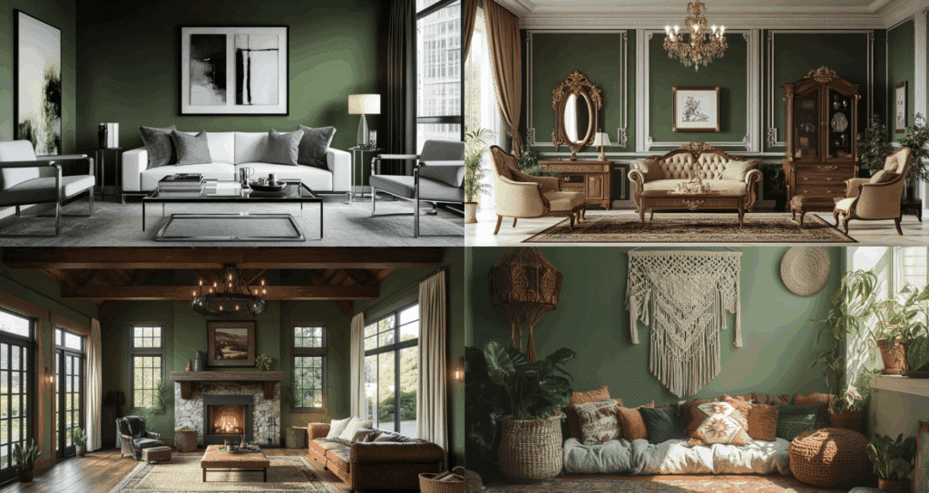
Let me share my design experience with Oakmoss.
After working with this color in countless homes, I’ve explored how wonderfully it adapts to any style preference.
Modern
Oakmoss creates a stunning backdrop for sleek furniture.
The color feels fresh with glass coffee tables, chrome accents, and black-framed artwork. The white sofa creates a sharp contrast, while gray textiles add depth to the monochromatic scheme.
Traditional
The green is a perfect match for rich wood furniture and classic details.
It beautifully complements brass chandeliers and gold-framed mirrors.
White crown molding pops against Oakmoss, while cream upholstery and oriental rugs blend smoothly with the walls.
Rustic
This color makes wooden beams and stone fireplaces look more natural. It pairs wonderfully with leather furniture and iron light fixtures.
Natural linen curtains and jute rugs add softness while keeping the earthy feel alive.
Boho
Provides a rich background for mixed patterns and textures.
Macramé wall hangings and woven baskets stand out perfectly. The green makes indoor plants look fuller, while colorful pillows and vintage rugs create fun contrasts.
What I love most about working with Oakmoss is its ability to enhance each style’s personality.
Whether you prefer clean, modern lines or cozy rustic charm, this color knows how to play its part perfectly. Trust me, I’ve seen it work magic in every home style.
Final Words
Looking to make a lasting change in your home? I can tell you from experience that Oakmoss might be just what you need.
What I love most about this color is how it shifts and changes, yet always feels just right.
From bright morning light to soft evening glow, it keeps revealing new sides of itself.
It works beautifully with any style – modern, traditional, rustic, or boho.
Watch how the color changes throughout the day. Add some warm lighting, layer in your favorite textures, and see how this versatile green makes everything around it look better.
Ready to try Oakmoss in your home? Start with a small space like a powder room or reading nook.

