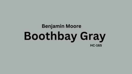
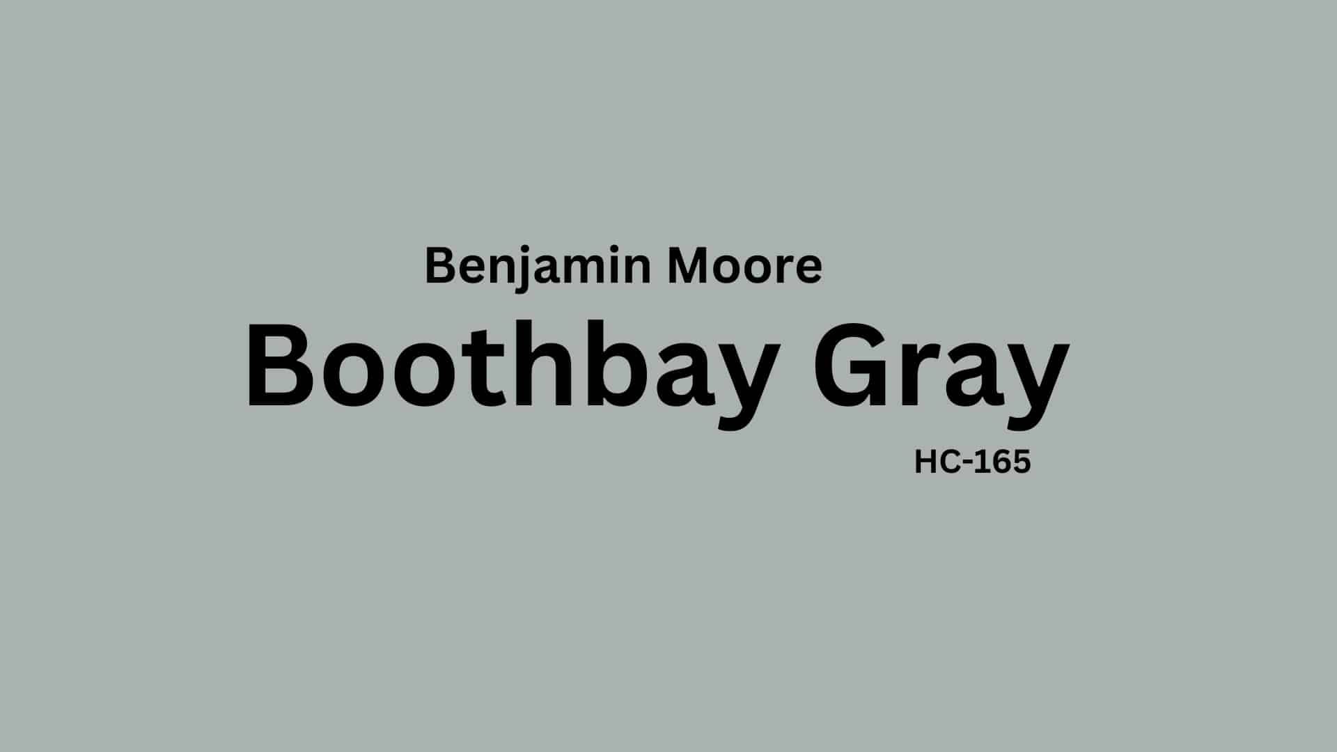
Looking for the perfect gray paint color for your next project? Benjamin Moore’s Boothbay Gray (HC-165) might be the answer.
This popular shade has been gaining attention for its versatility in modern homes. In this guide, we break down everything you need to know before buying this paint color.
You’ll learn how Boothbay Gray performs in different rooms, what lighting conditions work best, and whether its subtle green undertones will complement your existing décor.
We compared Boothbay Gray with similar colors, shared practical durability information, and revealed common application mistakes to avoid.
Our tips section will help determine if this paint is worth your investment.
Understanding Boothbay Gray’s Undertones
Boothbay Gray is a popular Benjamin Moore paint color that changes with different lighting conditions. This soft gray has unique undertones that make it versatile for many homes.
How Boothbay Gray Appears in Different Lighting
- Morning Light: Boothbay Gray looks cooler and more blue-green in morning light. The gentle morning rays bring out its refreshing coastal qualities.
- Afternoon Sun: Boothbay Gray warms up slightly as the sun gets stronger. The color shows more of its gray base with subtle green undertones appearing.
- Night Time: In the evening, Boothbay Gray deepens and can appear more neutral gray. The blue-green undertones become less noticeable.
- Artificial Light: Boothbay Gray can look different depending on bulb type under lamps and overhead lighting. Warm bulbs bring out its warmth, while cool LED lights emphasize its blue tones.
Color Details
| ATTRIBUTE | VALUE |
|---|---|
| Color Code | HC-165 |
| Hex Code | #ABB2AF |
| Light Reflective Value (LRV) | 43.26 |
| RGB Values | (171, 178, 175) |
What These Numbers Mean?
- Color Code (HC-165): This is Benjamin Moore’s unique identifier for Boothbay Gray in their Historic Colors collection.
- Hex Code (#ABB2AF): This six-digit code represents the exact digital color for web and graphic design purposes.
- Light Reflective Value (LRV: 43.26): This number shows that Boothbay Gray reflects about 43% of light that hits it, making it a medium-toned color that won’t make a room feel too dark.
- The green component (178) gives Boothbay Gray its slightly cool-toned look.
- The nearly balanced red (171) and blue (175) keep it from appearing too warm or too stark.
These values help Boothbay Gray adapt to different lighting conditions while maintaining its signature neutral-gray appearance.
Digital Uses
- Works well as a website background color for clean, professional designs.
- Serves as an excellent neutral base for digital presentations.
- Functions as a calming background for video calls and virtual meetings.
- Creates a complete look when used in digital marketing materials.
- Pairs nicely with both light and dark text in digital documents.
- Provides a perfect backdrop for product photography in online stores.
- Complements most logo colors when used in digital branding.
Why Choose Benjamin Moore Boothbay Gray?

Boothbay Gray is a balanced neutral paint, making it a perfect choice for creating a calming yet stylish space. Its versatility complements various home styles and décor choices, from modern minimalism to rustic charm.
The Durability of Boothbay Gray
Boothbay Gray is an exceptionally practical and long-lasting paint choice that offers style and functionality for today’s busy households.
- High-quality, fade-resistant pigment: Maintains its color well over time.
- Easy maintenance: Works in high-traffic areas, especially with satin or semi-gloss finishes.
- Moisture-resistant: Ideal for bathrooms and kitchens due to its ability to withstand humidity.
- Best finishes for durability: Satin for walls helps resist scuffs and stains; semi-gloss for cabinets and trim adds extra protection.
- Cleaning tips: Use a damp cloth and mild soap to keep it looking fresh.
With proper application and care, Boothbay Gray provides homeowners with a beautiful color that remains consistent and attractive for many years.
Texture Partners
| Material Type | Best Texture Partners | Effect on Boothbay Gray |
|---|---|---|
| Wood | Natural oak, walnut, reclaimed wood | Adds warmth and balances cool undertones |
| Metal | Matte black, brushed nickel, antique brass | Enhances modern or industrial attractions |
| Stone | White marble, quartz, gray slate | Complements the neutral style of the color |
| Fabric | Linen, velvet, wool | Adds softness and depth to the space |
| Tile | White subway tile, herringbone, textured ceramics | Creates a clean and timeless look |
| Glass | Frosted, clear, tinted | Reflects light, maintaining a bright ambiance |
| Brick | Painted white, exposed red brick | Offers contrast and constructive interest |
How Boothbay Gray Works in Different Rooms
Living Room Style

Boothbay Gray adds a calm and complete look to living spaces. The color creates depth without overwhelming the room and helps make spaces feel more open and airy.
- Pairing: Pairs well with white trim, wood accents, and navy or taupe furniture.
- Lighting considerations: Adjusts beautifully between warm and cool light sources.
Kitchen Freshness

Boothbay Gray creates a clean and inviting atmosphere in kitchens. It provides a neutral yet interesting backdrop that makes other elements in the kitchen stand out.
- Complements both light and dark cabinetry.
- Works well with stainless steel appliances and natural stone countertops.
Bedroom Calmness

Boothbay Gray converts bedrooms into peaceful retreats. The soft blue-gray tones promote relaxation and better sleep while maintaining a modern feel.
- Creates a soothing backdrop for any bedding color.
- It looks especially nice in rooms with morning or afternoon light.
Bathroom Serenity

Boothbay Gray brings a spa-like quality to bathrooms. Its subtle blue undertones feel fresh and clean, perfect for creating a calming self-care space.
- Pairs beautifully with white fixtures and chrome hardware.
- Maintains its color integrity even in humid conditions.
Dining Room Look

Boothbay Gray upgrades dining rooms with fresh style. It serves as the perfect backdrop for family meals and special occasions alike.
- Enhances both traditional and modern dining furniture.
- Creates a welcoming atmosphere under both natural and artificial light.
Home Office Focus

Boothbay Gray provides a balanced background for workspaces. It helps create concentration, like pure white walls, without feeling sterile or cold.
- Reduces visual distractions without feeling bored.
- Creates a professional backdrop for video calls
Colors that Complement with Boothbay Gray
Stonington Gray (HC-170)

A balanced, neutral gray with a slightly cool undertone, Stonington Gray complements Boothbay Gray by adding depth while maintaining a cohesive look. It’s ideal for adjacent rooms or trim work.
White Wisp (OC-54)

A soft off-white with a subtle hint of gray, White Wisp pairs effortlessly with Boothbay Gray to create a clean, airy style, perfect for trim, ceilings, or cabinetry.
Frosted Petal (2089-70)

A muted pink with a soft, warm undertone, Frosted Petal adds a gentle contrast to Boothbay Gray, making it a great choice for accent walls or decorative touches.
Chantilly Lace (OC-65)

One of the crispest whites, Chantilly Lace, enhances Boothbay Gray’s cool tones, providing sharp and good contrast for trim, doors, and ceilings.
Similar Colors to Boothbay Gray
Choosing the right paint color involves considering similar shades to find the perfect match for your space. If you love Boothbay Gray HC-165, here are a few comparable colors with slight variations in tone and undertone.
Silver Mink (1586)

A soft and airy gray with a hint of warmth, Silver Mink offers a more silent look compared to Boothbay Gray. It works well in spaces that need a subtle, complete touch.
Marina Gray (1599)

Marina Gray leans slightly cooler with blue undertones, making it an excellent choice for coastal or modern spaces. It pairs beautifully with crisp whites and darker blues for contrast.
Mount Saint Anne (1565)

This deeper, more pronounced gray has a stronger blue influence, giving it a moody and dramatic effect. It is ideal for accent walls, cabinetry, or cozy interiors.
Iced Marble (1578)

A light and refreshing gray with a hint of green, Iced Marble is perfect for brightening up small or dimly lit rooms. It pairs well with both cool and warm neutrals.
Tips Before Choosing Boothbay Gray

Before committing to Boothbay Gray for your home, carefully consider several important factors that can affect how this versatile color appears in your spaces.
The subtle green-gray undertones of this Benjamin Moore classic can shift dramatically depending on lighting conditions and surrounding elements, making it essential to evaluate it thoroughly in your specific environment.
- Test it in different lighting conditions. This color appears bluer in cool lighting and more gray in warm lighting.
- Compare with nearby colors in open floor plans to ensure good interaction with other wall colors.
- Consider the undertones carefully. Boothbay Gray works best with colors that complement its subtle green-gray tone.
- Pick the right sheen: matte for walls (soft and modern), satin for trim (simple style), and semi-gloss for cabinets (better durability).
- Sample it with existing décor by placing swatches near countertops, flooring, and furniture to see how they blend.
- Observe how the color changes throughout the day as natural light shifts.
Considering these considerations, Boothbay Gray can become a timeless choice that creates beautiful, versatile spaces throughout the home.
Common Mistakes to Avoid
When working with Boothbay Gray, homeowners should be aware of several potential pitfalls that can affect the final look of their space.
Understanding these common mistakes can help ensure successful application and the intended impact throughout the home.
- Using in rooms with very poor natural light can make it appear uninteresting.
- Pairing with the wrong undertones in furniture or accessories.
- Not testing in different lighting conditions before committing.
- Applying in rooms with strong green or yellow elements, which may clash.
- Selecting finishes that don’t match the room’s purpose (matte for low traffic, semi-gloss for high traffic).
- Forgetting to consider ceiling color, which affects how the wall color appears.
Final Thoughts
After exploring the many qualities of Benjamin Moore’s Boothbay Gray, it’s clear why this versatile color remains a popular choice for homeowners.
Its balanced green-gray undertones create spaces that feel both current and timeless. Boothbay Gray offers excellent durability and adaptability across different rooms and lighting conditions.
Whether for a whole-home color scheme or a single accent wall, this shade delivers great and complete results without being too trendy.
Before purchasing, remember to test samples in your specific space and lighting. While Boothbay Gray works beautifully in many settings, your home’s unique characteristics will determine if it perfectly matches your needs.
With its proven performance and style track record, Boothbay Gray remains a reliable option for those seeking a versatile neutral that stands the test of time.

Alex Guerrero, a graduate with a Fine Arts degree from the Rhode Island School of Design, has been a visionary in the world of color and design for over 15 years. His professional journey began in the heart of the fashion industry in Milan, where he developed an acute sense for color harmonies and trends. Alex joined our team in 2018, offering fresh and innovative perspectives on color utilization in various spaces. Renowned for his ability to blend contemporary trends with timeless elegance. Outside of work, Alex is an accomplished painter and a volunteer art therapist, his artistic talents further enriching his professional insights.