Have you ever walked into a room and felt instantly calm and fresh? That’s precisely what happened to me when I first discovered Sherwin-Williams’ Pearly White.
This isn’t just another white paint; it’s a game-changer that can alter any space in your home. I’ll walk you through everything from understanding its warm undertones and psychology to exploring room-by-room applications in kitchens, bedrooms, and bathrooms.
We’ll jump into perfect color pairings, furniture coordination, and even uncover similar alternatives if you’re looking for something slightly different.
Get ready to fall in love with the perfect white that’s anything but ordinary!
Understanding Pearly White Basics
Color Terminology
| PROPERTY | VALUE |
|---|---|
| LRV (Light Reflectance Value) | 77 |
| Color Category | Considered a light color (LRV above 50) |
| Comparison | Pure white: ~90 LRV, Black: ~0 LRV |
| RGB Value | Red: 232, Green: 227, Blue: 217 |
| Hex Code | #E8E3D9 |
Undertones:
- Pearly White is a soft, creamy off-white with subtle warm undertones of beige and yellow
- It has a luminous quality that creates a gentle glow without appearing too yellow or stark
- The hint of warmth is balanced, preventing it from feeling overly cool or clinical
- Pearly White offers a sophisticated, timeless backdrop that provides depth without overwhelming a space
- It’s versatile and pairs beautifully with both cool tones and warm accent colors, making it an adaptable neutral
Psychology of Sherwin-Williams 7009 Pearly White
It creates mental clarity and openness by establishing a gentle, reflective backdrop that expands the perception of space and encourages free-flowing thought.
It conveys subtle sophistication through its nuanced warmth and luminosity, projecting quiet confidence and timeless elegance without demanding attention.
It enhances the perception of light and harmony, softening harsh elements while allowing colorful accents to appear more vibrant and intentional against its neutral canvas.
It provides emotional balance, offering a sense of calm and purity that can feel both welcoming and uplifting in various environments.
Through its light-reflective qualities, it encourages optimism and presence, making spaces feel more peaceful and conducive to positive social interaction.
Why Choose Sherwin-Williams 7009, Pearly White?
Versatility
Pearly White transforms subtly across lighting conditions, appearing as a clean, bright off-white in natural light while revealing gentle, warm undertones in artificial lighting.
Its balanced warmth creates a refined neutral that pairs effortlessly with both contemporary and traditional design elements.
Key Features
Pearly White acts as an elegant spatial enhancer, expanding rooms and highlighting decorative elements without competing with them.
It provides a soft, luminous backdrop that feels timeless yet fresh, avoiding the clinical starkness of pure whites or the heaviness of deeper neutrals.
Durability
Sherwin-Williams Pearly White in premium finishes like Emerald or Duration offers excellent coverage and scuff resistance with simple maintenance requirements.
Its light-reflective quality effectively brightens spaces and maintains a clean appearance even in frequently used areas when properly applied.
Texture Patterns
Pearly White creates subtle sophistication through its ability to capture and diffuse light, adding gentle luminosity to walls while maintaining visual interest.
Its peaceful, warm undertones produce soft dimensional effects that enhance textured surfaces and create bright, welcoming environments.
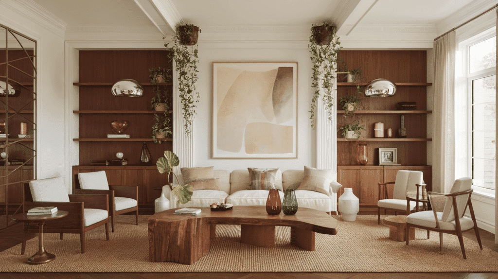
Room-by-Room Color Recommendations for Pearly White
Now that you understand what makes Pearly White so special, let’s explore how this versatile color performs in different spaces throughout your home.
Each room has unique lighting and function needs, and I’ll show you exactly how to make Pearly White work its magic in every single one.
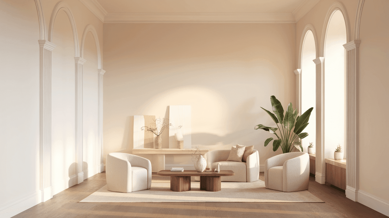
In Living Spaces and Open Floor Plans
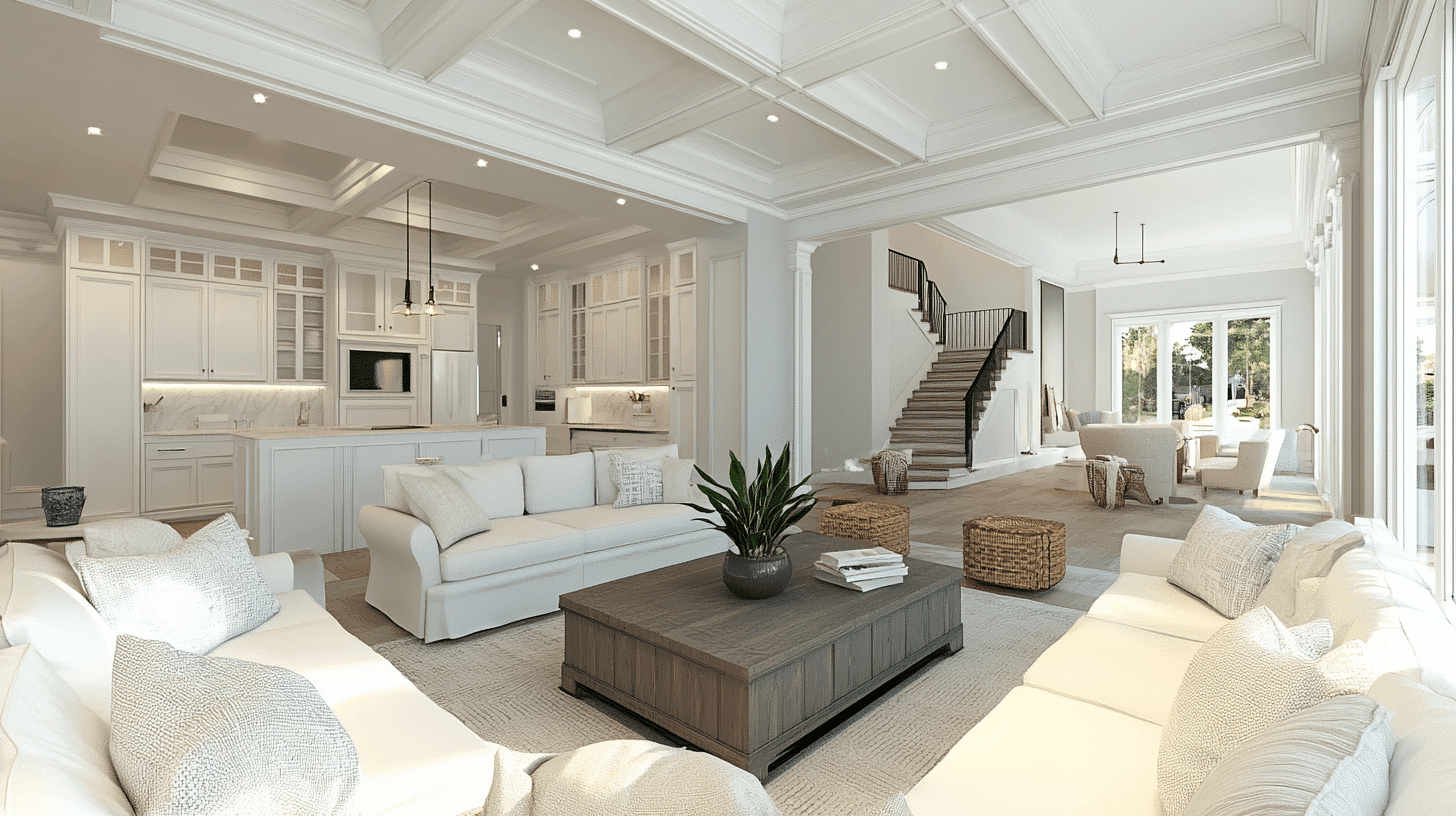
Pearly White creates graceful cohesion in open floor plans, as its luminous quality maintains brightness across varying light conditions.
Its high LRV provides airy spaciousness when used throughout, while allowing architectural features and furnishings to become natural focal points.
For refined contrast, pair Pearly White on the main walls with Extra White SW 7006 trim or create subtle dimension with Alabaster SW 7008 for adjacent walls.
In Bedrooms and Relaxation Areas
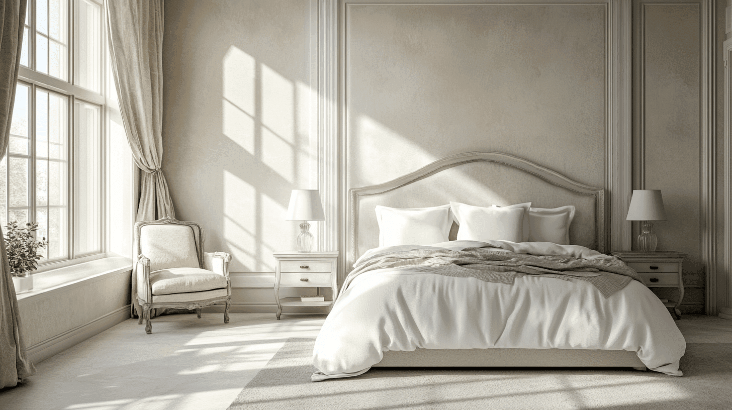
Pearly White creates a serene sanctuary in bedrooms with its gentle warmth, promoting tranquility and restful openness.
The subtle creamy undertones create a soft environment while maintaining enough neutrality to support various accent colors and textures.
Consider Pearly White for all walls, layered bedding, and textiles in varying tones and textures to create a peaceful retreat that feels both refined and welcoming.
In Kitchen
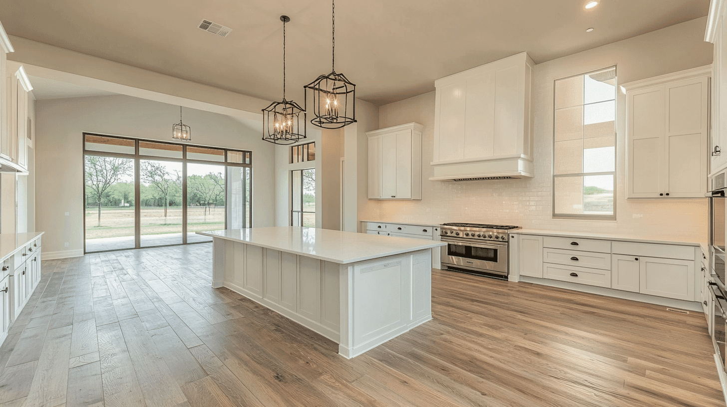
Pearly White in satin or semi-gloss finish offers timeless grace on cabinets or walls, while its light tone brightens the space and creates an airy, clean appearance.
The versatile warmth complements both cool marble and warm wood elements, providing a flexible foundation for diverse material palettes.
Pearly White creates a urbane backdrop for colorful accessories or statement lighting, adding refined brightness without the harshness of pure white.
In Bathrooms and Spa-Like Retreats
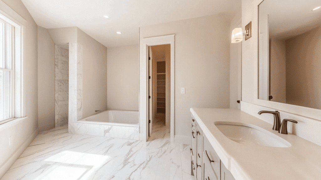
Pearly White establishes a refreshing, spa-like serenity in bathrooms. Its luminosity enhances visual spaciousness while providing a harmonious backdrop for fixtures.
This refined neutral subtly highlights chrome, brushed nickel, or brass fixtures, creating a coordinated, intentional aesthetic.
Consider using it on all surfaces for a bright, expansive feel, or pair it with a statement tile to create a balanced focal point that elevates the entire space.
Color Pairings and Combinations for Pearly White
Pearly White transforms transition spaces like entryways and hallways into bright, welcoming areas, lending an airy openness to often confined spaces.
When used on wainscoting or interior door frames, Pearly White creates graceful moments of brightness that establish a cohesive flow and enhance natural light throughout the home.
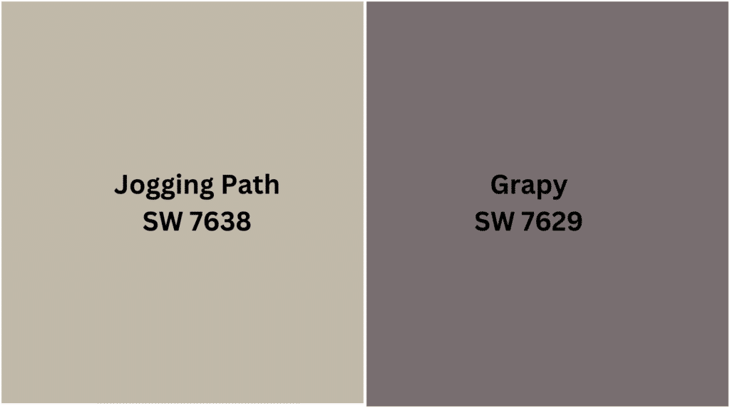
Complementary Accent Colors
- Jogging Path SW 7638 – A versatile, warm greige that adds subtle depth while harmonizing with Pearly White’s warm undertones.
- Grapy SW 7629 – A soft, muted purple that creates sophisticated contrast against Pearly White’s neutral canvas.
Creating Cohesive Color Schemes with Pearly White
1. Monochromatic Scheme
- Pearly White for main walls and trim
- Alabaster (SW 7008) for ceilings and connecting spaces
- Greek Villa (SW 7551) for architectural details
- Shoji White (SW 7042) for subtle contrast and depth
2. Cool Color Scheme
- Pearly White for main walls and millwork
- Sea Salt (SW 6204) for living areas and bedrooms
- Rainwashed (SW 6211) for accent walls
- North Star (SW 6246) for subtle color in bathrooms
3. Warm-Cool Balance Scheme
- Pearly White for primary spaces and trim
- Accessible Beige (SW 7036) for living and dining areas
- Jogging Path (SW 7638) for accent walls
- Coral Clay (SW 9005) for small spaces or accessories
4. Natural Elements Scheme
- Pearly White for main walls and built-ins
- Pure White (SW 7005) for trim and ceilings
- Colonnade Gray (SW 7641) for connecting spaces
- Riverway (SW 6222) for focal points or furniture
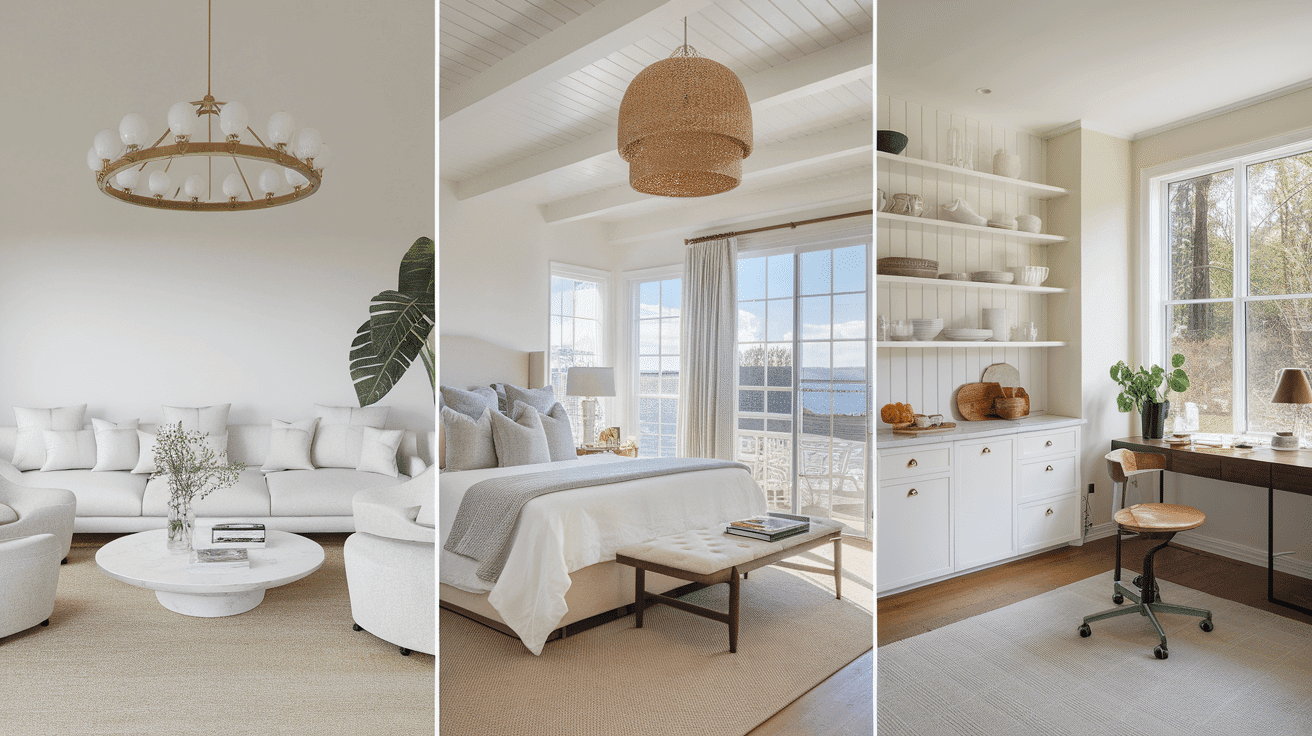
Complementing Pearly White with Your Home’s Furnishings
Wood Tones
Pearly White creates a soft, complementary backdrop for dark woods like walnut, mahogany, and espresso, enhancing their rich depth and grace.
For a more harmonious approach, medium-toned oak or maple provides a warm balance against this luminous neutral.
Whitewashed or bleached woods create a serene, Scandinavian-inspired pairing that emphasizes light and airiness.
Metals
Antique brass and champagne gold blend beautifully with Pearly White’s warm undertones, creating a cohesive, refined palette.
Chrome and polished nickel provide a crisp definition against Pearly White’s soft warmth, offering bright accents that enhance the space.
Brushed or satin finishes in any metal create a subtle texture that complements Pearly White’s refined luminosity without competing for attention.
Decor
Textural elements like linen, cotton, and natural jute in varying neutral tones add depth and interest while maintaining Pearly White’s serene quality.
Colored glass, ceramic, and porcelain introduce subtle or bold color moments that stand out elegantly against the neutral backdrop.
Abstract art with soft color palettes, trailing plants with gentle silhouettes, and pale marble or alabaster accessories enhance the light, airy quality this color establishes.
Similar Paint Colors: Perfect Alternative to Pearly White
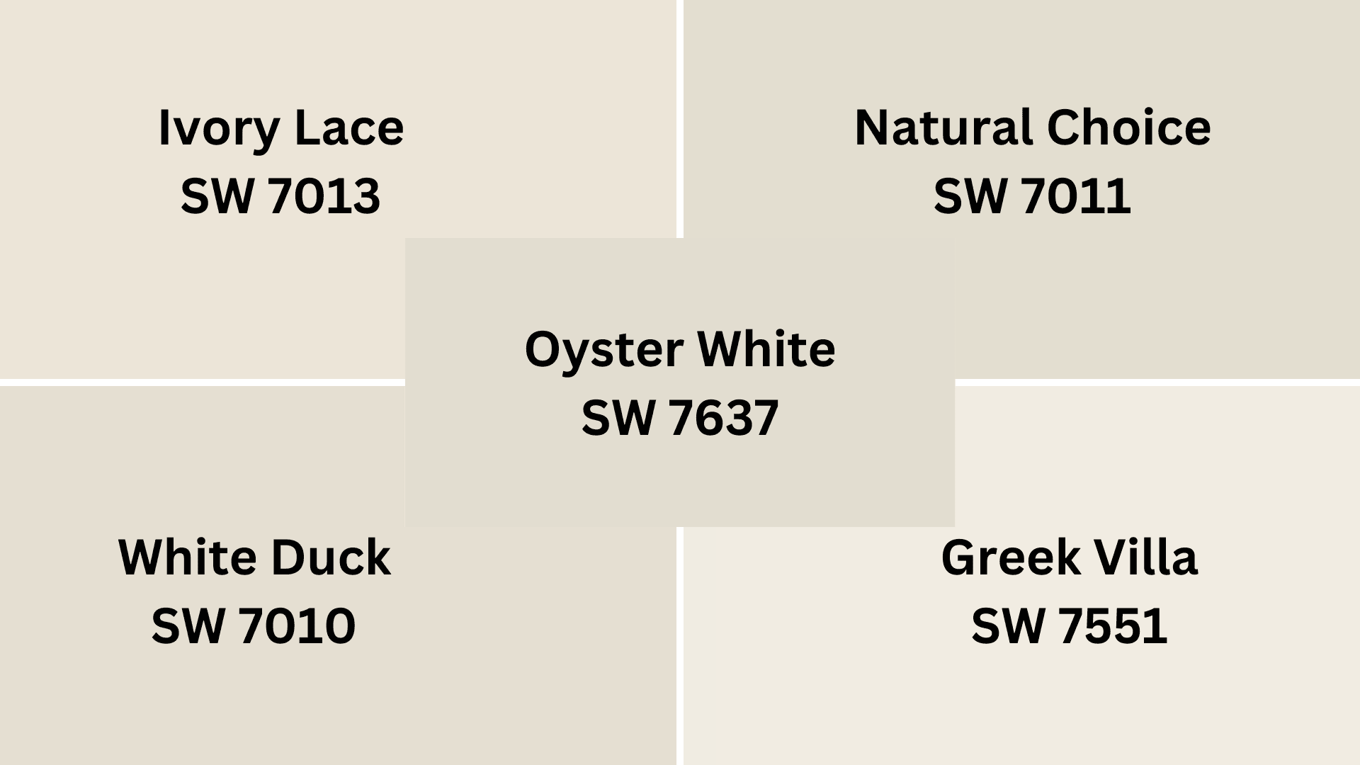
Pearly White is a graceful off-white with subtle, warm, creamy undertones. Its high Light Reflectance Value creates bright, expansive spaces while providing more warmth and softness than pure white.
SW 7551 Greek Villa – A slightly warmer off-white with pronounced creamy undertones that offers Pearly White luminosity with increased warmth for cozy, inviting environments.
SW 7013 Ivory Lace – A refined cream that maintains Pearly White’s gentle warmth but with a touch more yellow, creating a softer, more traditional character with timeless appeal.
SW 7010 White Duck – A versatile greige-influenced white that shifts Pearly White’s undertones toward cooler, more complex territory for a more contemporary, sophisticated presence.
SW 7011 Natural Choice – A balanced warm white with subtle beige undertones that captures Pearly White’s brightness while introducing a more organic, natural quality to spaces.
SW 7637 Oyster White – A complex white with gray-beige undertones that offers Pearly White’s versatility but with added depth and subtle contrast for more layered, nuanced interiors.
Final Thoughts on My Pearly White Experience
After living with Pearly White for several seasons, I’m convinced it was the perfect choice. Its luminous quality continues to surprise me—it catches morning light differently than evening light yet always maintains that urbane warmth I crave.
When friends visit, they invariably ask about my wall color, noticing how it sweetens everything from my textured throws to my statement lighting.
Are you ready to alter your space with a white that actually adds character rather than just serving as a blank canvas?
I encourage you to sample Pearly White in your own home. Test it in different lighting conditions and against your existing furnishings.
You might be surprised how this seemingly simple choice can elevate your entire design aesthetic. What room will you transform first with this versatile neutral?

Alex Guerrero, a graduate with a Fine Arts degree from the Rhode Island School of Design, has been a visionary in the world of color and design for over 15 years. His professional journey began in the heart of the fashion industry in Milan, where he developed an acute sense for color harmonies and trends. Alex joined our team in 2018, offering fresh and innovative perspectives on color utilization in various spaces. Renowned for his ability to blend contemporary trends with timeless elegance. Outside of work, Alex is an accomplished painter and a volunteer art therapist, his artistic talents further enriching his professional insights.